Project highlights

Task
Redesign Foqal’s core ticketing system, starting with the Kanban board and ticket detail view

Team
1 UX/UI Designer, 1 BA/PM

Duration
~7.5 months (2 phases)

Scope
Discovery interviews, user insights, ticketing system UX/UI redesign, dark mode introduction

About the client
Foqal is a California-based modern support platform helping IT, HR, and customer service teams scale without growing headcount. Instead of replacing existing workflows, Foqal plugs into them, bringing structure and real-time visibility to every request.
The product connects directly with tools like Slack, email, and internal systems. With 20+ integrations and flexible logic, Foqal helps teams resolve requests faster and keep context intact (no extra tools needed!).
Their approach is simple: keep what works, make it smarter.
What the client needed
Foqal had powerful backend logic and deep Slack integration, but the UX hadn’t kept pace. The Kanban board, the heart of the product, didn’t reflect the platform’s power and was confusing to new users.
Their founder Vlad Shlosberg reached out to us with a focused challenge:
-
rebuild the ticket board to make it more compact and easier to scan;
-
fix drag-and-drop bugs that blocked basic workflows;
-
help users understand what actions were possible (bulk edits, filters, views);
-
personalize the interface for different roles and working styles;
-
unify and simplify complex areas like automation and settings;
-
add dark mode for accessibility and user preference.
Challenges
- drag-and-drop caused tickets to disappear or act unpredictably;
- status indicators were inconsistent and hard to interpret;
- bulk actions existed, but few users could find or use them;
- ticket info was scattered across tabs and drawers, slowing response times;
- the automations UI felt fragmented, with 3 different ways to build logic;
- many used Slack exclusively because the web UI felt too heavy.
Results
- fully redesigned Kanban board became the go-to workspace;
- ticket layout was cleaned up, with smarter defaults and more flexible views;
- filters, views, and bulk actions saved teams hours each week;
- reports now felt more useful, with shareable filters and customizable widgets;
- automations were easier to build and reuse, with no more jumping tabs;
- goal-based onboarding adapted to each team’s tools and workflows;
- dark mode was added for teams working late or just wanting a calmer UI.
We started with discovery interviews and async user feedback. Working closely with Vlad and his team, we quickly moved from wireframes to functional prototypes.
The design team had direct access to active users, letting us test, iterate, and refine decisions in short, focused loops. We prioritized usability over aesthetics at first, validating what actually helped users move faster and then layered in visual clarity.
Each phase included:
-
discovery and user insights via interviews, support ticket reviews, and call notes;
-
flow mapping for tickets, automations, and dashboard usage;
-
lo-fi to hi-fi prototypes tested with stakeholders and internal users;
-
close collaboration with developers to stay implementation-ready.
Kanban board
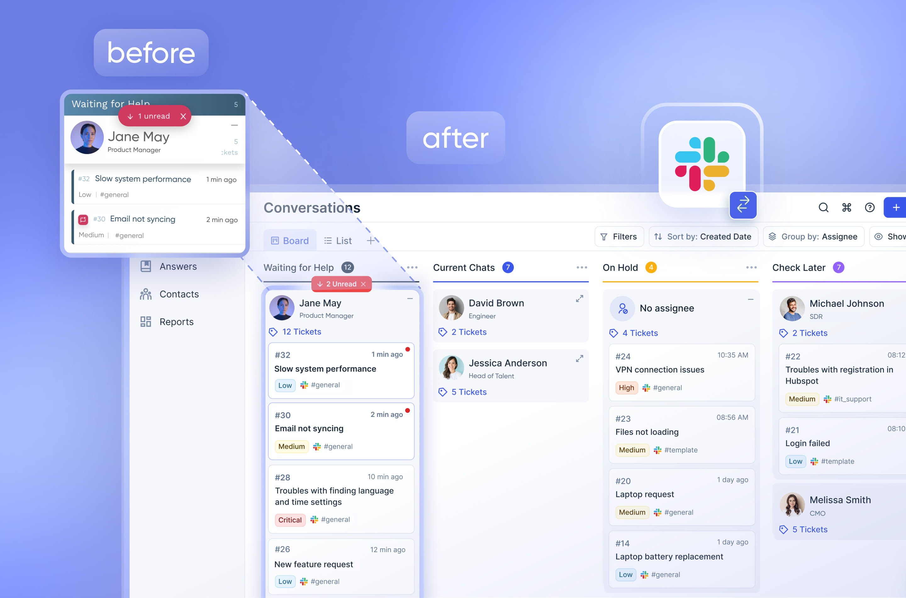
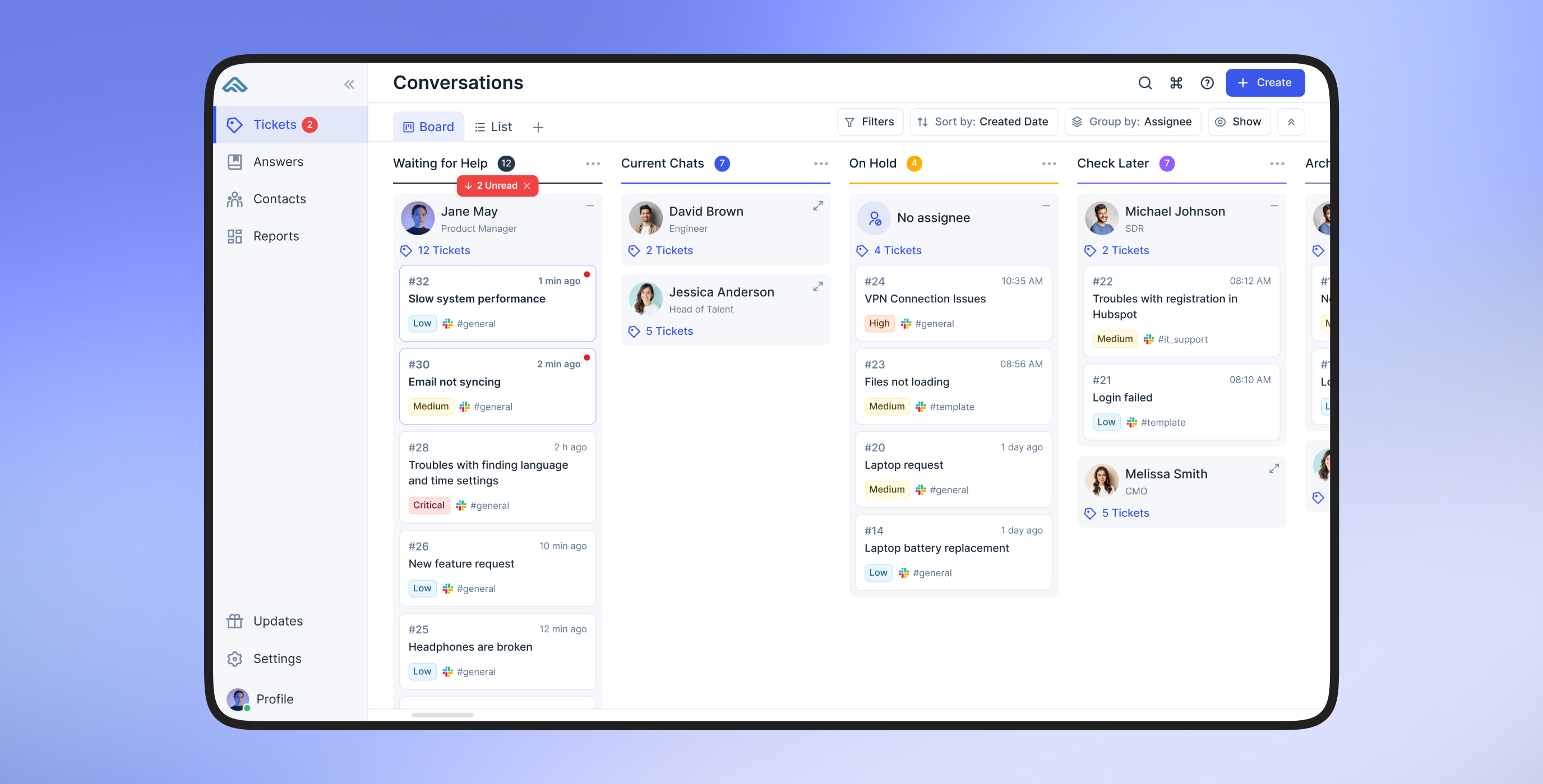
The Kanban board was Foqal’s most-used screen, but the original experience felt hard to trust. We turned it into a fast, modular workspace teams wanted to use:
-
drag-and-drop that works smoothly, even at full board scale;
- configurable views with filters and flexible grouping (e.g. by team, queue, or priority) to match how different teams work;
-
compact, scannable cards that surface the right info for each team;
-
live syncing and status indicators for real-time updates;
- bulk selection with clear UI for actions like assigning or closing tickets.
Ticket details & chat
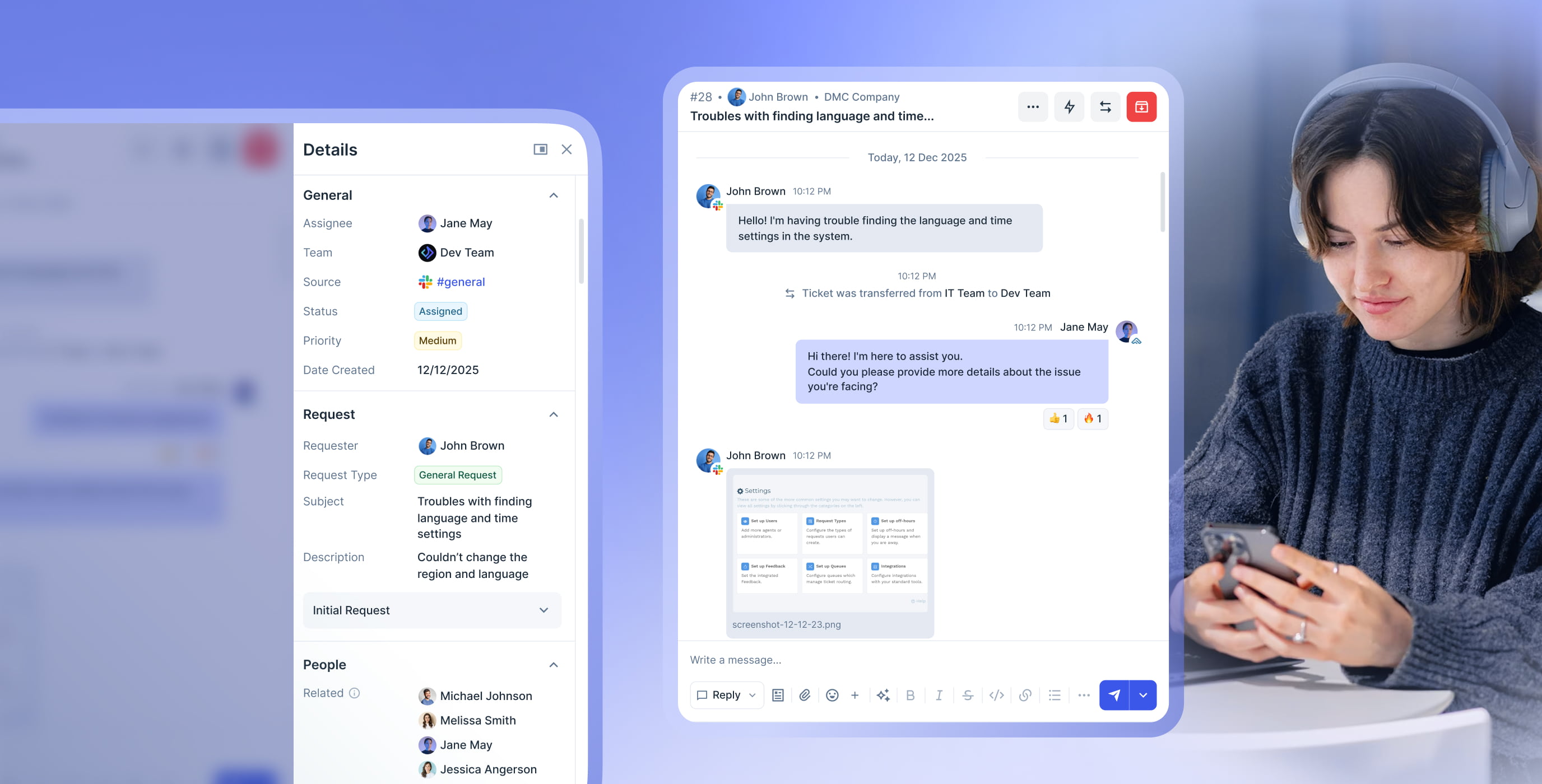
Originally, important elements like request details, actions, and channel indicators were tucked away in drawers and panels, and users weren’t always sure what to do next. Here's what changed:
-
request metadata (status, priority, requester, SLA) is grouped in a clean right-side panel;
- ticket actions (assign, escalate, snooze, etc.) live in a consistent dropdown;
-
channel icons and assignee avatars give instant context at a glance;
- formatting tools, AI actions, and file uploads are always accessible from the message bar.
The result: a more focused experience that lets teams respond without losing their place or their context.
Settings & automations
The settings module was one of the most powerful parts of the platform, but also the most complex and overwhelming. In phase two, we tackled this area head-on with:
- a unified automation hub that brings everything in one dedicated space;
- visual builder for editing logic with drag-and-drop blocks, labeled triggers, and live condition previews;
- reusable templates for common workflows, speeding up setup;
- custom request types that let teams define their own workflows.
Reports that work for users
Reporting wasn’t just a nice-to-have. Foqal’s users needed data to spot trends, manage SLAs, and hold teams accountable::
-
multiple reports with fully customizable layouts, not just a single view;
-
drag-and-drop widgets you can resize and rearrange on a freeform grid;
-
chart, table, and metric blocks with flexible filtering and trendlines;
-
shareable views with access levels (private, team, public);
-
dynamic data updates across priorities, statuses, agents, and timeframes.

Goal-based onboarding
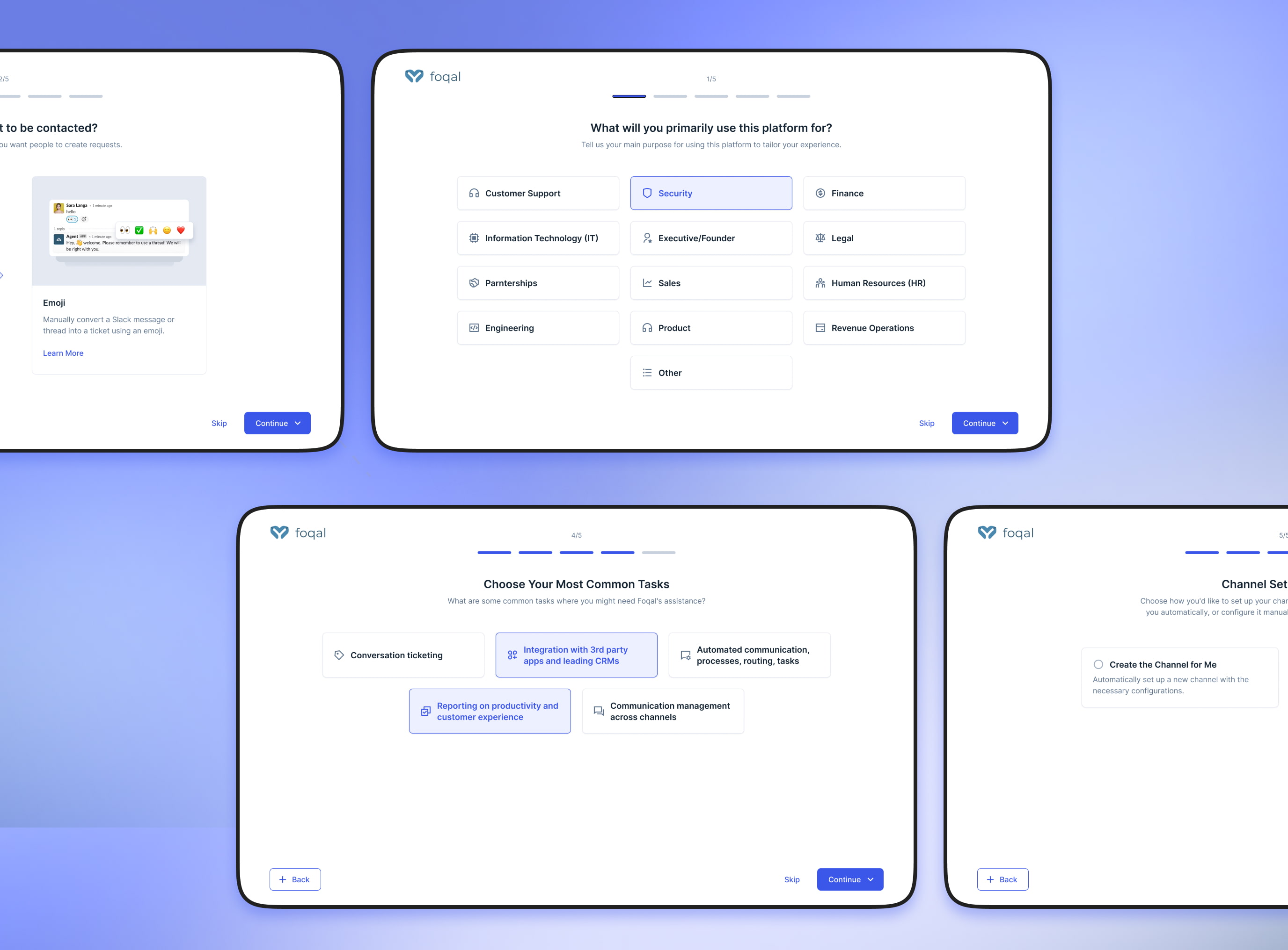
The new onboarding gets personal fast. It starts with a quick quiz about goals, tools, and roles, then adapts the flow to fit, connecting channels like Zendesk or Intercom on the go, and skipping generic tutorials in favor of pre-configured steps. Everything feels tailored from the start, so instead of just checking boxes, users get momentum.
we reply under 24 hours.
free
session
