ai

Designing Conversational Banking: How to Build a Multimodal Voice + Gen UI Experience

Yuriy Mykhasyak
Yuriy Mykhasyak CEO and co-founder
Last updated: 12 Dec 2025
Designing Conversational Banking: How to Build a Multimodal Voice + Gen UI Experience Cieden

Most banking chatbots still feel like talking to an IVR from 2005. 

You ask a simple question, it offers a menu. You try voice, it speaks back like a voicemail. And when it’s time to actually compare offers or confirm a decision, the experience jumps into a form somewhere else.

In 2025, we took a different path. Our client, a consumer finance platform serving over 100M users, needed to understand something fundamental:

Could a person start a loan conversation by voice, review details visually, type when needed, and never feel like they switched modes? 

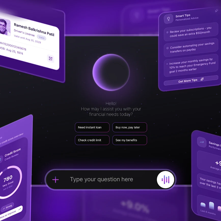
Enter FinPilot: a prototype built to answer that question. The goal was to redefine conversational banking for real financial decisions, blending the speed of voice with the clarity that screens do best.

The hypothesis was simple: 

  • voice is great for exploring (“What can I afford?”);

  • but people trust what they can see. 

This article is the story of how we built that vision: what worked, what broke, and what multimodal banking looks like when it finally feels human.

Why conversational banking needs a screen (and why speed matters)

Banking is full of smart assistants that don’t really listen. Most voice or chat systems follow rigid scripts: a sequence of questions that only work in one order. If you interrupt or try to confirm visually, they fall apart.

This is what many AI assistants still resemble in practice:

Designing Conversational Banking: How to Build a Multimodal Voice + Gen UI Experience Cieden
Play

Money is emotional. It’s high stakes. Users need to see the numbers, understand what’s happening behind the scenes, and feel in control before they commit to anything. But most current fintech UX patterns fall short:

  • voice feels fast but unreliable;

  • chat feels flexible but vague;

  • forms feel precise but exhausting.

None of these modalities work well alone. And when you combine them poorly, users end up repeating themselves or abandoning the flow entirely.

Multimodality is the next frontier for fintech UX

The shift isn’t theoretical. A 2025 Stanford study reported up to a 72% higher human preference for Generative UI over plain chat in complex tasks. Our own early testing echoed the same pattern: people love talking to an assistant, but they rely on visuals to verify and confirm. 

Multimodal banking also improves:

  • accessibility: voice for those who can't type, visuals for those who can’t listen;

  • discoverability: UI components immediately communicate the next possible action.

AI-led prototyping has changed the rules

Beyond the UX, this project demonstrated a massive shift in how financial products are built. Traditionally, designing a conversational banking system this complex would take months:

  • weeks for research;

  • weeks for design;

  • weeks for engineering;

  • weeks for integration and QA.

But AI-led prototyping changes the equation. You can go from concept functional prototype real user feedback in days, not quarters. And it empowers small teams to deliver what used to require entire departments.

In our case, a five-person team moved from a blank slate to a working, multimodal loan prototype in 2.5 weeks, complete with voice orchestration, real-time UI generation, and 11 interactive financial tools.

Conversational banking design team

Key UX challenge: seamless continuity

We needed to design a loan flow that works as one unified conversation (not three modes stitched together), no matter how the user interacts.

Picture this: You begin a loan conversation by voice while driving. You arrive at your office and switch to your desktop to review the interest rates visually. You type a private question because a colleague walks by. Finally, you complete the application with a single tap.

Achieving this required solving several intertwined challenges in conversational design:

  • high-stakes workflows: Financial applications require precision, error handling, and zero hallucination;

  • multimodal continuity: Synchronizing voice, text, and UI so all three reflect the exact same state in real-time;

  • trust pattern: Providing explicit, visual confirmations for sensitive actions without breaking the conversational flow;

  • low-latency responses: If the assistant takes even a few seconds to respond, the illusion of conversation breaks. It had to be instant.

Research foundations: designing for trust

Conversational banking design research

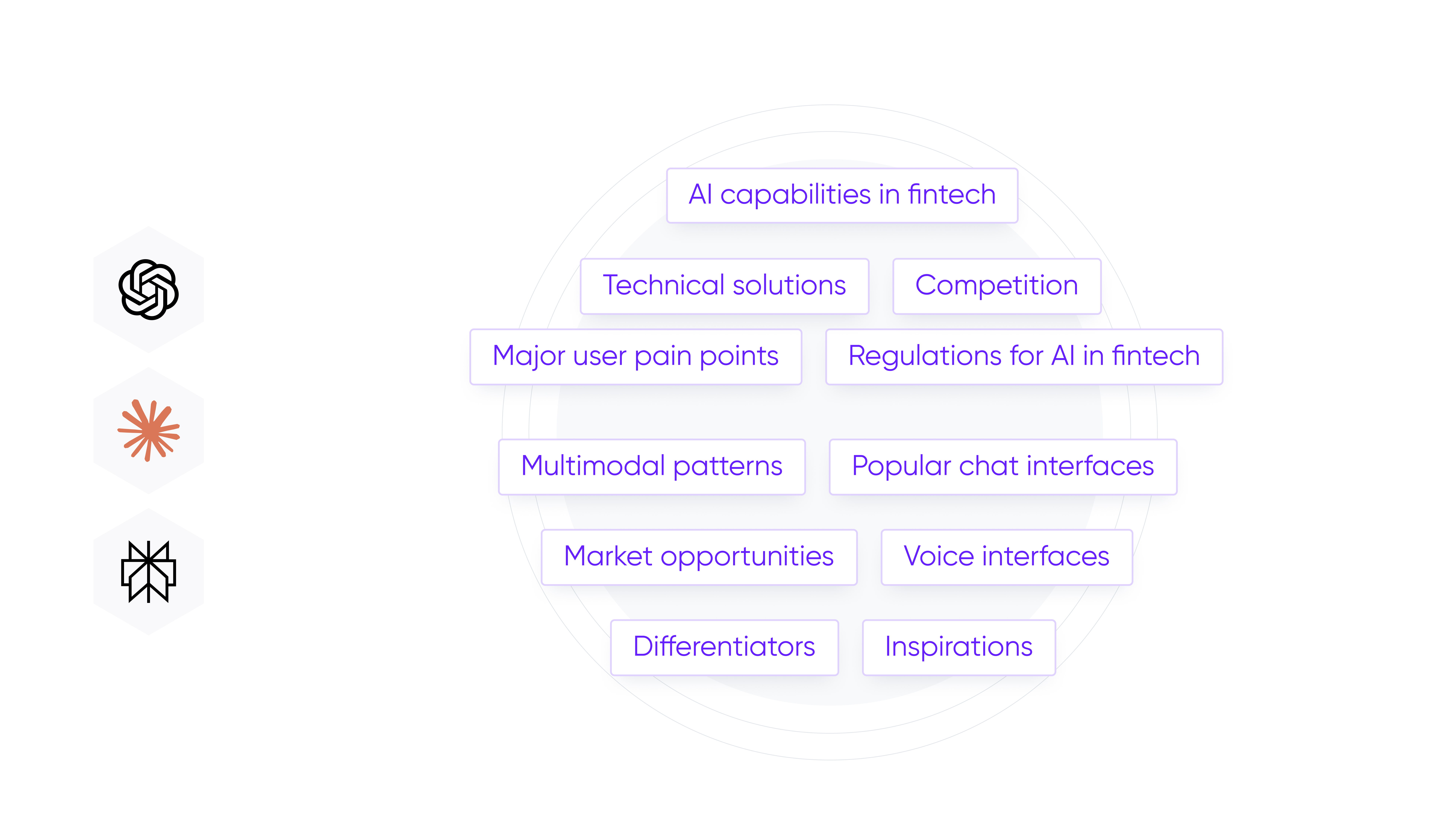
The process began by understanding how conversational banking should behave inside the client’s real ecosystem, regulatory expectations, and user habits. Our discovery zeroed in on three areas:

  • event architecture;

  • competitor evaluation;

  • Wizard-of-Oz testing.

Mapping the invisible conversation

Before designing UI components, we needed to understand one thing: How does a conversation move when voice, text, and UI coexist? Two event types turned out to be mission-critical:

  • client-to-agent events: Any tap, adjustment, or typed value must update the agent immediately. If the assistant believes old data is still active, it asks irrelevant questions, and the “single conversation” illusion breaks.

  • agent-to-client events: When the assistant needs to surface visuals (like a loan comparison card or a quiz), that component must appear instantly and consistently every time the tool is called.

This led to one guiding rule: every action, whether spoken or typed, must update the same conversation state, which became the backbone of our multimodal continuity model.

Competitor UX scan: finding a familiar metaphor

Conversational banking design research

Instead of looking at what fintechs say they do well, we looked at patterns users already understand intuitively. After reviewing patterns across major messaging and calling apps, one metaphor stood out: the WhatsApp call interface.

Users intuitively grasp mute and unmute, speaking indicators, connection status and when a session starts and ends.

This metaphor solved several UX problems:

  • state visibility: connection state, voice activity, and errors had a natural place in the interface;

  • mode switching: typing during a voice “call” felt intuitive since people already do this on messaging apps;

  • low learning curve: no need to explain how the interface works.

This gave users psychological comfort in what could otherwise feel like a futuristic experience.

Why we didn’t replicate standard chatbots

Chatbots present everything as text. Voice assistants present everything as speech. Both force users into a single mode – precisely what multimodality aims to avoid. We needed a calling-like shell with conversation-like content and dynamic UI structure inside it. Nothing in the current market offered that hybrid.

 Wizard-of-Oz testing: real reactions without full AI

Because voice agents and Gen UI are still evolving technologies, we couldn’t rely on the backend being perfect from day one. We also couldn’t wait for full agent orchestration before testing UX assumptions.

We found that the best way to test agentic flows is the Wizard-of-Oz methodology, allowing our team to drive the experience manually during live sessions.

This approach let us:

  • manually trigger tools mid-conversation;

  • test thousands of tool configurations;

  • see session logs and failures;

  • validate how humans handled the conversation flow before writing the prompts;

  • refine tool descriptions when reliability dropped.

This also resulted in a real-time observability layer for voice latency, tool calls, errors, and session flow, which was essential for debugging complex multimodal interactions later.

Main design considerations for Generative UI

Everything designed in FinPilot came back to a single principle: the interface should adapt to the user, not the other way around. That required specific strategic choices to keep the experience both human and legally compliant.

1. Choosing the right Gen UI architecture

Not all Generative UIs are built the same. We evaluated four distinct architectures before building FinPilot:

  • widget navigation: Navigating existing website layouts (like the ElevenLabs widget).

  • text summaries: Rendering stylized text blocks (like Anthropic’s Claude).

  • generic visualization: Using generic charting tools (like CopilotKit).

  • predefined components: The agent triggers specific, pre-built React components.

The verdict: We chose predefined components. For financial data, accuracy is non-negotiable. We couldn’t risk agentic code generation assembling secure financial interfaces on the fly - the guarantees aren’t strong enough yet. By using a library of strict, pre-built components (quizzes, cards), we could ensure reliability while still allowing the AI to orchestrate when they appear.

2. Solving the blank canvas problem

The biggest challenge with a voice banking interface is discoverability. Users often stare at the listening indicator and ask, "What can I actually do here?"

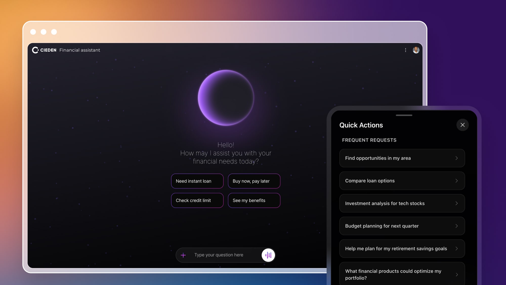
We solved this with quick actions. Instead of hiding features behind a command line, we placed a visible menu of chips in the UI. This serves two purposes:

  • speed: It gives power users one-tap access to frequent tools like "Check credit limit."

  • education: It subtly teaches new users the scope of the assistant's capabilities.

Conversational banking app design

3. Allowing text during voice

Most voice-first applications block the keyboard when the microphone is active to simplify state management. We decided to do the opposite by enabling simultaneous input and allowing users to type even while a voice session was live.

Why?

  • scenario: You might be on a train, wearing headphones. You want to hear the agent's answer, but type your reply to maintain privacy.

  • workflow: Try dictating an IBAN or a complex transaction ID. It’s a nightmare. Users need the ability to paste details instantly.

Supporting simultaneous voice and text required rethinking session ownership and billing logic, but it was necessary to reflect how people actually behave in public spaces. This decision turned a tech demo into a usable product.

Designing the experience

The interface needed to feel less like a tool and more like a collaboration. Here is how the conversation flows when you actually use FinPilot.

Continuity across modes

The first challenge was making sure that users never felt a break when switching between speaking, typing, and tapping. To enable this, the system maintains a single shared conversation state:

  • if a user spoke their intent, the UI responded visually;

  • if they tapped a card, the assistant adapted verbally;

  • if they typed, the voice session paused seamlessly.

There was no need to restart or repeat information since the context traveled with the user.

Progressive disclosure

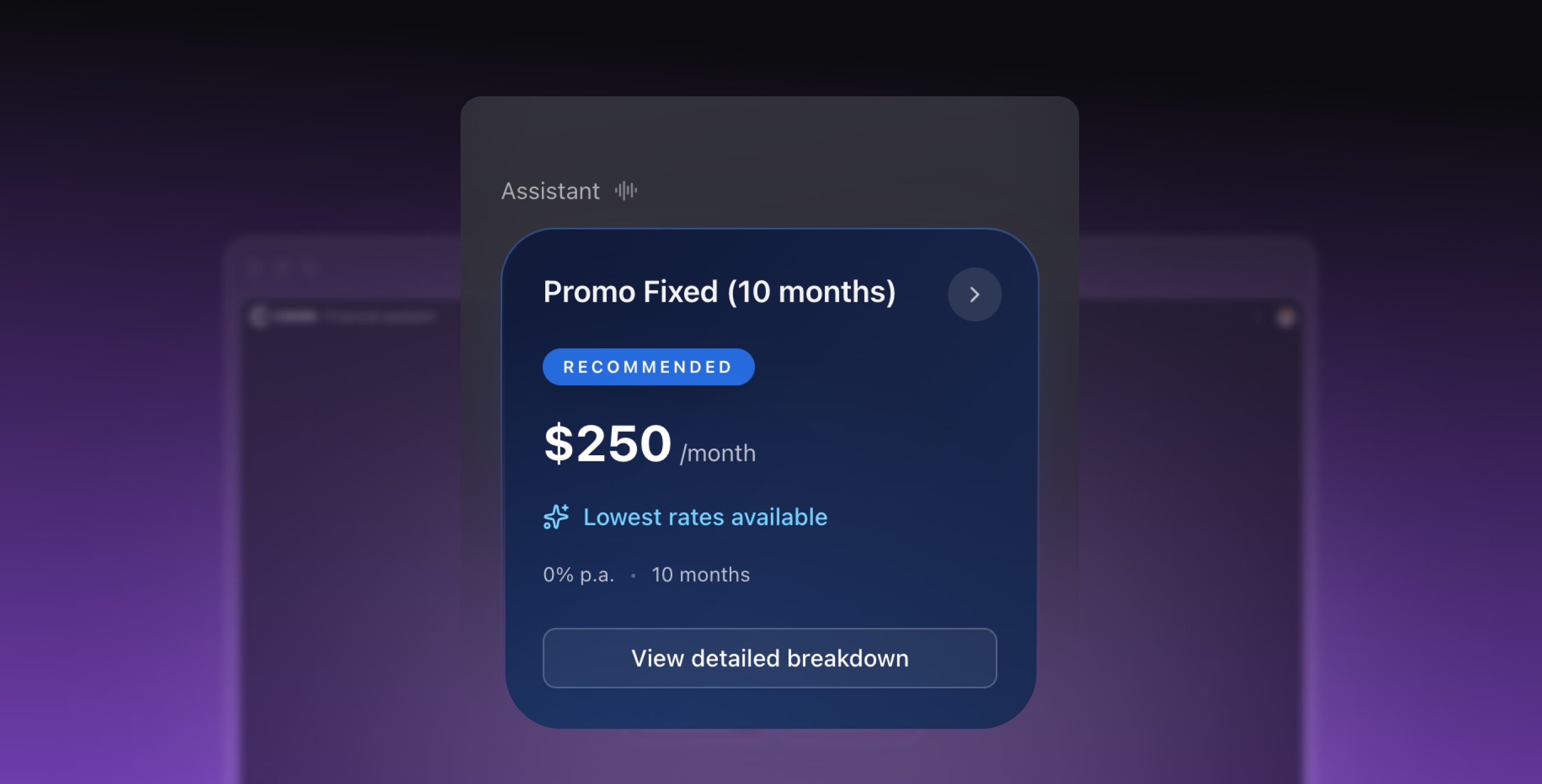
Let’s say you ask, "Show me loan options for $20,000." A bad interface would either dump a dense table into the UI or read out a list of percentages aloud: both overwhelming in different ways.

We applied progressive disclosure to surface information gradually:

  • a short verbal summary;

  • essential details shown first;

  • expandable sections for deeper information;

  • calculators and comparisons inserted only when needed.

This kept the interface focused, especially during more complex steps such as EMI evaluation or eligibility checks.

Designing Conversational Banking: How to Build a Multimodal Voice + Gen UI Experience Cieden

Visual confirmation as the center of trust

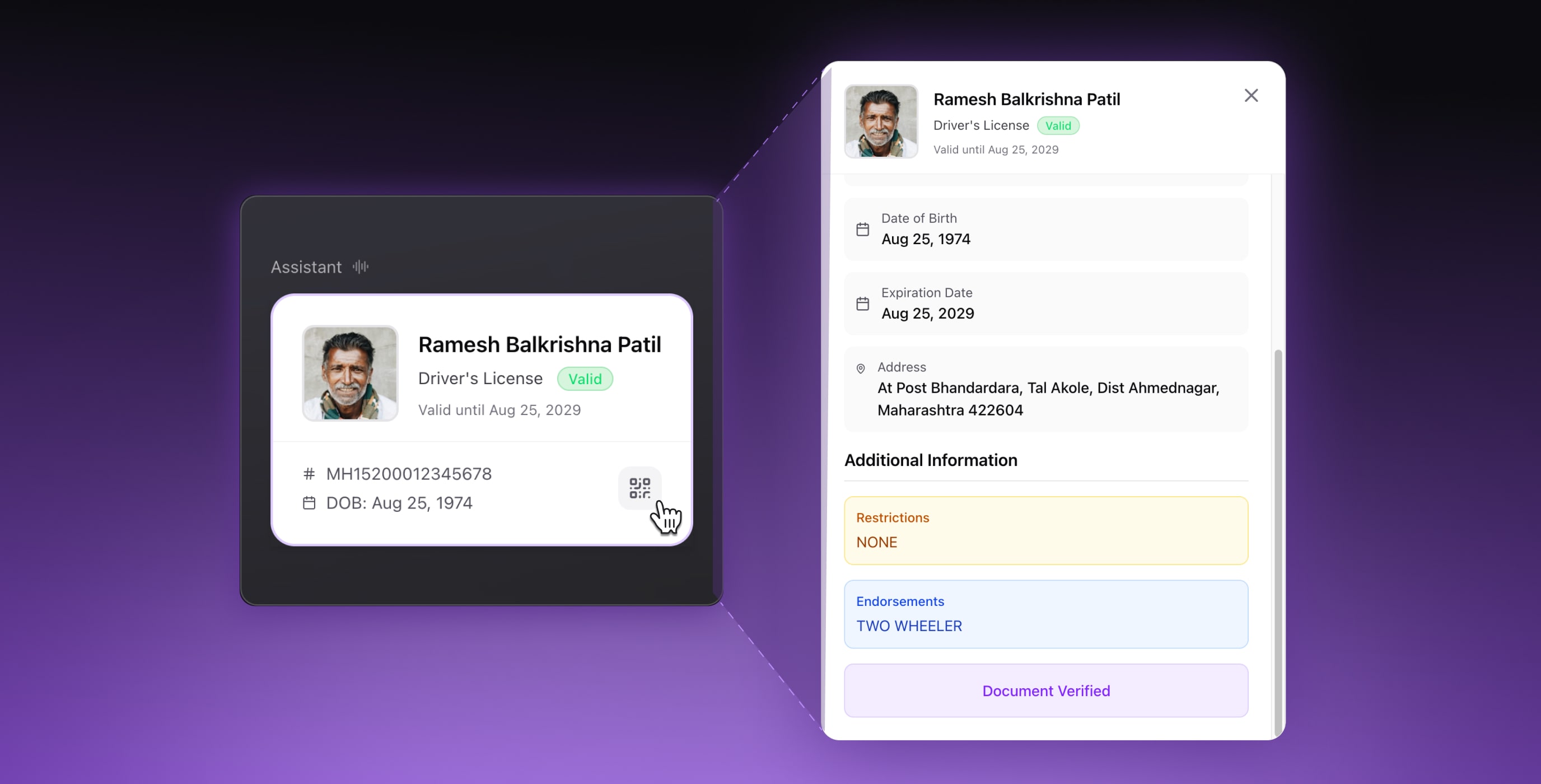
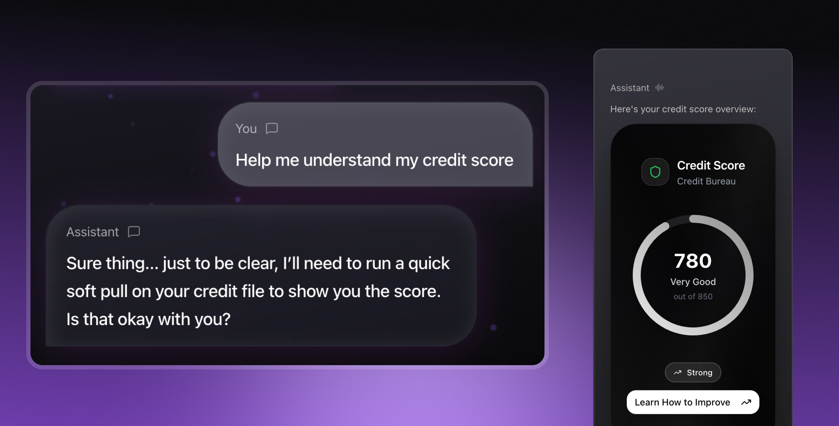
For every sensitive action, such as a credit check or loan submission, the system required explicit, visual confirmation. Only after the user approved the details did the assistant move forward.

Designing Conversational Banking: How to Build a Multimodal Voice + Gen UI Experience Cieden

Subtle anthropomorphic cues

When you open the app, it doesn’t look like a static form waiting for input. We used a restrained Glassmorphism aesthetic with voice-reactive backgrounds that gently pulse in response to speech.

When you start speaking, a speaking HUD activates. It’s a real-time waveform that reacts to your volume and cadence. This visual feedback bridges the latency gap. Even if the AI takes a second to think, the interface confirms: I hear you.

Designing for real-world interruptions

Interruptions are where most multimodal systems break. In a normal conversation, you might interrupt the other person, point at something, or nod. We had to digitize that nod.

In FinPilot, voice and touch share the same brain. You can ask, "What if I pay this off in 2 years?" (Voice) and then fill out a loan quiz (Type). The AI stops speaking instantly, recognizing the interruption, and adjusts.

How we moved so fast (the AI-augmented workflow)

The answer is that we fundamentally changed how we build software. We moved from design-then-code to design-via-code.

In a traditional workflow, teams spend weeks polishing static Figma mocks that act as specifications for engineers. But you can’t test voice latency or multimodal interruptions in a static image. You need live code.

So we adopted a new rule: humans focused on design intent and constraints, while AI generated and refactored the code.

We acted as directors, and the AI acted as the engineering layer. Here’s what changed:

1. Code became a sketching tool. In multimodal design, latency and interruption handling fundamentally change how the experience feels. By moving straight to live code, we could test reality rather than simulate it.

2. We skipped the handoff entirely. We defined interaction flows and the visual system (colors, spacing, motion) in high-level documentation, then fed those constraints into the AI. It generated the Next.js and TypeScript foundation, producing 98 component files and a complete UI library in days.

3. Refactoring became inexpensive. As the prototype expanded to include 11 interactive tools, multilingual voice handling, and real-time state synchronization, consistency mattered. We used AI not only to generate new code, but to reorganize and refactor existing structures to keep the system understandable and extensible.

What we built

By the end of the sprint, we had a working multimodal prototype: not a collection of screens, but a live system capable of handling a real loan journey from start to finish.

At a high level, the prototype included:

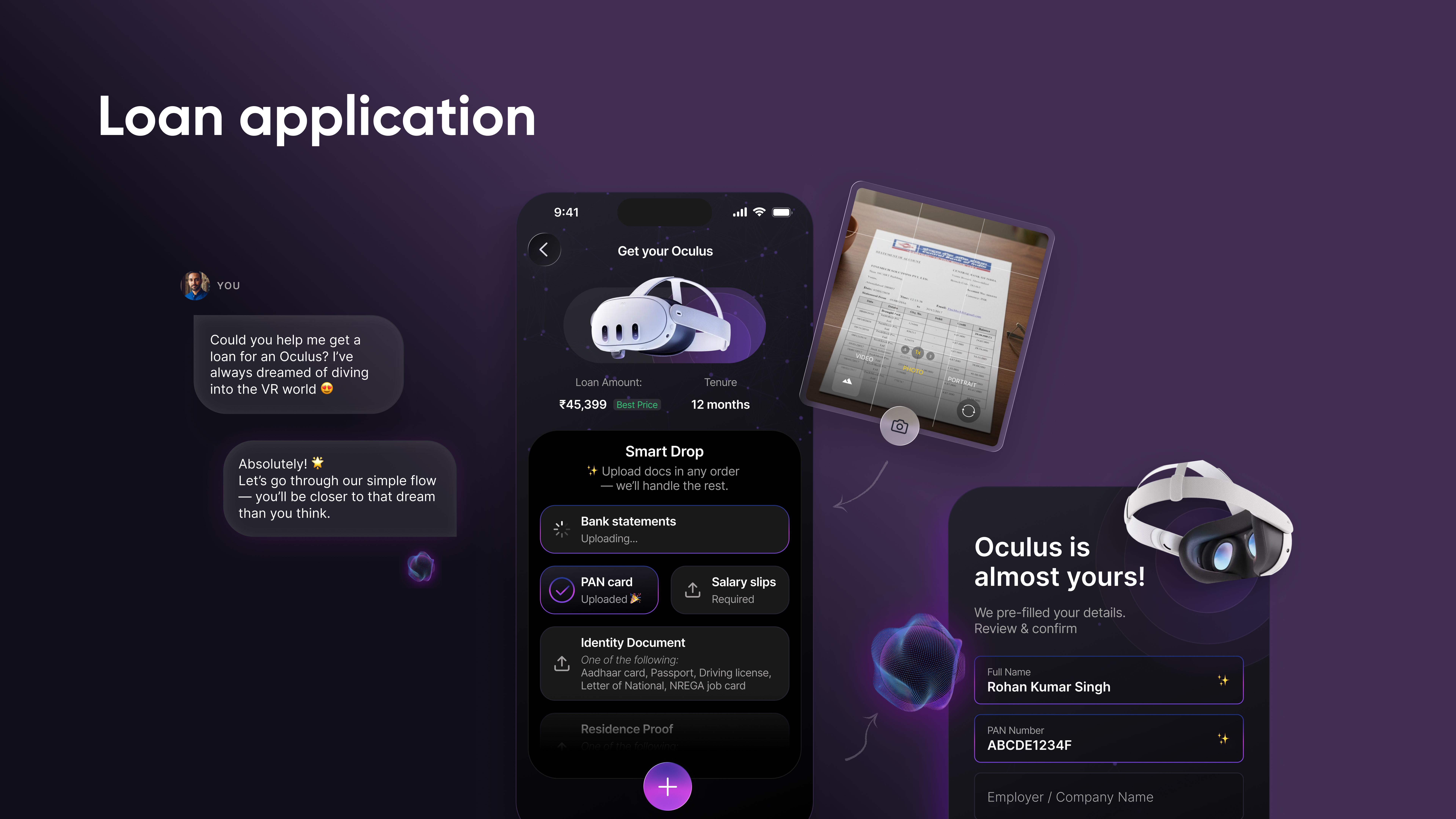
  • a voice-initiated loan flow that seamlessly transitioned into text and UI;

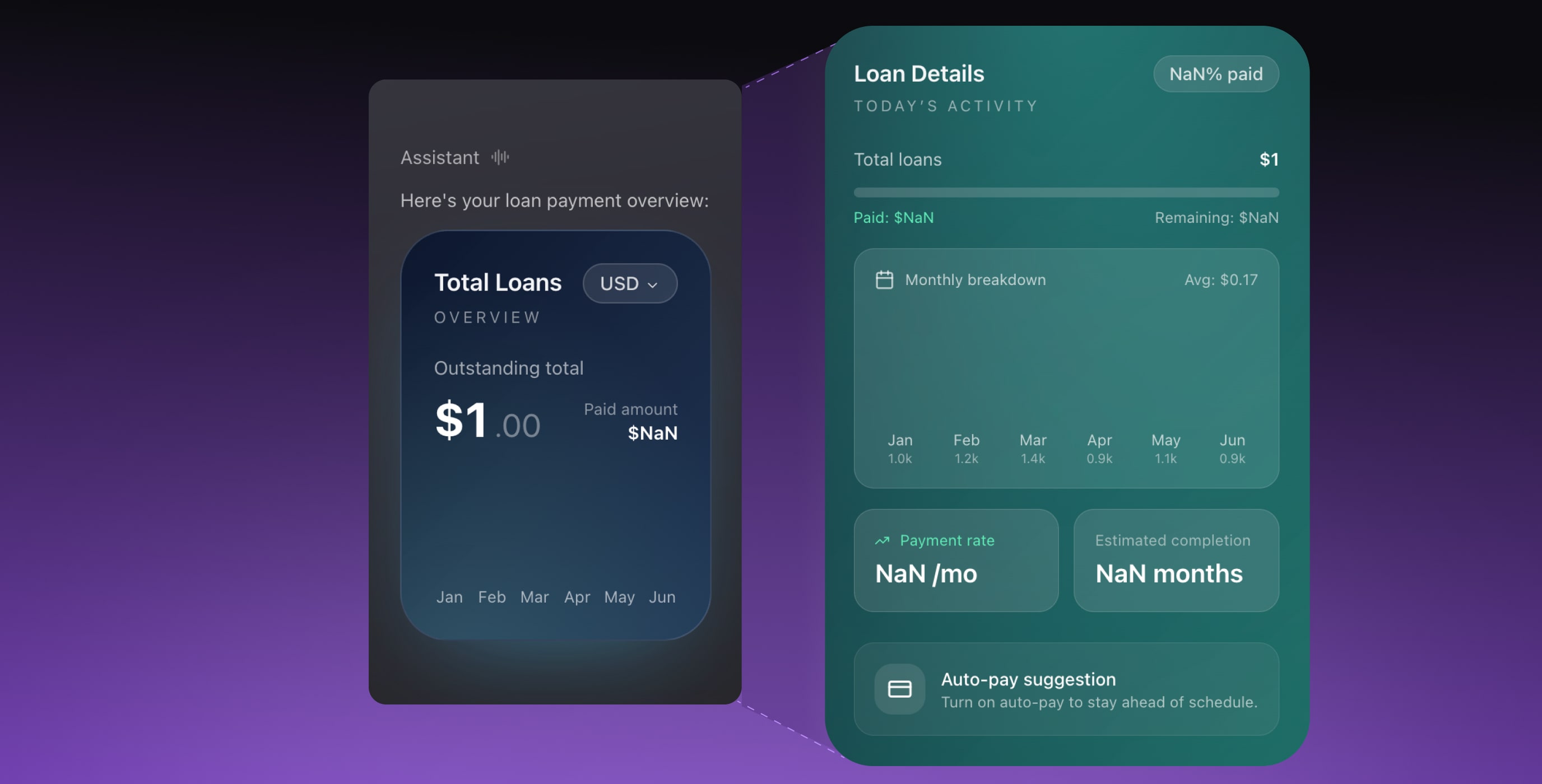
  • 11 interactive tools, from eligibility checks to repayment breakdowns;

  • Generative UI orchestration, with cards, quizzes, and sliders created dynamically;

  • real-time context synchronization across voice, typing, and tapping;

  • an EMI calculator and comparison engine surfaced exactly when needed;

  • a credit score module with explicit consent flows;

  • a guided loan quiz that replaced long forms with short, adaptive questions.

Discover the full case study.

Within, you'll find a brief story of the project and description of the product features with their designs.

Open

Problems solved

Behind the smooth experience was a set of technical and interaction challenges that multimodal systems rarely handle well. Solving these was essential to making the prototype feel reliable and safe for financial decisions:

  • connection latency: Initial voice connections took ~7 seconds to establish. We optimized ICE configuration to bring this under 3 seconds and avoid user drop-off;

  • cross-tab session locking: Users often open multiple tabs. We implemented local locking with heartbeats to prevent simultaneous voice sessions and double billing;

  • UI hallucinations: We enforced a strict message-as-protocol schema so the agent could only trigger predefined components, never invent them;

  • multimodal state management: A unified state controller coordinated WebRTC (voice) and WebSocket (text) to prevent race conditions during mode switches;

  • interruptions: Clean interruption rules ensured the assistant stopped, redirected, or recalculated without producing partial or conflicting responses;

  • context drift: Every user action updated a shared conversation state in real time, preventing repeated questions or stale assumptions;

  • zombie sessions: Automatic cleanup terminated voice connections immediately on tab close to avoid lingering costs.

In conversational banking, even small mismatches break trust. Each of these constraints had to be addressed for the experience to feel natural.

SYSTEM EVENTS (SANITIZED)
12:41:08   voice connection delay → retried
12:41:09   duplicate session blocked
12:41:10   UI request validated against schema
12:41:12   state drift detected → reconciled
12:41:14   user interruption → agent response halted
12:41:15   inactive session terminated

Lessons learned: the 8 laws of conversational banking

Building a multimodal, voice-driven financial experience in just a few weeks revealed how people actually behave in hybrid conversations — and what modern banking interfaces must solve next.

Law #1: Speed matters until accuracy matters more
Users will forgive slightly imprecise phrasing; they won’t forgive waiting seconds for a response. Conversation only feels like conversation when it’s fast.

Law #2: Voice is the mouse; the screen is the contract
People say broad, fuzzy things aloud, but when money is involved, they instinctively look for something visual to ground their decision.

Law #3: Users don’t think in modes
Designers talk about voice, text, and UI modes. Users don’t. They simply continue the conversation in whatever way feels natural, and the system has to keep up.

Law #4: Guardrails create freedom
Freedom makes interactions feel human, but behind that freedom sits a strict architecture: explicit state transitions, interruption rules, consent checkpoints, and visibility into what the system is doing.

Law #5: You cannot A/B test a ghost
The fastest way to understand multimodal behavior is to simulate intelligence before the intelligence exists. It prevents months of incorrect assumptions.

Law #6: AI builds the car, but humans drive the orchestration
AI can generate structure quickly, but design judgment still determines when tools trigger and how interruptions are handled.

Law #7: There’s no perfect UX for voice, only progressively better ones
Accents, background noise, hesitation, and rapid topic shifts are inherent to voice. Designing for voice means designing for imperfection.

Law #8: Multimodality isn’t the future — it’s simply more human
People already live multimodally: speaking, tapping, typing, pausing, and rethinking. Interfaces are finally catching up.

What’s next?

These directions extend beyond this prototype, but they emerged directly from the constraints we encountered.

  • interruptible agents: Moving beyond rigid turn-taking so users can correct or redirect mid-sentence without breaking context;

  • parallel tasking: Allowing the agent to run long analyses in the background while continuing the conversation;

  • explanation mode: Adding transparent “show your work” views that reveal logic and data sources behind recommendations;

  • universal Gen UI: Standardized financial UI components that models can trigger reliably without custom code;

  • deep observability and compliance: Ensuring every interaction is auditable, accessible, and regulator-ready;

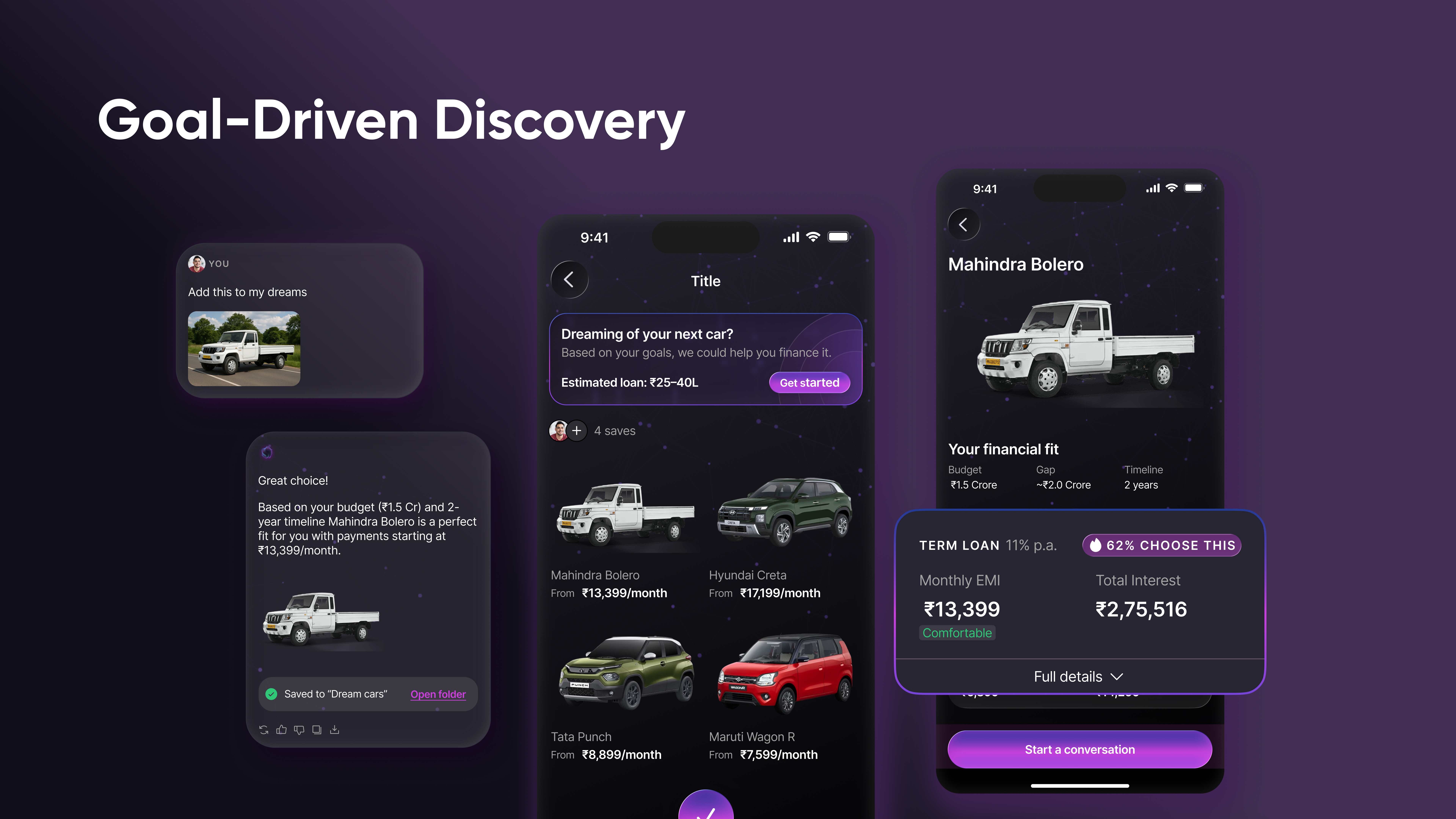
  • goal-driven journeys: Treating user aspirations (e.g. “my next car” or “a dream purchase”) as persistent conversational context, allowing exploration, comparison, and financing to evolve visually over time, without restarting the conversation.
Designing Conversational Banking: How to Build a Multimodal Voice + Gen UI Experience Cieden

Some challenges also remain unresolved. Turn detection and clean conversation endings are still fragile in voice interactions, especially when users interrupt or revise intent mid-flow. Supporting parallel, long-running tasks while maintaining conversational continuity and making the agent’s reasoning transparent without overwhelming users remains an open design problem.

The future is already unevenly distributed

For years, conversational banking has appeared in pitch decks as a promise. This project showed that many of the underlying patterns are already viable if teams are willing to design conversations as systems rather than scripts.

FinPilot wasn’t built as a finished product. It was built to test whether multimodal banking could remain continuous and human under real constraints: latency, interruptions, regulation, and imperfect voice input.

In that respect, the prototype held up well enough to demonstrate that multimodal continuity is no longer a speculative idea. It’s a design problem that can be solved today.

🎥 See the assistant in action

Join our CEO Yuriy for a quick, no-obligation demo where he walks through the prototype and key insights.

Book a demo

we reply under 24 hours.

Book your
free
session
Thank you for your message. It has been sent