ai

AI Startup Playbook: Creating a Dream Product from Scratch with AI

AI Startup Playbook: Creating a Dream Product from Scratch with AI Cieden

TL;DR

  • what this is: This is a hands-on guide where I share my 10-month path from “just a UX/UI designer with an idea” to “founder building a real product from scratch,” with AI embedded at every step.

  • who it’s for: Designers who dream of becoming founders, and anyone curious about using AI as a practical co-pilot for building digital products.

  • what you’ll learn: How to define your Big Idea, assess potential, talk to users, set up an AI-powered workflow, and create a strong product design. All based on real hands-on experience.

  • my ambitious goal: Give you a realistic playbook for turning a dream into something tangible and move beyond the pretty-but-empty Behance/Dribbble case study format we’ve all stopped trusting.

  • reading time: ~50 minutes.


Ten months of late nights and weekends. Dozens of AI experiments. 70+ final screens (and plenty more variations). And, most importantly, a ton of valuable lessons learned.

It started last summer with a simple idea that popped into my head right before sleep. Not long after, I stumbled on a really well-timed entrepreneurship course. Back then, I had no clue how much the decision to work on a personal product would reshape my career.

I’m Volodymyr Merlenko, a product designer with four years in design and the last two deep in AI. I write articles about it, run a small LinkedIn blog, and occasionally give talks and mentoring sessions. In my free time this past year, I’ve also been building a product to help tech folks finally master the skills they keep putting off “for later,” and do it in a way that’s easy and personalized.

The old way most teams work? Endless calls you didn’t need to attend, messy comms, slow-motion bureaucracy, and hours lost on low-impact tasks.

AI Startup Playbook: Creating a Dream Product from Scratch with AI

The new way? A single designer, supercharged by AI, doing the work that used to take a small team.
AI Startup Playbook: Creating a Dream Product from Scratch with AI

This article is Part 1 of that journey: how I’m building a real product from zero and how AI upgrades every step. 

So grab a coffee, block out an hour in your calendar, and let’s go. ☕️

Big Idea

Every product starts with a spark. But before you rush into wireframes or mockups, you need something simple to guide you – a Big Idea doc. It does two things really well:

1. Checks whether your idea solves a real problem for a real person.

2. Highlights risks before you spend time and money.

It doesn’t need to be perfect or polished; it just needs to make sense to you and your future users.

What I usually include:

  • problem statement: What real issue exists out there, and why current solutions don’t cut it;

  • user persona: Who struggles the most with this problem, and what their day-to-day looks like;

  • assumptions & hypotheses: Your best guesses, phrased so they can be tested later;

  • competitive analysis: How others are approaching it (direct and indirect competitors);

  • business plan: The basic mechanics of how this thing could make money;

  • StoryBrand framework: The narrative that makes the user the hero, not the product;

  • service UX map: A mix of CJM and Blueprint to see both user and system sides of the journey;

  • information architecture: The first sketch of how everything fits together;

  • MVP requirements: The smallest version that actually delivers value;

  • parking lot: A backlog for ideas that sound cool but don’t belong in the first release.

💡Two important reminders:


  1. 1. Don’t expect version 1 to be “the final one.” Mine usually evolves 10+ times as I run interviews and tests. That’s a good sign and means you’re learning.

  2. 2. Be ready to kill your darling. If the idea doesn’t solve a real problem or looks like a financial black hole, it’s better to pivot now than a year in.

Define you problem statement

The very first step in building a product is defining the problem you’re solving. Without this, everything else (personas, hypotheses, even design decisions) will float in the air without a foundation.

A solid problem statement answers three key questions:

  • what problem exists right now that isn’t being solved well?

  • who feels this pain the most?

  • how will your product make their life better?

Keep it short and concrete. Don’t describe features or solutions yet, just stay focused on the pain.

When I started working on PDPro, here’s how my initial draft looked:
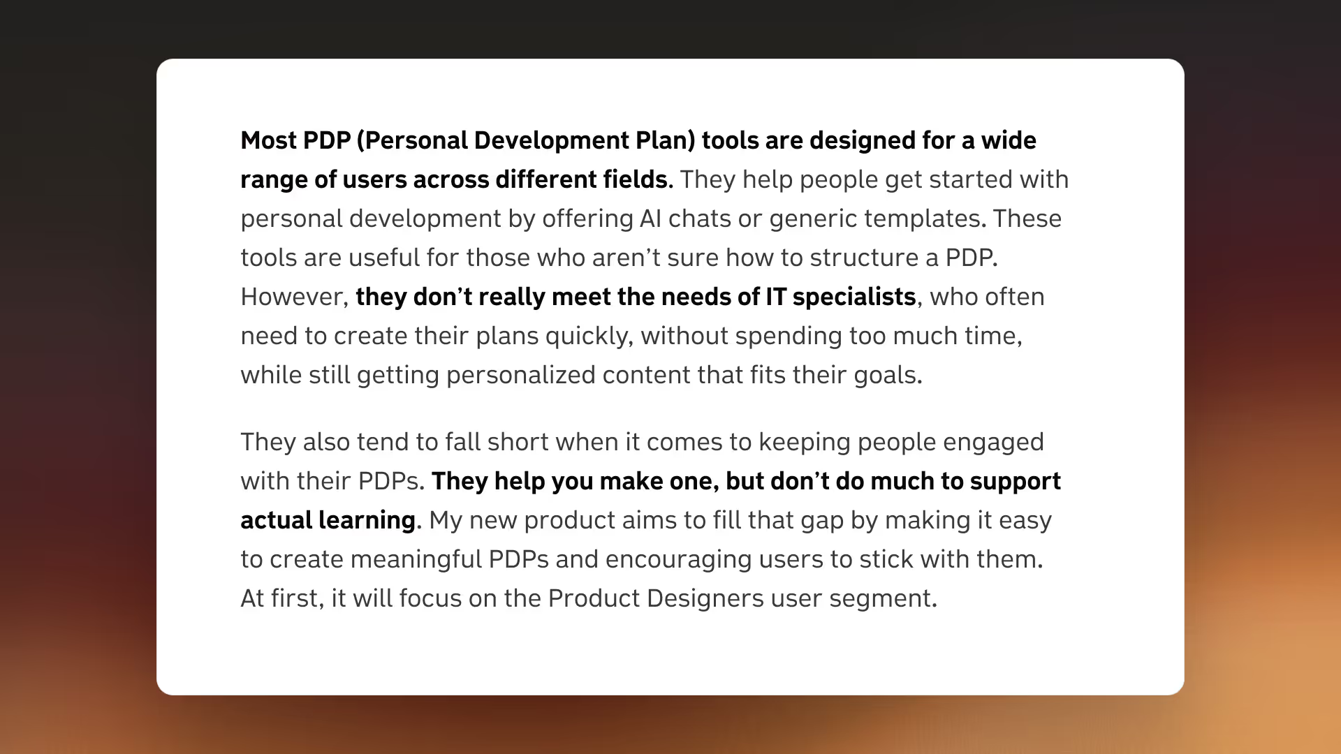
Problem statement

At first glance, it seems okay. But in reality, it was already slipping into “solution mode” (motivation, personalization). The stronger version came later:
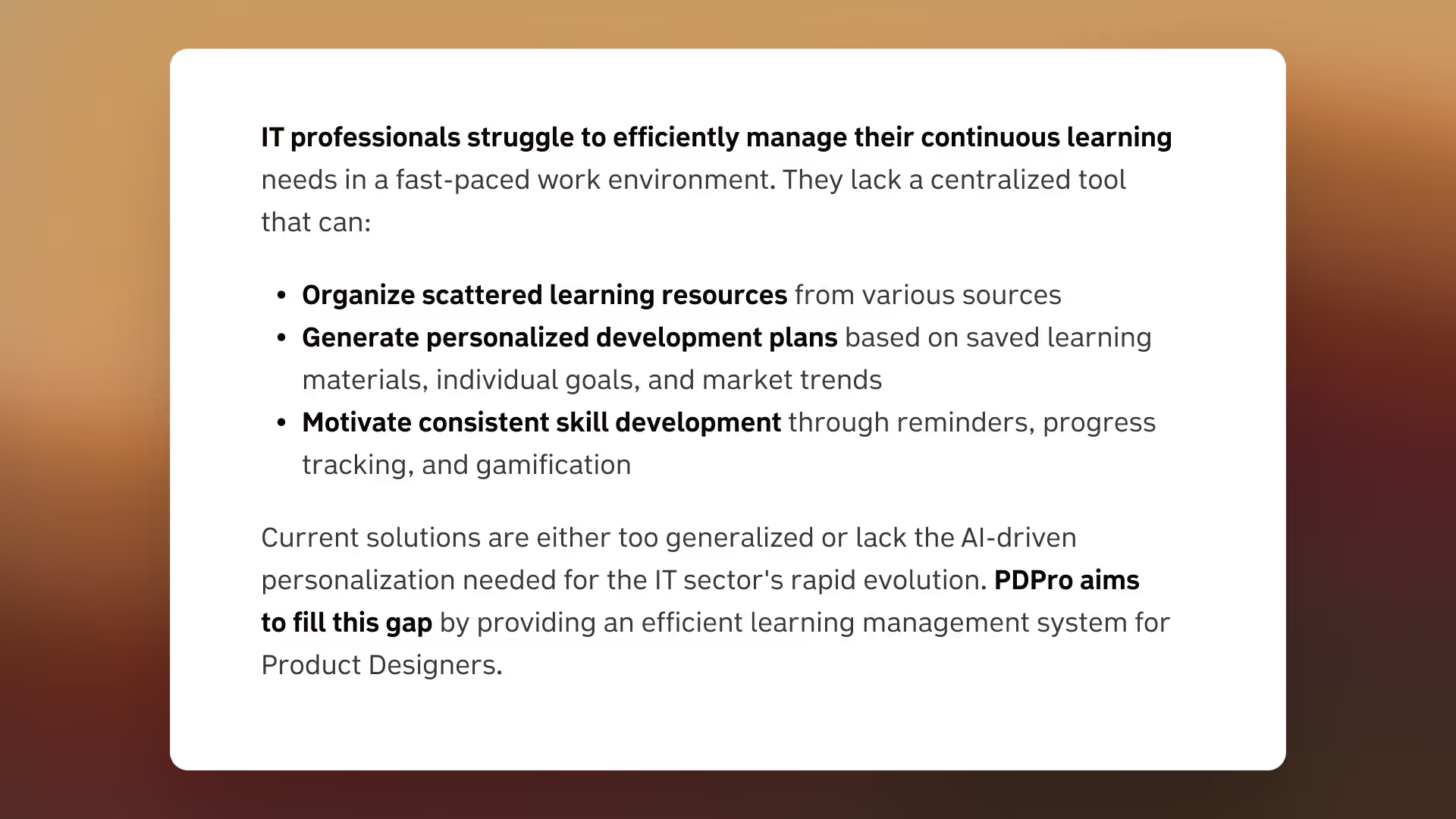
Problem statement

Create your user persona

A user persona helps you stay focused on who you’re building the product for. Every time a new idea pops into your head, check it against the persona. This way, you avoid one of the most common traps – building features instead of solving real needs.

You can start with a proto-persona: basically, your best guess of who the user is, even without solid data to back it up. Later, you’ll refine it as you gather insights from surveys and user tests.

There’s no universal template for a persona, and the details will always depend on your product. Still, I recommend focusing on four categories:

  • background: Their role, environment, and daily situation;

  • behaviors: How they act, make decisions, or approach the problem area;

  • pain points: What frustrates them most about today’s solutions;

  • goals: What “better” looks like for them.

Let me give you a quick example:
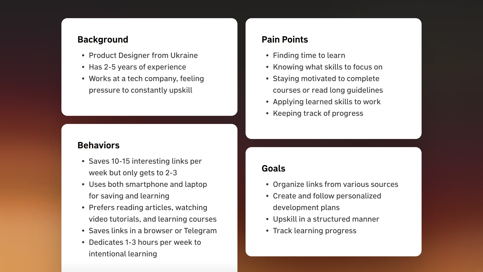
User persona

Write your assumptions and hypotheses

There are two main types of hypotheses:

  • those based on user, product, or business assumptions;

  • and those tied to functionality.

Most designers (myself included) aren’t big fans of writing them out. But honestly, it’s easier than it looks if you stick to a couple of simple formulas:

  1. 1. “I believe [assumption is true/false], and I can find out by [research method].”

  2. 2. “I will achieve [result] if [user group] gets [value] by using [functionality]. I can validate this through [research method].”

Where assumptions come from

An assumption can be any thought you have about your product that you’re not 100% sure about. If you like a structured approach (like I do), here are a few prompts from Jeff Gothelf’s book Lean UX:

User assumptions:

  • “My early users are…”

  • “They struggle with…"

Product assumptions:

  • “These problems can be solved with…”

  • “The most important features are…”

  • “The main value of my product is…”

  • “This is what it should look like…”

Business assumptions:

  • “I’ll get most of my users through…”

  • “I’ll make money by…”

  • “My main competitors are…”

  • “The biggest risk for my product is…”

  • “I can avoid this risk by…”

To make it less abstract, here’s a set of hypotheses I wrote while working on PDPro:
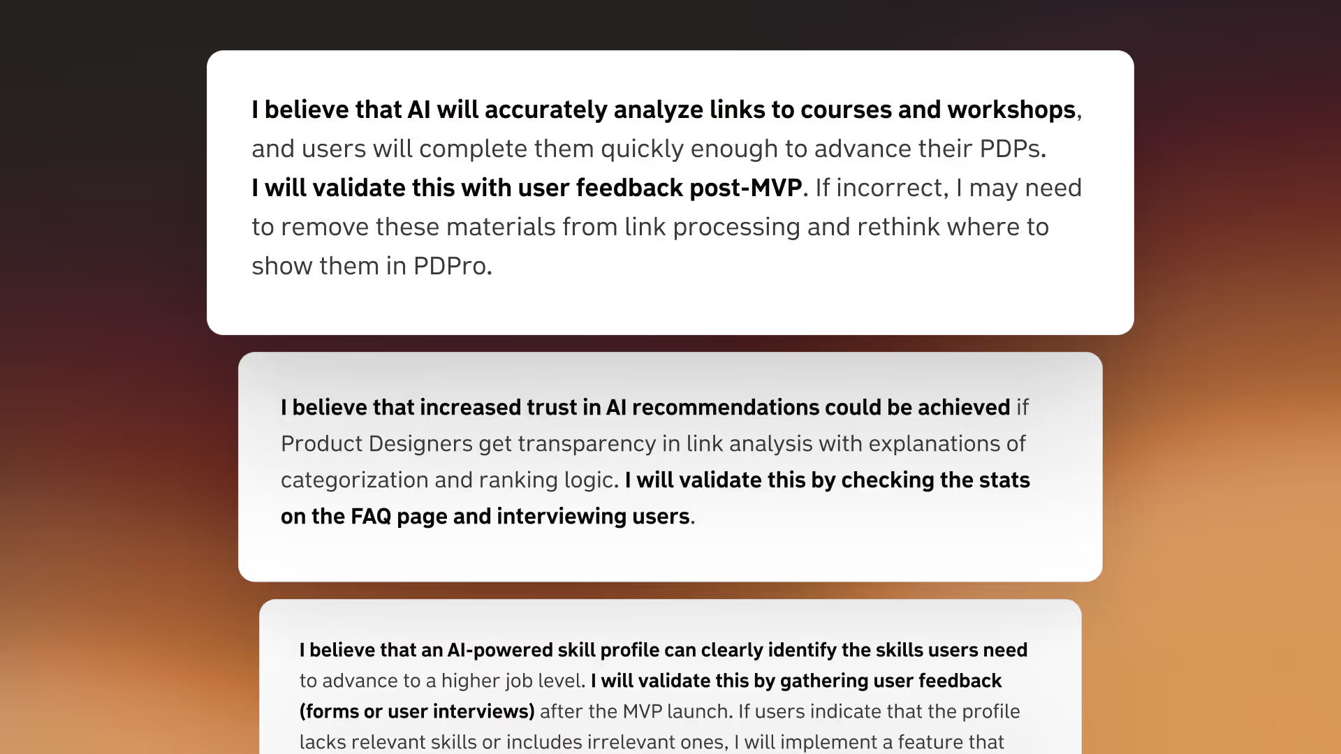
Assumptions & hypotheses

How to test hypotheses

When you’re building a product, new ideas pop up constantly (usually around 2 AM 😴). The question is: where do they go?

There are two main buckets:

  • assumptions/hypotheses list: If the idea feels important and could have a clear positive or negative impact on the product;

  • parking lot: A “holding area” for ideas that don’t solve the core user problem and would just add extra weight to your MVP.

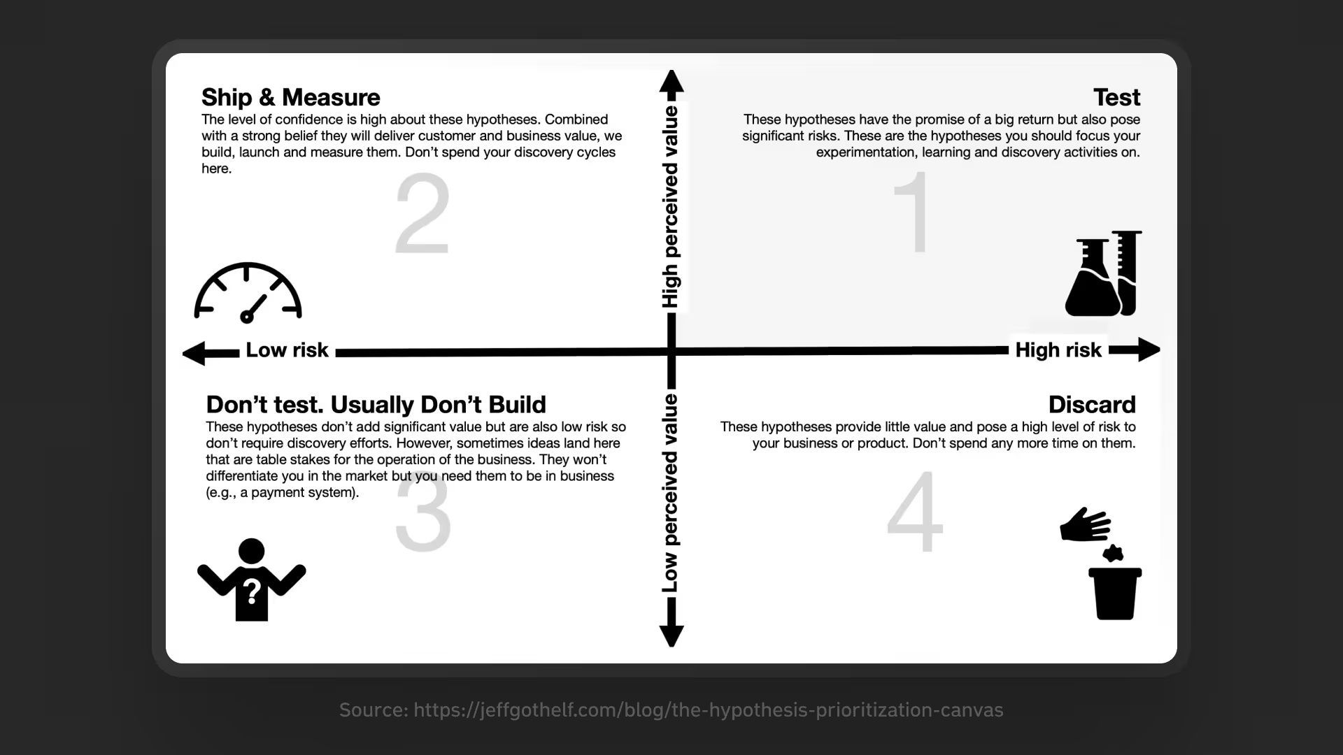
Trying to test everything at once is overwhelming, both for you and for respondents. That’s where a prioritization matrix comes in. It helps you decide what to explore first by mapping each hypothesis against two axes:

  • value: The potential benefit for users and the impact on your business goals;

  • risk: The possible downside for the product, including technical complexity.
AI Startup Playbook: Creating a Dream Product from Scratch with AI Cieden

Source: Jeff Gothelf

Keep in mind: hypotheses are never static. You’ll be adding and adjusting them all the time. Prioritization happens before each new research cycle, because that’s what determines what you’ll test next.

Move faster with AI

We live in a time where AI gets more powerful almost every week, sometimes every day. When I started building PDPro, AI tools were far less capable than they are now. But one approach I tried early on has stayed relevant even a year later.

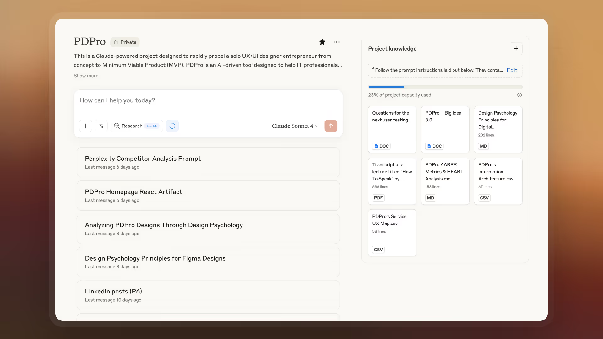
Claude Projects

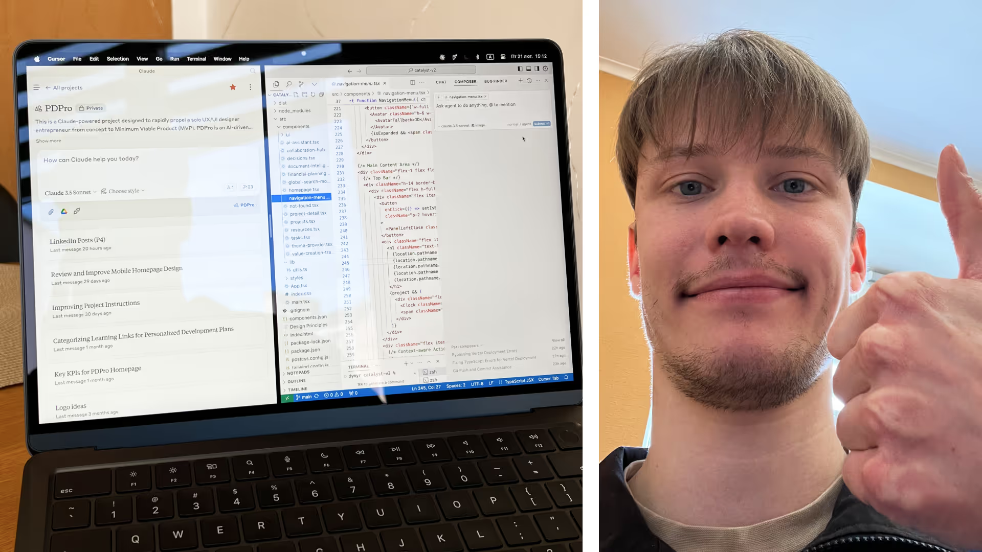
This is a feature in Claude AI that lets you create a dedicated workspace for your project. Think of it as a super-smart teammate who remembers every little detail about your product and is available 24/7.

Other AI tools now offer similar functionality, but in my experience, Claude still delivers the best results when it comes to research and even development.
Claude Projects

How to set it up

  1. 1. Get the subscription, it’s worth it (as of writing, it’s $20/month).

  2. 2. Create a new Project in Claude.

  3. 3. Upload your core docs (problem statement, personas, hypotheses, etc.) into Project Knowledge. These become your AI’s knowledge base.

  4. 4. Add instructions for how Claude should respond: tone of voice, what “role” it should take, and any rules it should follow.

  5. 5. Spin up as many chats inside the project as you need.

If you don’t yet feel confident creating all the product artifacts from your Big Idea doc on your own, just lean on AI as a collaborator. Write the way you normally would, ask questions, request advice, and co-create the documentation with Claude. Later, you can upload those drafts into Project Knowledge, too.

💡Important:


Project Knowledge is a living documentation hub that changes as your product evolves. The great part is that Claude lets you link Google Docs and Sheets alongside static files, so updates pull in automatically. No more re-uploading every time you tweak something.

Strengths

When I needed to prepare a product artifact (say, a user testing script), I’d start a new chat and ask Claude for a draft. That gave me a solid starting point instead of a blank page. And if I later needed a similar script, I could just return to the same chat and build on it.

I go deeper into Claude’s (and other AI tools’) capabilities for product designers in a separate article, but here are the highlights:

  • keeps context across chats: Because everything lives in one project, you don’t have to repeat the same prompt or re-explain past conversations. Claude always refers back to your Project Knowledge, especially if you ask it to.

  • great for learning and insights: When set up well, 90% of the answers are spot on. And when Claude makes mistakes, it’s still valuable, as you get to learn new concepts explained simply, often with examples grounded in your own product.

  • fresh perspectives: We’re all biased in our own thinking. Sometimes it’s useful to hear an outside opinion, even if it’s from an AI. You can even tell Claude to role-play different personas and explain its reasoning in detail.

  • data analysis: This is where AI really shines. I used it to interpret survey results and usability testing feedback. What normally would take hours of manual analysis took just minutes.

Weaknesses

AI can be powerful, but it has limits and will never make final decisions for you. That’s always your responsibility. You need at least some experience in the domain you’re working in, so you can tell the difference between good advice and bad advice.

Also, keep in mind that the main goal of every AI assistant is to answer you even when it doesn’t know the right answer. That’s why it sometimes helps to explicitly tell the model: “If you don’t know, say ‘I don’t know.’”

And yes, the best results come when you work in English, which isn’t a bad thing, as it doubles as free language practice.

Prompt engineering

The quality of your outputs depends on the quality of your inputs. Set up your project carefully and give more specific prompts. For example, instead of just writing:

“Create a user survey.”

Say:

“I’d like you to create a user survey based on the knowledge from this project. Before you proceed, ask me any clarifying questions you have.”

This way, the AI itself will tell you what extra context it needs to generate the best result.

About two years ago, I read a few guides on prompt engineering and took a couple of courses. I even started drafting an article on the most powerful techniques, but AI moves so fast that the material was outdated before I finished. Still, one trick has stood the test of time. Whenever I’m not sure if my prompt is good enough, I use this template:


Copyable Prompt — Bulletproof Line Breaks
Prompt

You are an expert in prompt engineering and optimization. Your task is to analyze and improve the following prompt: "Your original prompt here"

Please follow these steps:

  1. Briefly explain your understanding of the prompt's goal.
  2. Identify any ambiguities, unclear instructions, or potential issues in the prompt.
  3. Ask me 10 crucial clarifying questions to better understand my intent.
  4. Wait for my responses before proceeding.
  5. After that, suggest an improved version of the prompt based on my clarifications.
  6. Allow me to provide feedback on the suggested prompt for further refinement (optional iterations).
  7. Once a satisfactory prompt is achieved, answer the prompt.

Remember to consider factors such as clarity, specificity, context-setting, and alignment with your capabilities.

Copied!

How it impacted my work

Using Claude Projects cut down the time I spent on research and product artifacts dramatically. It really felt like having a co-founder who’s always ready to share expertise and jump into the conversation (well, except when the tokens run out 🥲).

AI is a powerful tool, but it’s not a magic wand. Use it to extend your skills and accelerate the process, but always keep your own judgment in the loop.

Phase 1
31%

What we’ve achieved so far

  • Turned a raw idea into a Big Idea doc
  • Defined the problem and described the target audience
  • Formulated assumptions and hypotheses
  • Set up Claude as an AI design assistant

What’s next

  • Listen to what potential users have to say
  • Prepare and run the first user tests
  • Take a closer look at competitors

Listen to your users

In an ideal world, product design always includes user interviews and moderated tests. In reality, there’s rarely enough time or even desire to do them. It’s ironic: design is one of the most people-focused professions, yet most designers I know get anxious just thinking about interviews.

That’s not always bad. If talking to people feels hard, you’ll usually prepare better and listen more closely.

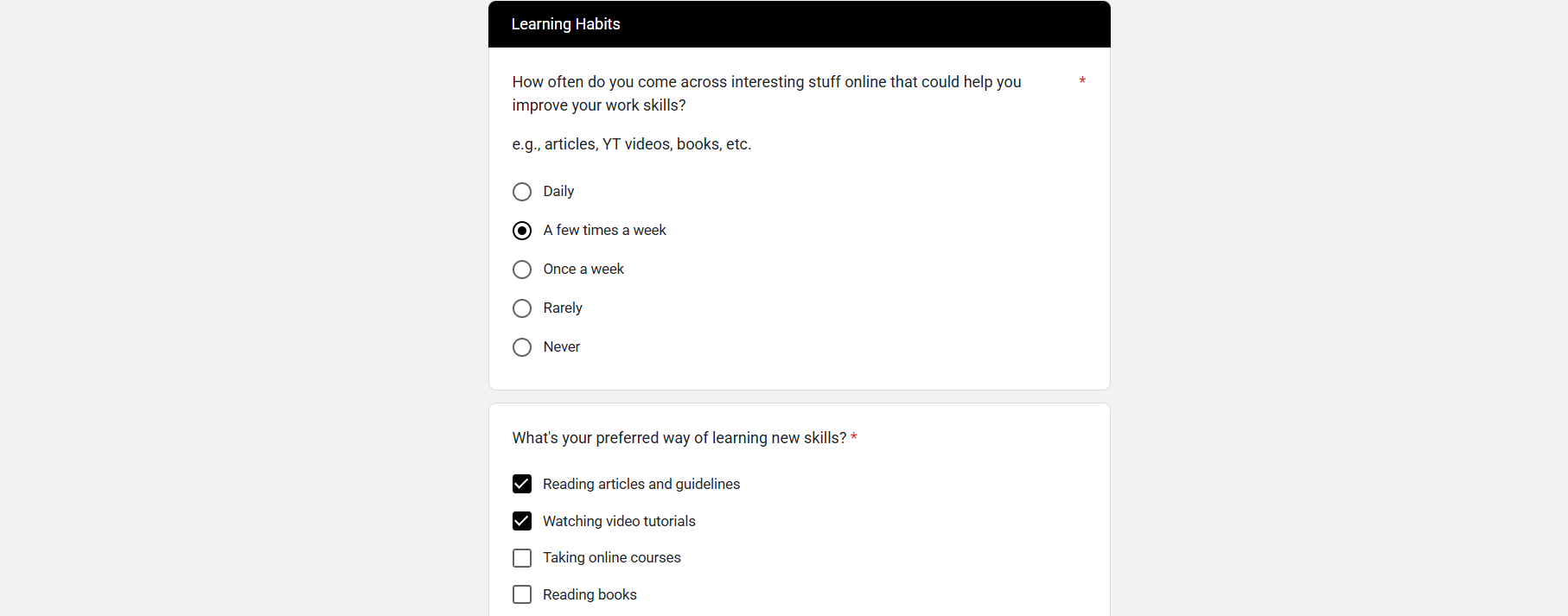
But when you’re just starting out, you don’t always need interviews. A simple survey can already give you solid insights. That’s how I uncovered a few unexpected findings for PDPro that shaped its direction:

  • create with AI: The assistant we set up earlier generates questions and even suggests ideas you wouldn’t have thought of.

  • use closed questions: People prefer clicking to typing, so more will finish the form. Keep open ones to a minimum.

  • set up Google Forms: It’s simple and exports neatly into CSV, which is perfect for AI-powered analysis later.

  • find (and motivate) participants: Aim for ~100 respondents. That’s enough for reliable data with a low margin of error. Reach out personally in the right communities, not random chats.

  • keep improving: Use each round of insights not only to refine your product but also to make the next survey easier for users and more useful for you.

  • expect surprises: Users will tell you what actually matters. Sometimes, even enough to rethink your business model.

Also, don’t ask about the future: “Would you pay for…?” Ask about the past instead: “Have you used an app that could…?” “If yes, did you pay for it?” “Was the price worth it? Why?” That’s where the real data comes from.

User servey

You can check out the original survey form as a reference here.

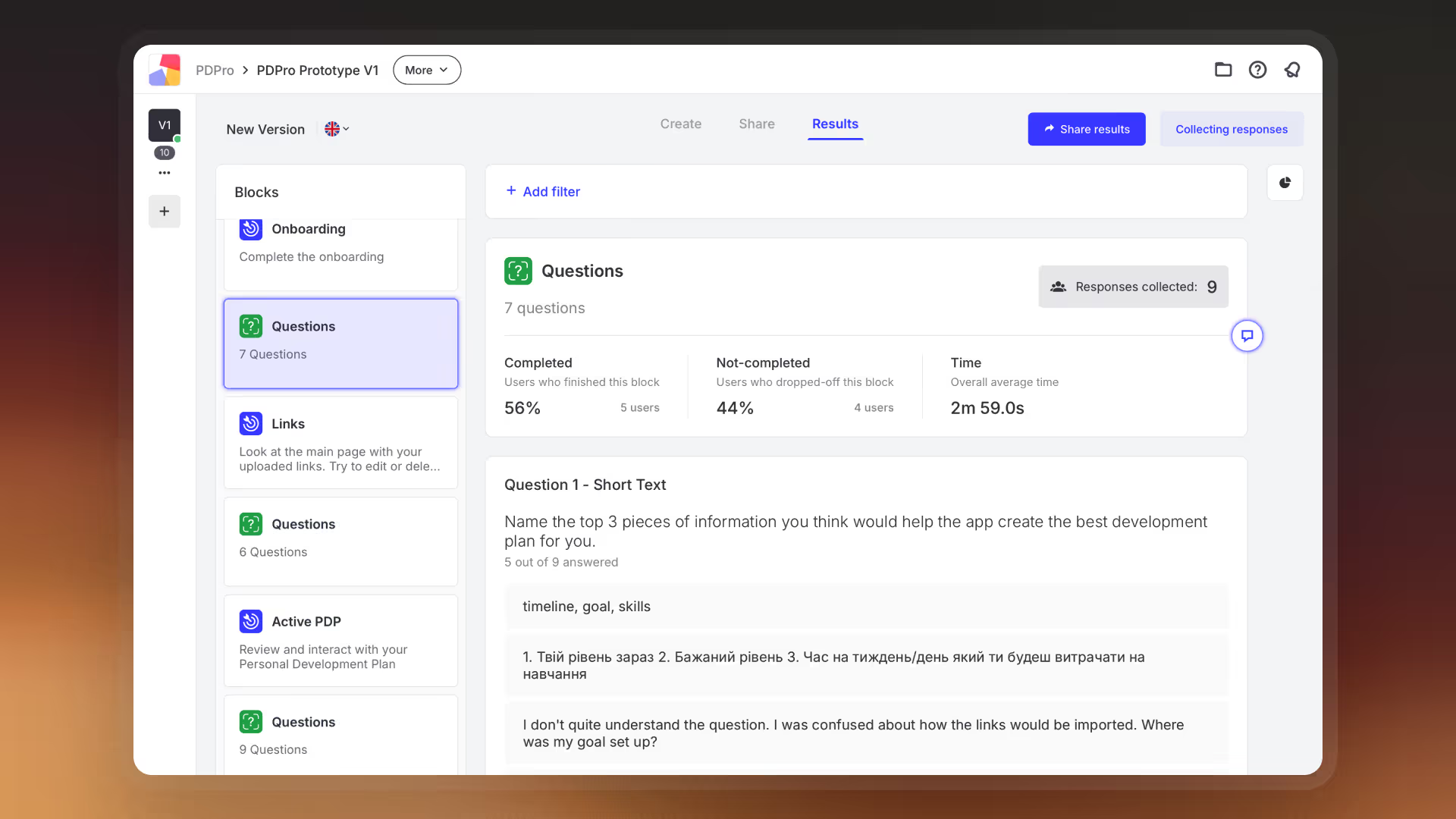
Unmoderated user tests

Unmoderated tests are great for early validation. You get both numbers and insights without the time and cost of moderated sessions.

If you’ve already set up Claude Projects with your docs, AI can draft a testing script for you in minutes. It’s not perfect, though (it sometimes adds biased tasks), so brush up on research basics and be ready to edit.

Back when I started PDPro, I drew wireframes in Excalidraw and stitched them into a prototype in Figma. That worked fine a year ago, but I wouldn’t recommend it today. Now you can spin up full, high-quality interactive prototypes directly with AI tools like v0, Lovable, Bolt, Readdy, Magic Patterns, or even Figma Make.

For testing platforms, most people pick Maze. I’d go with Useberry instead. Their free plan is much better for early-stage founders. Plus, you can just drop in a prototype link from an AI tool and run tests without manually wiring screens in Figma.

Unmoderated user tests

Finding respondents

This part’s easy if you've already run surveys and asked people to leave their contact information at the end (always do this!). Reach out to those same people and invite them into the next round of testing. Aim for at least 5-10 participants to uncover most usability issues.

AI-powered analysis

Why make it complicated if you can keep it simple? The 80/20 rule works great for MVPs, and it applies to research analysis, too.

Here’s how I handled it for PDPro: after collecting responses in Useberry, I copied the raw results into my Claude Project and asked AI to:

  • organize the data into clean tables and charts;

  • spot patterns in behavior and answers;

  • compare those patterns against my earlier assumptions and hypotheses from the Big Idea;

  • highlight which ones were confirmed (and which weren’t);

  • summarize key insights with next-step recommendations.

AI quickly flagged what worked and how to approach the next PDPro iteration.

⚠️ One caveat: 


Don’t take AI’s word as gospel. Always do a quick manual pass yourself, then compare. The mix of your judgment + AI efficiency is where the value is.

Research competitors in minutes

Classic competitor analysis can eat up days. Luckily, AI makes it much faster if you know how to set it up.

First, figure out who you’re analyzing:

  • don’t skip indirect competitors: Even if it feels like “there’s nothing like my product,” chances are similar solutions exist in another form.

  • if stuck, look back at your survey results: Users often mention tools they already use.

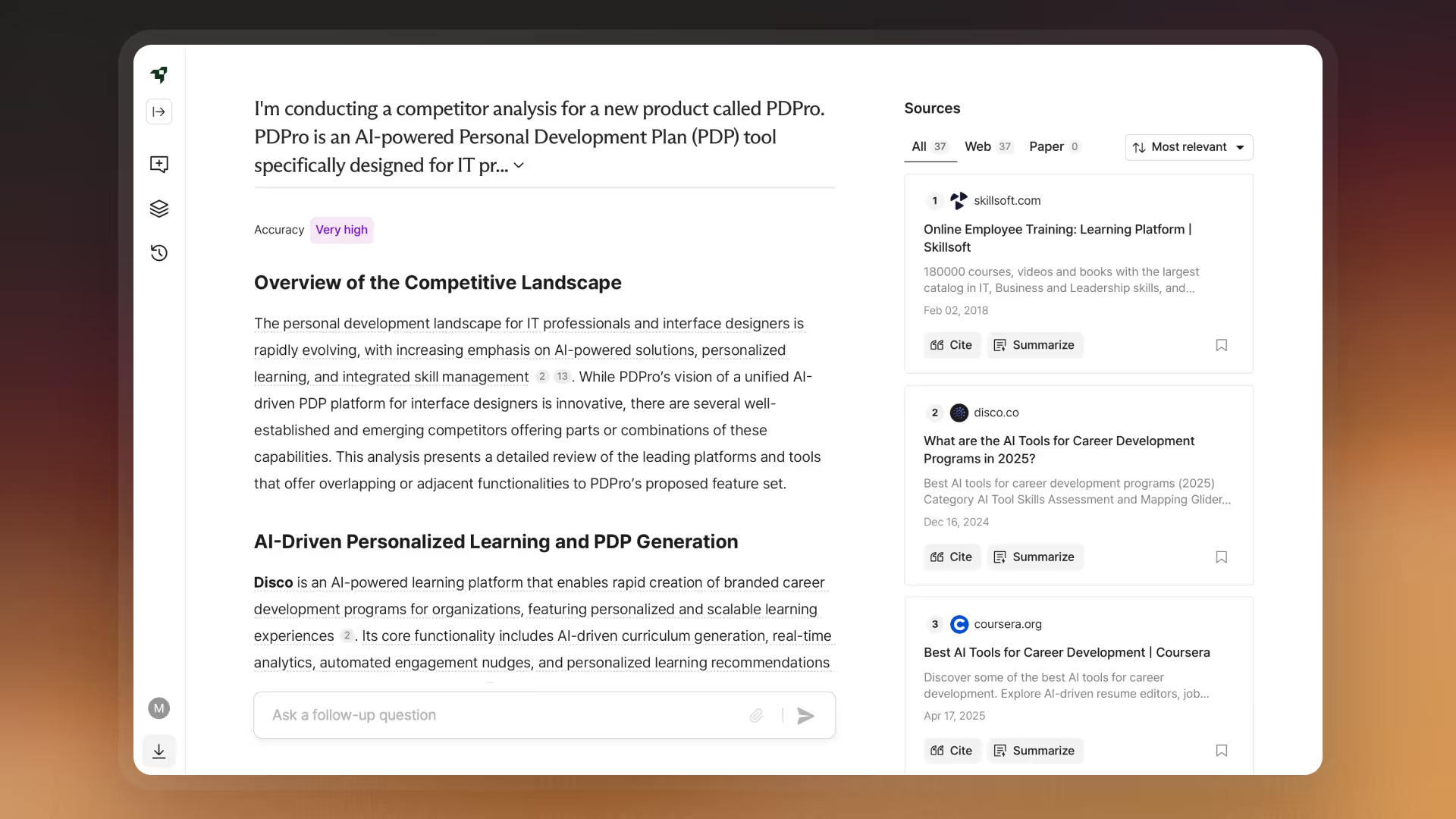
Perplexity & Liner

Yes, ChatGPT now has deep research too, but in practice, Perplexity and Liner gave me the best results. Both have generous free plans that are enough for a founder-sized study.

The key point is to never just ask AI to “do a competitor analysis.” That’s how you get garbage. The issue is the prompt.

💡Update: 


Claude now has its own deep research feature, but it’s not free. Results are solid, though.

My go-to prompt template

In Claude Projects, start a new chat and drop this in:

Copy-ready prompt

Based on all the information gathered in this Claude Project, create a concise research prompt that I can use in AI deep web research tools like Perplexity or Liner. Format the prompt in markdown.

The prompt should follow this structure:
Conduct a comprehensive competitive analysis for [my product name], [brief product description]. Using App Store reviews and Reddit forums as primary sources, analyze both direct competitors [list potential direct competitors based on previous discussions] and indirect competitors [list potential indirect competitors].

For each competitor, provide:

  1. Business Model Analysis – Subscription structures and pricing strategies – Value proposition and differentiation strategy
  2. User Experience Evaluation – Content/feature organization and discovery – Visual design and usability highlights
  3. Feature Comparison – Core functionality differences – User engagement mechanisms – Unique offerings
  4. User Feedback Analysis – Common pain points from App Store reviews and Reddit – Most appreciated features – Retention challenges
  5. Strategic Opportunities – Identify gaps in competitor offerings – Highlight potential differentiators based on competitor weaknesses – Recommend positioning strategy

Format the analysis as a concise report with actionable recommendations for [my product name]’s market positioning and competitive advantage.

Copied!

Running this kind of AI-powered competitive analysis gave me insights I probably wouldn’t have uncovered as quickly on my own. A few that directly shaped PDPro:

  • competitors try to cover a broad audience, while PDPro focuses only on IT folks with a personalized flow;

  • many cool features are locked behind paywalls, while PDPro delivers value right from free onboarding;

  • strong products have strong communities, which is the same for PDPro, where users shape the shared experience;

  • I got a clearer sense of typical pricing models in this space.

Research competitors in minutes

AI isn’t enough on its own. Always click through competitor sites and apps yourself, write down impressions, then feed those notes back into the same Claude chat. It sharpens the results and catches mistakes AI might miss.

Phase 2
54%

What we’ve learned so far

  • How to understand users with surveys
  • How to run unmoderated tests
  • How to explore competitors with AI

What’s next

  • Create the first landing page
  • Put the user at the center of the story
  • Handle the “boring” but essential business pieces
  • Map out the product structure and try a new approach

Build a free landing page for your product

Not long ago, the idea of building a website felt scary. Expensive, time-consuming, and never quite clear what else you had to do beyond the design itself to actually get it live.

That’s changed. With the launch of Figma Sites, you can now design and publish a website directly in the tool you already use every day.

Want to move even faster? Try Lovable. It’s one of the best AI tools for spinning up landing pages right now. Here’s an example I generated with a single prompt while writing this article.

💡Note:


Is it perfect? No. Plenty you could tweak. But for five minutes of work, it’s a solid start. And if your target users aren’t designers or techies, they’ll care far more about the content and story than about pixel-perfection. 

Who needs this?

  • founders validating an idea:  You don’t need a finished product. A simple site with your idea and a “Sign Up” button is enough to test interest. That button doesn’t even need to lead anywhere. Just track clicks with analytics to see how many people would take action. Instant validation.

  • founders building a waitlist: In this case, your CTA should lead to a signup form where people can leave their contact info for updates on the launch.

What does it cost?

There’s still a myth that landing pages require big budgets and entire teams. Truth is, if you’re just starting out, the cost can be zero. The tools above all offer free plans. And if you’re adding a waitlist, you can plug in a simple Google Form.

What to keep in mind for later?

  • custom domain: Probably the only thing you’ll need to pay for. That said, having a personalized link isn’t critical in the early days. If you want one, grab it on GoDaddy or a similar service. Cost: around $15-20 per year.

  • analytics:  As traffic grows, analytics tools will help confirm (or kill) your assumptions. Start with something simple like Google Analytics or PostHog.

  • advertising: Early on, focus on organic growth through free channels like LinkedIn posts. Later, you can explore paid ads to reach new audiences. We’ll cover different types of marketing in the next sections.

Make your user the hero

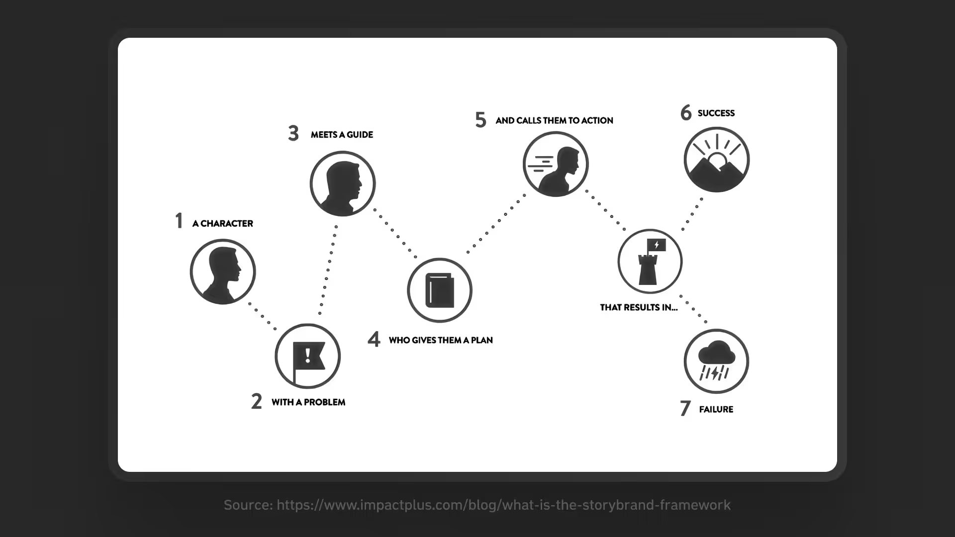
One of the things I wish I’d learned earlier in my design career is StoryBrand. For some reason, it’s not that well-known among designers, but it absolutely deserves a place in your toolkit.

StoryBrand

Source: Impact

What is StoryBrand?

It’s a storytelling method where the user is the main hero, and your product is simply the guide that helps them succeed. StoryBrand is used far beyond tech; authors and screenwriters apply the same structure. Think about the flow of your favorite movie, and you’ll see the pattern right away.

It helps you:

  • communicate ideas in a way that connects emotionally;

  • sell an idea, which is especially useful when you don’t have a product yet.

Where to use it:

  • marketing, social posts, email, ad campaigns;

  • product branding, website copy, UX microcopy;

  • basically anywhere words and your business intersect.

How to build a StoryBrand with AI

If you haven’t already, run your user research and build a persona based on real insights:

  1. 1. Google “StoryBrand template” and pick one you like (they’re all more or less the same).

  2. 2. Fill it out manually first.

  3. 3. Upload it to your Claude Project and ask AI for suggestions to make it sharper.

  4. 4. Get the messaging that resonates.

Most businesses talk about themselves: how great their product is and how advanced their features are. But think about it, do you remember a single brand that bragged its way into your heart? Probably not. Because people only care about themselves.

Top brands don’t talk about “me.” They talk about you: your problems, your struggles, your transformation. They show you how their product helps you avoid failure and become a better version of yourself.

Stay disciplined over inspired

When you’re building a product, discipline matters more than inspiration in the long run. Inspiration sparks ideas and lights a fire, but discipline creates the routine that delivers results over time.

It helps to have a plan with clear goals and tasks. Deadlines won’t always stick (they rarely do), but the structure keeps you moving forward.

Here are a few methods you can try:

  • OKRs: What do you want to achieve, and how will you measure it?;

  • SMART: Specific, measurable goals with deadlines;

  • 4DX: Focus on the most important, track progress consistently;

  • The One Thing: Do the single most important task first;

  • NCTs: Define what you want, decide how to do it, break it into tasks.

They’re all pretty similar. For PDPro, I went with NCTs, as it was the easiest to understand and apply.

💡Example NCT:


  • need: Improve PDPro awareness among designers;

  • commitment: Gather 100 people on the waitlist by the end of summer;

  • tasks: Draft LinkedIn post topics, publish at least 2 posts per week, promote the waitlist there.

Don’t put off the “boring stuff”

Business model, market research, and financial planning often get pushed aside until launch. That approach usually backfires. Better to tackle them early.

Define your business model

Your business model is how the product creates and sells value. Some common ones:

  • freemium: Basic features free, premium ones paid (ChatGPT);

  • subscription: Monthly or yearly fee (Netflix);

  • e-commerce: Online sales (Amazon);

  • advertising: Free content, monetized with ads (Instagram);

  • marketplace: Connecting buyers and sellers, earning on commission (Airbnb).

Pick one that fits what you’re selling and who you’re selling to. Keep it simple at the start. Subscriptions, for example, are great for products that deliver ongoing value, and they give you predictable revenue.

Research your market

Market research helps you estimate the size of your audience and the growth potential of your product. Free reports are rare, so get creative.

For PDPro, I looked at the number of registered freelancers by business code in Ukraine to estimate how many designers and developers were active in the country.

You can also lean on AI research tools like Perplexity, Liner, or Claude’s deep research. And if you want to dig deeper, look into TAM, SAM, and SOM.

Plan your finances

Financial planning means forecasting numbers in a simple spreadsheet, estimating costs, and setting goals for the next year (or more). Even if you’re not great with finance (I’m not), it’s worth trying. Until you crunch the numbers, every idea feels “definitely profitable.”

Claude can help draft a financial model and answer questions along the way. Use the ELI5 approach (“explain like I’m five”) to break down complex terms into easy analogies. Tools like Perplexity Voice are also handy if you want a more interactive way to learn as you go.

Of course, the ideal is to create a financial plan with a real accountant, but that comes later, once you’ve launched your MVP and maybe even attracted users or investors. For now, even a rough plan is better than none.

Promote with PESO

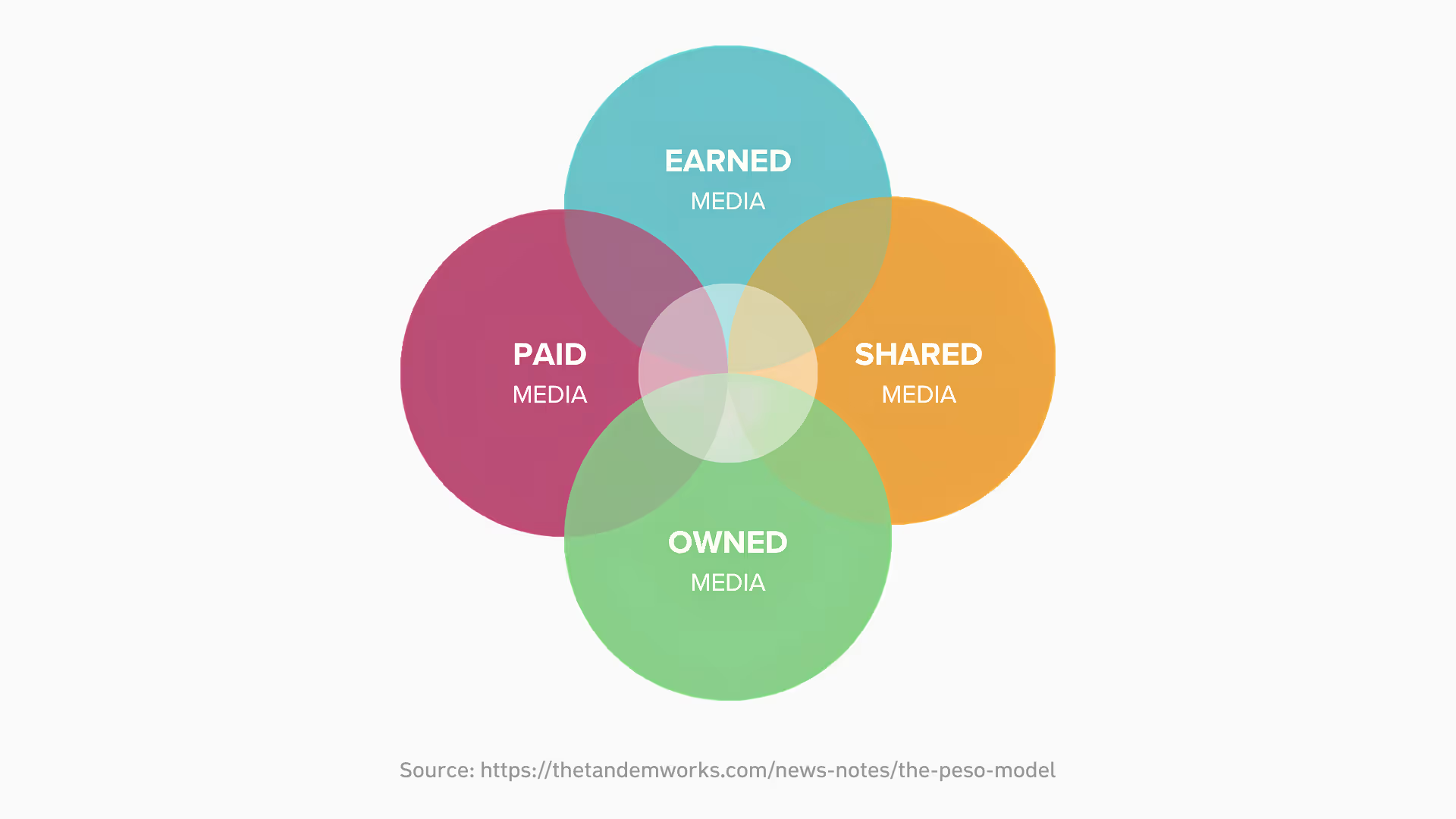
PESO is a simple framework for thinking about how to get your product out into the world. The letters stand for Paid, Earned, Shared, Owned: four types of media you can use to build visibility. Each one has its own pros and cons.

PESO

Source: Tandem Works

Start with Shared

This is the easiest entry point: content you share on social platforms. It’s free and keeps you in touch with your audience. The trick is to show up where your people already hang out.

For PDPro, aimed at designers, that meant LinkedIn, where they spend time and talk shop.

Examples: LinkedIn, X (Twitter), Instagram, TikTok.

Earn trust with Earned

This takes more effort but pays off in credibility. “Earned” media is when other people talk about you, whether it’s a shoutout in a newsletter or a guest talk you give.

In my case, I’ve been giving talks and writing articles about design and AI, sharing what I’ve learned along the way. That not only builds my personal brand but also attracts potential users for PDPro.

Examples: media mentions, podcast features, word of mouth.

Own your channels

Owned media is where you set the rules. It’s your landing page, your blog, your newsletter, and all the things you control completely and can track with analytics.

A simple landing page already makes your product feel more real. It’s also a chance to tell your story in your own way, without worrying about algorithms or platform restrictions.

Examples: website, blog, newsletter.

Use Paid as a last resort

Paid media (ads, sponsored content, promotions) can work, but don’t rush into it. In the early days, it’s usually smarter to focus on the free channels above and see what sticks. Once you have an MVP and maybe even some funding, that’s the right time to test paid campaigns to scale your reach.

Examples: Google Ads, Facebook/Instagram Ads, LinkedIn Ads.

Put it into practice

Make a content plan so you know what you’re posting, where, and when. Set clear goals (for me, it was “get 100 people on the PDPro waitlist”). Keep showing up, share useful insights, and invest in your personal brand. Then, every few weeks, check what’s working and adjust.

Combine CJM with Service Blueprint

When I was starting out in design, I used to wonder: how do people even come up with new research methods or activities? Working on PDPro, I finally realized: if you can’t find the method you need, make one yourself. You don’t need decades of experience to do it. If it helps you, it’s valid.

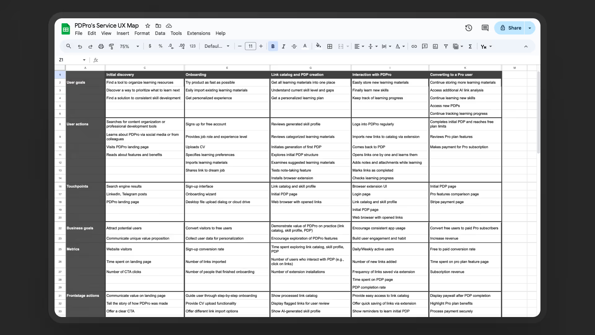
That’s exactly what I did when I wanted a way to see both sides at once: what PDPro users would see in front of them and what was happening under the hood technically.

Spot the gaps in traditional methods

CJM is great for visualizing the user journey. Service Blueprint is great for showing system actions at each step. But I needed something that showed everything together. After too much Googling and article-skimming, I still couldn’t find it, so I made my own.

Build it step by step

I started by laying out the journey stages horizontally (discovery, onboarding, first product interaction, upgrade to Pro). Then, for each stage, I mapped out vertical categories:

User categories

  • goals: e.g., Collect all learning links scattered across browser tabs;

  • actions: e.g., Go through PDPro onboarding;

  • touchpoints: e.g., PDPro landing page.

Business categories

  • goals: e.g., Communicate the product’s unique value, capture a new user;

  • metrics: e.g., Track how many complete onboarding and where drop-offs happen.

System categories

  • frontstage actions: Visible to the user (e.g., offer easy link imports from browser);

  • backstage actions: Hidden from the user (e.g., analyze links, filter out irrelevant ones);

  • support providers: Integrations/third parties (Convex DB, AI model APIs).

The result was a clear view of the full product: how user goals and business goals align, where tech might get complex, and where to simplify. It also forced me to think through integrations and tech stack before touching Figma, which made the design a lot closer to real development.

Service UX map

I ended up calling this hybrid method the Service UX Map. (Name’s still up for debate. I’m open to better ideas 😅).

💡Try it yourself:


  1. 1. Start with AI. I used Claude Projects to draft both a CJM and a Service Blueprint.

  2. 2. Refine those drafts manually.

  3. 3. Combine them into one simple table. (The horizontal stages are the same. The only difference is which vertical categories you include.)

  4. 4. Don’t overthink templates. Use whatever structure fits your product.

  5. 5. Focus on the insights. A plain Google Sheet works just as well as a FigJam board.

Map your product architecture

Imagine you’re building a house from scratch. Which option would you choose?

A) Create an architectural plan first and build based on it.

B) Wing it, room by room, figuring things out as you go.

Most of us would say A. Yet for some reason, designers often jump straight into UI without a clear plan. That’s why Information Architecture (IA) is so useful.

Understand IA (not to be confused with AI)

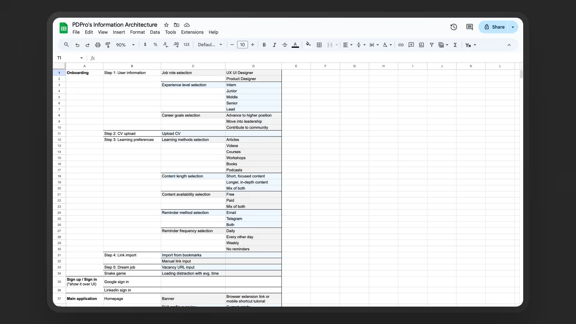
IA is a structured diagram that lays out every piece of navigation in your interface. Think of it like prepping for construction: you decide what goes where before picking paint colors or furniture.

It keeps all navigation in one place, reveals gaps in your structure, prepares you for the UI phase, and gives you a checklist of what to design. Plus, you won’t have to juggle dozens of ideas in your head and hope nothing slips through.

Keep it short and simple

Sure, IA can be extremely detailed, but I prefer simplicity. My Service UX Map from the last section made this much easier.

For PDPro, I limited IA to four levels, for example:

  1. 1. Onboarding

  2. 2. Onboarding steps

  3. 3. Questions at each step

  4. 4. Possible answer options

Create IA with AI (sorry for the pun 😅) 

I used my Claude Project, since it already had PDPro documentation loaded. The first draft wasn’t perfect, but it:

  • generated a solid starting point, fast;

  • saved me hours of manual effort;

  • reminded me of small details I might have overlooked.

Information Architecture

Cut features to build faster

Beginner founders often think everything is important. They try to pack every possible feature into their product, which usually means years of building and no launch. Writing down clear MVP requirements protects you from that trap.

Use the ICE model

The ICE model is a quick way to prioritize. Start with a list of all features you’d like to build. Then score each one from 1-10 across three criteria:

  • impact: How much users need it;

  • confidence: How sure you are it’s valuable;

  • ease: How easy it is to design and build.

Multiply the three numbers together. The highest scores get the highest priority. 

Factor in constraints

Think about limits early. For example, if you plan to offer free access, a trial, or freemium, define what the free plan includes, how it differs from paid, what limits you’ll impose, and how you’ll nudge users toward upgrading.

Phase 3
85%

Where we are now

  • Landing page built at zero cost, plus strong storytelling
  • Discipline and realistic goals (via NCTs)
  • Business model, market research, and financial plan
  • Service UX Map, information architecture, and clear MVP requirements

What’s next

  • Collect high-quality design references
  • Learn psychological design tricks

Find design references

I look for references only after I’ve nailed down the information architecture. That way, I know the structure before I start worrying about visuals. It also makes sense to do this after sketching quick paper wireframes or generating a prototype with AI. That sequence keeps you focused on experience first, not appearance.

This approach helps avoid two common mistakes:

  • wasting time searching without knowing what you actually need;

  • copying someone else’s design instead of developing your own ideas.

Know where to look

The best references are screenshots from real products. My go-to sources:

  • Mobbin: Paid, but super high quality. Search by product, component, screen, or even by a text snippet inside the UI.

  • The Component Gallery: A big list of popular design systems and components. Helpful if you know which library you’ll use later.

Collect them in one place

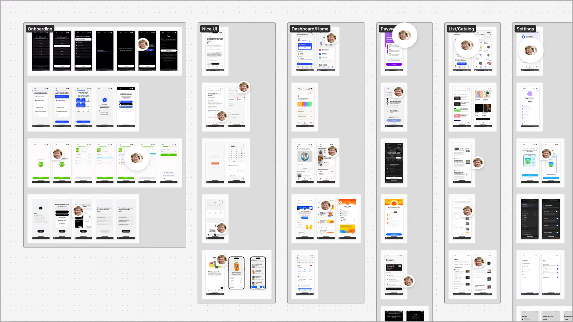
Set up a FigJam board with sections for each important part of your interface. Organize them by pages or flows. Add sticky notes explaining why you picked a reference. That way, you’ll know it’s not just “pretty” but also useful.

Design references

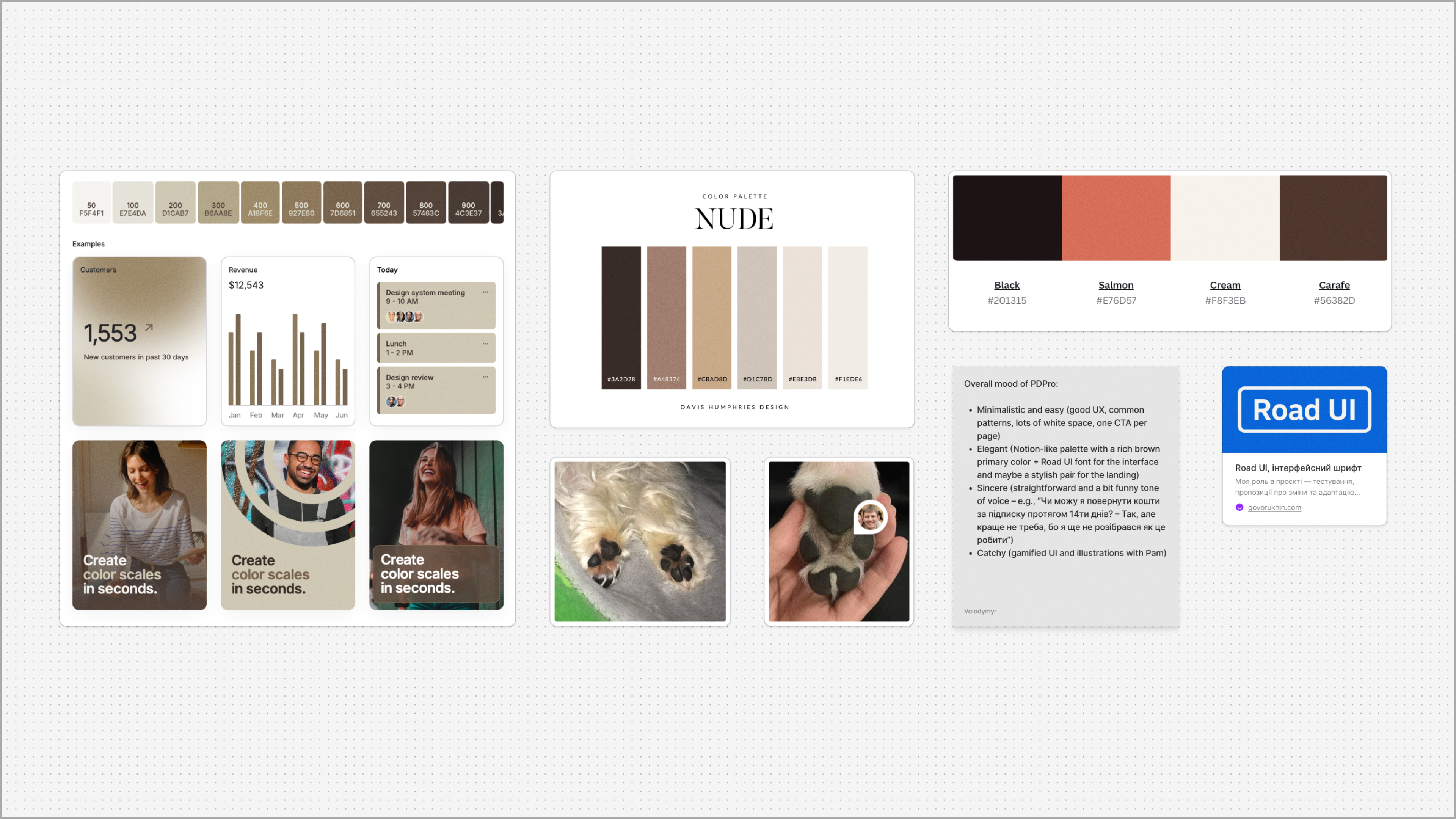
I also recommend a separate style moodboard: color palette, 1-2 fonts, logo ideas, and a description of the overall vibe you want your UI to have. This turns your work from “a nice design” into the start of a real brand.

Start with mobile

It’s easier to design mobile-first. If you can craft a smooth experience on a small touchscreen, scaling up to a desktop will be straightforward. The reverse is usually painful, with lots of compromises.

Design references

Apply psychology to design

Design case studies on Behance or Dribbble almost all look the same: a pretty cover, an intro, a neat research summary, maybe a sleek timeline, and then a design system with fonts and colors. It looks nice, but let’s be honest. It’s outdated.

This article is my attempt to rethink what a product case study can be. Instead of just showing UI, let’s talk about why it works – the psychology behind the design.

Ask three simple questions

When you’re building your dream product, it’s easy to obsess over features and UI polish. But without empathy, you risk creating something beautiful that fails to deliver results. That’s where three simple questions can unlock deeper insights:

  • “If you had a magic wand and could instantly [get the value], how would that change your life?”

  • “Tell me about the last time you tried to [do the action]. What was it like? What got in the way of [the goal]?”

  • "What’s your biggest struggle with [the problem]? Why is it so hard for you?"

These questions turn interviews into stories. Stories reveal emotions – the real drivers behind user behavior that standard research methods often miss.

See a practical example

Let’s say you’re building a learning app, similar to PDPro. You could ask:

  • “If you had a magic wand and could instantly organize all your learning materials (articles, videos, courses) in one place, how would that change your life?”

  • “Tell me about the last time you tried to stick to a professional development plan. How did it go? What stopped you from finishing it?”

  • “What’s the hardest part of figuring out what to learn next in your career? Why is it such a challenge?”

The first question uncovers motivation: why they care. The second and third reveal obstacles: what’s getting in their way.

Recognize why ideas fail

If users don’t do what you expected when you built your product, it usually comes down to three reasons:

  • they’re not motivated enough (the outcome doesn’t matter to them);

  • your solution feels too hard (it takes too much time, money, or mental energy);

  • they don’t know how or when to act (you didn’t give them a clear call-to-action).

Simple as they seem, these three questions help bridge the gap between design that just looks good and design that actually changes lives.

Phase 4
100%

All done 🎉

  • All 13 milestones completed

From me and Pammy 🐶

Get into the details of each artifact we covered, keep experimenting, and keep building your entrepreneurial skills. The best designers are the ones who can take an idea from nothing to something real.

For me, the journey is far from over. The next big chapter is tackling the technical side of building PDPro with AI. Luckily, programming today is way more accessible than when I first started. That makes me even more excited about what’s next.

If everything works out, you’ll see a follow-up to this piece, this time about the nuts and bolts of building with AI.

P.S. For the curious: here’s the original Figma file and the real Big Idea doc with all the behind-the-scenes secrets 🤫.

AI Startup Playbook: Creating a Dream Product from Scratch with AI Cieden

we reply under 24 hours.

Book your
free
session
Thank you for your message. It has been sent