Task

Team

Duration

Scope
Overview
This client is one of the Philippines' premier online shopping destinations.
Cieden collaborated with stakeholders to understand business requirements, gathered general user data, analyzed user behavior, and conducted competitor research using Google Analytics and Hotjar.
We also created a user survey and user interview scripts to validate initial hypotheses and develop a UX strategy based on the results. Following that, we defined the project scope, created a feature prioritization map, and developed the information architecture and wireframes for usability testing. We performed usability testing to validate our design and made changes based on the findings. After the testing iteration, we finalized the mobile app design and the website, both desktop and mobile
responsive versions.
The main issues that we turned into solid UX solutions were connected with the search and filtering, reordering the goods from the completed order, saved item discoverability, replacements for goods,
and checkout steps.
Challenges
- different mental models of Filipino users, so some UX patterns do not work for them as we expected (usability testing insight);
- to understand the real user pains and jobs, to challenge the initial idea of the app's functionality, and to cast aside the bias created based on the client's research.
Results
- 200,000+ clients attracted after redesigning the eCommerce platform from scratch;
- NPS of 78 achieved, validating higher customer satisfaction;
- 25,000 SKUs seamlessly managed through advanced search and filtering;
- design system scalability ensured consistency across app and web platforms.
Finding the right products
Following the best practices of online shopping adopted in e-marketing SaaS, our team has designed an advanced search algorithm with an opportunity to discover goods across different categories as well as filter them by brands, product types, weights, prices, and discount availability. The filtered navigation is essential to narrow down the visitor’s product search. It also creates a seamless buying experience and makes the whole process intuitive and effortless. We have placed the filters section on the left-hand side in line with the usability patterns established for this element. Particular attention was paid to the product card design which had to be informative yet visually appealing and easy to read.
Adding goods to cart
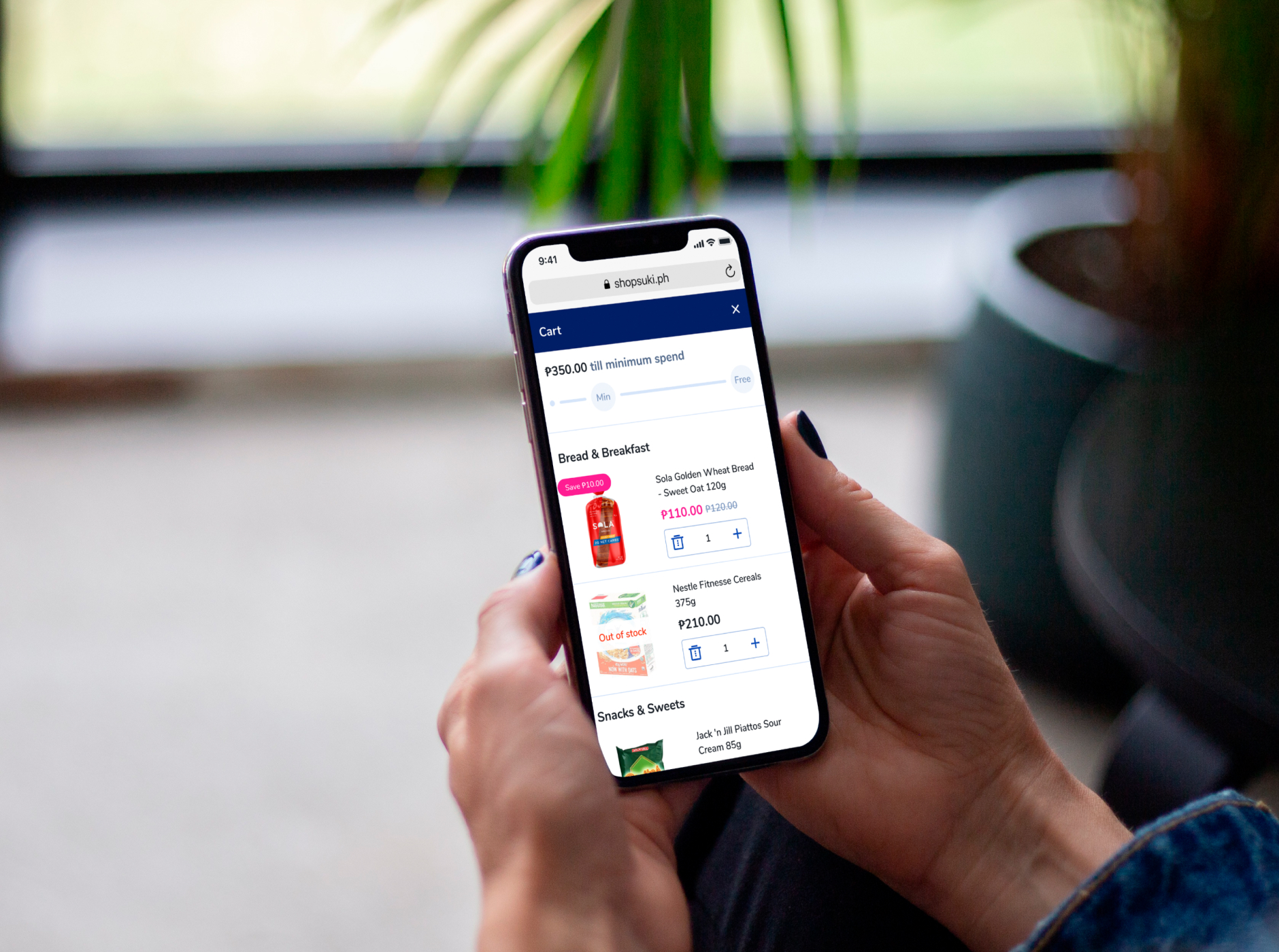
After searching for the relevant products, a visitor can add them to a cart with one click. We want to emphasize another useful tool that our team previewed for managing the shopping card without getting back is an opportunity to add any quantity/weight of a chosen product. It can be easily done by multiplying its number within a special field in front of every item. The total price is automatically adjusted in real time. A user-friendly cart preview in the right upper corner of the website makes it simple to check out the products and their quantity added to ensure that everything is correct and a user can move on with the process.

Reviewing orders & making purchases
The product checkout phase is the most critical point of the purchasing process. At the moment of cashing out, a user might change their mind about buying some products, realize they are out of their budget, or simply forget to include some needed goods. To improve and simplify the buyer's experience, we came up with a smart replacement feature that lets a customer select any other relevant item instead of a chosen one without the need to get back to the shop. And to finalize the process, a customer can easily pay with multiple payment options at their disposal.
Easy multi-order flow for pickers
Pickers can process multiple orders at the same time. Each order is color-coded, which simplifies navigation and prevents confusion with numbering. While picking, workers scan barcodes and instantly check product availability. This speeds up the process and ensures faster delivery to customers.
Repeating orders
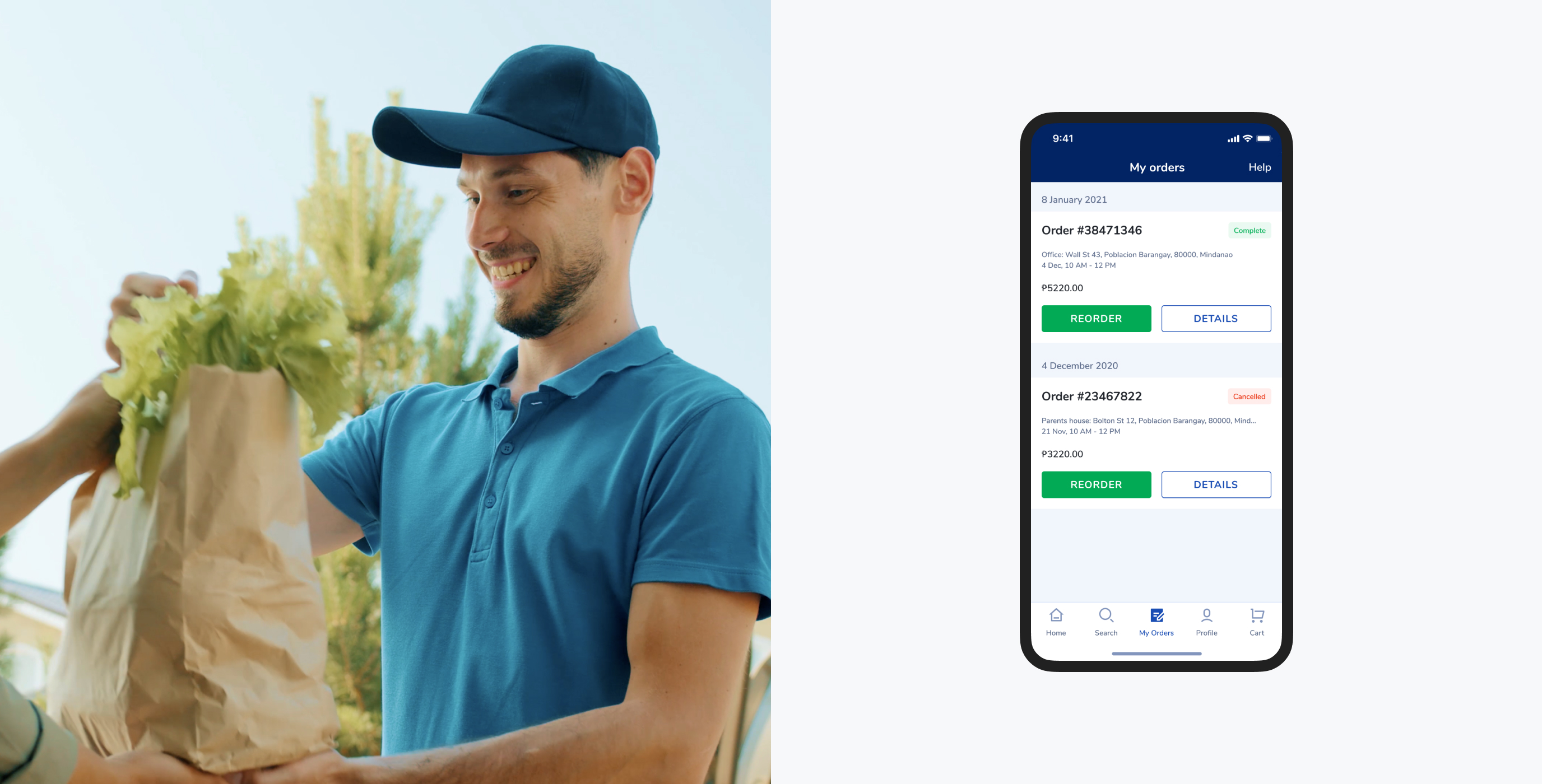
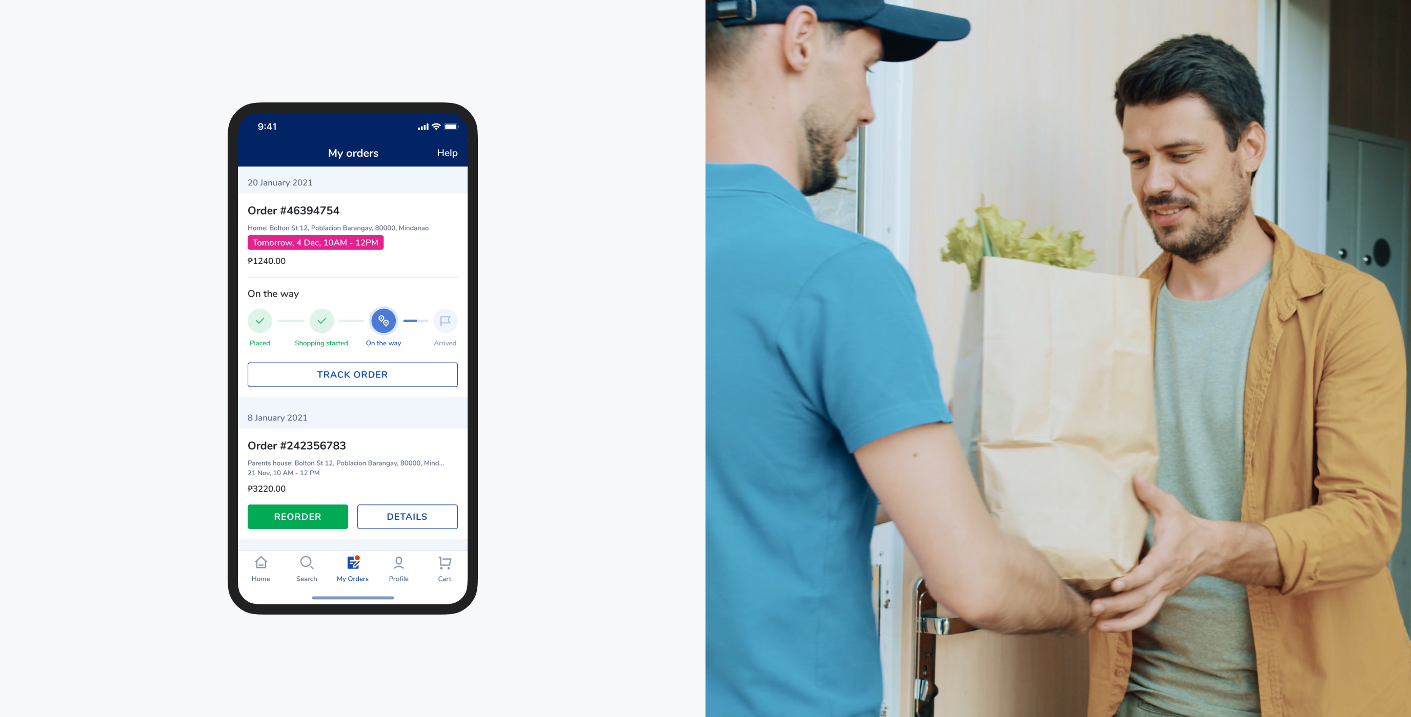
To save time, customers might also want to reorder the same groceries they purchased the last time. Our team has carried out this handy feature in the most visually straightforward manner to enable fast reordering with one single click. It will significantly save visitors’ time and take their grocery shopping to a whole new level.
Rating experience
Once the grocery is successfully delivered, the menu offers the summary and details of all previous orders by date. What’s important, the customer can rate their overall experience and leave their feedback which can become a solid basis for potential application and website feature improvements.
To deliver an appealing, intuitive design that aligns with industry best practices and client's needs, our working process includes multiple steps.
Usability testing
Following the creation of the interface solutions, the best practice is to use the prototype to observe how users complete tasks to validate ideas, identify areas of confusion, and improve the overall user experience.
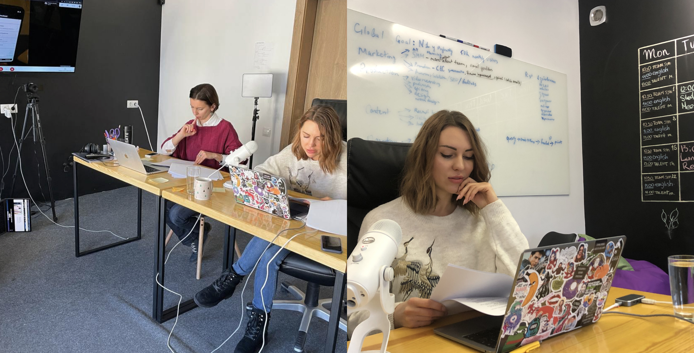
The team developed a testing session plan based on the main functionality and created flows for these scenarios using the prototype's wireframes. After everything was ready for the testing session, the team was divided into a testing facilitator, note-taker, and observer. Then people from our TA were recruited for the testing.
During testing, the team discovered which features are not expected by the TA, which features are missing, and which features work well.
Information architecture
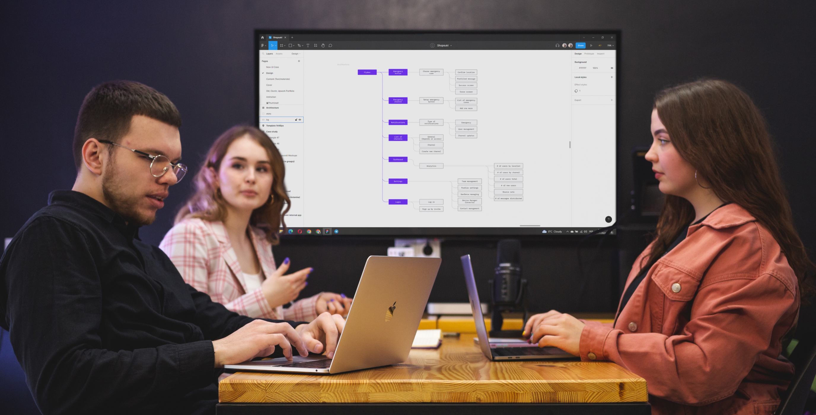
We gained an understanding of user actions, flows, and scenarios after completing the discovery phase. Following that, we created an information architecture to organize content so that users can quickly adapt to product functionality and find what they need.
Google Analytics & Hotjar analysis
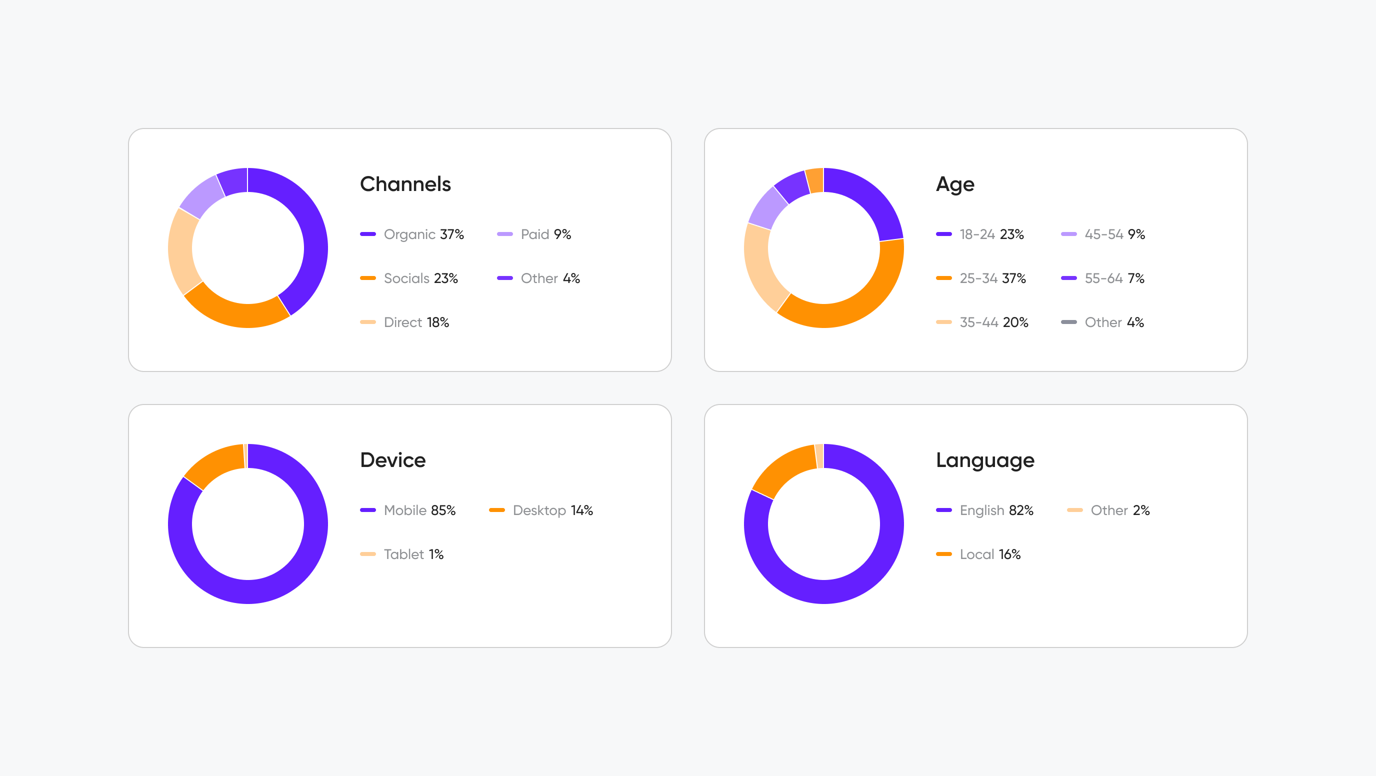
We conducted a Google Analytics and Hotjar analysis in order to gain a better understanding of who our users are, what devices and browsers they use, their geographic location, social democracy, and psychography, as well as how they interact with the current website.
As a result, we anticipated making initial assumptions about how we could improve the current experience with design solutions.
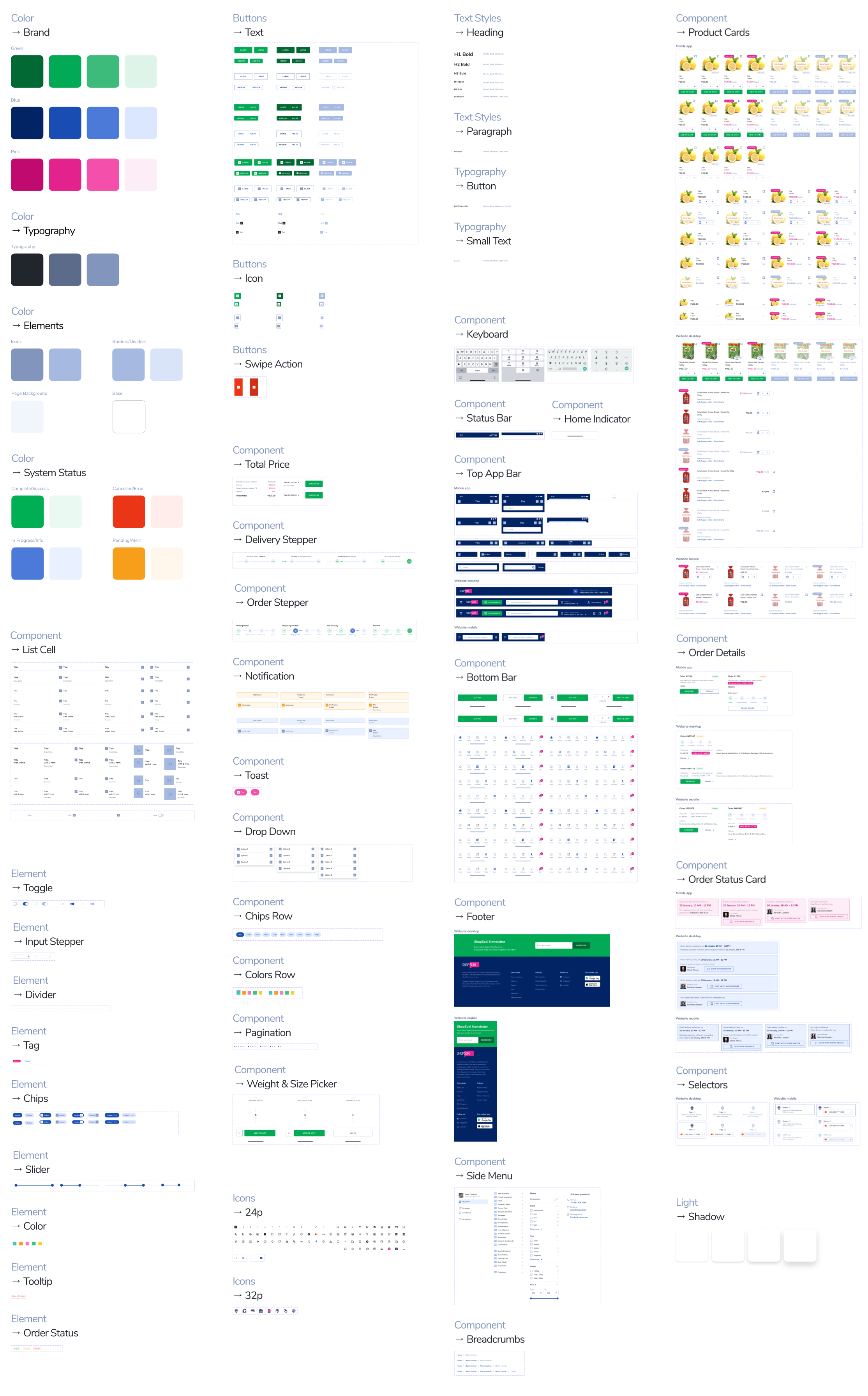
Design system
To ensure consistency in the project implementation, the team developed a huge design system which is the single source of truth. Grouping all elements and components for all platforms within a project so that the teams can work together to create a product.
By utilizing a collection of repeatable components, we create an exceptional
user experience.
Documentation and dev support
We documented product requirements in user stories format to hand-over to the development team for estimation at early stages to start back-end preparation under tight deadlines. Also, Cieden provided supporting documentation in the form of a table of permissions, a high-level database structure (ERD diagram), a context diagram of a list of APIs that could be integrated, and other supporting documents.
we reply under 24 hours.
free
session
