Project highlights

Task
Design role-specific analytics dashboards to support faster logistics decisions

Team
1 UX/UI Designer, 1 Product Manager

Duration
2.5 weeks

Scope
Discovery workshops, user research (via client feedback), persona definition, dashboard UX/UI design
About the client
OptaHaul is an Irish SaaS company with a niche (but important) mission: help the dairy industry boost farmer profits while cutting haulage costs and emissions.
Their cloud-based platform supports clients in Ireland, the UK, Hungary, and the US, focusing on farm-to-plant milk transport — a complex, often overlooked logistics challenge.
They’ve worked with major co-ops like Dairygold, achieving an 11.2% cut in route mileage per litre. In 2024, OptaHaul won Gold in the ‘Tech Startup’ category at the National Startup Awards, recognizing their role in modernizing dairy logistics.
What the client needed
Though their optimization engine was strong, OptaHaul needed help showing the right insights at the right time for different kinds of users, from logistics managers to supply chain directors. The data was there, but users still relied on Excel and manual calculations to make decisions.
They needed:
-
one place to see all the logistics and cost data;
-
dashboards tailored to each role;
-
tools to run “what-if” logistics scenarios;
- a more visual way to share insights with hauliers and finance teams.
Challenges
- with no direct access to users, we worked off feedback that OptaHaul had gathered;
- each role (finance, logistics, supply chain) needed different KPIs and data depth — one-size-fits-all wasn’t going to cut it;
- existing workflows were heavily Excel-based, with many manual steps;
- some metrics (e.g., cost per litre) varied wildly depending on contracts and regions;
- users wanted to test “what if” scenarios, but the product didn’t support forward-looking planning yet.
Results
- role-based dashboards became a go-to tool for daily planning and reporting;
- teams replaced scattered Excel spreadsheets with structured, visual insights;
- finance teams could break down costs by haulier, supplier, and route — something they couldn’t easily do before;
- scenario modeling gave users a way to plan proactively, instead of reacting after the fact;
- planners could compare real vs optimized routes in a few clicks.
We started with a remote workshop to get aligned on roles, goals, and decision flows. From there, we ran weekly check-ins with regular demos, async feedback, and clear design deliverables.
Here's how we worked:
-
used anonymized feedback from OptaHaul’s dairy clients (like Horizon and Dairygold) to understand what users needed most;
-
mapped out key KPIs for each persona and grouped them around real decision-making flows;
-
designed early dashboard concepts with modularity in mind, to allow for role-based views;
-
prototyped directly in Figma, collaborating closely on structure and clarity.
Role-based dashboard
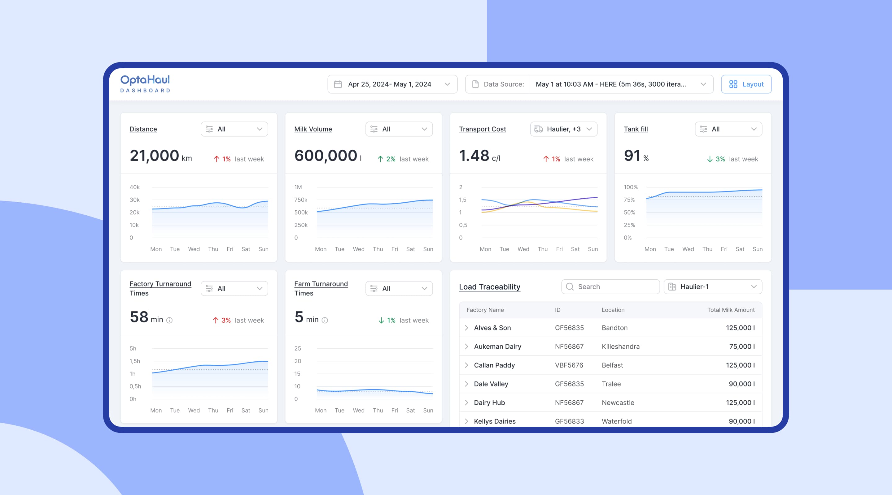
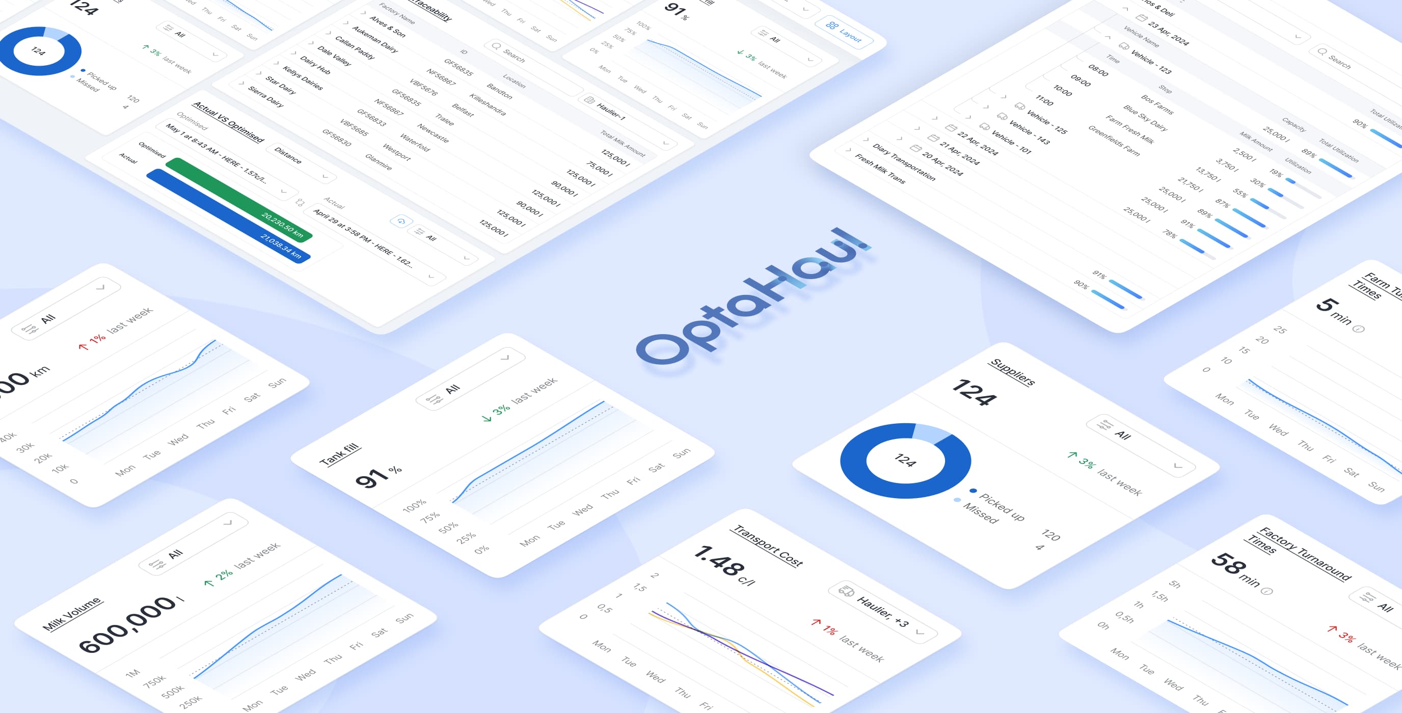
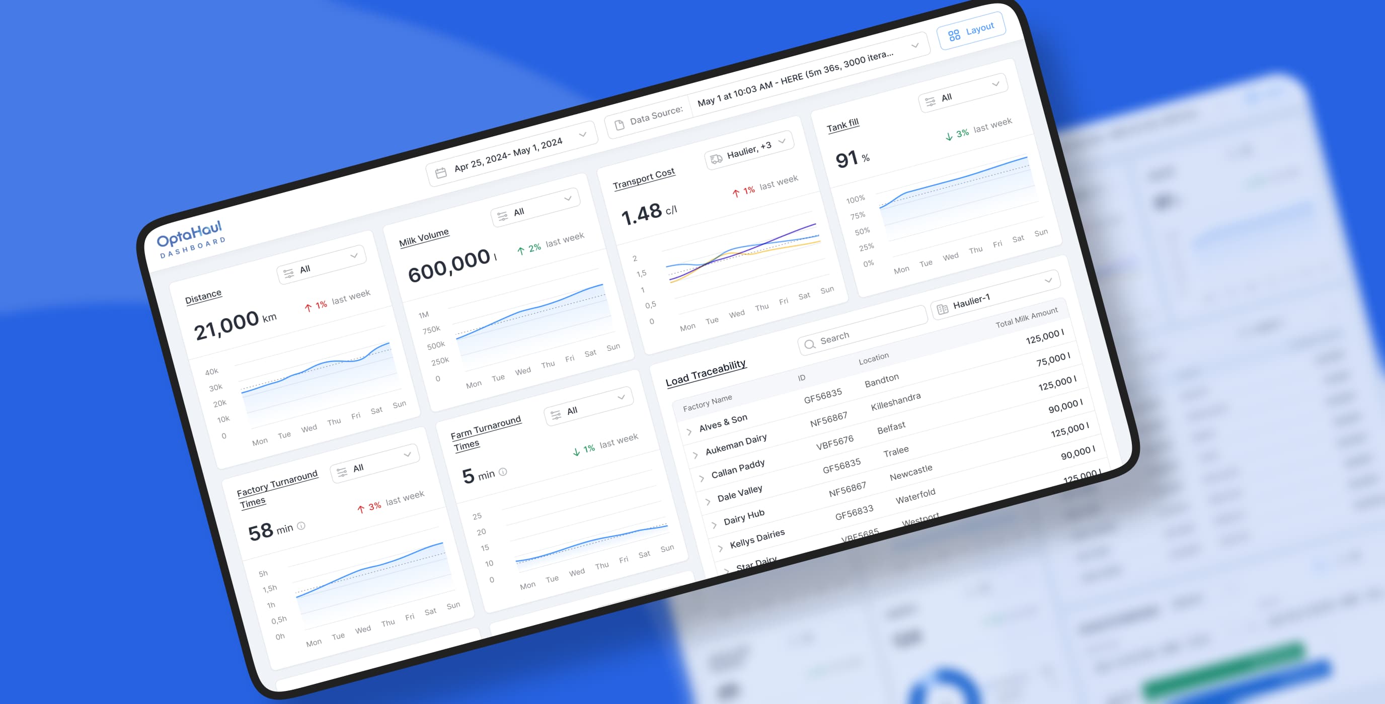
To keep things simple and avoid overwhelming users, we designed the dashboards around a modular card system. Each card highlighted just one metric — like Distance or Tank Fill — with visual cues (trend lines, bar charts, color indicators) that made it easy to scan at a glance:
-
card-based layout that scaled easily across roles and use cases;
-
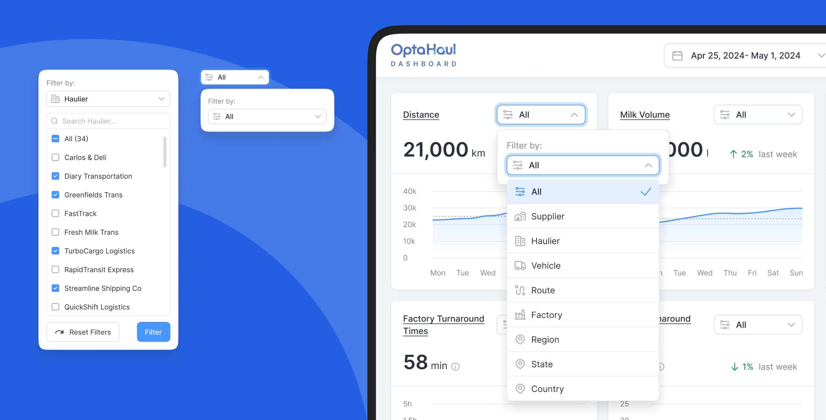
contextual filters (like haulier, route, supplier, or factory) available at both the dashboard and card level;
-
minimal visual style with light grid lines, calm colors, and clear typography for easy reading.
Drill-down drawers
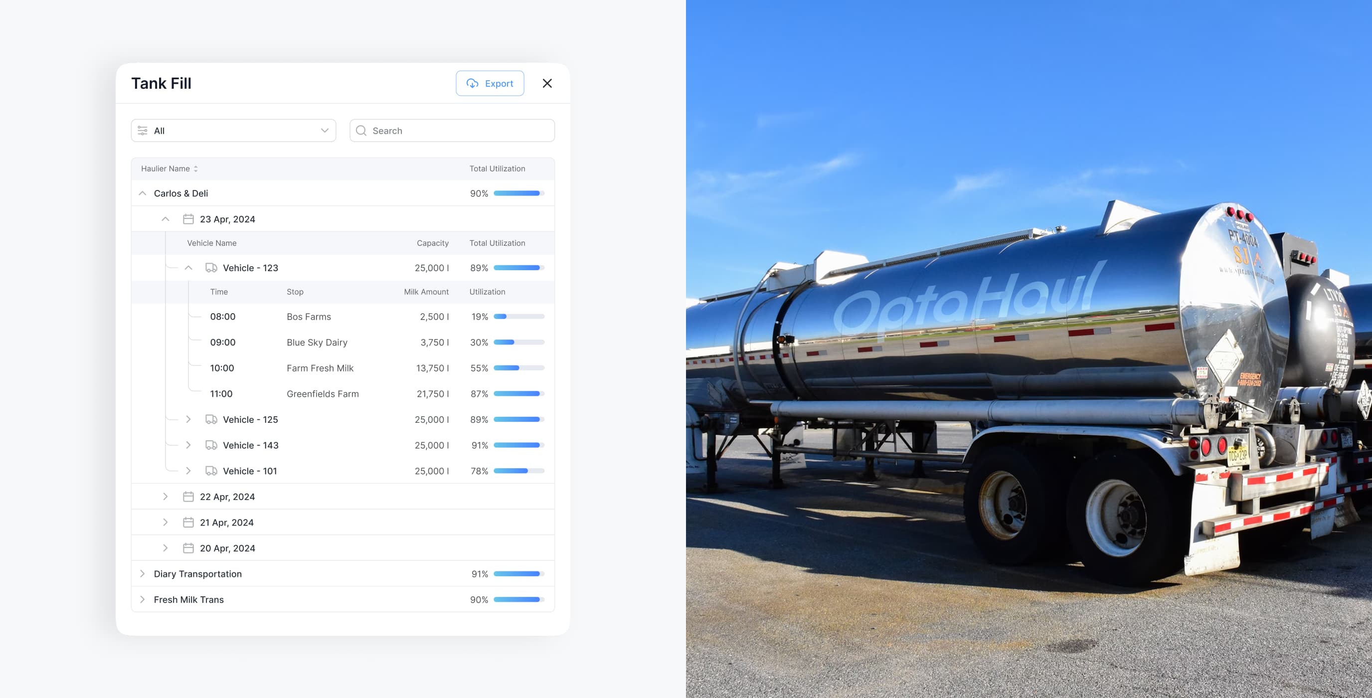
Once users had a clear view of their daily metrics, we focused on helping them explore what could be improved. Clicking on a dashboard card opened a drawer with more information on the selected routes or hauliers, without leaving their current screen.
The goal was to let people get what they need fast and get back to planning with:
- inline filters and search inside drawers for quick exploration;
- one-click export for quick offline reports and team sharing.
Actual vs optimized view
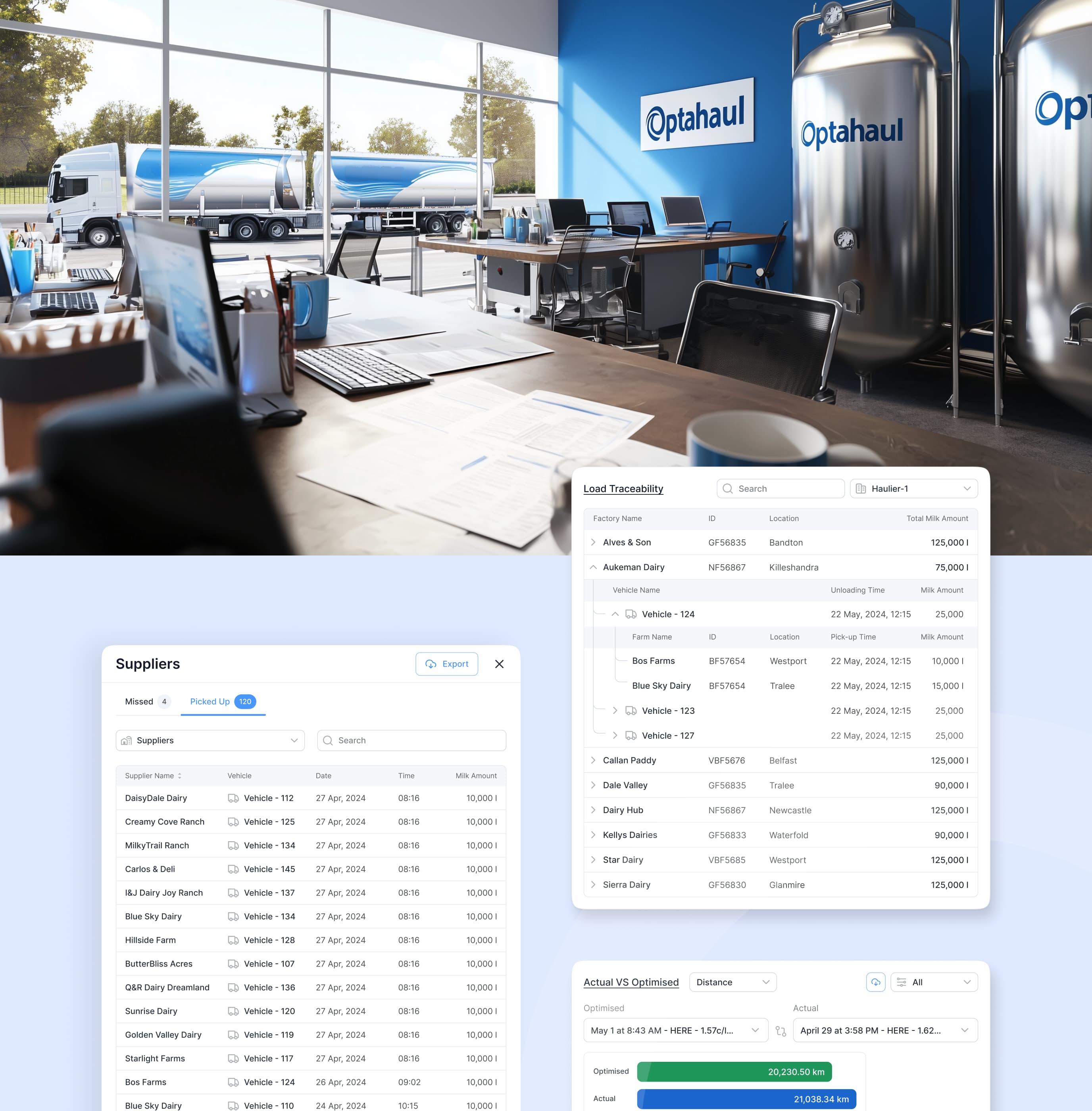
The comparison module showed the differences between what actually happened and what OptaHaul recommended, so users could spot where costs or timing were off, and understand why. The interface included:
-
side-by-side comparisons for “actual vs optimized” performance;
-
dropdowns and date pickers to filter and test different scenarios;
-
expandable route-level views with vehicle and delivery details;
-
color-coded bars to flag differences between current and optimized outcomes.
Scenario modeling
To help planners think ahead, we added a scenario modeling module that let users see how changes, like adding a haulier or rerouting deliveries, could affect cost and performance over the next 6-12 months. It gave planners a way to try out ideas before committing and replace guesswork with real numbers.
Suggestive UI for rerouting
Once users saw where performance could be better, we layered in suggestive UI elements to flag when a load could be cheaper or faster with a small change. Nothing intrusive, just enough to point to better options, while keeping users fully in control.
Operational & financial metrics
A few under-the-hood improvements were made to reflect the complex realities of dairy logistics and finance:
-
flexible cost calculations that adapt to different haulier contracts and pricing setups;
-
turnaround time broken into pump vs non-pump delays, so teams can identify what’s really slowing things down;
-
finance metrics — like cost per litre and $/CWT — with filters by supplier, route, or factory.

we reply under 24 hours.
free
session
