Task

Team

Duration

Scope
About the client
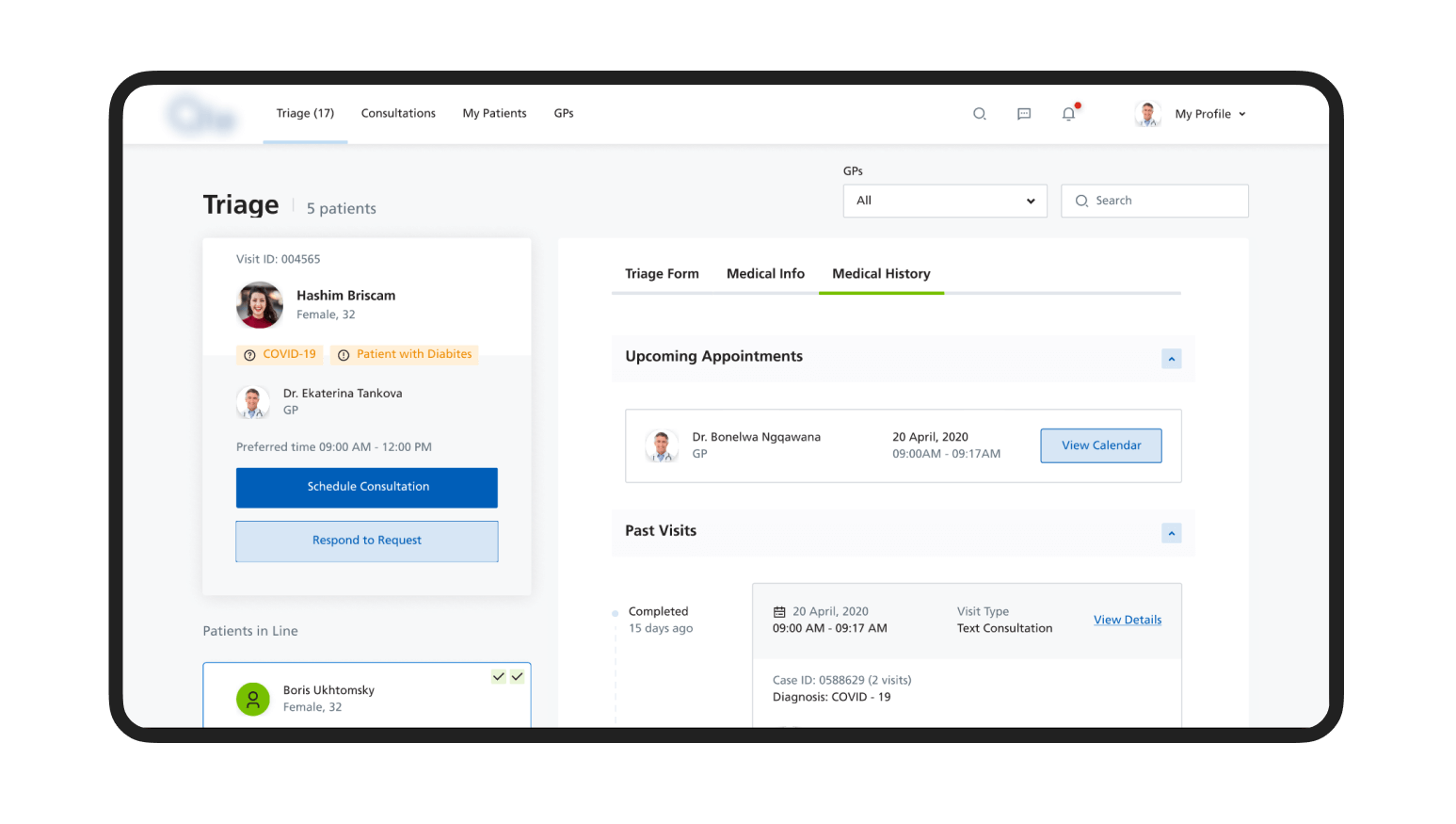
Food safety compliance encompasses more than just the crucial point during production. During the pandemic, chefs needed to be especially careful and strived for a way to guarantee the top quality of their dishes.
The app helps to ensure that nothing is left to chance, chaos is eliminated, all kitchen tasks are tracked, and the work gets done faster
Overview
A well-known French chef and proponent of food safety and HACCP compliance founded Qualizy. The startup aimed to connect food security and health. The app digitalizes safety management and provides enhanced functionality: checklists, audits, tracking expiry dates, and allergens.
However, the end-users did not utilize the application to its full potential, they only tracked tasks in kitchens and kept documentation organized. The client addressed Cieden to help improve the UX of the app, help Customers discover all the features and use them efficiently, along with creating new capabilities.
Benefits
- the client collected feedback from actual users of the product and used the findings to improve UX;
- Cieden team assisted in conducting deep competitor research and applying the findings to revamp the app;
- we helped to develop new features and design the logic of integration of the app with hardware devices;
- the app was launched during the peak of demand in food compliance apps;
Challenges
- technical limitations due to the existing code base;
- unique environment of app usage;
- main actor the app is a team of users;
- urgency of the release due to COVID pandemic;
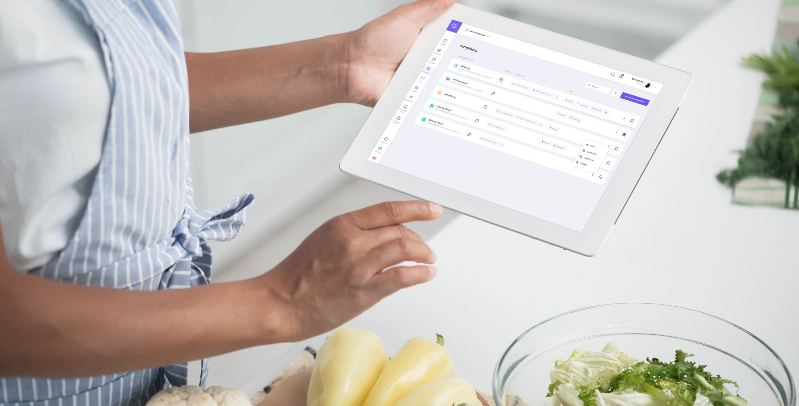
We designed an app that makes food safety and health digital while reaching operational supremacy.
Pixel-perfect design
A wide functionality is only a halfway point of digital product success. In order to really nail it, the design of both web and mobile versions should be pixel-perfect. In order to achieve that we assisted the customer in conducting market and user research.
Based on the findings of the UX research, we have determined how the interface can solve user pains and needs, and improve the UX of the existing website.
To create less friction for existing product users, we kept the same visual styles – colors, typography, and rounded input styles. However, we fully changed and improved page layouts, navigation throughout the platform, components, and their usage.
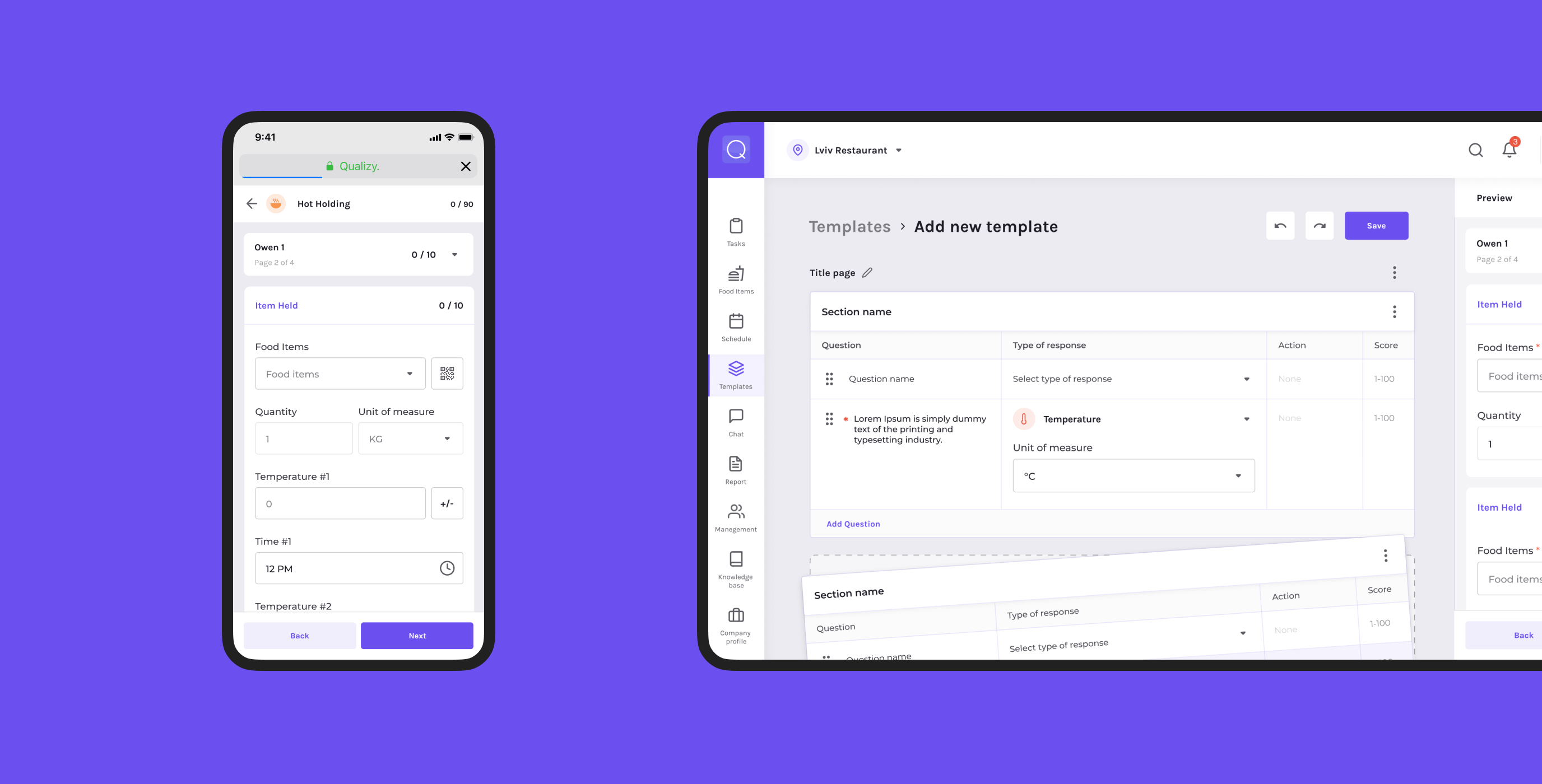
Creation of complex reports
We have developed comprehensive, easy-to-use reports that display meaningful information in the most clear and communicative way.
Convenient task management
The app helps teams effectively collaborate in real-time: create, assign, and track tasks and rapidly close the feedback loop.
The app allows continuous monitoring of all the required processes and keeping a finger on the pulse of every workflow.

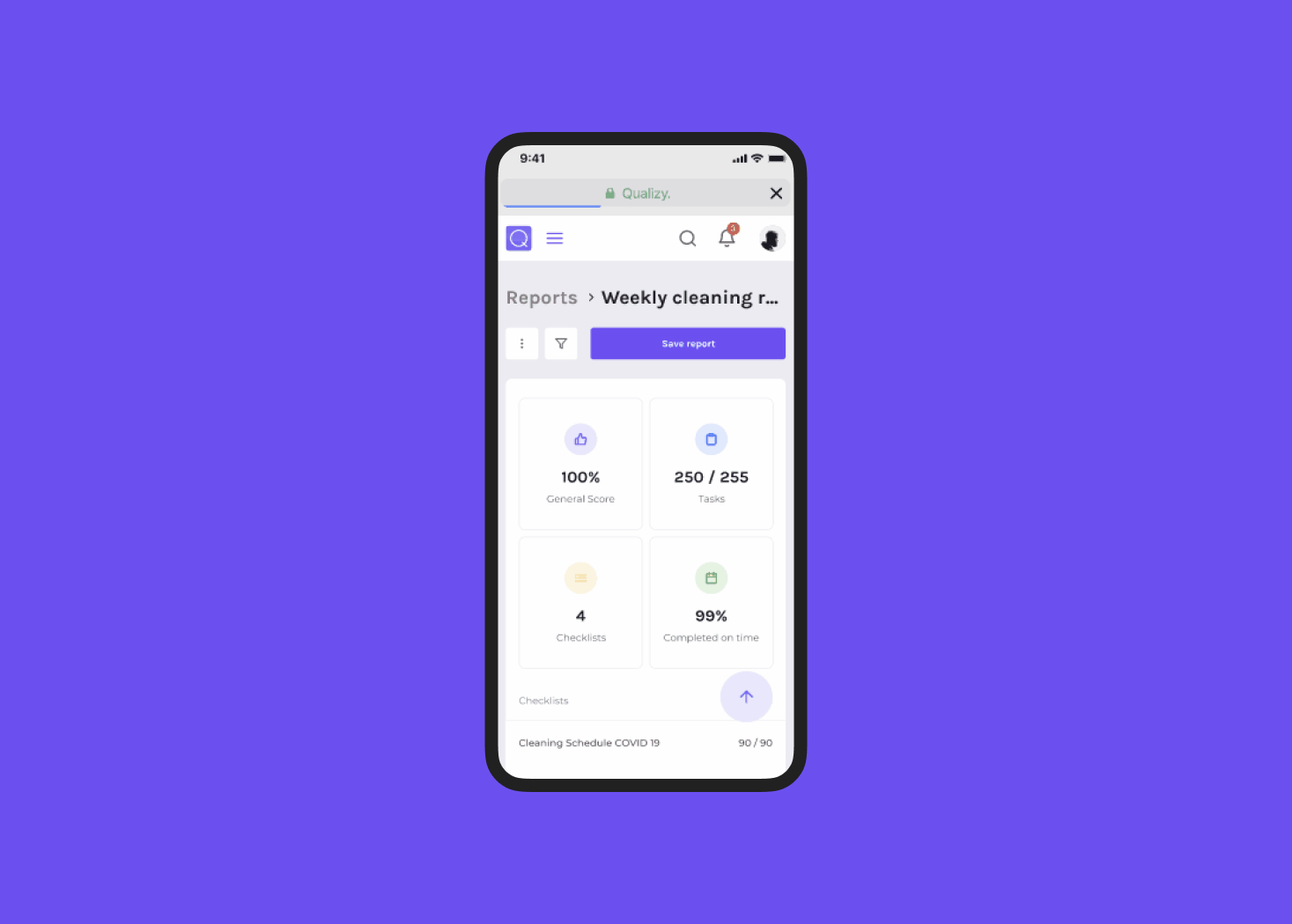

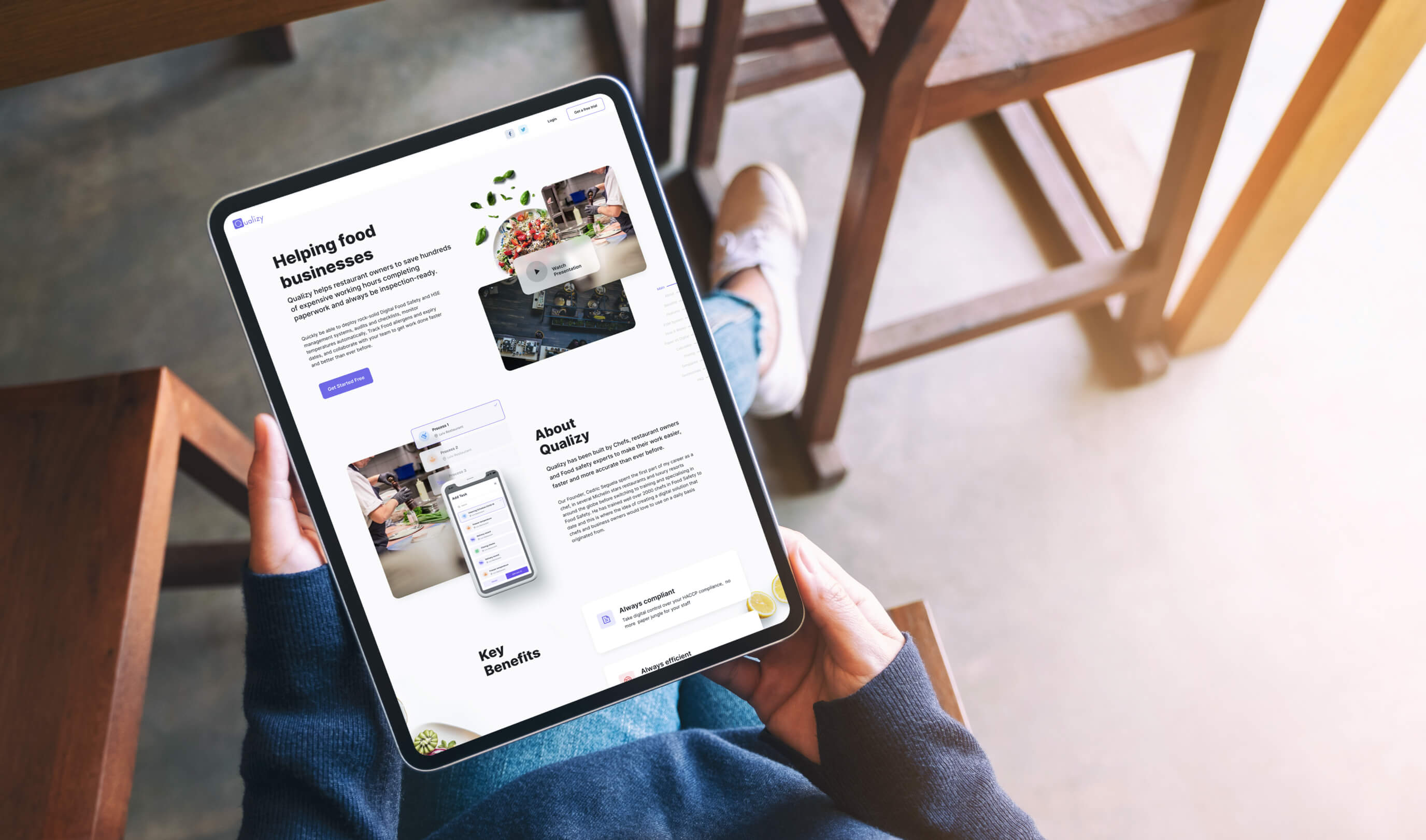
Landing page
In order to promote this product and gain new users, all features and capabilities needed to be properly communicated on the Product Landing page. The existing page was excessively text-heavy, poorly structured, and didn’t give a clear overview of what the product can do or what value it can provide. We made it simple and clear.
At Cieden we are sharp-focused on the efficiency, ease of use, and utility of every user interaction with an app.
Discovery Phase
Since this was a working product, our first step was to review existing functionality and audit the UX. We discovered that to launch the product quickly, Qualizy had been adapted with a preset framework for e-commerce applications. In many cases, this can lead to confusion and inappropriate controls usage.
After getting acquainted with the current functionality, we conducted competitor research to understand what approaches and patterns were being applied by direct competitors or other task tracking tools. We also considered the environment in which our target personas operated (Kitchen manager/owner of business and employee), what devices they typically used, and how frequently they were logging in tasks.
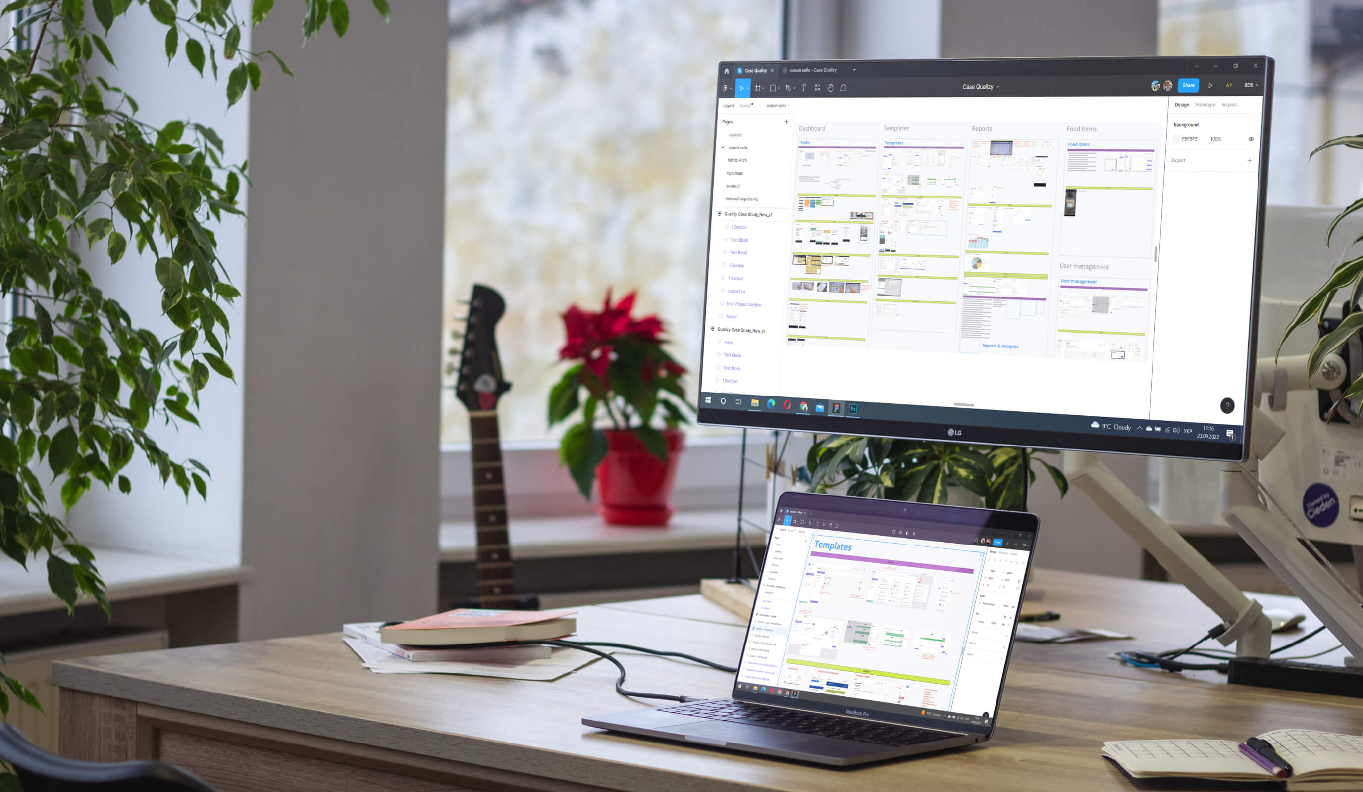
Competitor Research and IA
Despite the newness of the technology and the little-explored market, our client already had quite a few competitors. While most of them had different technological solutions, they all targeted the same customer segment and pursued similar business objectives.
To secure our client, we have researched both direct and indirect competitors to understand their edges and weaknesses, so that we could address a user's needs and pain points in a better way.
Documentation and Dev Support
Along with design source files, the Cieden team prepared supporting documentation. Its key deliverables included: a general system overview; user cases and user stories; roles/permission matrix; acceptance criteria; BPMN process diagrams; end-to-end user flows.
we reply under 24 hours.
free
session
