Project Plan
Team
2 UX/UI Designers, 1 Stakeholder
Duration
4 Months
Scope
120 screens for mobile app
Result
Design implemented in a functional product
Overview
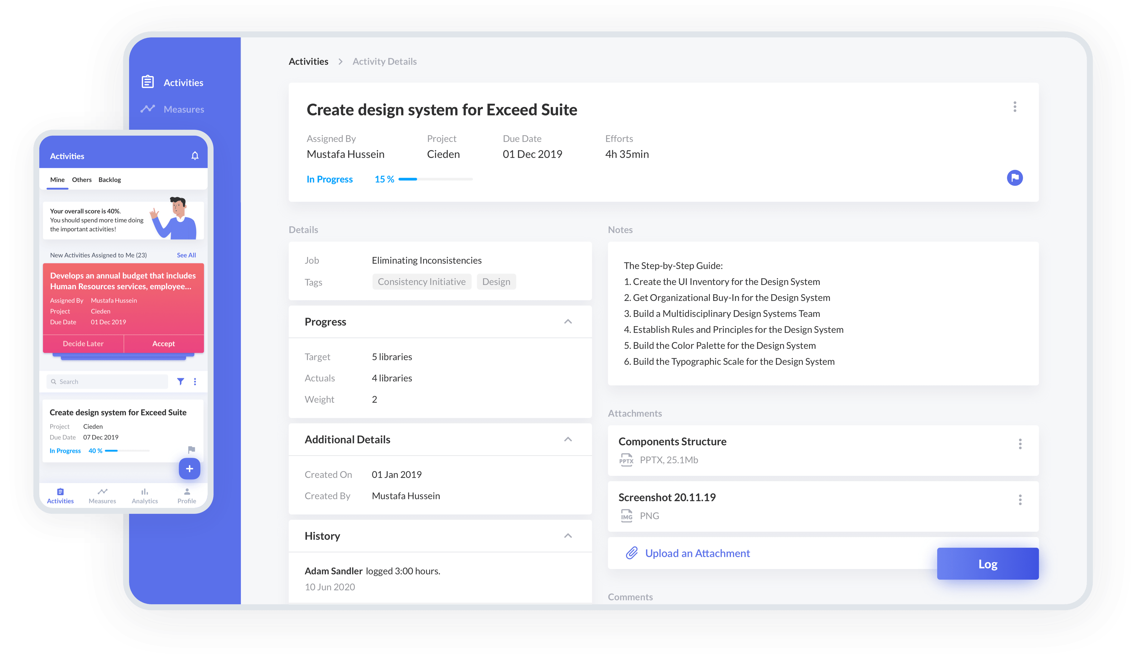
Manpower Investment Monitoring (MIM) is a task management system, created by Exceeders, which aims at increasing employee productivity by enabling effective performance management within a company.
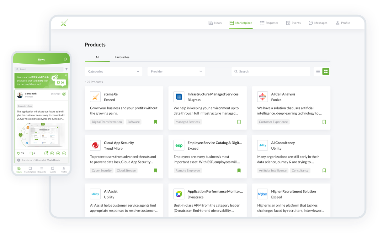
The system was initially developed as a separate product, and later it became one of the widgets for the advanced StemeXe application.
Our Approach:
- stakeholder interviews;
- usability testing;
- cross-platform;
- design QA of a live solution.
Benefits
- Client engagement
- Competitor research
- Access to end-users
- A design system that we previously created for whole Exceed suite products
Challenges
- A lot of restrictions from other systems
- Aim to create a fully flexible and customizable application
Step 1
Discovery Phase
At the discovery phase, we studied the organizational structure of Exceeders, as well as the dependencies of this application compared to the others within the company portfolio suite.
The company uses the well-known OKR framework in a slightly modified form. This has an impact on the reporting process and the approval of assignments. The Existing system served as a source of data for another company’s product, which was used to calculate employees’ effectiveness in relation to the department and company strategy.
Step 2
Wireframing
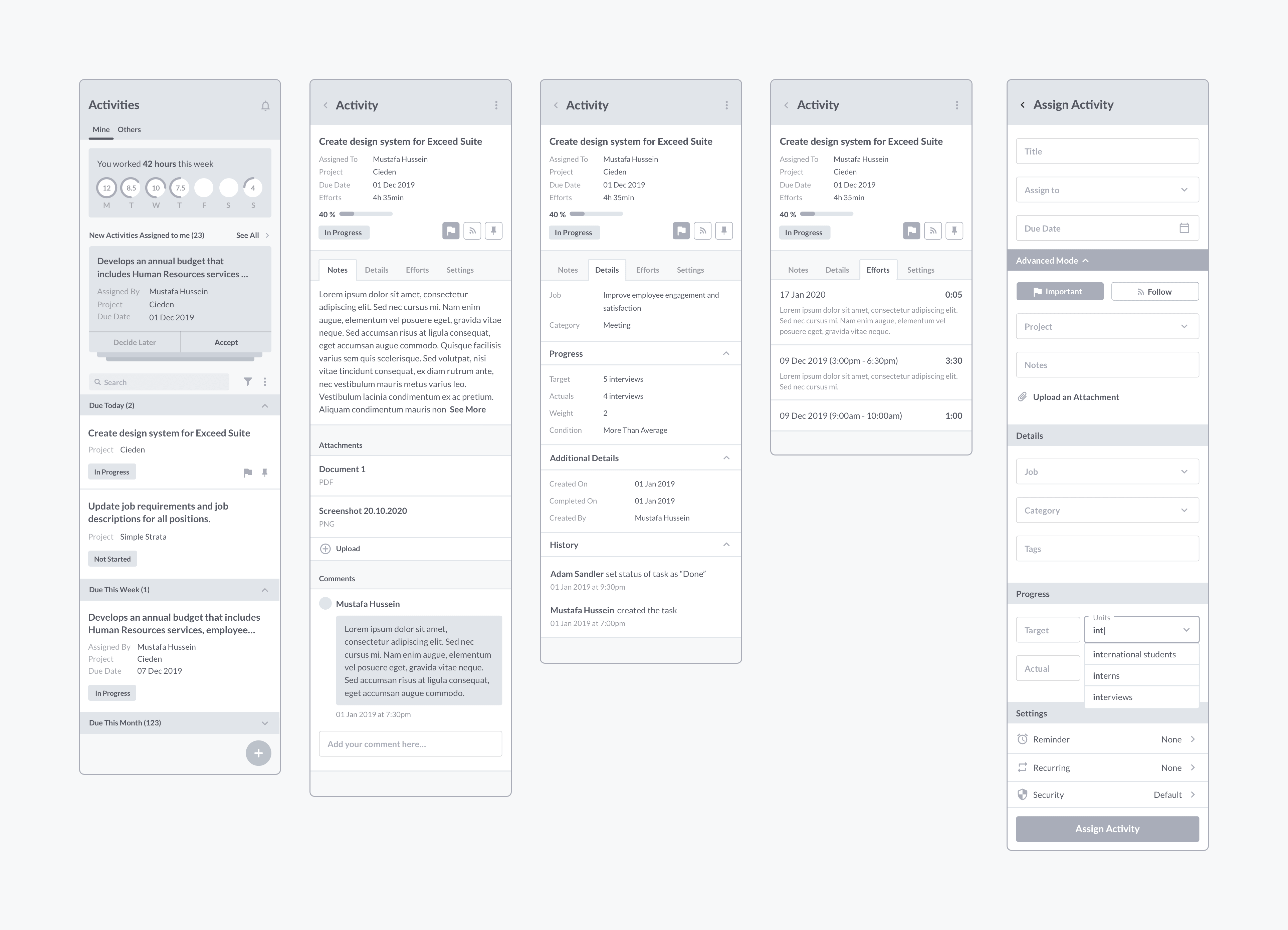
We started ideation from paper sketches and quickly moved to wireframes that we presented to the client. After the approval of our core structures, we created the whole flow ready to be validated by our target audience.
Step 3
User Testing
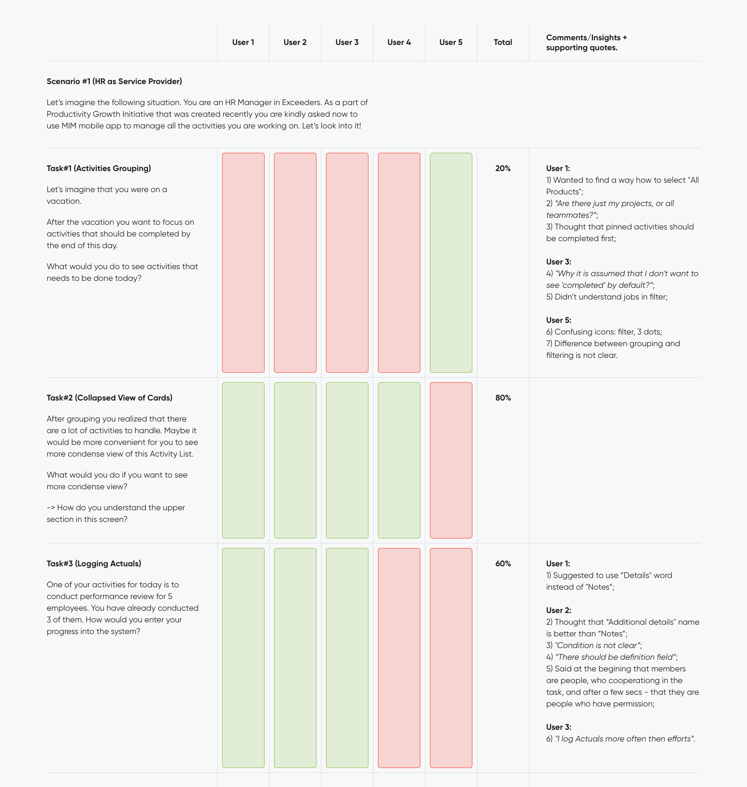
At this stage, we conducted remote moderated user testing with 5 real users (according to Norman Nielsen groups, this number of users detects 80% of all problems that occur in the system). This approach allowed us to catch design flaws in the early stages when changes have the lowest cost. After proper analysis, we sorted out all identified design problems according to their frequencies and importance within the system. This method allowed us to focus on tasks with the highest priority.
User Testing Pass Rate – 78%.
Step 4
UI Concept
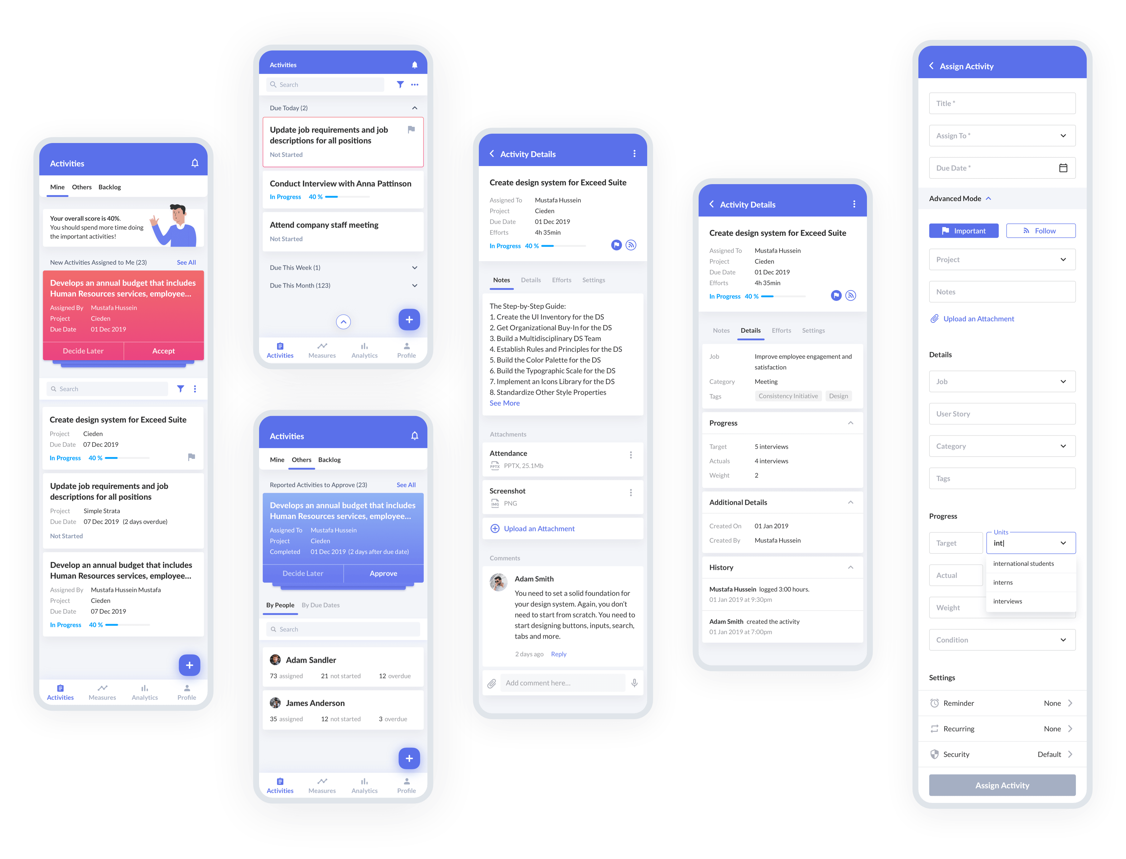
Cieden has already developed a design system for the Exceed application suite when designing the Exceeders app. Therefore, elements such as icons, fonts, and all sorts of fields were reused. Considering the mentioned limitations, we have created the following visual style of the product.
Step 5
Module Customization for Different Systems
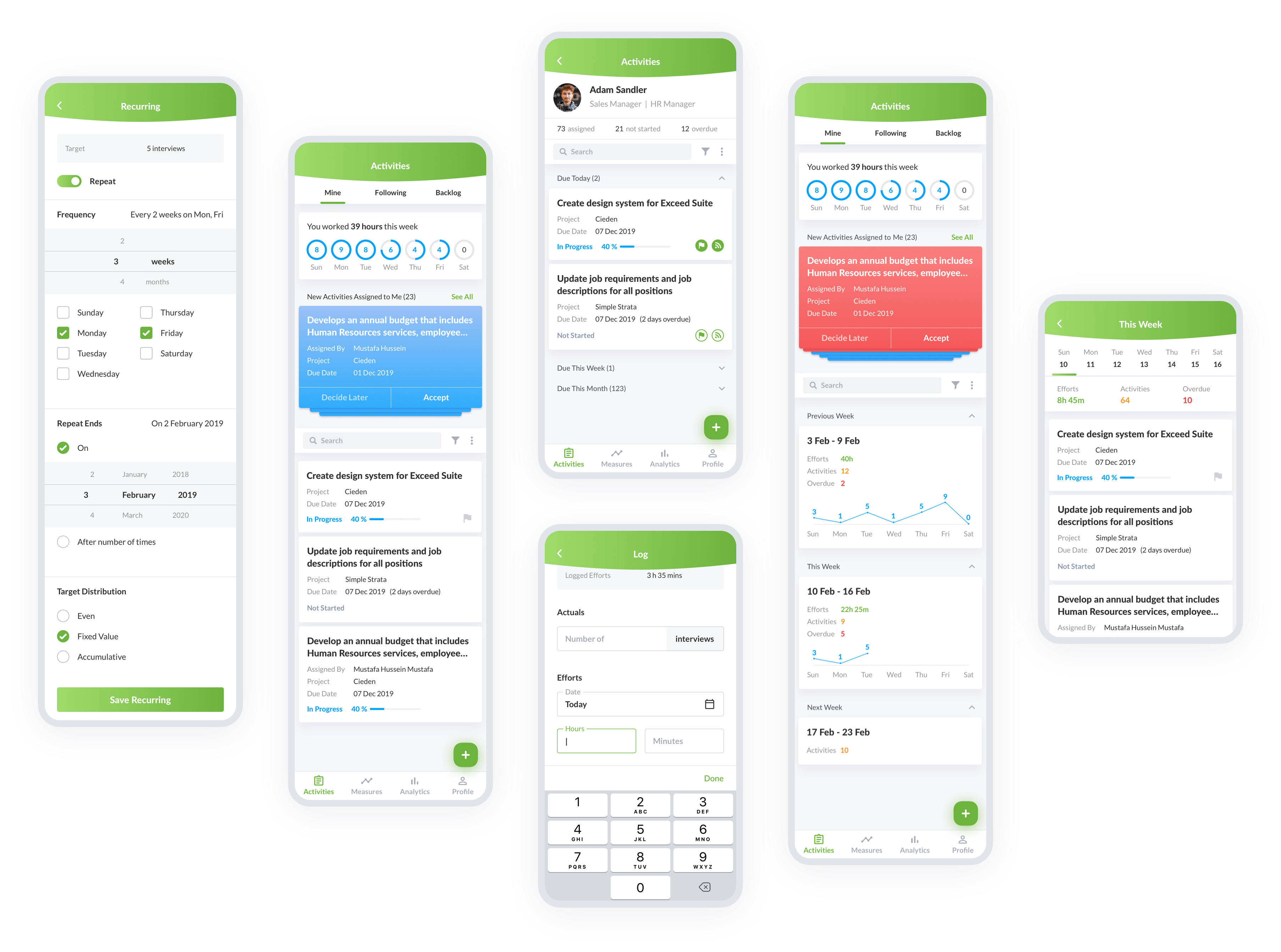
Subsequently, the MIM system was built into the StemeXe application. For this reason, it was necessary to apply a different style.
Step 6
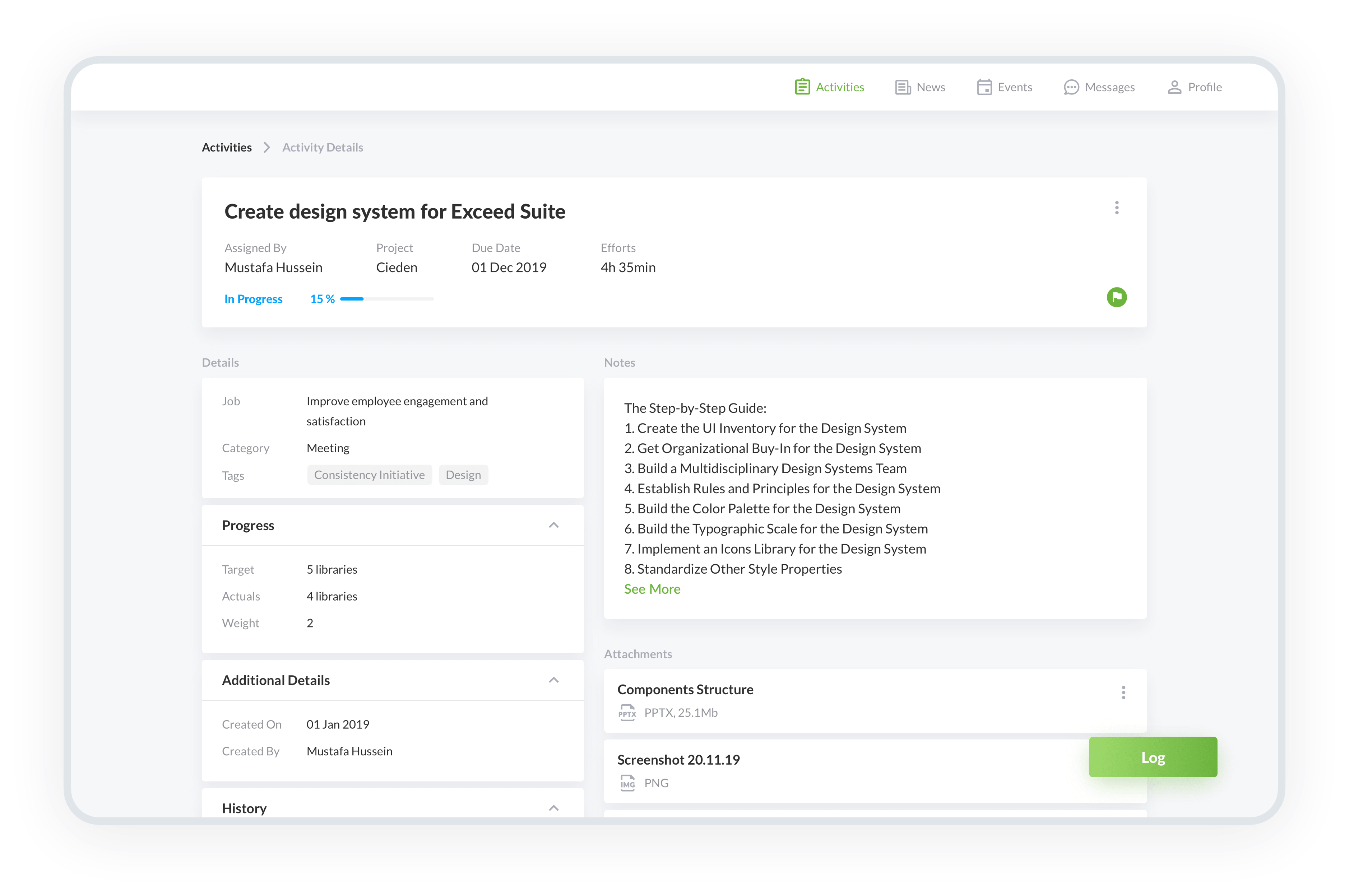
Web Design
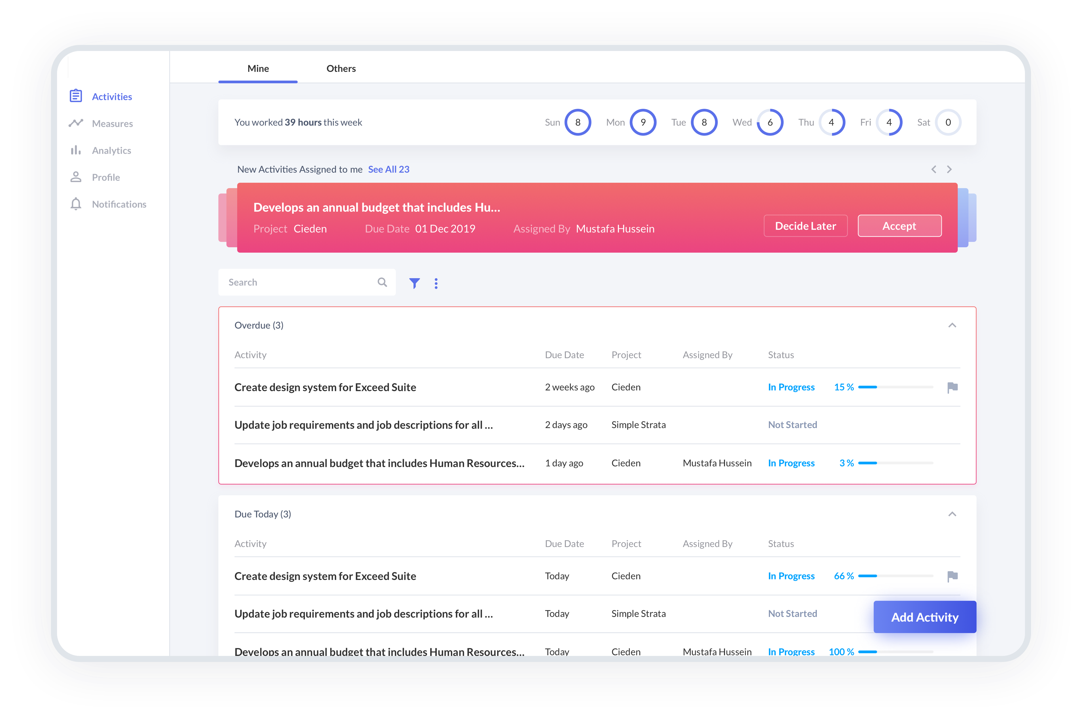
We started from the mobile-first approach and later on designed the web version of the app.

Step 7
Dev Support
The approval of the design is only the halfway point to a successful result. Cieden maintains constant communication with programmers to give a clear picture of how the design should work. Additionally, we conducted several design Q&A sessions to indicate potential issues that could arise during the implementation phase.
we reply under 24 hours.
free
session

