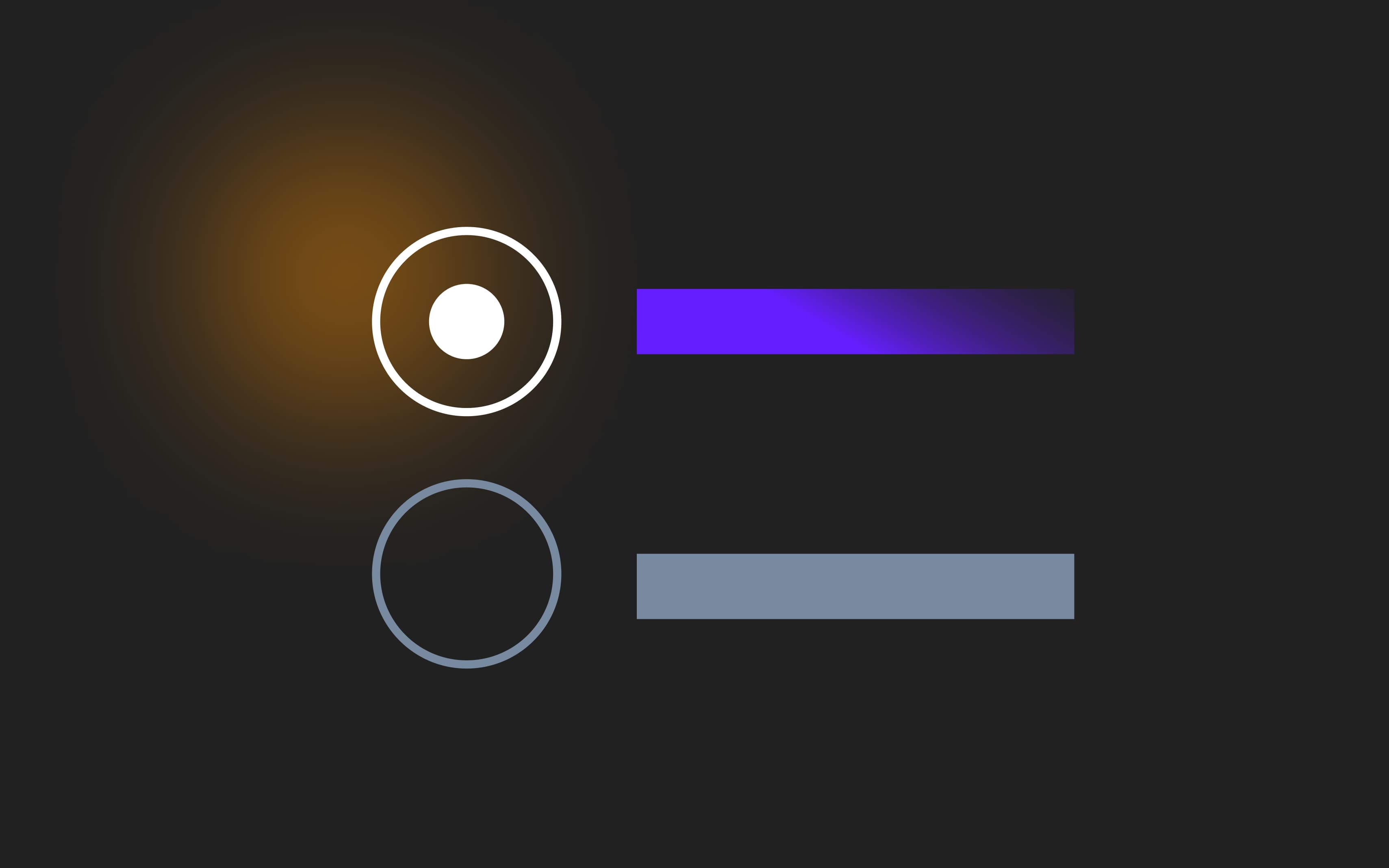
A traditional radio button typically has two common states: default (unselected) and selected. But there are also other states like disabled, hover, and focus. They’re optional, but they might make interacting with the button feel smoother. Explore which states are essential, how to implement them effectively, and improve accessibility and usability in your design.
17 Dec, 2024


