Project Plan
Task
Turn an idea into a functional product through design, marketing, and product management
Team
2 UX/UI Designers, 1 Product Marketer, Project Manager
Duration
January 2019 - present
Scope
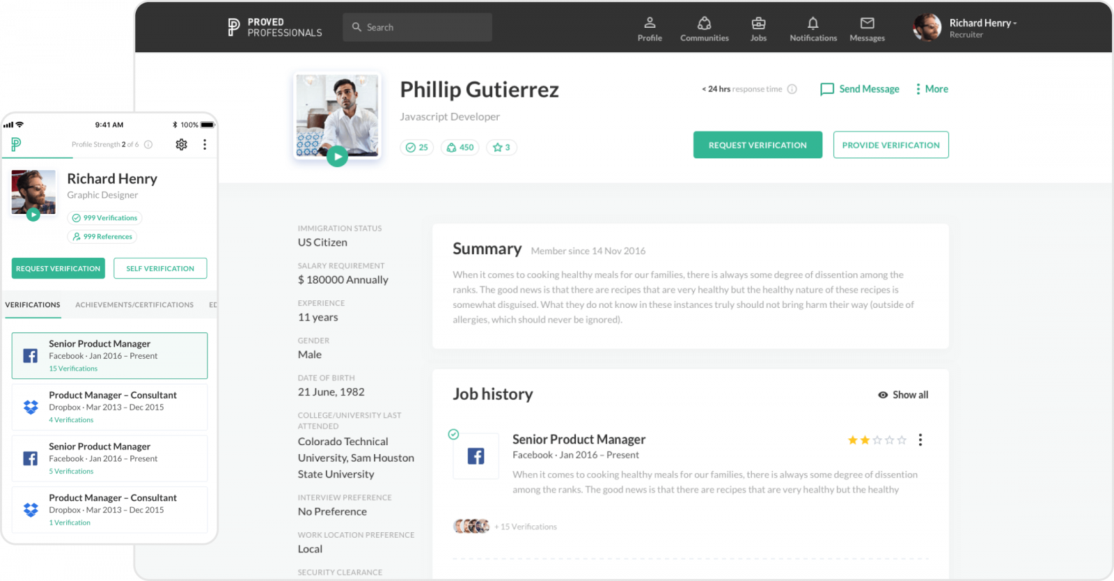
Designing a fully functional web application and its mobile version for both iOS and Android. Marketing the app pre- and post-launch
Result
A fully functional web and mobile design
Overview
Our customer approached us with nothing more but an idea to build a B2B recruiting app and a very rough-coded prototype. As exciting as our customer’s vision was, it lacked deep marketing and design understanding of its implementation. That’s where Cieden came in.
Empowered with marketing and product research, we turned an idea into a comprehensive, actionable plan to design, launch, and market the product and then executed it.
Benefits
- Ownership over design and marketing processes
- Close communication with the client
- Ability to iterate and pivot
- Access to end-users
Challenges
- Working with legacy designs
- Working with a first-time start-up founder
- Fleshing out the product vision on the go
Step 1
Auditing the state of play
As mentioned before, while approaching us for help our client already had a rough launched web app. In the app’s earliest stages, the functionality was modest and built around our customers’ initial assumptions on the users’ problems.
The UX/UI Design wasn’t a priority for the first launch, so even without thorough user research, we’ve identified a number of usability issues. Another issue that we immediately brought attention to is the lack of research to indicate a potential product-market fit.
Having thoroughly documented our concerns, we’ve defined and documented them, thereby creating a short-term roadmap to kick things off the right way. The very first thing we, as design and marketing experts, did is talk to the end-users.
Step 2
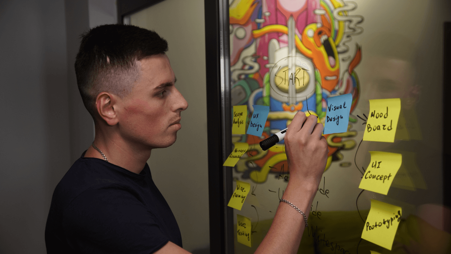
Customer Interviews
Interviewing potential customers has been eye-opening in terms of the product features and their importance for both us and most importantly our client. Based on the insights we gathered, we’ve significantly changed our idea of what our users considered valuable and what needs to be built first.
We can’t go into explicit detail about this but let us just say that if we went with our initial idea, we would have ended up with a fraction of the user base we managed to gather.
Go-to-market plan & UX Strategy
Now that we have validated the problem product solves, there’s no better time to plan from the standpoint of the two facets of our expertise: marketing and design intelligence. Working in parallel with our designers, the marketing team developed a thorough go-to-market plan outlining the following aspects of the app’s launch:
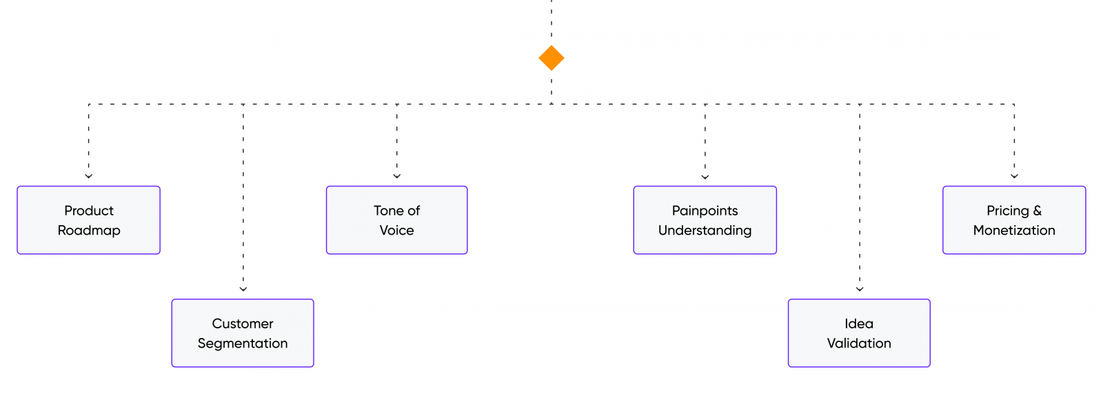
In the meantime, our designers were busy developing a UX strategy. This task entailed aligning the business strategy, user needs, and technical capabilities. This document articulates the brand experience and its guiding principles, while also supporting the long-term vision of the app.
Having both marketers and designers on board made wonders for us in terms of creating a cohesive and consistent brand experience. At that point, we already had a somewhat fleshed-out picture of the end-product in mind. That’s what enabled our design team to move on to the information architecture development and wireframing.
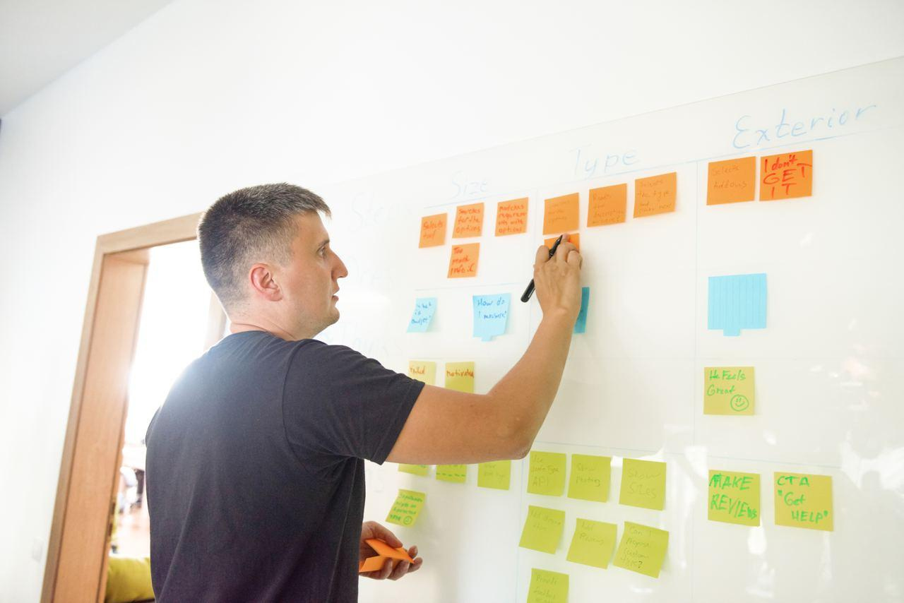
Wireframes & Information Architecture
One of the deliverables of our prior research was documenting the features that should make it into the MVP. Having these features at our disposal, we’ve proceeded with mapping them into a cohesive app structure, aka Information Architecture. This helped us further validate the logic behind these features and their interactions.
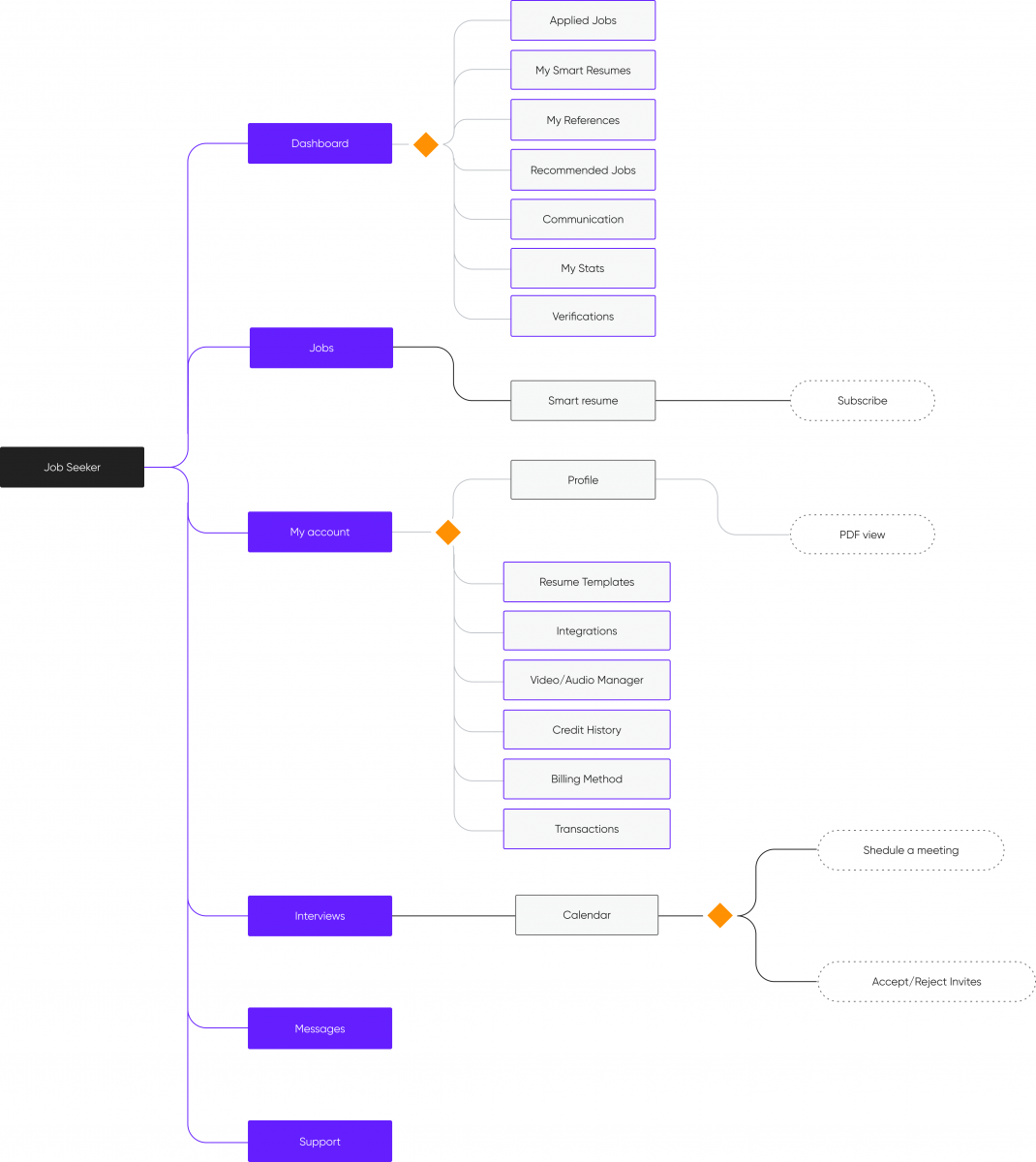
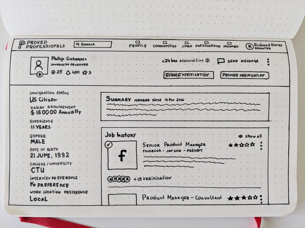
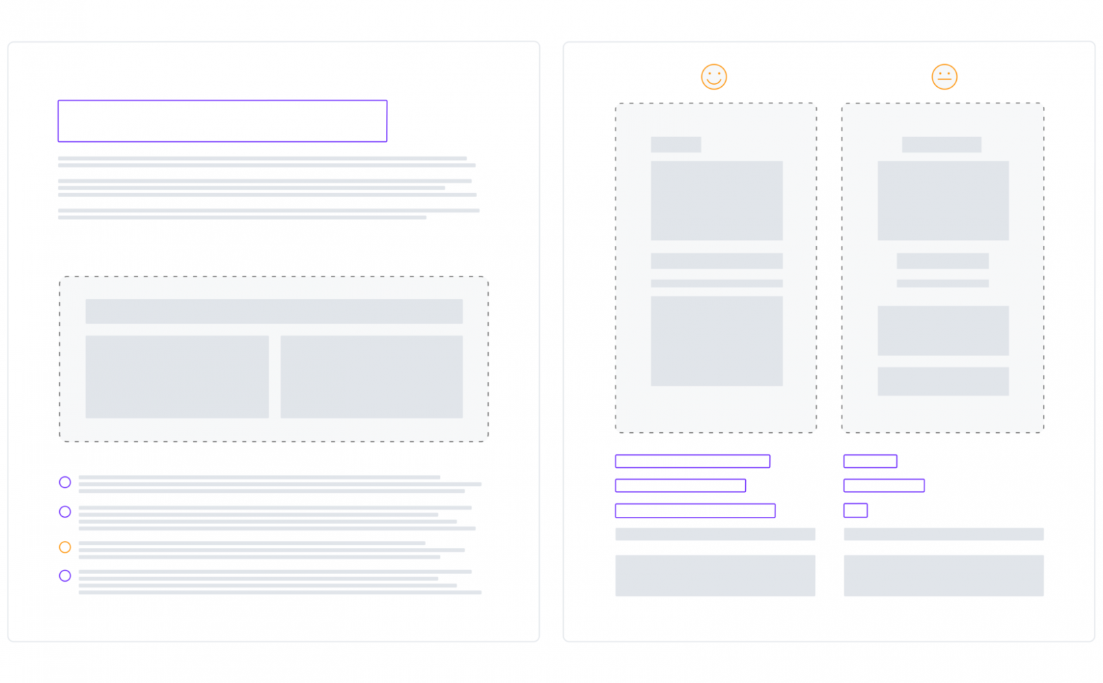
Once we’ve settled on the optimal app architecture, we then developed rough versions of the design. This stage is most commonly referred to as wireframing. The key reason one would ever spend time on wireframing is to pinpoint the usability weaknesses as early as possible. That way all it takes is a few clicks to fix, which would otherwise have taken much-much longer had the design been live.
The second major reason to develop wireframes is to have an early app prototype, which allowed us to further validate the app idea and its potential execution through usability testing.
Usability Testing
Testing our wireframes is one of the most exciting project phases. This is when we get to either support our design assumptions with tangible user feedback or discard them.
In order to validate our designs, and not have developers spend time coding them, we turned the wireframes into no-code clickable prototypes. Such an approach is yet another way to maximize outcomes with as little effort as possible.
The usability testing sessions have yielded plenty of insights into what our users thought was useful and usable. It took a few iterations until we arrived at the design version that passed the usability testing with flying colors.
High-Fi Design
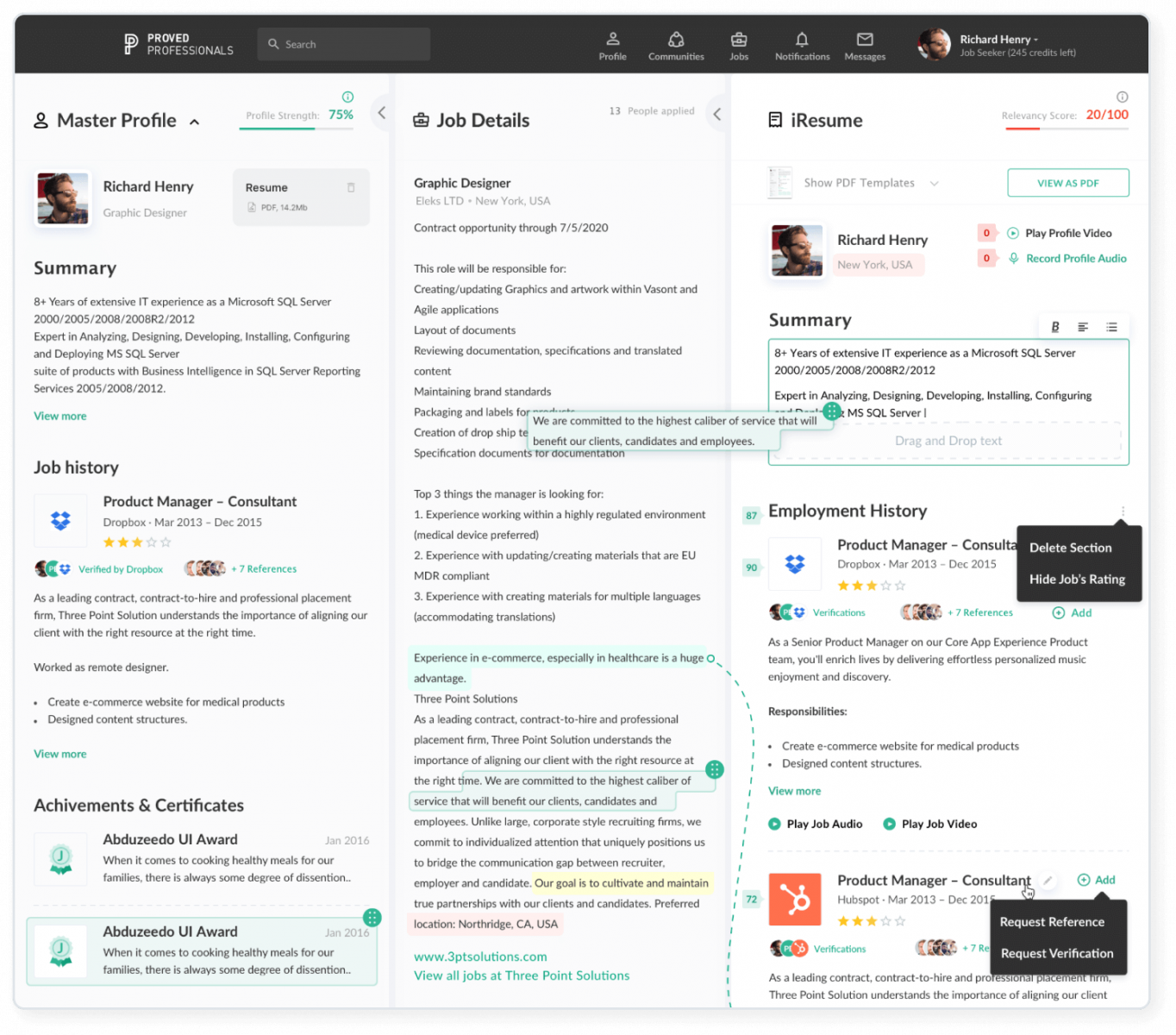
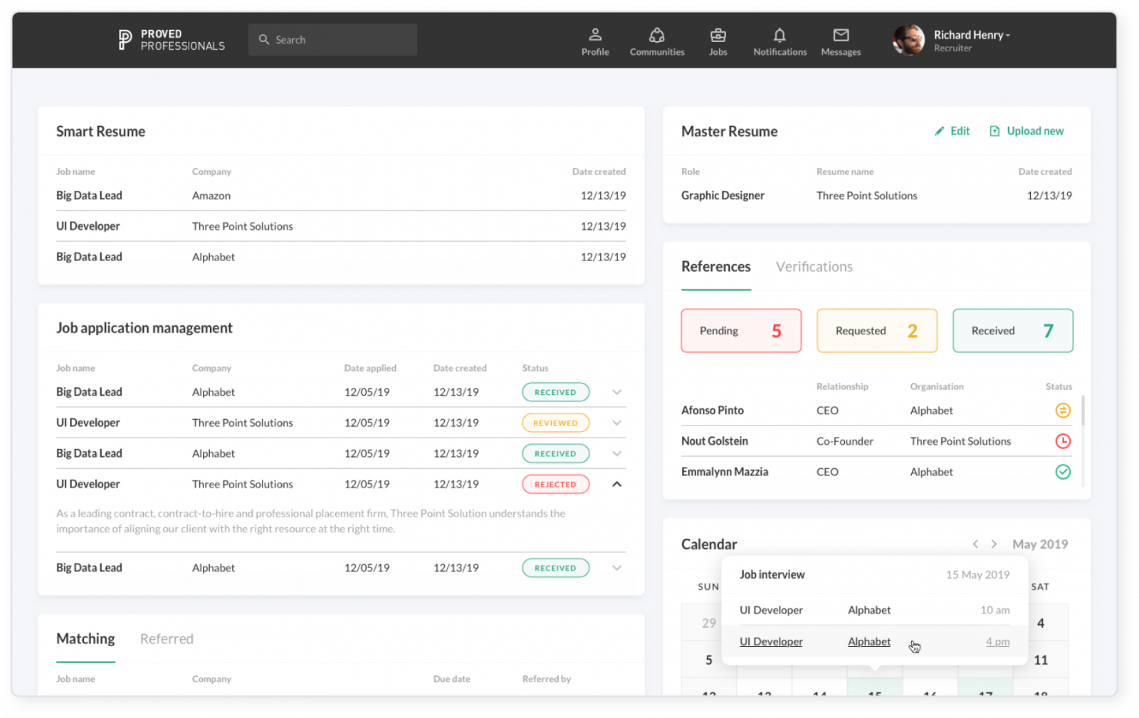
Once we settled on the optimal wireframe design, the next step to take was making these look as attractive as possible. That’s what we did. We hope that the UI designs below speak for themselves.
Launch
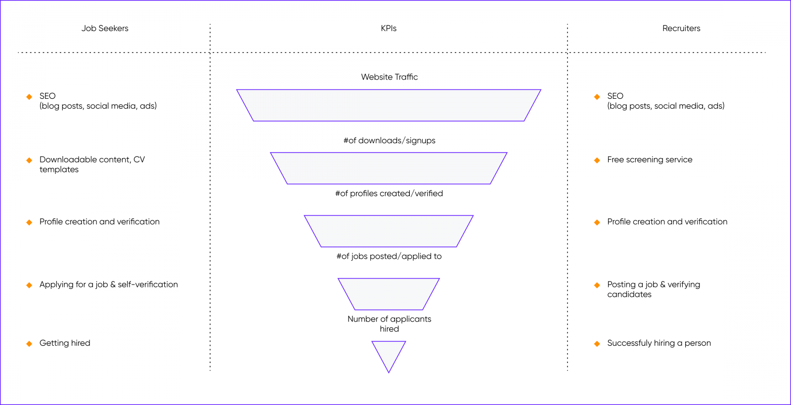
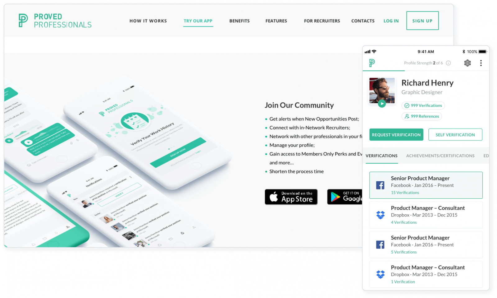
What an exciting time it was. The product of our efforts finally hit the market. For us, as marketing and design experts, it meant a number of things. For starters, we could finally collect quantitative data on our new design. One of the approaches we adopted is visualizing the job seekers’ and recruiters’ paths through the platform as a funnel.
The other data mining tools we used include:
Google Analytics
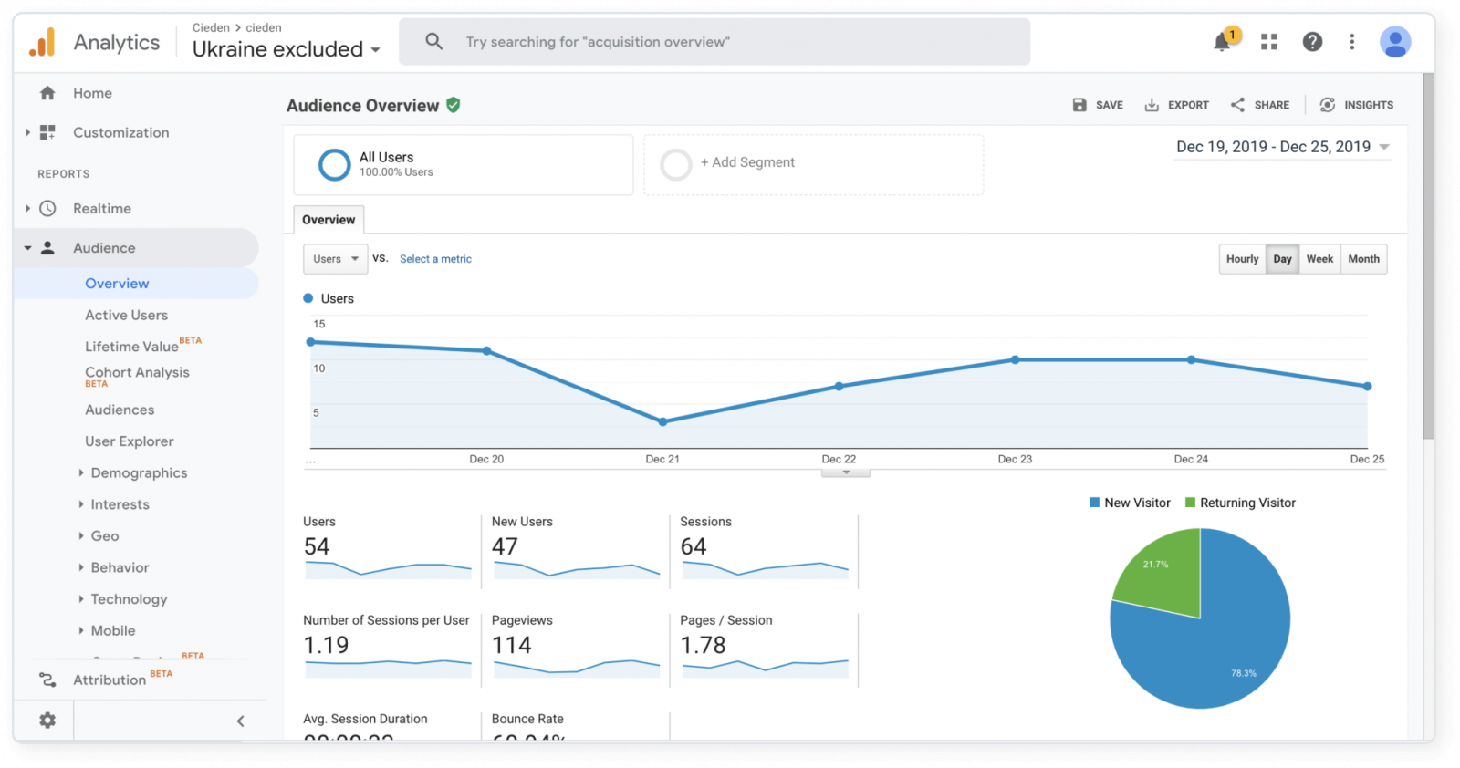
Having set up our marketing activities, we started to dig deep into what works and what doesn’t. Google Analytics is an invaluable tool that does just that.
The insights we gathered from this instrument were critical for helping us see major patterns in our customers’ behavior. Not only that, but it also pinpointed areas where our traffic bottlenecks, thereby shifting our focus to the essential things to tweak.
Mix Panel
MixPanel is yet another tool that helps build our understanding of users’ behavior. Thanks to this instrument, we uncovered in-app areas of improvement that resulted in leads’ drop-offs.
What makes MixPanel especially critical is that it enables us to see the whole user journey from a stranger to a loyal customer, a priceless insight for every marketer and product manager.
Social Media Ads and Analytics
Having started being active on social media, thereby experimenting with different formats, styles, and channels, we started tracking user engagement metrics such as likes, comments, shares, etc.
It helped us see which posts perform best, and therefore tweak our strategic social media planning.
Iterate, Pivot, Rinse & Repeat
Remember the qualitative data we mentioned in the last section? Well, we’re certainly happy we tracked things. A few weeks after the launch, we arrived at a conclusion that the users weren’t sticking with the product as long as we had hoped. Another round of research led us to believe that we needed more features that create value in the longer term.
Remember all of the stages we’ve outlined starting from the information architecture up to the launch? It’s time for a repetition drill. This time, however, we’re armed with even more information on the market and the end-users.
In addition, in an effort to go the extra mile, we’ve also involved our trusted partner who consults start-ups that pursue investment and product-market-fit. On the picture below, you can see a Gannt chart outlining the plan we devised for a 360° product audit.
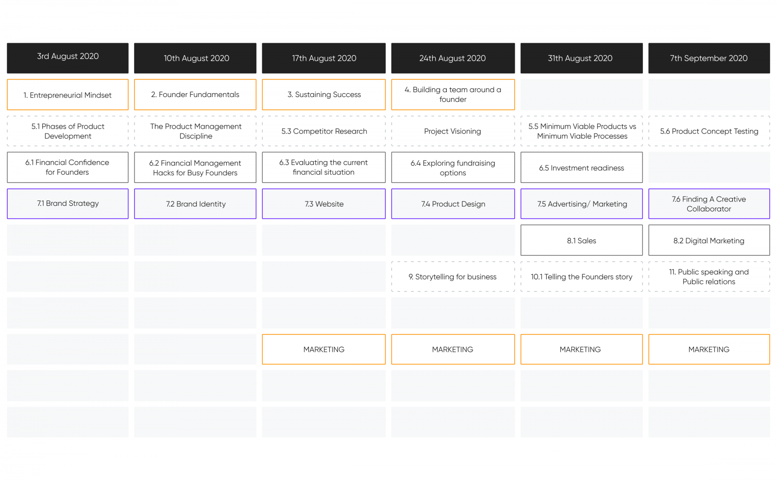
It’s worth mentioning that we identified both minor and major issues in the product as a whole. The latter is understandable since ventures typically take about 3 years to get to the level of maturity that they begin to experience rapid growth. Success takes time. Pursuing to hit the nail in the head in the first iteration, founders often overlook major product flaws. Ignoring these issues usually results in launching dozens of times and flatlining.
The approach we took was:
- Clarify their product strategy & go-to-market strategy
- Identify the killer features & market position the product would take
- Help select/construct a Go-To-Market team by appointing more advisors to help shape the product & venture
- Build out paths to market & to investors
- Help define the Objectives & Key Results of ProvenBase’s go-to-market effort
The result was:
- A much cleaner, more market-aligned, lower friction product
- A far superior venture team, capable of successful execution
- A fully elaborated, competitive business model
- An investable venture for Seed Round
- A lot of abortive works were avoided as a result of receiving proper advisory
To be continued
This is where our journey is currently at and although it’s far from being over, we couldn’t help but share such an awesome project with the world! We’ll make sure to keep you updated on any further developments.
we reply under 24 hours.
free
session


