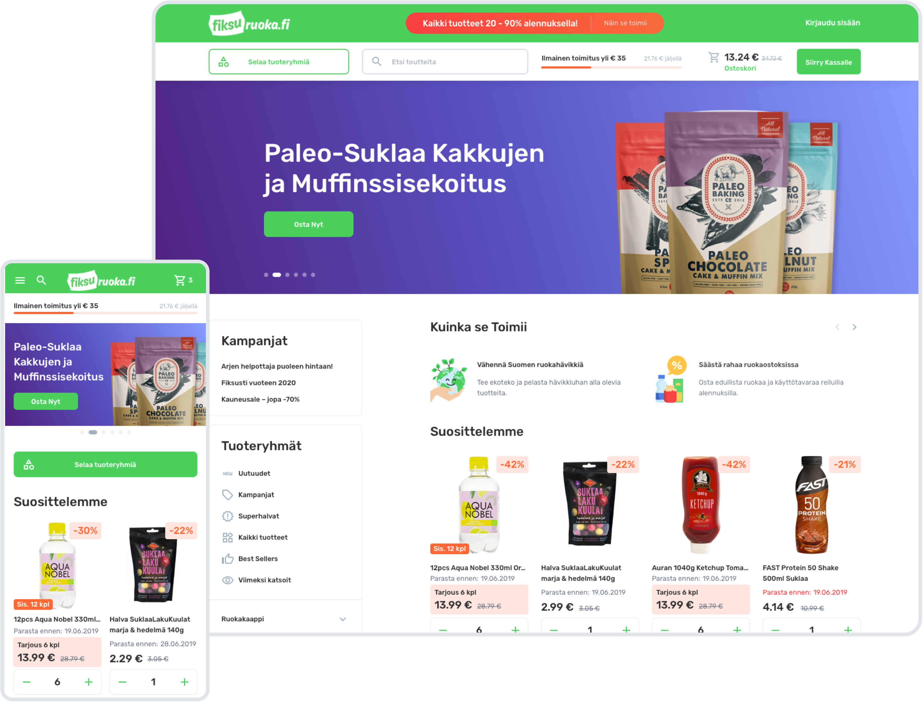
Project Plan
Task
Improve e-commerce user experience and reduce the average time spent before checkout
Team
3 Marketers, 1 UX Designer, 1 UI Designer
Duration
5 months
Scope
322 hours, 42 web screens, 45 mobile screens, custom icons and illustrations
Result
The design was implemented as a functional product
Overview
EU food regulations are very strict with product expiration dates, which has led to numerous European supermarket chains throwing out food several days early in order to be safe.
Noticing this needless waste and a solid business opportunity, the Finnish food chain Fiksuruoka stepped in. Now, through the platform that Fiksuruoka created, both eco-conscious and budget-conscious shoppers have the unique possibility to order soon-to-expire food at much cheaper prices.
Even better – it can be delivered to any city in Finland. However, the company needed help refreshing the flows and visuals on their platform, and we at Cieden were more than happy to help. After all, we were particularly excited to work on another ecological product that helps us feel like we are contributing to a bigger cause.
Benefits
- Responsive and professional marketing team on the client’s side
- Clear vision and requirements
- Cooperative environment
- Thorough user testing on the client’s side
- Assisting a company with a noble cause
Challenges
- Original interface is exclusively in Finnish
- Need to simplify exisitng checkout flow
- Integrate gamification
- Conduct user testing
STEP 1
Stakeholder Interview and Requirements Elicitation
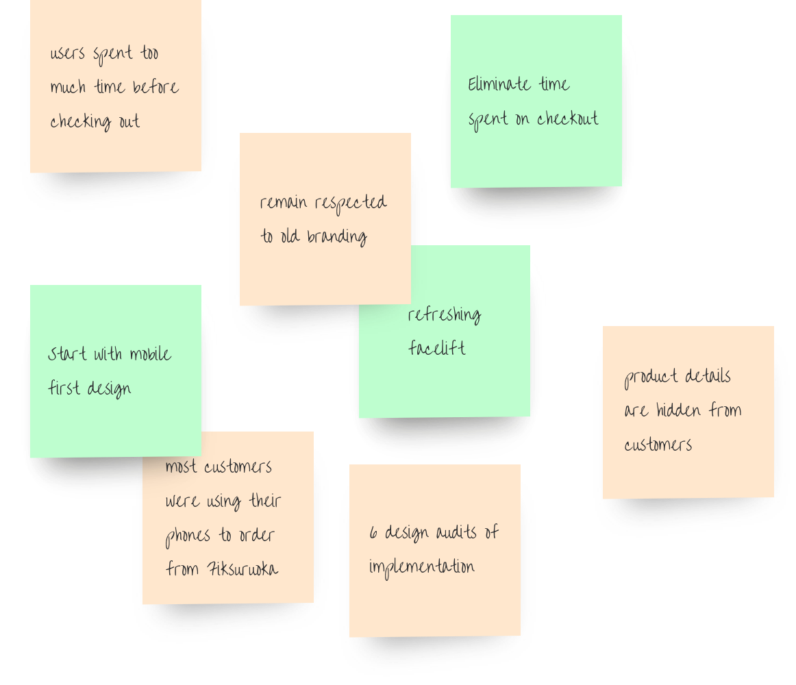
Our design team was lucky to work with the marketing department on the client’s side. Riku, Lauri, and Henni had already conducted user and marketing research, which led to very clear requirements and KPI’s.
The results from their user testing were conclusive: for our first stage, we were going to focus on three main areas:
- The largest issue to address was the fact that average customers spent too much time on the website before checking out.
- User engagement research showed that most customers were using their phones to order from Fiksuruoka, which meant our redesign would have to be mobile-first.
- Finally, the company was hoping for a refreshing facelift on the UI and general visuals.
- Conducted 6 design audits of the implementation.
STEP 2
Wireframes
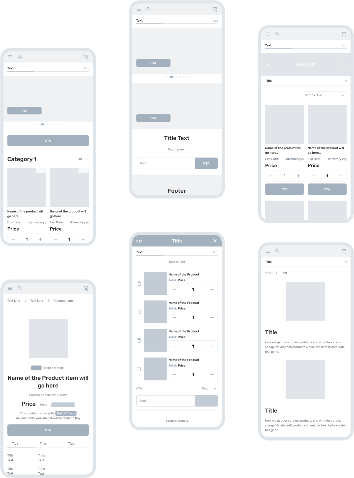
Our first step was to conduct a UX audit together with the marketing team.
Insights from this exercise were combined with the additional supplementary research that the team had conducted. As a result, Fiksu’s marketing specialists were able to provide their first product reenvisioning in the form of sketched wireframes. These wireframes followed the requirements for a mobile-first approach, which we absolutely supported.
And, since we saw that many people use Fiksuruoka on the go, or simply prefer mobile phones to big screens, we wanted to focus our efforts on satisfying those needs first.
STEP 3
UI Concept
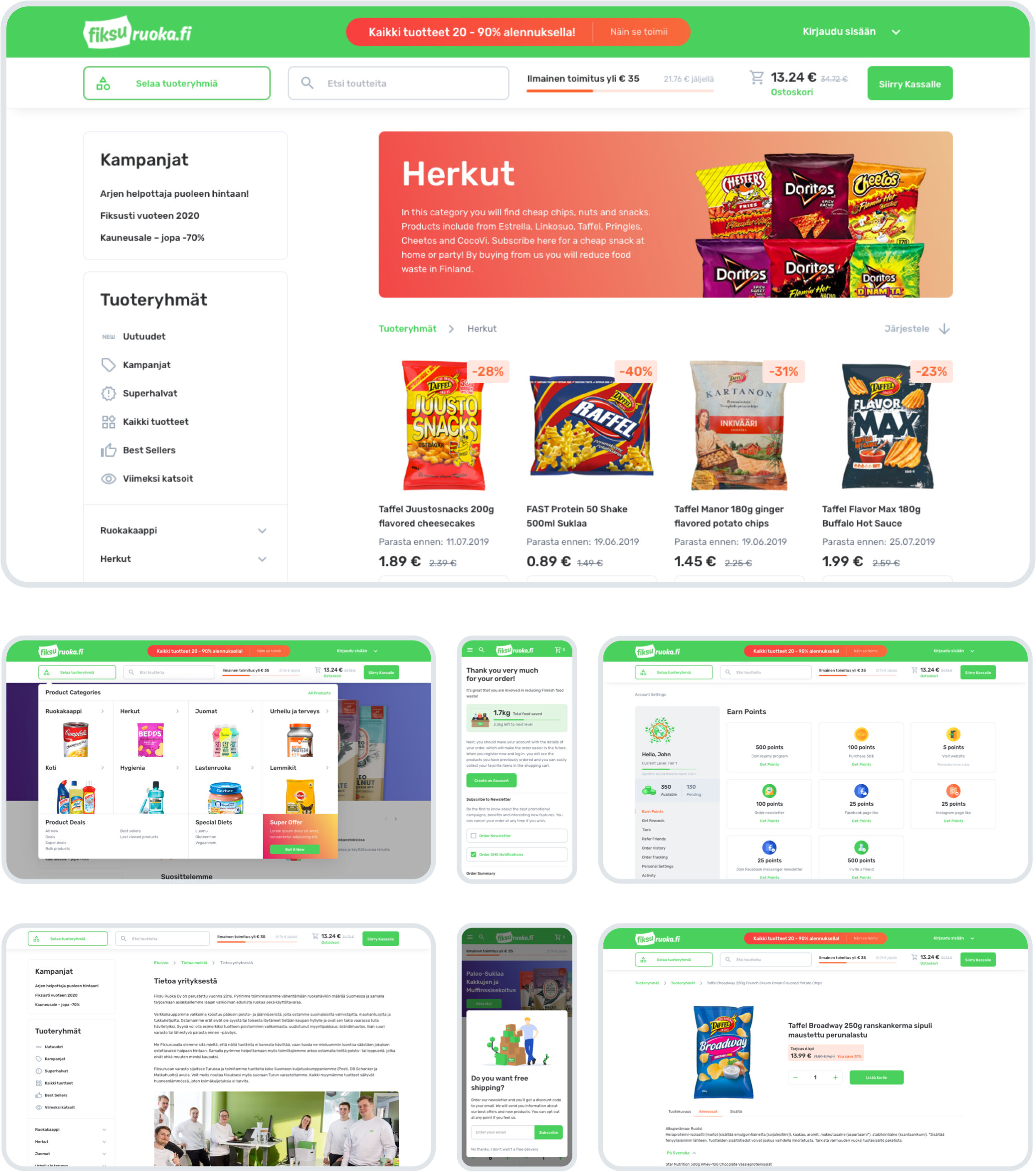
In order to give the website a cleaner look, we came up with a fresh UI concept that respected the old branding, in order to remain easily recognizable by the loyal customers, while making sure that it would appeal more broadly to newcomers.
Along the road, we added colorful gradients, secondary accent colors, and colorful illustrations. This approach gave the website a friendly and joyful appeal, which very much aligned with the branding strategy.
Main Design Challenges
Below are some of the project’s unique challenges we were happy to take on.
1.
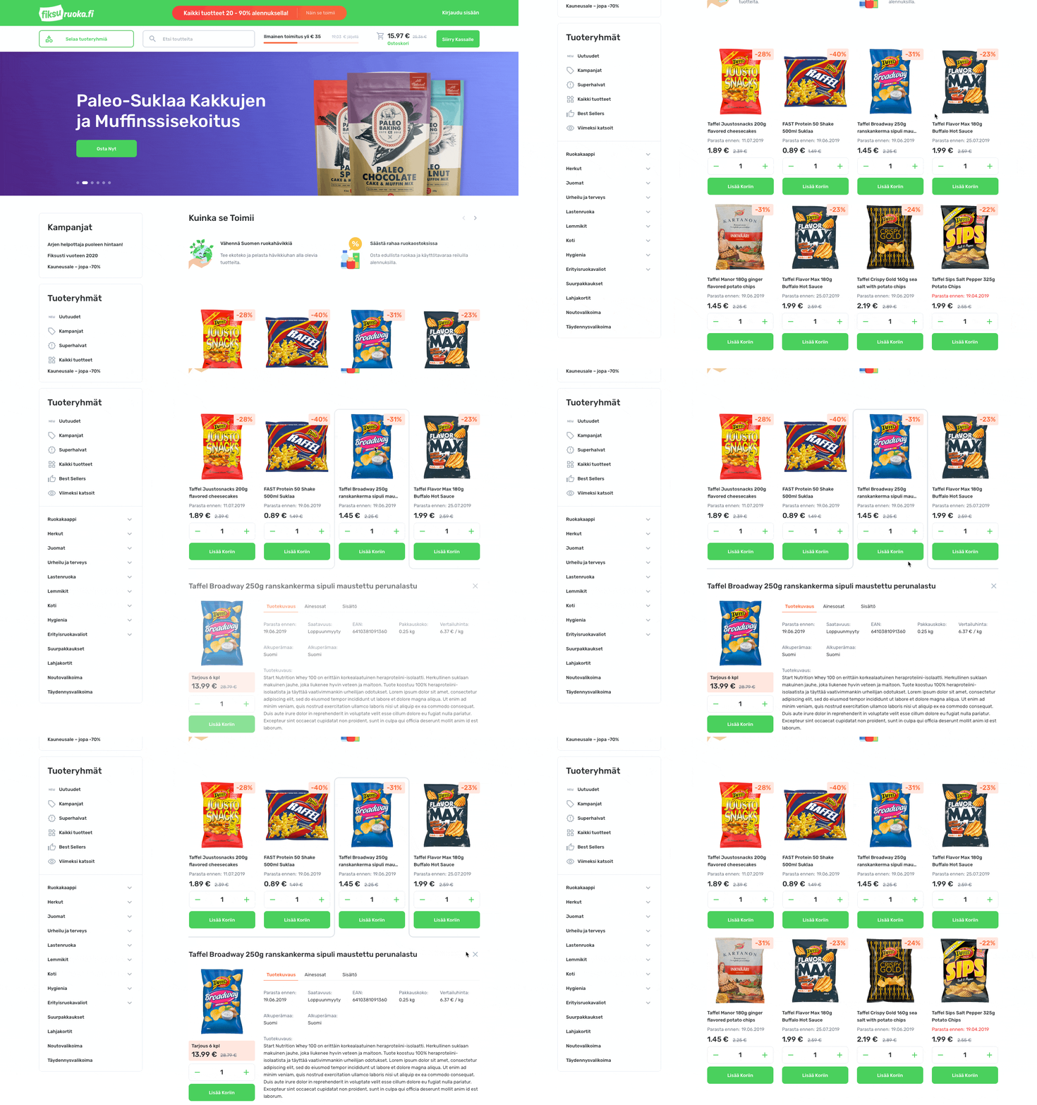
The product details information was hidden on a separate page, which needed more clicks for the user to view them.
Thus, in order to eliminate the number of clicks needed to research and buy a product, we allowed for the product details to expand within the listing instead of directing the user to a new page.
2.
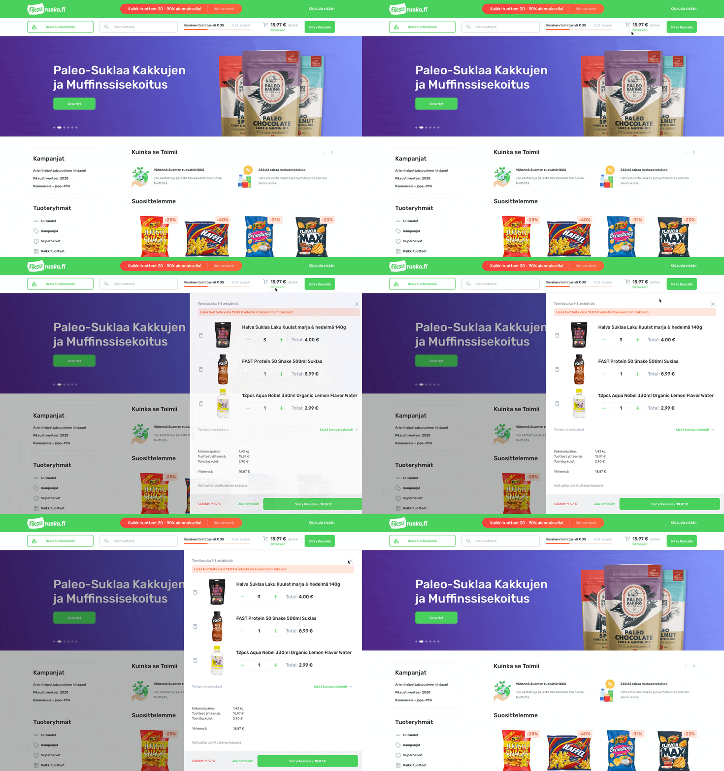
The checkout process was simple unless the user needed to edit their shopping cart. To simplify the existing flow, we designed the shopping cart to be editable via its own slide-out panel. This move vastly simplified the overall process.
3.
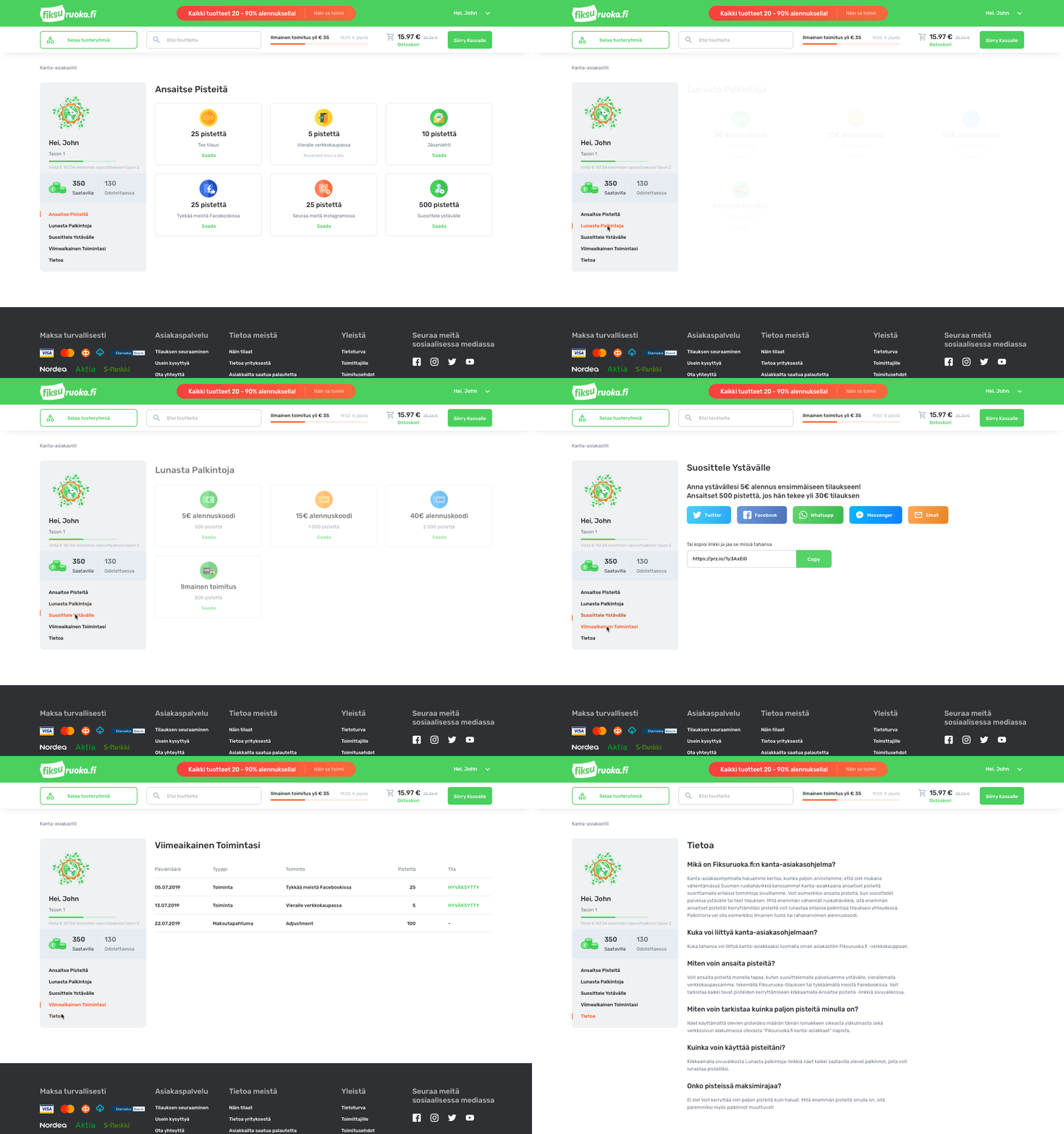
We integrated best practices from gamification design to reward customers for brand loyalty and dedicated shopping.
4.
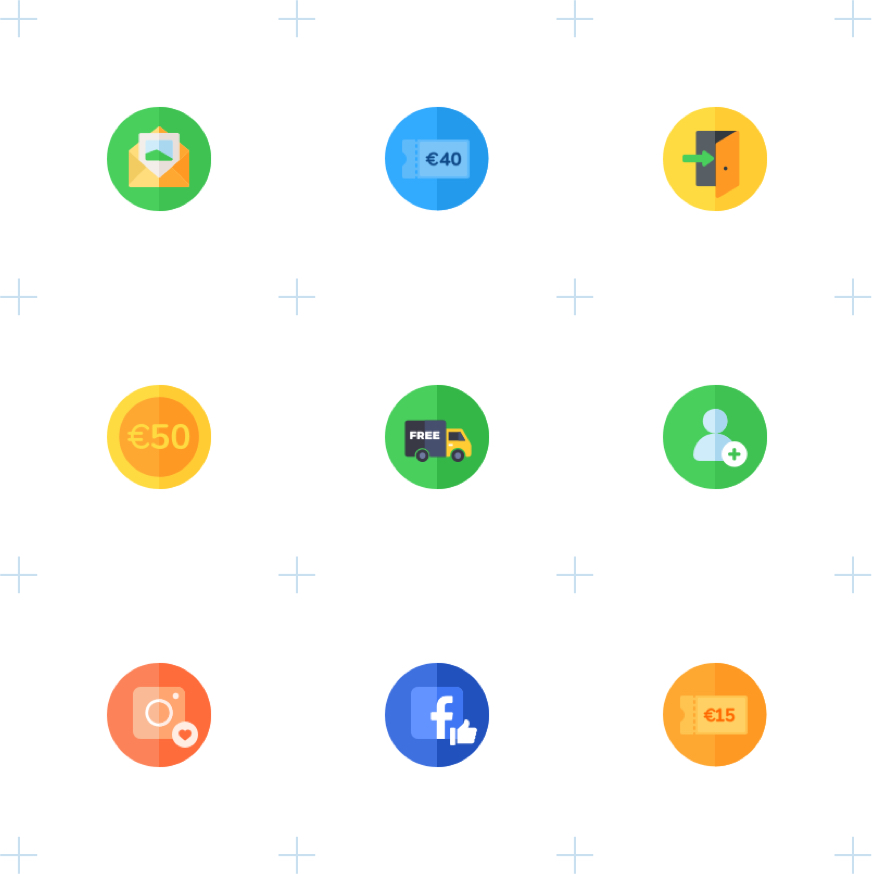
We decided to custom design several illustrations in order to further promote the company’s eco-friendly messaging.
Dev Support
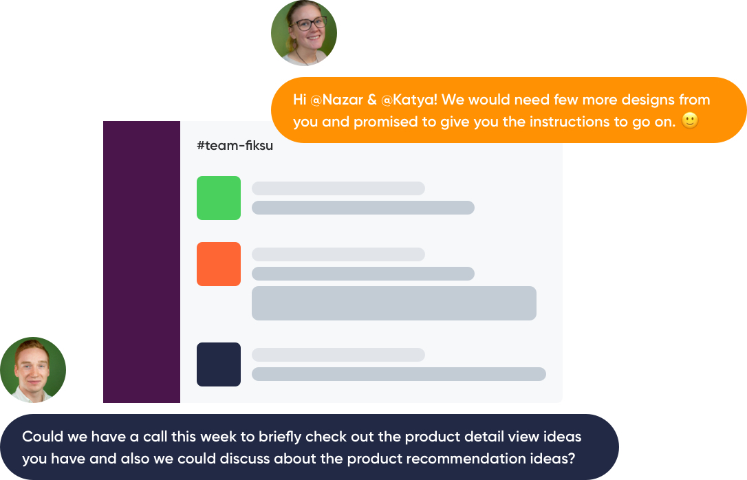
After the initial designs were finished, we remained at our client’s side for as long as they needed.
After all, simply handing over the assets does not mean a true designer’s work is finished. Sketch files, svg illustrations, and animation data were only a portion of the full value we wanted to provide to Fiksuruoka. With this in mind, we audited both the web and mobile front-end programming to make sure that the designs were implemented correctly.
We also continue to help them identify and solve new UX issues that arise.
Additional Support
Since we modernized Fiksuruoka’s brand visuals, we needed to roll out the same approach for other designs in the company. We are a design agency, after all, and once we start working on a project, we make sure that our clients maintain an excellent style and taste in all their designs.
In Fiksuruoka’s case, it means we also worked on:
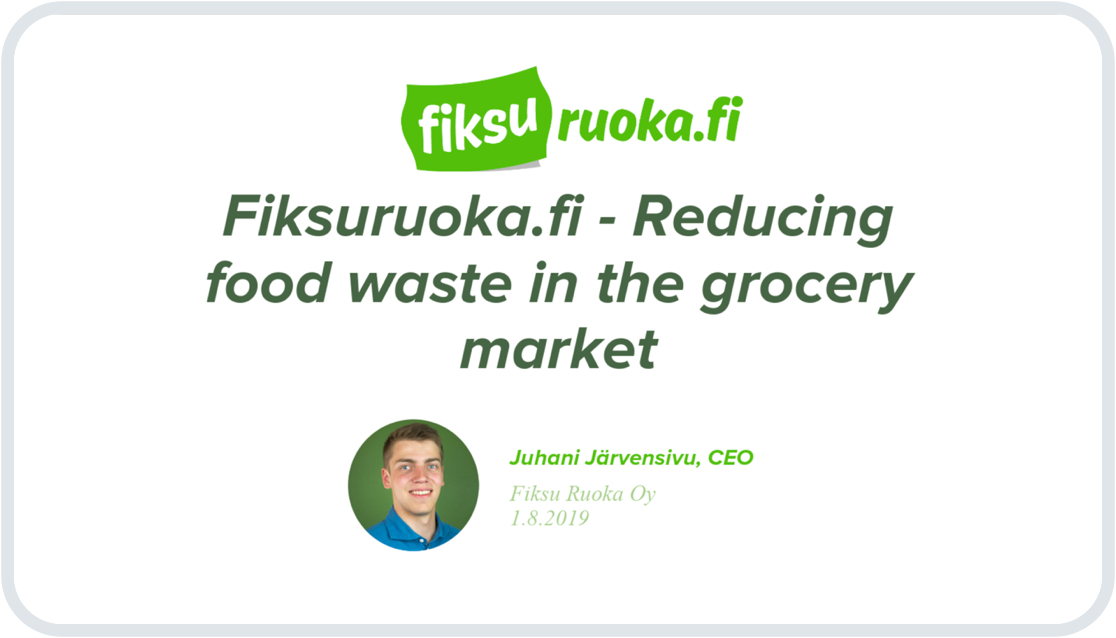
- Pitch presentations
- Illustrations for marketing and videos
we reply under 24 hours.
free
session
