Task

Team

Duration

Scope
Overview
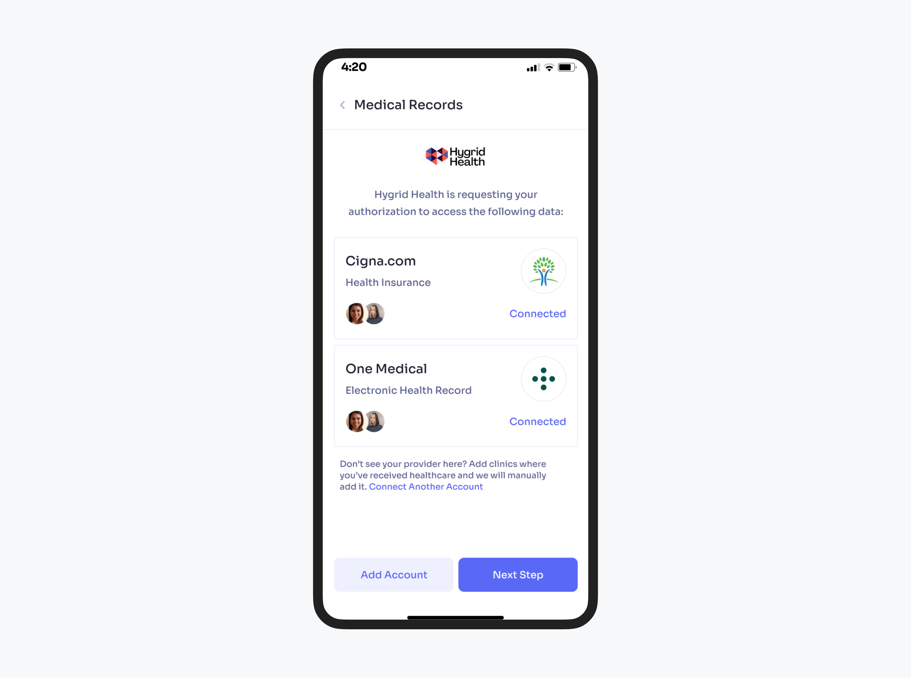
The healthcare industry is overflowing with patient data and this amount still keeps growing exponentially. Nowadays, it becomes increasingly difficult for people to manage their own medical information. Therefore, a client came up with an unconventional solution that is channeled into solving this problem through synthesizing, structuring, and providing user access to medical data within one single platform.
As a result, the client turned to our team in order to conduct a discovery phase, create applicable UX/UI for patients to organize their data as well as deliver a clickable prototype to demonstrate the key features and the potential of this solution to investors and tackle further product development. To make it all happen, we have assigned 2 professionals, a design director, and a UX/UI designer, to work on this project
Challenges
- develop a disparate system of record-keeping adapted to American healthcare system;
- integrate and unify the product with all types of electronic health records used by different healthcare facilities;
- meet a limited deadline of 8 weeks to complete and test a clickable prototype while ensuring its viability as well as foresee the strategy for different phases of product development;
- although the client came with a clear vision and strategy for the product, we had to go beyond the idea itself and give it a shape based on our industry experience, research, and thorough data analysis;
- deal with the responsibility to persuade potential investors of the product value through effective design and a high level of functionality;
- present the UI design which corresponds to the client’s strict requirements in several intensive iterations.
Results
- conducted a series of discovery meetings to polish requirements for the product’s expected functionality and features;
- researched a competitive landscape and found a safe niche for the client’s product;
- created product wireframes from low to high fidelity in order to save time in-between testing and iterations;
- experimented with layouts and the flow structure to meet inputs from stakeholders, tech, and design teams;
- delivered a style guide to enable our client to effortlessly develop and scale the product in the future;
- developed a clickable prototype that was aimed at presenting and testing the tool’s extensive functionality;
- designed a fully responsive web version of the product adjusted for further development in order to provide a flawless user experience on different devices.
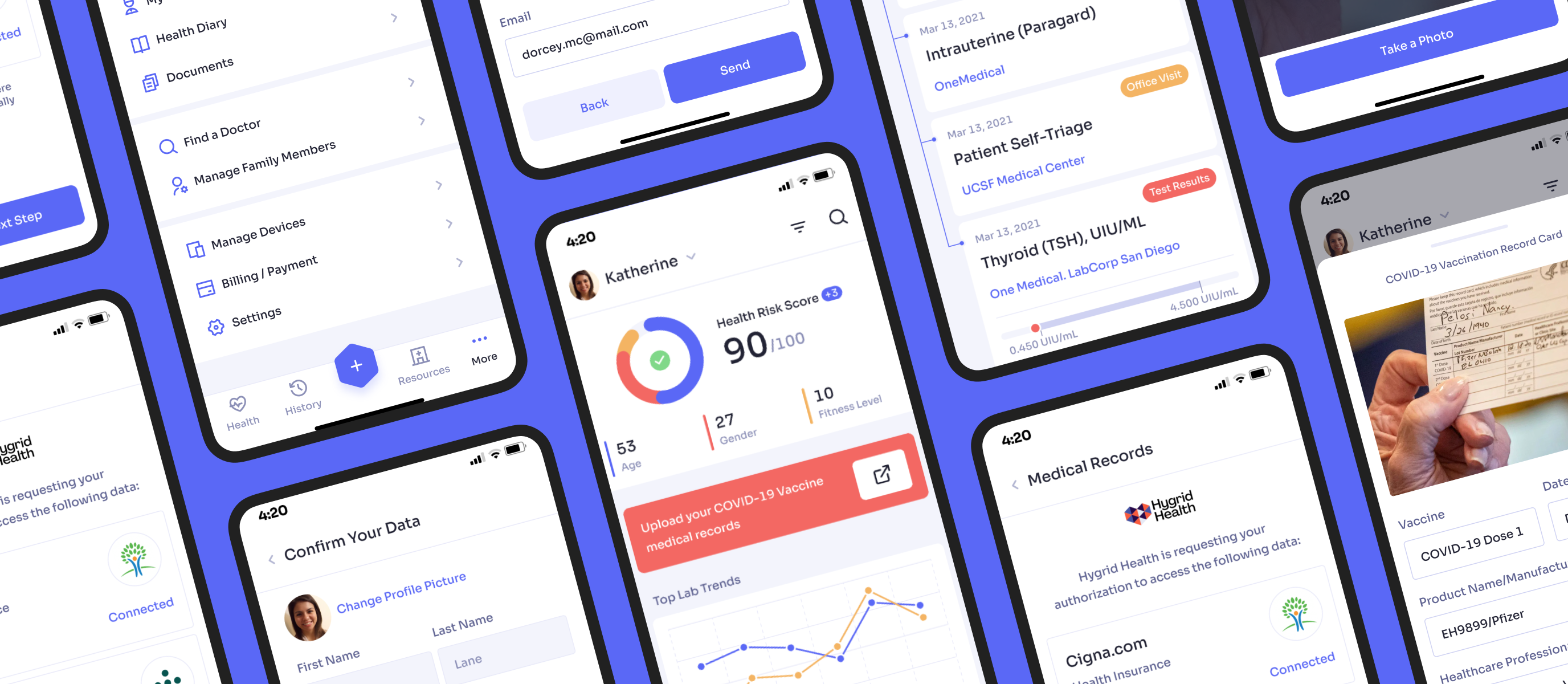
The secret of our successful collaboration was pretty much simple. We were applying the most personalized individual approach while working with the client. Our team enthusiastically dived into a project while researching and analyzing the market to make the application design stand out. Our diligent work made a client prolongate our collaboration and work together on further product-related tasks.
Main focus of our UX/UI design
Taking into account the thorough market and user research as well as the analysis of the competitive environment, our team was concentrating on the following aspects:
-
making the design simple and minimalistic in order to minimize the cognitive load and suit the needs of users of different age ranges: from the youngest people to the elderly generation;
- high usability and convenience to provide an intuitive and, what’s more important, effortless user experience of web and mobile;
-
having accessibility and compassion in mind: using plain and reassuring language, avoiding medical jargon, and considering users emotional well-being to ensure the most pleasant experience.
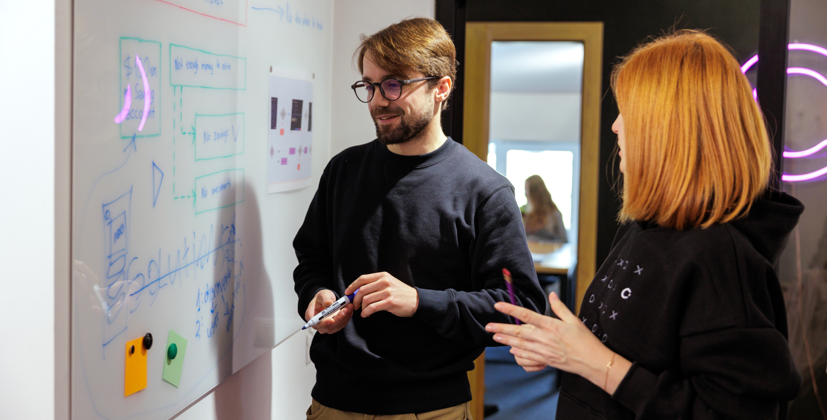
The core features .
We closely collaborated with the client's team and consulted on ideas to improve outcomes and offer a more functional solution.
Taking into account that security and confidentiality in healthcare are the main priority, we figured out a way to prevent creating fake accounts by incorporating driving license validation.
During the sign-up process, every user has to provide a selfie with their driving license to verify their personal identity based on a vouched ID. Moreover, this solution allowed us to address several UX issues. For instance, a major user headache of remembering the password as we enabled authorization through the user’s driving license. In addition, it has also simplified the onboarding experience by automatizing personal data transfer from the user’s ID

Healthcare data timeline
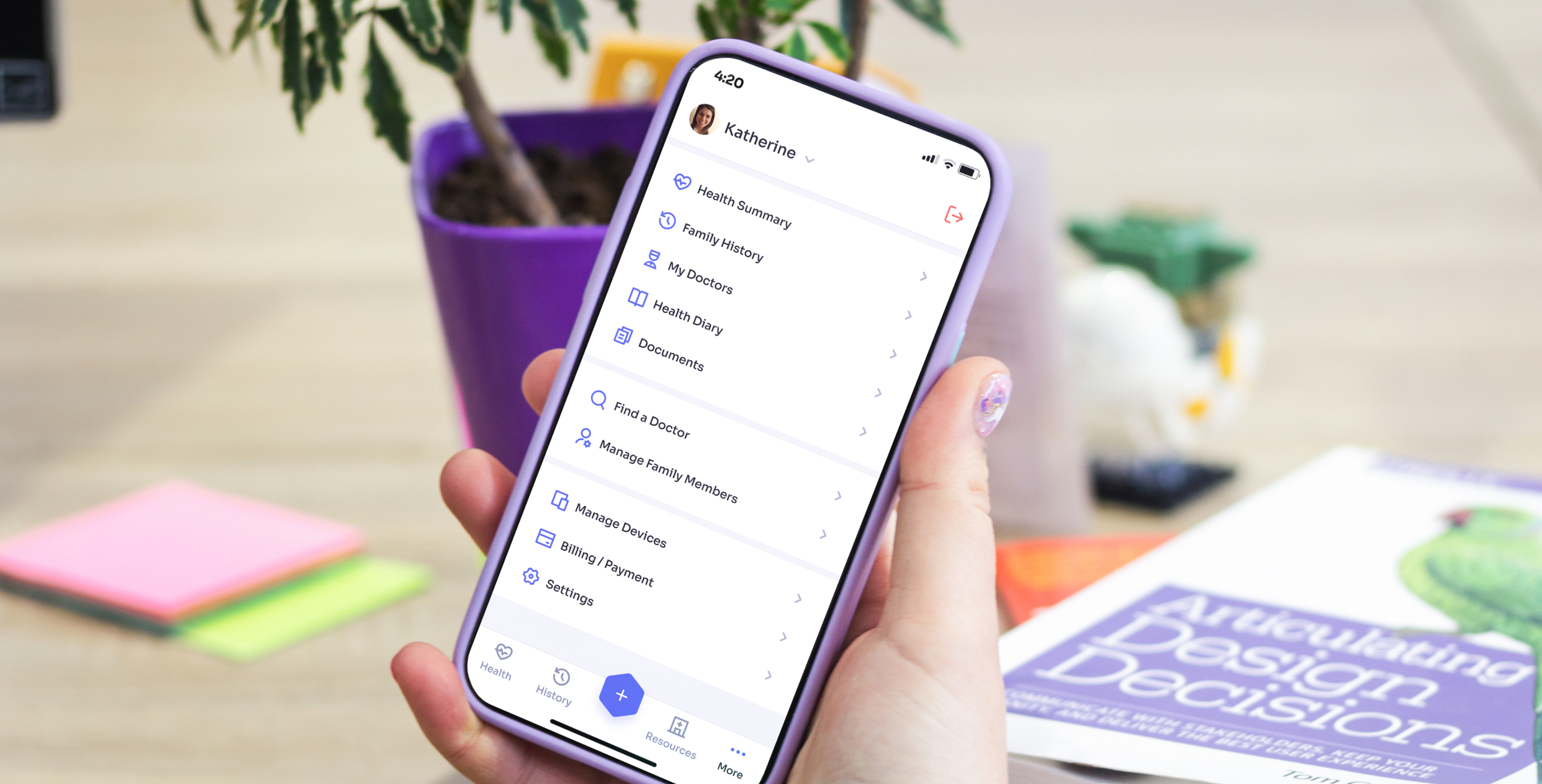
The healthcare industry is overflowing with the amount and diversity of medical data. Thus, it pushed us to seek ways to prevent users from getting lost in this information.
We structured data and healthcare procedures in an intuitive and easy-to-navigate manner. Therefore, we agreed that a chronological timeline will be the most suitable way to organize the data with the opportunity to filter records based on data type (procedure, prescription, doctor visit, labs, etc) and to view and arrange the details of each visit
Test results structuring
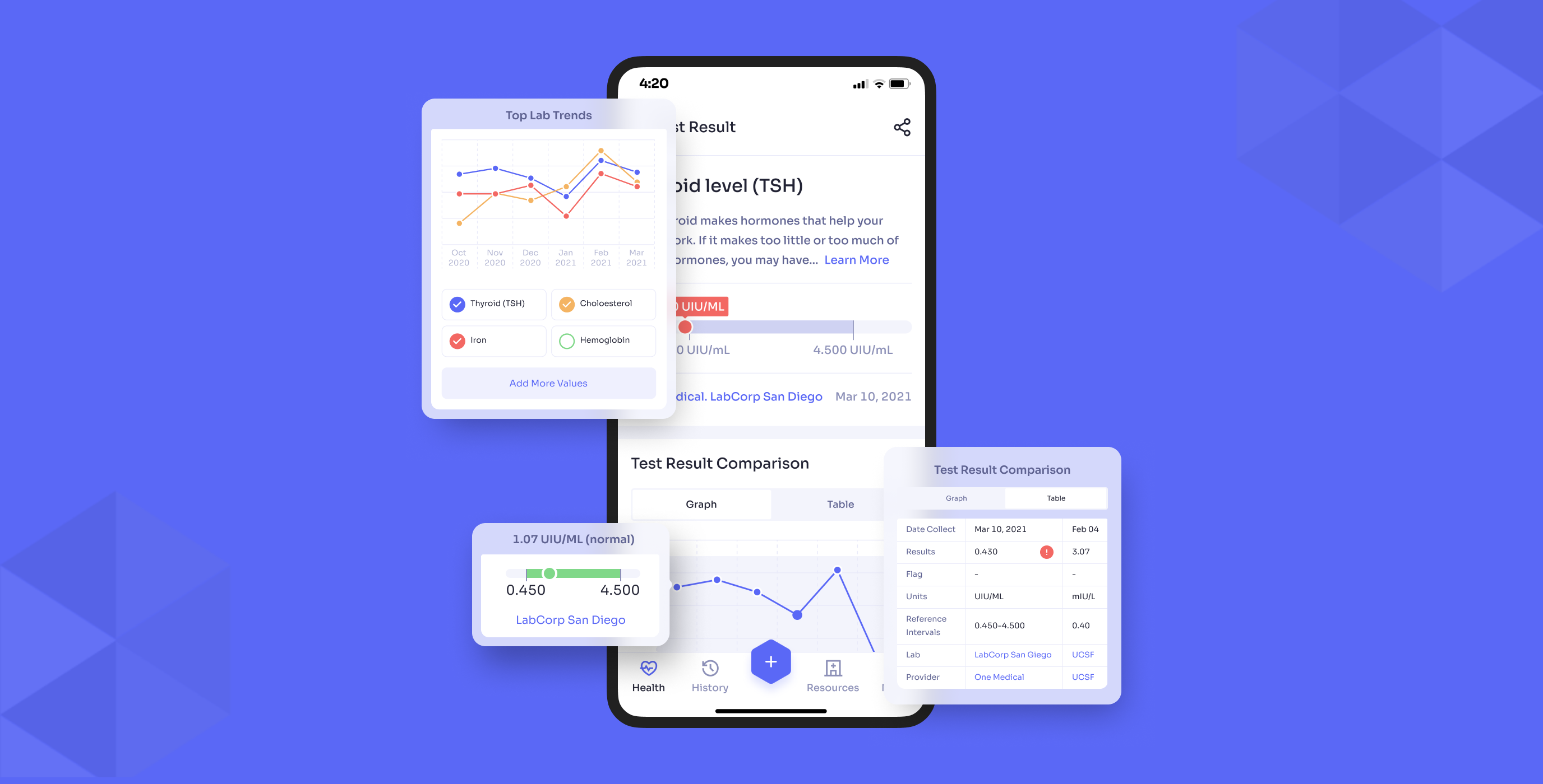
We also found a solution for organizing and structuring highly specialized laboratory data that had no parallel on the market by integrating analytical, descriptive, and illustrative data within a single, consistent, and clear tool. Our system provided the following features:
-
records filtering by different criteria and comparing them in the temporal perspective;
-
showing trends and correlations in lab results by using charts and graphs;
-
data presentation in a table view;
-
unification of values that vary per clinic as well as a normal range;
-
showing and operating the genetic data;
-
data sharing with a medical provider and a non-provider;
-
adding the device data on connection to portable devices.
Health risk score
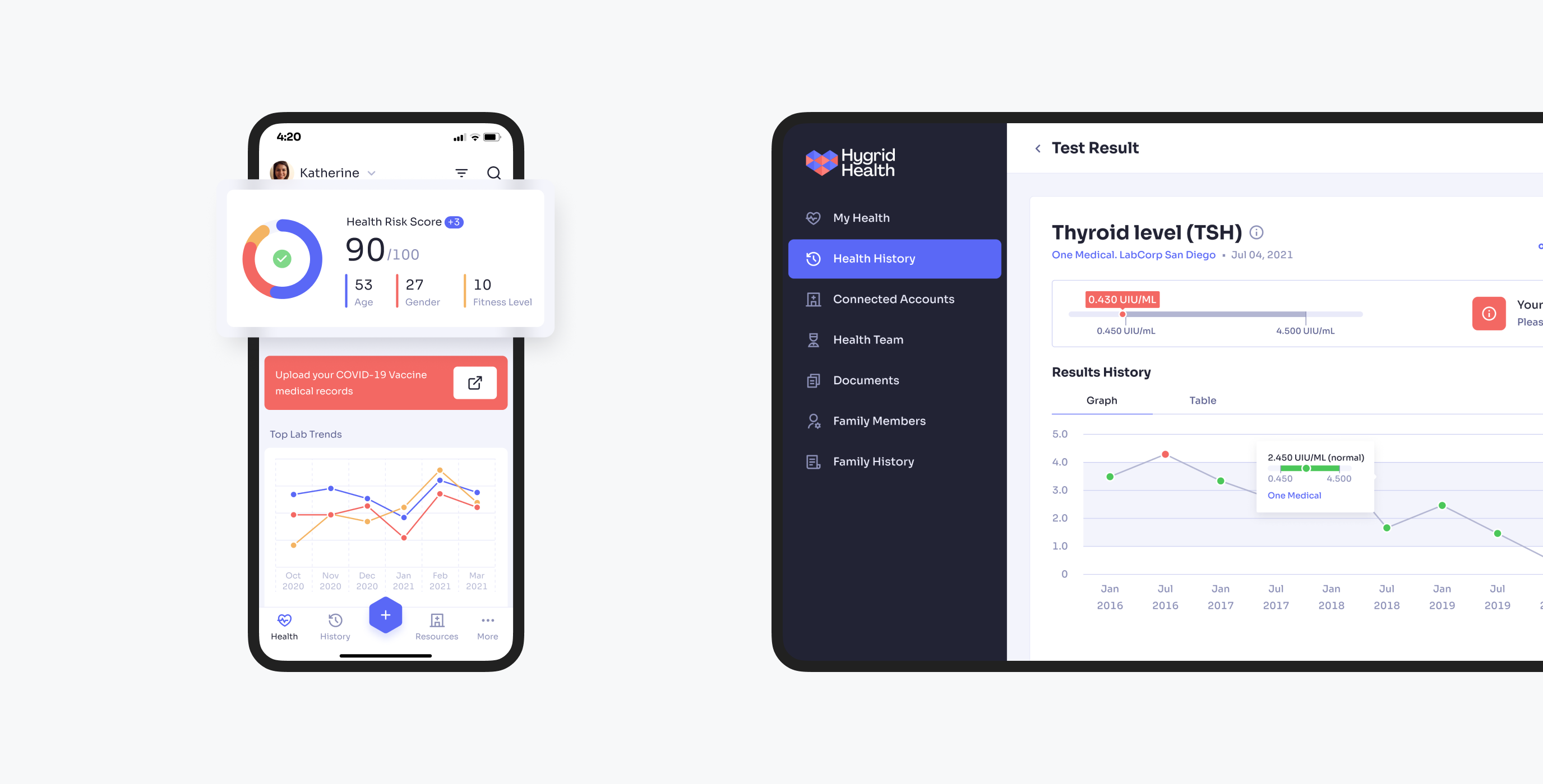
Our team incorporated some gamification elements into the product's UX in order to motivate users to monitor their health condition more often. The feature of the health risk score shows how well a patient is doing and whether they are doing better based on analysis of their medical data.
COVID-19 vaccination
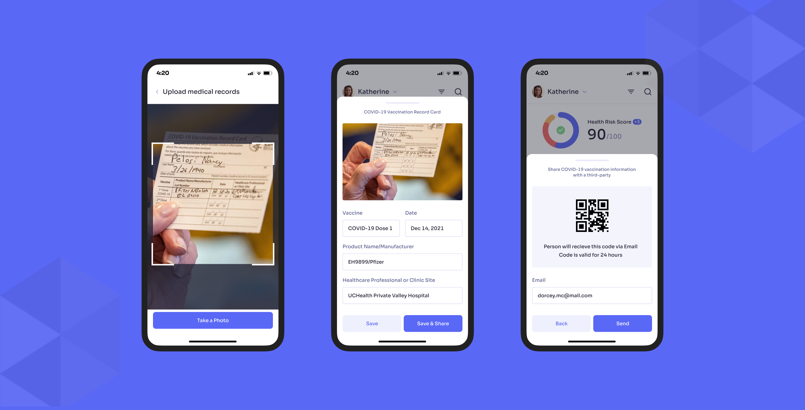
The COVID-19 pandemic was raging across the globe for a few years and it was the issue number one in the realm of healthcare until recently. Our team realized we needed to pay particular attention to this factor in our information architecture. Therefore, we designed a special feature allowing us to verify and monitor the vaccination status of every patient, as well as share this data if needed.
A user just needed to take a photo of a vaccination card and check out the details and make sure there are no mistakes. After that, vaccination status could be confirmed, validated, and shared with one click, at the request of a healthcare provider or institution. It’s also worth mentioning that the app informs users when their vaccination certificate expires and sends reminders to get a vaccination appointment to renew the certificate.
Documentation and dev support
Our team has delivered a style guide with repeated visual elements systematized to enable our client to effortlessly develop and update the product while adding new components, features, and services in the most efficient and consistent way.
we reply under 24 hours.
free
session
