Task

Team

Duration

Scope
Overview
Open IQ, an Australian provider of feature-rich, cloud-based telephony and contact center software, partners with global companies to enhance their telephony services. Their trusted product is utilized by major international enterprises in sectors such as insurance, banking, and government. Offering a comprehensive range of features, including inbound and outbound recording, customer satisfaction assessment, agent evaluation, workforce management, telephony, and analytics.
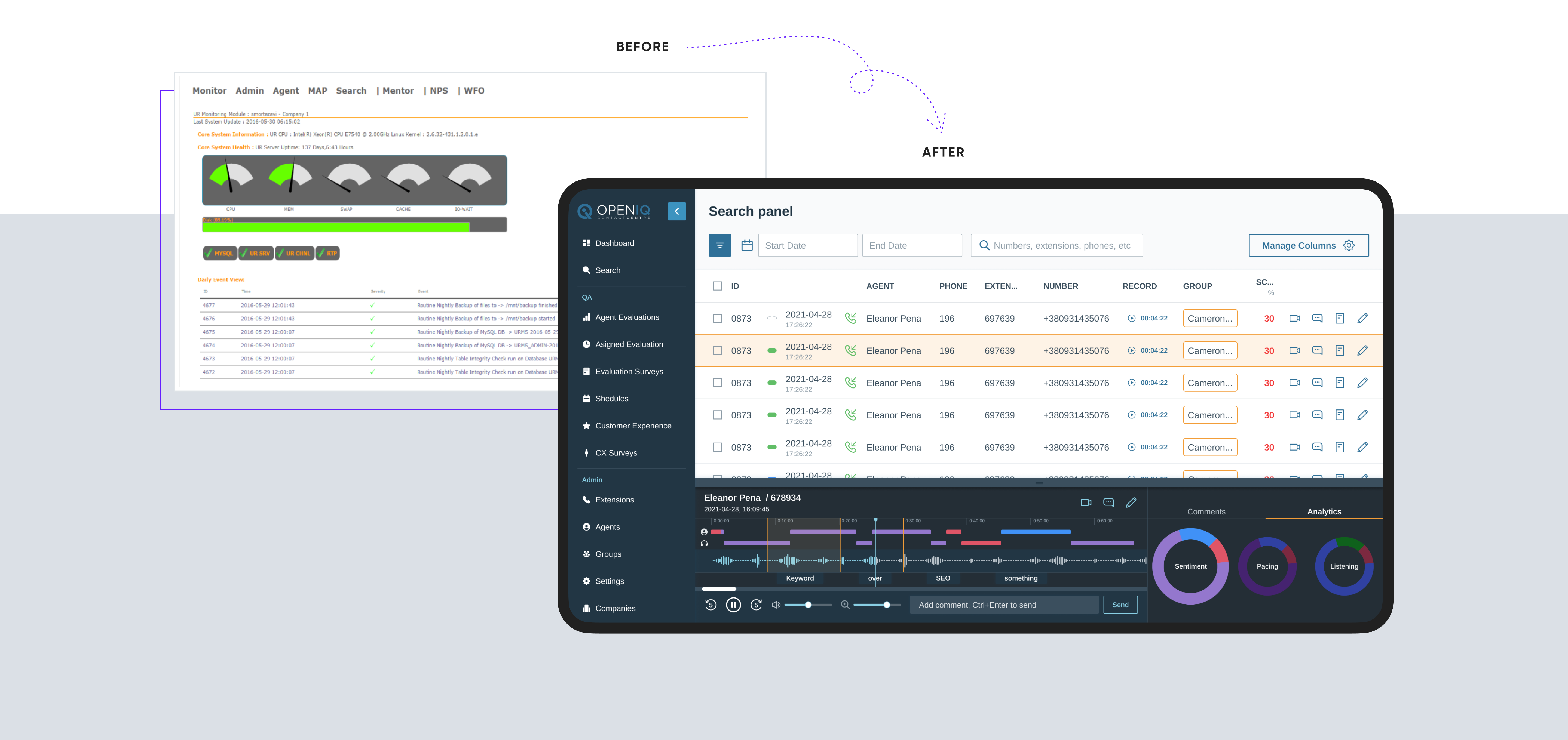
After a successful market presence of approximately 10 years, Open IQ recognized the need to fully redesign and modernize their outdated contact center software. With significant expansions in software functionality over the years, they sought our professional assistance to improve and enhance the UX/UI of their product. This transformation aimed not only to align with the latest product features but also to cater to the ever-evolving user requirements.
Project overview
Since the product was established long ago, the outdated design didn’t reflect the excellence of its software functionality, ever-changing user needs and required UI modernization and UX improvement to keep growing in the competitor market. Our team quickly onboarded, conducted an audit, and suggested UX improvements.
The designers worked closely with the CEO of the client’s company, a specialist with more than 10 years of experience in the field. We worked on UX optimization, simplifying user onboarding, improving advanced search tools, and upgrading the dashboard customization. Our task also presumed collaboration with stakeholders and supporting the redesign's technical implementation by creating documentation and conducting the review during the implementation phase. Each of the key design decisions was iteratively validated by the client. As a result, the updated interface of the product, improved user experience, and new features implemented were highly appreciated by existing users.

Challenges
- optimize the use of space while keeping the same functionality, especially in the collapsed mode view to keep everything condensed but functional;
- create a design that would be fresh and new yet familiar and intuitive to the existing users;
- not to compromise with the visual appeal and usability of dashboards despite significant technical limitations;
- design features that would allow operators to multitask during calls and customize work areas with split views.
Results
- optimized UX, simplified onboarding, and decreased training time to 25 minutes;
- created scalable and technically feasible interface design;
- ensured new features validation and implementation;
- came up with highly customizable dashboard design that still met the development time limits;
- saved budget and reduced development time;
- attracted new enterprise-level customers with redesign.
Most cloud-based contact center software programs require all sorts of readjustments including the need for additional software or even a change in business processes. Another problem is the abundance of unnecessary features distracting from work.
Here at Cieden, we do believe that software should adapt to the user's needs, and not the other way around. Therefore, we’ve focused on providing a highly configurable, customizable, and intuitive interface that addresses actual operators' needs at all stages of their work.
Main focus of UX/UI design
Considering user needs research and the competitive environment, we focused on three main objectives:
-
making all functions easily discoverable, accessible, and consistent in order to reduce onboarding time;
-
allowing dark and light themes of the interface to adjust to the environment of the user who can work day and night shifts;
-
introducing new features to support more use cases of the solution and drive business growth.

The core feature
Recording and managing conversations with customers are essential parts of a call-center operator’s work. Therefore, we paid special attention to redesigning the recorder. Our goal was to empower an operator with some advanced capabilities as well as to remove the redundancies. We conducted a market analysis of indirect competitors. After that, this feature was iteratively developed in tight collaboration with end users, voice and data engineers, and other solution providers.
For instance, instead of an accordion, which was used to open the recordings, we used an overlay so that all the elements of the UI are always in the same place as expected. This design decision allows the user to easily switch between records, which helps to easily manage a call and access additional tools in the same window simultaneously.
Some of the functionality of the recorder appeared to be outdated. Because of this, we had to remove everything that was out of use, preserved the most useful functionality, and complemented them with the new.
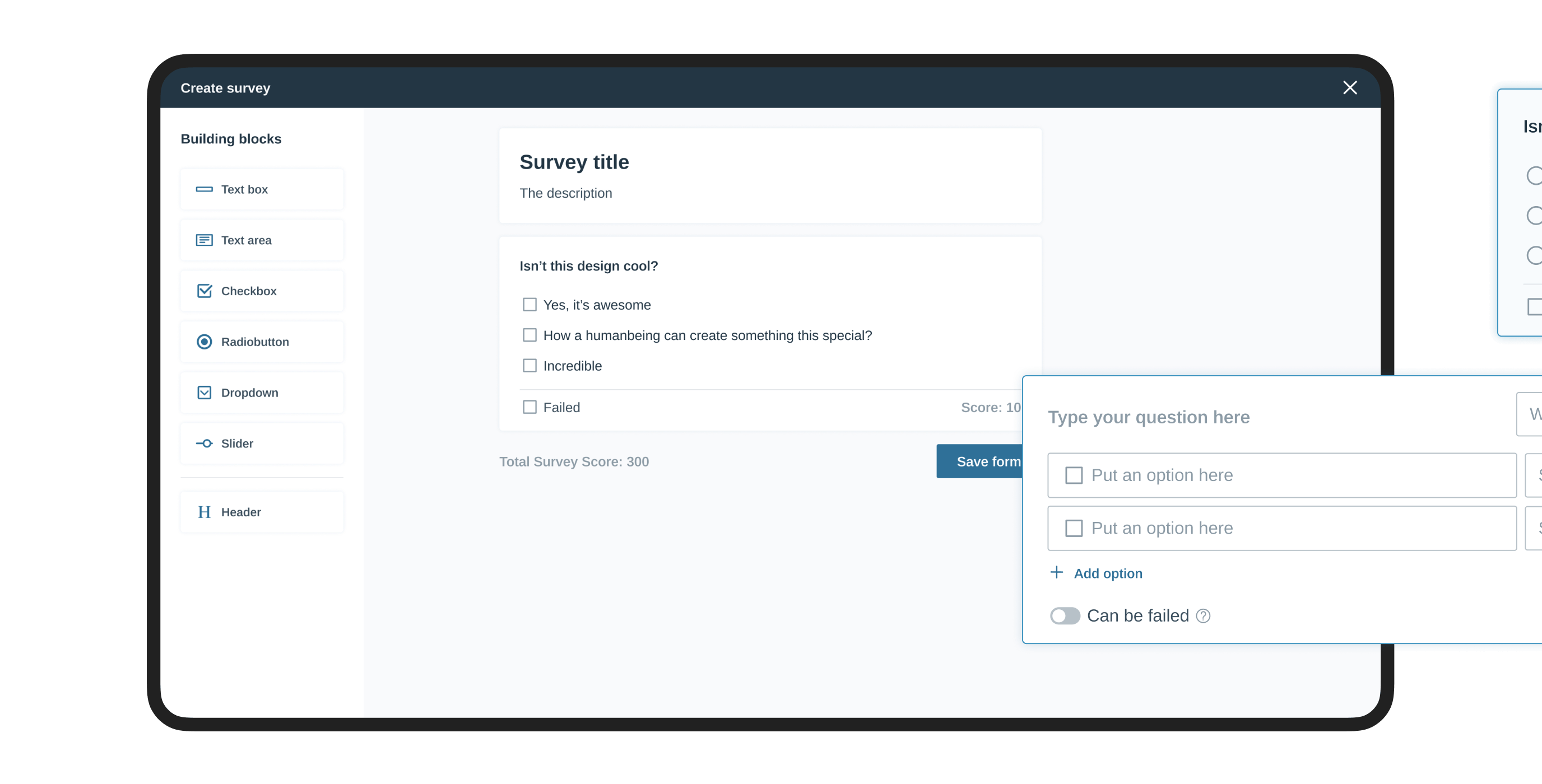
Survey builder
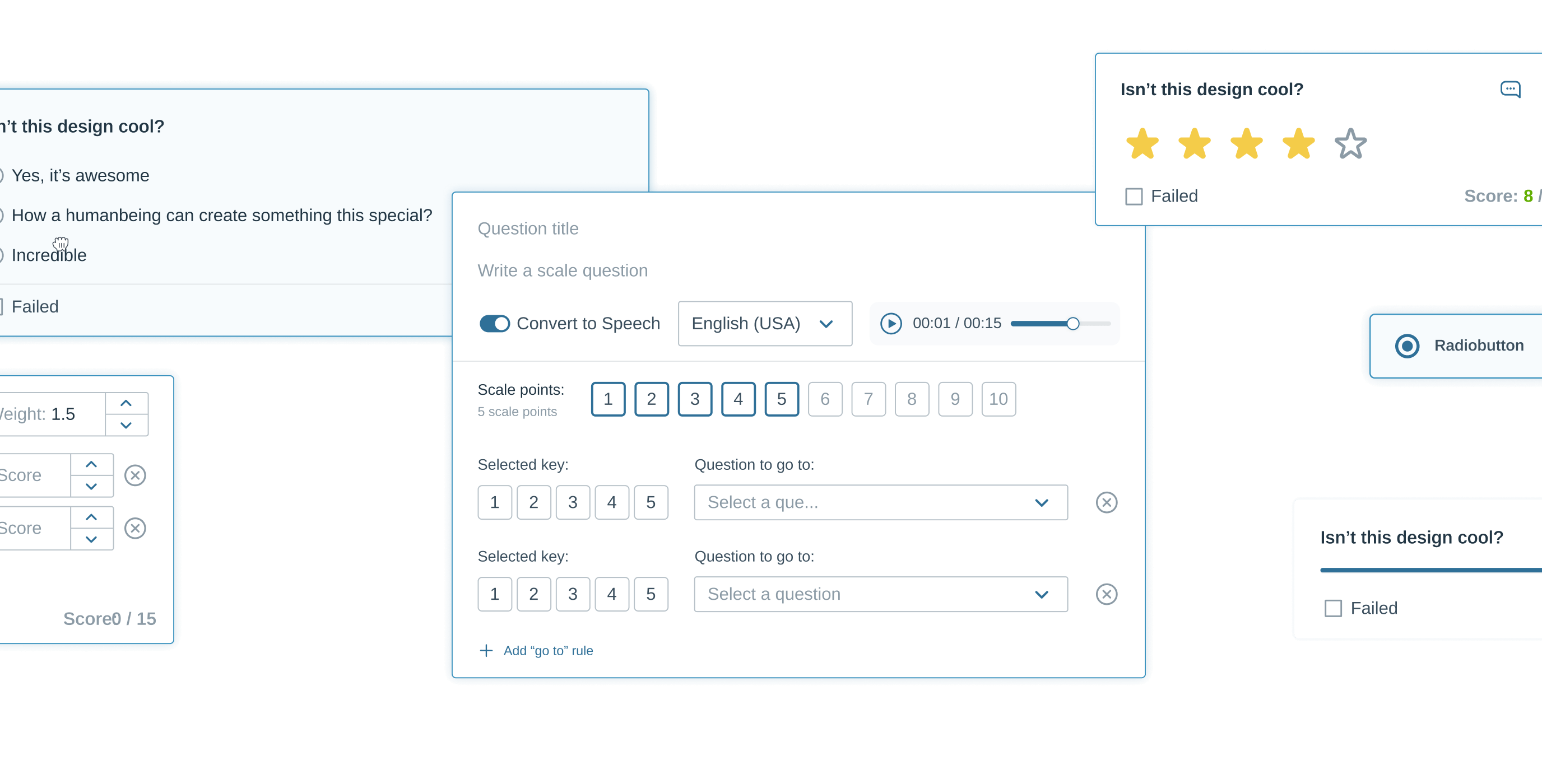
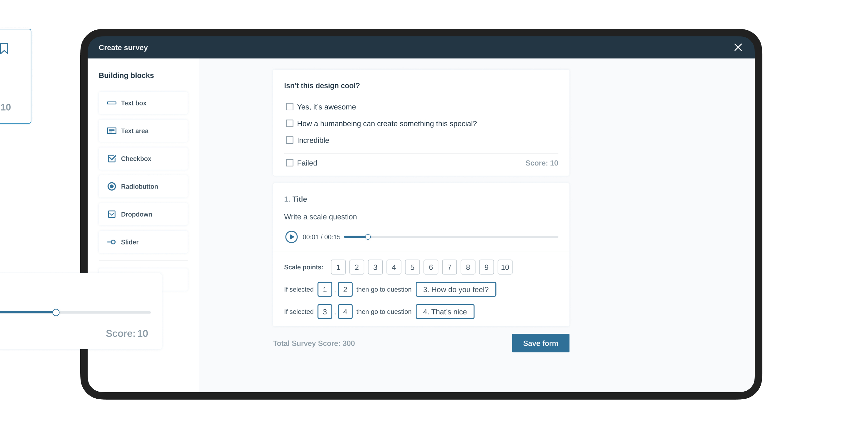
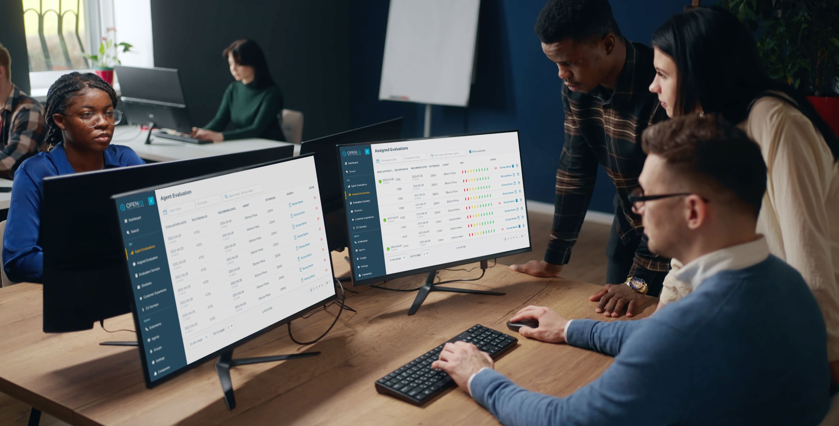
The product enables the evaluation of the operator’s performance to be standardized and objective. It also allows users to create custom forms that simplify the review process by applying a scoring system that considers the weight of the question.
The previous version of the survey builder had a high entering threshold, and because of this, managers needed special training to create surveys. However, with our suggestions, the process became easier to understand. Our approach presumed the use of preset of the typical questions, which the user can reconfigure intuitively by using drag and drop. Besides, we added the ability to support different types of questions and inputs while keeping their creation process seamless.
Admin
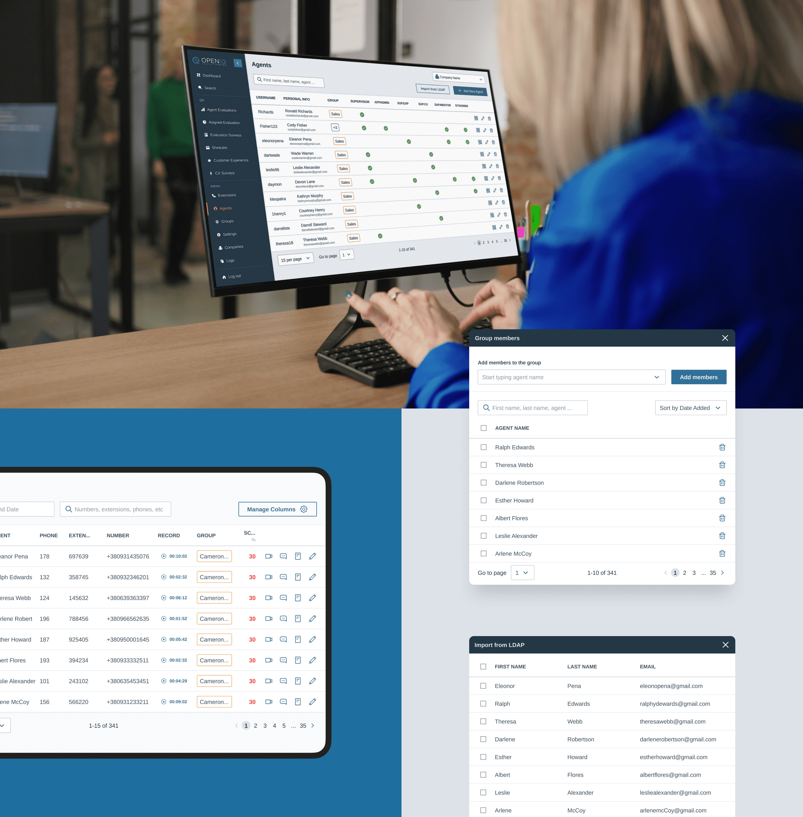
The main functions of admin are not only user management or company setup but also the configuration of various extensions and complex system settings. Our main challenge with this part of the project was to save all the complex settings and present them in a convenient and intuitive format.
We improved the settings of custom fields and added descriptions to the settings so that users could navigate through the process themselves. We also thought about placing the descriptions of the fields above instead of below, since the hint text is often located in such a way that the scanning of the information is consistent and the hint is always visible, instead of being hidden while scrolling.
Customizable analytics
AI and analytics modules electronically listen to phone calls, analyze the sentiment and intent of the speaker, generate quality assurance reports, gain valuable insights from customer interactions, and seamlessly integrate with third-party applications.
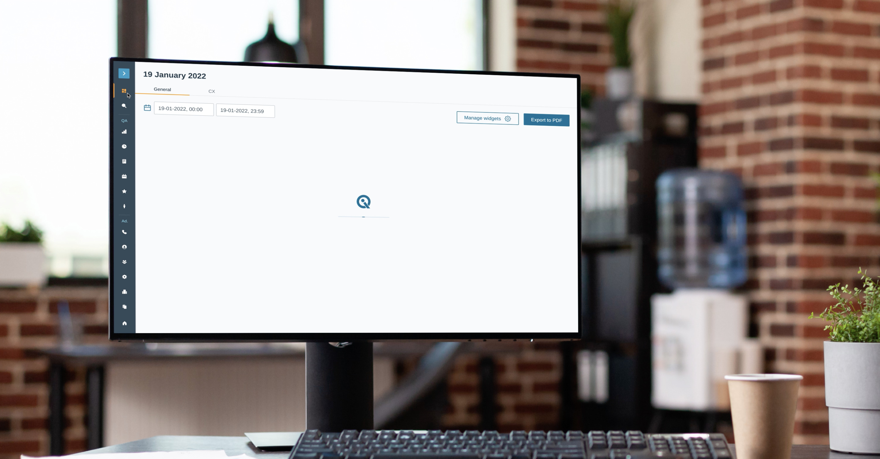
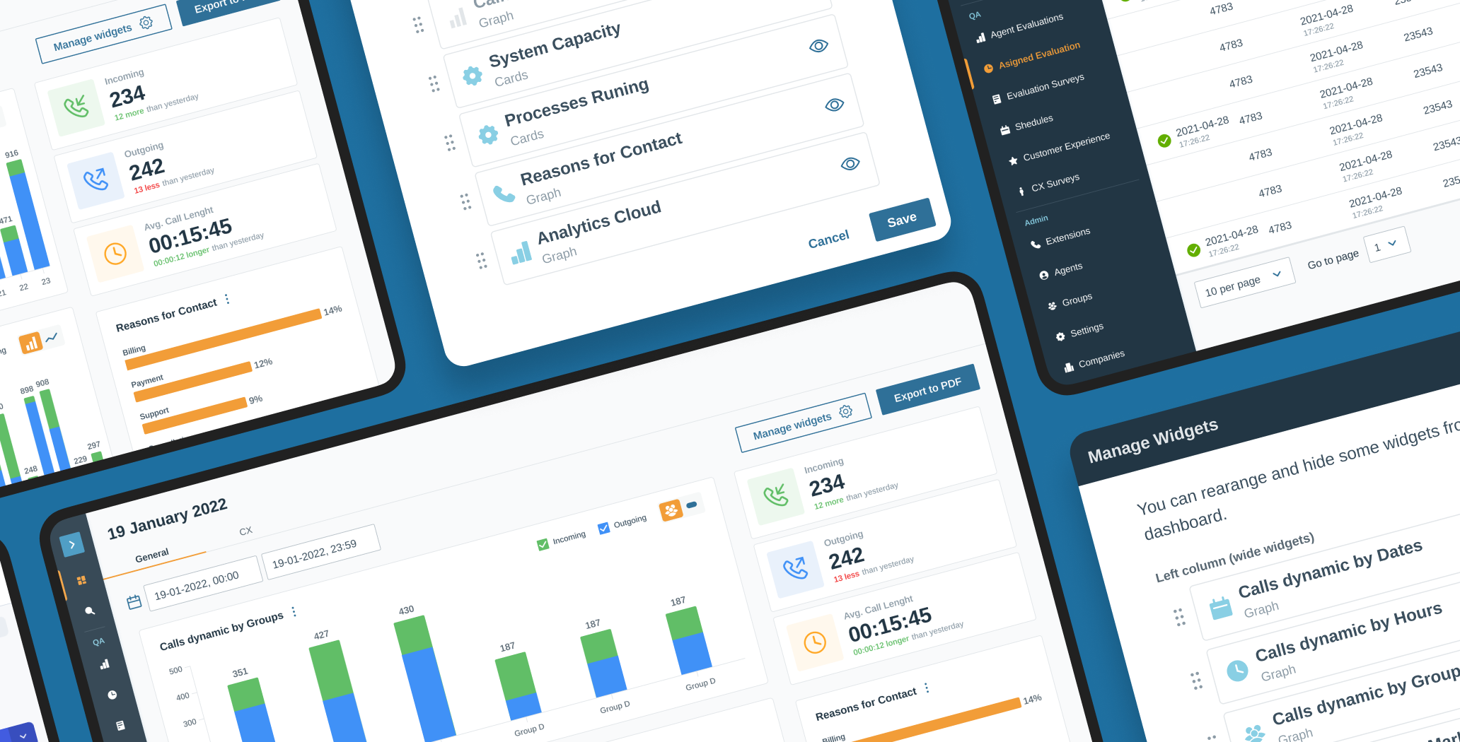
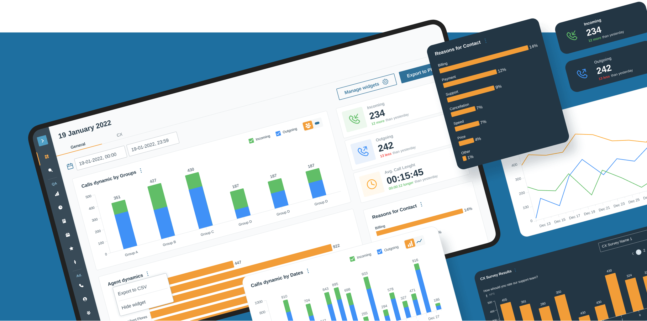
Different businesses have different goals, and for some, one piece of information is more important than another. Bearing this in mind, we divided the dashboard into two sections where charts and graphs were grouped logically. The user could rearrange and turn on/off the widgets to create a custom view.
Our task was to create the visual part for all these functionalities taking into consideration that the users will be able to customize the dashboard to their needs. Not only did we manage to achieve our goal, but we also optimized the implementation effort.
Documentation and dev support
Our team worked closely with the developers to ensure that the design is properly implemented according to the agreed-upon specifications. We created design documentation, which included detailed information about the design, wireframes, design guidelines, and specifications for user interface elements and user interaction.
Moreover, we provided technical support during the implementation phase by conducting a design review, answering questions, providing clarifications, and addressing different sorts of issues. As a result, the product was implemented as expected and designed.

Discover key parts of legacy product design update with insights from our team and detailed explanations of suggested UX improvements.
we reply under 24 hours.
free
session
