Task

Team

Duration

Scope
Overview
Flybox.io is a communication and safety platform that enables its customers to send and receive location-based notifications under full anonymity of their personal data.
It was initially designed as a campus messaging platform for sending alerts in life-threatening cases such as a natural disaster, an active shooter, or a hostage situation. The unique advantage of the platform was an opportunity to immediately reach and inform everyone within an emergency area without tracking their data or violating privacy in any other way.
Business owners very much enjoyed the idea to send context-specific information to their clients without making them download an app or requesting GPS permission.The original version was good for nothing except demonstrating the viability of the idea and efficiency of the algorithm. But it could not show high marketability and attract new funding.
That is why we decided not to redesign the existing version but to start the work from scratch.
Benefits
- Open-mindedness and cooperative attitude of the client
- Engagement of a Business Analyst during the entire design cycle
- Collaboration with the development team for validating technical feasibility of design decisions
Challenges
- No access to designs and documentation on the previous version of the product
- Uncertainty about the integration with third-party tools
- Unsettled functional requirements making us change the workflow on the go
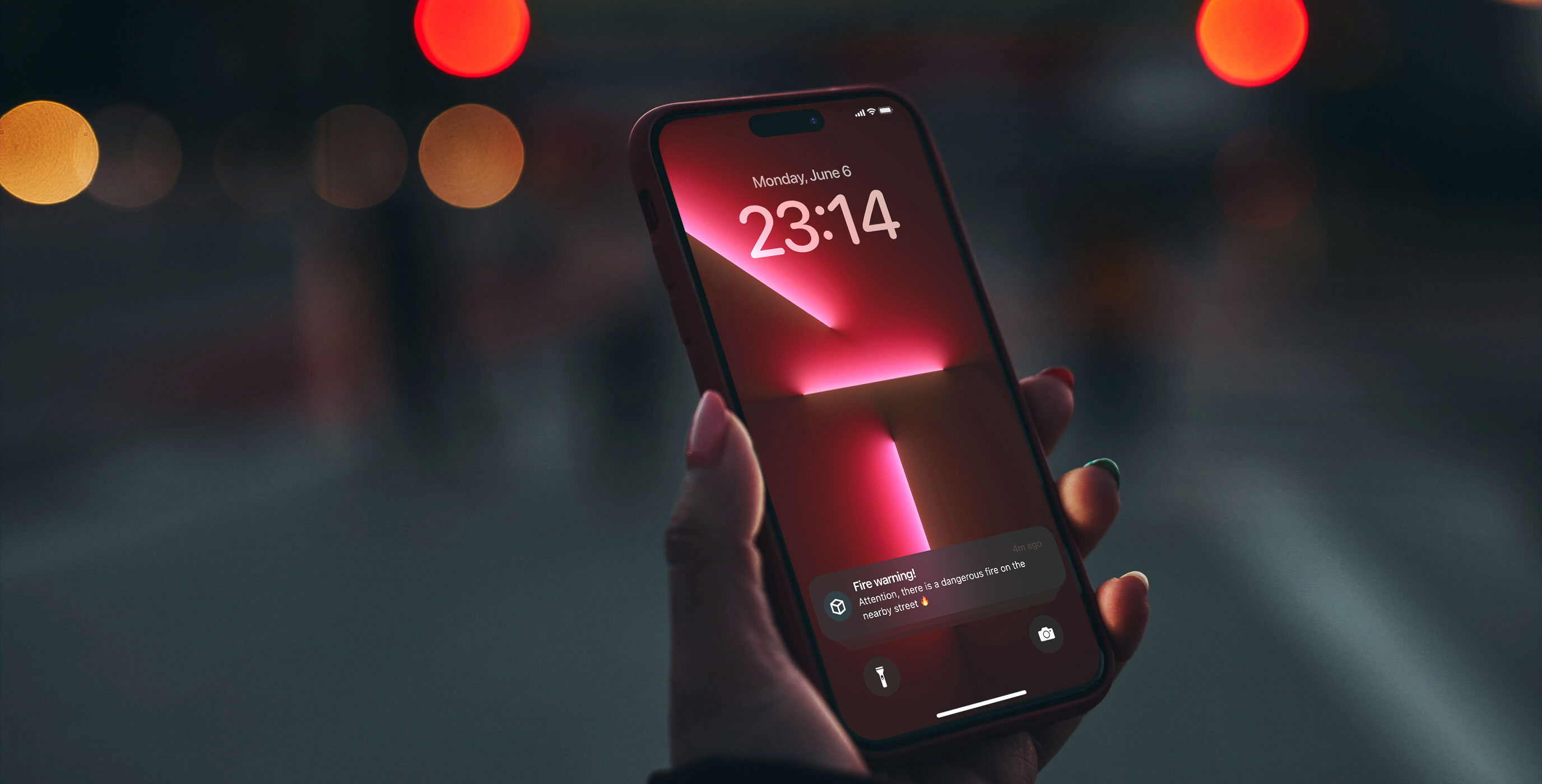
Emergency Button
The emergency button is a core feature of the product. It represents an algorithm for sending emergency messages to all users within and/or between locations without tracking their personal data.
The challenge was to make a user flow fast, easy, and intuitive. We approached the problem by implementing a location-based quick filtering option, message templates, and other streamlining solutions.
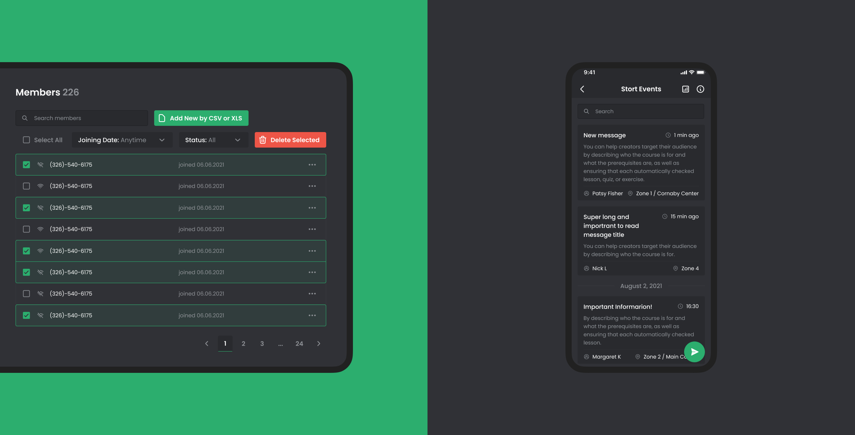
Channels
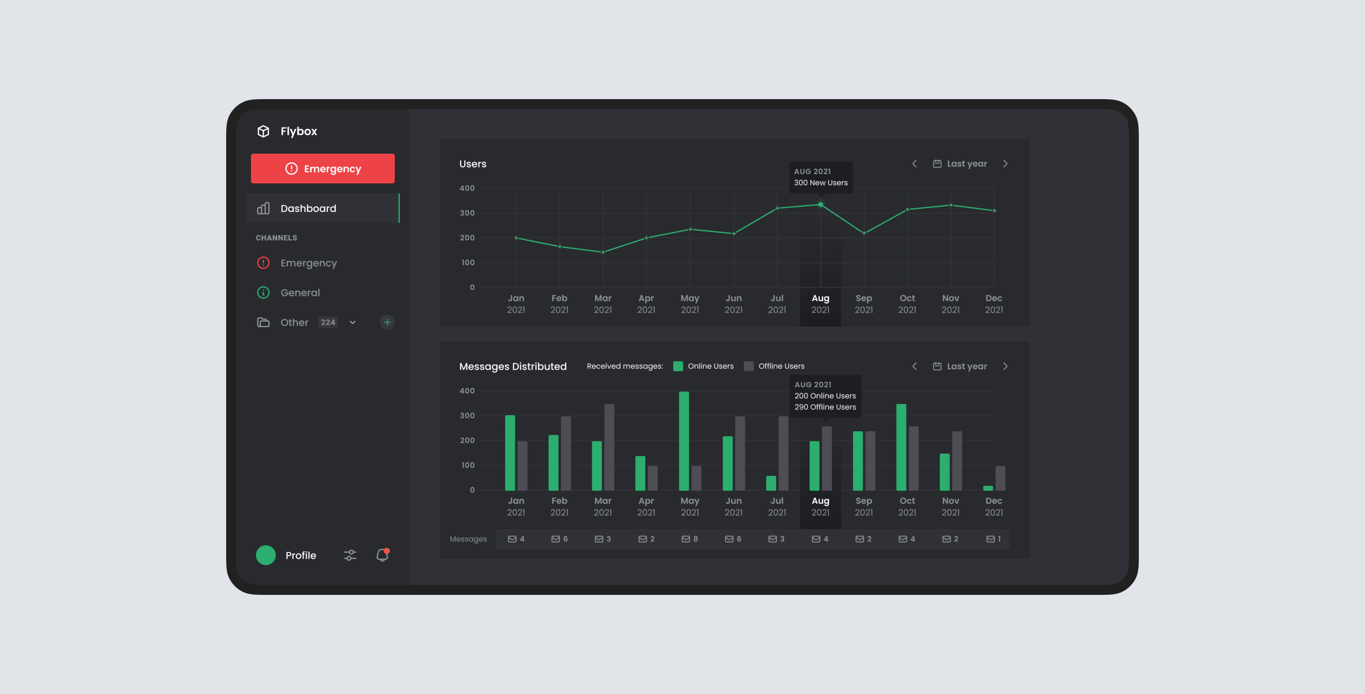
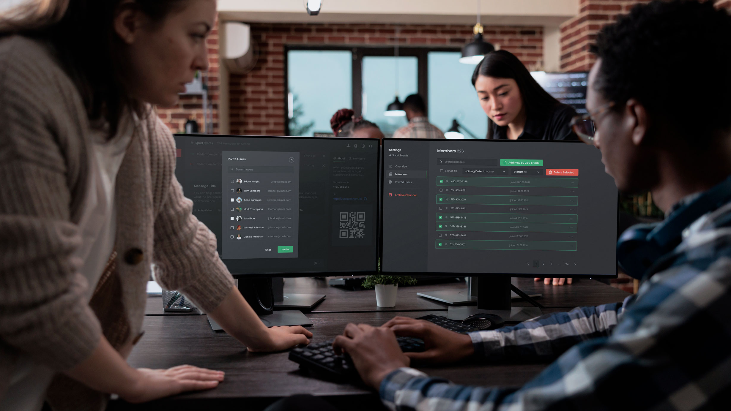
As Flybox already matured from a simple emergency notification platform to a multi-purpose communication-and-safety service, we had to envisage a more complex communicative system adaptive to various environments and specific needs of customers.
This included options for providing informational support, notifying about special offers, or making relevant real-time announcements. We also designed a planning function to manage messaging based on users’ location.
Our services are custom designed to provide real business value and are delivered in a way that fits your workflow. Did we hear you breathe a sigh of relief?
Project Discovery Phase .
We encountered a project with huge untapped potential in a relatively new market. Therefore the research could not give much information about the established trends and practices in this field. So it was critically important to clarify the business objective and the product requirements set by its key stakeholders.
Thus we conducted comprehensive user research and workshops to create personas based on their pain points.
As the product was built on an innovative technical algorithm of non-tracking messaging, exhaustive clarification of its technological standards was vital to the total output value.
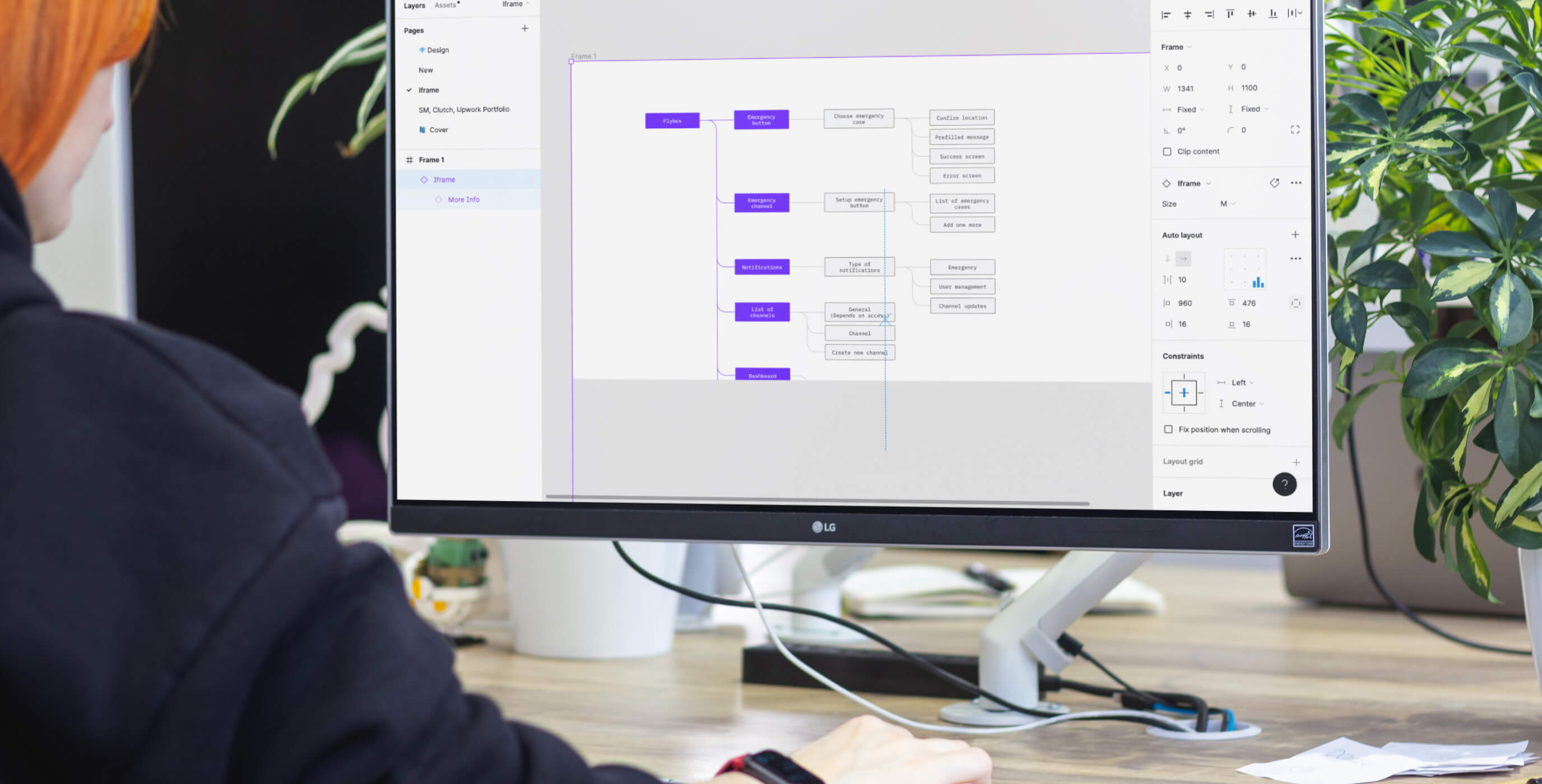
Based on the client’s requirements we created a clear end-to-end flowchart to capture and visualize all the complex variables and processes underpinning the Flybox technology.
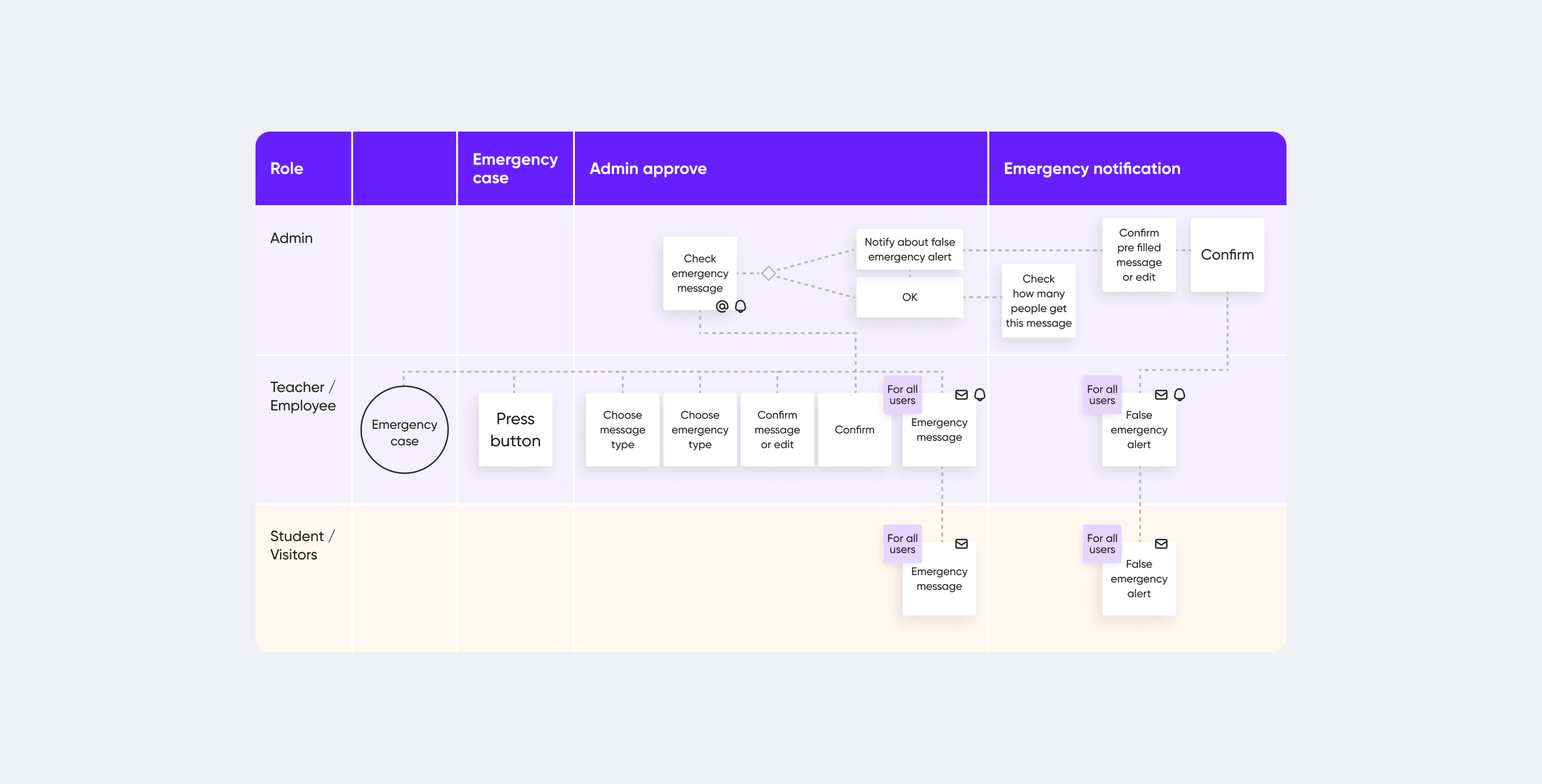
Workshop
As the product’s technological and market niche represented largely uncharted territory, active brainstorming and ideation were absolutely indispensable.
Thus we have initiated a workshop with the involvement of both our design team and the company stakeholders. Its main deliverables included elaborate user personas, user scenarios, and the customer journey map.
Competitor Research and IA
Despite the newness of the technology and the little-explored market, our client already had quite a few competitors. While most of them had different technological solutions, they all targeted the same customer segment and pursued similar business objectives.
To secure our client, we have researched both direct and indirect competitors to understand their edges and weaknesses, so that we could address a user's needs and pain points in a better way.
User Experience Design
During the UX design stage, the team concentrated their effort on functional requirements (e.g. communication range) and non-functional requirements (e.g. usability and accessibility). We ensured their compliance with the business objectives and selling points from marketing and monetization perspectives.
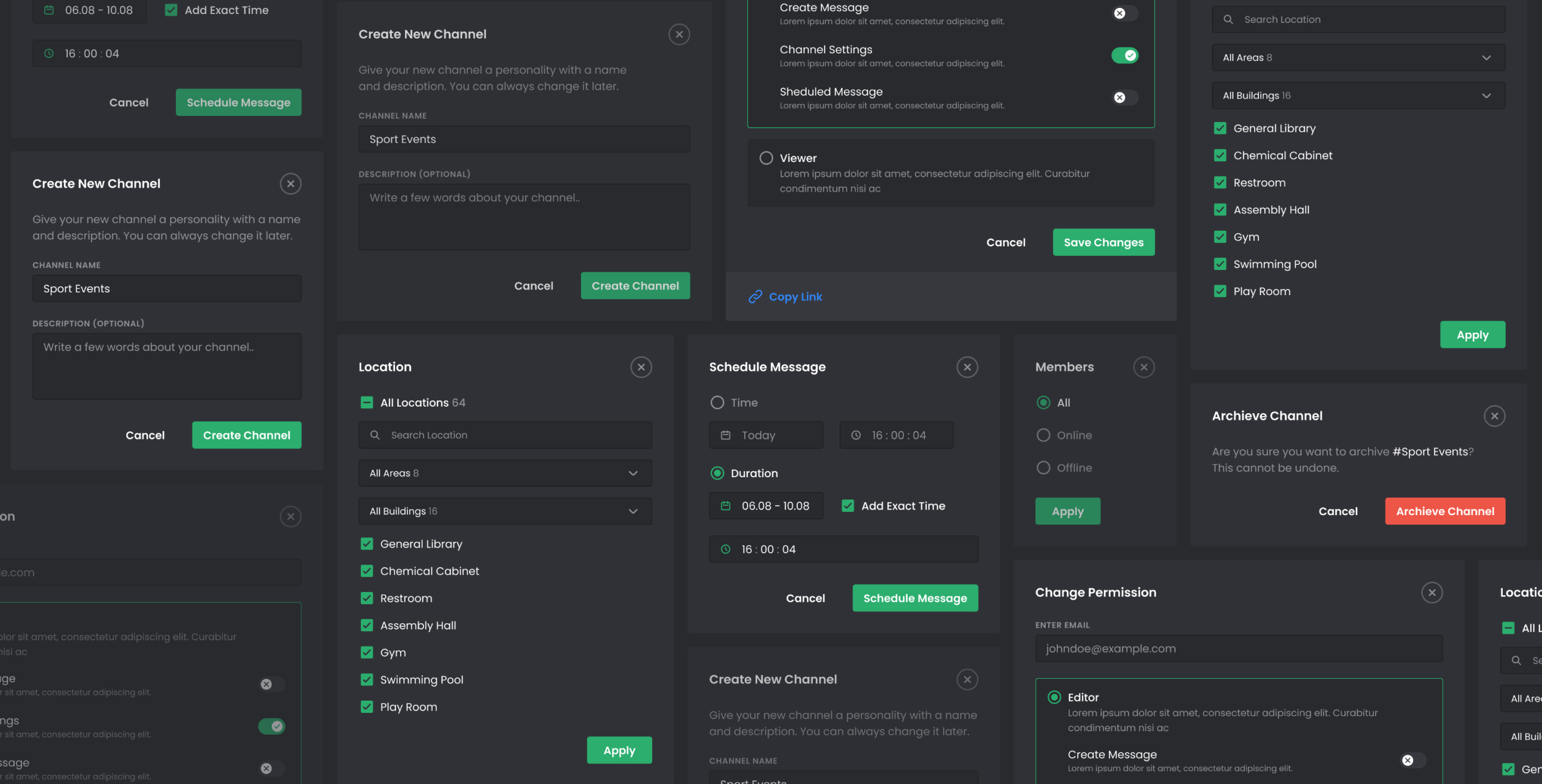
Design System
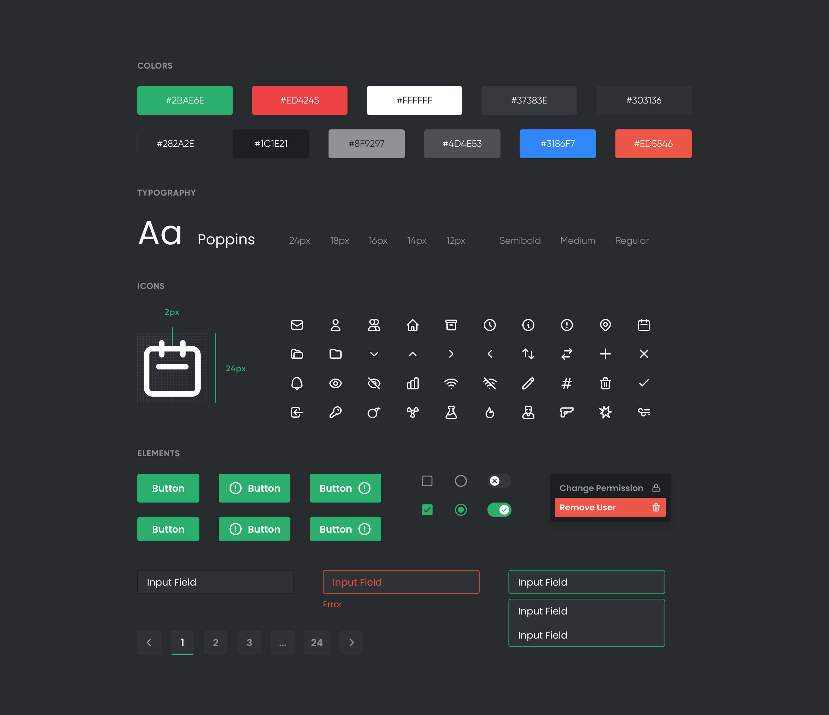
The primary benefit of design systems is their ability to replicate designs quickly by utilizing premade UI components and elements. Teams can continue to use the same elements over and over, reducing the need to reinvent the wheel and thus risking unintended inconsistency.
Documentation and Dev Support
Along with design source files, the Cieden team prepared supporting documentation. Its key deliverables included: a general system overview; user cases and user stories; roles/permission matrix; acceptance criteria; BPMN process diagrams; end-to-end user flows.
we reply under 24 hours.
free
session
