ux/ui essentials

Want to Stand Out? Check Out These 5 Creative UX Designer Portfolio Websites for 2024

10 min read
Derek Odom
Derek Odom
5 Jul 2022
How to stand out from thousands of UX/UI designer portfolios? Top 5 creative websites examples in 2024 Cieden

After endless UX/UI client projects, it’s finally time to design for your toughest audience: yourself.

It’s weird, isn’t it? You can map out user flows in your sleep, but when it comes to your own UX designer portfolio, every pixel feels like a life decision. And with portfolio websites everywhere that look more or less the same, the real challenge is making something that doesn’t blend in with the crowd.

Before starting, you would certainly like to get some inspiration and see what others do. That’s why we did the hunting for you — five of the top inventive UX portfolio website examples of 2025. 

Now, calling something “top” can be tricky because everyone's idea of the “best” is different. In our selection, we went beyond just good looks. These five portfolios balance originality with user experience, showing off their unique style without sacrificing usability. They might seem a bit crazy for most businesses, but that’s the beauty of them.

How to stand out from thousands of UX/UI designer portfolios? Top 5 creative websites examples in 2024 Cieden
Play

Top 5 creative UX/UI designer portfolio websites and approaches in 2024

Portfolio built around a symbolic central theme [muskat.com]

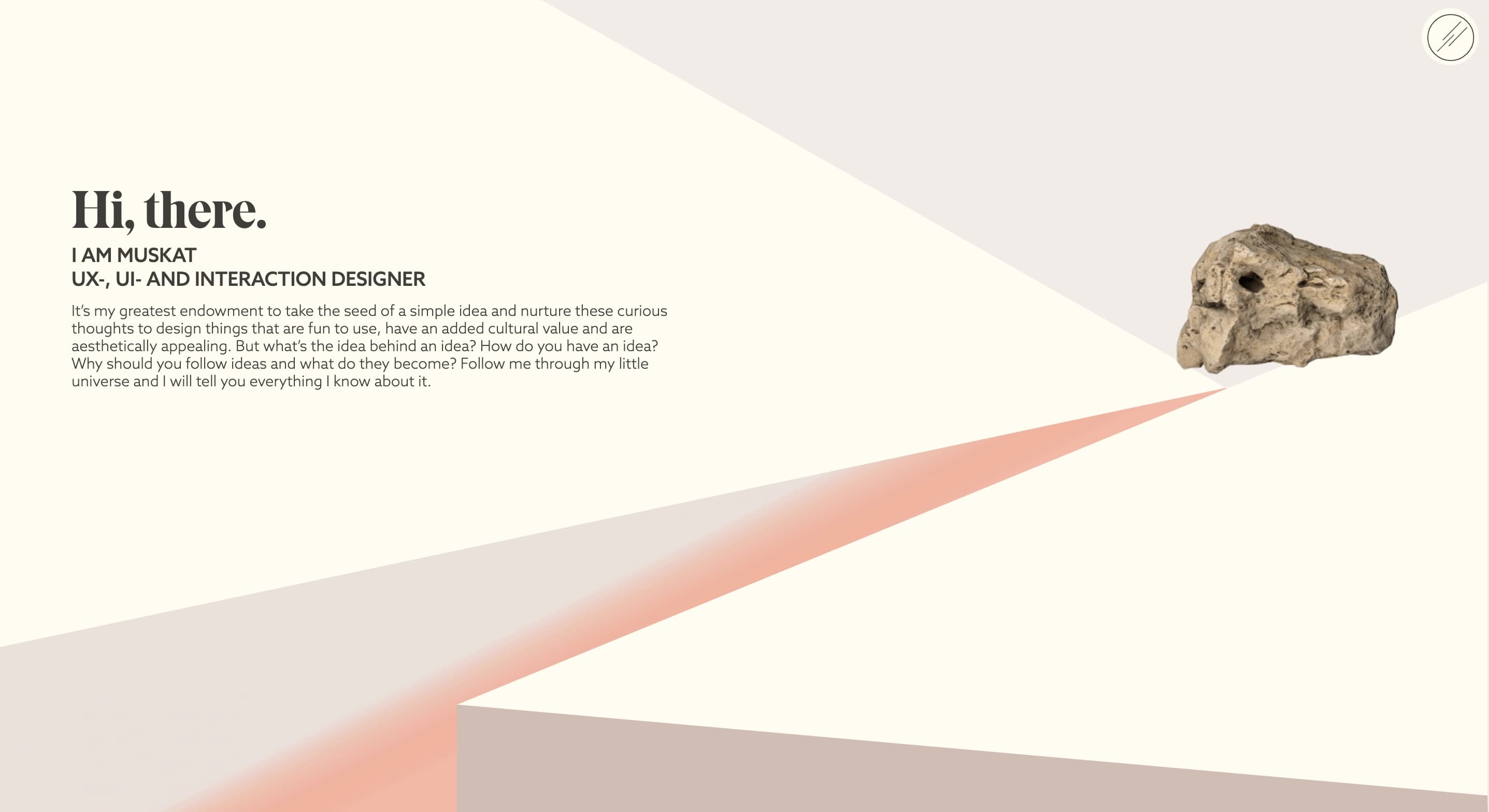
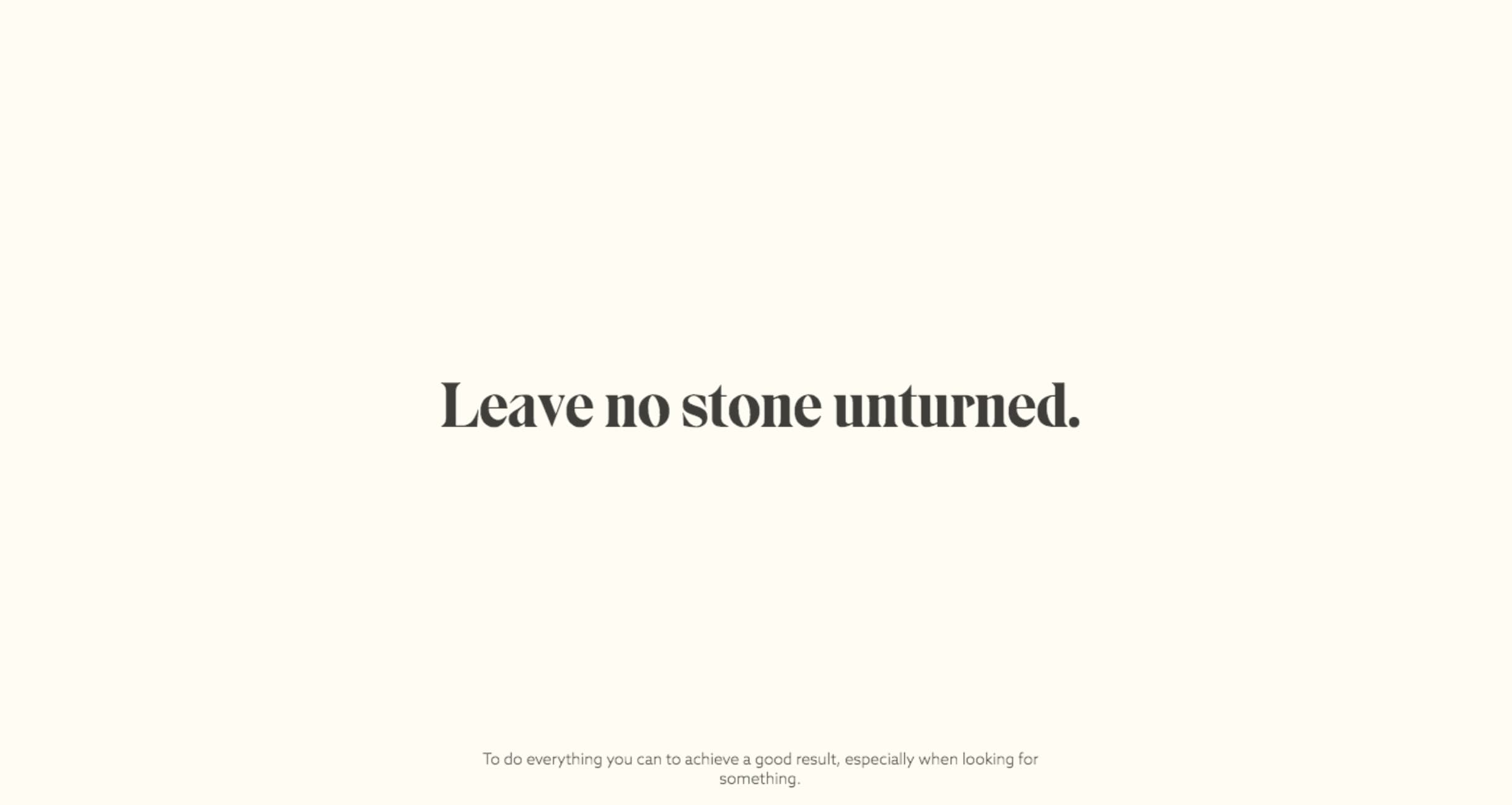
UX/UI designer Katharina Muske’s portfolio, Muskat, was something else. Sadly, it’s gone now (hoping it might come back!), but for those who saw it, it was like walking into a world built from stone. Literally.

Creative UX/UI designer portfolio

The UX portfolio website was created as a non-linear, multi-dimensional space, and a visitor could choose one among several ways to explore it.

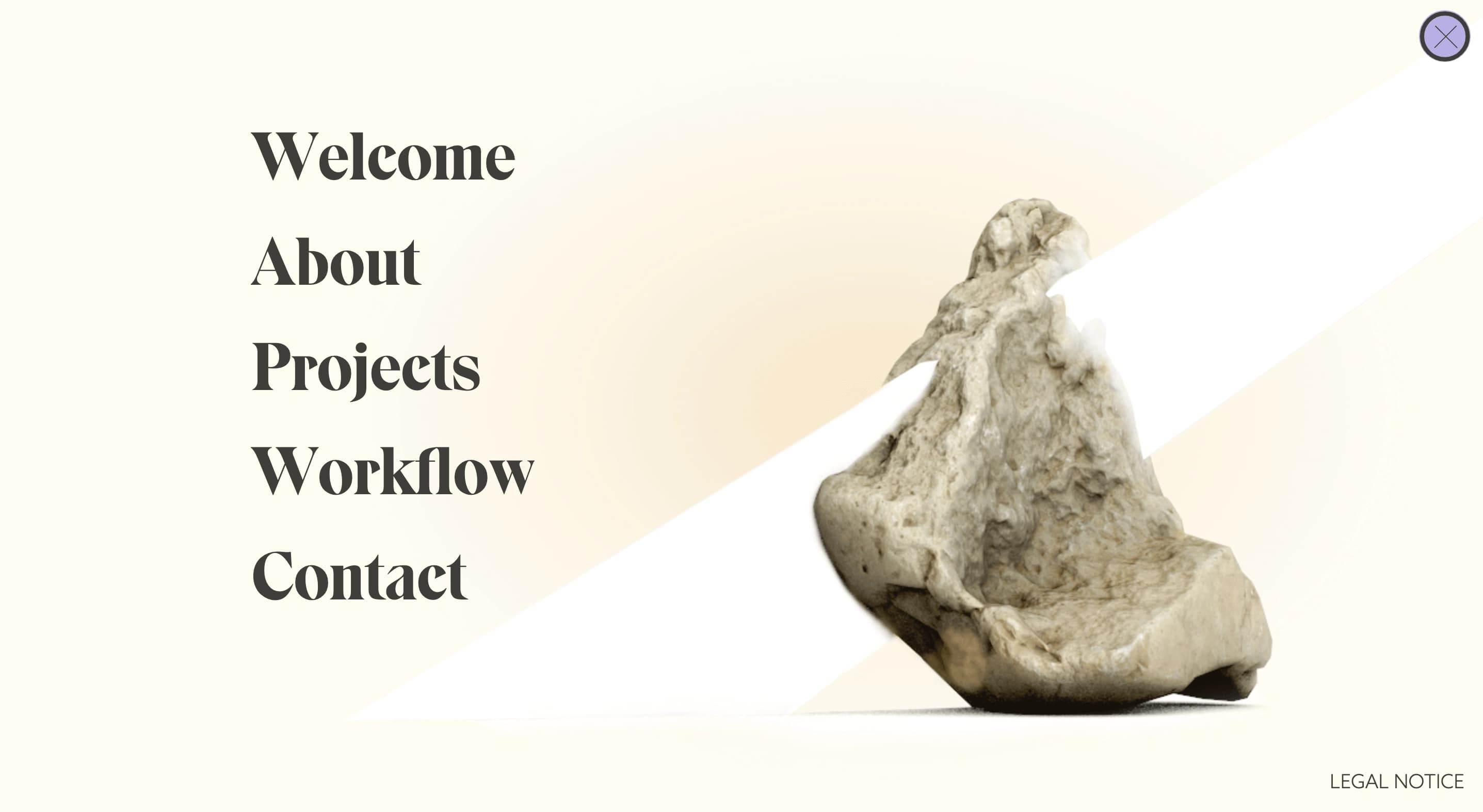
First, you could click the round “Explore” icon in the upper right corner, and it would bring you directly to the main menu with a beautiful kaleidoscopic play of colors.

Designer portfolio

Or, by hovering on a rotating stone, you could enjoy quite a big show leading through labyrinths of transformations and revelations.

UX/UI designer portfolio example

The stone wasn’t just a design choice; it was a metaphor for UX itself, a nod to the craftsmanship of stonemasonry, where every chip and detail matters. Katharina used the symbol to link all aspects of the site, making the experience feel whole, almost timeless.

UI/UX designer portfolio example

Using a single theme to pull an entire UX portfolio website together is exactly what Muskat’s stone motif did, and it made the whole experience feel like a journey you wanted to keep exploring.

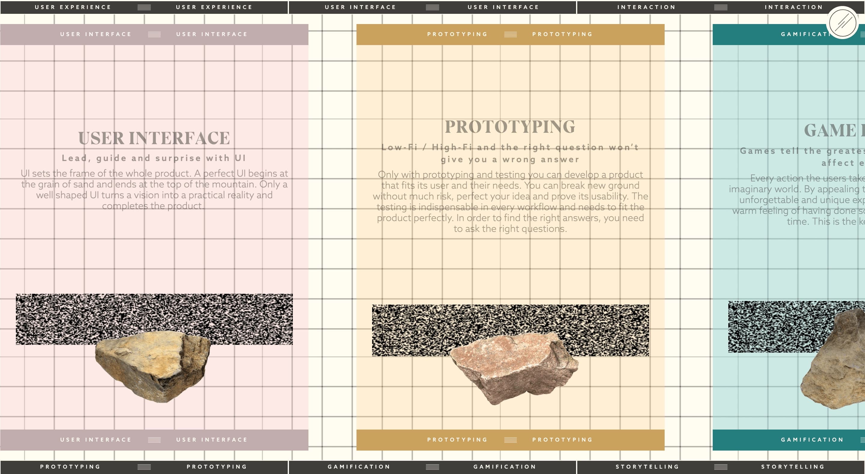
Now, since we can’t unpack every detail here, let’s look at two standout sections: skills and design process — the must-haves for any designer’s portfolio. The skills section was represented as a set of cards from a natural history museum, lighting up as you hovered.

UX design prototyping

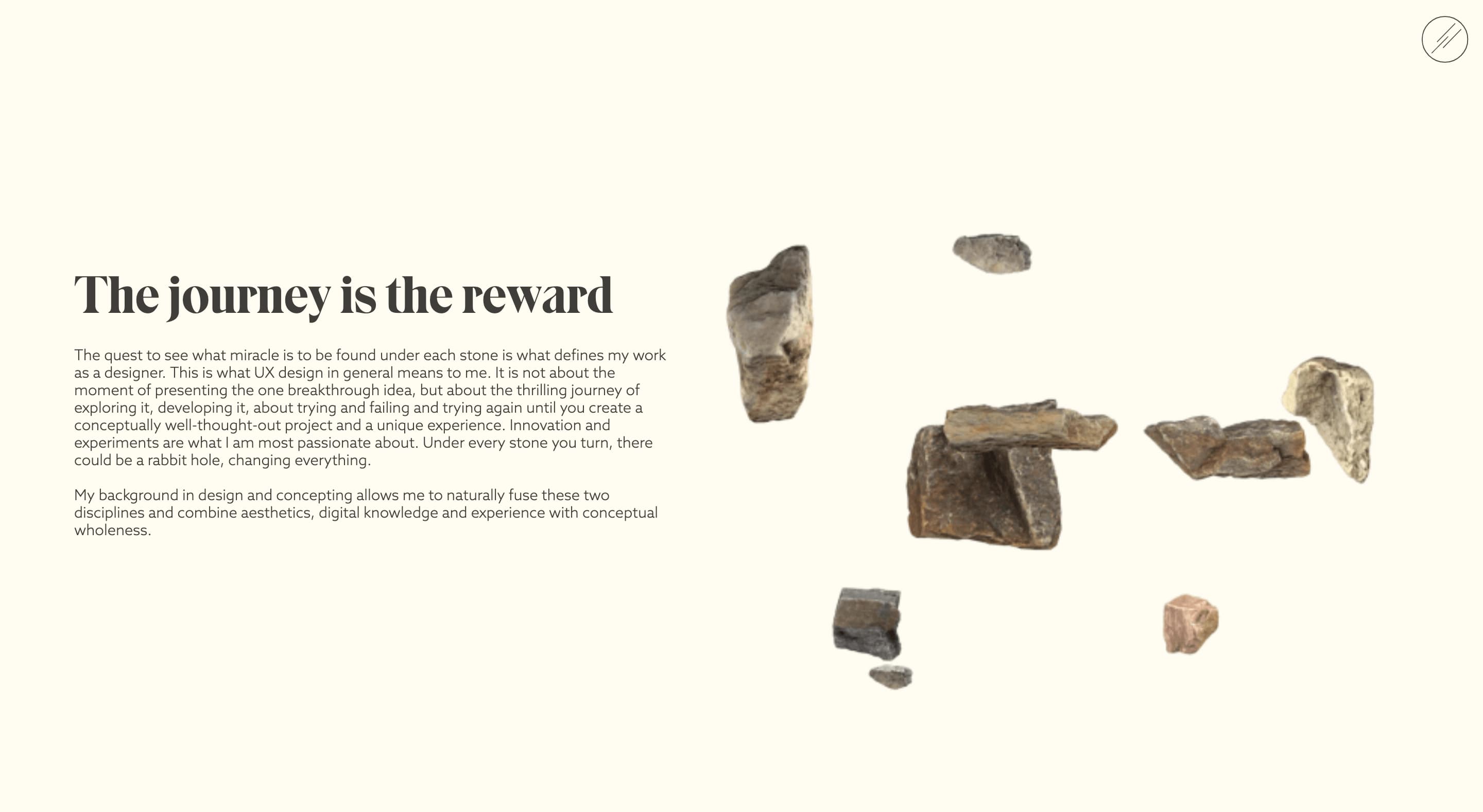
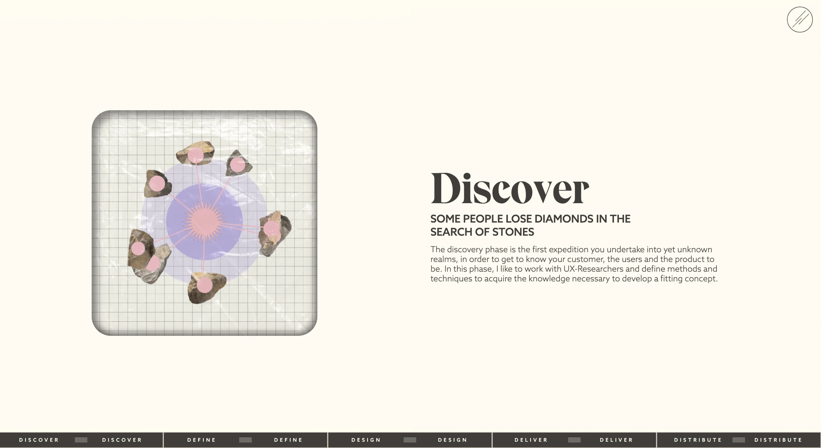
In the design process section, Katharina played with a cosmic theme of the Asteroid belt: stones orbiting each other or rotating around their own axes, alluding to some kind of a telescope lens.

How to stand out from thousands of UX/UI designer portfolios? Top 5 creative websites examples in 2024 Cieden

All of this happened against an earthy, soft background that tied it all together. The site felt like a mix of sci-fi, natural history, and timeless wisdom — perfect for anyone who loves design that’s a little off the beaten path.

Where imagination meets interaction [luсalem.com]

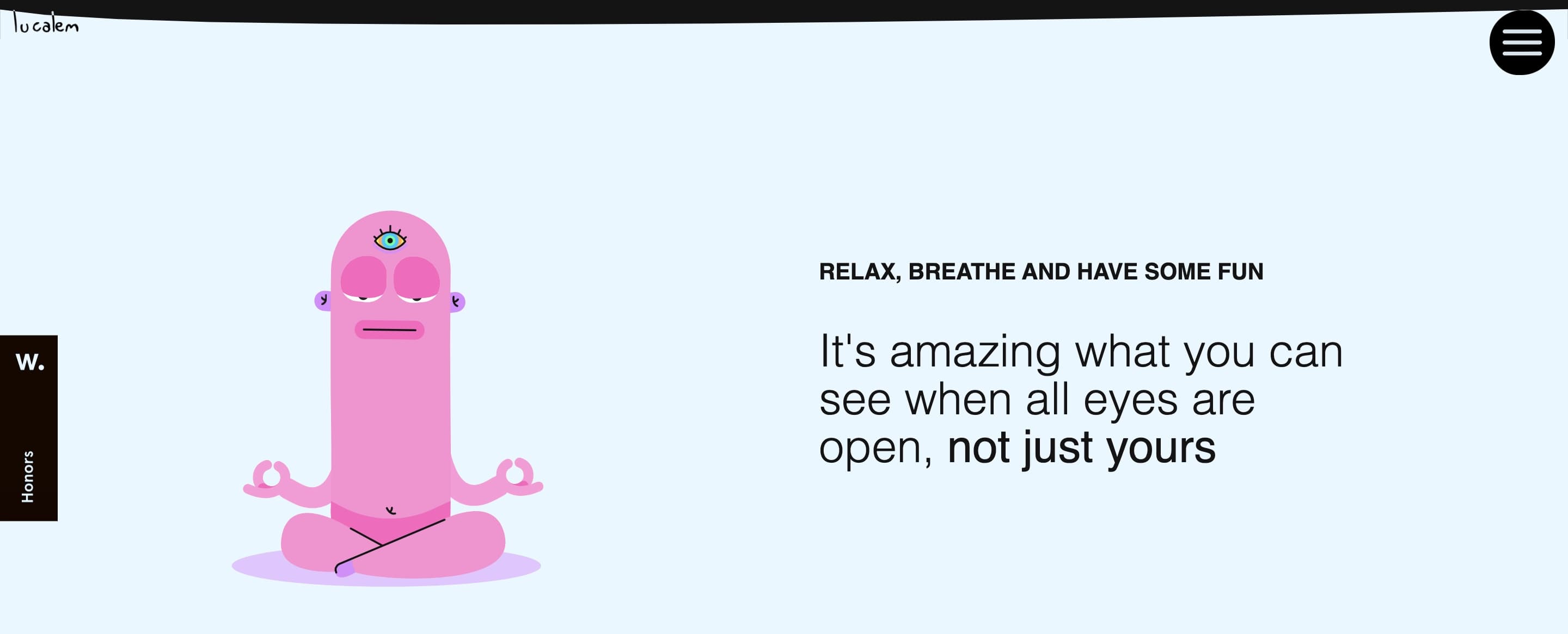
This UI/UX designer portfolio is an acquired taste, sure, but you won’t walk away unaffected by Lucas De Melo’s creation. Like it or not, you are going to stay for a while and start examining his fantasy world with its own depths, planets, and weird creatures. And then... You get hooked and want to explore further.

UX portfolio

And there are a lot of things to explore. 

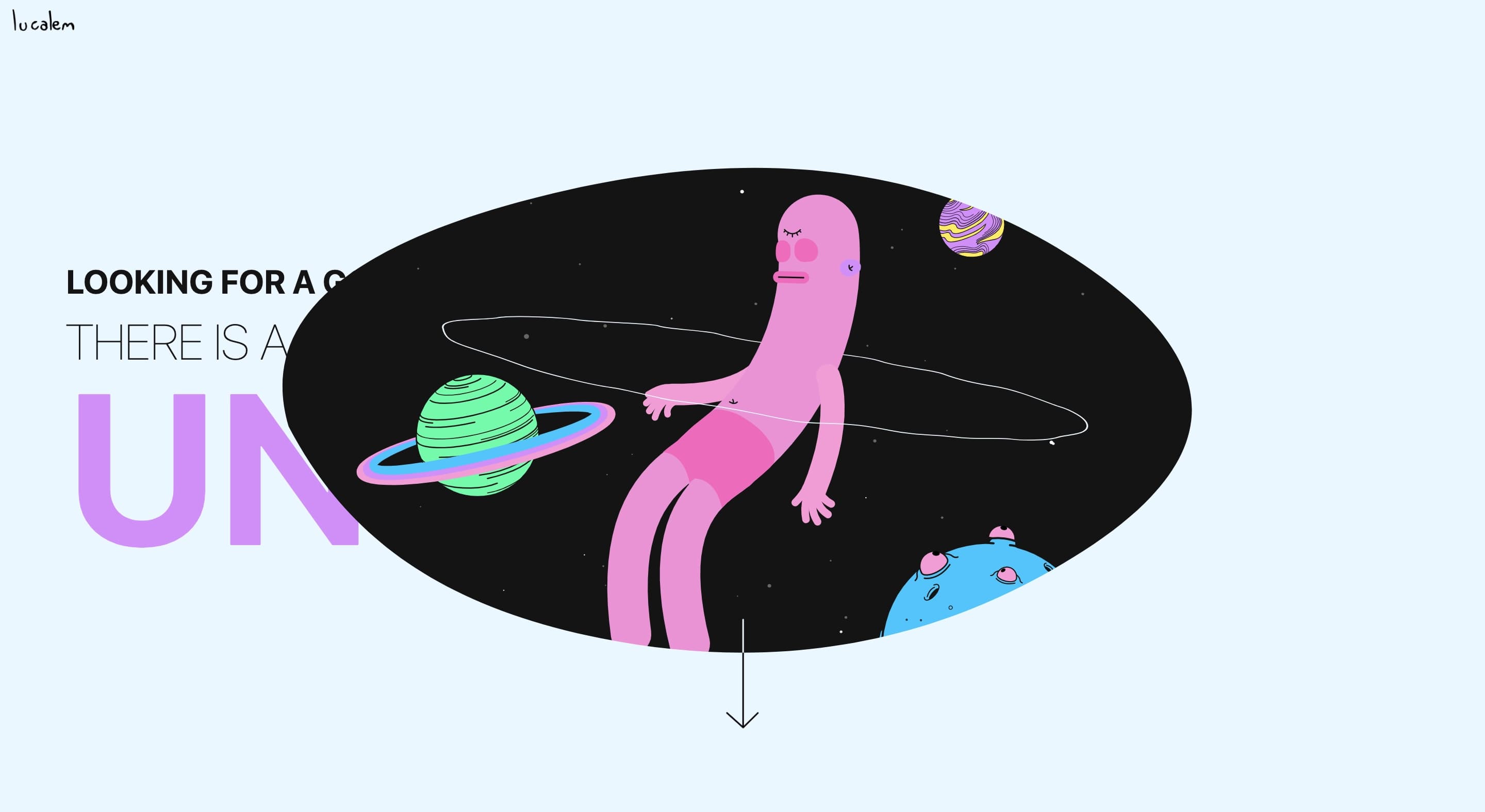
From the start, you’re greeted by an almost blank page with a simple tagline, and then things start to get interesting. Planets drift, a flying saucer floats into view, and a creature in its underwear meditates in peace, inviting you into this eccentric world. 

Note how much care and love are invested in making every spatial object so detailed. The pink creature in meditation seems to be the key character of this universe. Most probably, it’s supposed to be some kind of an avatar, representing the designer's creative identity in a way that feels far more personal than the usual “about” section with a headshot and a bio.

UI/UX design portfolio reference

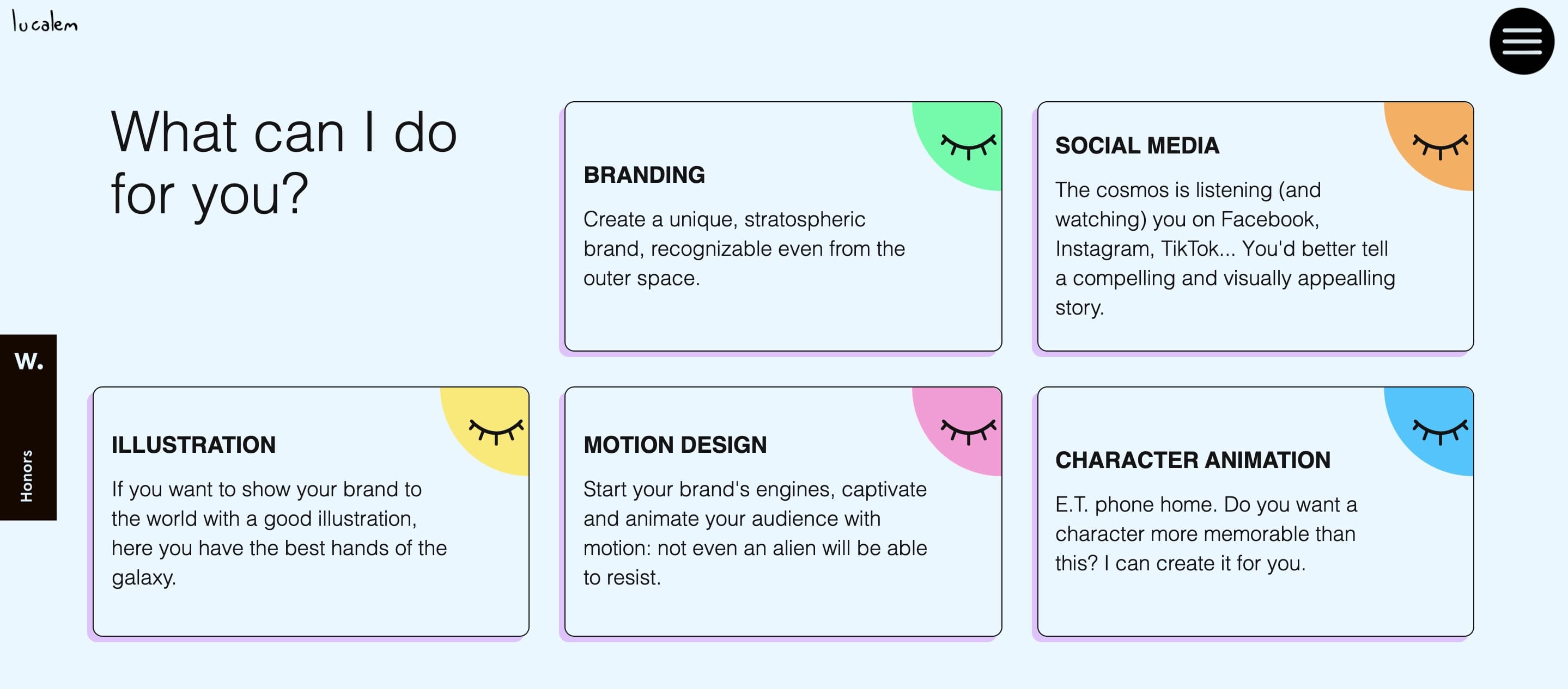
But you need to be a little investigative: this UI/UX portfolio website encourages a visitor to interactivity. Hover over a closed-eye icon in the corner of every section, and suddenly you’re watching a smooth, high-quality animation.

design portfolio reference

As you scroll, you discover sections dedicated to UX/UI design where you can drag and drop every object. These cards, buttons, taglines...

design portfolio example

It’s minimal, clear, and to the point. Nothing extra. 

High-quality transitions and motion effects [filsdegraphiste.fr]

“Parlez vous Français?"

design portfolio example

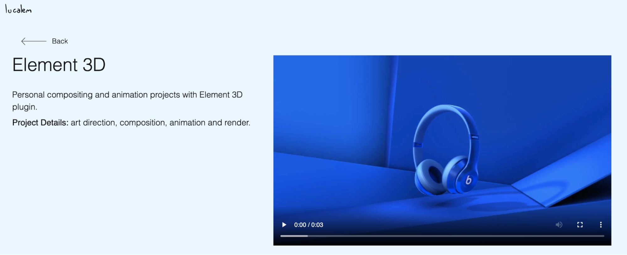
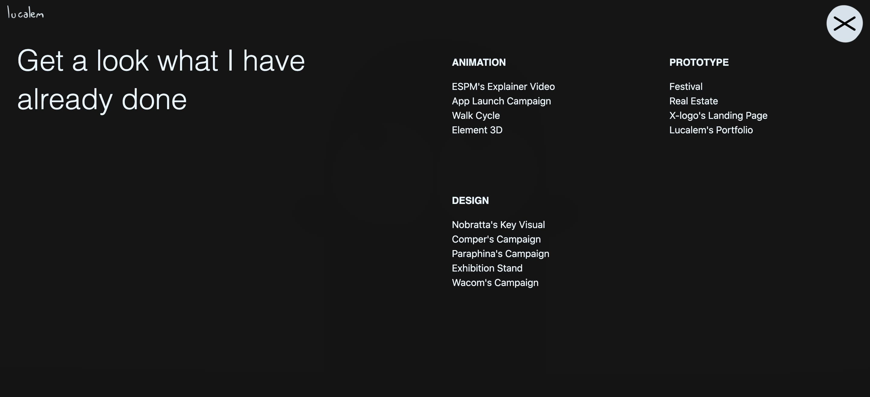
When you finally reach the projects, the fantasy fades, and things get straightforward. Each case is neatly categorized, with a clean layout, text summaries, and quick video recordings.

Graphic design portfolio

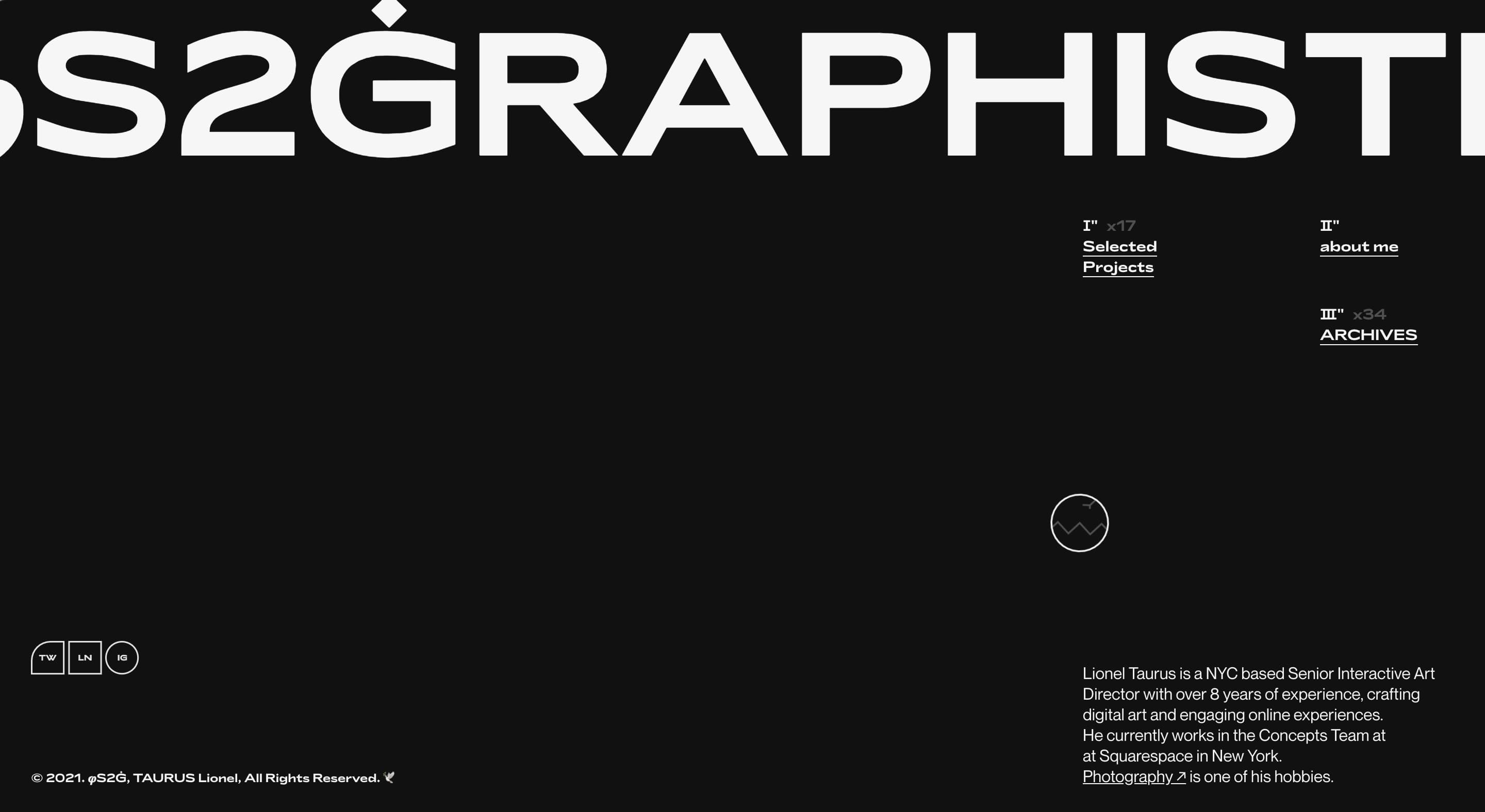
From the first glance, Lionel Taurus’s UX designer portfolio website is pure French glamor, with its asymmetrical layouts, elegant dark mode, stylish serif fonts of varying sizes, and plenty of negative space. 

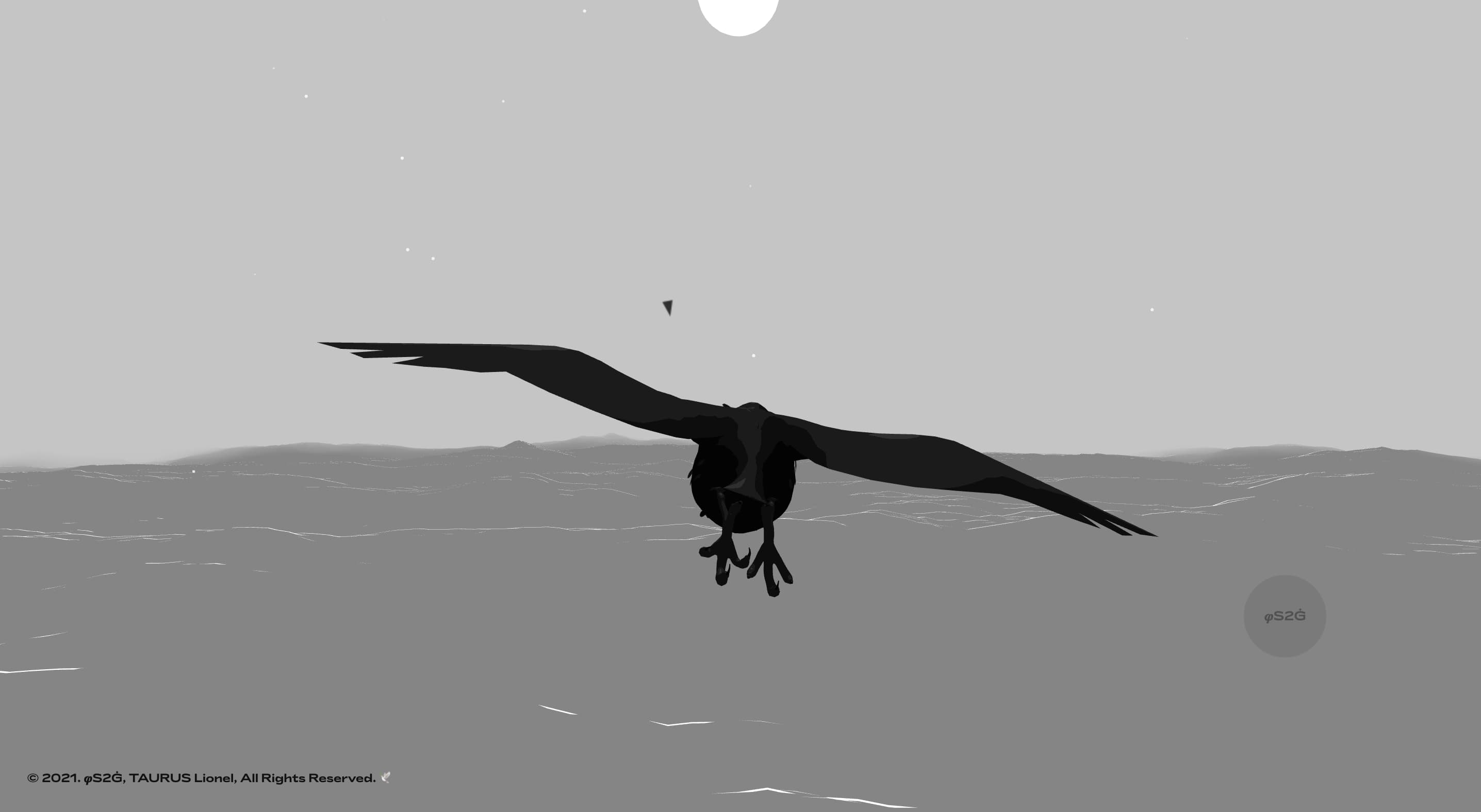
Lionel, a Squarespace designer from Guadeloupe, has created an experience filled with face-melting elements, like a “singing” cursor that releases audible visible chirping.

Creative UI/UX design portfolio

Follow this whimsical bird, and it’ll take you on a meditative journey across the ocean. Sure, this impressive device isn’t quite justified from the usability standpoint, as such animation should consume just an enormous amount of energy and hardware resources. But it’s undeniably beautiful – no questions asked.

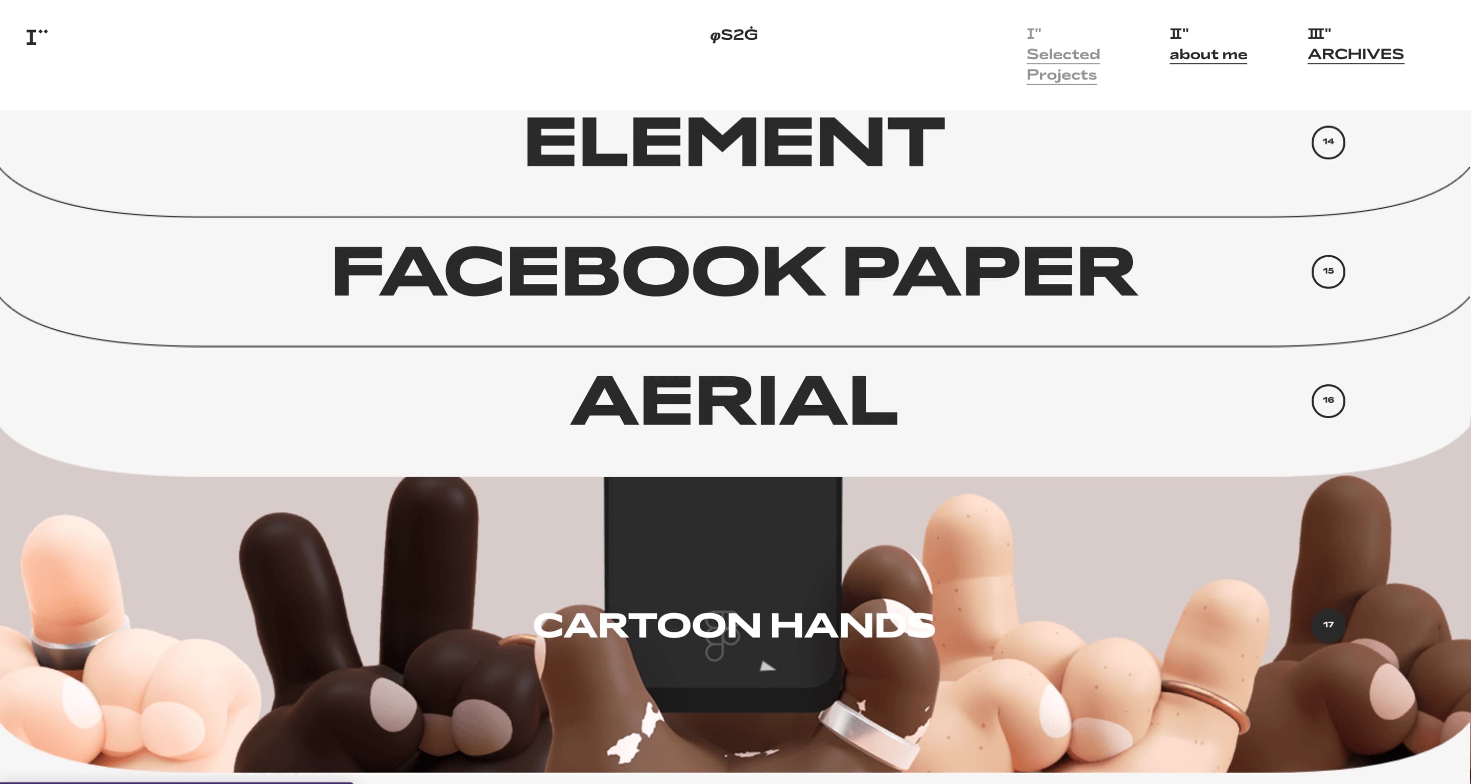
The real reward, though, is in the portfolio section. Unlike the previous UX portfolio website examples, where the case studies were minimal, Lionel’s portfolio is the complete opposite. 

Projects are organized in a high-tech, telescoping slot system reminiscent of a file cabinet, with bold, capitalized captions. Hovering over each slot swaps text for a 3D animation that transports you into a unique visual world. 

cartoon design portfolio

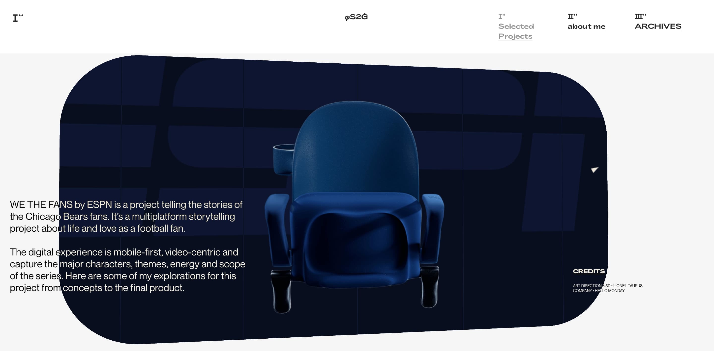
Interestingly, the portfolio’s clean, snowy tidiness contrasts sharply with the noir style of the landing page — but somehow, it all works. Click on any case, and you’ll see Lionel’s mastery in both motion and graphic design.

3D design portfolio

The portfolio mixes flat design with 3D elements to create an emotionally engaging experience, with rich visuals and minimal text. It’s beautiful, no doubt, but while visitors may eternally enjoy the beauty of interfaces and graphics, they won't have much opportunity to figure out what this project is about and how it was implemented.

A one-page UX journey with game-like depth [david-hckh.com]

Calling this UX design portfolio website “creative and innovative” barely scratches the surface.

Funny UX design portfolio

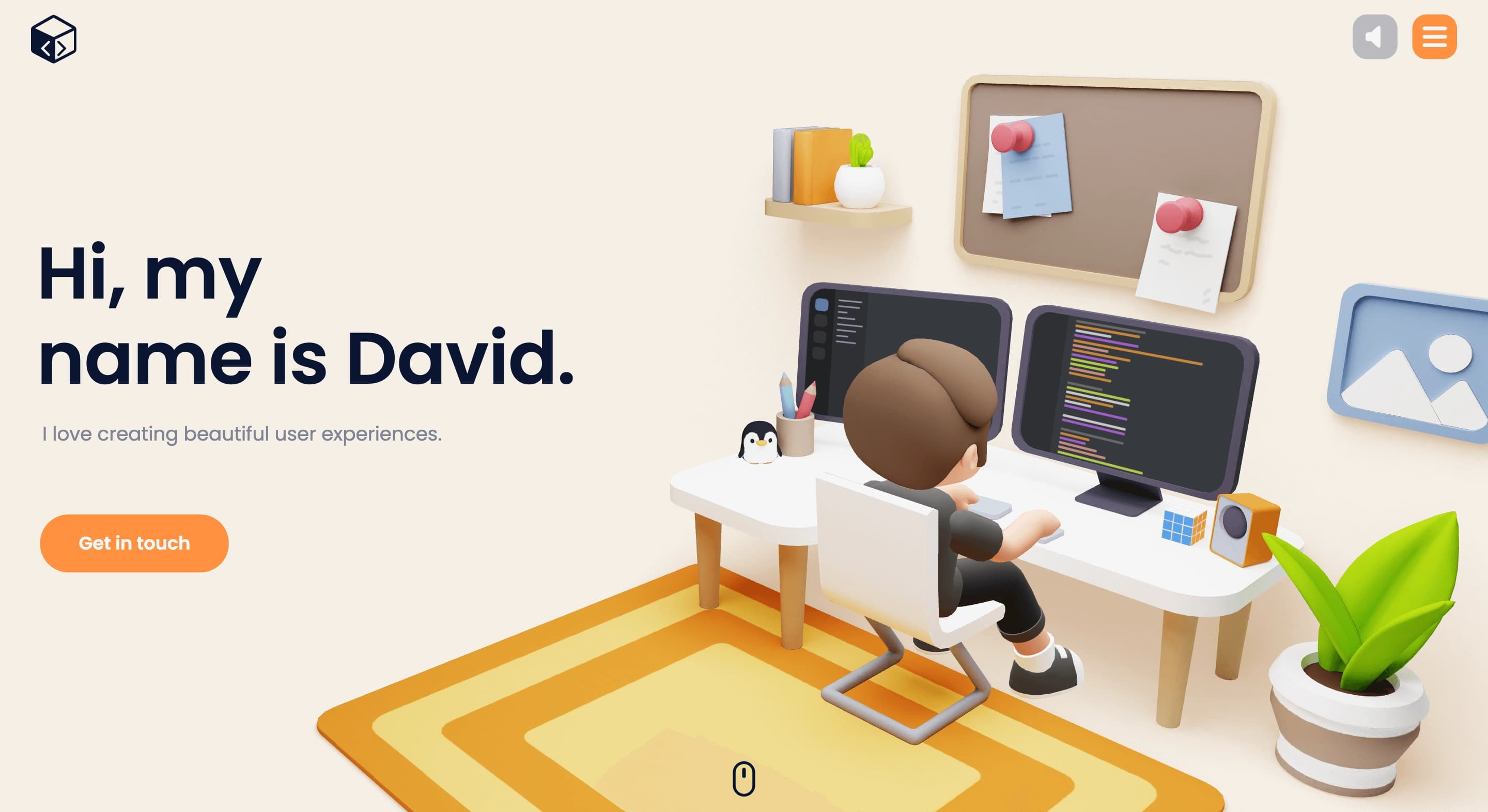
David, a designer from Germany, says he’s all about “creating beautiful user experiences,” but one look at his site and you can tell he’s not relying on your typical UX toolkit. Obviously, it could not have been done without some heavy artillery of 3D modeling and programming. 

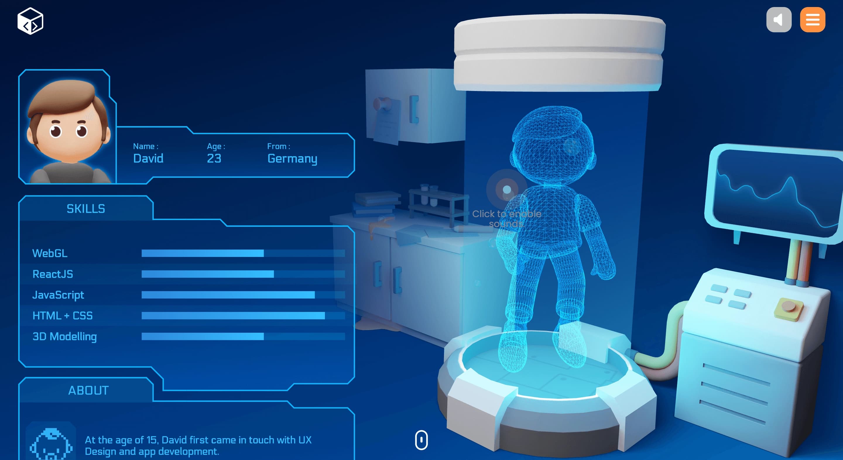
His personal website is styled as a virtual apartment that makes an allusion to the popular genre of real-life simulation games. As you scroll, you see an avatar profile with stats, personality characteristics, skills, and even a digital matrix of a character in this futuristic tube hooked up to a computer.

UI portfolio

The quality is awesome. Vibrant colors, perfect composition, exceptional drawing of 3D models, and seamless animations. For an even more immersive experience, you can turn on sound, making the space feel closer to the real-world environment. David gets big points for interactivity!

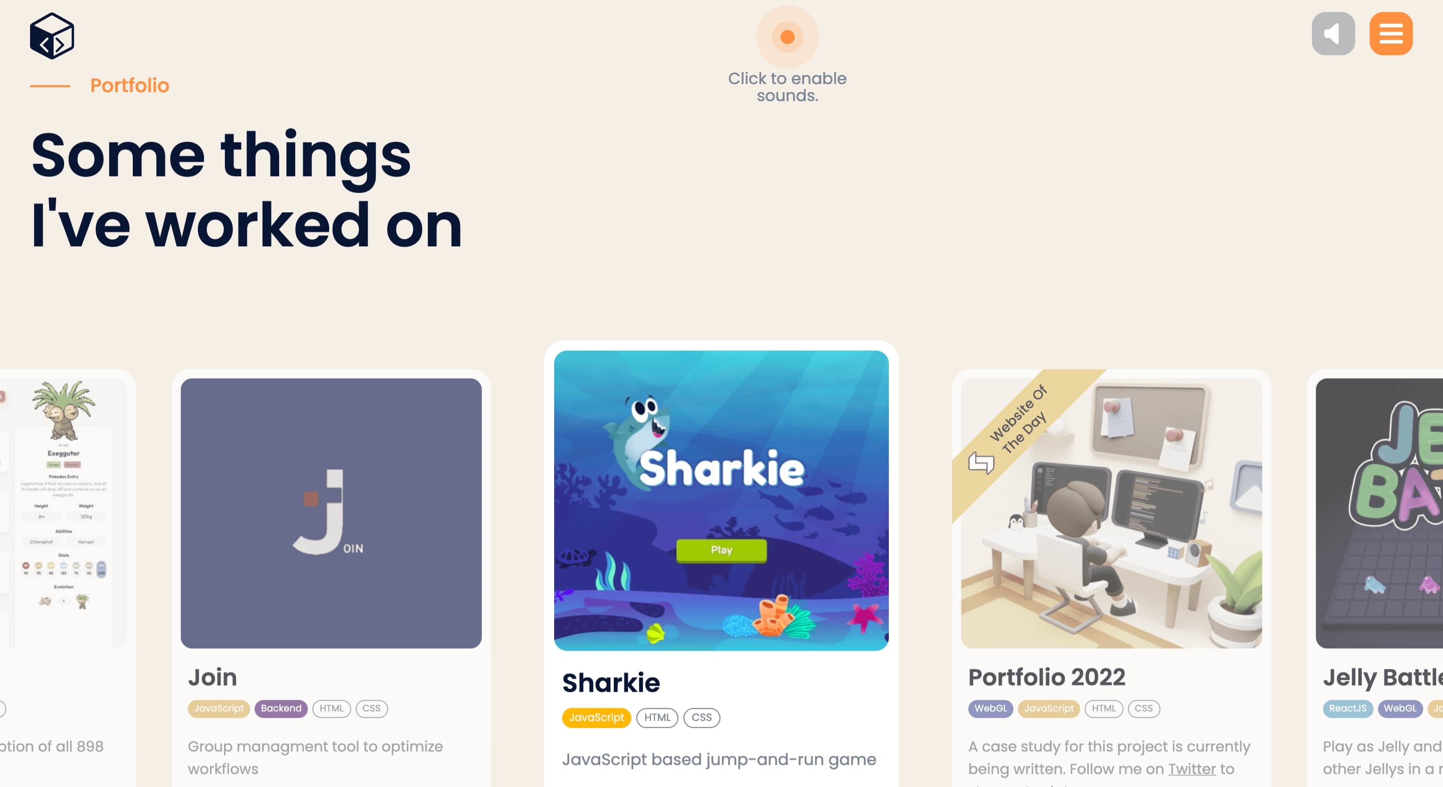
Instead of long, detailed case studies, he keeps things simple with a clean list of projects, each with a quick description and a link to learn more.

Example of UI/UX portfolio

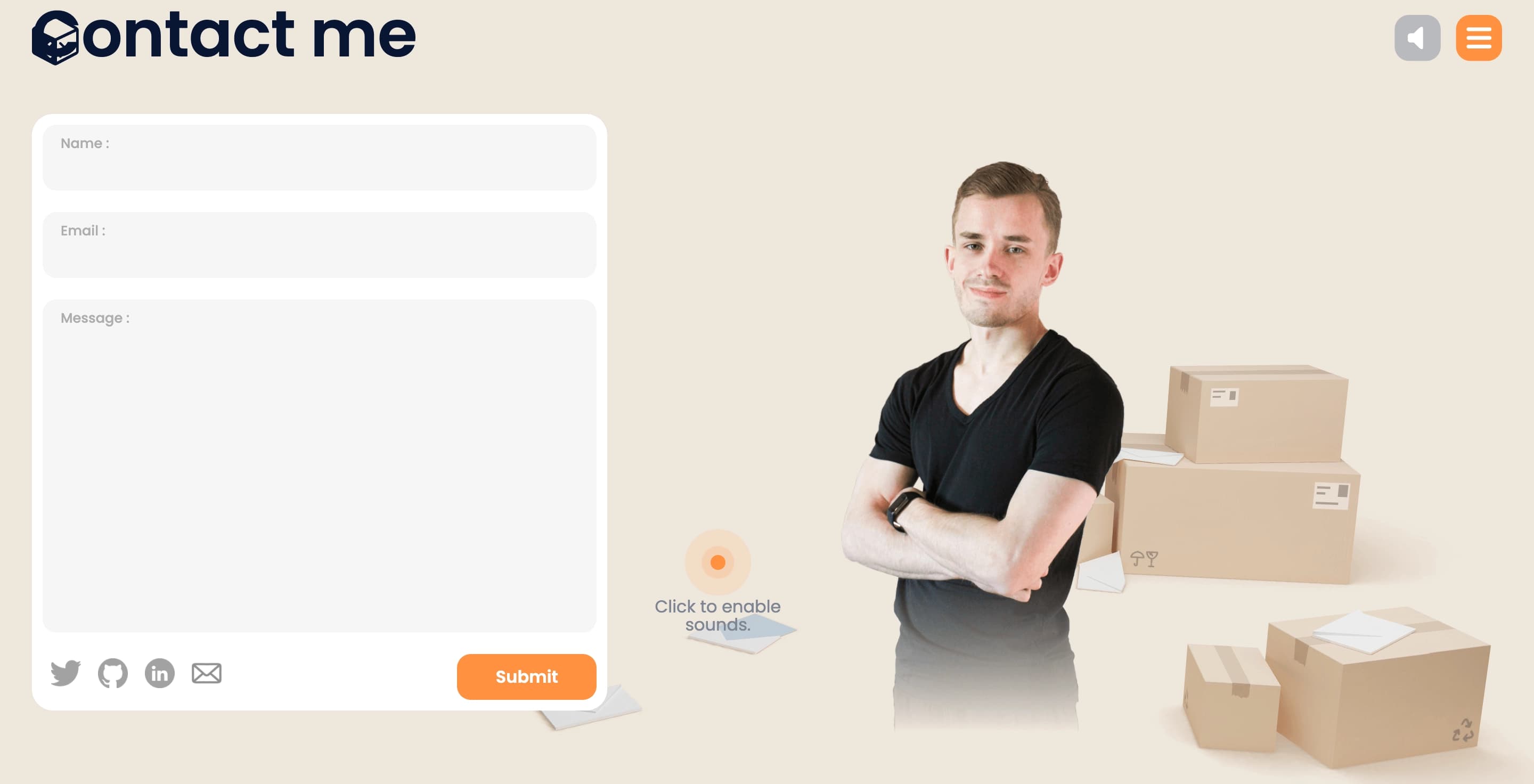
This is quite understandable: after what we have seen on this site, a visitor doesn't need to have any additional proof of David's skills and competencies. At least, this may be his way of thinking. But if you still need more info, there’s a simple contact form to reach him.

contact me portfolio example

The whole site is one page — compact, straightforward, and yet you find yourself wanting to hang around a bit longer. Making a UX portfolio website this engaging, while keeping it so clean and simple, isn’t easy, so David's work is highly commendable.

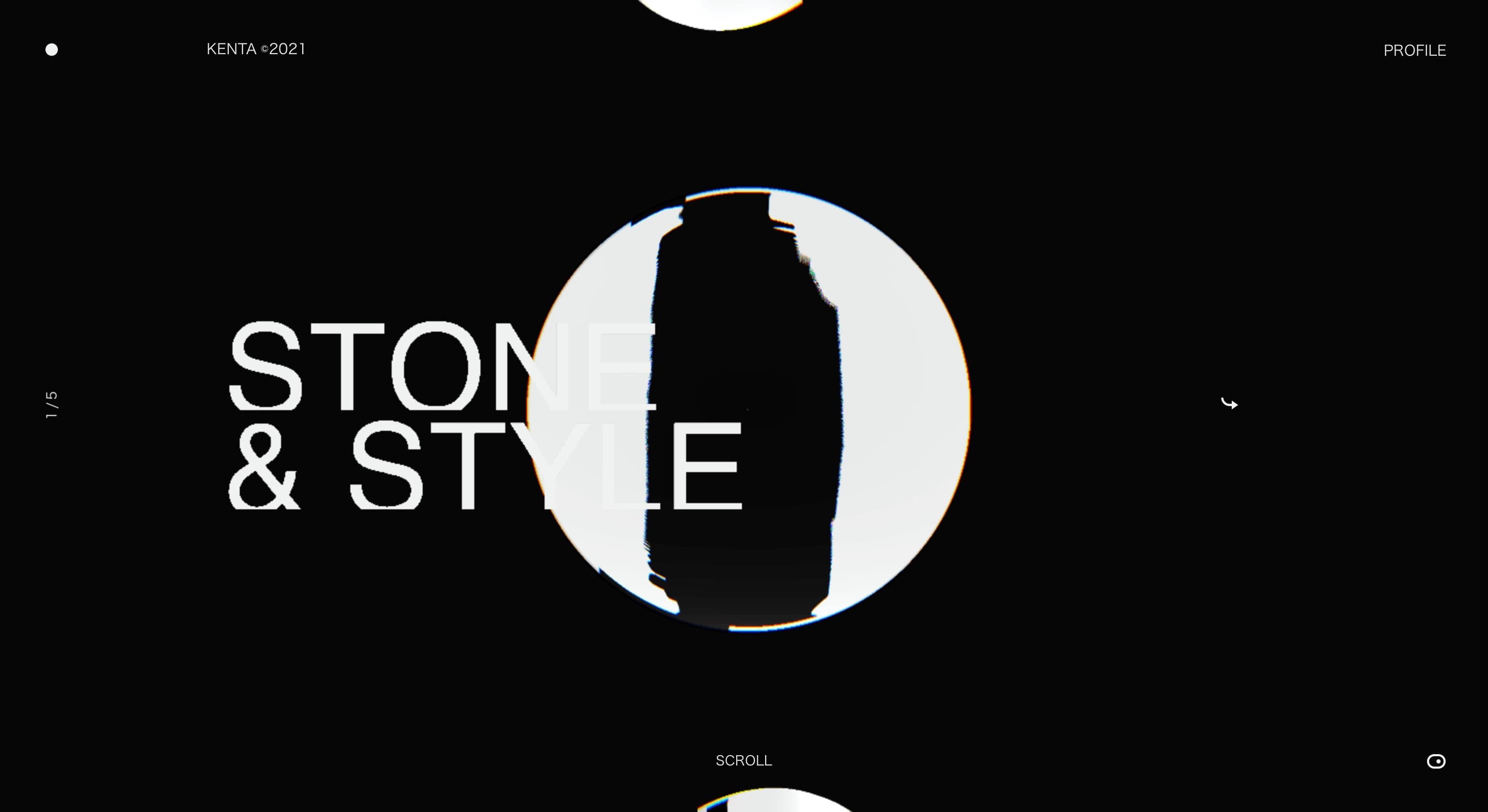
A fusion of Japanese art and futuristic geometry [kentatoshikura.com]

Kenta Toshikura’s website feels like stepping into Japan’s creative soul — a mix of manga, calligraphy, haiku, and that quiet, artsy vibe from black-and-white ‘70s films. Imagine the calm of a temple garden fused with futuristic geometry, and you’re close. But really, it’s something you need to experience firsthand.

black and white design portfolio

As you open the landing page, the first impression is the feeling of some disorientation, with “Where am I?” and “What to do?” sentiments, quite in line with Asian ambiguity that’s somehow both intriguing and inviting. 

But as you start scrolling, everything turns out to be very clear and intuitive and you realize these abstract pictograms encased in white spheres are case studies that Kenta invites us to explore. 

Kenta’s site invites you to slow down and take in each detail, blending modern minimalism with traditional Japanese art. It’s an intentional experience that feels as much about the journey as it is about the design itself.

Leaving with fresh eyes

Each of these UX designer portfolio examples shows us there’s more to UX than just showcasing projects. These designers create entire worlds. They remind us that a portfolio can be immersive, playful, and still communicate skill and personality. 

So if you're setting out to create your own, take a cue from these boundary-pushers: make it unforgettable, make it you.

FAQ

What is a UX designer portfolio?

A UX designer portfolio is a website or digital collection that shows off your best work as a user experience designer. It’s a place to highlight your skills, projects, design process, and the impact you’ve made through your designs. This is your personal brand in action and your chance to show potential clients or employers who you are as a designer and what you can do.

What should I include in my UX portfolio?

Include a few key projects that showcase your design skills and thought process. Show not just the final product but how you got there, with research, sketches, wireframes, prototypes, and any testing you did. Highlight your role in each project, and add some background on the problem you solved and the results you achieved. A short bio, contact info, and any extra skills (like coding or motion design) can be great additions, too!

start your project with us.

Getting in touch
is easy .
Thank you for your message. It has been sent