Project Plan
Task
Redesigning the language learning platform and designing new features and flows
Team
Senior UX/UI Designer
Duration
4 months (Jan 2019 - Apr 2019)
Scope
59 responsive web app screens, 4 landing pages, design system and branding materials
Result
The design has been implemented into a functional product. Active users complimented us on the improved look and feel and new functionality
Overview
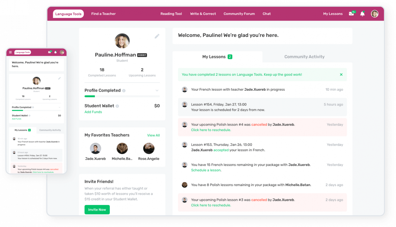
Regardless of your linguistic ability, sharing language is all about connecting. That’s exactly what the Language Tools (LT) does. The app is a vibrant community of language lovers that will help you thrive.
LT helps students with a wide range of educational activities ranging from writing essays to talking to actual native speakers and fellow learners. In turn, with the help of the platform, the teachers can focus only on what matters most – teaching. No need to rack your brains over the payment process, scheduling, or finding students.
The LT team reached out to us in January 2019 with an existing platform in need of a redesign, due to dated UI and numerous usability issues. In the span of 4 months, we managed to document and prioritize the design issues, iteratively redesign the whole platform with a number of new features on top. Additionally, while preparing the hand-off files, we’ve structured the design elements in a design system.
Benefits
- A customer who’s open to honest feedback
- A number or similar products to analyze
- Large amounts of aggregated product data to analyze
Challenges
- Few interactions
- No time for comprehensive design validation
- No prior design documentation
Step 1
Discovery Phase
To kick things off the right way, we’ve decided to have a workshop to identify and document the areas that needed improvement the most. That way we could redesign the platform iteratively in an agile manner rather than planning a waterfall-like lengthy design process. Such an approach enabled developers and us to work in parallel.
The final workshop deliverable was a project roadmap that aligned our vision as designers and our customers’ as the business person.
Step 2
Ideation & Prototyping
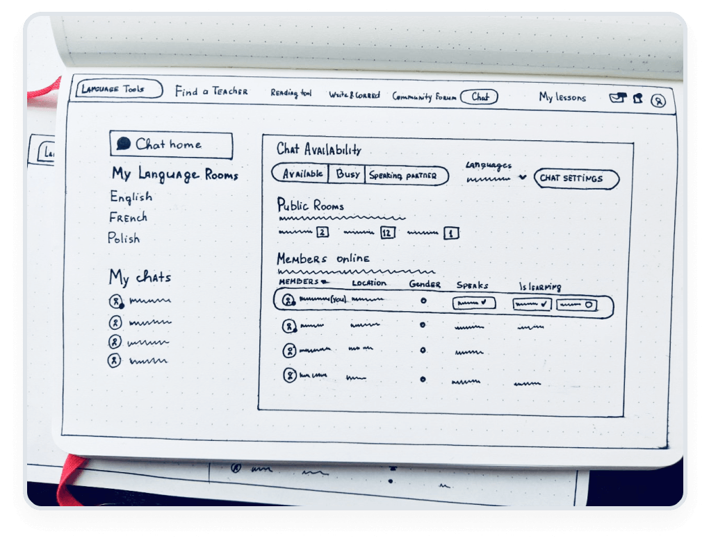
Having prepared a prioritized list of design issues to be tackled, we started brainstorming solutions. Then, we would turn these solutions into early design concepts and wireframes. Starting with wireframes provides a wealth of insights into the logic behind the user flows and helps pinpoint potential problems at the ideation stage, rather than realizing something is off during the software development.
These wireframes were later turned into clickable prototypes to re-create the actual user experience as accurately as possible. This brings us to our next stage.
Step 3
Validation
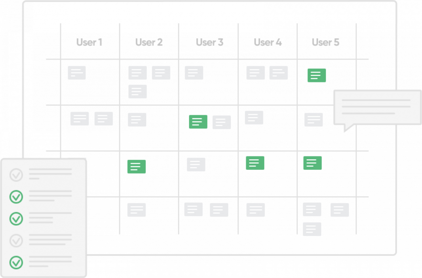
Though internally approved, the concepts and prototypes that we’ve developed at the previous stage were now ready to face the ultimate judges of our design – users. In order to have as many processes run in parallel as possible, we’ve involved our customer’s team to help us interview the app’s end-users.
At a minor expense of a week of testing, we’ve identified a number of areas that needed improvement that could otherwise cost us months of design and development to fix. That’s what we call UX magic.
Step 4
High-Fi Design
Usually, before proceeding to designing a polished final user interface, we would need to spend some time looking for moodboards, i.e. design references and inspiration to get an idea of what our customer likes. On this project, however, it wasn’t the case, as we already had a legacy design with clear design and branding directions. Therefore, we took the older look and feel and enhanced it with a modern touch and a much clearer UX.
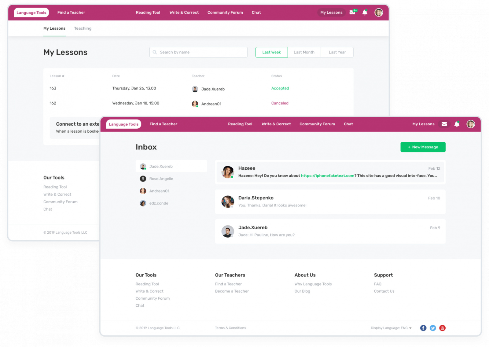
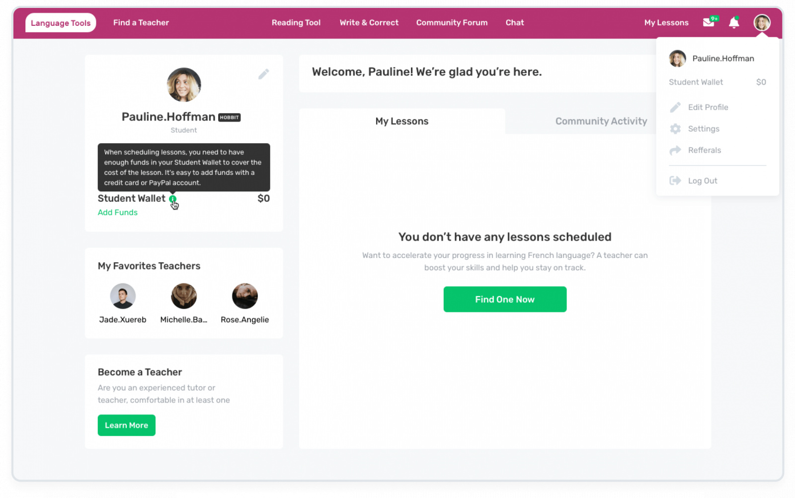
Having validated the usability aspects of our prototypes, it was then only a matter of making it look stunning. And so we did. At least according to our customer.
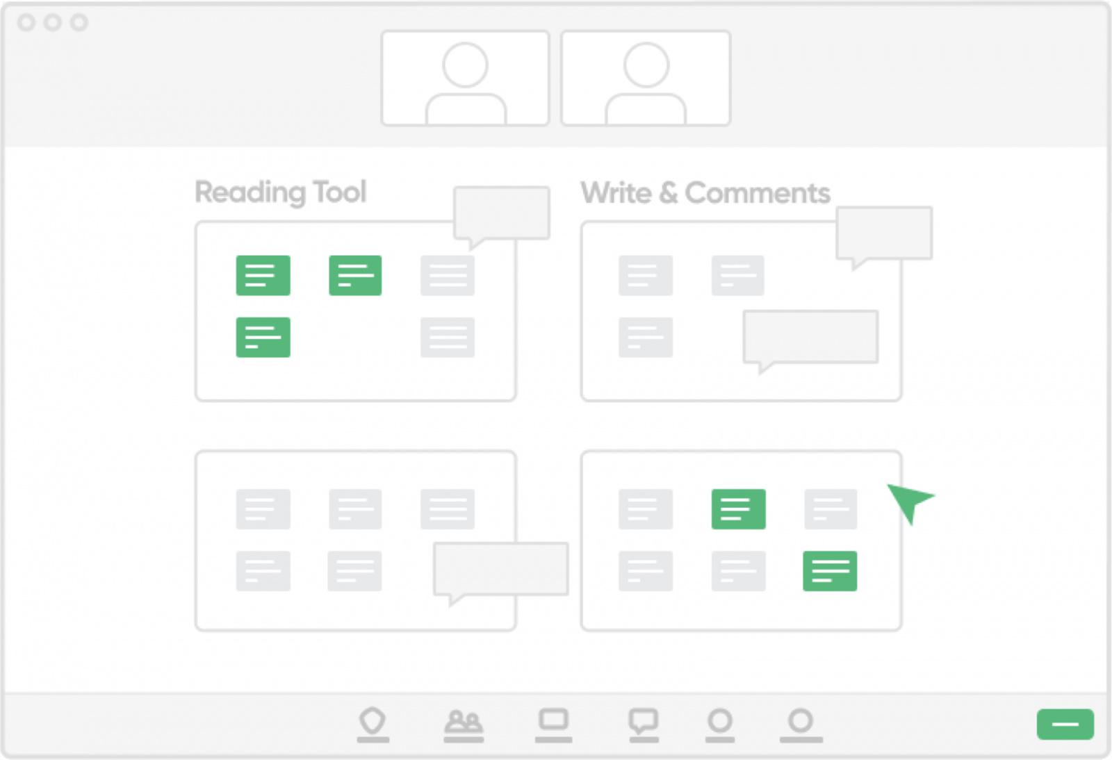
Reading Tool
Mouse-over dictionary
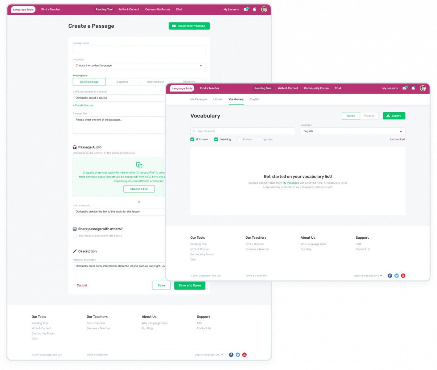
The built-in mouse-over dictionary lets you highlight anything you don’t understand and get a quick translation in context.
Stacked with features
Most pop-up dictionaries won’t give you definitions for phrases, don’t color-code words that you’ve looked up before, and don’t keep statistics. This platform does all three.
Upload audio & import video
You can upload audio and import YouTube videos, too. (Sweet, right?).
104 languages
Oh, and it supports 104 languages, more than any other hosted reading
tool available.
Write & Correct (Community Forum)
Whether you want to become a better writer in your target language or just use writing as a way to bolster your skills, nothing beats corrections from a native speaker.
Corrections from LT dedicated community
Free essay tool allows you to write whatever you want – essays, phrases, idioms – and get corrections from the dedicated community.
Auto-tracking
Language Tools platform uses auto-tracking so corrections are consistent and clear.
Correct an essay
You can make someone’s day and correct an essay yourself.
Share and get tips
Share experiences and methodologies, get tips and tricks for language acquisition, and play geeky language games.
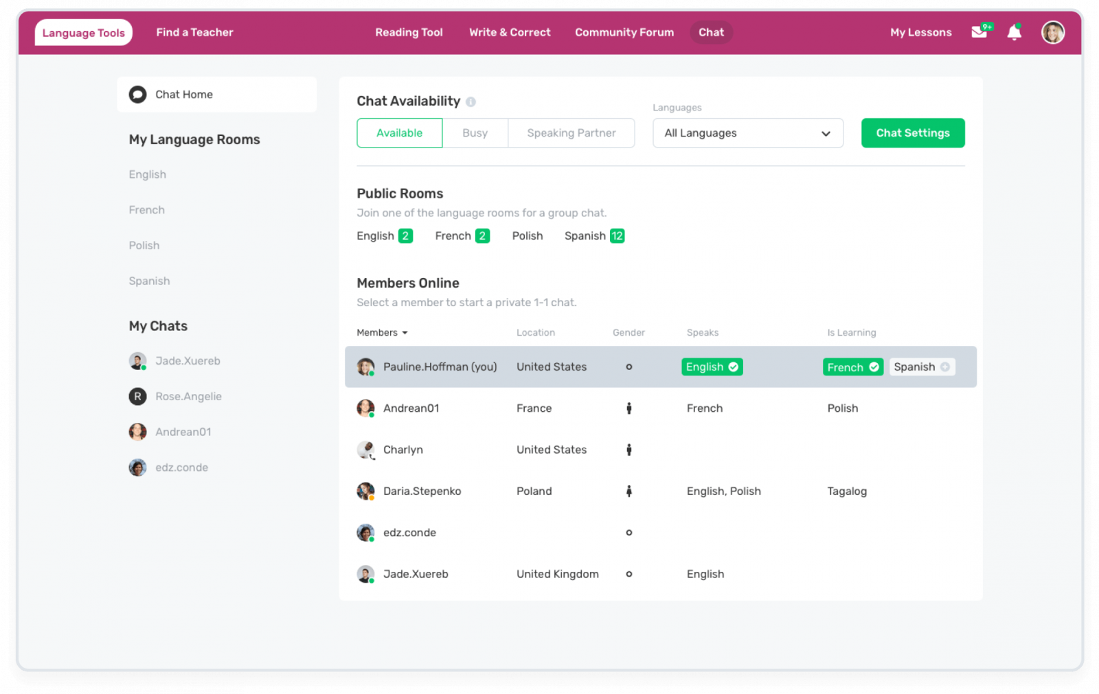
Chat
Some of us study languages for months without the opportunity to practice conversation. Language Tools global community is anywhere you are – log on to converse in whatever language you choose.
1-1 chat
1-on-1 language exchange in private rooms.
Language rooms
Group chats in language-specific rooms.
Voice and text
This tool supports both voice chat and text chat.
Step 5
Design System
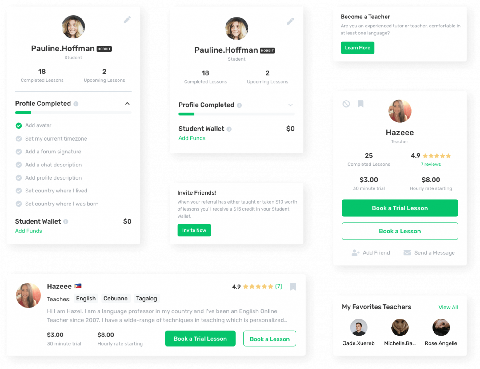
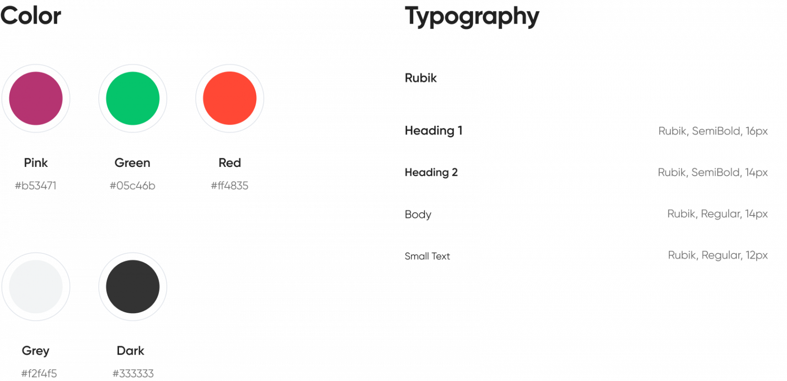
Now that we have a polished high-fidelity UI design, it’s time to prepare a hand-off file for a seamless transition to development. The best practice for a dev hand-off is creating a design system. That’s exactly what we did. By creating a design system we ensured that both designers and developers can gather all reusable elements in one place to save time and keep things consistent.
Step 6
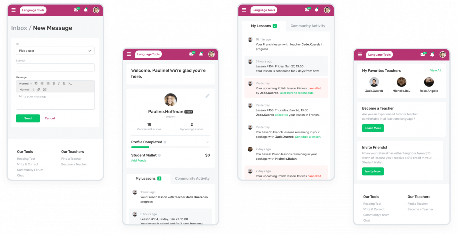
Mobile Responsive
we reply under 24 hours.
free
session
