Project Plan
Team
3 UX/UI Designers, 1 Manager
Duration
12 months of active work
Scope
Product discovery, UX/UI design of six digital products for Android (min resolution), tablet (768x1365), and Web (1440), design system
Result
The fully functional application for FlexyMenu; the rest of the products are in the phase of development
Overview
Cloud computing technologies continue transforming the service sector worldwide. Our client from Flexybox, Denmark, is on the cutting edge of the booking system digitalization in the media, fitness, and hospitality industries. The company provides all-inclusive “turn-key” integration of the booking business processes into the virtual space.
Along with this, a special “bonus” offer of Flexybox to its B2B clients is an opportunity to create a customized white-label app for users consistent with a company’s brand identity. This is what the Cieden team has been requested to help with. Our task was to envisage an algorithm enabling an average customer without particular technical skills to adjust an app to the needs of their business with a series of simple steps.
Benefits
- A collaborative client with a deep understanding of the digital design process
- Close cooperation with the development team
- Prototype testing before the development stage
Challenges
- Building a design system from scratch
- Tight deadlines
- The need for a detailed prototype with video for every new feature
- Enhanced requirements of a client on the product documentation
The Product Suite
Our client requested to create a framework for app-building and brand alignment for such key products of Flexybox as:
- FlexyFitness app: booking and managing classes in fitness centers, sports clubs, and gyms;
- FlexyMenu app: ordering a meal in restaurants, cafes, and bowling alleys;
- FlexyPOS app: the support of the coffee shops network in the Copenhagen area.
- A “one-size-fits-all” approach to devising app concepts was not an option in this situation, due to the highly specific nature of each sphere. That is why we had to produce distinct user flows and design systems separately for every Flexybox product.
- Along with this, we created a series of tools empowering Flexybox B2B clients to customize basic app models:
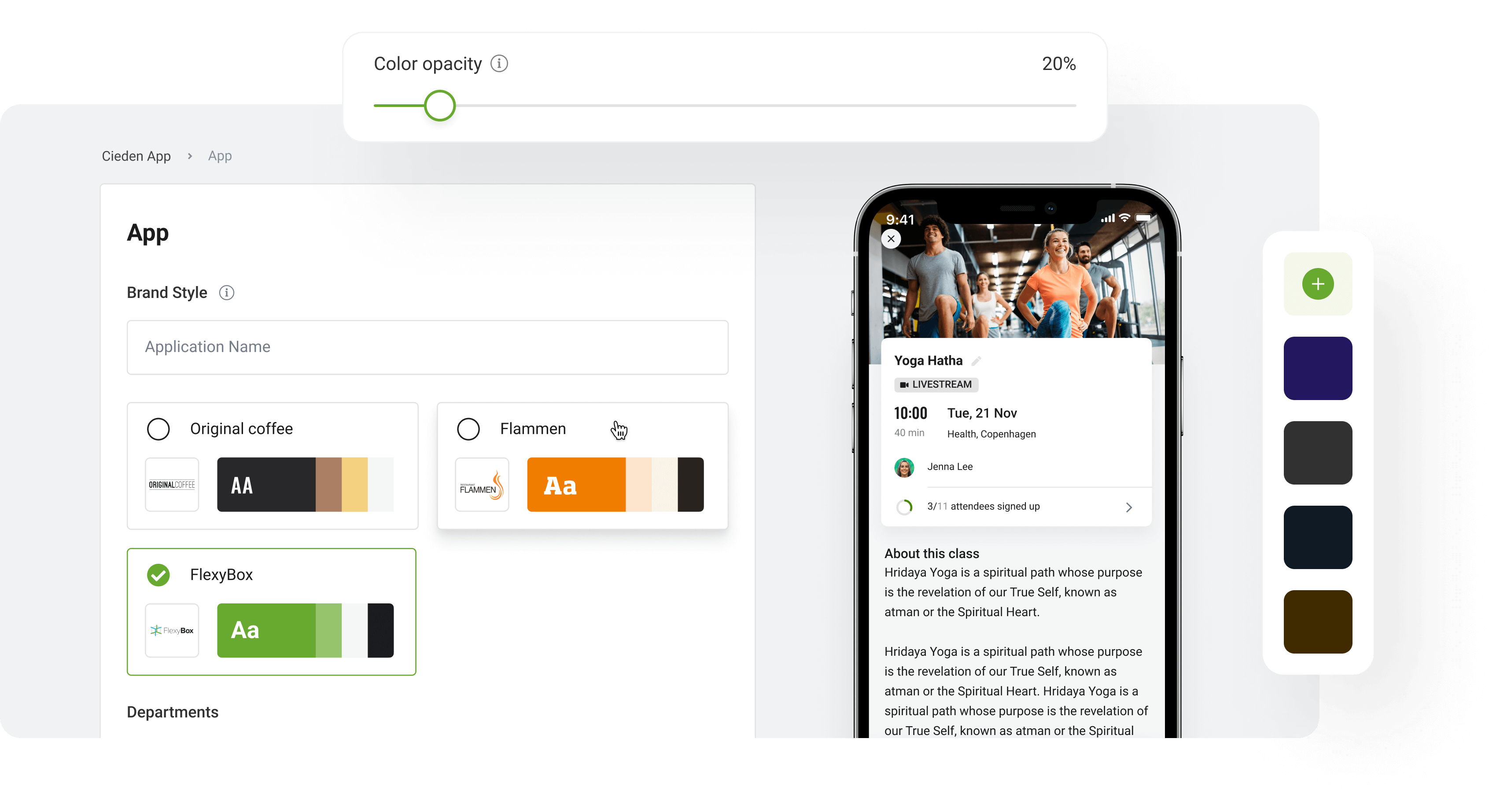
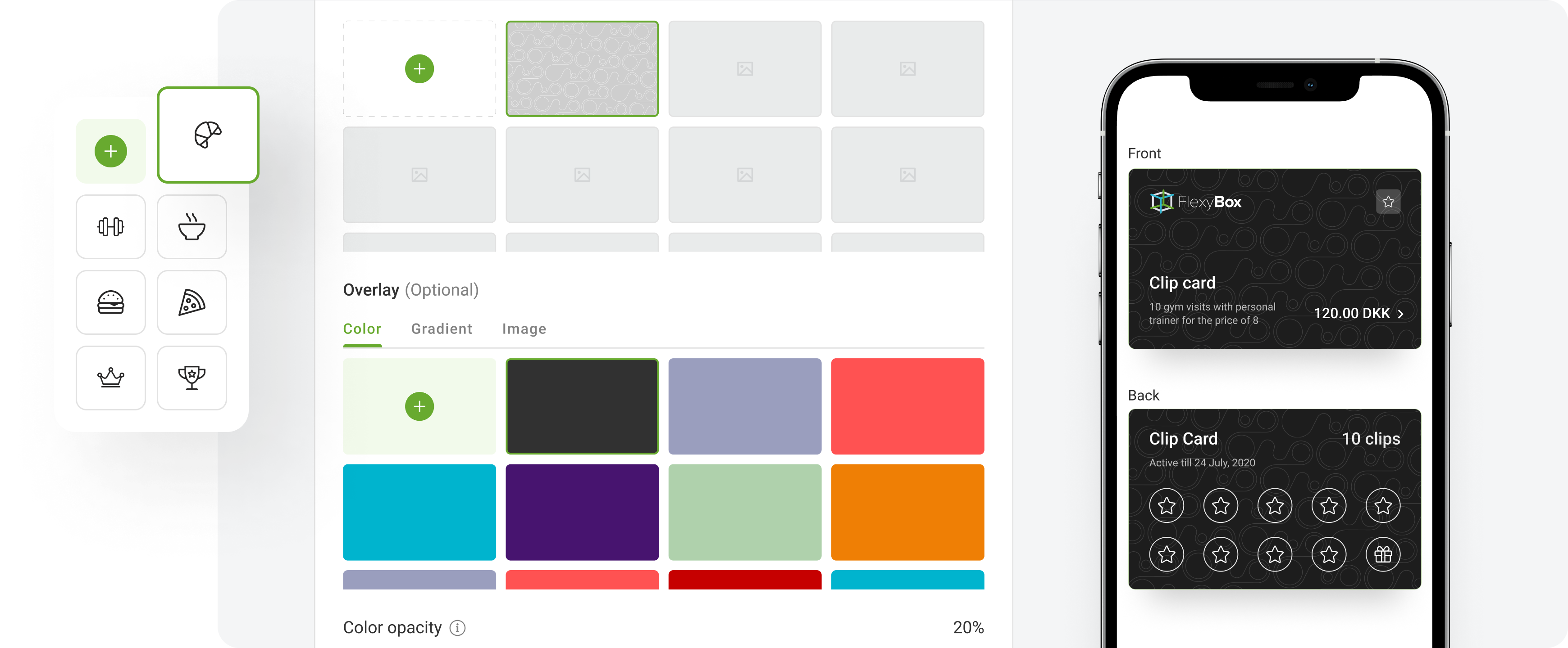
- company settings & branding: high-precision adaptation of the visual style by opting for the needed colors, fonts, and icon bundles;
- loyalty builder: creating an app from scratch by selecting only needed functional modules and fully configuring their format and content on the up and up;
- “Super Admin Panel” versions of Flexybox apps for admins, with enhanced powers of giving access, enabling/disabling features, etc.
Discovery
We start our design process from in-depth research to make sure that a digital product has a market need and is fully consistent with the actual needs of the end-user.
The specifics of the discovery phase for Flexybox consisted in the necessity to conduct user research for every product separately, as each one had a distinct target market. They could partly overlap but there was a little chance that, for example, a fitness club member would be a heavy coffee drinker in combination. Therefore our UX researcher prepared tailored questionnaires and scripts for the surveys and interviews.
Meaningful user research gave us a complete picture of user needs, expectations, preferences, usability habits, and technical skills that we translated into user personas and detailed user flows.
Competitor Research
At the time we started working with Flexybox, the company was commercially active for nearly 20 years already. This meant the market was mature and competition did not promise to be easy.
However, we have discovered that Flexybox as a multi-purpose booking digitalization platform had only a few direct competitors. Most of the alternatives indirectly competed in particular industry niches while almost none offered a universal approach of such a scope.
This was both an opportunity and a challenge to our team, as it raised the bar for white-label app design standards. We had to find a perfect balance between simplicity and versatility of app assembly solutions.

Information Architecture
We gained an understanding of user actions, flows, and scenarios after completing the discovery phase. Following that, we created an information architecture to organize content so that users can quickly adapt to product functionality and find what they need.
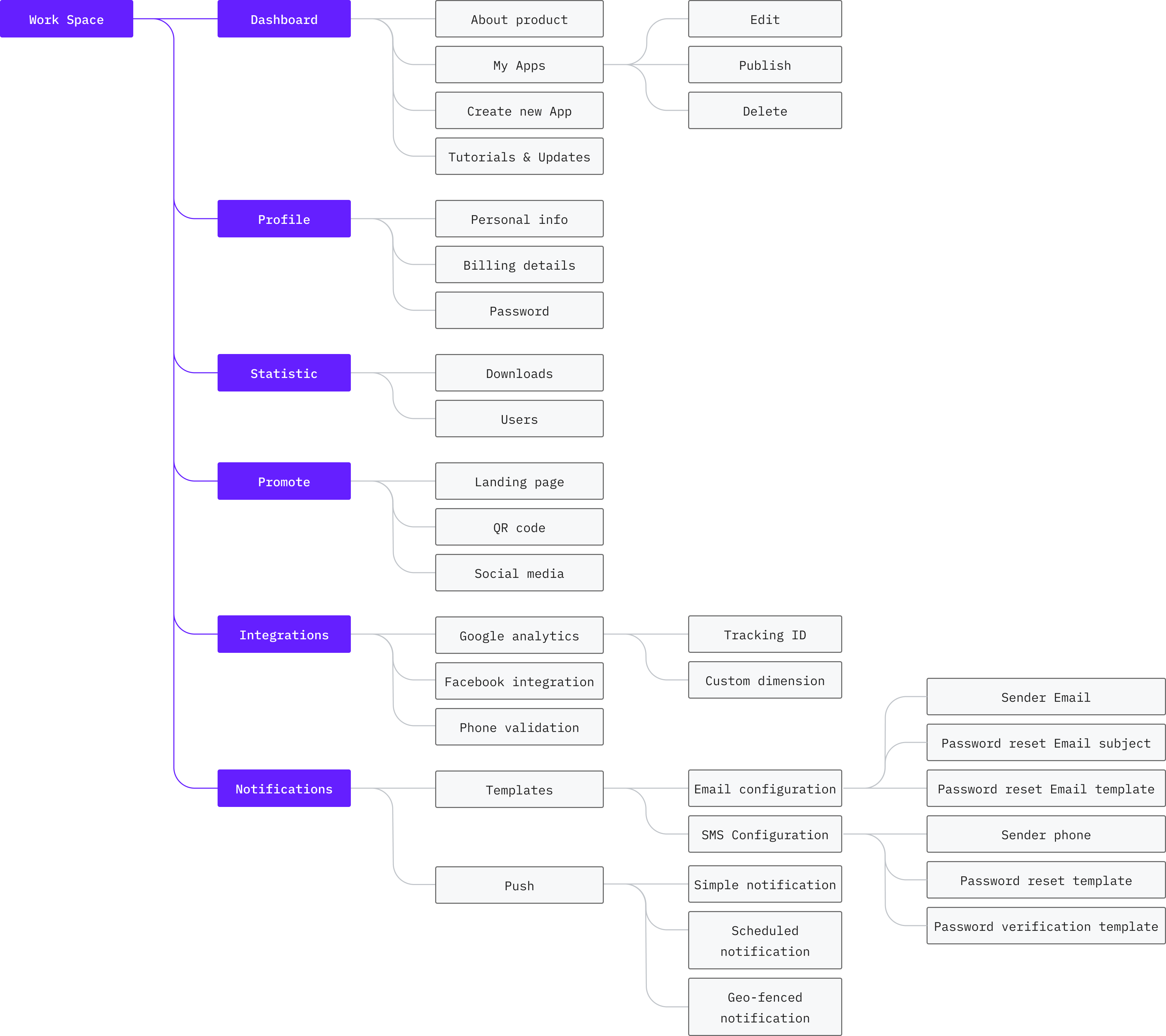
User flow
Our user flows are always informed by the key UX research documents such as the customer journey map, user personas, and user scenarios. Basically, in this project, the team elaborated on the two main types of flows:
- the booking process of an average user including such aspects as registration/subscription procedure, choosing a product/service to book, filtering by different categories to narrow down the scope of choice, checkout process, etc;
- an app moderation process by admins focused on configuring its functionality and managing content (e.g. permission, loyalty program terms and conditions, etc).

Build your own app
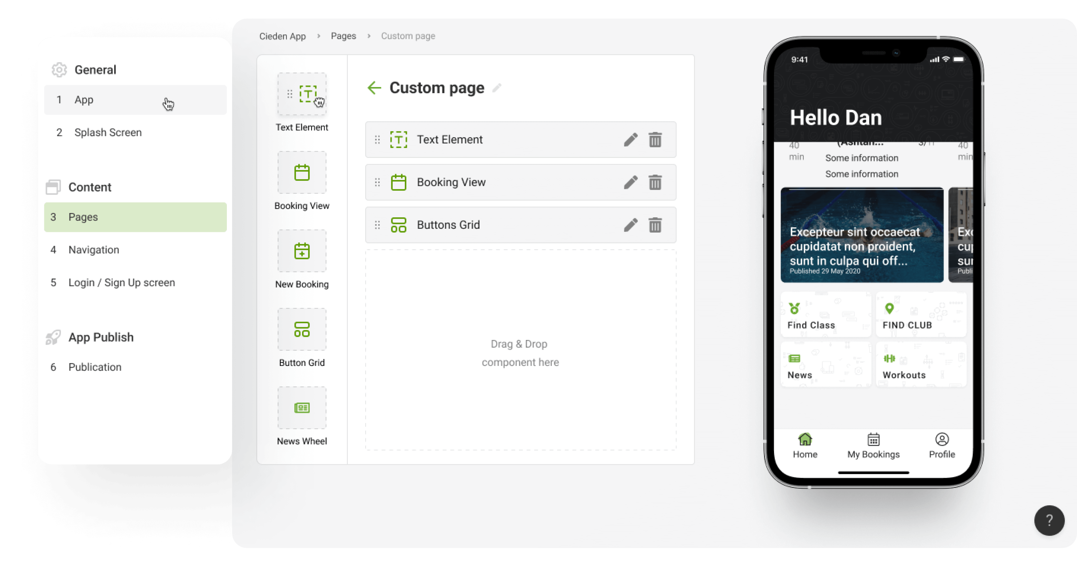
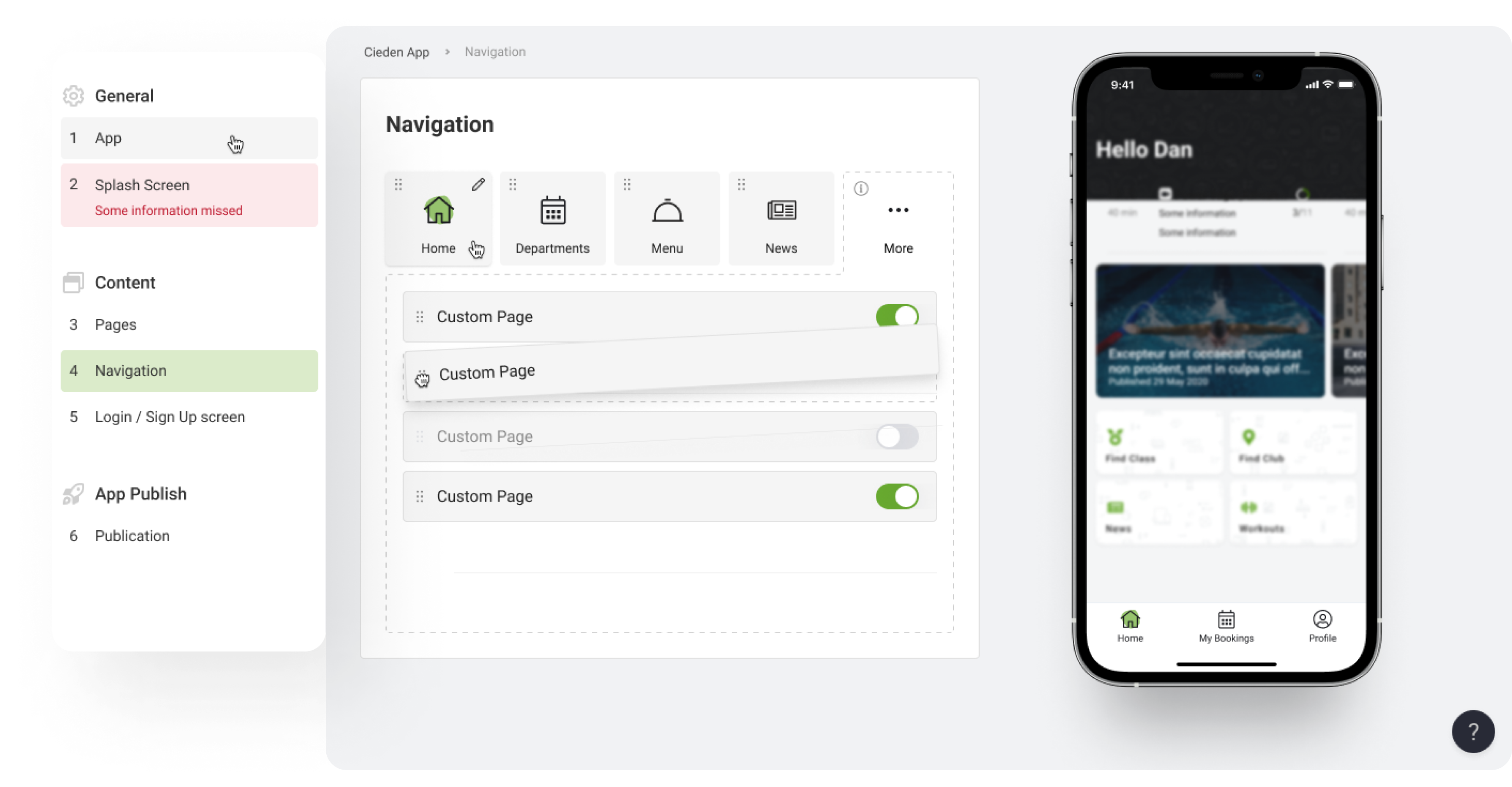
Initially, the client expected us to create a simple system just to slightly configure the functionality and visual style of a basic app. They were very strict about keeping their direct instructions and did not leave too much room for initiative. However, our team still found a way to go beyond their expectations. We created a loyalty app builder that allows for constructing an app from scratch, with such options as:
- selecting basic functional modules and pages (e.g. registration, events, offers, news);
- a toolkit for managing format, content, and accessibility within every module;
- the definitive collection of icon sets for features and functions “for all occasions”.
Flexybox has plenty of products in the most diverse industries, and their number grows persistently. Therefore, our client got a “jackpot” with this universal constructor applying to the needs of any online business in any area, infinitely.
Or use already created templates
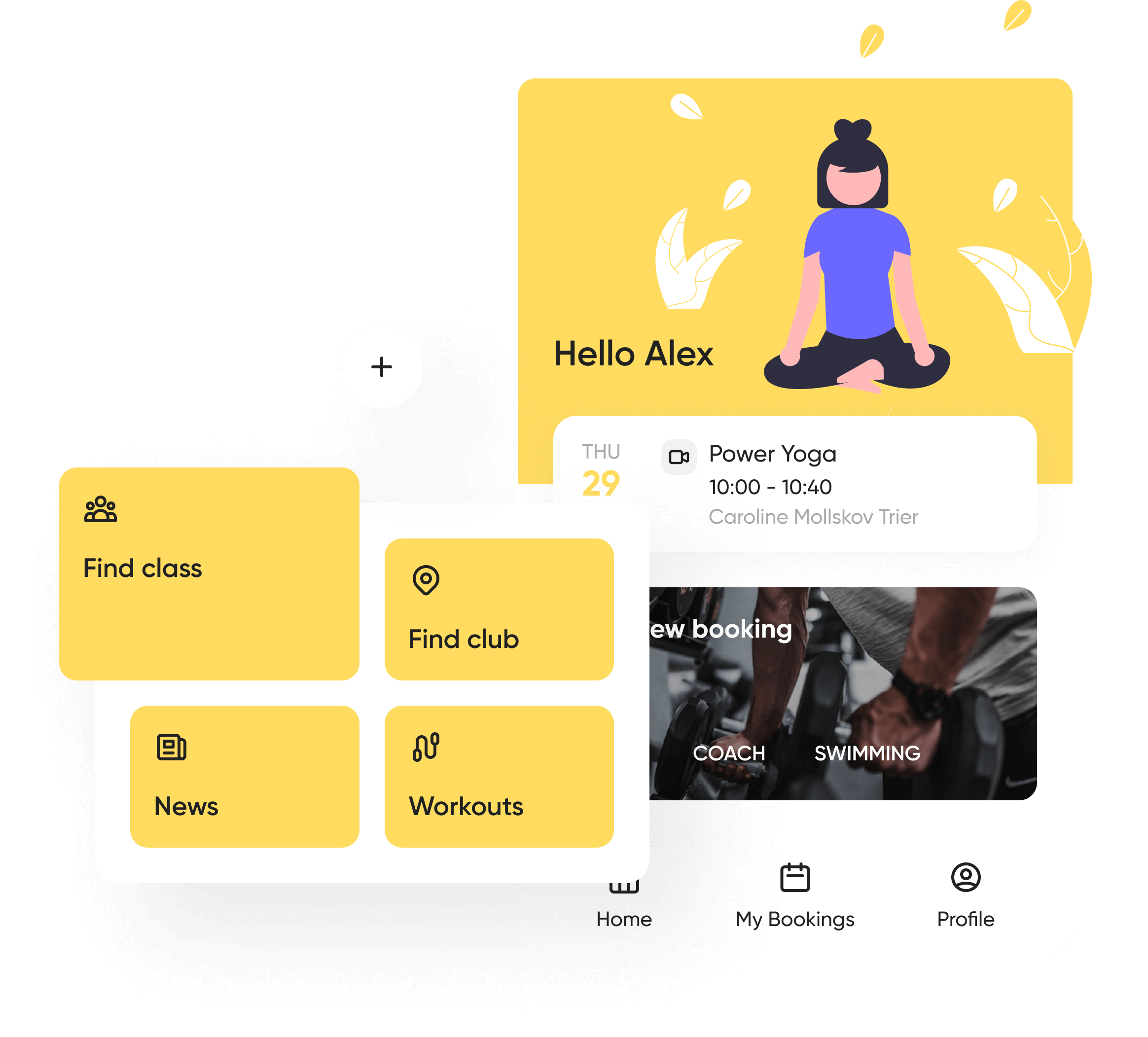
Fitness app
FlexyFitness is one of the key products of our client, so they have placed great hopes in the functionality of a new app that had to let a user keep track of their personal training programs and manage fitness events within a simple and convenient user experience.
We have attained that objective by providing for the following features and options:
- an interactive calendar comprising all the planned events in a card form;
- an advanced search tool;
- a booking management feature with internal controls to subscribe, postpone, and/or cancel an event reversibly.
FlexyPOS Loyalty App
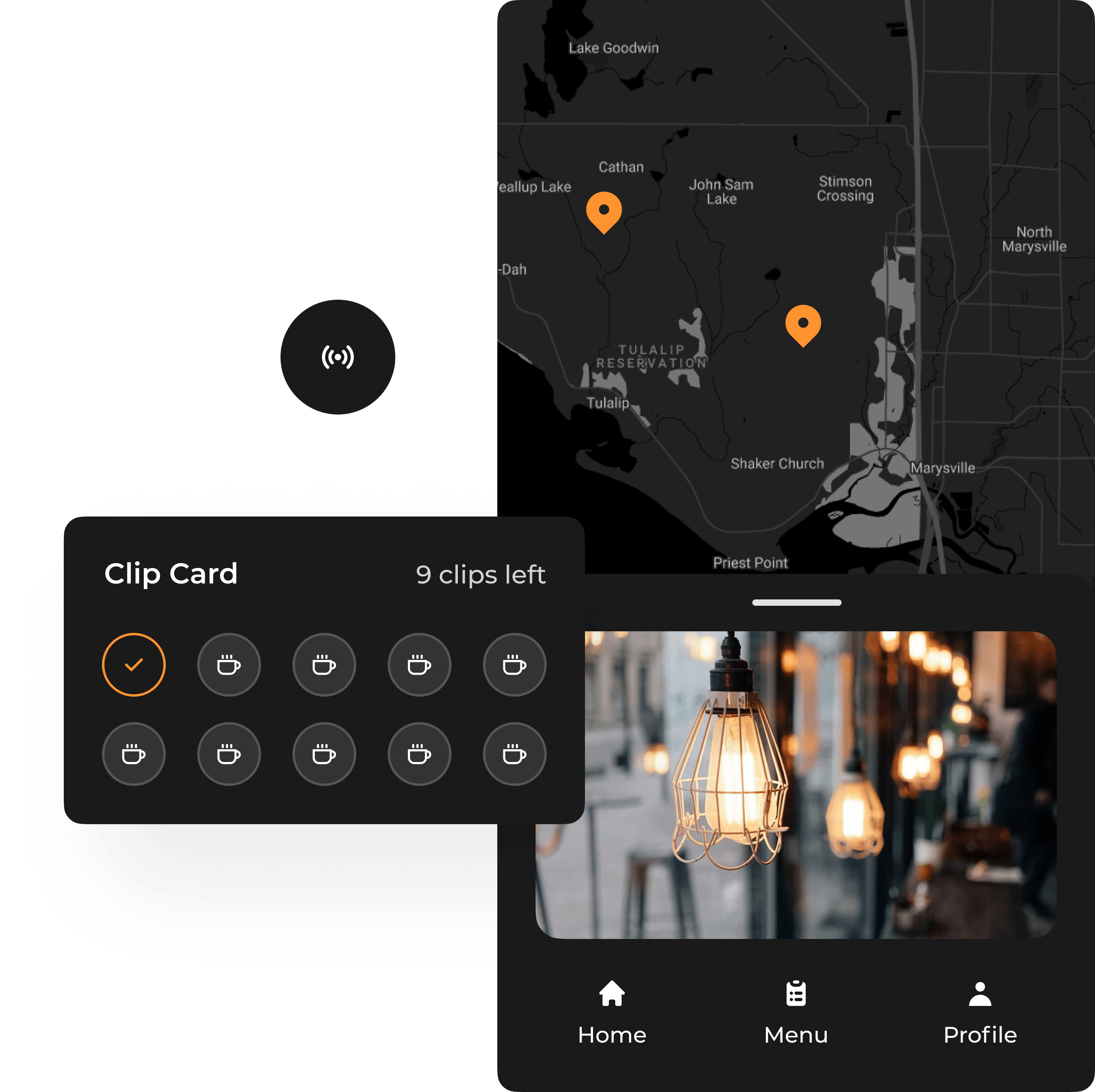
FlexyPOS focuses on providing security and service quality to high-end cafe and restaurant venues. Flexybox privileged customers use FlexyPOS as a business tool to streamline their customer service under the loyalty program. For this product, we have created a smart system of special-purpose card types, each reflecting a particular dimension of the loyalty program. The most notable edges of the app include:
- an elaborate interface of a membership card with a wide variety of layouts and options of booking and payment;
- the “punch card” and “clip card” features, externalizing a system of accumulative discounts management with a smart scanning system for requesting bonuses;
- a gift card allowing to deposit funds and set a specific value of this item available for spending within the network;
- a catalog of venues, with their photos, opening hours, contacts, etc.
Food delivery app
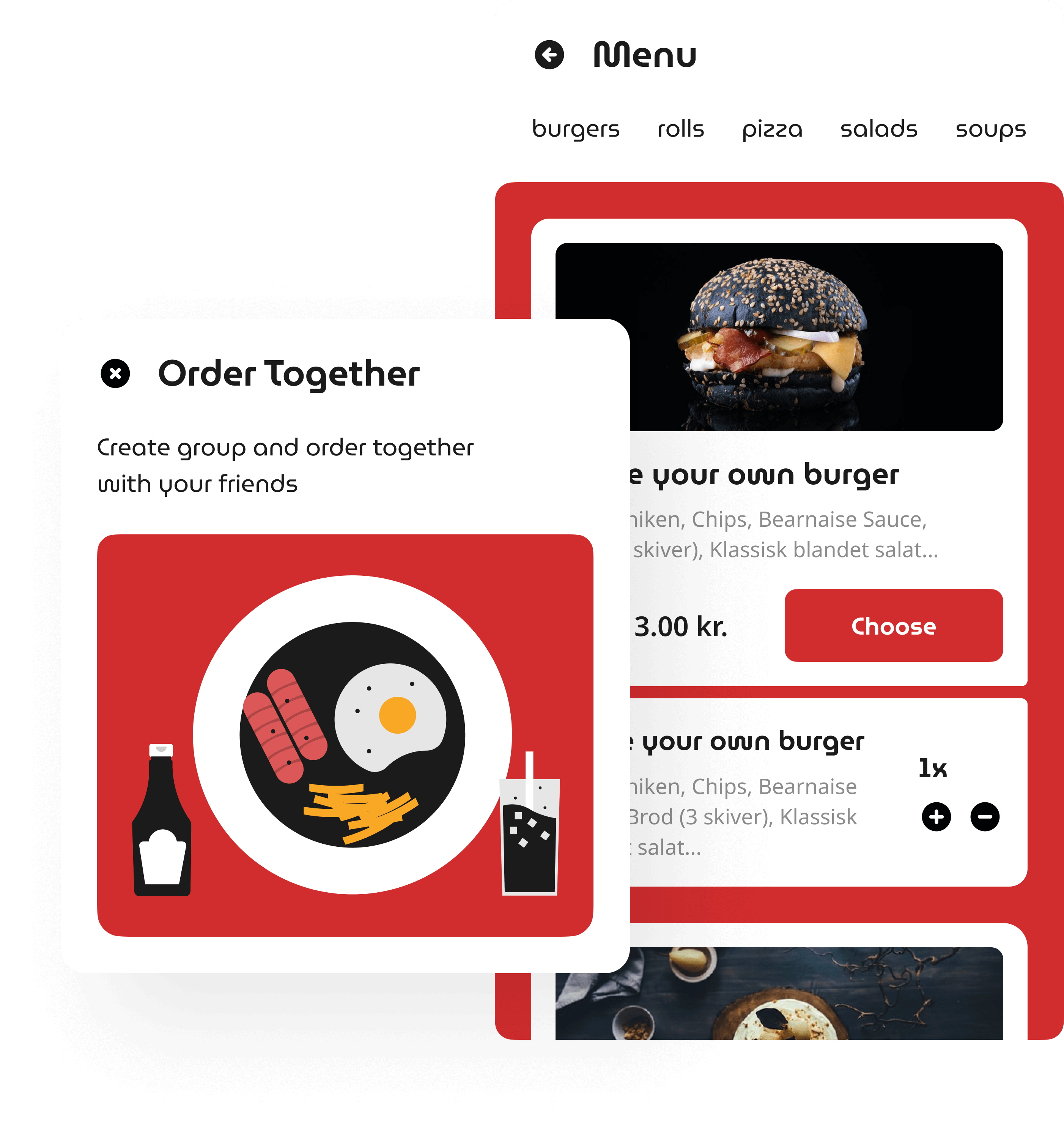
FlexyMenu is a self-service platform for catering venues based on a system of electronic menus.
Our prototype for an app included:
- a geo-positioning system allowing for observing the network of available catering services in the area and choosing the preferred service provider;
- a customizable electronic menu with separate lists of main and additional items, a detailed description of every item with images, and buttons guiding a user through the booking process;
- an advanced algorithm for drawing and booking tailor-made meals based on selecting and compiling any ingredients available in the kitchen;
- a special feature “order together” with options to invite friends and order meals within a team, e.g. at birthday parties or corporate events;
- a comprehensive checkout process.
Same app - different styles
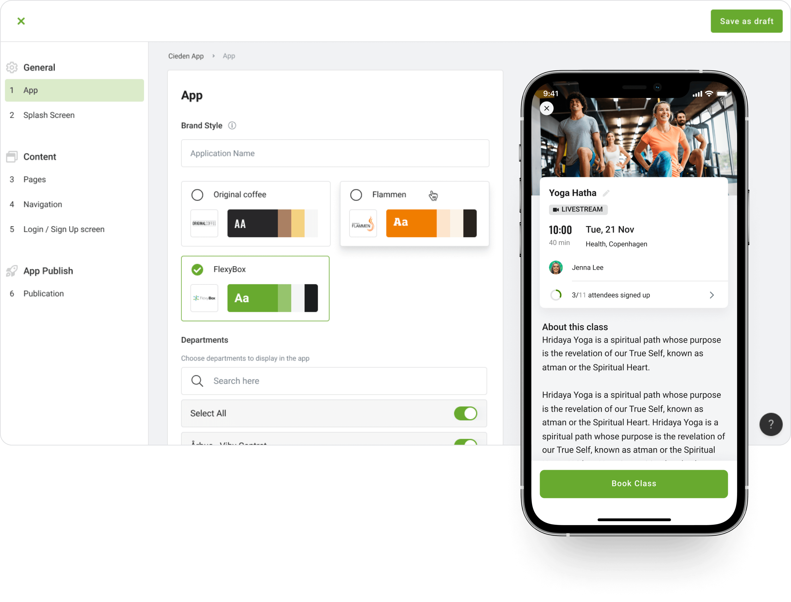
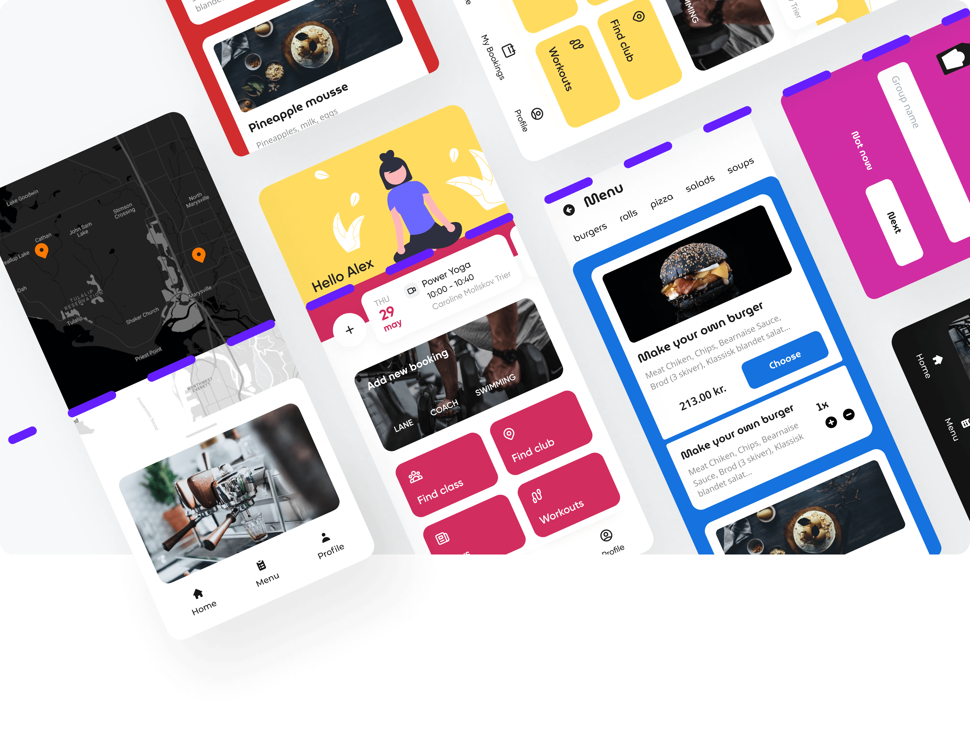
After finishing the basic models of each app, we have created an easy-to-use system of “dressing them up” by applying brand-consistent colors and components, including:
- options for selecting the dominant color scheme and font family;
- configuring a general style of an app (flat vs elevated);
- an opportunity to integrate external brand components (e.g. a logo file);
- ready-to-use templates with preset qualities already validated for usability and visual consistency;
- options to delete branding components and reverse changes at any moment.
we reply under 24 hours.
free
session

