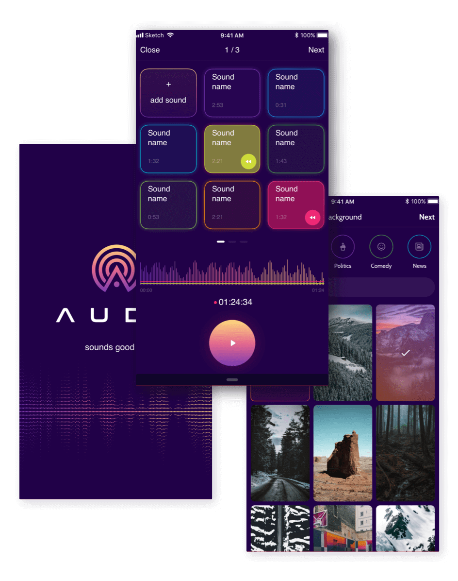
Podcast app.
Project Plan
Task
Design an audio social media app almost from scratch
Team
2 Stakeholders, 2 UX Designers, 1 UI Designer
Duration
1 month
Scope
170 hours, 17 screens, 5 iterations
Result
The design implemented in the functional product
Overview
The contemporary social app giants owe their success to leveraging the power of visuals. Such an approach has been dominating the industry for quite some time.
However, we don’t always have the time or the opportunity to consume information by way of reading, or we might simply want to reduce the time we spend looking at our devices’ screens. This is where other senses come into play. Throughout the centuries people have been sharing stories via conversations.
Benefits
- Client engagement
- Basic wireframes were provided
- Many references to existing social apps
- MVP approach
Challenges
- No access to end users
- No time for complete research
- Many drastic iterations over the process
- A very diverse target audience
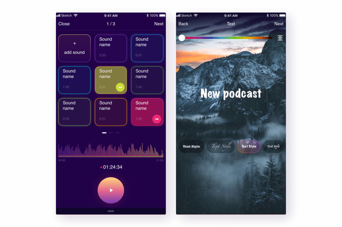
Audo podcasts feature audio tracks as the core content, which is accompanied by beautiful and topical visuals. Adding different sound effects helps emphasize the idea you want to get across.
This app enables you to create Audos in a few simple steps so that the whole world can listen to your thoughts online. Enjoy the recent news and hot topic debates via audio recordings while saving time and energy. Audo is a social media app at the frontier of the future.
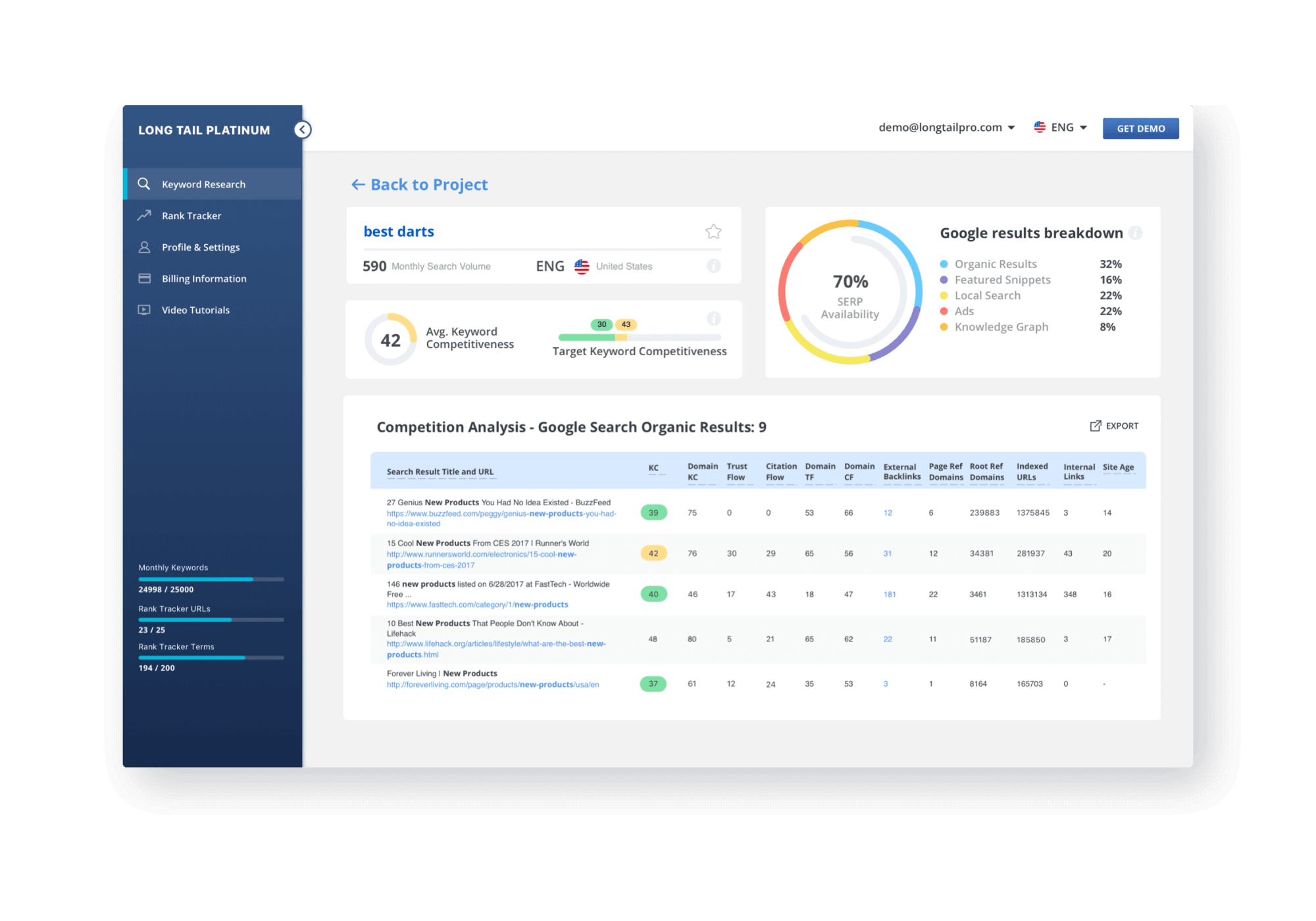
As we all know, there are direct and indirect competitors. Even if there are no absolute equivalents on the market, there is always some tool that competes for your potential user’s time and attention. A good example is Uber being an indirect competitor to Netflix. So, while in a race for user’s time, we need to keep an eye open for the alternatives that are popular today.
These findings helped us understand the current state of the podcast market and collect information about the flows and controls familiar to our users. We aimed at combining these approaches in building this app, concentrated on podcasts translation.
Our research showed that the social network of podcasts already exists, using other platforms as its ground base. Youtube, Facebook or Instagram stories were full of podcasting material, among the main focus content of these networks.
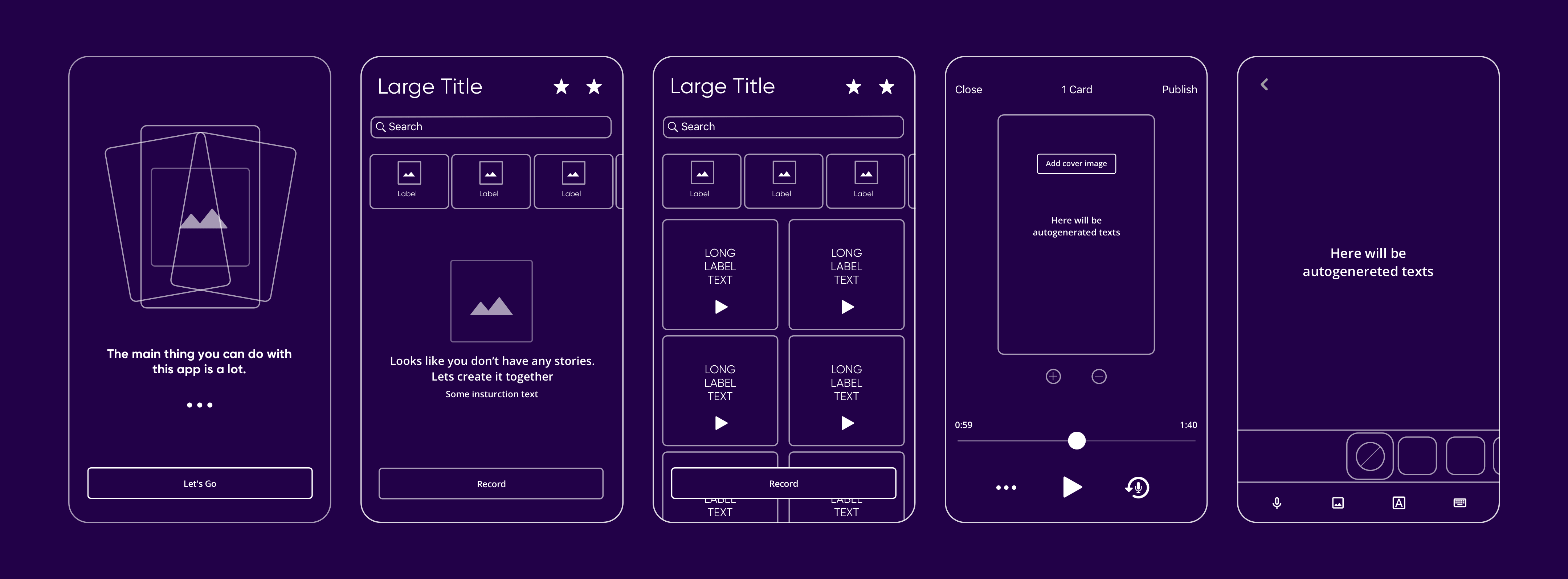
Wireframes
As a project kick-off, we received a brief with the product ideas and the wireframes done by the client's team. The client is very active and believes in the right process. So even though, we had no access to the actual users, some of the user research had already been conducted and the results were shared with us. This was a great beginning that helped to communicate the vision and start our collaboration as a team. It enabled us to give a quick estimate and start working immediately.
UI Concepts
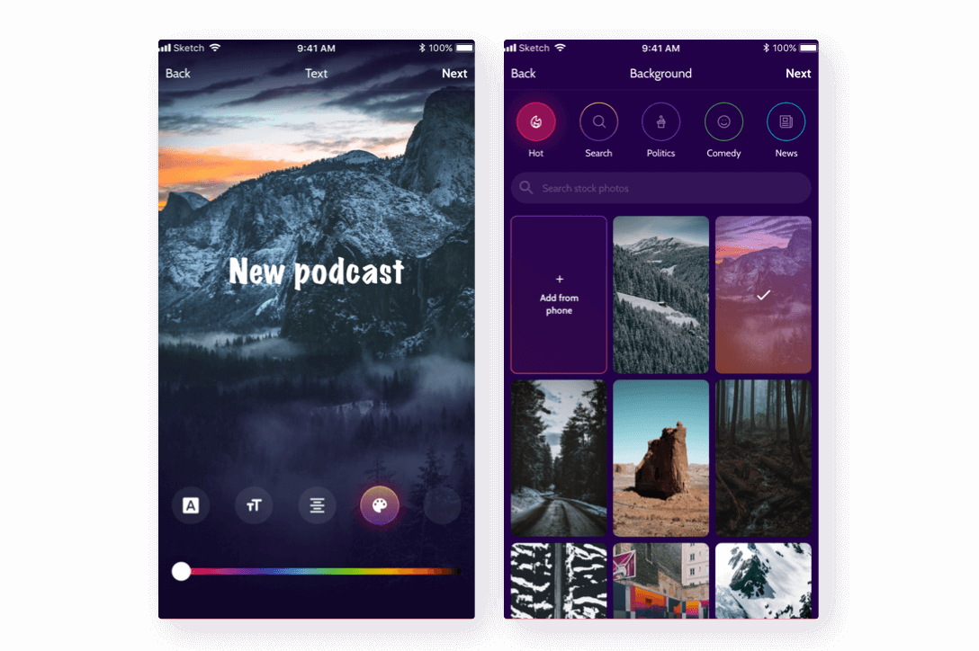
Having the basic wireframes on the table, we had to reconsider them slightly, according to our fresh info, and move on to UI customization.
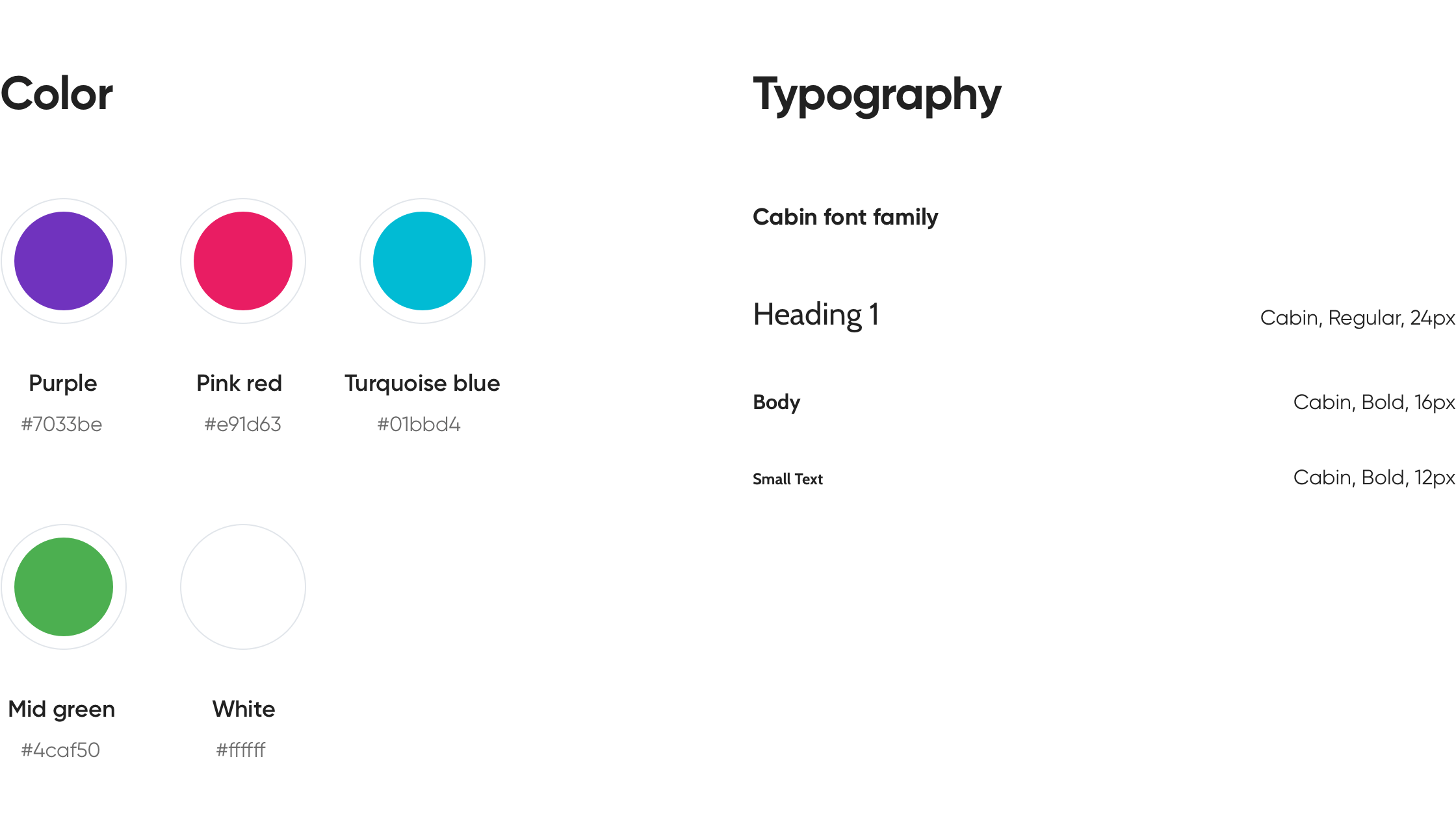
Our usual process includes 3-4 different UI concepts: 1 or 2 basic concepts, 1 alternative concept, and always a crazy idea. We call the last concept ‘crazy’ as it usually goes against the requirements or branding and offers a whole new vision. Usually, we make those for the sake of comparison but sometimes they turn out to be the best choice.
In order to build the perfect UI concept, we needed to gather the references both on our side and on the client’s side and prepare them for mutual discussion. This helps to develop a common aesthetic library. As always, the client was very helpful and clear with his taste.
Applying the chosen style to approved wireframes
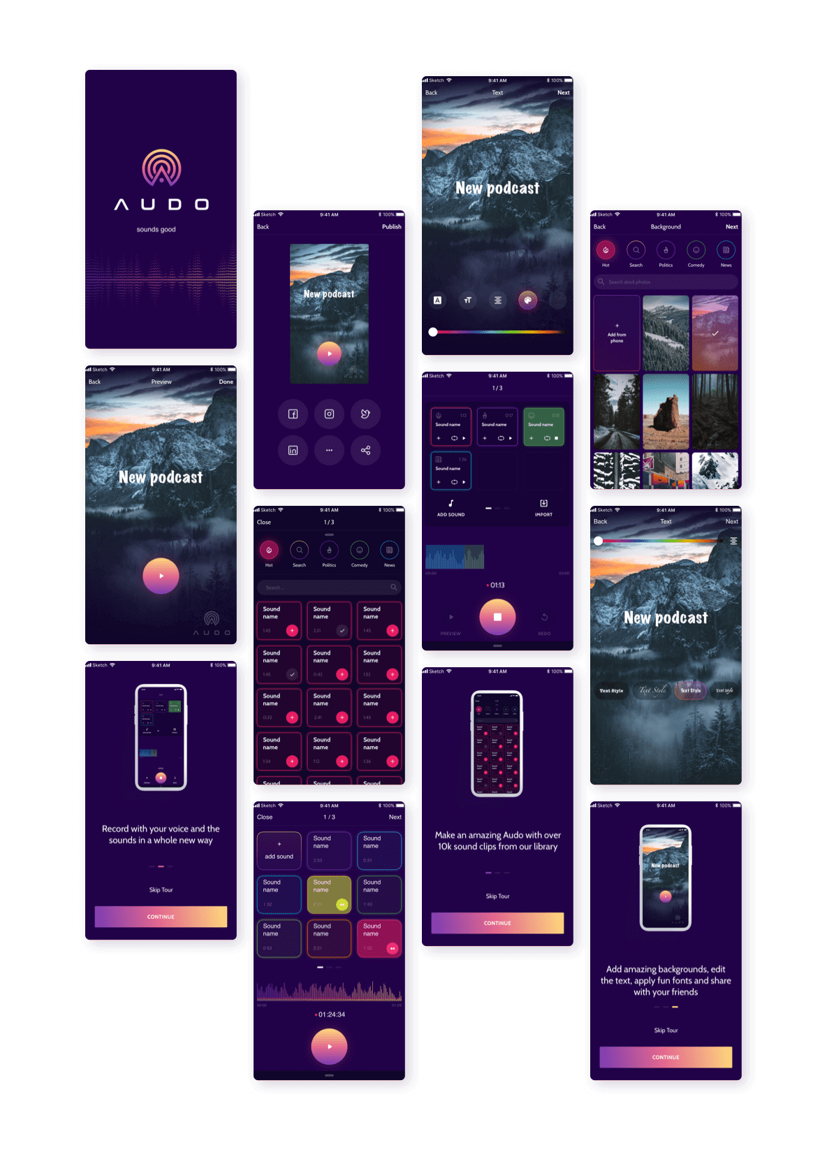
Having established a concrete style we moved on to finalizing the designs. However, following the Lean UX process, we were not afraid to implement drastic changes, when we felt it was the right thing to do. Some functionality was reconsidered multiple times. Having adopted the agile work style, we knew it was the right path to follow. We had the most fun with making the edit screen black and then expanding on the concept to develop the whole app dark-themed. And it makes perfect sense.
UI solution
we reply under 24 hours.
free
session

