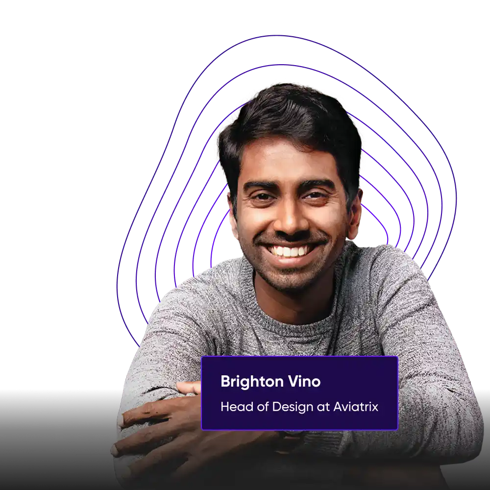
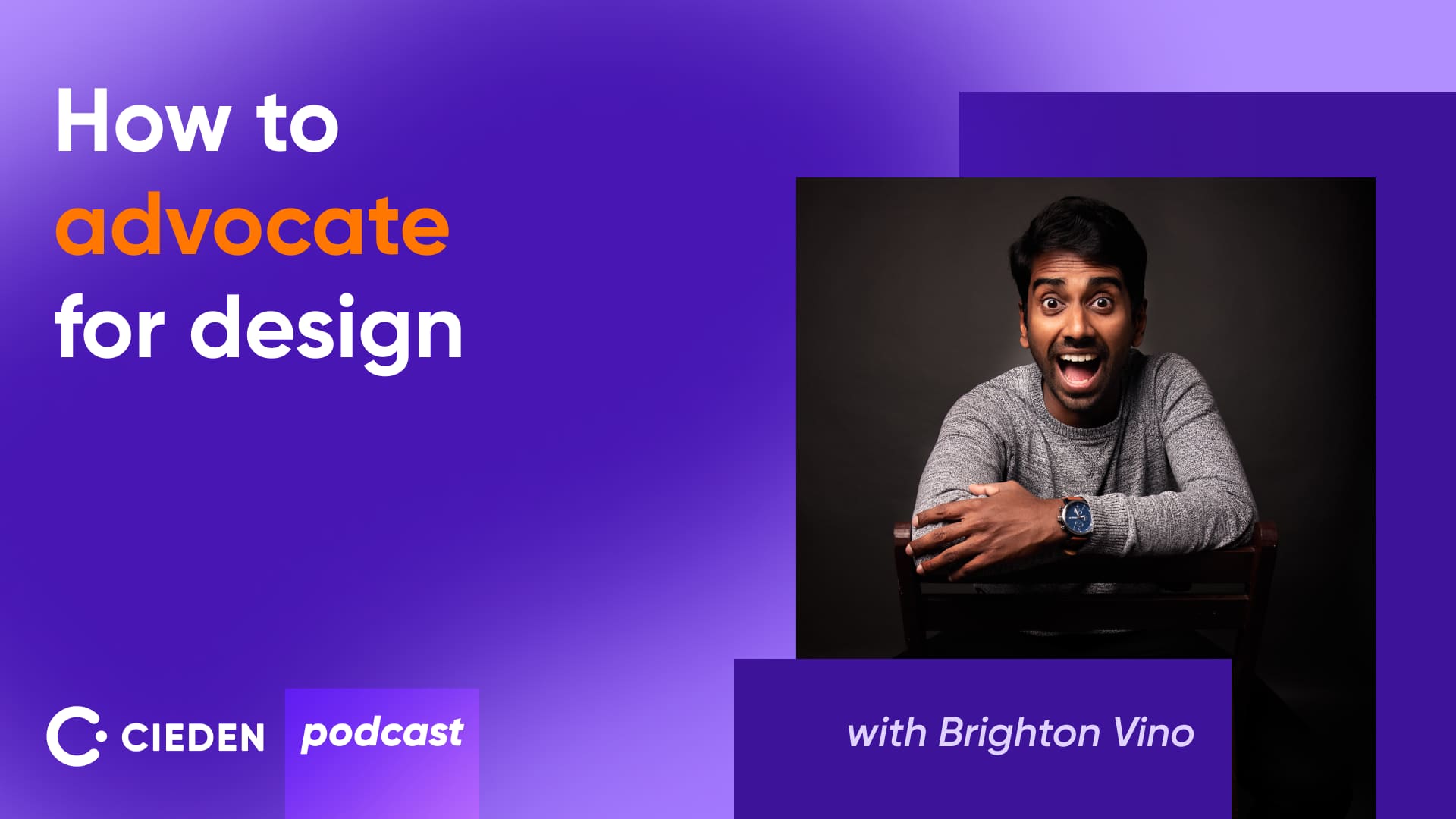
In this episode, Brighton Vino Jegarajan, the Head of Design at Aviatrix, will share his insights on promoting design thinking within product organizations.
A bit more about Brighton: Brighton leads design at Aviatrix, a cloud networking platform. He has played a key role in leading the Aviatrix initiative to reinvent how customers achieve a great user experience with a distributed, multi-cloud firewalling solution. He has been critical in extending Multi-Cloud Fabric to the edge, rolling out the Multi-Cloud Network Visualization feature, and building in visibility and troubleshooting generally and at scale.
Designing for technical audiences
Ana: Hi everyone, and welcome to the new episode of the Cieden Podcast. Today, I'm thrilled to welcome Brighton Vino Jegarajan, Head of Design at Aviatrix. Brighton, it’s so nice to have you here today.
Brighton: Hi Ana, good to meet you and thanks for having me today.
Ana: You have a background as a developer. Do you think it somehow impacts your vision of how you treat UX? Does it help you to be a better designer?
Brighton: It definitely has given me a significant advantage in terms of working as a designer in engineering-heavy organizations. I create experiences for users who are technically, on average, more proficient than a consumer audience that you would typically encounter.
Having a development background, helps me understand the bounds of possibility and reality. I see that typically after design exploration phases, it helps me bring that design into a pragmatic realm of possibility so that I understand what's possible from the system. It helps me scale down the design after the exploration phases.
Sometimes you know enough to challenge the occasional developer who might want to opt out of building something, especially if that requires more effort. So it gives you an opportunity to work with them more closely and understand their challenges better. Right now, I think as a design leader, it helps me understand the effort to value as a function of engineering cost. It equips me better in discussions and deliberations with engineering leadership. I still might find myself dabbling in code at times and staying in touch with software engineering. Honestly, at the end of the day, I do think it helps you earn that fractionally additional amount of respect that you can gain as a designer from an engineer.
Challenges in designing for cloud networking services
Ana: Yeah. Are there any unique challenges or opportunities you face when designing for cloud networking services for tech people? Are there any specific things you need to consider?
Brighton: I think, yeah, there are challenges in every domain of design. In enterprise design specifically, it's different because you're designing for a user who is paid to use your product, however horrible it is. They are paid and incentivized to use your product. So the average user you find in this space is often technically and technologically more advanced. In the cloud networking space, for lack of a better word, they mostly rely on the geeky and the nerdy side. So we often have strong opinions. Truthfully, and in full disclosure, the users have taught me certain intricacies of my own product that I designed that I never intended to be working or to work out that way. So it's an interesting space, and it's not the most attractive of spaces to be a designer.
In some ways, you could say enterprise is still catching up with the rest of the general design standards. Personally, I see this as an opportunity to make it exponentially better. As a designer in this field, like in a generic field, we have designed chat applications, shopping carts, and so many other common interactions that we have converged into this narrow band of acceptable standardized and qualified experiences in the product. But there's so much to be done here in the enterprise space because enterprise does not have these standards, and specifically in the infrastructure space, it's still nascent in certain ways. For example, one of the key problems that we are tackling is the visualization of network infrastructure. There are so many products attempting it, each striving in their own ways towards excellence and setting industry standards. I think that's the charm of the space. So you talk about challenges here, but there's also the charm of the space. There's so much potential to make a wider impact. I think at Aviatrix, our design team has been pushing these boundaries, and I would say we are well on course to set some standards in the industry in UX.
Advocating for design decisions and earning a place at the table
Ana: Yeah, you actually raised a very interesting question about enterprise companies just keeping up to date with design. It was not always a priority for enterprise companies. They're functional companies. They need to create a solution for their employees to perform the job. I think designers in this environment need to be advocates of some ideas. How do you advocate for design decisions?
Brighton: I think that's a good transition that you noted there. Today, if we look at companies, especially enterprises, they call it consumer-grade enterprise design. It's not enterprise-grade consumer design, which just tells us where we are as a design standard in enterprise. I think the buy-in and the resistance to buy-in is always a challenge in the enterprise space. There are always checks and balances, ensuring that you're doing due diligence as a designer. So you always go back to think about when you're trying to get someone to buy into it, you think about why they should care. What is in it for them? You go back and reflect and say, have I maximized the return of value for them, which is the diligence that you bring to it. Sometimes the resolution to that is, you may not need it because over the course of that deliberation, you understand different business values and propositions, and maybe the design proportion does not have a return of value or a higher value compared to other things. So it might not work. And sometimes you might have to go and back it up with more data and research towards what you want out of leadership or what you want for the design function. Either way, I think these are opportunities to learn even more about the business and say, the checks and balances tally now that I understand why this is no longer required. Or you just go back to your drawing board and figure out what more I should do to make it a better attractive proposition for your business stakeholders before it becomes a reality for your external users.
Ana: Yeah, that's true. And if you could provide advice to design leaders who face resistance in driving these design initiatives, what piece of advice can you give to those people who struggle to communicate design value?
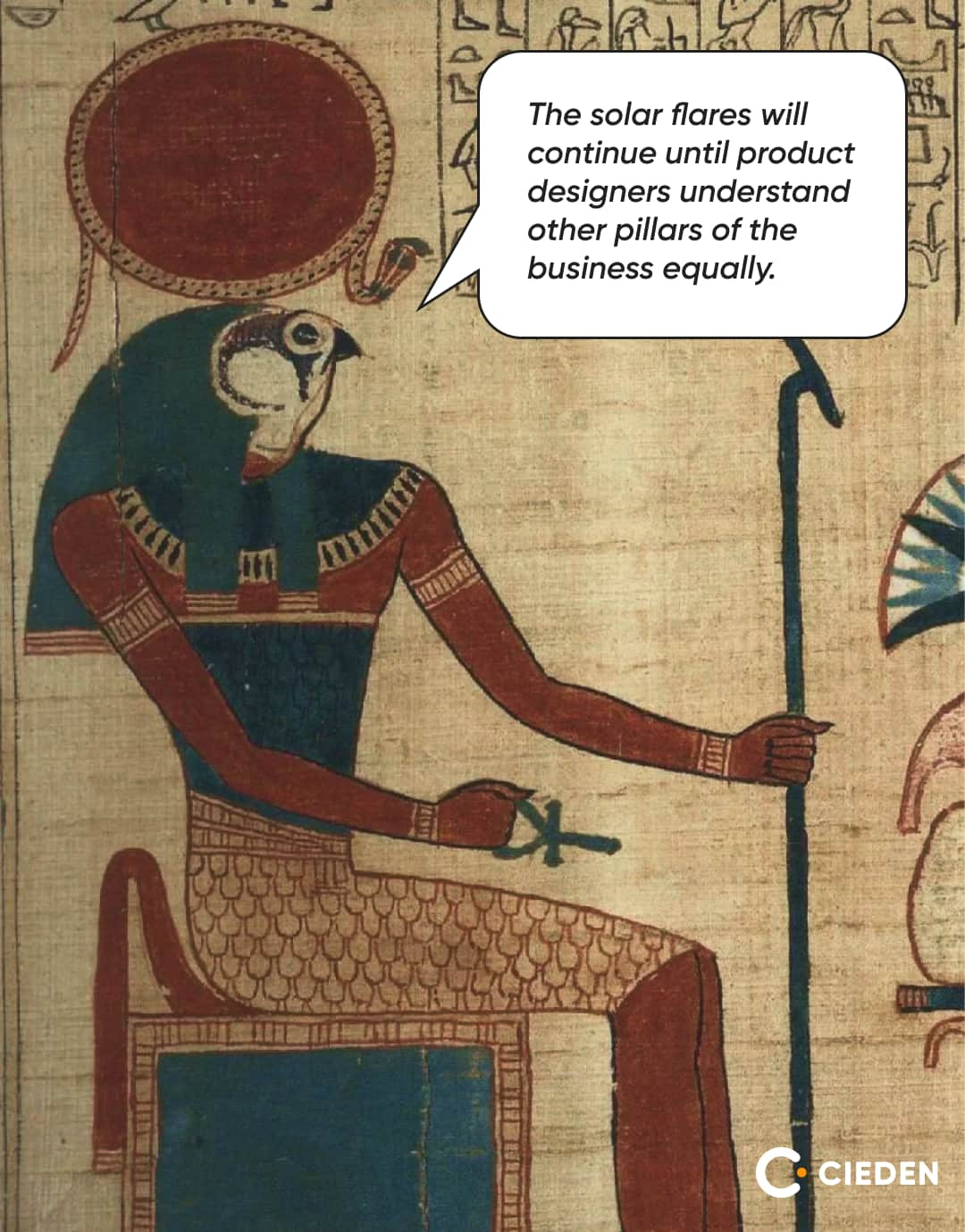
Brighton: I think we always hear the phrase, does design have a place at the table? And I think the phrasing of it could be better: has design earned a place at the table? I think that's how design leaders should look at it. And that's what I would urge them to think about—the phrasing of that statement. Especially in a real leadership role, just being the master of the art or the super skill that you're out of design is not enough. I think you need to understand other pillars of the business equally. You need to speak the language of the business, like quantifying the impact of design. The numbers resonate at a higher level. For example, if you did a redesign, show them how much increase in conversions you've had, if that didn't improve your overall customer satisfaction score. Have these quantitative metrics or have a way to gauge them, possibly indirect or direct measures that can put some numbers and direct understanding of the trends of how design is impacting the business. I think translating these designs with business metrics resonates with stakeholders, and aligning these designs with business direction and strategy is very important here. And sometimes, you might not have the framework to do that. In that case, rely on some case studies. You could show similar organizations or similar teams having adopted this successfully and share the case study as evidence of tangible benefits that you can gain from it. Overall, these two methods build trust and collaboration. You're educating them and evangelizing design. It's a cross-functional collaboration. Sometimes what has worked for me is to get this advocacy from multiple avenues. Let's say you're forming a new idea or thought, see if your engineering team is buying into it, see if your product team is buying into it, and then take it up. When you take such an initiative up, the likelihood of that idea succeeding is higher because more people have bought into that idea, and that gives executives and leadership more confidence in the due diligence you have done to get there and the team coming together to back your idea. Sometimes gang tackling does help, and it also ensures that you do your diligence there.
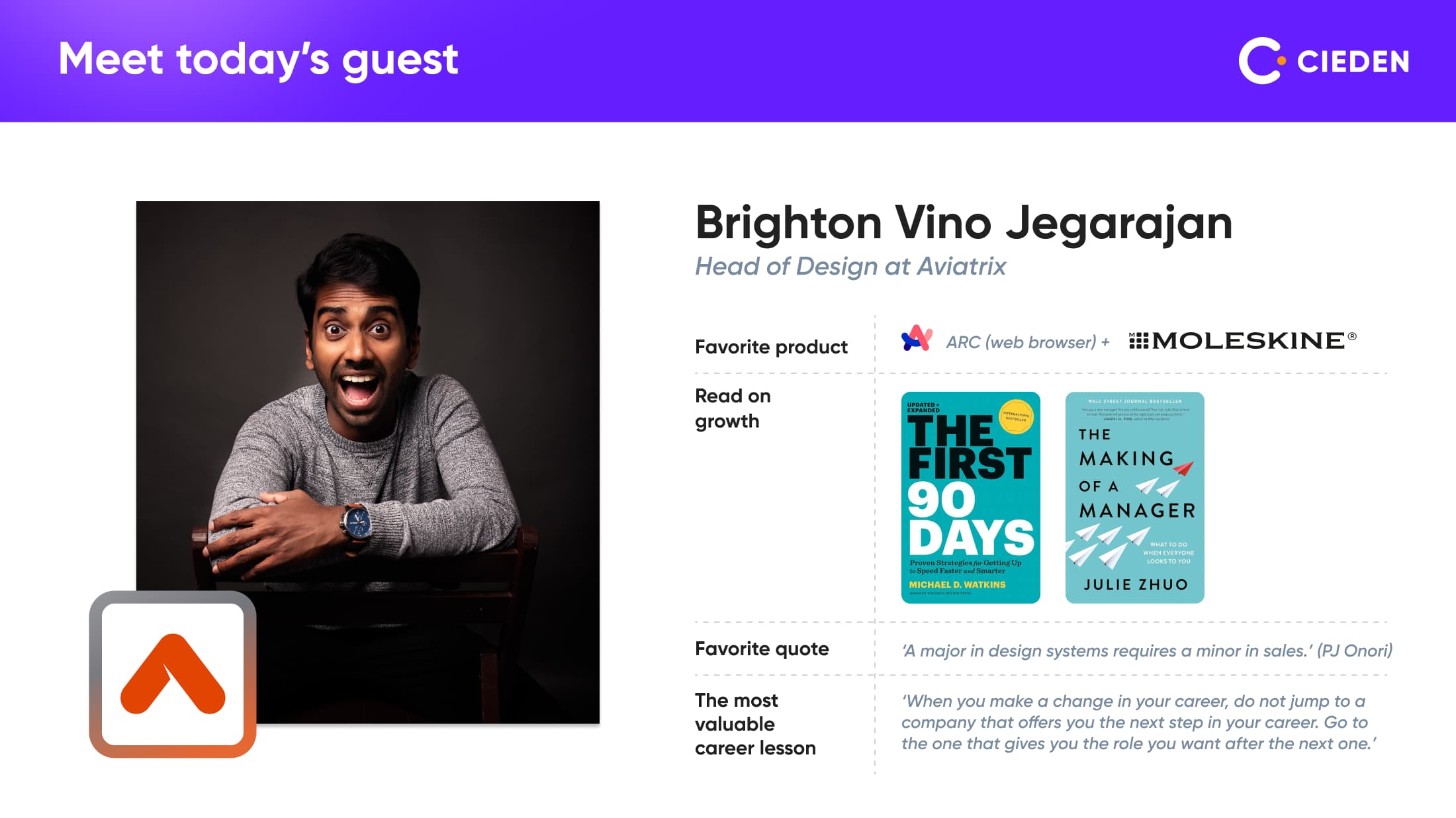
Ana: Yeah, I agree. Sometimes we need to build coalitions with different groups of stakeholders because everyone has their own interest, and we need to understand that by having something like our stakeholder map. But I think it also creates pressure on designers because they should not only be providing the design outcome and output, but also be part of the product management team, understanding metrics, how we move these metrics, and how we can provide in a creative way or an ordinary way to improve the product, improve the different user metrics, or business outcomes. I think you phrased it better than I did in answering that question. At the end of the day, design's key role is not just the mock-ups or the journeys we produce. It's also about bringing consensus and bringing teams together to see a common vision and common idea, where there are multiple people speaking different languages. Having that visual eventually ties it all together so everybody sees that vision together. Again, I go back to the quote that I mentioned earlier, ‘A major in design requires a minor in sales,’ and you're selling this. You're selling an idea to another team. You're getting everybody to sell together to an executive leadership for a bigger buy-in. So that's day-to-day work in senior levels of design.
Hiring for design roles: evaluating soft skills and domain versatility
Ana: But it also creates a challenge on how to hire a right product designer. The designer role has augmented during the last years. And now, in order to find a person who will drive this initiative, communicate value, understand and second all the customer requests or user input, process it, communicate it to different stakeholders, and negotiate, it requires so much soft skills and training. And I assume that just goes within experience. You need to be very experienced in different domains and in different situations. How do you find these people on the market, and how do you train them?
Brighton: That's, yeah, that's not an easy problem. Even if the market is heavily in favor of hiring, it's still hard to judge a skill to that detail during a process. I think what we look for is, experience is definitely helpful, especially when you're dealing with senior stakeholders and trying to be the interface between a customer and a business executive. There are a lot of soft skills to be grown. And I think, a growth path for a junior designer into those roles actually puts them on a great career trajectory. Well, coming back to your specific question on hiring, I think what we look for, especially at the higher or senior levels of design, are soft skills and collaboration skills. How do they communicate when they get contrasting feedback? How do they consolidate this feedback? How are they able to tally them up? How are they able to check and balance the different forces that are acting on it? But at the end, you're the only stakeholder having the users at heart and key to your product. So it's a lot of soft skill evaluation. It's hard to judge in a hiring scenario with the short time you have. But I think there are tools and conversations that kind of elicit and give you a sense of that. And I think at the end of the day, if you're open to it, if you're humble as a designer, I think humility is a key trait. And I think you are bound to succeed at some point in time with experience.
Ana: At your company, do you have some specific hiring procedures in order to test these soft skills?
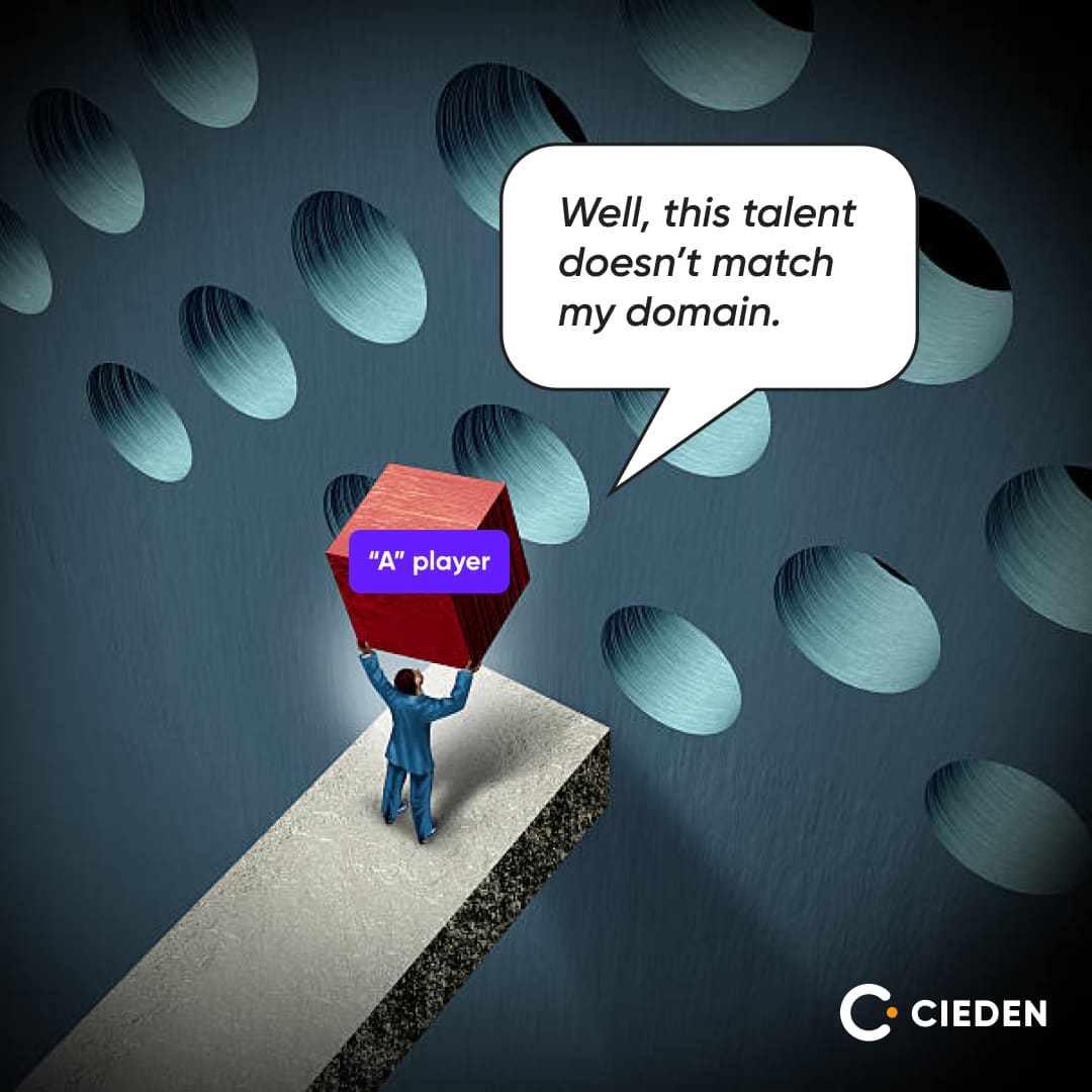
Brighton: One of the things that we realized in the last couple of years is when you're hiring in a domain like this, it's very hard to find talent that matches the domain. And I think that's at times not required because that has the cons of not making a team diverse enough. So when we look for candidates, we look for candidates who have tried different domains of design. They've gone from consumer to enterprise in a completely different sector, like the finance sector, working with banking designs. It's completely different from the infrastructure space. So I think that shows the ability of the designer to gain knowledge into the domain, understand the intricacies, and still produce quality design input. I think that's one of the key traits that we look for when we are thinking about hiring and getting someone from outside the infrastructure space, honestly.
In terms of tools to identify the soft skills, we do have certain interview rounds focused on a whiteboard exercise where we care less about the visual design, but more about trying to understand the conversation. We have members of our design team wearing the hats of product manager, user, and it's like a panel interview on a whiteboard where we kind of have an open critique session on the design brainstorm. It's less of an interview; it's more about condensing our design process into one hour as much as we could and seeing how they react and respond, how they think about it, whether we understand the way they think about it, how close it is to our process, and how it relates to how we want our design team to evolve and how they bring in their understanding of other domains into solving the problem. So I think there are definitely tools that help us make a more informed decision in the limited time that we have.
Ana: That's great. We actually started this process of whiteboarding sessions recently as well. And it really is working, providing really good results. You can see the person in their environment with a lot of uncertainty. You see how they work, how they speak. It's a fairly good process.
Brighton: The goal of the session was never to find the best solution for the problem. It's more about understanding how they think, how they react to different forces, and how they consolidate everything into a final direction. So I think of all the rounds in design interviews, I found that to be the most valuable and very influential in making the final decision.
Creating and integrating a design system
Ana: I know that you have created a visual design system, and also you've launched an internal design system for Aviatrix. So I wanted to understand, like you actually collaborated with a cross-functional team. It requires UX, UI designers, product managers, marketing, and engineers perhaps as well. What was the most challenging part during this?
Brighton: I think the common misconception is that most of the time people tend to believe that design systems come first and then the product UI gets built on top of it. More often than not, you find an initial proof of concept, at least, or some product actually out in the market where the engineers have put together screens and then the UX team gets hired only after a value in the market has been found. So that's the more common case. Aviatrix was no different. We came in at a fairly mature stage of the product. At that stage, what was critical to building the system was understanding every piece of the process and the people around it. We actually spent a good amount of time before building the design system, understanding the lay of the land, the well-oiled machine that was operating, because you're introducing a system and the system works only if the processes and the people around that ecosystem buy into it. So it was more of a secondary operation, an afterthought of bringing in a design system. You are already working with a set of UI components that they have picked that might be disparate or could have been the same. So you have some broken Lego pieces before you build your component system. One of the key challenges was working with a product of a certain degree of maturity that was already in the market and transforming it while the engine is running. That was the challenging part. Deep diving into the processes, almost breaking down every page to understand the users' needs, and dissecting it before distilling it helped us arrive at this finite set, which we now call Flight Suit and which drives about almost 95% of our product UI.
Ana: And what was your approach? Did you run two systems in parallel with an older UI and new UI with new components if you fixed any of them? Because I assume that there could be some inconsistencies and you need to fix them. There are different approaches to how it could be done, like either a parallel run or you build an entire system with a newer UI in parallel and then just launch it at one point and collect a lot of different feedback from users when they say that something is not performing as they expected or something is broken. What was your learning here?
Brighton: Yes. I smiled because you hit the problem that we were facing in the first few months. A lot of companies would not have the comfort of investing completely in a design system, working that UI up until it's at parity and then launching it. You have to change along the way. You have to change the parts of the engine while the engine is running, which is interesting and challenging. That makes it fascinating as a problem as well. So what we did is...
We understood where the lay of the land was. In the first phase, we considered it just as a visual revamp. We thought, ‘Okay, we have two systems. How do we convert this quickly at a more stylesheet level?’ Like, get the colors in order. If you had 64 hex codes being used, drop it down to 24 to get some consistency around it. Then we looked at fonts, then at spacing tokens. So we got those individual pieces across the two systems aligned and a little bit more cohesive, while all the new features that we were building were marked to be built only with the new design system. At some points, when enhancements came in for the old parts of the system, they got redone. So it's like, fix the visual pieces first, then fix the interaction pieces. Then you get to a certain level of consistency while you're building the new pieces completely on the new system. Somewhere in the meantime, you'll find that you're about 80% there, and the rest of the 20% is okay. Just bite the bullet and do it and migrate it to the new system.
Ana: Yeah, big products often live with two different UIs simultaneously. You can often go to settings in Google, and they just look really outdated and that's fine.
Brighton: Honestly, 5% of the system will always live that way because it's either not a business priority or you don't have users using it as much. It's very hard to justify the return on investment of migrating it. So yeah, you can see the life cycle of the product in those pages and how it's evolved. It's the museum part of it.
Leveraging user research to enhance UX
Ana: The next set of things I would like to discuss is about your processes around UX. Do you leverage user research as your target audience is like they know about the product or their needs and features better than designers sometimes? They can provide feedback and be very vocal about what they like or dislike and if anything works not as expected. How do you collect this feedback?
Brighton: I think the UXR, the User Experience Research, has been a big area of growth and maturity for us as an organization over the last couple of years. I think bringing in the design teams has definitely accelerated it. We are nowhere close to being done and being the benchmark here, but it has been one of our key focus and investment areas where we're striving to do better and more research is coming into play with every product. In our case, we rely both on internal pseudo customers, as well as strong channels from customers who partner with us in building certain features. We engage with them early. They get a title of something like design partners. You are involved even from day zero as the idea gets conceptualized internally within the team. You're on a weekly sync-up with them, trying to understand their use cases. Simultaneously, you have four more customers adding a little bit more breadth to that idea. You've identified the MVP. They come in even before a minimum viable product conceptualization happens in the product. That has been one of the things that has helped us refine and make sure the solution we're bringing is actually close to the problems we are trying to solve. It has definitely helped us iterate faster and iterate with the intention to keep the feature finite and deliver faster to our customers.
Ana: Yeah, we also touched on the question about enterprise companies where there are different stakeholder groups and different customer groups. We have users who actually interact with the solution, and we have customers who are buying personas. Sometimes those customers can have a divergent vision of what they need compared to what users actually will be able to use. So I think it's also important to understand this difference and keep track of requests from customers and people who make decisions because they could be some CTOs or even finance people who can have a say in the building.
Brighton: Yeah, there's so many different personas involved even at the customer level. The decision maker is not the one who's paying the check, and the one who's paying the check is not the one who is using it. Another vector is you're selling to large medical establishments, popular consumer products, educational institutions, and big finance logos. There's also a sector of resellers who are selling your product to their customers. Everywhere, the requirements around a singular feature are diverse enough that we need to analyze different sectors, break them down, and distill them into a finite solution that caters to multiple sectors. There's no one solution that fits all, but you're trying to find the common denominator that helps multiple sectors with that singular feature. Research, again, like you pointed out, is the core pillar and the key to success.
Ana: Yeah. While UX research is on one side of the design process, we also have measuring UX or design outcomes with different metrics. Are there any metrics that you keep track of?
Brighton: The metrics that we keep track of are different for different sectors. For example, we think about our onboarding as our key experience and certain common workflows as key experiences. In those key experiences, we track a lot more metrics in detail. We track time to value, number of clicks, context switches, number of distracting emails that come as a process, and whether the call to actions are clear. We try to quantify as much as possible in these key workflows. In enterprise, there are so many workflows that this level of detail and diligence cannot be standardized across all of them. So we have different levels of quantifying and metric analytics tracking in those products. There is also general usage of the product, the time spent on screens, dropout ratios, basic Google Analytics metrics, and feature usage in terms of product telemetry that influence how we focus, where we focus, and how we resource different areas of research.
Impact of AI on design roles
Ana: Now I'll maybe shift our conversation from very practical to very, I don't know, not impractical, but rather psychological or philosophical about AI and its impact. Because everyone is talking about AI. Why don't we cover this topic as well? How do you think it impacts the design role? There are so many design tools that have either AI features or we can utilize some tools to speed up the work. But how do you see it might impact the design in, I don't know, five years, let's say?
Brighton: I think different phases of UX will be influenced in different ways here. I mean, if you talk about UX as a skill and the practice of making the designs, I think these tools are going to help with generating designs faster and being able to check your compliance with the design system. Those are places where machine learning and automation are going to help. In terms of product direction and how product experiences are going to be influenced, I think the large language models have inevitably made that single text box interaction with LLM models for support or help almost like table stakes in every product. Every product now has an AI bot in it that you can ask questions to help you answer. As a UX person, you're thinking about that feature and how the presence of an assistant inside the product helps with the workflows and how you contextualize it.
One of the key thoughts that come to mind is this journey towards AI is different, but also similar at the same time. When SQL was introduced in the industry, people had an impression that most users could write SQL queries to get outputs and it does not require an interface. But what we realized is that was not enough; there are still some user experiences and journeys that need to be built using the power of that system to make it more consumable to users. I think we are in a similar phase, but dealing with a different beast here. AI is great at bringing in large amounts of information, but most of it is still going to require a human in the loop. You will still need a human to own the decision, especially in critical systems. AI is probably going to help you surface the relevant information faster, but there will still be a human to make sense of the presentation of the information.
In certain times, that critical information has to be responded to quickly, like in a medical setting. You're getting a lot of data from multiple medical systems, crunching the data, but still a human in the loop makes the call. Presentation of information, carrying the context, and making sure what you understand from user research and insights is passed into the AI system. And how do you present and gain that human in the loop without much friction to the system? I think those are three areas where UX will still be very relevant and will play a key role in shaping these AI systems to be more accessible and useful while harnessing the power of efficiency and processing a lot of data into something that's closer to solving user problems.
Ana: So it doesn't mean that all solutions will be the same, like a chatbot just answering the questions, but we still will have a lot of work to create user experience and to have this interface to connect with powerful machines in the background. How do you think designers can keep up to date with all AI changes? Because I think that it just impacts how we will design interfaces as well. It's not only about this one window, but the entire interaction can be different. Everything will be more automated, less user clicks, less user input, but still there will be this communication with the system. Do we need to learn all those AI capabilities as well? Do you have any recommendations on how we can stay updated with all this crazy pace?
Brighton: I think since this is a nascent field and it's evolving as we speak, there are a lot of unknowns to it. I personally don't know the right way and what would be strong advice for it. But what I feel is you don't need to be as proficient as the ones who are building those AI models, but you do need to understand the bounds and capabilities of the system. When you're expressing an interaction and building trust in a user, I think with AI models and machine learning, the element of trust and confidence in the system is a reflection of how much it's going to be useful and how much the users will trust the system at the end of the day.
As designers, you need to understand the bounds and scope. You need to understand what it's good at, what it's capable of, and translate that into the right presentation with the right affordances to build trust. So there are some elements in place for a designer that they have to actively think about while learning how the system evolves and how that is going to be relevant to the sector of the industry that you're operating in.
Ana: Yeah, because some of my colleagues are trying to add learning AI tools to their PDP because they just want to understand how it works and what patterns we can reuse, what the capabilities of the system are, because more and more we will rely on open AI capabilities rather than creating some functionality with a lot of UI.
Recommendations for design leaders
Ana: Maybe you can provide some recommendations or practical advice to people working in a similar position as you on how to design, how to be a good leader, how to inspire and lead the team, and how to drive design changes in a product, regardless of if it's technical or consumer.
Brighton: Yeah, I think it's become imperative in this market to make sure you are utilizing your resources in the most optimal and efficient way. As a company, you need to focus on the problem, align on the MVP of the product early, iterate faster, and provide value at every stage to the customer. With a higher bar on efficiency, you have to operate with the ability to reach a resolution faster. The overall theme is, ‘How do I get more bang for my buck?’ So think about the aspects of efficiency and operational efficiency, which makes it even more critical to do more research. The time spent in an earlier cycle is going to save a lot of time in the later phases, helping you get your product to value faster and reduce iterations later. I think the market is forcing certain changes in the way design leadership looks at the team and processes internally as well. This is something I've been working on in the last few months.
Ana: Great! And the last thing, what's the most valuable lesson that you've learned in your career?
Brighton: One piece of advice was given to me by one of my first senior directors I was reporting to. I was talking to him about career choices and when the right time to make transitions was. He was kind of my mentor as well. He said, when you make a change in your professional career, do not jump to a company that offers you the next step in your career, because that's the natural thing we do. But he said, go to the one that gives you the job or the role that you want after the next one. I think that was very insightful and powerful, and it took me a while to realize that. Like putting myself in a place that offers the next step after that, ensuring that I have people in that company whom I could look up to and learn from, and sharing that with everybody that talks to me about careers. And I think that's made an impact on my career as well.
Ana: That's a great insight and great advice. Thank you for sharing your experience in creating design systems and for being an inspiring leader and driving design changes. It was a pleasure talking to you today, and I wish you great luck in all your endeavors at Aviatrix and other products as well.
Brighton: Thank you, Anastasiya. It was a pleasure chatting, and it was a fun one-hour video. Thank you.
Ana: Thanks. Bye.
That’s all for this time. If you think your colleague or friend could benefit from these tips, please share this episode with them. Thanks!
