ux/ui essentials

Design Systems: Everything You Need to Know

10 min read
15 Jun 2021
Design Systems: Everything You Need to Know Cieden

In an ever-evolving world, adaptiveness to change is key for your product not only to survive but flourish. That's why product owners should maximize the agility and adaptiveness of their product development processes.

One of the most potent ways to save time and money is to standardize and reuse the elements you've already built. In fact, such formalization practice is commonplace and often indispensable in the professional UI/UX design realm. This is what this article is about: saving time, money and effort, while also maximizing the efficiency of your product team. In other words, this article is about design systems.
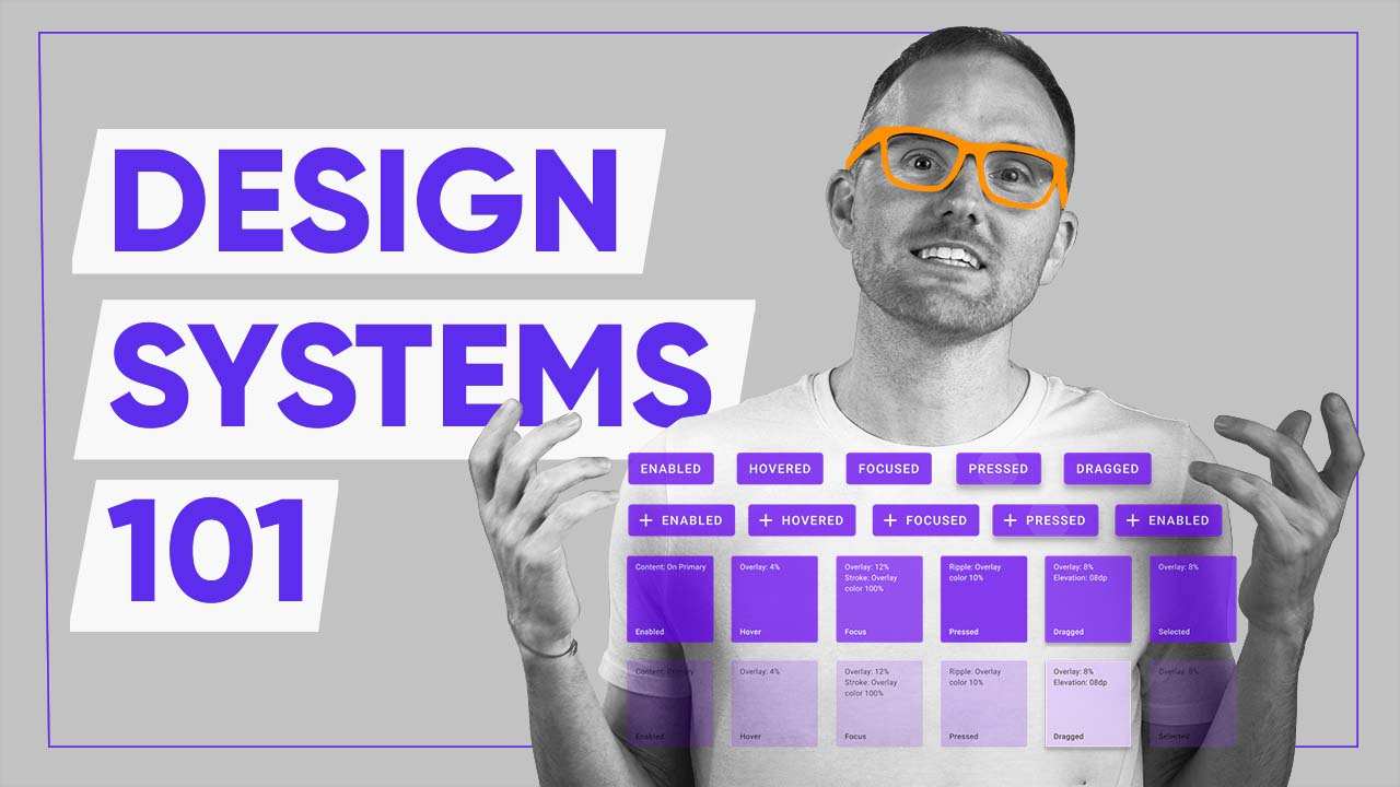
Video version of the article:

Design Systems: Everything You Need to Know Cieden
Play


What is a design system?

In layman's terms, it is considered a collection of all of the reusable components, such as buttons, input fields, headers, their states, and the rules and guidelines of their usage.

Design system definition

From a more formal standpoint, it is a structured, visually organized, and logically consistent kit of multi-mission components, as well as standards and rules of their implementation, in order to organize the design experience in the most effective, consistent, and predictable way.

Design system principles

The most essential principles worth particular mentioning include:

Simplicity.

There is a reason that standardization includes only those components that are planned to be reused and rules that are really comprehensive. Arrangement of everything, up to the most peripheral and redundant elements, would produce distraction and eventual frustration of a designer's creative process. This can be compared to a huge bureaucratic mechanism leading to design dehumanization, reduced spontaneity, and zero innovativeness. 

Intuitiveness. 

In line with the previous principle, this rule focuses rather on the visual organization of a system, with each element made responsive to redesign and development, as well as introduced via a visually clear interface, with concise hierarchy and sufficient space between components.

Adaptiveness. 

The context of the design process always changes due to revision of business objectives, updates in user needs and expectations, and sophistication of the technological base of a product. That is why, both the architecture and interface of a system have to be enough flexible to modification. This implies a certain level of autonomy of each element, meaning that dramatic change or elimination of any component would not make the entire system meaningless. 

Still, along with the mentioned fundamentals, any design system will reflect all the usability principles, for two main reasons. 

First, any such system is created primarily for the designer’s community as its end users. It makes their professional life a little bit easier and more cost-effective, in terms of time and energy spent. This means that usefulness, efficiency, consistency, cognitive load reduction, and other usability basics are fully applicable to any design apparatus. 

Ideally, a good system should be responsive to the level of expertise and skillset of any specialist, so that even a newcomer designer totally unfamiliar with a given brand, a product philosophy, or the design team’s approach, is capable to learn and begin implementing established standards and style guides in the shortest possible time. 

Second, usability matters because a design paradigm is often articulated to the general audience, in either an exhaustive or a condensed form. A good system is actually a matrix for a product design and brand identity, exemplifying integrity, inner coherence, and quality of a company, a trademark, or a digital product agency. 

That is exactly why serious IT players often devote space to an overview of their design scheme. It can be a separate guidelines page, a section within case studies in the portfolio, or even an encyclopedic canonical issuance, as in the case of trend-setting corporate giants such as Google or Apple. 

Elements of a design system

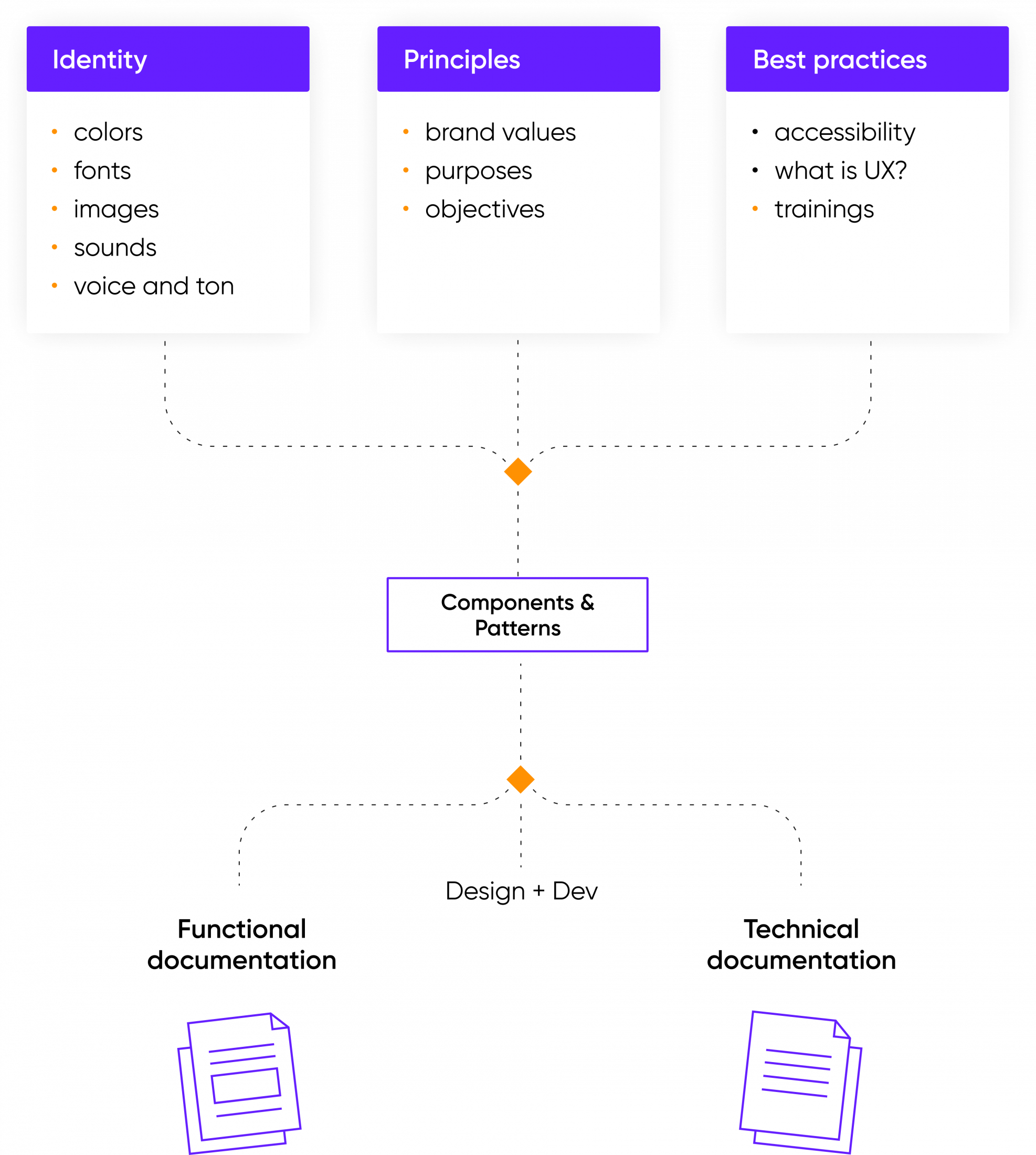
Such systems are usually comprised of three elements:

  • a pattern library (a collection of buttons, input fields, tables, etc.);
  • style guides (typography, colors, brand identity, icons, etc.);
  • rules of usage (design principles, language (tone of voice), documentation, nomenclature, etc.).

It's also crucial to point out, that developers are able to attach code snippets to each of these elements to ensure code consistency and reusability.

Elements of a Design System

Why do you need design systems?

Here's what such a system provides:

  • consistency (All identical interface elements are designed identically regardless of the designer with the help of a style guide);
  • efficiency (No need to design or code the same element twice);
  • flexibility (It's easy for new teammates to get up to speed);
  • standardization (A design matrix is a single point of reference for most if not all UX&UI decisions).
Design systems provide consistency, efficiency, flexibility and standardization


We should also note, that the bigger the design team, the more useful a system is.

Conversely, having no system results in:

  • chaos in elements with dimensions, paddings, font;
  • inability to quickly apply global changes results in extra costs and extra time;
  • having to design and code the same element multiple times.

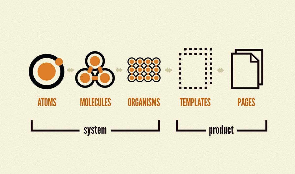
Atomic design as a milestone of design systems

Being a chemistry-inspired approach to grouping elements, the term Atomic Design was coined by Brad Frost in 2016. The principle is fairly simple: you should decompose your design into its basic components. This includes both the smallest imaginable parts (atoms) all the way to larger conglomerates of elements such as templates or pages. This exact line of thinking serves as a basis for any paradigm. The practical application of the design principles developed by Brad Frost manifested itself through design systems.

Atomic Design illustration

That's not to say that there were no such systems before 2016. Designers have always been reusing elements and trying to keep things consistent. However, what we owe to Atomic Design is a rigorous and conceptualized approach to keep our work in order.

What are the benefits of design systems?

Along with evident advantages of a structured approach to design for the workflow, already noted above, it also has a series of less evident, yet strategically priceless benefits for the entire business process. This includes:

Financial gain.

Unless you are a company with a nation-size budget, man-hours expenditures dedicated to a product design and development process would definitely matter. Particularly visible this becomes in the long-lasting perspective, regarding products and services developed for years.  We already clarified that a systematic approach saves time and energy for the designer (and most often developer) teams. 

In business terms, this means that design systematization not only accelerates the production process but also releases human resources to be focused on strategically more important issues. You may argue that creating such a system is a time-consuming process by itself. However, with a proper approach, it is created only once. Its subsequent maintenance and updating are incomparably easier than from scratch each time. The studies show that by saving 20% of a designer’s time, a company saves between $30,000 and $50,000 per person annually. Moreover, you need not even create such a system, by using one of the most popular ones instead as a template.

In addition to that, such a system gains particular financial value when you start to scale your product commercially. Compared to from-scratch designs, a system provides incomparably greater levels of maintenance, scalability, and sharing capacity.

Cultural capital and moral value. 

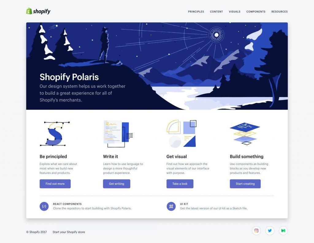
This will be no exaggeration to say that well-established design systems become political. Each time when anyone users Shopify Polaris to architect an online marketplace, the first idea they perceive, feel and memorize is Shopify as a socioeconomic symbol. This means that the system can enhance market positions and brand recognizability as no special advertising campaign. If your system is so good that it becomes a model to be followed, this would inevitably lead to the growth of your cultural and social capitalization. 

Nest egg for the future.

If we believe the technology oracles (hyperlink), the not-too-distant future will be the reign of artificial intelligence (AI). Putting aside Elon Musk's dire forecasts about AI's sinister effects on mankind, it can be very promising for the future of design. 

In quite a few years we can stand aside and observe how smart self-learning algorithms effortlessly update the UX and user interfaces of our products, scale them, or even produce new ones with unworldly ease and elegance. How would they do it? By relying on a standardized and encoding-convenient design scheme. Without such a system in place, putting AI to work can become a daunting task.

When to create a design system?

These systems are usually created whenever there's a need to reuse elements. Therefore, the moment you start designing high-fidelity product, you should save repetitive elements.

Usually, designers group multiple elements by using design tools into a larger object (e.g. the button shape + text), and then turn the object into a symbol (in Sketch) or component (in Figma). The beauty of symbols and components is that changing the master component will change all instances of this element. This makes global changes as easy as changing a single design element.

How to create a design system?

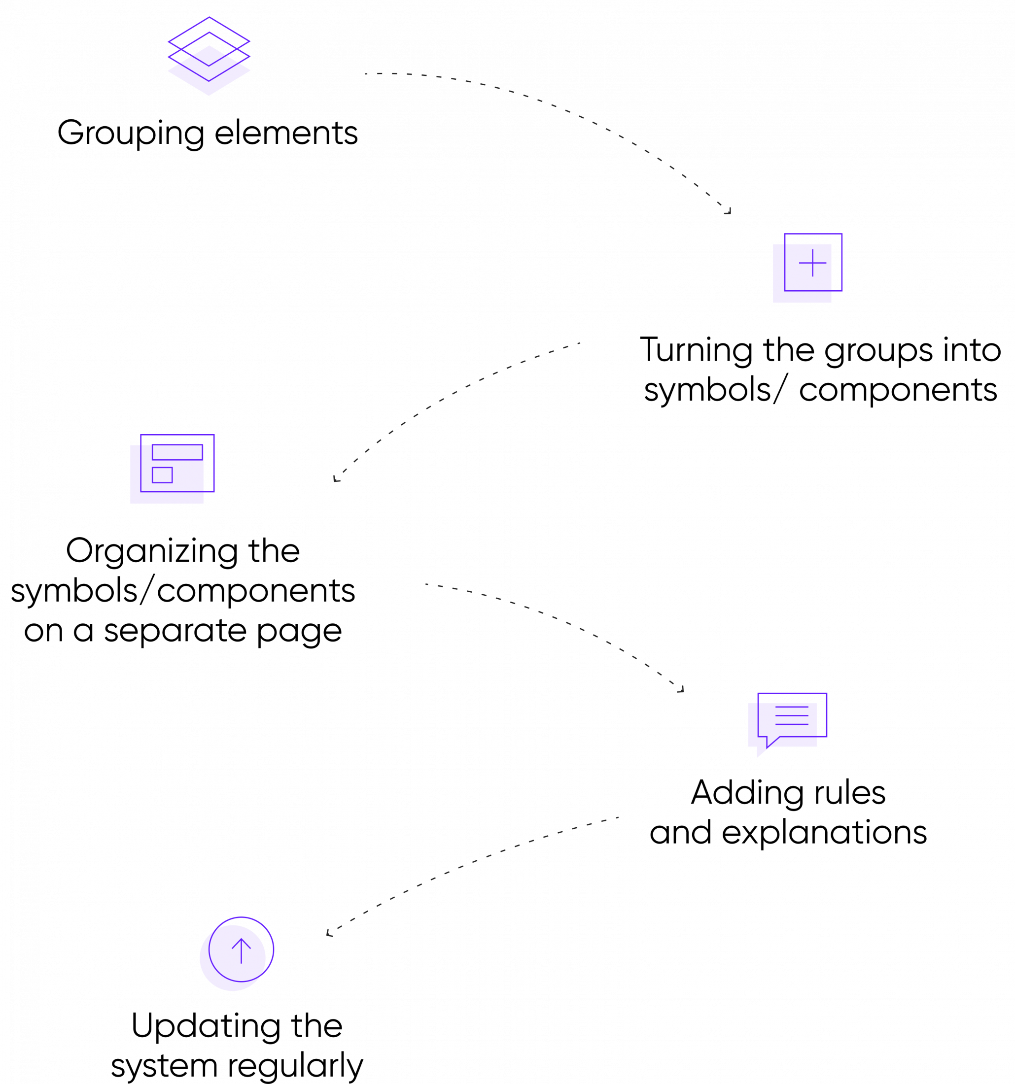
The algorithm of its creation is as follows:

    Algorithm of design systems' creation

    Step 1: Grouping Elements.

    At this stage, a designer needs a really discerning eye and systematic thinking to figure out what elements are to be included in a system and how to organize them.

    Step 2: Turning the groups into symbols/components.

    This is mainly the technical part. Here, proficiency in the use of software tools for designers, such as Sketch, Figma, or Framer, is what matters most. 

    Step 3: Organizing the symbols/components on a separate page.

    Recall the principle of intuitiveness and make visual representation clear, evident, inspiring, and easy to use. 

    Step 4. Adding rules and explanations.

    As with any other user manual, the more complex and multi-layer the system is, the more important is to define and explicate function, destination, and specific caveats of use of any element, as well as their interactions.

    Step 5. Updating the system regularly.

    It is to be permanently revised in line with the market evolution and product improvement, especially in the case of long-run digital products and services.

    This algorithm does look pretty simple on paper. The difficult part is being consistent with your efforts, updating the system, and actually using them. The worst fate any piece of documentation can meet is gathering dust and being forgotten.

    Aside from the reusable elements, creating a system also entails thinking through such things as text hierarchy (headers, paragraphs, hyperlinks, etc.). Additionally, one should document the product's pallet. The pallet usually features the primary branding colors, secondary colors, and semantic colors (success, error, warnings, etc.).

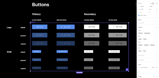
    By the way, we couldn't not mention a recent Figma update that made maintaining systems easier. The app introduced variants, that allow creating multiple states and variations of a single button. Neat!

    Variations of a single button

    Pre-built vs custom design systems

    So far, we've been discussing the benefits of such systems in general. Let's take a moment to go over the benefits of a custom and pre-built design organization.

    A custom system is built from scratch, which means that you'll have to spend time and resources creating it. That said, despite the difficulties, a custom design will lead you a long way in differentiating your product through both the UX and UI. Additionally, you'll have full of control of what elements need to be built.

    It's worth noting that sometimes there's no need to create a system from scratch. For projects that need to adhere to specific design principles, designers use pre-built open-source design systems.

    There are quite a few benefits of using a pre-built model. Here are a few of them:

    • no need to invest resources into building a custom system;
    • tapping into a popular visual language that users are likely familiar with.

    The key drawback to using any pre-built structure is that you sacrifice a lot of what makes your product unique. Using a pre-built model will make your product’s layouts look Googl'ish, Apple'ish, or Microsoft'ish. Another shortcoming of such structures is that if chosen unwisely they become a pain. For example, you probably shouldn't use Shopify Polaris for a mobile game.

    Examples of design systems and how you can use them

    Here are a few of the most popular open-source systems out there:

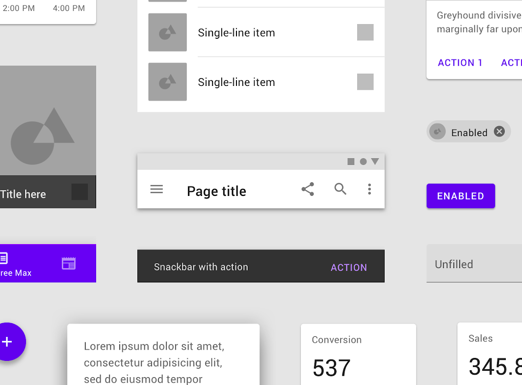
    • Google Material Design. GMD is one of the most comprehensive paradigms out there. Aside from the most common patterns and layouts, it also features dark mode, elements of skeuomorphism, and motion design. The major con of using GMD is that you'll potentially become less distinguishable in terms of UX and UI.
    Google Material Design System example
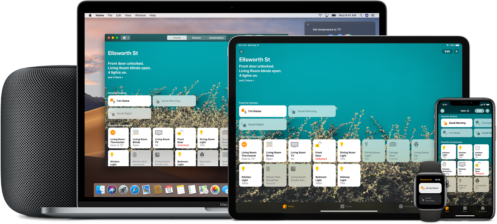
    • Apple Human Interface Guidelines. Again, AHIG is very comprehensive. The downside to the system is that you'll be competing with millions of apps that have a similar look and feel.
    Apple Human Interface Guidelines
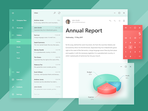
    • Microsoft Fluent Design. It's a little less comprehensive than the previous two. The shortcomings include lacking documentation and some inconsistencies in patterns. However, it's still a solid choice.
    Microsoft Fluent Design
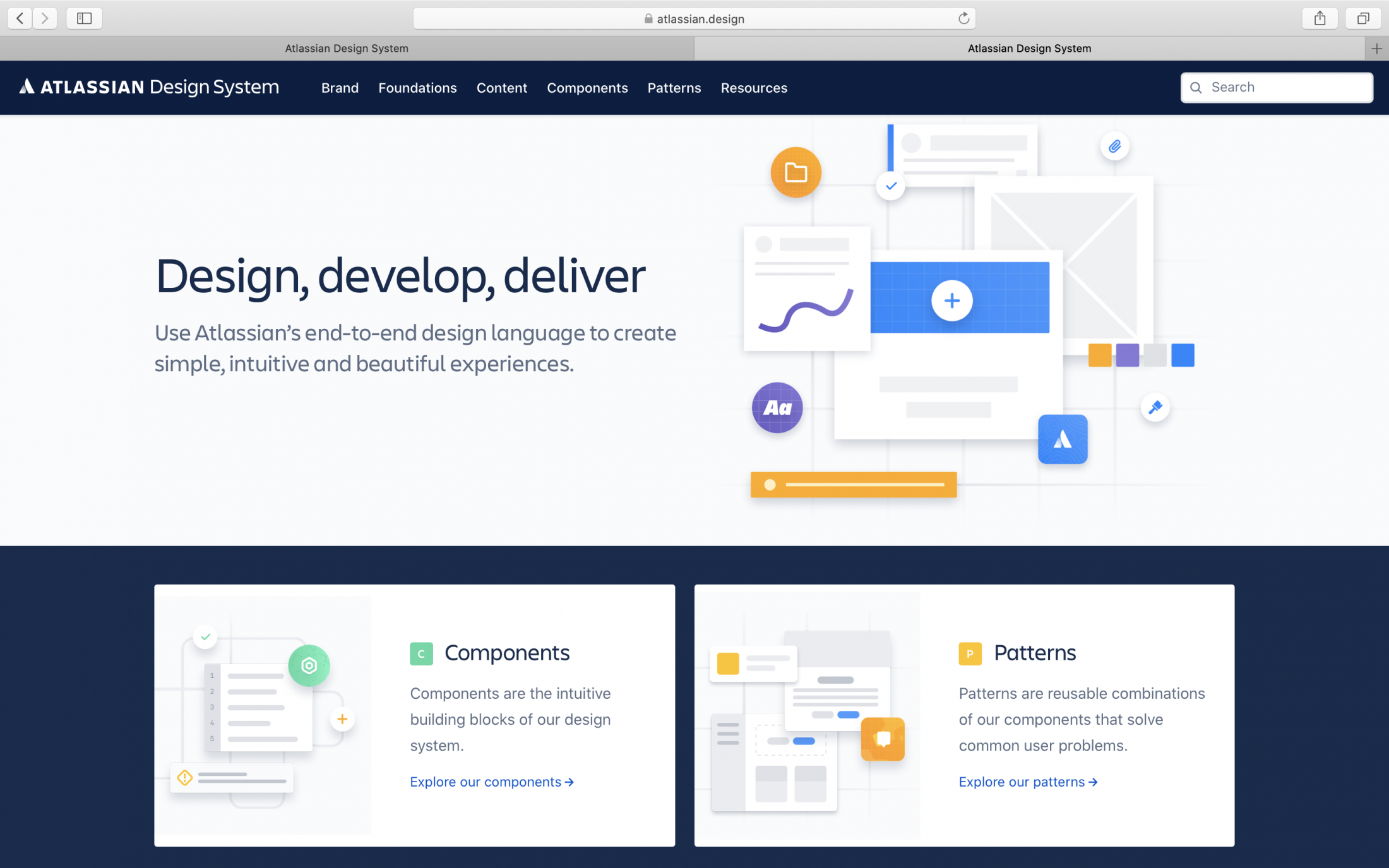
    • Atlassian Design System. A solid choice if you like the look and feel of Atlassian products like Jira or Trello.
    Atlassian Design System
    • Shopify Polaris Design. As the name suggests, this model is created for e-commerce merchants. If you're designing an e-commerce project, that's a very good choice.
    Shopify Polaris Design

    Conclusion

    Hopefully, if you had any doubts as to whether you need a design system, this article made a good case for it. Regardless of whether you're building a custom or a pre-built system, these are vital for long-term scalability and adaptivity. If you're looking for a place to follow your journey with design systems, look through the pre-built models to get an idea of what they should look like.

    start your project with us.

    Getting in touch
    is easy .
    Thank you for your message. It has been sent