Project Plan
Task
Create a better experience for land lords and tenants on any scale
Team
1 Lead UX/UI Designer, 1 UX Researcher, 1 Middle UX/UI Designer
Duration
2.5 months
Scope
70 screens
Result
High-fidelity prototypes for three kinds of users
Overview
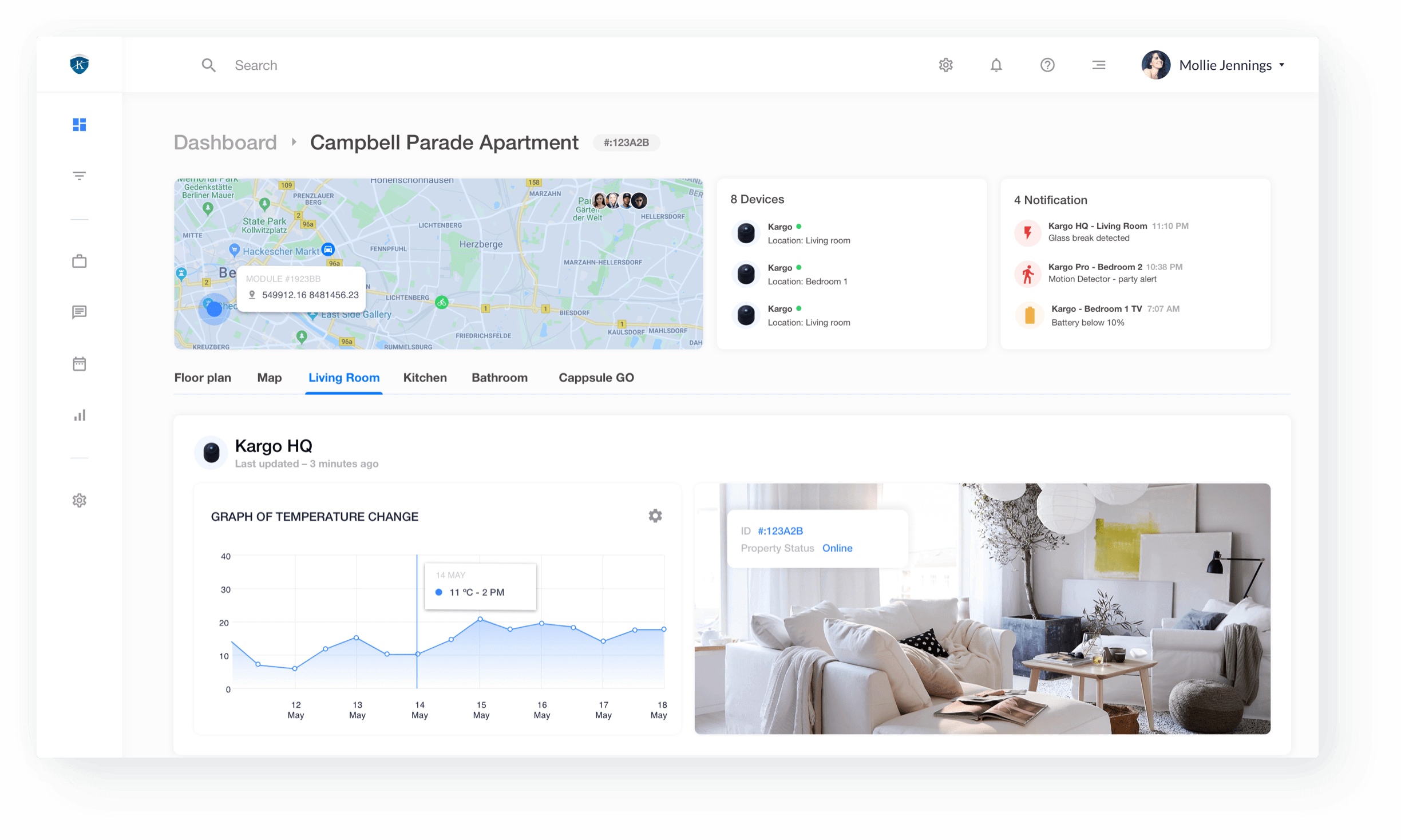
The application we were working on is a smart home monitoring system based on a network of non-Intrusive IoT Sensors and Software that can send real-time alerts to Host and Property Managers. Not only it helps landlords and tenants keep track of any threats the property might be vulnerable to, but it also puts the vast numbers of properties real estate corporations own at their fingertips.
The application seamlessly integrates with the sensor security devices you already have, aggregating everything you need to know on the screen in front of you. Based on the information the app collects, it provides you with analytics and suggestions to cut down your expenses and mitigate potential risks.
Benefits
- One month discovery phase
- Stakeholders’ technical background
- Unique app functionality
Challenges
- Tight schedule
- Making a seamless UX for multiple user types
- Lack of access to the end users
Moodboard
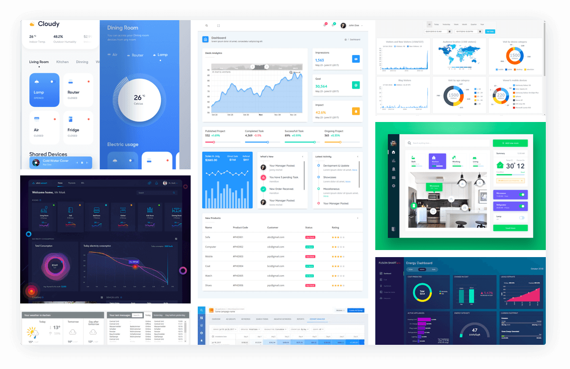
We prepared a mood board in order to help our customers find the visual style and the user experience pattern they were looking for. Our UX Researcher and UX Designer gathered a list of design references from various sources such as Dribbble, direct and indirect competitors, leading apps in the domain of smart home solutions, and other applications with unique UX and visuals.
User research
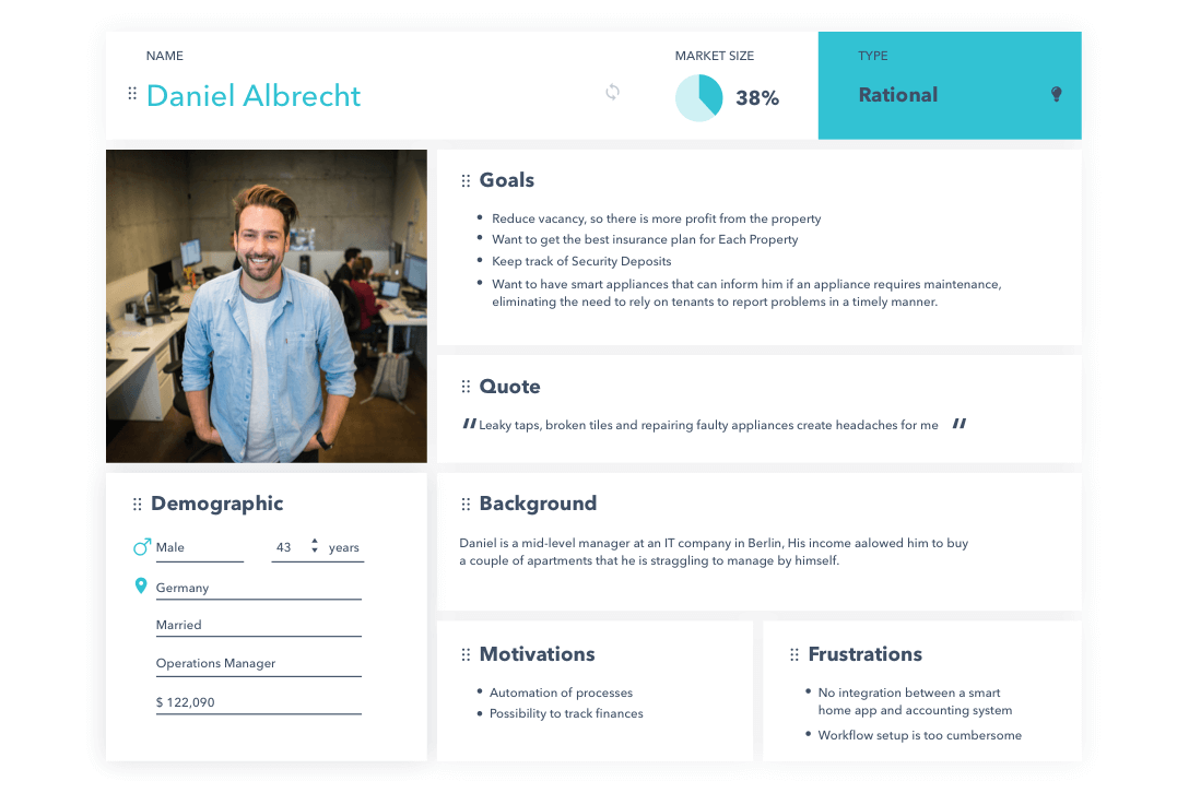
Based on the initial data we received from our client, we developed three proto-personas for each type of user. After gathering this initial information, we decided to proceed with looking for potential customers that we could interview, which would help us validate or refute the assumptions that our proto-personas were built on.
In one of our interviews with a real estate agent, we attempted to find out what information was most relevant for him, and how he tracked it. In response, we discovered that our number one competitor is an excel spreadsheet since they integrate with services like Airbnb. However, the agents also have to manually monitor each property, which is time-consuming and bothersome (to put it mildly). Also, we came to understand that one of the most important fields is the check-in / check-out dates, which are vital for managing properties.
Customer Journey Map & User Stories
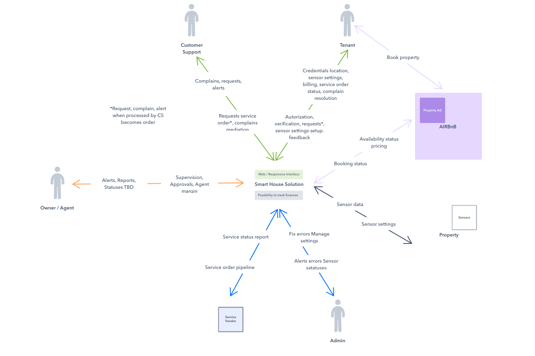
Thanks to our interviews, we managed to identify the recurring processes in agents’ work. As our next step, we turned this information into a customer journey map in order to see which pain points needed to be tackled first to gain the users’ loyalty.
Keeping in mind that the application was to be used by three types of customers, developing user stories was vital to keep the team on the same page and to avoid confusion. It helped us create a list of features that are necessary to solve our users’ problems.
Low-fidelity wireframes
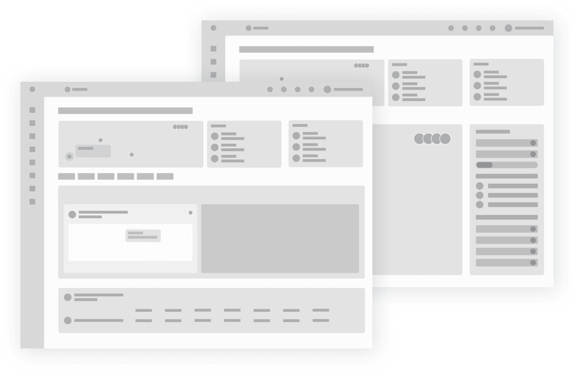
Wireframes, finally! Raw drafts of our first web interface for the users with many properties. We started with grey monochromatic primitive UI components in order to save our client and ourselves from an untimely focus on the visuals rather than functionality. Now with the development of designer tools, this step may seem unnecessary since you can start with detailed screens right of the bat but nevertheless, low fidelity prototypes help us think through all UX.
High-fidelity prototypes
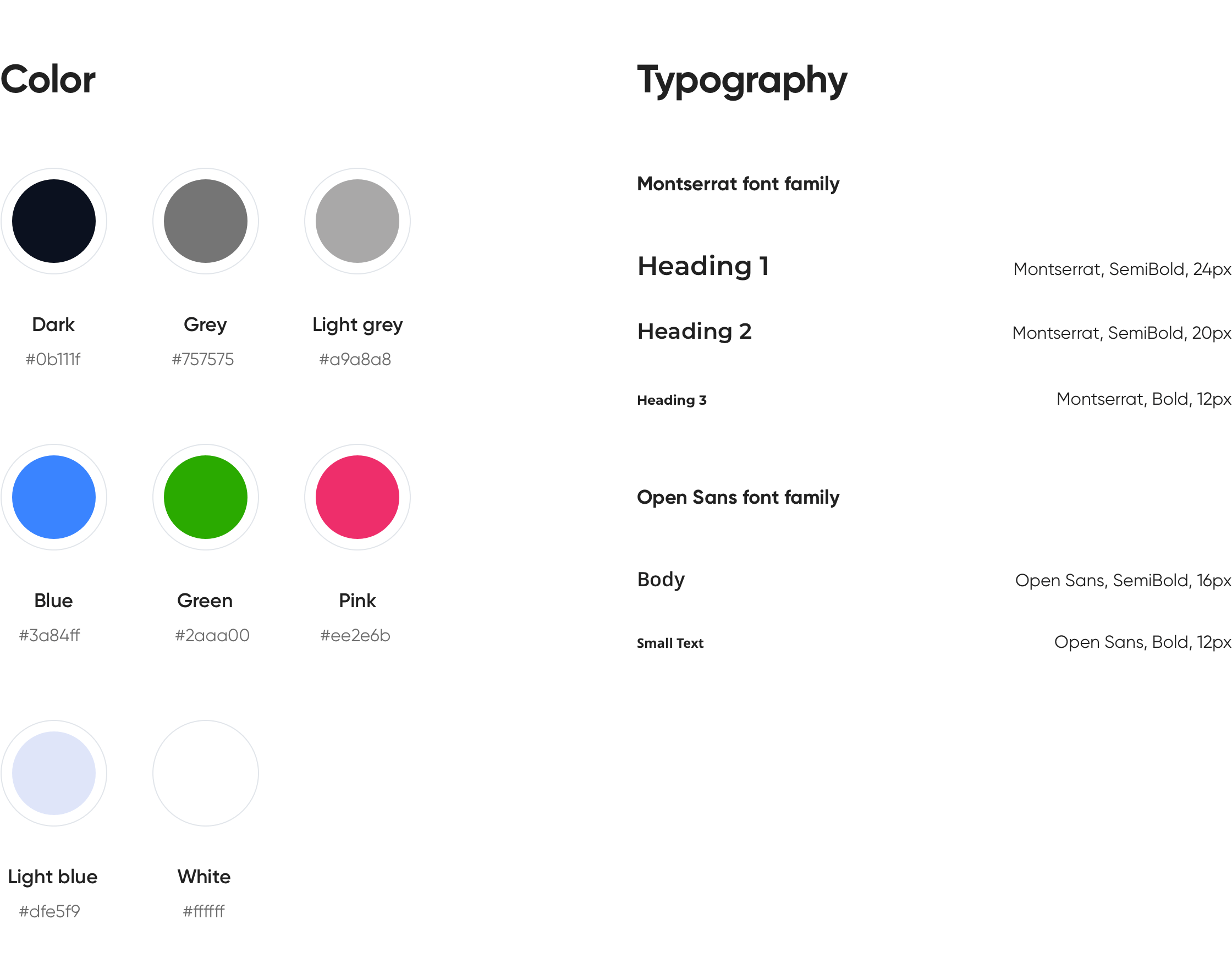
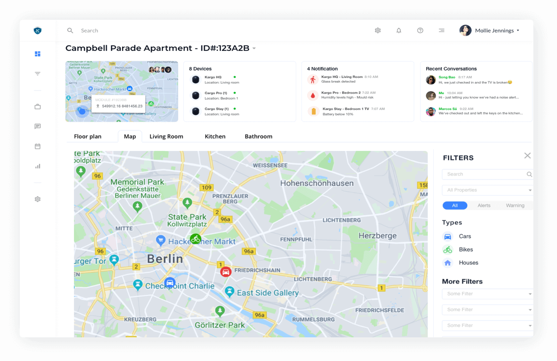
Since we organized the process well from the start this step was
easy and painless. Since the low-fidelity prototypes were designed with the help of symbols in Sketch, we were able to change the elements on all screens fast and keep iterating until all stakeholders were beyond satisfied.
we reply under 24 hours.
free
session
