Client case study at a glance

Task

Team

Duration

Scope
About the client
MedEntry is a leading medical entry preparation provider in Australia, New Zealand, Ireland, and the United Kingdom that has operated on the market for almost 20 years. They are committed to helping students across countries enter medicine and dentistry, preparing them for interviews and tests, and ensuring gaining entry into the top medical schools in those countries. MedEntry has helped around 20K students with medical entry preparation and offered them the most comprehensive and up-to-date resources available.
Overview
MedEntry has developed an online platform and mobile application that prepares students for the exams to enter medical universities in the most accessible and user-friendly manner. Their innovative and intuitive tool is designed to personalize student training and feedback to plan all the educational activities properly.
The client turned to us to redesign their existing platforms for two different markets, design a mobile application, eliminate bugs, and make UX improvements to increase students’ engagement and motivation, improve the way they use the platform, and simplify complex navigation and feature discoverability to offer a smoother experience.
In addition, over time new features have been introduced to enhance the platform and also required design expertise. We have allocated 2 specialists to this project: a business analyst and a UX/UI designer to transform this student platform according to the client’s request.
Challenges
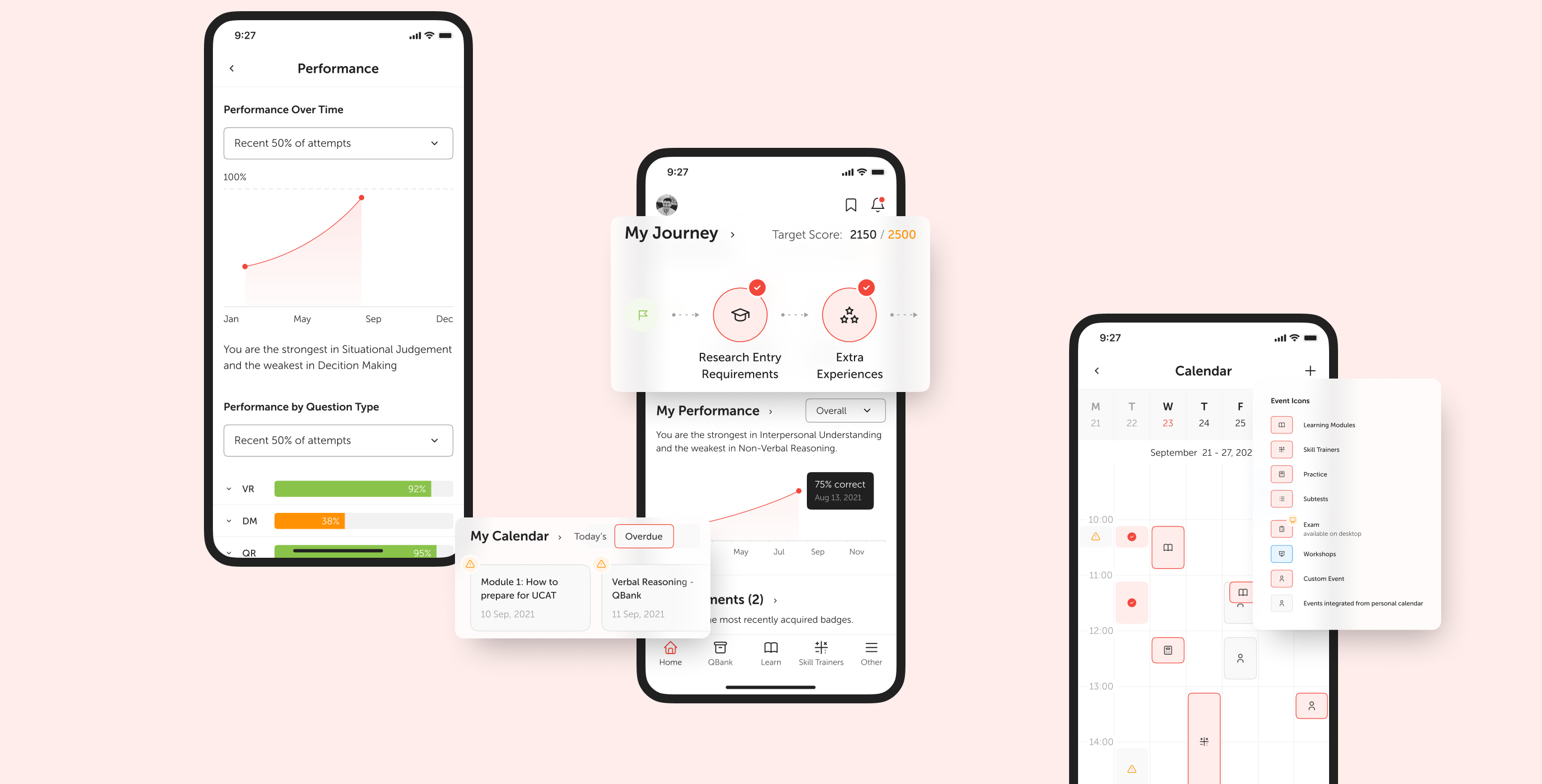
- smoothly adapt the red color as primary in the design system and make it catch the user’s attention in the most subtle manner without overcharging the main visual look;
- take into consideration the responsiveness of the platform during the designing stages to make it suitable for different devices;
- design the platform with accessibility in mind and introduce big buttons, contrast colors, etc. to enable students to study anytime from any place, and even on the go — all to streamline the studying process;
- represent data and analytics visually while encapsulating complex concepts in more simple visual elements.
Results
- based on the data collected through user interviews and competitor research, we built an information architecture for the product backed up with solid data;
- enabled effective and appealing data visualization to track student progress and define areas for improvements;
- created a web platform as well as a responsive mobile application that included light & dark themes for a comfortable user experience;
- designed a new logo to refresh branding and align it with the updated look and feel of the platform;
- improved and simplified the product UX;
- based on our initiative, implemented gamification elements to increase the engagement of end users;
- introduced new elements to evaluate progress and score in the leaderboard to compare users’ results;
- customized video player with the opportunity to leave notes while watching the educational content and get video transcripts.
We went beyond just simply following client requirements and generated our own ideas to improve the platform. Striving for more makes us stand out among competitors. While working on this product we brainstormed and extended the list of features for this product to offer a unique student experience, boost their engagement, and simplify learning processes. It enabled us to put the platform ahead of the competition as well as improve the overall product value proposition. We aim at maximizing client business growth through our high-performing UX/UI design and result-oriented approach when dealing with each specific case.
Main focus of our UX/UI design
Based on the user interviews that we conducted along with deep competitor research, we were focused on the following design aspects:
-
streamlining the platform’s navigation to let the students easily find relevant information and switch inside the modules between different topics;
-
making students’ progress highly visible and enabling them to easily pick up on the tasks they left off and continue learning sessions without missing overdue tasks;
-
facilitating analytics and eliminating vague scores and percentiles so students can evaluate their progress within seconds;
-
creating a responsive mobile app design so students can use it on any device of their choice and still have the most seamless experience;
-
simplifying the platform UX/UI to make it easily understandable and easy to use for all the students and let them focus on the educational process;
-
maximizing the platform’s accessibility for young students who are the main target audience and emphasizing on contrast and size of visual elements.
My journey & homepage
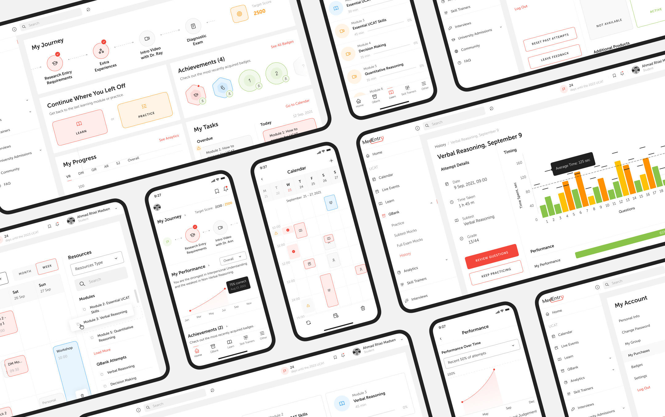
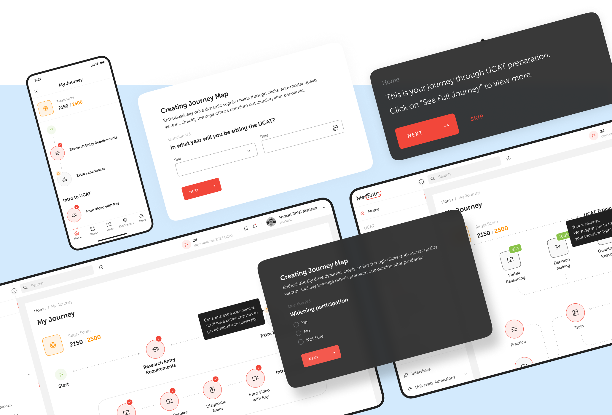
We came up with and effectively implemented one of the core platform features — My Journey. It’s a personalized visual study plan to measure students’ progress and see how they move through the learning process. This educational journey is showcased on the home page to see what’s done and what’s missing right away in a very minimalist and understandable way. Our team has also enhanced the home page with achievements, tasks, and analytics blocks not only to help students effectively track their daily routine, pick up where they left off, and see overdue tasks but also to boost their motivation and make their learning more straightforward and organized.
Integrated calendar
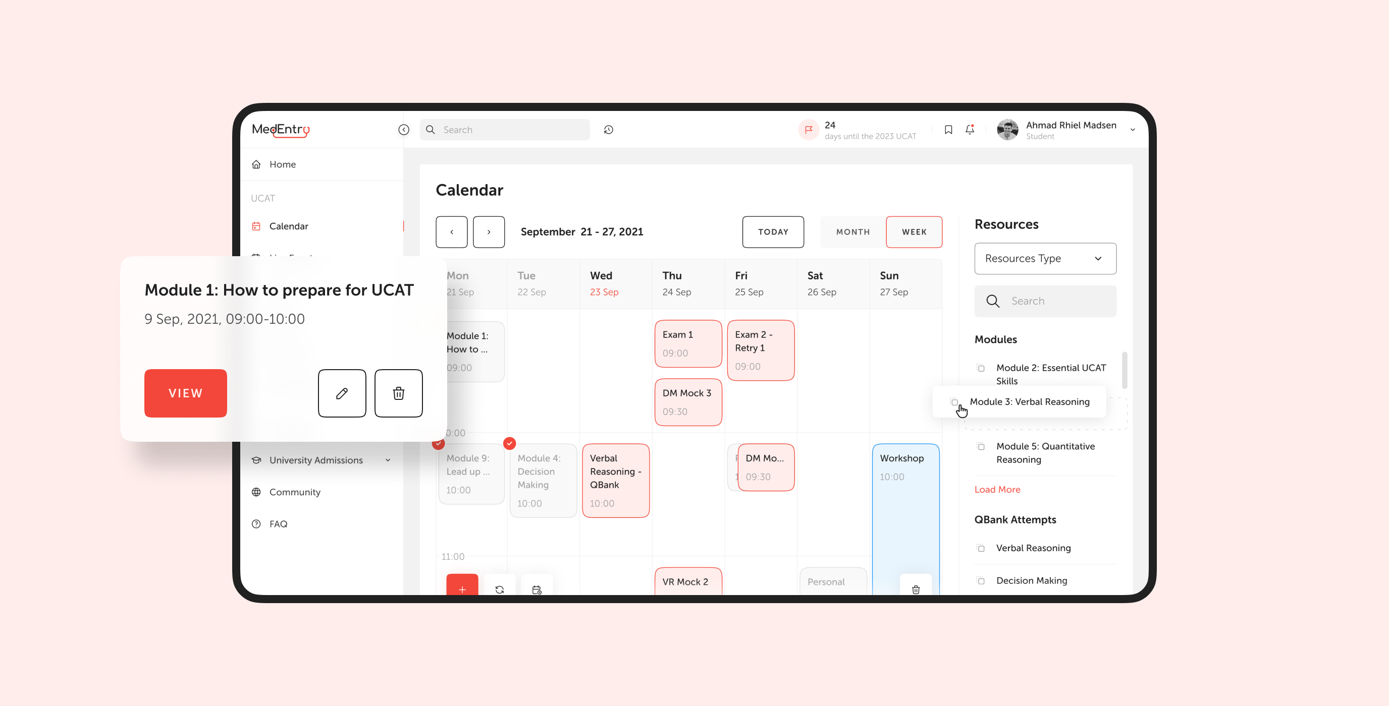
After redesigning the in-app calendar, students can better plan their learning activities, schedule their time, and study in a more efficient way. It enables them to prioritize, organize and set up activities of the study plan in the most convenient manner. Moreover, they can integrate the in-app calendar with Google Calendar to fully plan their studies in accordance with other daily activities so that students do not miss something important.
Handy bookmarks & notes
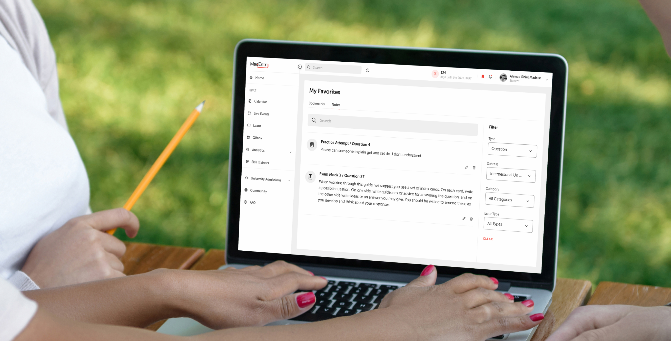
Bookmarks and notes are simple yet extremely helpful features that make the studying process so much simpler. While learning the material on the platform, it's possible to mark important or difficult information and review it when necessary. Notes that students can also take while watching videos and reading educational content are organized and stored in one place. They can be available throughout the year to review crucial information with ease.
Skill trainer
Getting ready for an exam is a very tedious and time-consuming process. The preparation requires a lot of skills and this module helps students boost these skills inside of the platform. We have visually transformed plenty of valuable exercises to hone critical skills needed to enter medicine and turned it into even a more exciting experience for students.
Detailed analytics
We significantly improved the platform analytics to allow students effortlessly compare and track their overall progress. The comprehensive and convenient analytics panel demonstrates students’ critical scores on the skills they build and showcases their performance during trial tests to evaluate the effectiveness of their learning. In addition, students can easily compare their results with other people and see how they perform in relation to the average score. Through this, they could stay up to date with their progress and understand if they need to train more efficiently.

Documentation and dev support
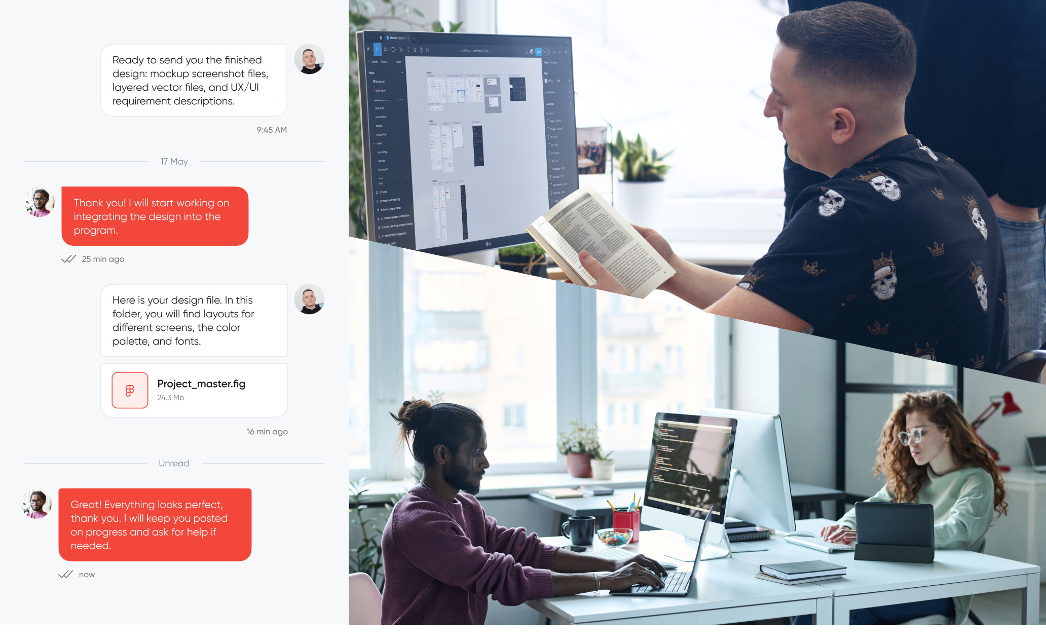
During the implementation process, our team offered design support to ensure the smooth and bug-free transformation of the platform and new mobile app development. We closely collaborated with the development team to make sure they could implement our design solution with no bottlenecks and adjusted our design in case there were some technical restrictions. We gave feedback on the design implementation to eliminate issues and release an impeccable product.
It’s worth noting that after we finished the designing stage, we tested the final product on students with and without experience using the client’s platform to evaluate the efficiency of the implemented design and functionality changes and make respective amendments if necessary.
we reply under 24 hours.
free
session

