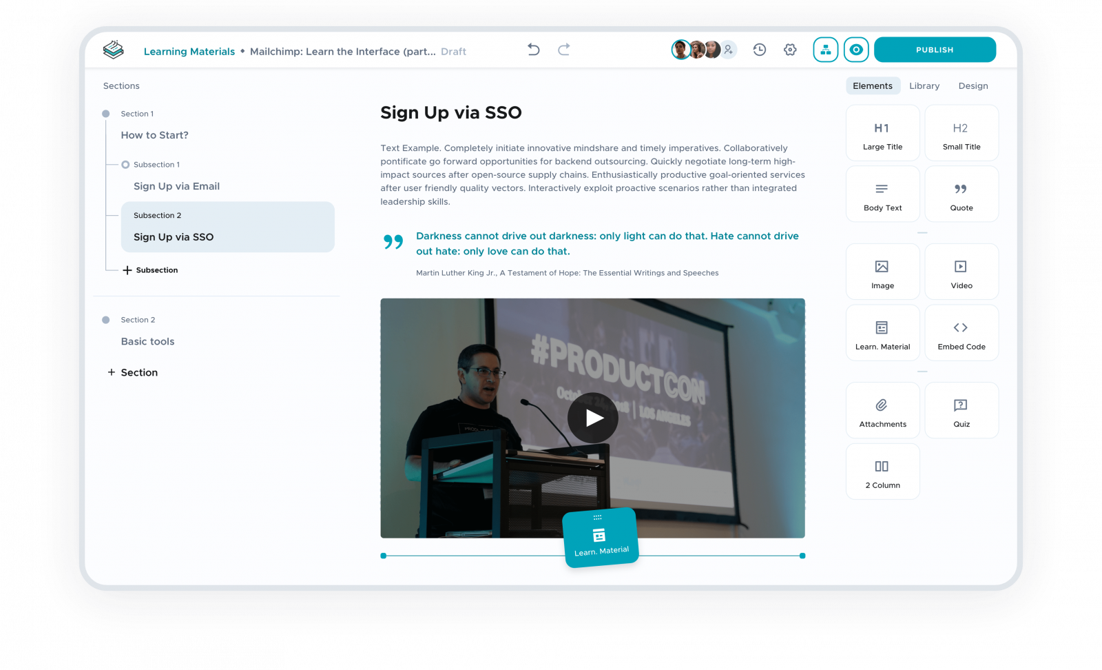
Project Plan
Team
1 UX Researcher and 1 UX/UI Designer
Duration
6 Months
Scope
Complete user flows for two personas
Result
The product is in development now
Overview
The customer approached us with a straightforward task – to redesign an outdated platform that had multiple usability flaws. After a quick analysis of the product, we realized that it was missing Points of Difference – a strong differentiator among other similar products on the market. There were many stronger competitors out there on the market.
Our Approach:
- the human-centered approach that started from the User Research phase (user interviews) aimed to identify user needs and user pains while creating documentation and training;
- rapid low fidelity prototyping;
- user testing;
- UI design.
Step 1
Intro
Quick dive into the product that has discovered multiple usability and visual issues.
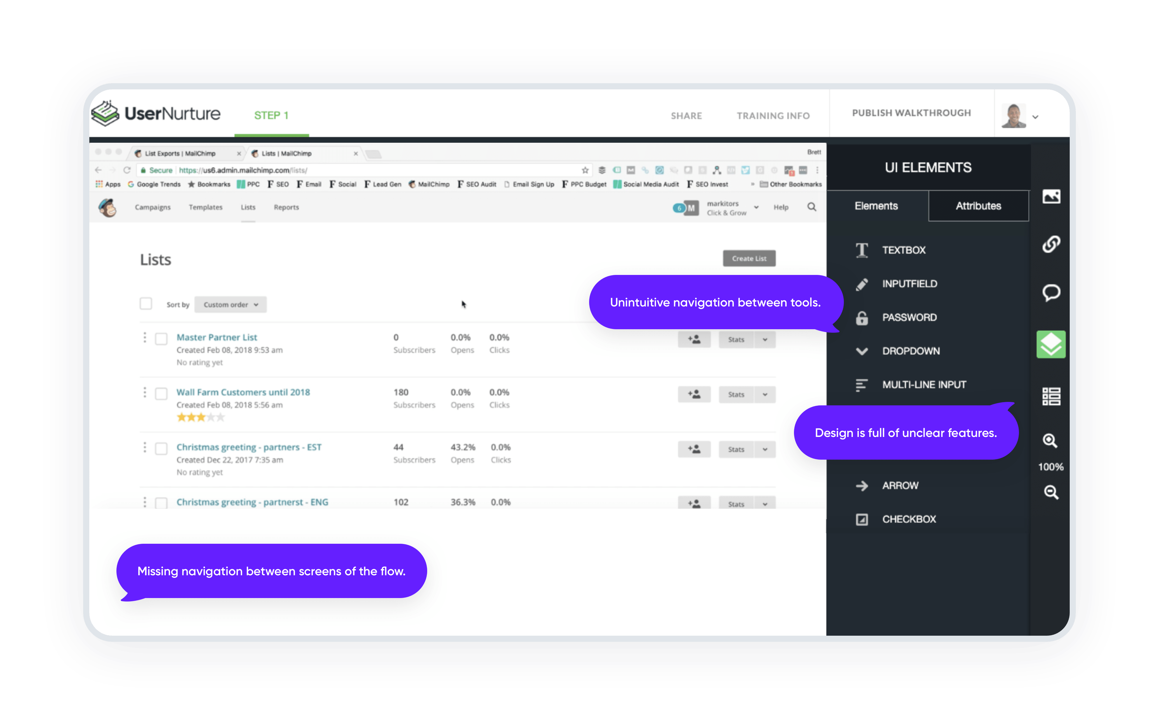
Step 2
User Research
12 users were interviewed using a semi-structured interview method.
The analysis of these interviews has revealed:
22 Findings (both user pains and user needs)
3 Patterns (findings that are repetitive across 3+ user interviews)
Major pain for users working on creating any learning materials is using multiple tools and storing data in multiple places. We called this insight the All-in-One Tool.
Now, we know our users and have investigated their needs and pain points. We have also established a good amount of empathy and understanding of what can bring considerable value to the users – instructional designers, who create learning materials and documentation every day.
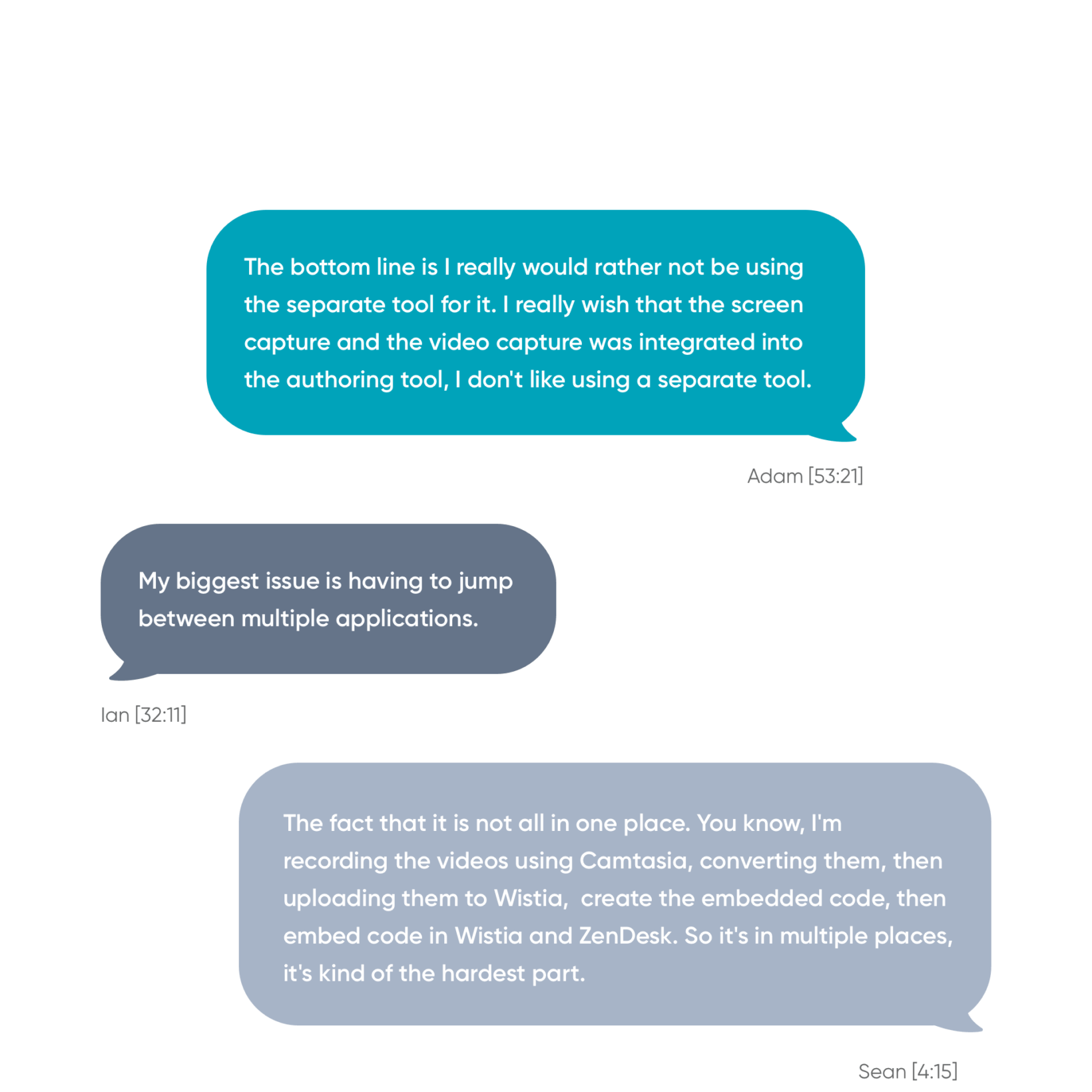
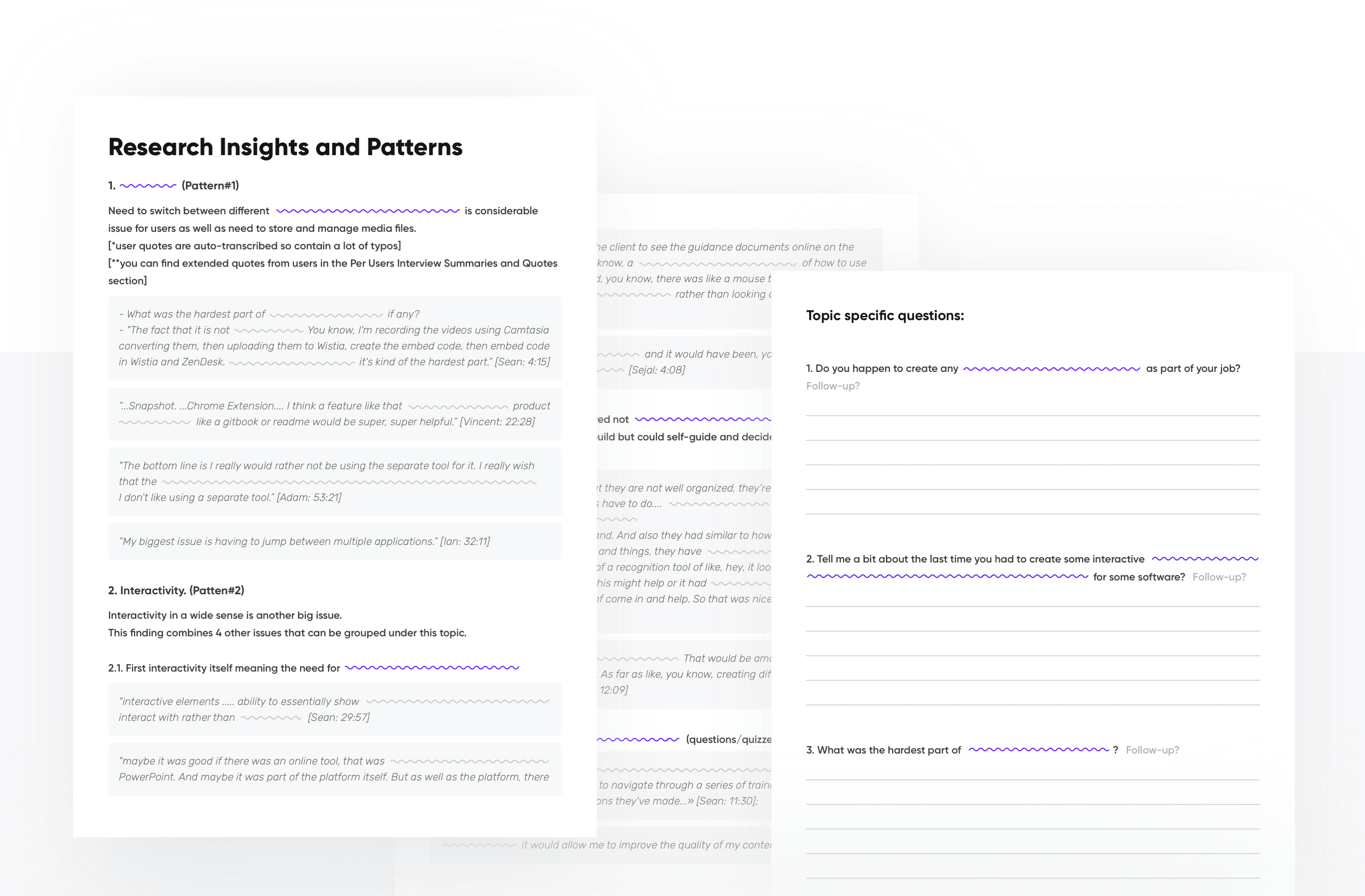
Abstract from the User Research Report.
Key findings are blurred because the product is still under development, is not launched, and is under NDA.
Step 3
MVP
Together with our client and a Business Analyst we agreed on what functionality will be included in the MVP and prepared a rough estimate for the design phase.
Step 4
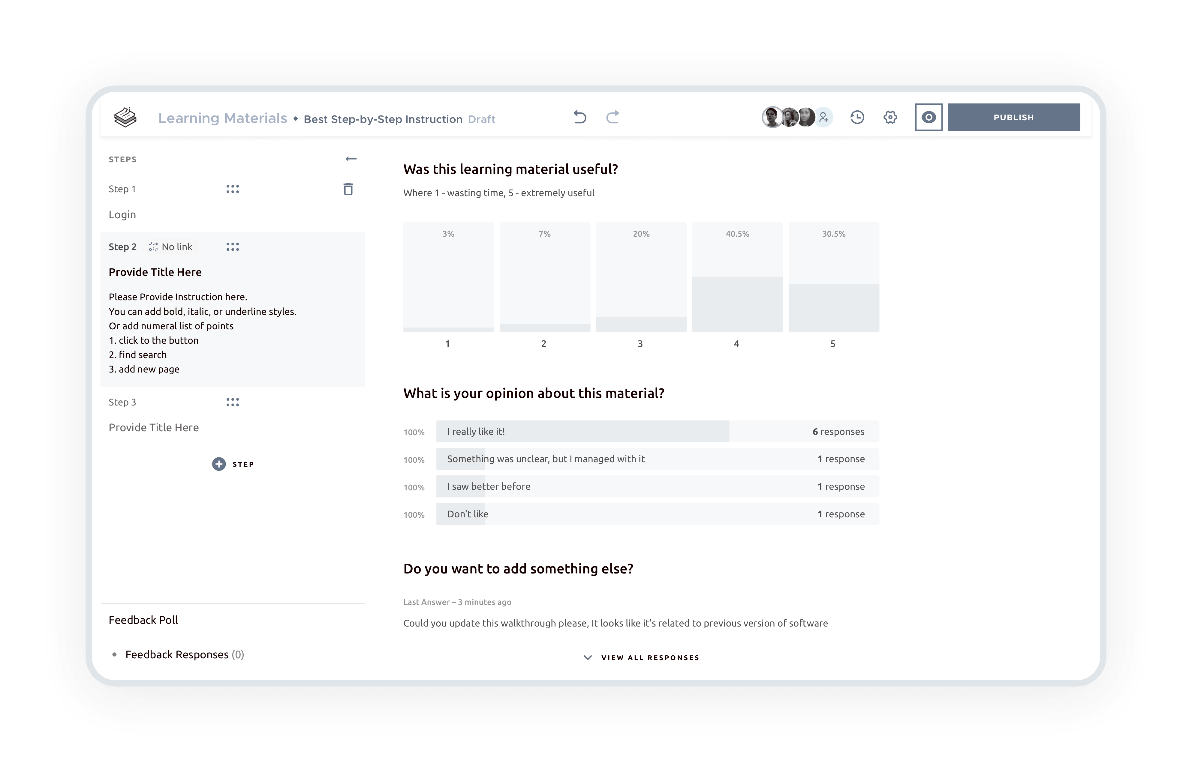
Rapid low fidelity prototyping
Work with low-fidelity wireframing allowed us to save a lot of time and quickly move to the validation phase.
Step 5
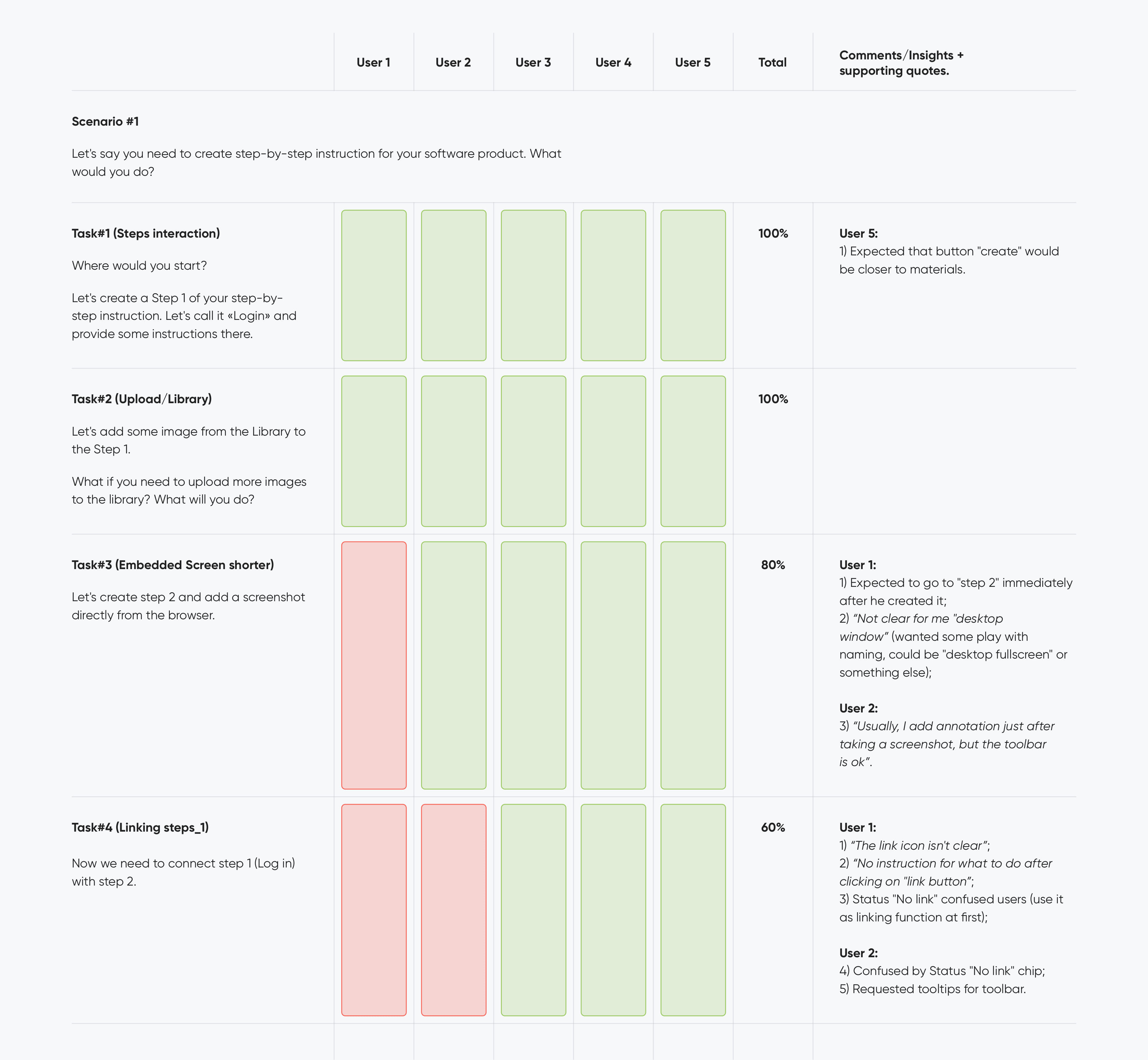
User Testing
User Testing, as a design validation phase, showcases how our design hypothesis works with our users – instructional designers.
We used a Remote Moderated User Testing Method.
Step 6
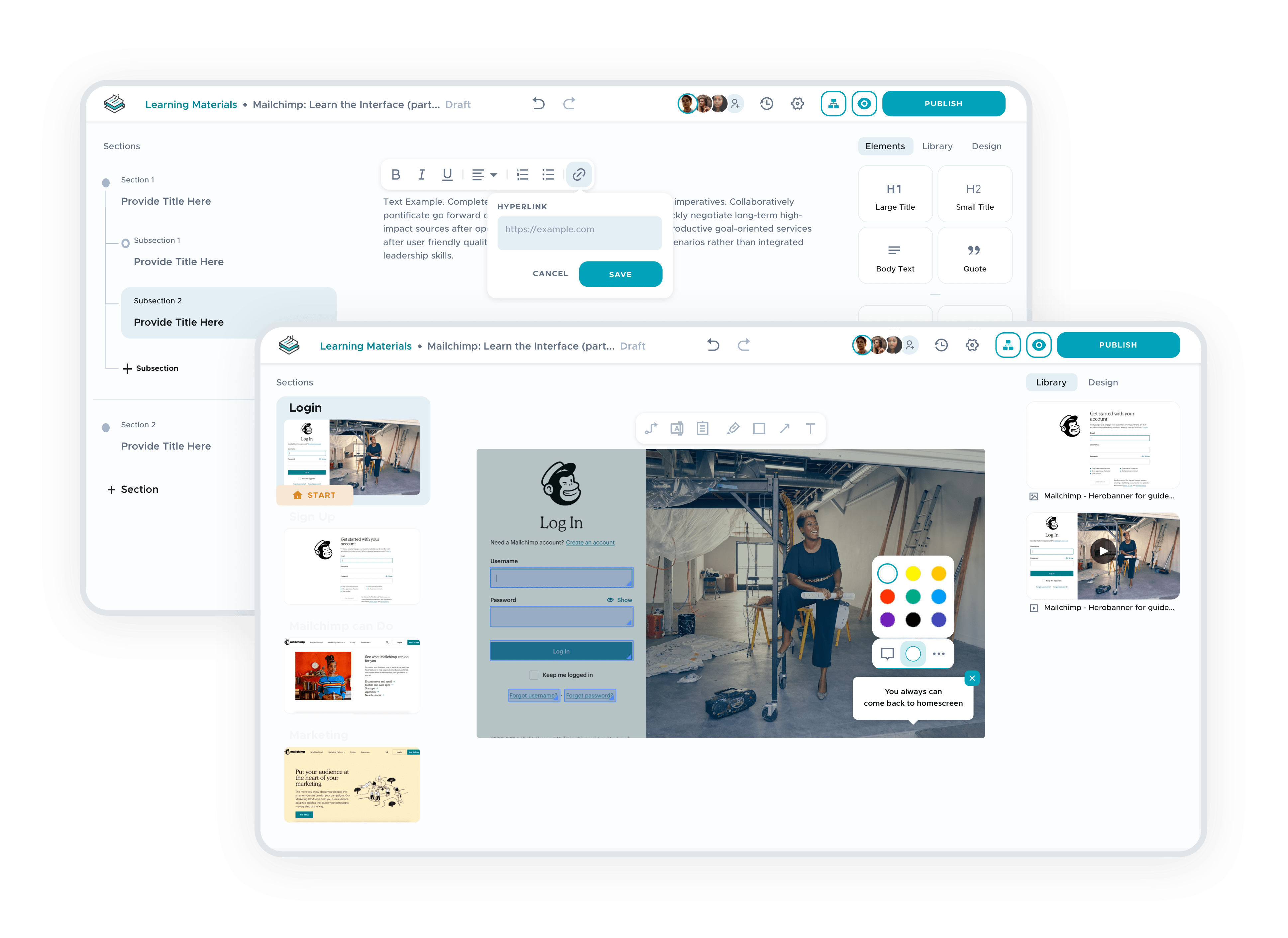
The second iteration of design and validation
Result
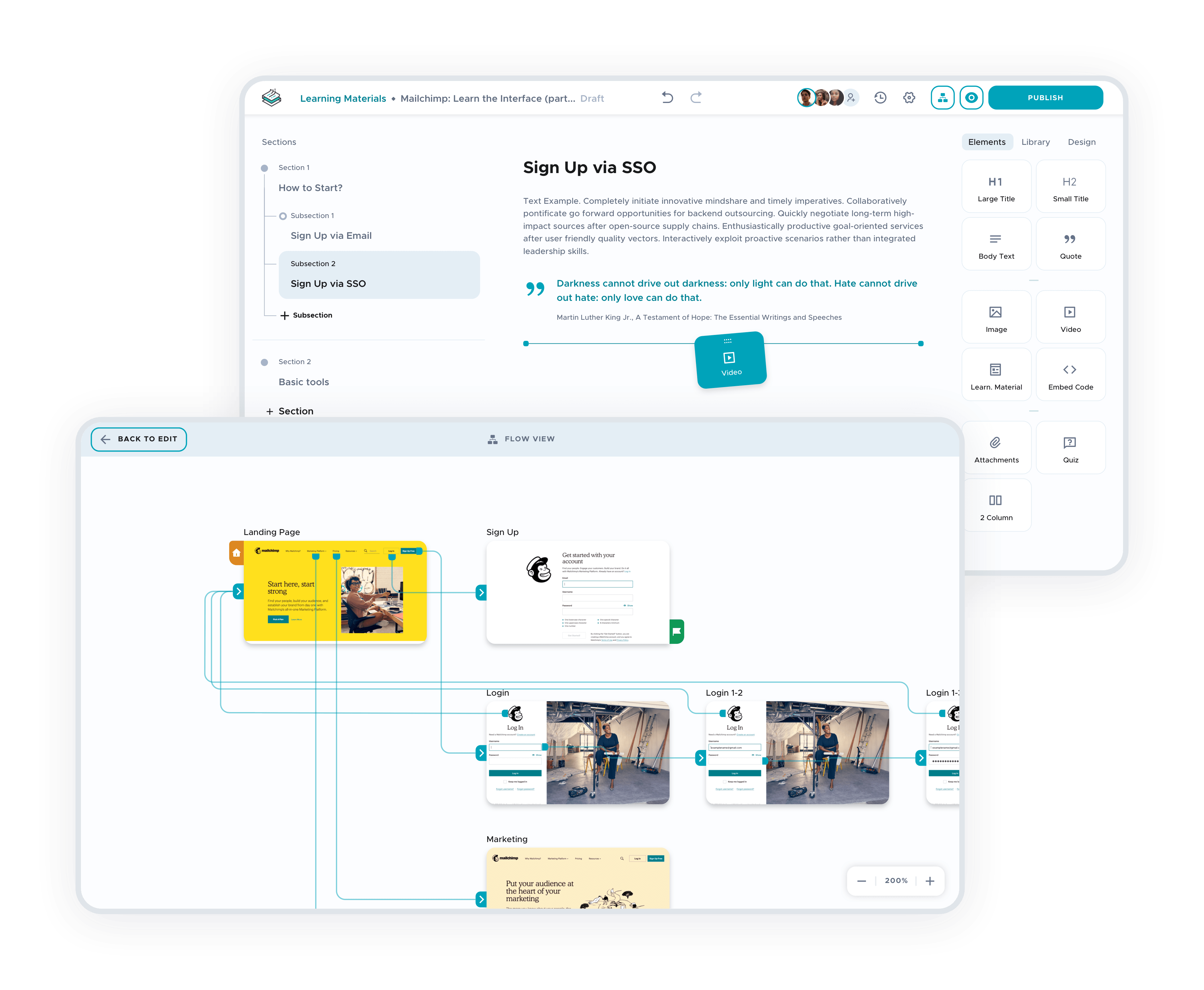
All-in-One Tool that meets needs and soothes the pains of instructional designers, who work on a daily basis on creating learning materials and documentation.
-
Improved brand impression with a simple and consistent design
-
Decreased time for creating learning materials
-
Got a wow-effect from our users during validation phases
we reply under 24 hours.
free
session


