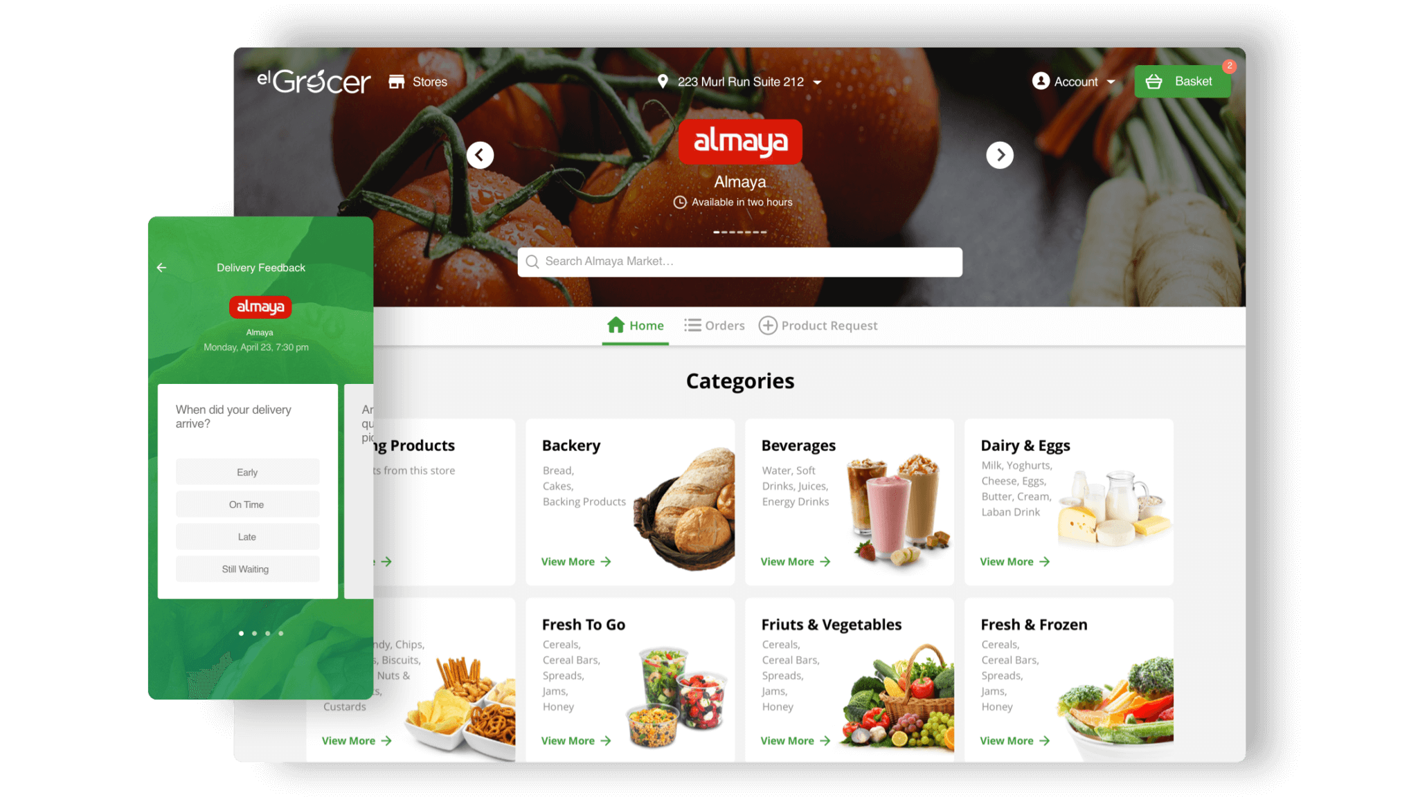
Project Plan
Task
Create a better experience for customers shopping in multiple retail chains from scratch
Team
2 UX/UI Designers, 1 Lead Designer
Duration
4 months of design, 2 months of support
Scope
410 hours, 72 screens, 3 iterations
Result
Fully functional product website and an iOS application
Overview
El Grocer is an online grocery app that:
- enables you to make the service better by requesting stores, brands, and even individual items
- delivers from the store of your choice, be it a local shop or a large supermarket
- has an in-app item replacement system (no calls from customer service to replace a missing item)
- has the same prices as you get in the physical store
- delivers immediately or at your desired time for maximum convenience
- tracks your order in real time and keeps you up to date with our in-app customer service live chat
- uses a high precision location picker and multiple locations per users deliver in under 60-minutes, by working with a wide variety of shops so you can choose the closest option to you if you’re in a hurry

Benefits
- Client engagement
- Multiple analogius applications
- Access to the product to see its full functionality
- The ability to create a design for any screen resolution (desktop, tablet, mobile)
Challenges
- Limited budget
- No time for user research
- Most of the communications happened via emails
Process
We were very pleased to win this project because this topic felt close to us. There were already many apps and websites with such goals, which allowed us to understand the problem more. We searched for Inspiration, did a competitors’ review and of the other products with the same functionality. Basically, we conducted a study in the area, of what solutions work and what don’t.
Also, we created a User Journey Map which helped us put ourselves in the user’s shoes and describe their experience. We identified the main groups of users (user personas) and then determined what questions they ask at each stage of interaction with the app.
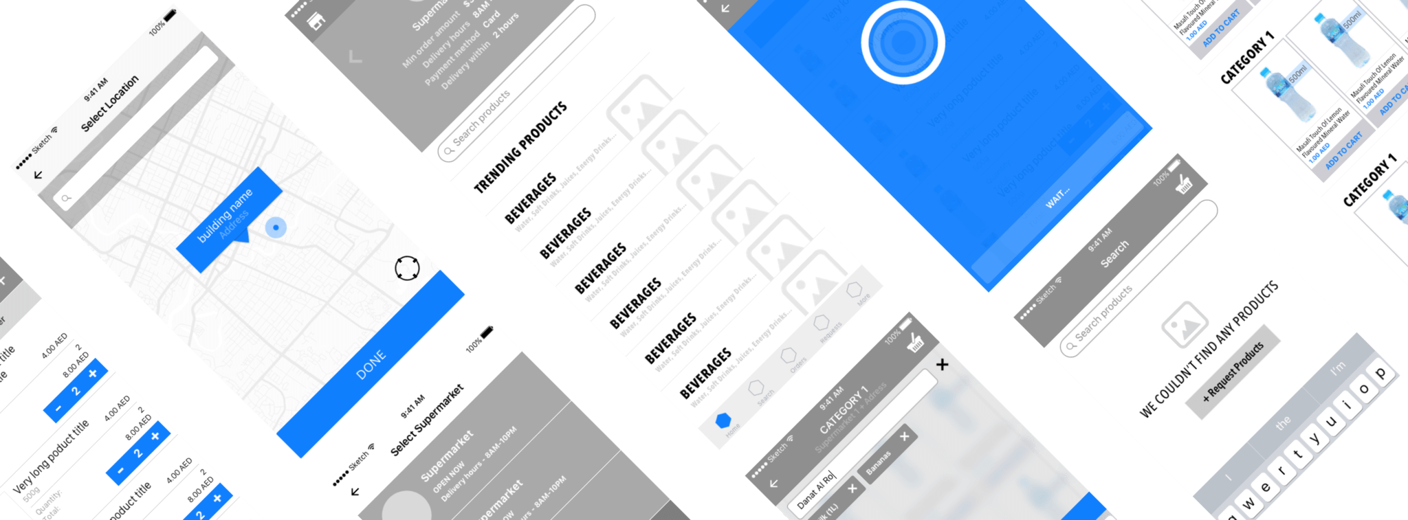
Wireframes
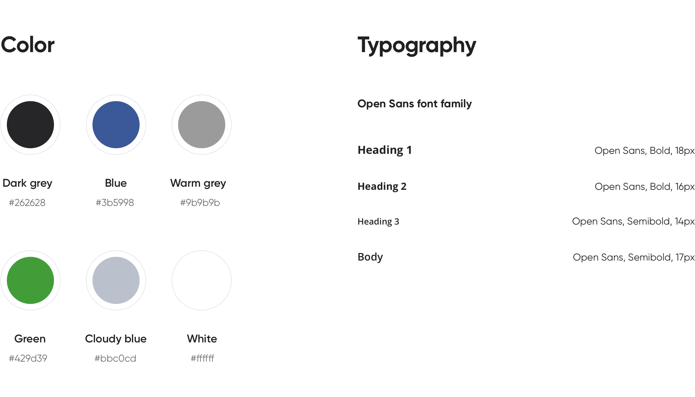
UI solutions
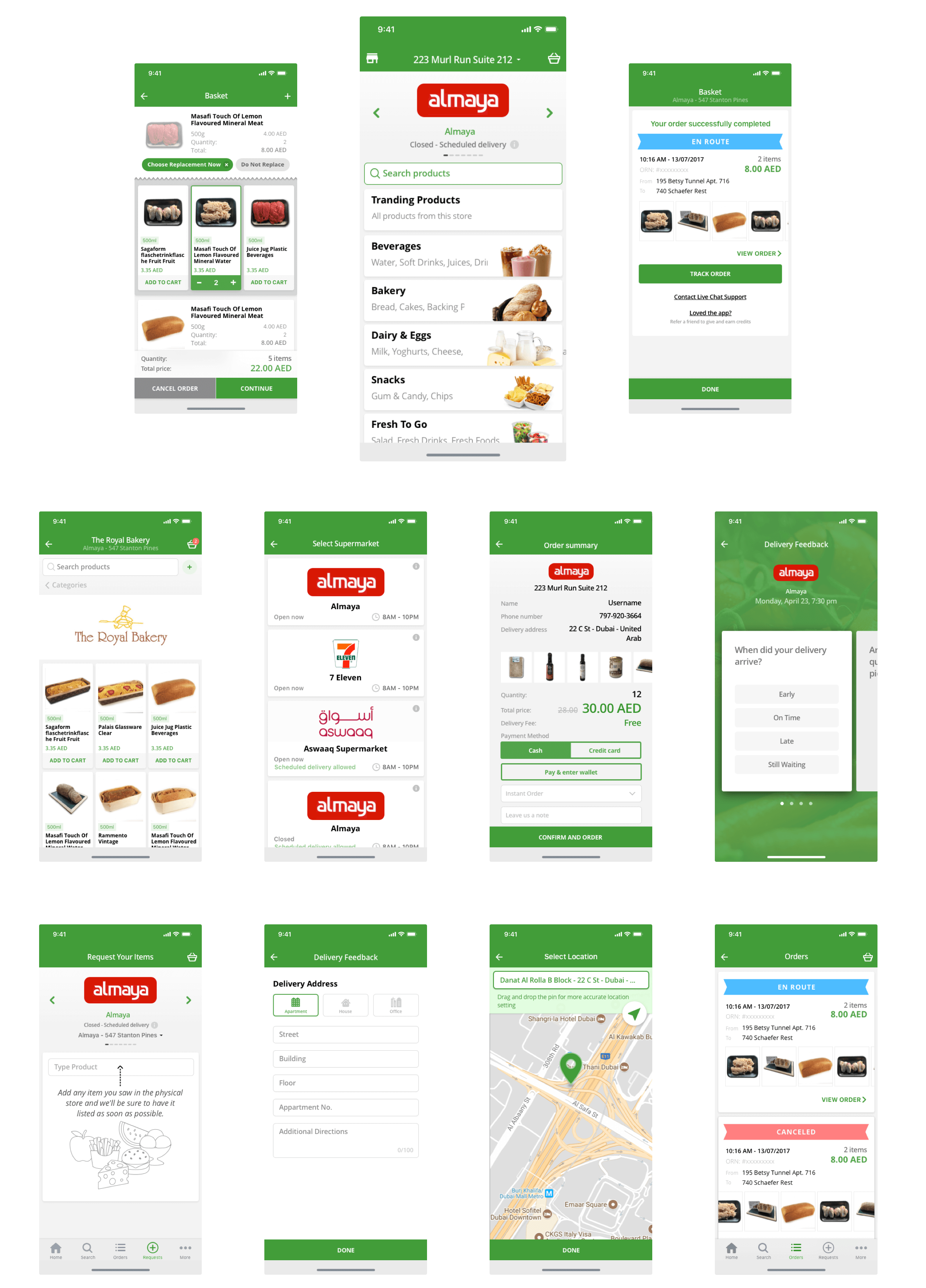
Web App
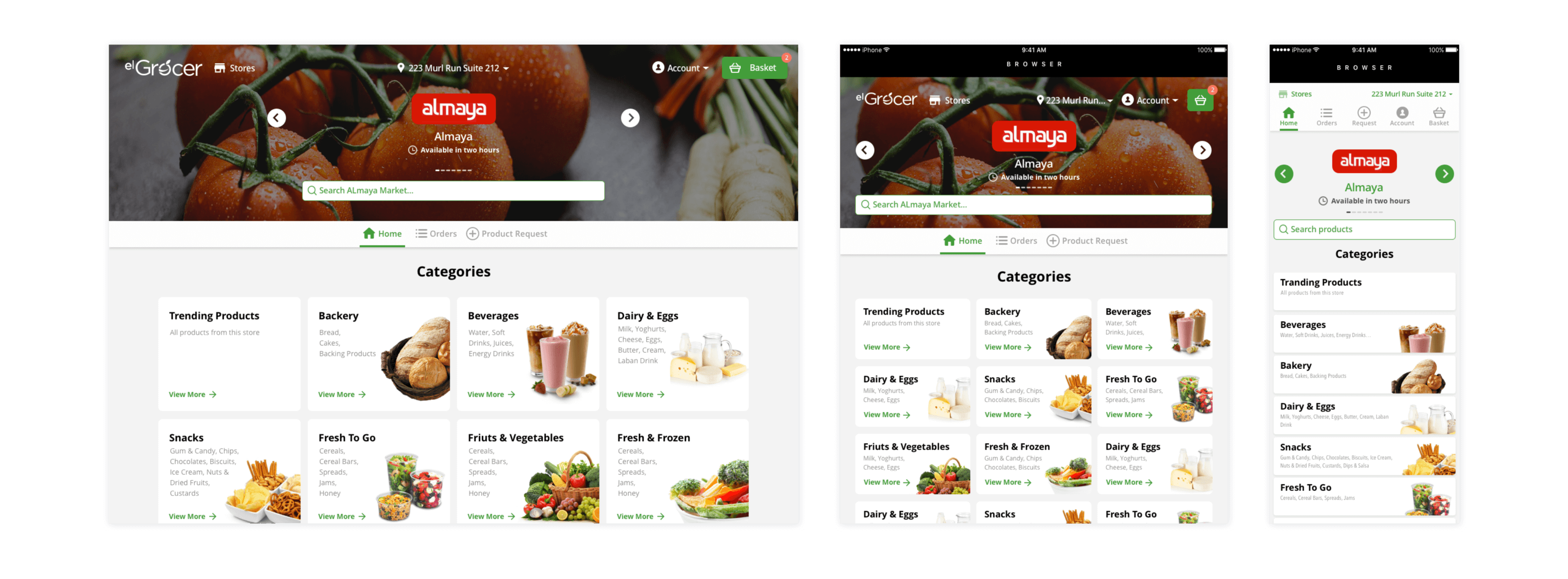
After launching the application in stores, it became necessary to create a website that would contain slightly less information and limited functionality. Using the site the user should be able to view information about the store and its products, order products from stores, pay for orders, etc. The upcoming site was to contain the following sections: About, Shop, Blog, Contacts.
We had to create a design for different types of extensions: for computers, tablets, and phones. In order to adapt the already created application design for the website, we had somewhat to change the typography, the proportion of cards, and the menu. We created the design for various types of extensions: for computers, tablets, and phones. It’s worth noting that the website for phones looks a bit different than the app.
we reply under 24 hours.
free
session
