Project Plan
Task
Improve existing software for the long tail search to increase efficiency
Team
2 UX Designers, 1 UI Designer, 1 Manager
Duration
2 months of design, 2 months of support
Scope
240 hours, 53 screens
Result
The design implemented in the functional product after two months of work
Overview
Long Tail Pro makes keyword research simple by finding the highest traffic and low competition keywords in any niche. It is suitable for anyone looking to find high-traffic keywords with low competition.
Using Long Tail Pro anyone can save huge amounts of time, otherwise spent on keyword research and competitor analysis.
Benefits
- Client engagement
- Access to the end-users
- A highly professional manager on the client’s side
- Competitor analysis
- Stable functionality
- One user flow
- Usage statistic logs provided
Challenges
- No time for user research
- Terminology inconsistency
- No UX/UI resources of the original app design and no one to share the previous design decisions
Old design
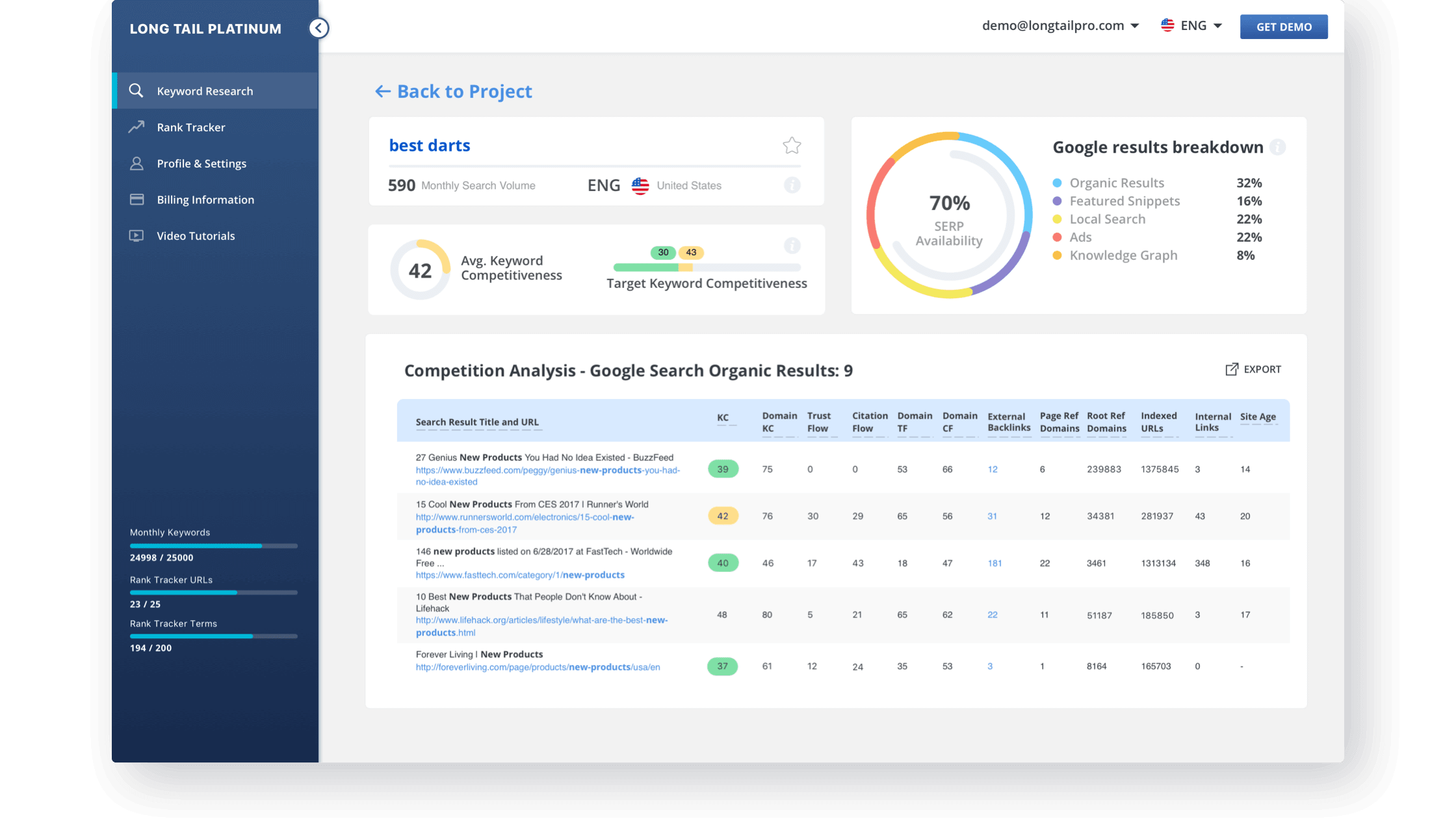
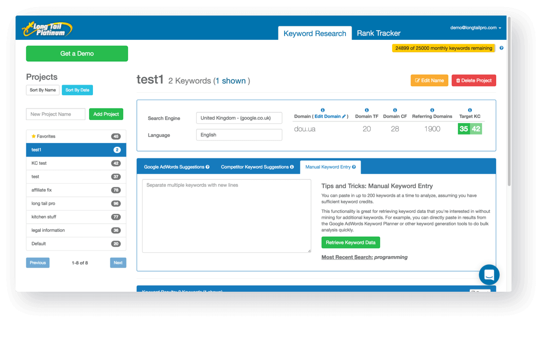
Despite all the cool features and clear profit to the end-user, the app struggled with complicated UX and even main functionality proved to be extremely hard to understand. The interface was fighting for the user’s attention with colorful secondary buttons and labels. So our main goal in this project was to make the app more appealing and intuitive.
Design Process
1. Research project area
Who and why analyzing SEO metrics of the words? What is the most important information for them? How well do they understand the subject area? How can we walk them through the system?
2. Model users and their behavior
SEO specialists decide to find stronger keywords. Users explore keywords to find something they can make money of. What steps do they make to complete each task? What information do they possess?
3. Find the biggest pain points in the user interface
When we realize what kind of users work with the system and what type of tasks they use it for, we can find the most problematic interface parts from the user’s point of view.
4. Suggest the way to fix it and make interaction with a system much easier
Now, as experts, we develop a couple of approaches to solve them. We needed to find the best option to fit the client’s budget, programmers’ capacities, and most importantly the end-users.
We began by applying a new navigation approach. Focused mainly on the UX side and general application logic, we replaced the menu on the left side. Rearranged the page element, the way our customer suggested.
Before designing anything new, we shared our main ideas with the client, so we could be sure that we were on the right path.
Significant client engagement allowed us to do small sprints every 1-3 days. After agreeing on everything with the client, we went on to apply Lean UX methodology. The next day we discussed the problems before we could prepare a first rough mockup.
User Pain Points
- Are the form fields related to each other? How many words can I enter?
- What if the user copy-pastes an enormous amount of words, should the text field scroll, or should the input field expand?
- What should I enter first?
- Are all the form fields required?
- And what if I want to get results from multiple search engines?
Our UX team prioritized functionality and made a decision to rebuild the information hierarchy. We chose to remove the standard bootstrap button, hide additional functionality and leave one main CTA ― “Save Keywords”.
User testing showed that users were faced with the complexity of adding a new keyword algorithm. It seemed to be hard.
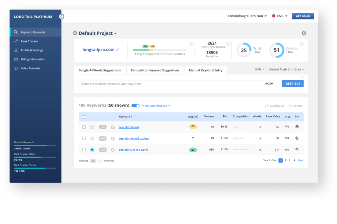
We tried to find the answers to their questions and make sure that users won’t have to think about them in the future. Finally, we provided the users with additional information to help them make better professional decisions. To reach that, we substituted the old summary with an infographic.
UX/UI Solutions
Meanwhile, our UI Designer prepared a few versions of the visual appearance and we offered our client to choose the style direction.
With the next iteration, we came up with a mockup that became fundamental for all the future changes and the rest of the app design.
After that, we felt we could move on to the next section. The second main section provides users with a different kind of functionality, so we needed to adapt both visual appearance and the UX pattern of the “Rank Tracker” section to it.
Also, at first, the client suggested adding groups of keywords to the “Project” section in the app and we developed a few interface versions. But after some consideration and prioritizing we decided to implement this idea in a future update.
We decided to provide some changes for the “Rank Tracker” section. We tried to upgrade the user infographic, add filters, and additional functionality to the table.
With each sprint, we came closer to the desired result. The summary section was changed multiple times, search type selection was redesigned, a simplified version of prefilters inside “Google Adwords Suggestions” and the table content, were developed. UX designers in collaboration with a UI expert crafted a design solution.
At this stage, we were faced with multiple challenges with the filter settings, as it’s not generally recommended to create a dropdown with less than 3 items. In that case, it should be replaced with a radio button multiple choice. At the same time, we didn’t want to decrease the discoverability of all the 3 types of search the system provides; also, we needed to add settings for language and location in a way that won’t break the visual hierarchy. Finally, user research showed that people couldn’t understand the zoom icon, so we decided to alter it and hide the prefilters.
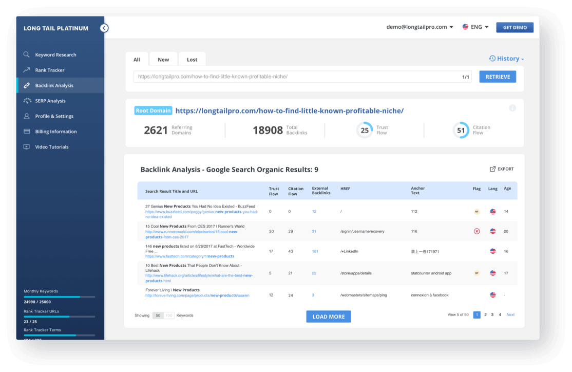
By that time, the most of the design had been done - the main user section as well as as the other small ones. The only thing left was a nested page inside “Keyword Research” that used to look like a table, full of numbers.
After getting some extra time, as well as a very detailed instruction from the client, we started to work on a more attractive data representation of the summary and came up with the final layout.
Final Result

we reply under 24 hours.
free
session

