ux/ui essentials

Product Redesign: 4 Key Transformations for Legacy Systems

10 min
Product redesign: 4 key transformations for legacy systems Cieden

Outdated design tortures customers 🥲

Hey! I'm Anastasiya, the Associate Product Director at Cieden. I’ll explain how to redesign digital products without killing the patterns customers love. And in case you're not 100% sure if a design update is needed, I've outlined a few UX red flags that make your users suffer and eventually leave.

I know nobody wants to think their design is weak, but let's face the truth: in this competitive race, where companies invest thousands into design and continually test and refine, you can't afford to have an outdated interface.

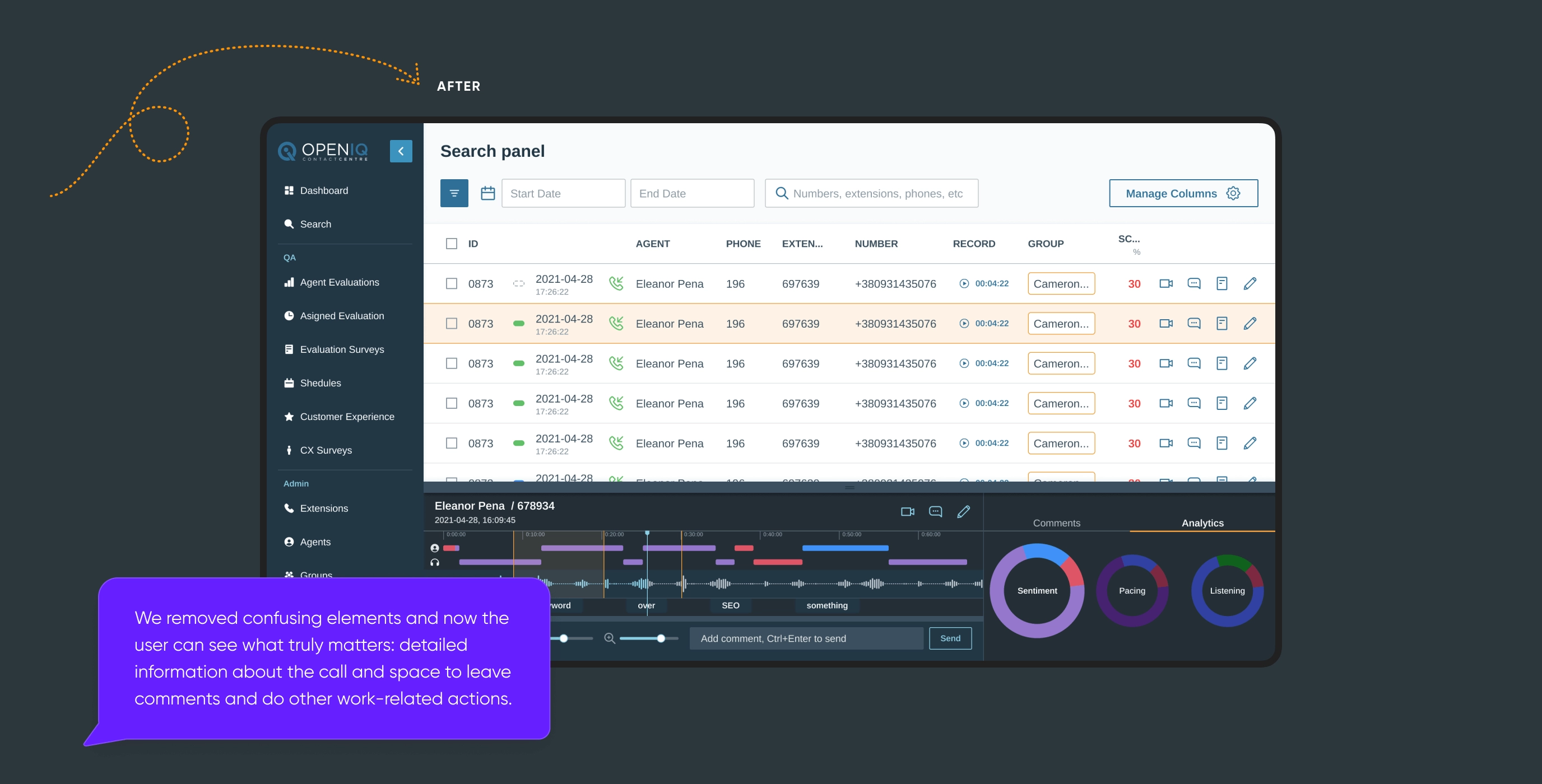
Let's look at the example of Open IQ. They modernized their product and attracted new enterprise-level customers with large budgets.

A bit about Open IQ and their business goals

Open IQ is an Australian cloud-based telephony and contact center software provider. They offer inbound and outbound recording, customer satisfaction assessment, agent evaluation, workforce management, telephony, and analytics. Such a broad functionality spectrum allows Open IQ to work with enterprise-level companies in the insurance, banking, and government fields.

After a decade in the market, the team understood that their application functionality was limited by the design and that a fraction of users had negative feedback because they wanted friendlier onboarding and training. So, the company started looking for a product design agency. That was the point where Open IQ met Cieden.
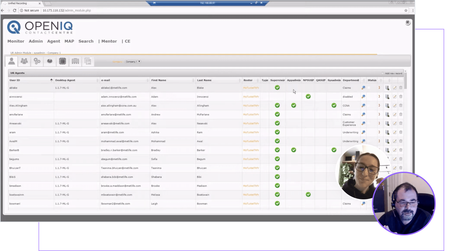
Our sync with the client to dive into product functionality and make informed decisions.
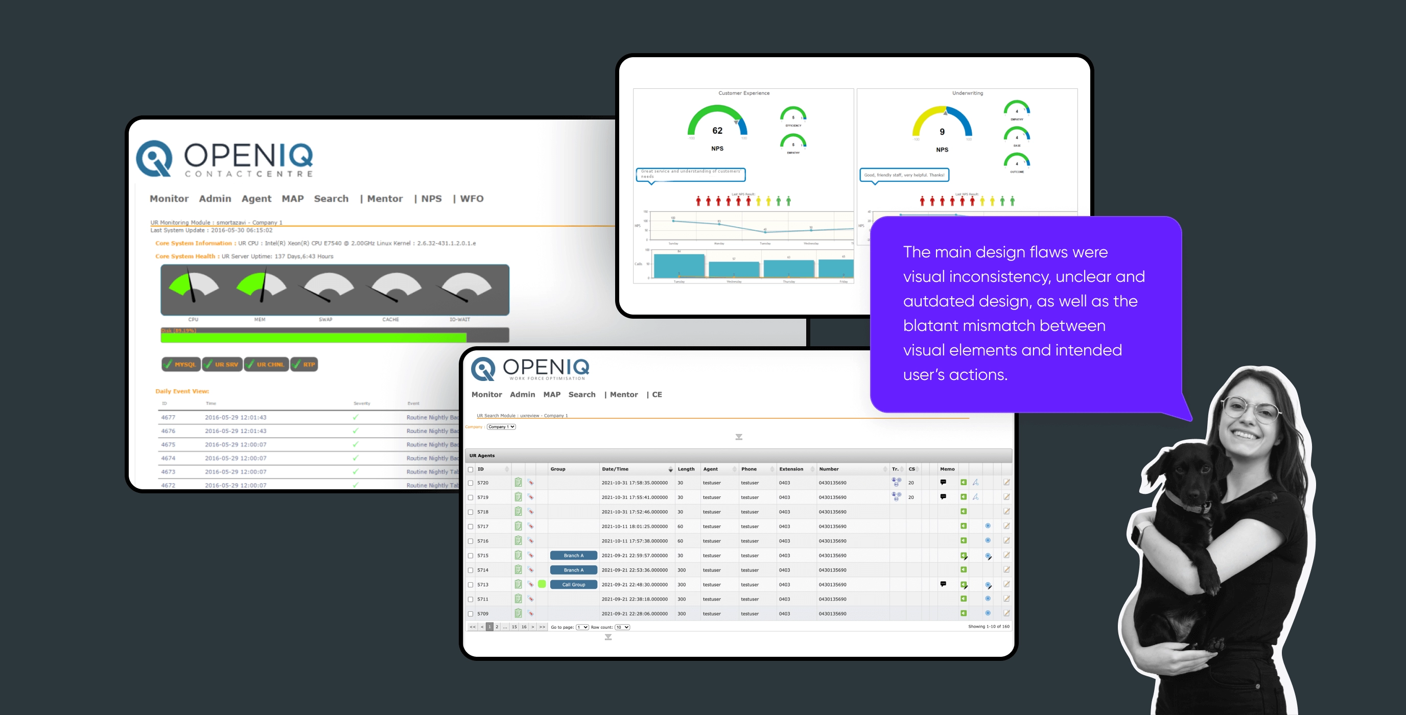
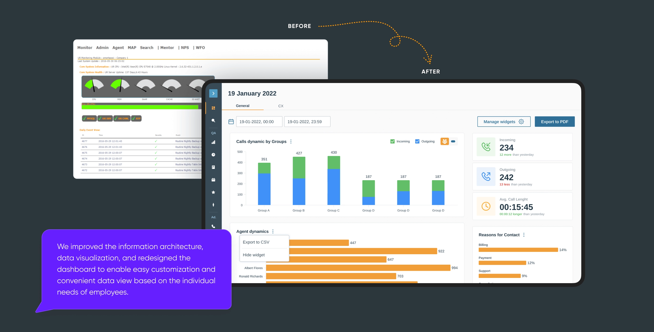
This is what the contact center system looked like at the beginning. On the first call, Shad Mortazavi, the CEO & Product Owner of Open IQ, discussed the company's objectives and users' needs.

Then, the CEO sent us requirements, and we began the project together with the product team.
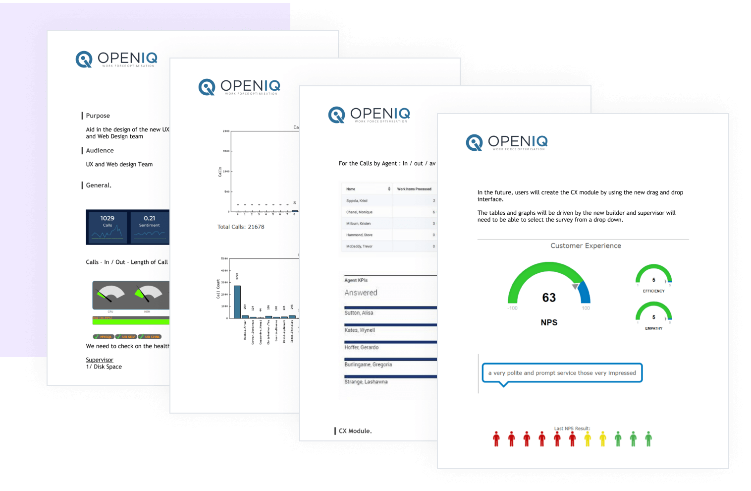
The client structured well the core product features which kickstarted the design process.

Clear requirements supported by data are key to ensuring your design will pay off. Here are some other necessary elements to include in the requirements for a product redesign: user personas & demographics, key user behaviors, and pain points affecting NPS.

A bit about our design team

Together with Kateryna, our Product Designer, we took most decisions in collaboration with Shad Mortazavi, the CEO & Managing Director of Open IQ. We also worked closely with developers and QA engineers to ensure the design was implemented correctly. This approach is crucial for achieving pixel-perfect product design. Otherwise, developers might overlook certain elements, leading to additional costs. Disappointing.

Product redesign: 4 key transformations for legacy systems Cieden

4 Fundamental parts of the product redesign process

Part 1: Audit of the existing platform

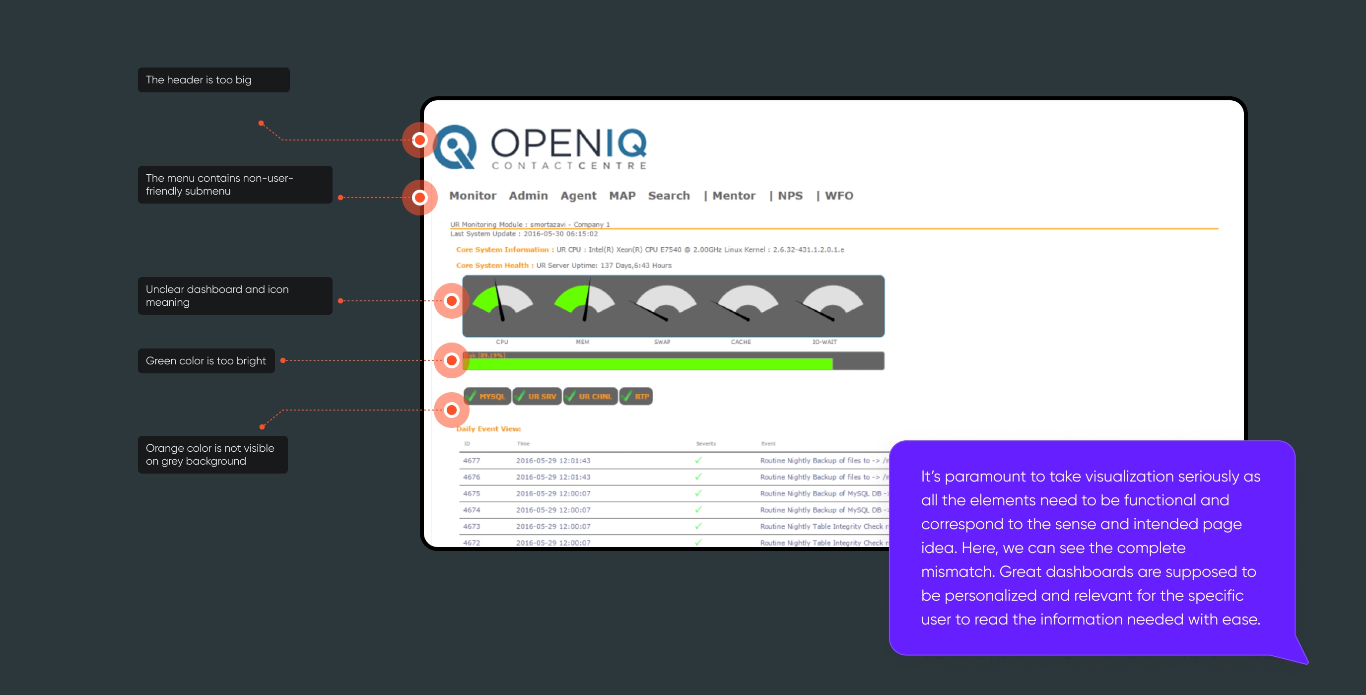
We began with a thorough audit of the existing platform and identified a list of UX/UI product flaws. These issues are so common that I'll list them here:

  • the HR manager spends hours on tedious training and demo videos for new employees;
  • even after onboarding, people keep asking for additional explanations. That means the interface is overloaded;
  • product users lose track and skip steps in multi-step processes;
  • you receive countless customer support requests, but this is just the tip of the iceberg. What you don't see are the users who have left without saying a word;
  • you notice that users aren't utilizing the app's key features. This means its potential isn't being realized, and you're losing money that could be earned with a better design.
Product redesign: 4 key transformations for legacy systems Cieden

Part 2: Researching best UX practices for each feature

In the Open IQ product, there were several features that are key to a successful call center. One of them is the ability to record video and audio calls, transcribe the conversation, mark specific timestamps, leave notes, and tag them. This ensures that no crucial moments in the conversation are missed and saves the employee's time, as they no longer need to repeatedly listen to the same recording.

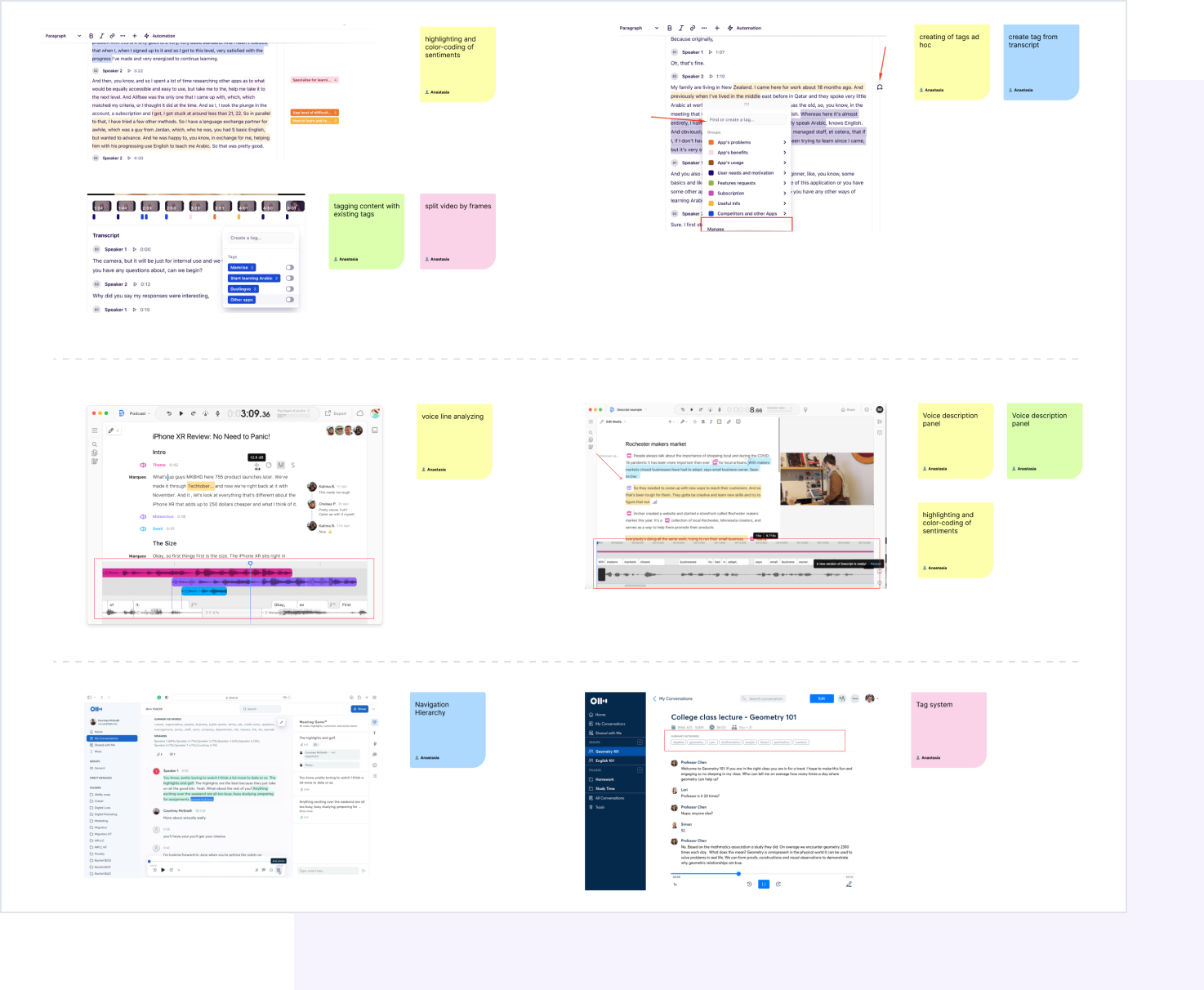
The idea was fantastic, but the visual part wasn't intuitively clear, leading to user issues. To address this, we turned to quality tools that record video and offer similar functionality. After this analysis, we identified design patterns that became the foundation of our solution.

Product redesign: 4 key transformations for legacy systems Cieden

That's how our board with design patterns notes looked like.

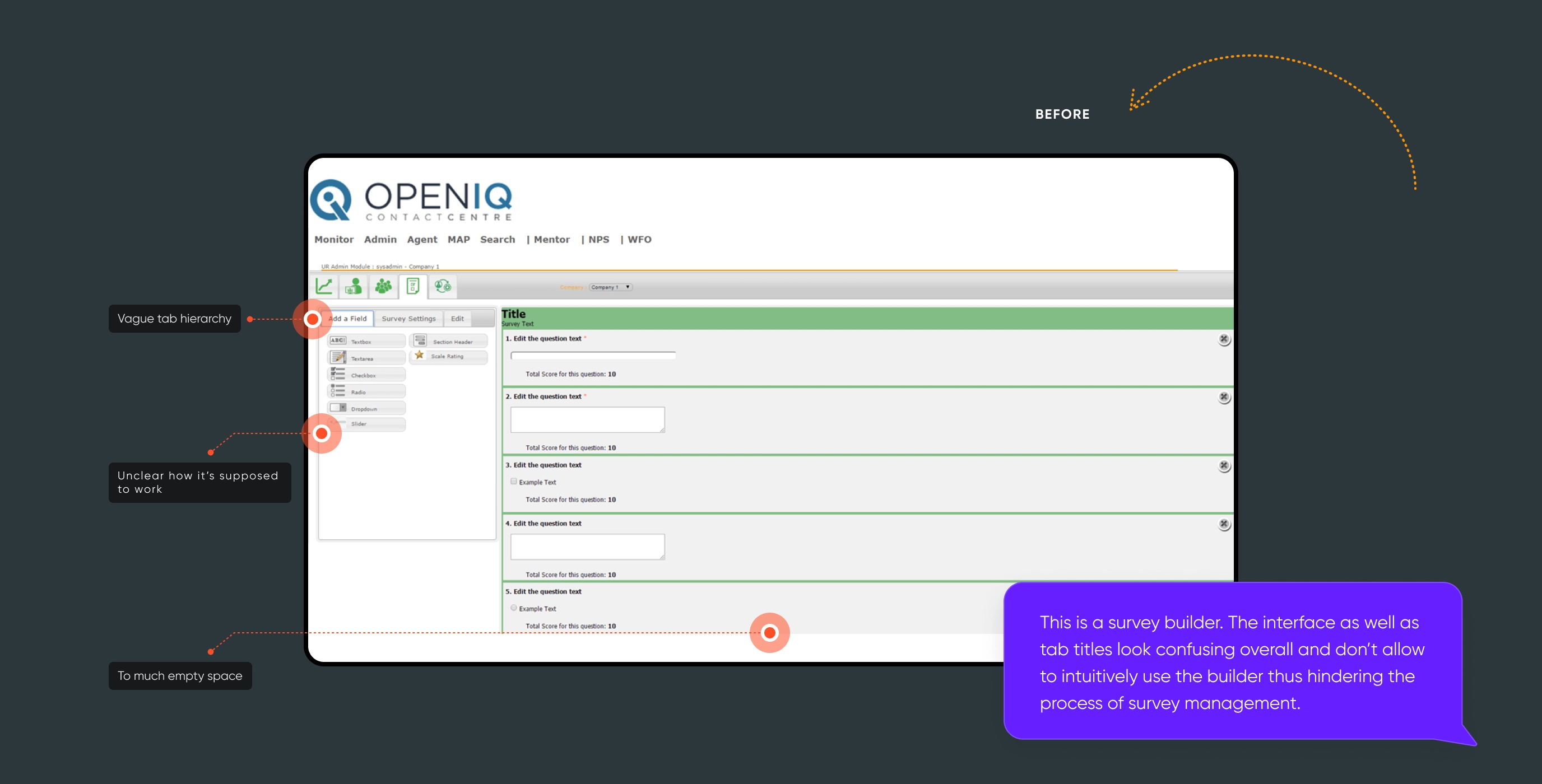
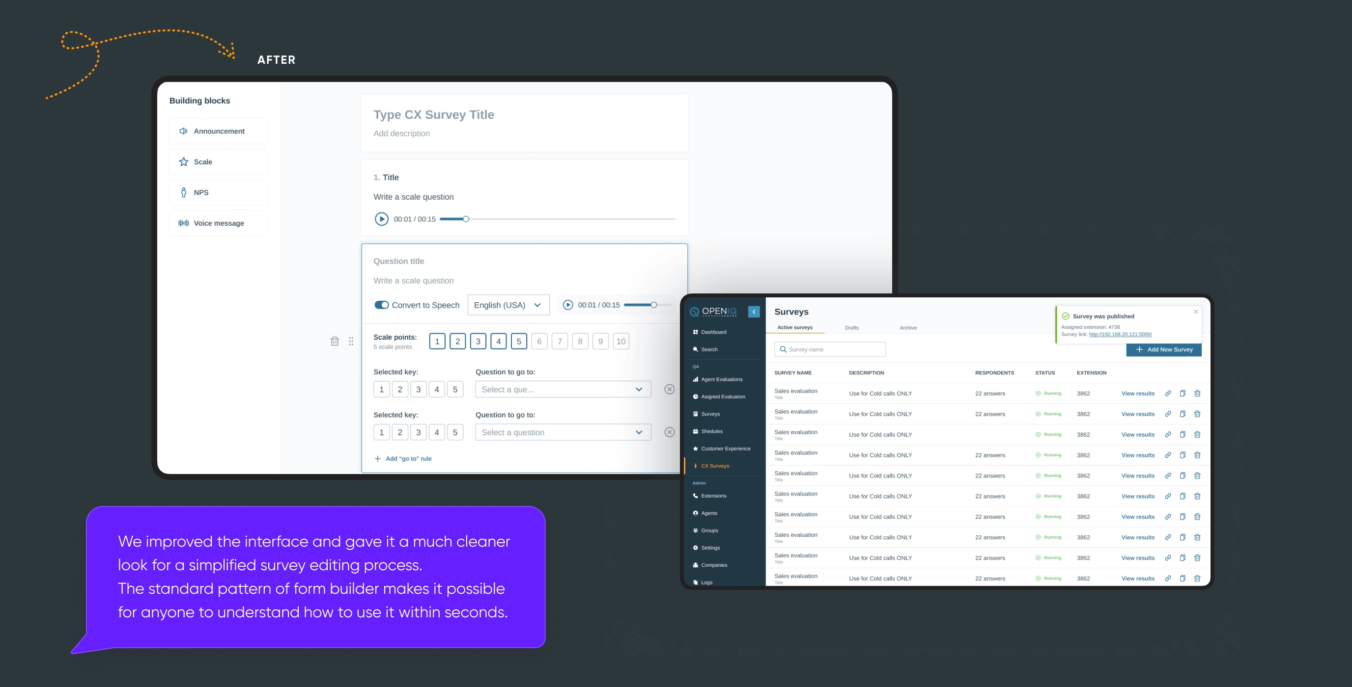
Then, we improved the second feature - the survey builder that helps objectively assess the operator’s performance. The previous version had a high entry threshold, requiring managers to undergo special training to create surveys.

"Again, we've looked at apps with such functionality that had high NPS. We identified patterns and made enhancements, so the survey logic became intuitive and the interface more interactive.

You can find the survey builder visualization in the Open IQ case.

As a result, we came up with the goal of crafting a digital tool that is both intuitive and easily customizable to meet the requirements of operators and their supervisors alike.

Part 3: Design styles approval

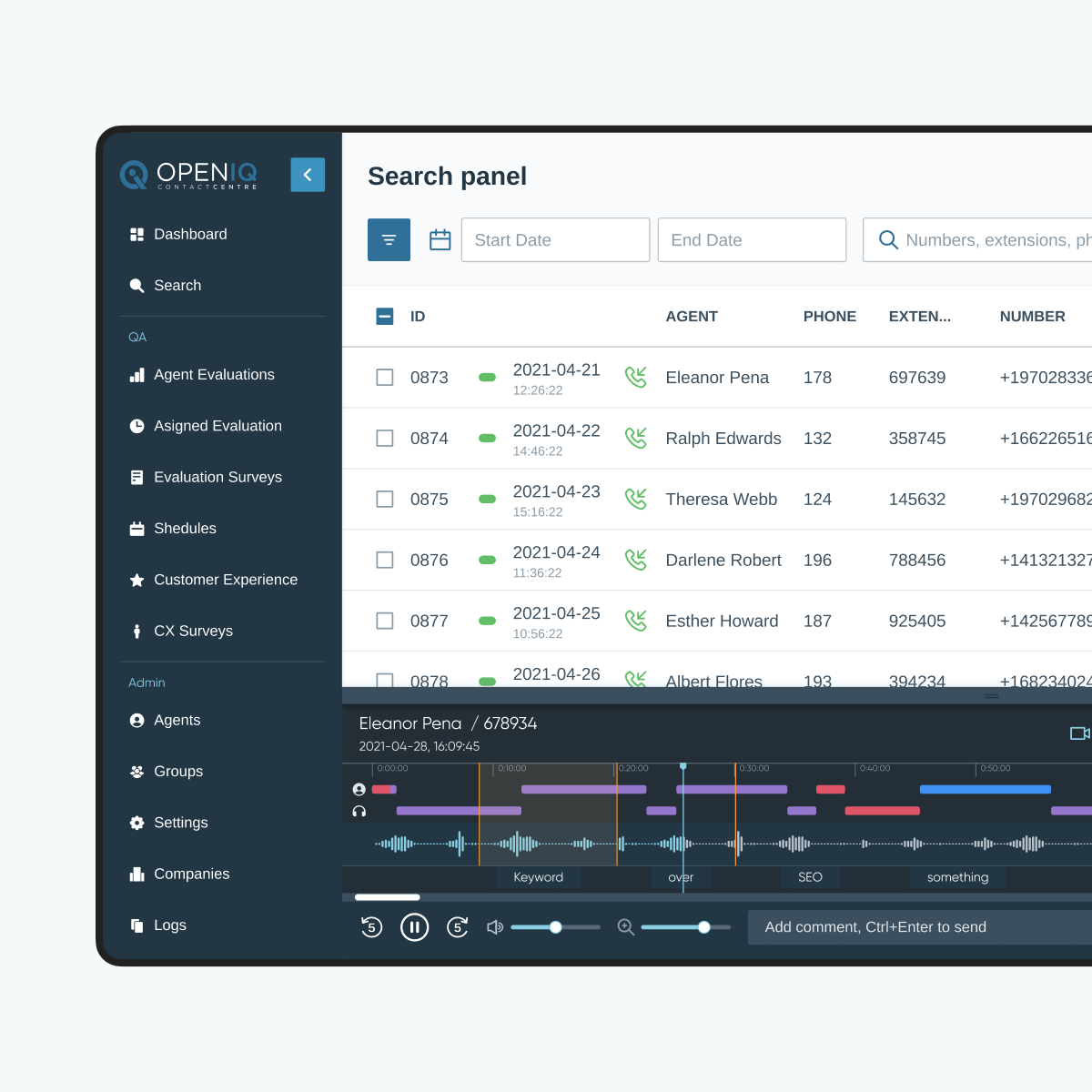
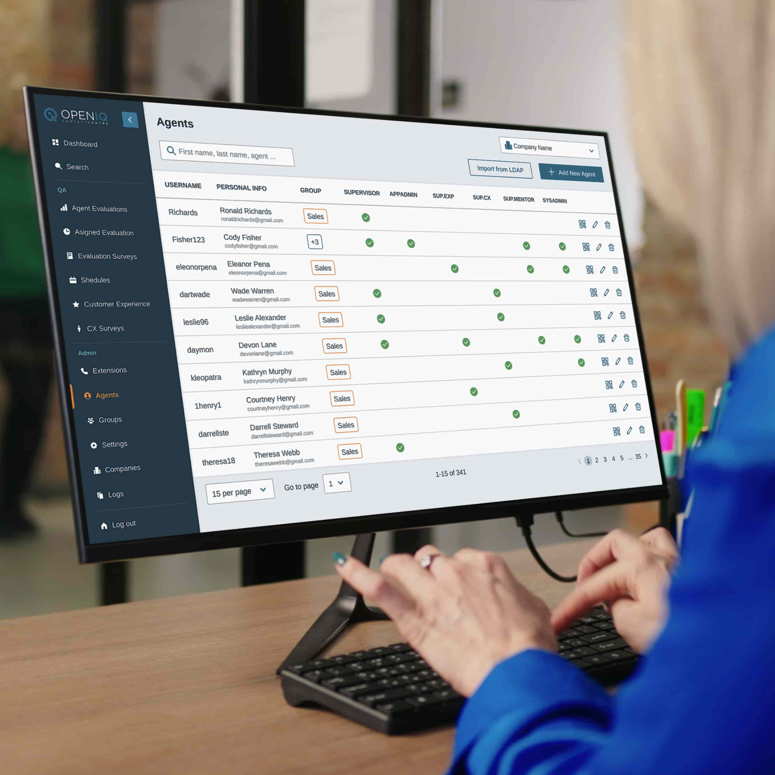
While I was conducting the audit and researching the market and features, Kateryna developed a design concept. She then presented our redesign refresh plan and style ideas to the client and primary stakeholders. We all agreed on a corporate style with a clean, uncluttered interface that's simple yet functional. This approach allows users to focus solely on the data. We also ensured that all core brand colors were retained.

Kateryna had an additional suggestion to add a dark sidebar to the interface. This simplifies navigation and makes the sidebar more noticeable without straining the eyes. The client believed it would enhance the user experience 😎

sidebar design

Part 4: Design implementation & dev support

We believe that even the most user-friendly UX can fail if not properly implemented. That's why we closely collaborated with developers to make sure the design was implemented according to all the requirements and specifications.

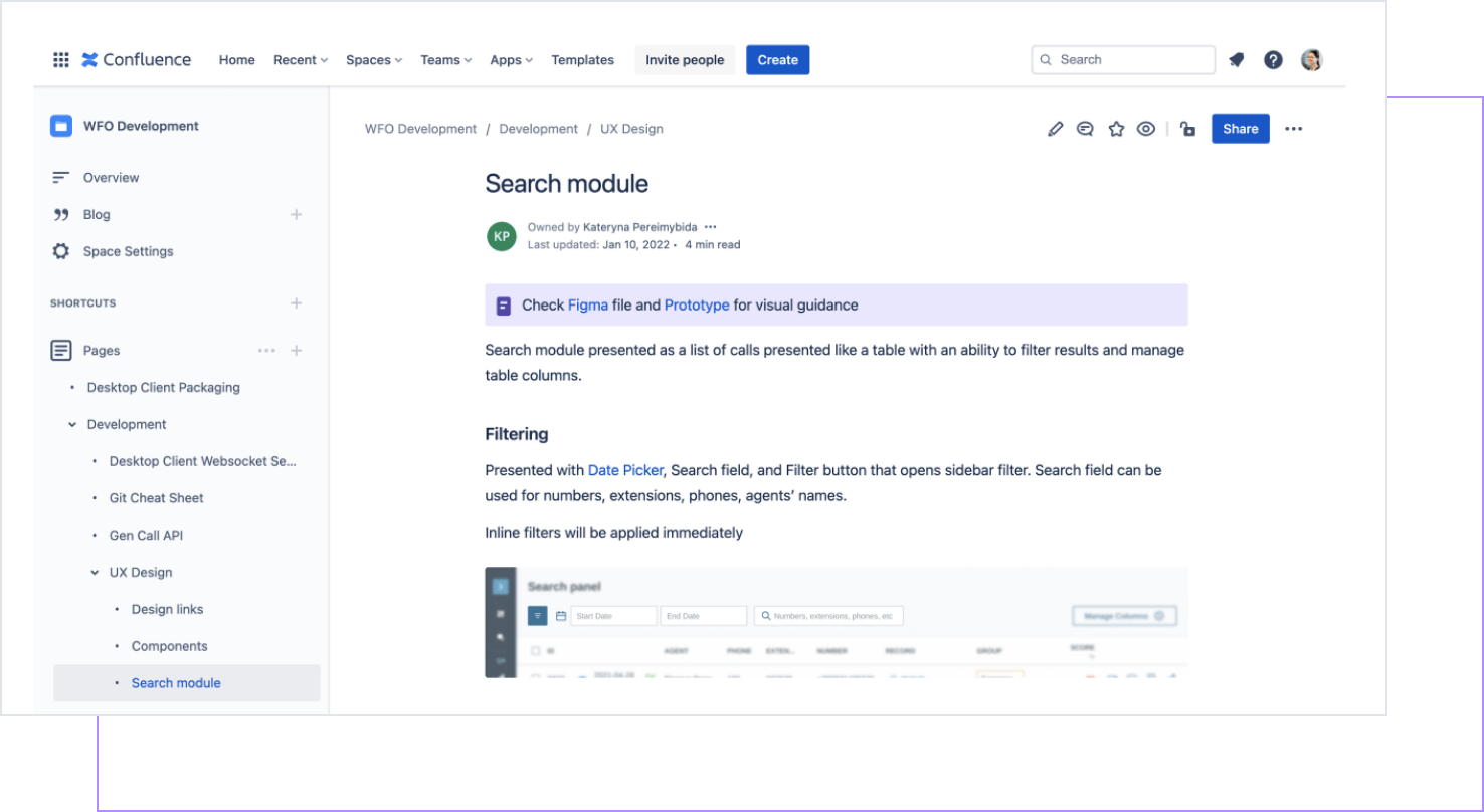
So, I provided them with detailed design documentation including information about design, wireframes, design guidelines, and specifications for user interface elements and user interaction.

For a flawless redesign, our collaboration with developers worked in both ways. On one side, we collaborated with them to ensure the feasibility of our design. During our regular meetings, we received feedback on how to streamline and optimize design from the implementation perspective and usability testing. On the other side, we conducted a design review of implementation and provided feedback on revisions to be made.

Product redesign: 4 key transformations for legacy systems Cieden

To facilitate collaboration with developers, we chose a workspace that was comfortable for them and centralized all the necessary information.

Results 

  • Open IQ attracted new customers and drove revenue through redesign project;
  • customer satisfaction rate increased, the company received positive user feedback;
  • we delivered a scalable and modern interface that improved product usability;
  • key product features stood out more;
  • onboarding became simpler and training time was cut down to 25 minutes;
  • we reported bugs and helped find usability issues;
  • operators were able to multitask during calls and customize work areas;
  • development time was reduced.

Final thoughts

When Shad reported a higher satisfaction rate and mentioned that customers adored the interface because it was GORGEOUS, I treated myself to a bottle of wine, and for that moment, life felt perfect 😌

Together with Kateryna, we met all our OKRs: every product function was easily discoverable and accessible, and onboarding and training became simpler.

Additionally, thanks to Kateryna’s initiative, we introduced extra features to spur business growth and broaden the software's potential applications. I'd like to call it a true happy ending, but I'm aware no such thing exists.

The stark reality is that you have to monitor the market, you have to do user interviews and gather customer feedback to meet user expectations every single day. Without these, it's easy for someone else to outpace you.

Discover the full case study.

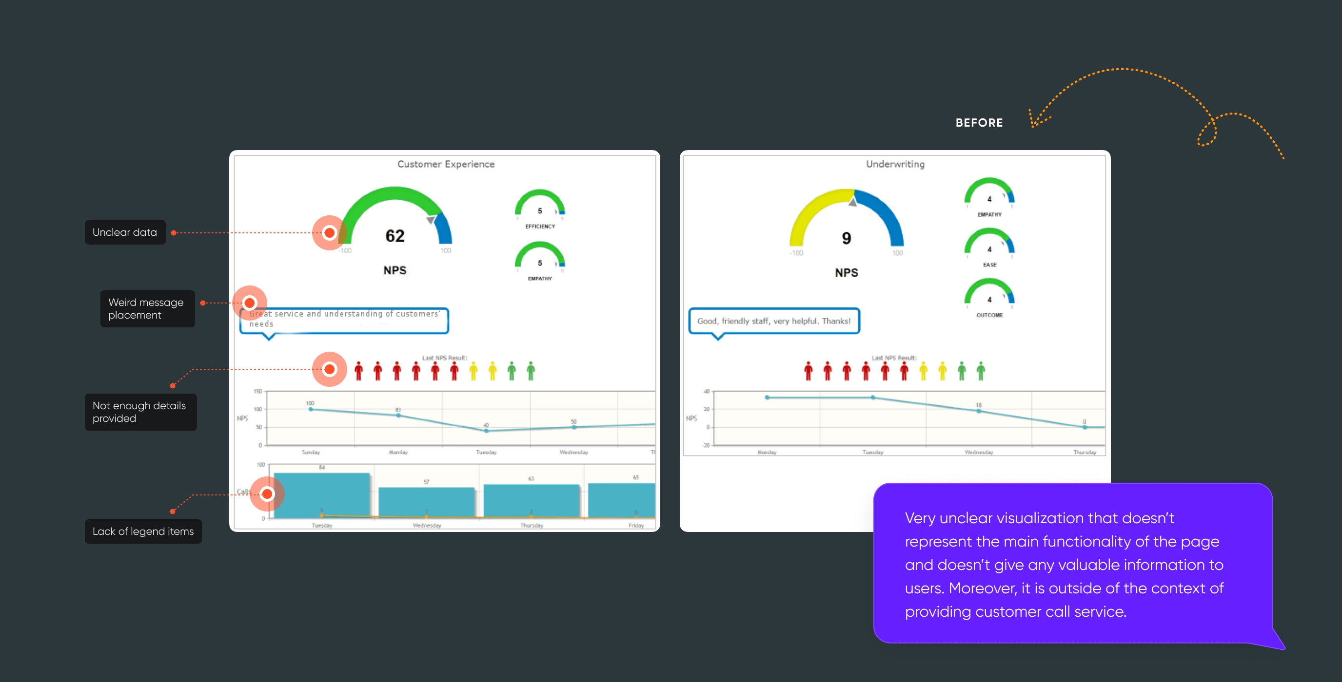
Within, you'll find an in-depth description of the product functionality, enriched with vivid demonstrations. Discover the specific elements we refined to elevate the Net Promoter Score (NPS) and enhance user satisfaction.

Open

start your project with us.

Getting in touch
is easy .
Thank you for your message. It has been sent