Have you ever wondered why sometimes it can be almost unbearable to use an interface no matter how beautiful it is? Despite a visually appealing design, you get lost and cannot quite figure out what this is all about.
And on the contrary, it happens you can’t get enough of a website or an app with a simple unpretentious UI, simply because it is so convenient and helpful in achieving your goals.
This is what I would like to talk about today. I will show you that details matter in building a truly high-grade user experience for a digital product. Together, we are going to detect and fix design mistakes that may seem subtle but play a decisive role in the quality of UX.
Play
For this purpose, we will use a design sample for a mobile banking app from a designer network Dribble.
Although it looks pretty, I will show you some UX mistakes that were made here.
Design #1. Mobile banking. Screen 1
Mistake №1. Wording problems
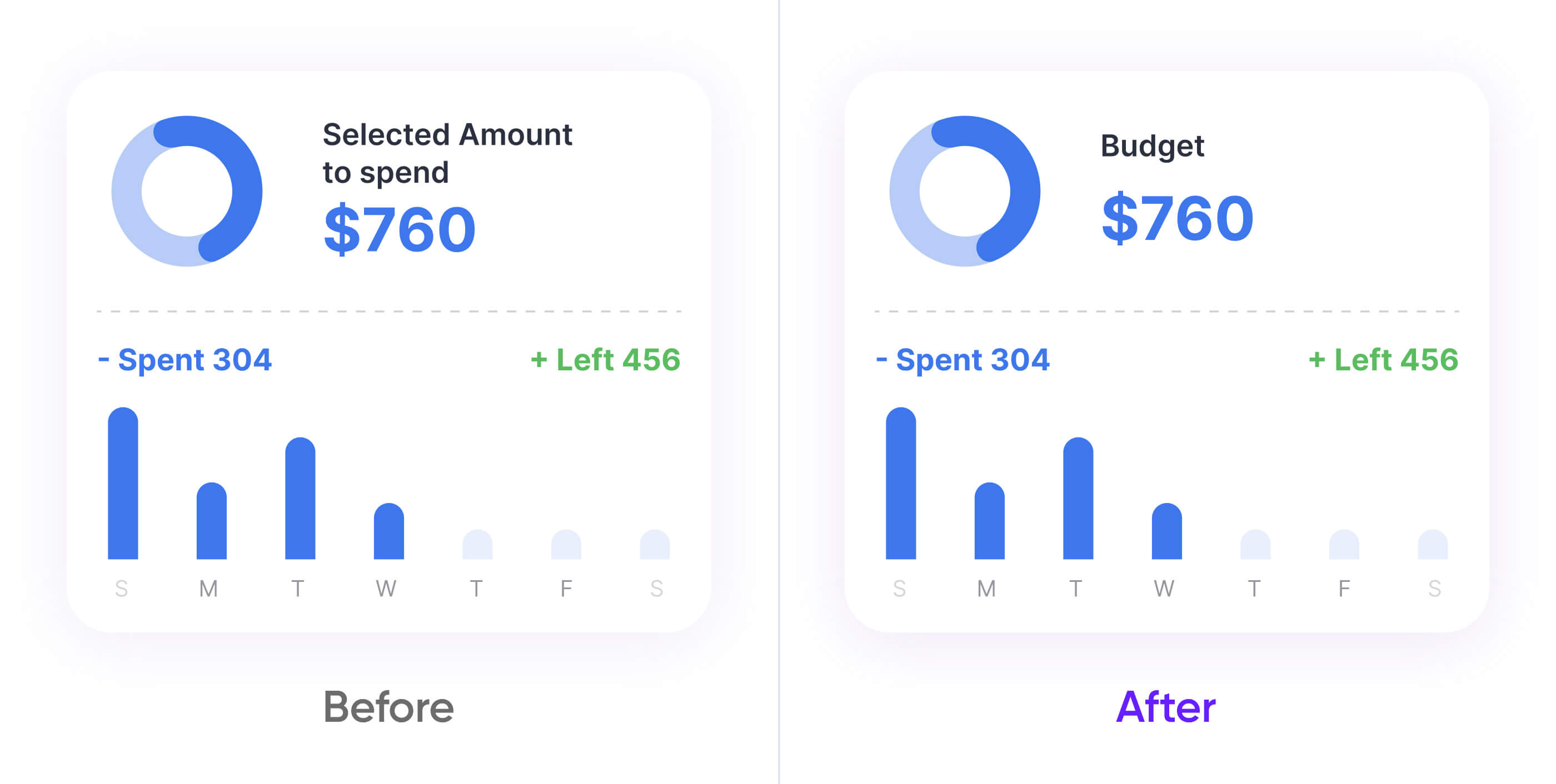
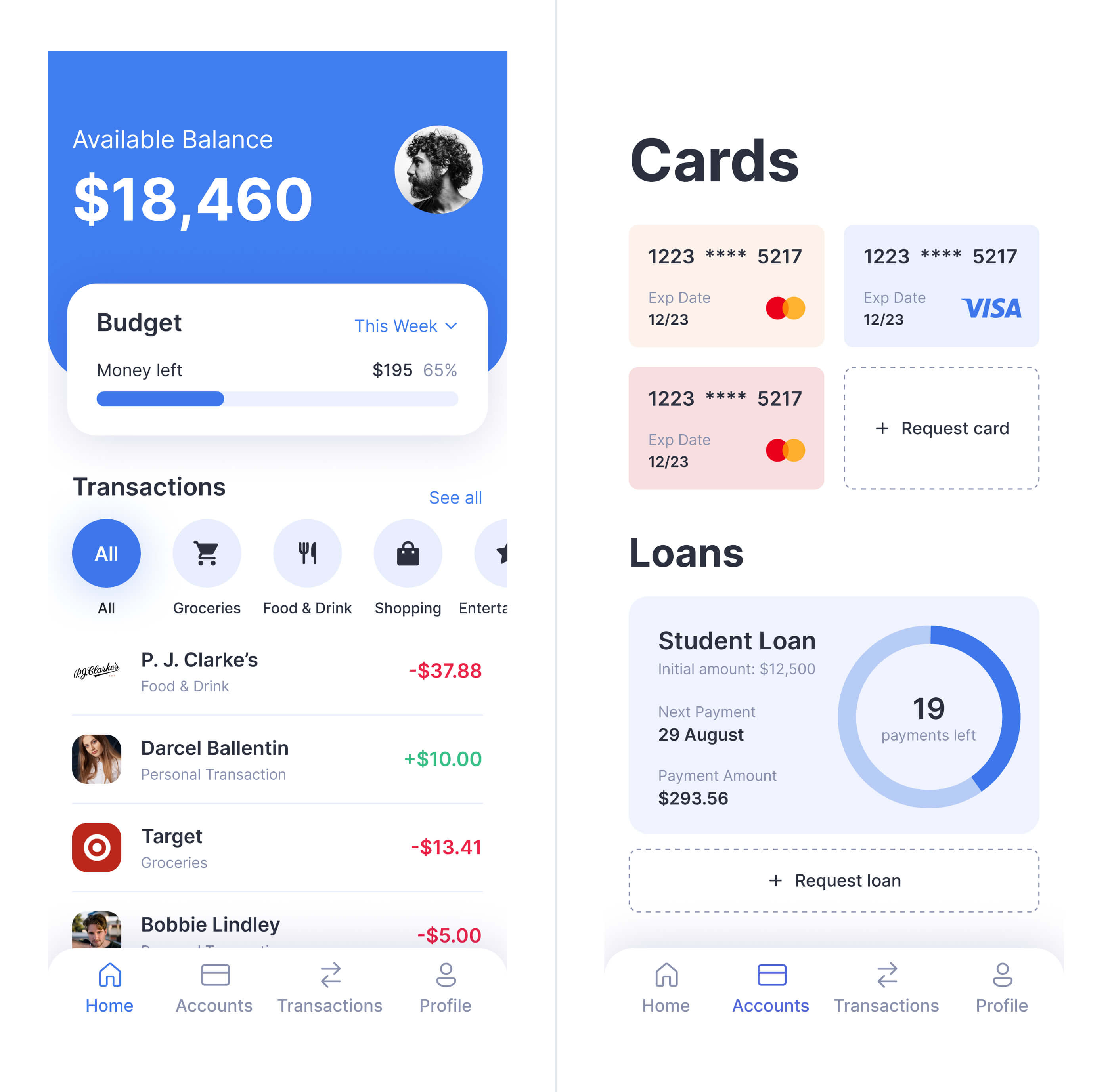
Interface text should be simple and straightforward to avoid confusion. This makes the user experience more intuitive and takes less time and energy to sort it out. Therefore, instead of "Selected amount to spend" a more appropriate title would be "Budget".
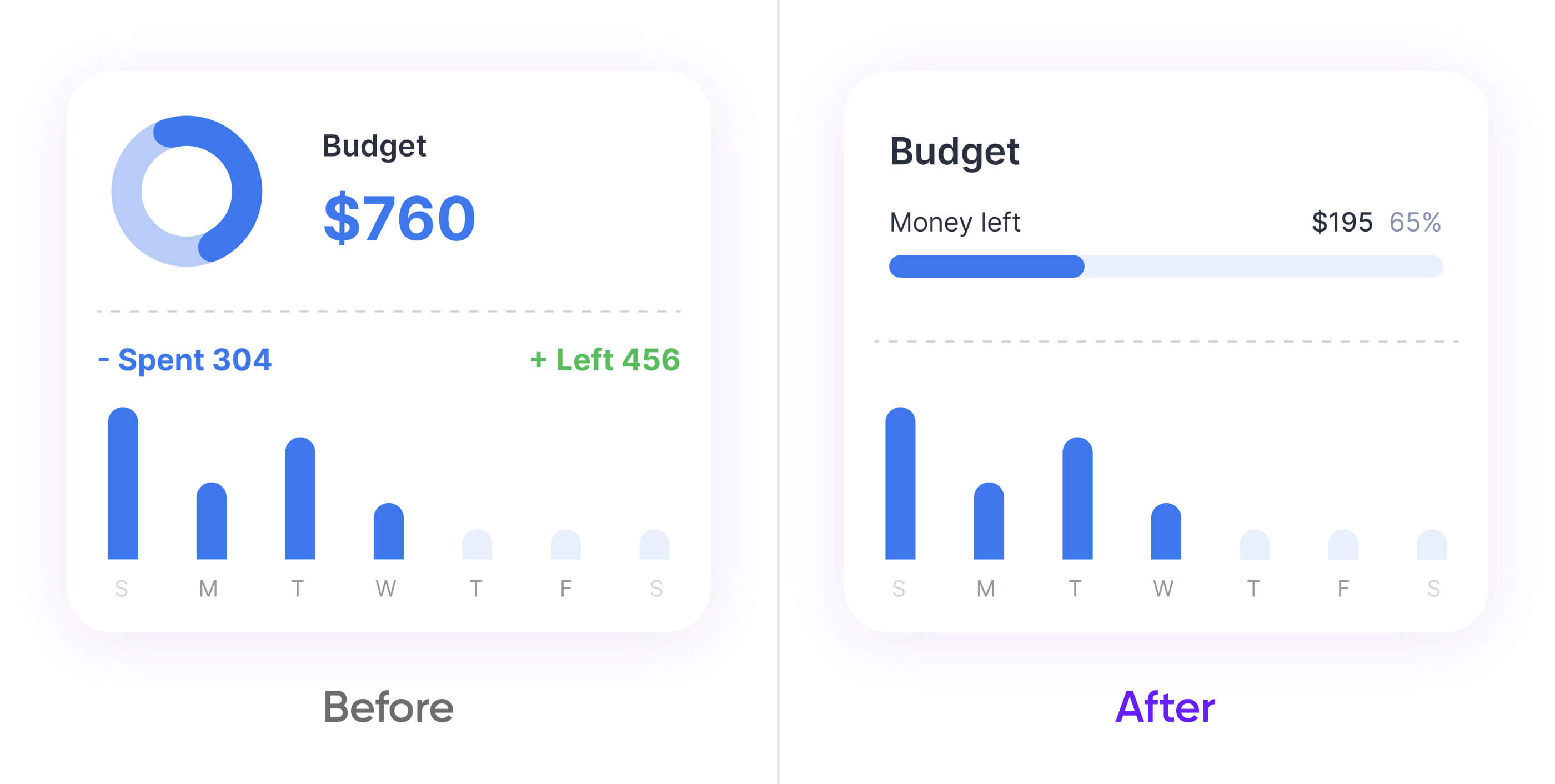
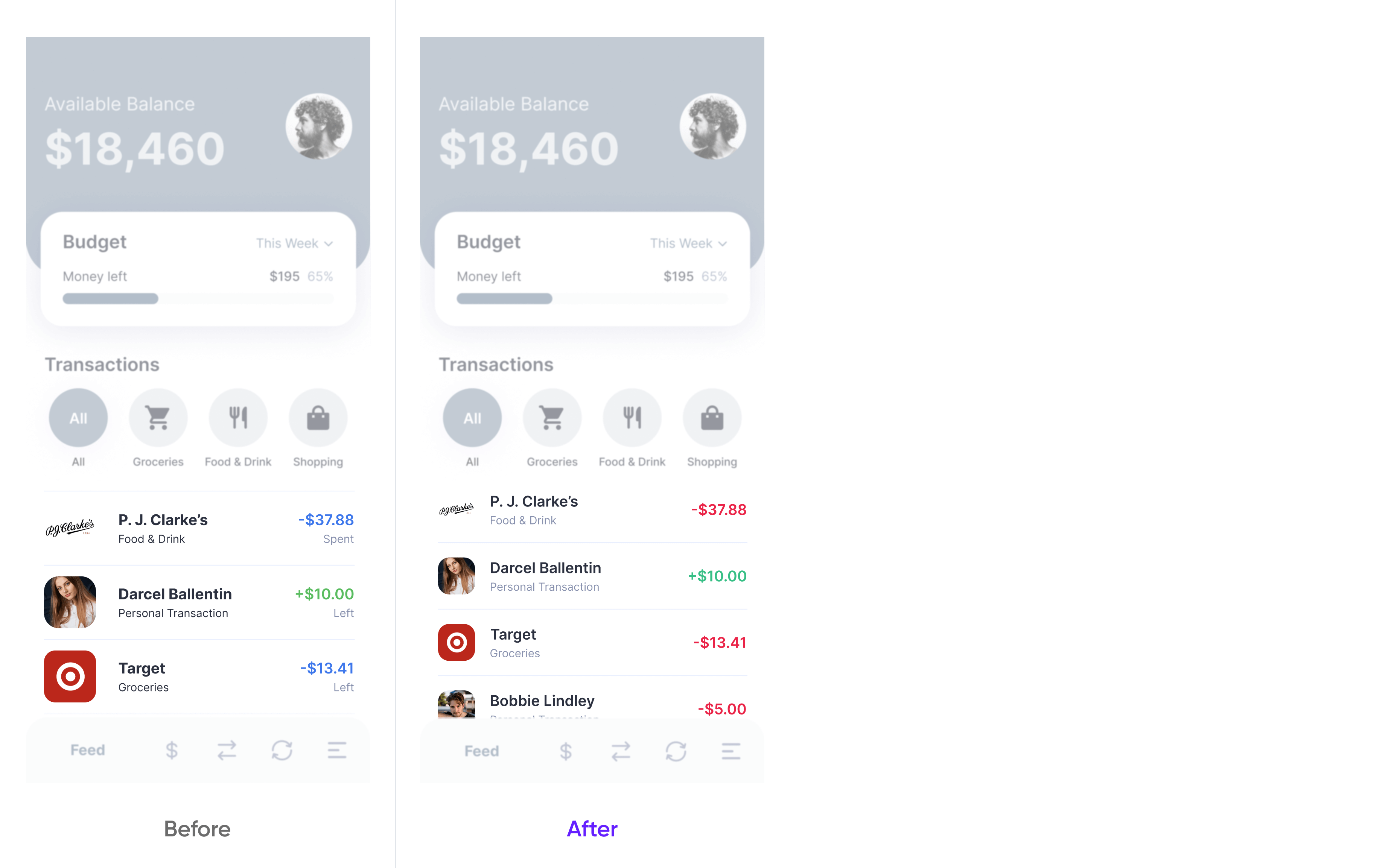
Mistake №2. The budget card has hierarchy mistakes and takes too much space
The card indicates the cost profiles for your budget. It has two main quantitative indicators: total expenditures and the account balance.
However, the current solution is not illustrative of a customer’s costs and savings. It hence makes it difficult for a user to take a holistic view of their finances and achieve their primary goal.
There is also insufficient space for transactions. However, transactions are a more vital aspect of mobile banking than budgeting because they are more indicative of financial changes within an account.
I had switched the pie chart to a progress bar and included a percentage. It cleared the vertical space while emphasizing the remaining balance, thus having improved both the UX and the UI of a product all at once.
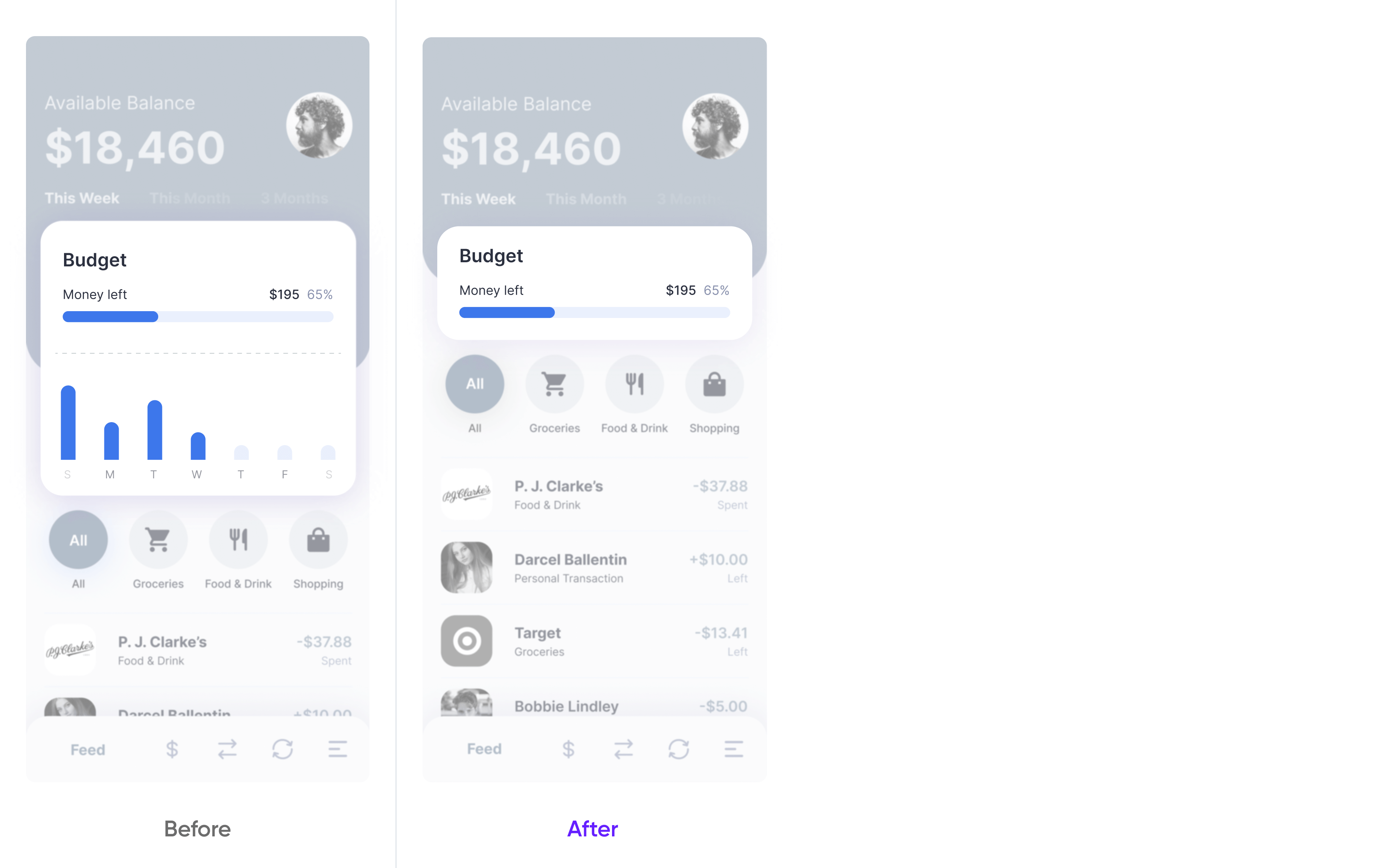
Mistake №3. Bar chart by day is uninformative
Users need to see the full picture of their spendings. It gives them a feeling of control over their finances. This is the goal of the bar chart below the budget section.
Although this specific chart shows the overall expenditure dynamics, it fails to expose patterns in the cost behavior, reflected in a specific amount spent each day. One of the solutions can be adding the amount above or below the bar chart. But as I explained before, transactions make a more important piece of information. We should save as much vertical space as possible for this feature.
As I see it, the best solution is to get rid of the chart at all and put it in a more detailed view on another page. Every idea does not have to be featured on the home page. Sometimes, less data means better UX.
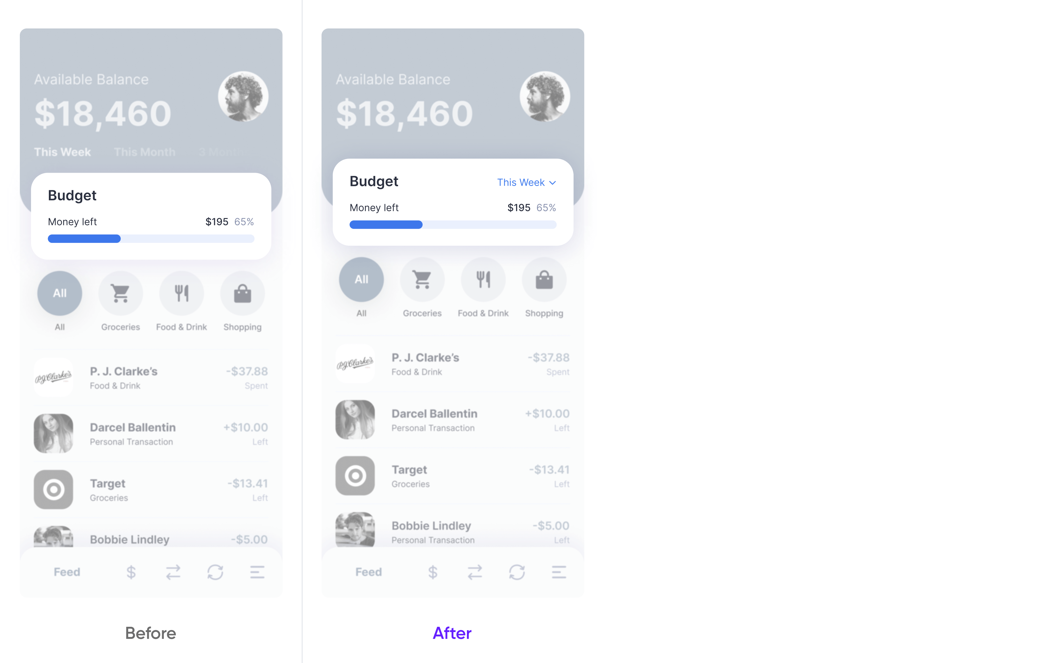
Mistake №4. The timeframe filter is outside the budget card
Users need this filter for sorting their transactions by different periods.
But the color of inactive filters has low contrast with the background color palette. Therefore it is almost invisible for a user. Also, having this filter outside the card is confusing. It's nearly impossible to tell what we filter. Is it a set budget or the entire page's content?
To avoid confusion, I have placed the filter inside the card and added some contrast to its font color.
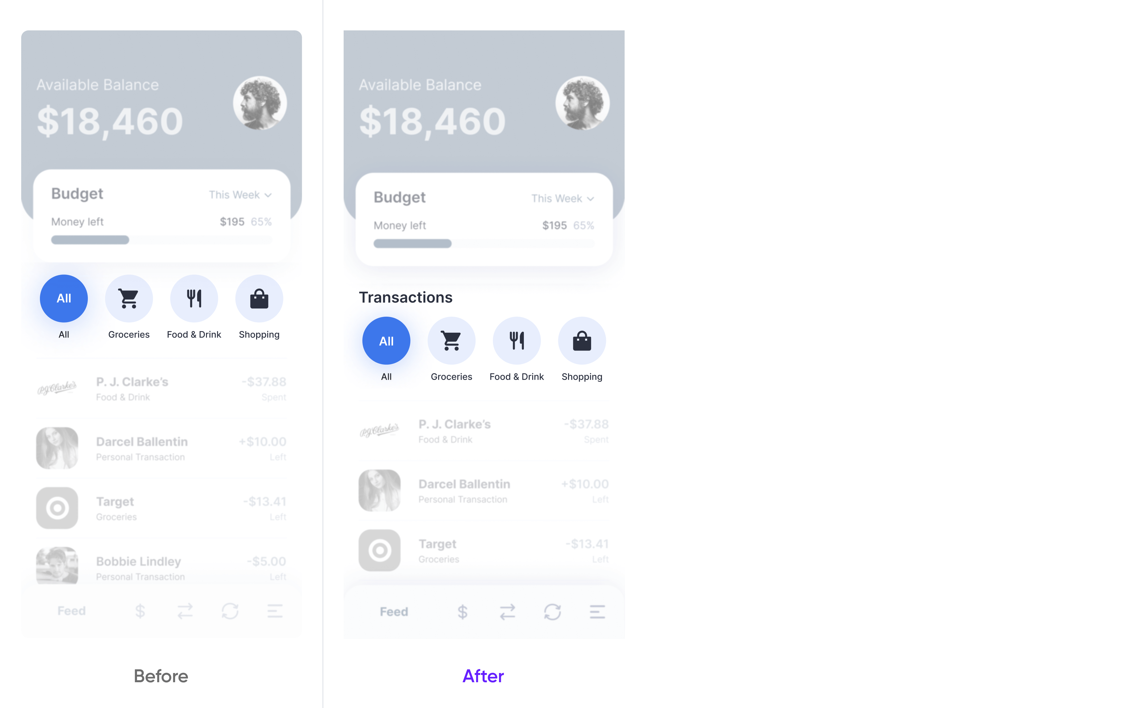
Mistake №5. The absence of a header makes the transactions filter confusing
In this section, we have 1) transaction groups classified by category, and 2) the list of transactions that belong to a selected category. However, users can get confused because these two components are visually perceived as separate and unconnected. This is because categories without a header look like a group of buttons redirecting to other pages, and having no intuitive relation to the transactions below.
You may notice how the situation changed after I had added a header above the categories. Now the section looks complete and the information is meaningfully grouped.
Mistake №6. Looks like there are only 4 categories and that's not true
Although it looks much better now, it is not over with this section yet.
The current organization of icons gives a misleading idea that we don’t have any other categories available for filtering. A customer has no visual hint that this filter is scrollable.
To solve the problem I added one more category that's peeking out of the screen. This way, users intuitively see that the actual pool of categories goes beyond the visible margins of a page, and hence will be scrolling if needed.
Mistake №7. Irrelevant hierarchy inside of the transaction card
For usability concerns, users should see a larger number of transactions.
Currently, each transaction takes too much room due to the unreasonably big image and font sizing. In addition, the text has the same color and low contrast. It stands out only at the expense of its size. Labels "Left" and "Spent" are confusing and noninformative. The color choices for these indicators are not intuitive, because the psychology of UX suggests using green for savings and red for spendings (instead of blue).
That is why I fixed the color solutions accordingly. This in turn allowed me to and remove the labels that became redundant after the implementation of proper colors. implemented. Furthermore, I have increased the overall contrast of the text. With all these strategies in place, I have managed to reduce the size of images without detriment to visibility.
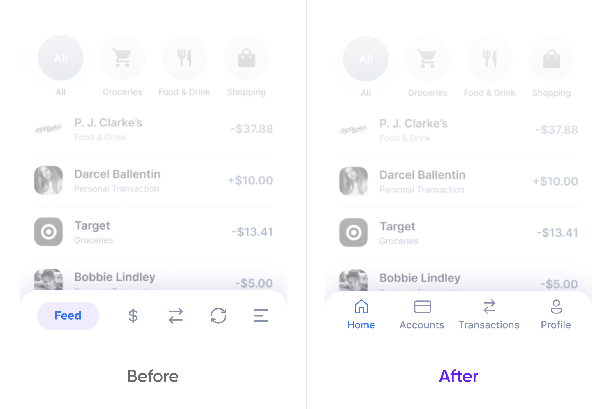
Mistake №8. Dribbble-style menu
The menu is the backbone of app navigation. It improves the user experience and optimizes the time and energy needed for accomplishing a customer’s goal.
With the dribble-style paradigm of using unlabeled and often casual icons, it's almost impossible to guess their function and destination. The tap-zone is also loose and moving depending on the text inside.
That is why I have replaced the dribble-style menu with a more classic one that has standard icons and labels. Now even if a user cannot grasp the meaning of an icon, they have sufficient information to navigate.
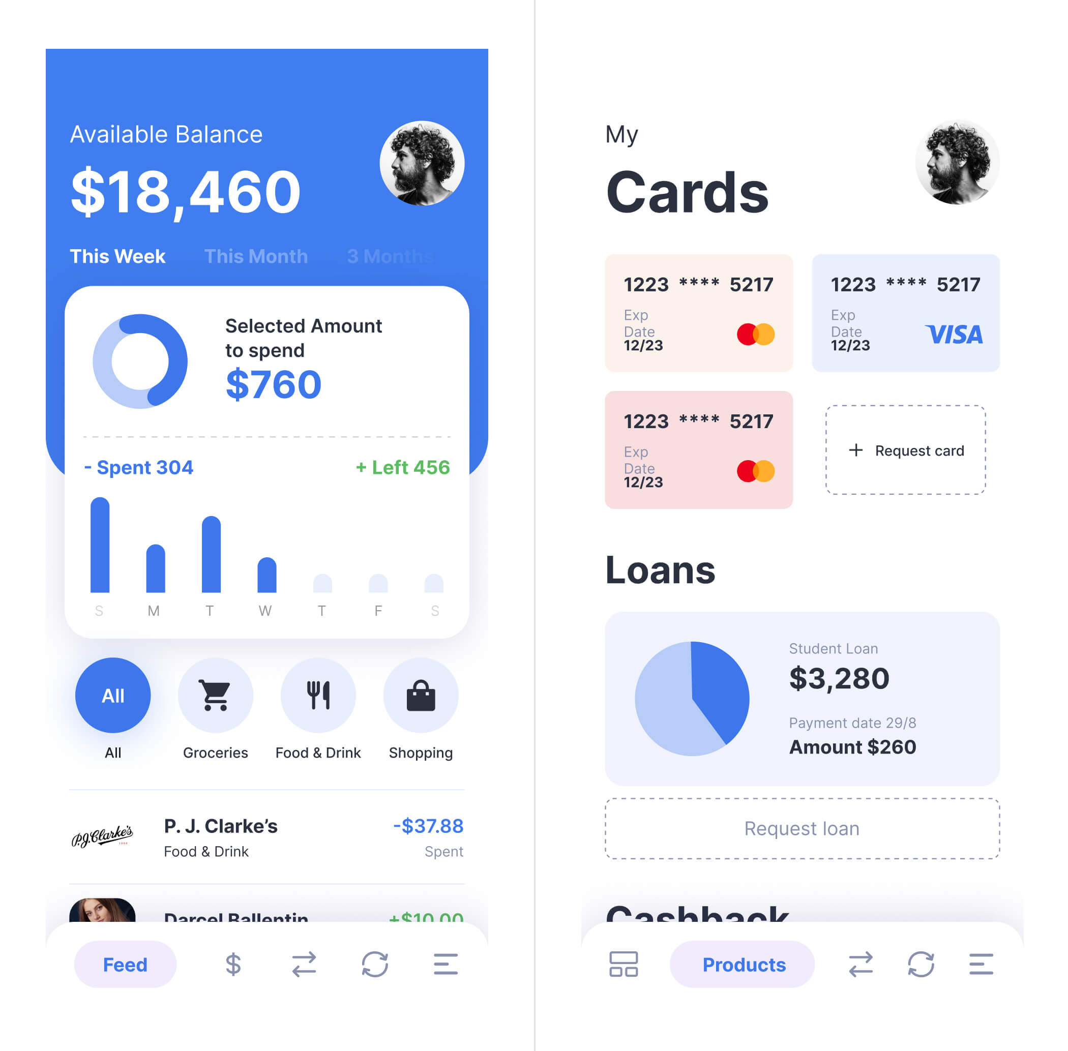
Mobile banking. Screen 2
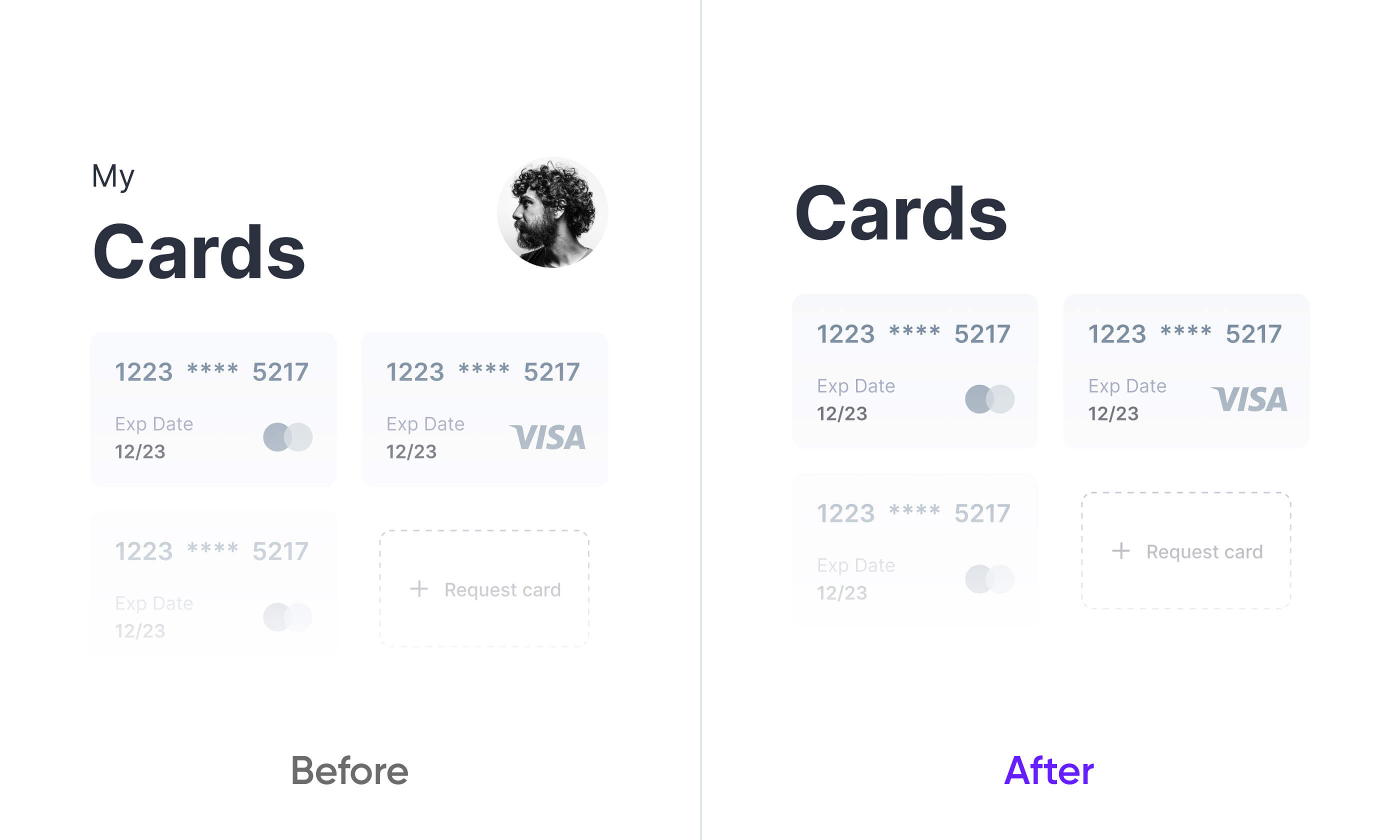
Mistake №9. Design duplicates from screen to screen
Design consistency doesn't mean that solutions should duplicate especially if they aren't functional.
For example, on the first screen, the title comprises the amount of money and the label "Available balance". On the second screen, however, we can only see the title "Cards".
The user profile button is also duplicated. But on the second screen, it only distracts the user from the main content on the page.
To make additional room vertically, I have got rid of both the small label “my” and the image of a user profile.
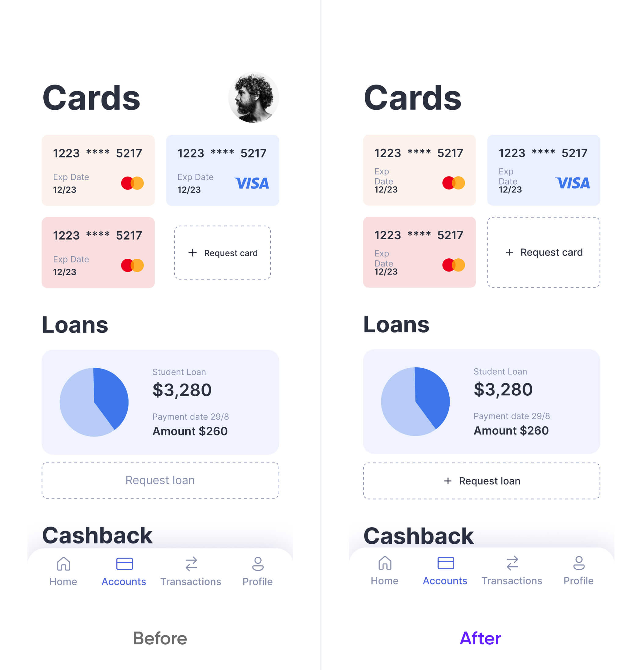
Mistake №10. Button for requesting card and button for requesting loan have different styles
Any controls that have similar functionality should have a similar style too. Design should follow this rule to make the behavior of the elements more predictable. It helps users to learn quicker and avoid confusion when something goes wrong.
So I made both buttons of the same style.
Mistake №11. The design ofa credit card has troubles with hierarchy
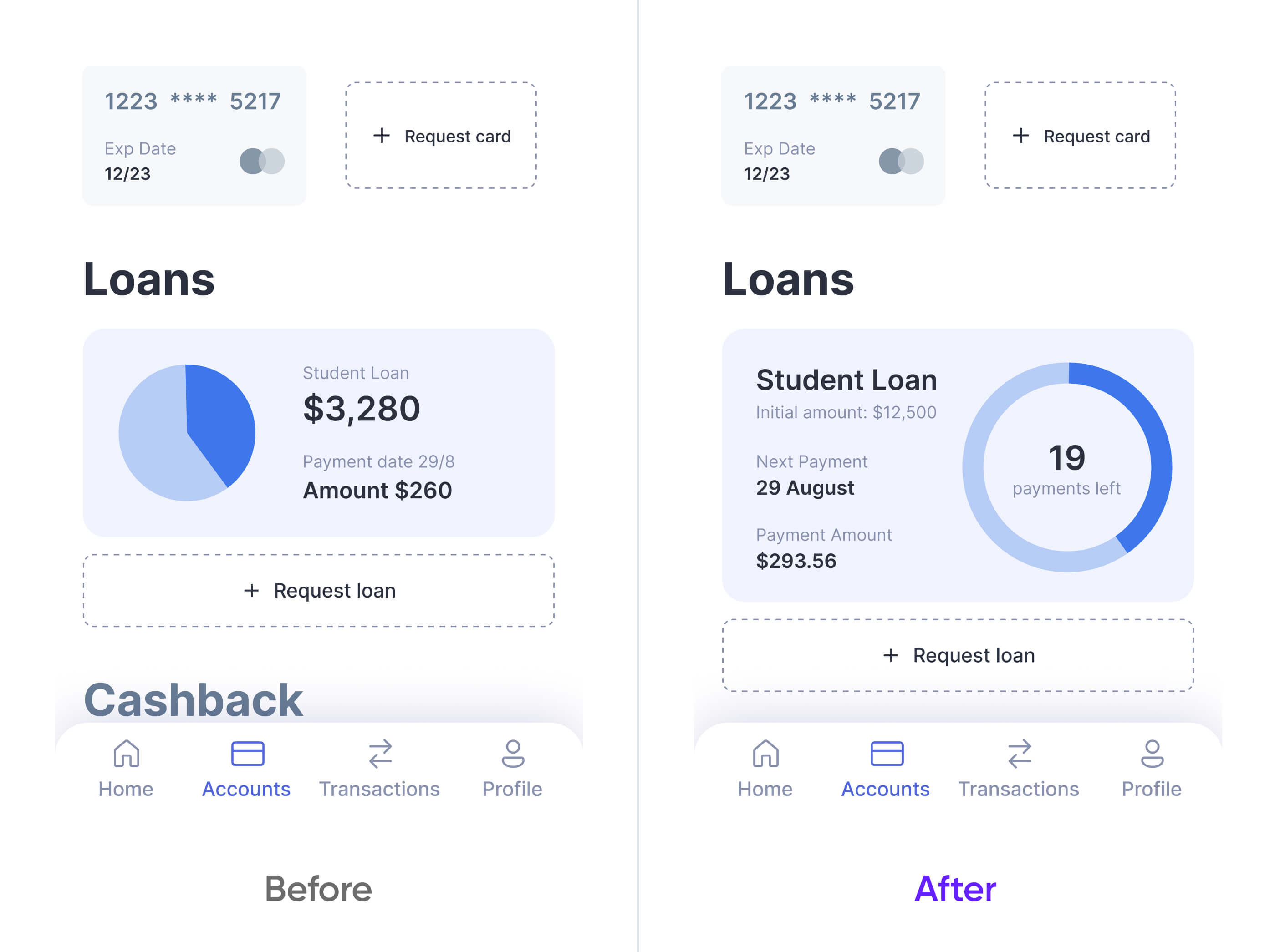
A credit card includes information on the amount and date of the next payment, as well as the initial loan size. The chart should represent the correlation between sums of paid and unpaid loans.
But the card has many problems with hierarchy. The title "Student Loan" is the name of the loan but not the label for the initial amount. The date and amount of the next payment are not equal because the amount has more contrast than the date. The date itself has poor visibility due to the small font size.
So I visually emphasized the title to help users distinguish between different loans. I reduced the font size for the initial amount under the title to keep it less noticeable. This amount is not very important since it will change with time.
At the same time, I organized the date and amount of the next payment in a column with labels and text of higher contrast. I also included information about the remaining payments.
Now the purpose and intended meaning of this chart are totally clear.
After
Conclusion
You can see that apparently simple but surgically accurate changes in style, hierarchy, and wording can remarkably improve the overall quality of your design and its problem-solving efficiency.
To make this happen, a designer needs to consider the fundamentals of human perception and cognition along with aesthetical principles. It is also important to understand how your intended customer thinks, what problems/goals they would address, what is quintessential for them and what is secondary. Finally, to notice everything that can be improved, one must be fully engaged with a product and truly interested in its success.
I hope this small redesign workshop has given you enough clues for understanding what good UX is all about. To put it simply, a nice design is nothing if it does not allow for a convenient, simple and satisfactory user experience.