There are so many different ways to succeed in a saturated SaaS market. You could go with micro-SaaS, vertical SaaS, PaaS. The opportunities are endless. What’s even more fascinating is that there are as many, if not more, ways to fail.
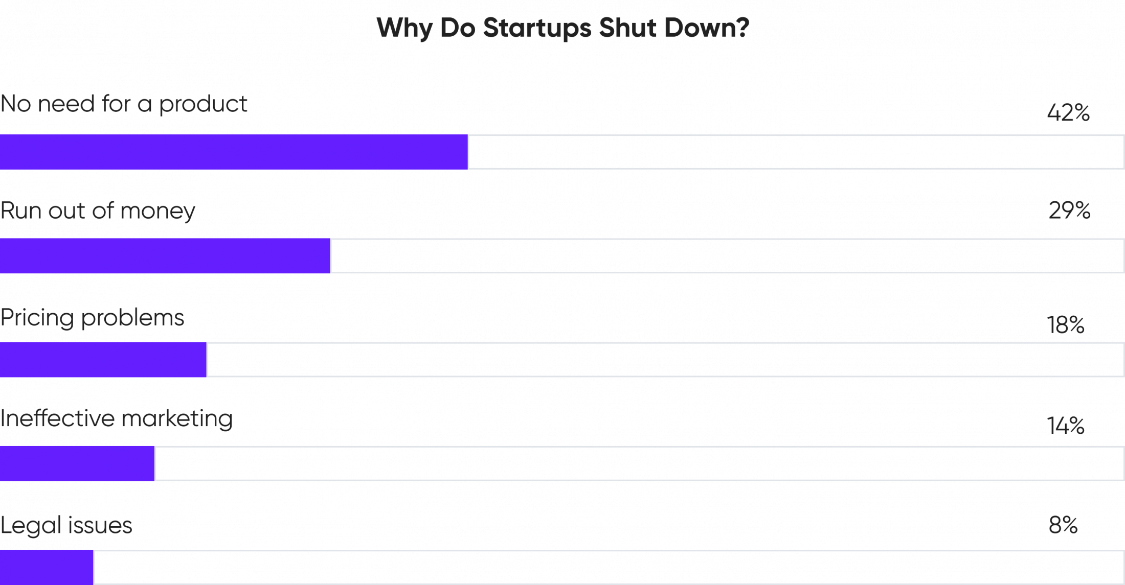
We’ve likely all seen charts like the one below:
Source: LITSLINK
Charts like these show us the grim reality of launching startups. While this statistical data is true for all startups across different industries and verticals, we’ve found that SaaS businesses have their unique problems.
Having worked with a variety of SaaS startups, we’ve noticed 5 extremely common mistakes that are detrimental to their growth. Let’s break them down, shall we?
1. Market-centric approach
Don’t get us wrong. There’s nothing wrong with being market-centric per se. After all, market research is how you make sure there are people who are willing to purchase your product. There’s a catch though.
We’ve noticed a huge tendency for market research and user research to be lumped together. Combining these two types of research is usually done at the expense of proper user intelligence. Let us explain.
By and large, the stakeholders, such as company owners and product managers, own the success of the product. They define the product vision and business strategy, build the roadmap, and scope of the product. Depending on their roles and background, they also tend to do market research, competitor analysis, prioritize the features, work with the development and sales teams, define pricing, and help the marketing teams position the product well in the market. Needless to say, that’s way too many activities for a few people to handle well.
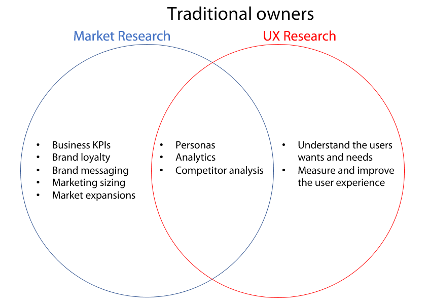
Now let’s take a look at the infographic below. You can clearly see the difference between UX and market research. While some activities seemingly do overlap, they don’t actually overlap fully. For instance, a competitor analysis, depending on whether it was conducted by a UX designer or a product manager will be completely different.
Source: Simple Usability
That’s not to mention that ditching any efforts to understand the users’ needs and wants is a surefire way to a generic user experience. Remember, 1$ invested in UX brings a hundred in return. That’s why you shouldn’t shoot yourself in the foot early on and set yourself up for mediocrity with a market-centric approach.

Source: Forrester
2. Market-centric profiles
Having a market-centric profile is yet another blunder that’s closely related to the one we’ve just discussed. Although the first two mistakes (a market-centric approach and market-centric profiling) seem similar, they tend to manifest themselves in different ways. Let’s break down how.
So here’s a thing about SaaS products (especially b2b). Closing a deal and getting a customer is not as simple as convincing a single person your product is good. Oftentimes, there’s a complex network of decision-makers and influencers who have the final say. Luckily, most SaaS teams we worked with recognize this fact.
The recognition of the decision-making complexity, alas, makes it all too tempting to zero in on marketing the product to executives, vice presidents, heads, etc. This approach shifts the focus toward the upper management at the cost of the end-users’ experience. As with many things in life, you should strike a balance: the balance between catering to both actual users and the decision-makers involved.
3. Feature-centric approach
Most, if not all, startups, SaaS or otherwise, are in constant pursuit of numbers. You’ve got to reach the quarterly goals, increase the metrics, gain traction. In doing so, it seems tempting to cram as many features into your product as possible. More features = more solutions = more users, right? Well, not necessarily.
As long as quantity goes hand in hand with quality there’s nothing wrong with having a lot of features. After all, the SaaS market is rich with examples of large enterprise solutions that have a seemingly endless list of features. Nonetheless, balancing between quality and quantity is easier said than done.
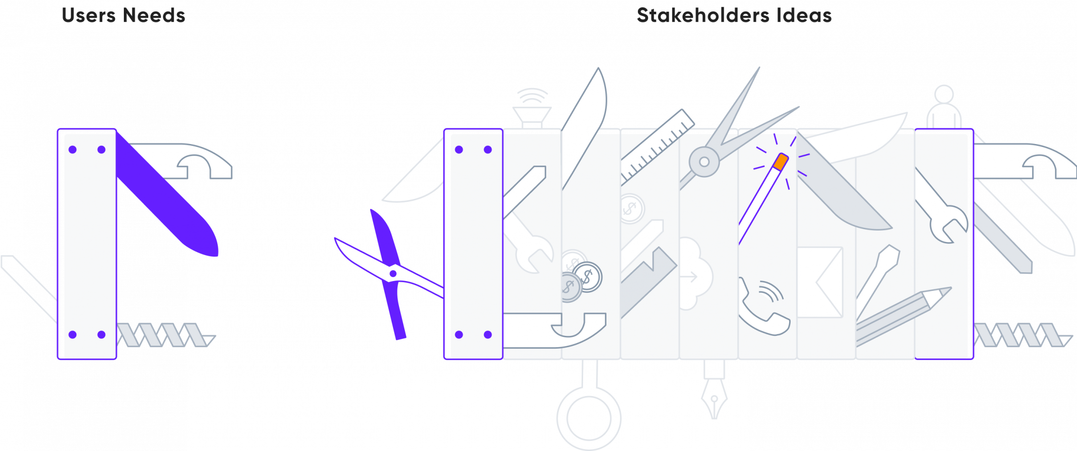
Here’s one of the many SaaS product commandments for you: few great features beat many mediocre ones. The swiss knife illustration below speaks volumes in this regard.
Source: Shopify
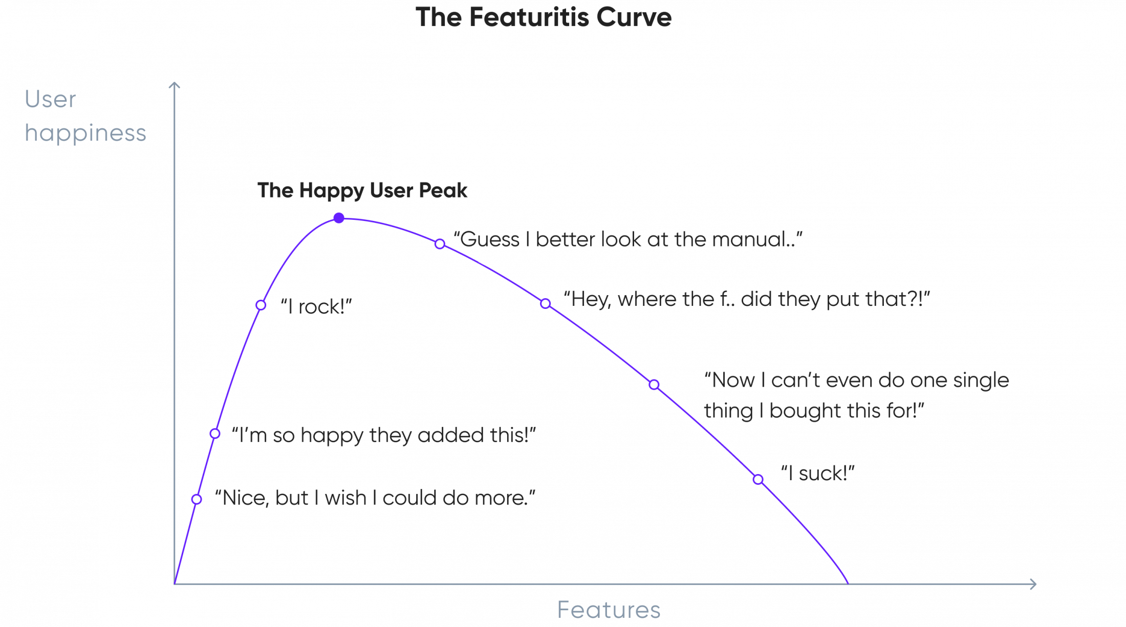
Having too many features, also often referred to as “feature creep” can confuse users and needlessly complicate your product. Take a look at the chart below. It shows a typical users’ reaction to introducing too many new (and confusing) features.
Source: Shopify
Here are a few tips to avoid feature creep:
- define and prioritize core features. Common feature prioritization frameworks include RICE, MoSCoW, and the Kano model.
- not all feature requests are equally valid. Are you sure the feature represents a large enough part of your user base? Are you sure you’re not just listening to those who scream the loudest? Are you sure this feature is more important than the hundred others you have in your backlog?
- define a roadmap and stick to it. Having a clear roadmap that reflects your research findings and business priorities is how you separate the wheat from the chaff. Don’t just attack every feature that comes your way.
4. Product revamp resistance
So, you’ve built an MVP for your SaaS platform and gained some users with a limited budget and resources. Things seem to be looking up for your business. You can finally exhale, sit back and snap out of your constant stress for a little while.
Not to be a killjoy, but here’s what’s likely to happen next: your users won’t tolerate the little effort you’ve put into UX for too long. Yes, we get it, an MVP requires “quick n’ dirty” solutions. It doesn’t mean, however, that this approach will work forever.
The longer you go without the proper UX, the heavier the price in time, effort, and money you will pay further down the line. Do you know why? – It’s because the more work you put on top of a badly designed product, the more work you will have to undo and redo afterward. Therefore, you should seriously consider getting a proper UX evaluation as soon as you have reasons to believe you’re onto product-market fit.
Limping through feature launches and product updates without proper UX is analogous to building new stories on top of a building with a poor foundation. Resisting revamp will sooner or later bottleneck growth, so make sure you bite that bullet before it’s too costly.
5. Client resistance
Do you remember a recent Facebook design update? If so, you likely also remember the outrage it caused among the users. Here’s the moral of the story here: regardless of whether a new design is more usable or not, you’ll likely meet resistance. A lot of users simply don’t like changes. Period.
So what do you do if you launch a design update and suddenly get swamped with negative reviews? – First, don’t panic and don’t just revert to the old version. If you’ve done your homework before the design update, you will have had good reasons to believe the design is good.
Additionally, don’t just look at reviews. Fragmented qualitative data doesn’t tell you the whole story. Look through Google Analytics, MixPanel, FullStory, and whatever other tools can shed light on the users’ behavior.
Remember that reverting to the old design undoes everything your team had been working on for months. You’d better have a good reason to discard everything altogether. More often than not, you’ll be dealing with a small portion of the users who are content with having things as is.
You should also know that any change takes time to sink in. No matter how superior your new design or feature is, some users will stick to their old ways. And that’s fine. A typical journey for a user would include shock, denial, anger, fear, and only then acceptance and commitment.
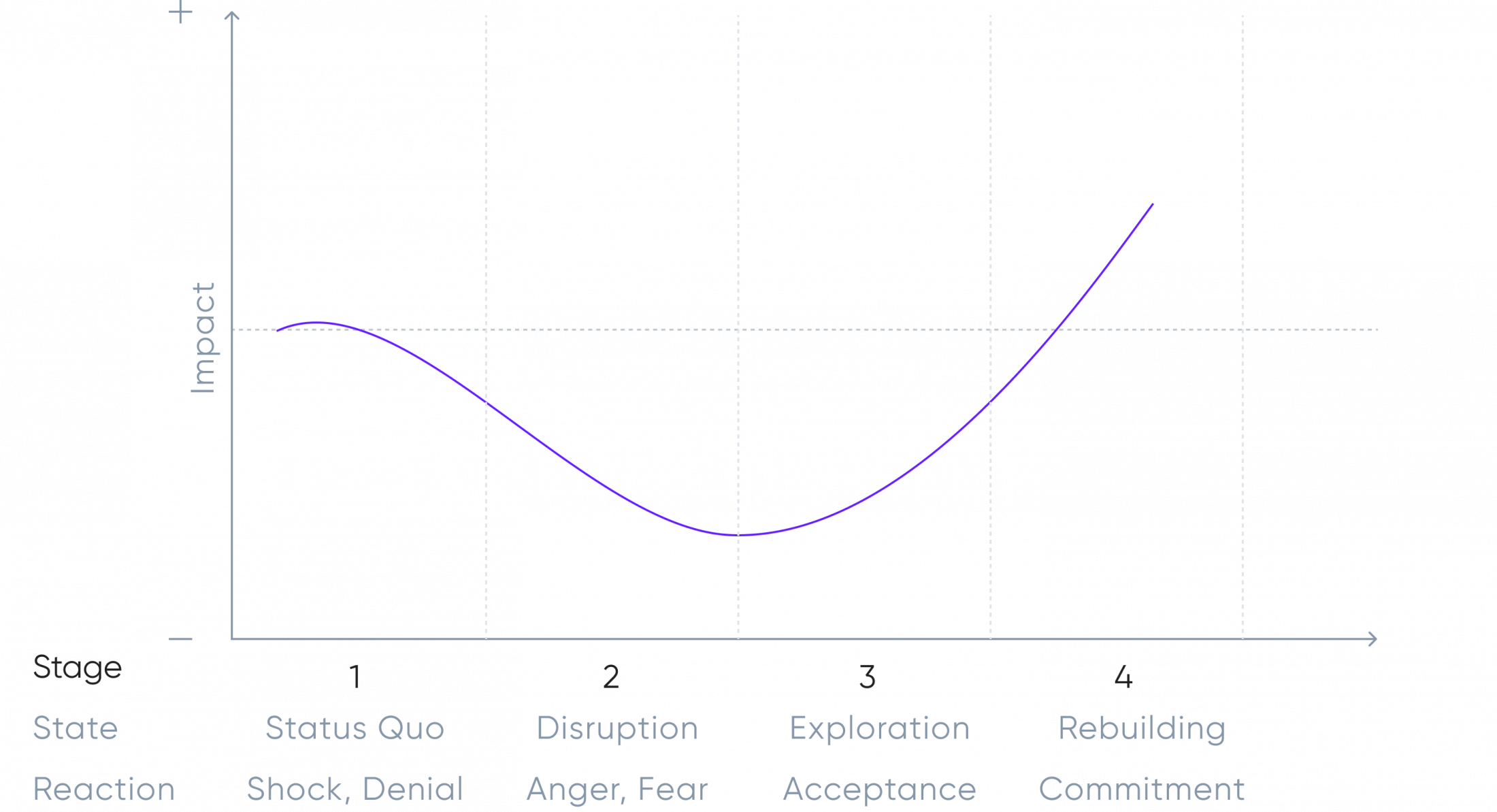
While some degree of negativity is inevitable there are still a lot of things you can do to ease out the transition. What you should absolutely do is offer help and assistance via onboarding, blogposts, live support, etc. Empathy, after all, should be at the heart of product design.
Additionally, you should also consider explaining your reasoning and goals behind the design changes, so that you don’t just leave your users guessing. All of these things will help people adopt change quicker and be less grumpy about it in the meantime.
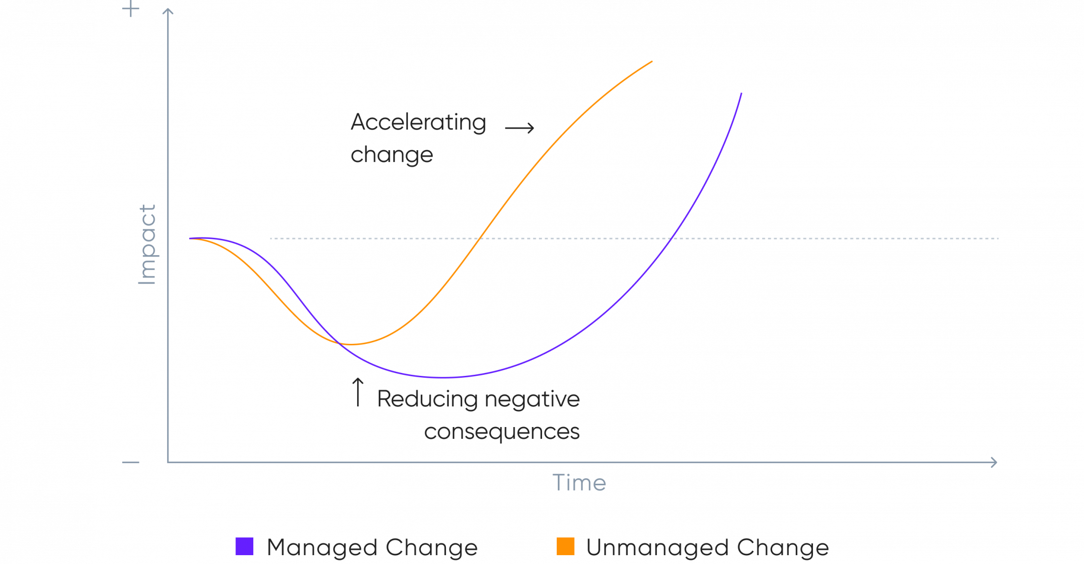
Source: MindTools
Bottom line
First of all, thanks for sticking by till the very end! We hope you’ve enjoyed the ride.
Secondly, there’s a running theme among all of the problems we went through. Can you guess what it is? – Right, it’s the lack of proper UX. We hope we’ve managed to convince you that having UX as an afterthought is a recipe for disaster.
UX is not something that should be left solely to developers, product managers, project managers, or marketers to figure out. And if you do indeed lack expertise in that department, you’re always welcome to contact us. We’re just one call away :)


