

In most cases, the customer conversion is not a purchase yet. It only means that a user got really interested and ready for further acknowledgment of your product. A necessary but not a sufficient condition, as mathematicians would say.
But this is the point where we start, in our strategy to increase your SaaS revenue. And a good start is half the work, as you know.
We already spotlighted the significance of the conversion metrics in our introductory article, where we discussed thinking about your platform in terms of a sales funnel and the customer journey.
Now, let’s consider specific hands-on technologies, allowing you to take everything from UX design to boost your sales.
Here are some verified tips to provide the highest conversion possible through an improved user experience.
Start with a clear value proposition
While this recommendation looks apparently self-evident, it is underestimated or misinterpreted oftener than expected. Even big SaaS players tend to use vague headlines or generalized titles on their landing pages, instead of a clear statement of value.
So, what distinguishes a value proposition from a nondescript tagline?
- it clearly and straightforwardly informs a potential customer what a benefit they receive and/or what problem is going to be resolved in their lives;
- it is specific. Within the area/industry where your product exists, a value proposition clearly outlines the niche where it is unique and indispensable. For example, the proposition “to improve health” for a healthcare service or “to secure your devices from viruses” for an antivirus start-up will be too superficial and unattractive for a target user;
- it is emotionally appealing. A visitor may stay on your landing page only for a couple of seconds. So the message should not only be rationally sound but also touch deep strings of the human heart;
- it takes an imperative form. Don’t confuse it with the call to action. The value proposition refers to resolving a user problem without direct allusions to your product. But it directly drives a user to action. Famous examples are “Spend Less. Smile More” (Amazon) or “Unlock the power of video” (Vimeo).
To make it more clear, take a look at this cloud computing platform, as an example of how things should NOT be done.
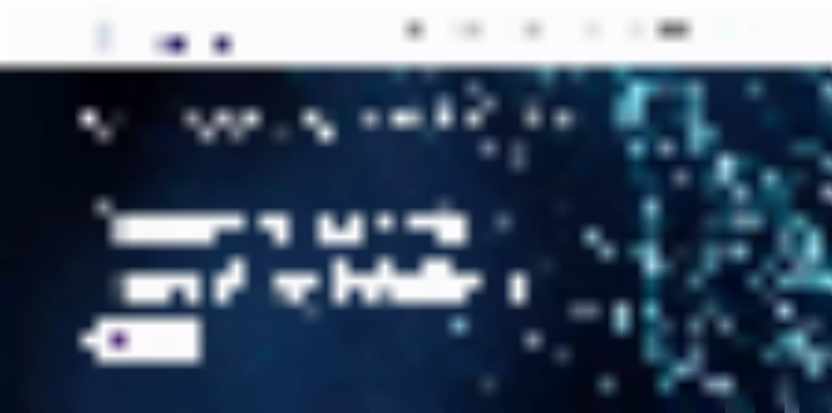
Source: AITHERAS
Despite a catchy and nice-looking slogan, it does not convey any explicit value proposition. Obviously, the “customer-centric innovative solutions” can be applied to almost any SaaS product today. It introduces neither the brand identity nor the unique value of a platform.
Moreover, it does not even give an idea of what the product is about. Did you guess, by the way? It is data analysis and IT engineering. You need to delve into reading the copy throughout the homepage, to figure this out.
Now, compare it to the statement of value provided by Overflow.
Source: Overflow
The value proposition is clear, customer-specific, encouraging, and moving to action. Even at the first glance, you get a full and precise idea of what this service can bring into your professional life and what a problem it may resolve.
Take care of consistency
Once you have established a value proposition, you need to take care that all the elements, pages, and channels of your platform are consistent with it.
A homepage is indisputably the main landing page of your sales funnel. Despite a wide variety of media channels, studies show that nearly half of B2B companies still consider a homepage the most appropriate front door to their products.
However, the further transition from a homepage to other spaces of your funnel has to be similarly superb and impeccable. Product teams often pay the most attention to conversion metrics and rates of a homepage. The conversion potential of other pages, such as the sales page, register page, customization page, and others, is neglected despite their prospectively high and untapped potential.
As a result, despite an initially high click-through and conversion rates provided by the high-quality entrance of a funnel, the eventual retention rate can drop drastically. Yet it is exactly what defines the growth of your SaaS revenues.
For example, here is how Dropbox ensures consistency and intensity of user engagement, after responding to the call to action on its home page.
Source: Dropbox
This is the next page where you find yourself after pressing a CTA button:
Source: Dropbox
You may notice that a visitor’s attention is sustained by an unobtrusive interactive interface. Instead of immediately suggesting long readings or boring registration procedures with fields and verifications. the platform offers a customer to make an interesting choice and to customize further communication, according to their needs and preferences.
Include only the essentials
A sales funnel is designed for one purpose – to gently but decisively lead a customer to the once-and-for-all Decision. Therefore, everything along the way should remind it and push a user in the right way.
That is why make sure that every other element on a target page not only serves its purpose but absolutely indispensable to meet it.
The minimum set of must-have elements of a landing usually includes:
- a unique selling proposition;
- a call-to-action button;
- a hero image (some archetypal match with the buyer persona);
- a lead capture form;
- a navigation menu;
- a footer.
You are well aware of the most famous example of such a must-have-only homepage design.
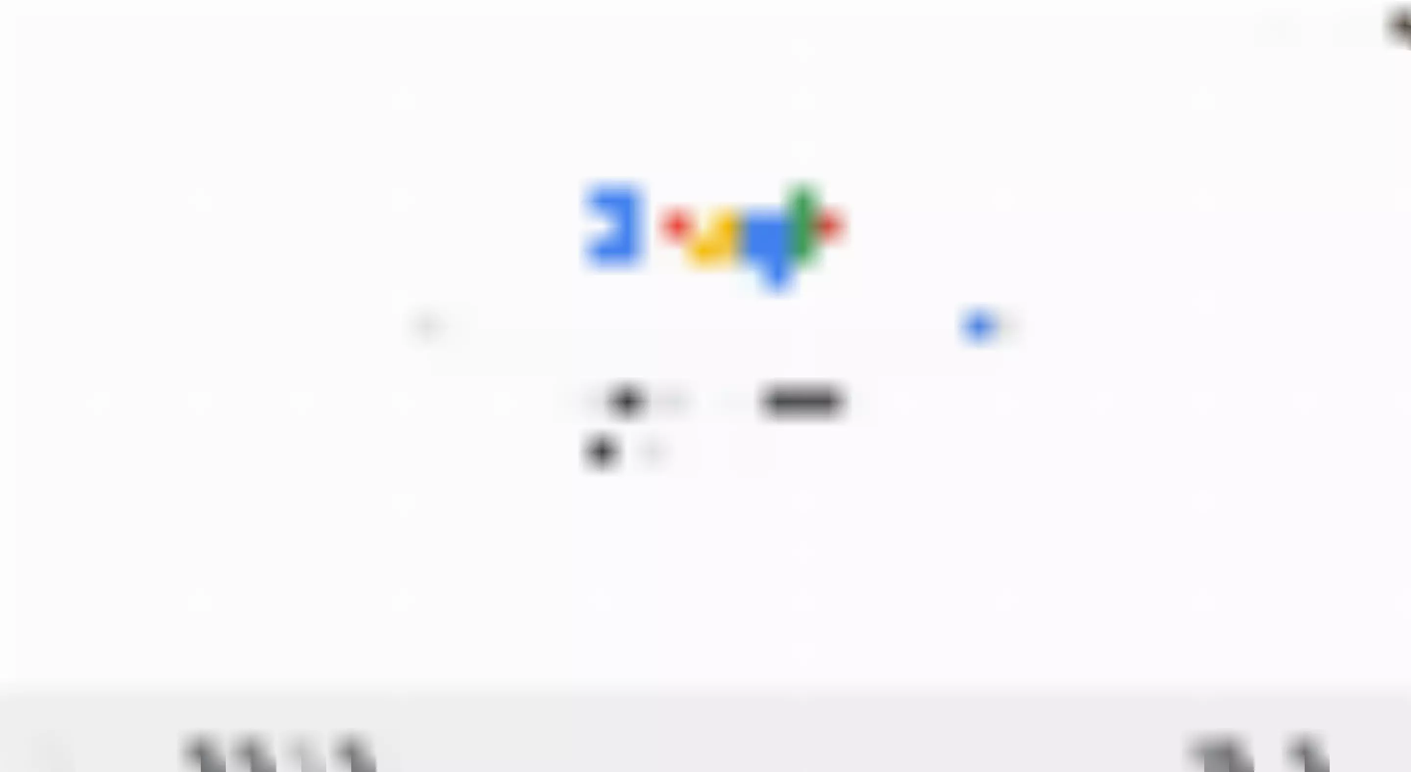
Source: Google
Along with this, social proof, demo version, and supplementary information may be included in scrollable sections.
All the can-go-without elements and copy should be ruthlessly eliminated, to avoid any potential distractions from the single conversion goal. The principle is simple: if you don't know whether to keep it or toss, don't hesitate to toss.
This rule will be easier to follow keeping in mind that a customer's attention is stuck at a webpage only for 8 seconds at most to make a conclusive impression. If something is too dear to your heart, relocate it to other spaces, such as About or FAQ pages, where a truly interested customer may easily find it.
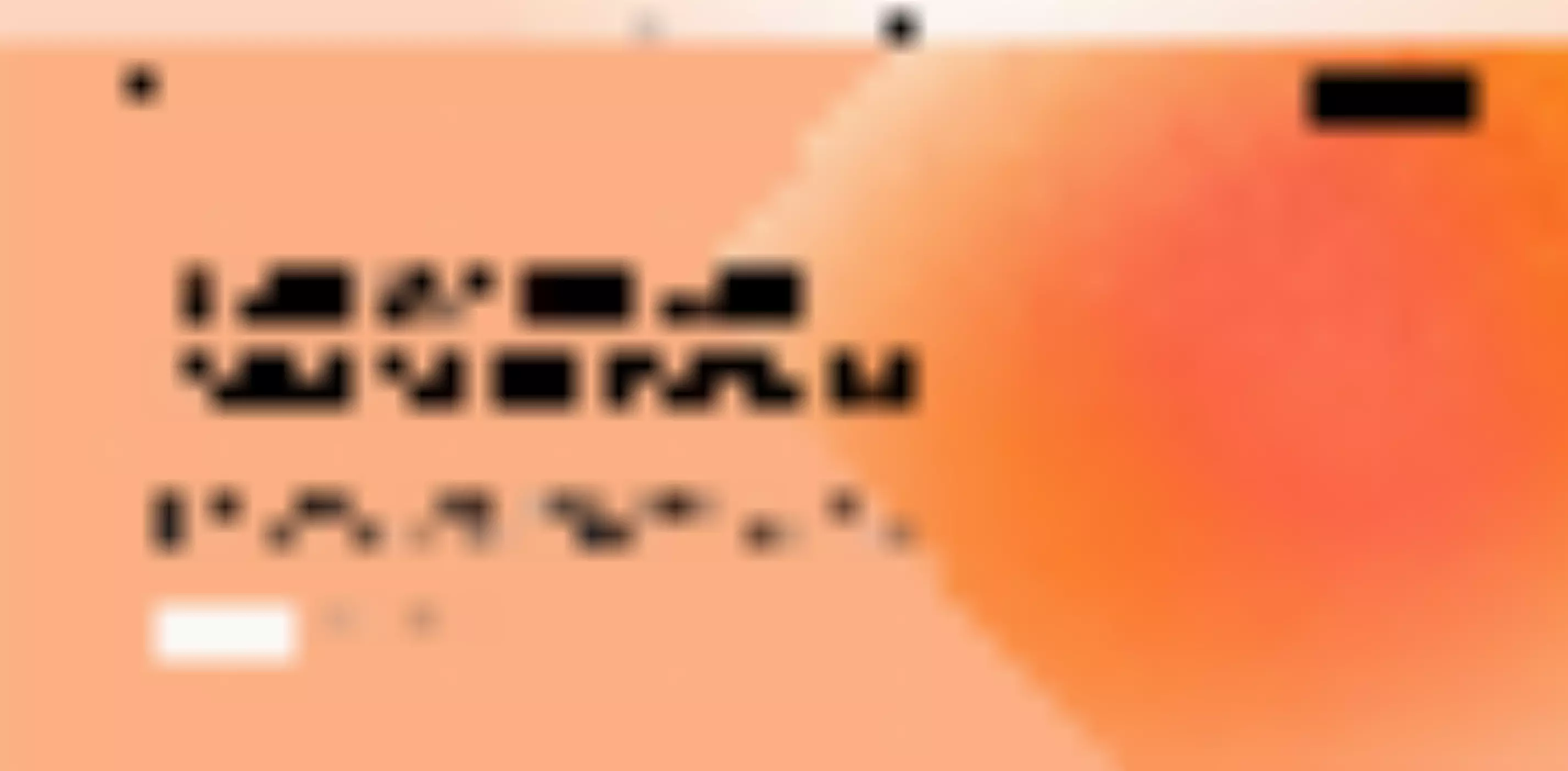
Apply high-quality aesthetics
This is actually a designer's work to ensure that the user interface of a landing page conveys the air of harmony, clarity, and transparency.
It is not enough to include all the needed elements on a target page. If they are a mess, the journey will end before it even began. Clear hierarchy, colors compatibility, sufficient spacing between elements, and other UI fundamentals may either make a customer fall in love with your product and boost sales, or quit the page for a split second.
Source: Adobe
Regardless of the field of the market, it is very helpful to provide appealing illustrations along the way of your funnel. Visual information is quicker to reach human brains compared to words. It also simplifies the understanding of textual information by a general audience, even if it goes about the simplest things.
Ensure emotional trust
While really long-lasting credibility is built through informed consent and experience, the initial impression about a product's trustworthiness is always triggered on the emotional level.
Make sure that your videos, images, color choices, and verbal messages push the right buttons in the human psyche.
A hint: they have to be engaging yet unobtrusive, friendly yet mild-mannered, and warm or cool depending on the specifics of your buyer persona(s).
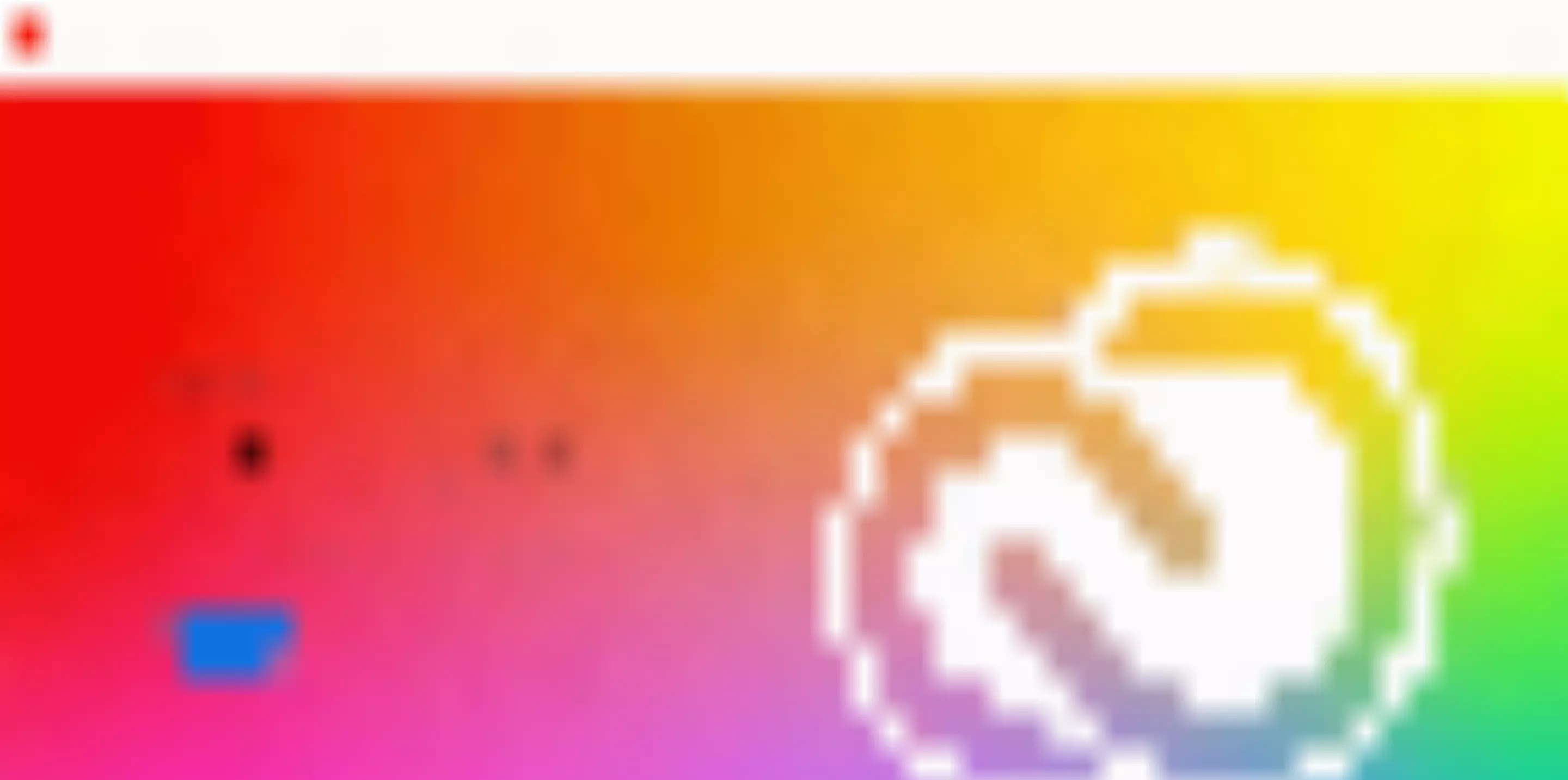
An apparently challenging task? Wait, there’s more. What color palette would better suit your field and audience? Conservative pastel? Practical earth? Catchy jewel? This all differs - and matters for the conversion rate. But if your product team is proficient enough, it will cope.
Source: Sketch
Make market & user research
The more information you collect about your target market and intended users, the more delicately you may tune your sales funnel for the conversion. This may (and should) include:
- competitors research, revealing what works with other companies in the field;
- usability studies and in-depth interviews aimed to know the thought and feeling patterns of a typical website visitor;
- research of customer activities in social media, spotlighting most preferred channels and modes of information exchange by your user;
- creating buyer persona(s), imaginary characters reflecting the ideal types of your client, capable to make the most use of your product and bring the most benefit to your business.
- outlining a customer journey map, with all its stages from unawareness to decision, based and all the data received, and serving as a foundation for your sales funnel.
Design for all the types of audience
Any SaaS funnel should be equally effective for both knowledgeable tech experts and the general audience. This is especially important for some sophisticated B2B products belonging to FinTech, RegTech, or LegalTech. They are sometimes prompted to use almost an esoteric level of technological discourse in line with their narrow niche expertise.
On the one hand, a bit of terminology is often imminent to represent all capacities and opportunities of an item. Relevant community discourse also impresses the professionals making a primary beneficiary group of a product. Yet, on the other hand, excessive professionalization can make the narrative of your buyer's journey too lifeless, dull, and complicated.
For example, let’s consider a notional brand Color Therapy ™ to trace how different rhetorical approaches affect its overall perception by users.
Too special: The technology of Color Therapy ™ alters neural activities in the hippocampus and limbic system. It stimulates the emission of dopamine, serotonin, and oxytocin, constituting the Happiness Trifecta. It also inhibits the emission of cortisol and therefore reduces the level of adrenaline in the blood. As a result, the neurochemical balance of the brain gets positively mediated.
Too profane: by using the technology of Color Therapy ™, you will forget about stress and fatigue. Confidence, joy, and inspiration will become your usual states of mind. This is your reliable path to permanent happiness.
Middle ground: The technology of Color Therapy ™ enhances positive emotional states of joy and pleasure by stimulating the emission of dopamine, serotonin, and oxytocin. It also reduces stress by inhibiting the emission of cortisol, a neurotransmitter primarily responsible for adrenaline levels in the blood. As a result, your emotional state will radically and steadily improve.
A right balance is often hard to find, but it is still worth it. Designing a quality set of buyer personas in advance can be a great help in doing so.
Well-defined personas help teams using enterprise RFP software craft proposals that speak directly to the right buyers.
Give something valued in advance
Even if you provided the best UX/UI design solutions, a customer can avoid conversion for more profound personal reasons.
It is just as with a viewer that enjoyed watching a movie teaser, but did not purchase a streaming subscription for simply having no cash at the moment. Later, such customers will forget to come back even if they had a totally positive impression.
There is a solution. To make a user stay as a lead and a prospective customer, simply offer them something slight but valuable, immediately and for free.
Source: HubSpot
This can be a free trial, a demo, or even a free plan for beginners with limited access to services. The latter option is called freemium. Some experts consider the freemium pricing strategy an effective booster for SaaS projects, if applied properly.
At first sight, such welfare work does not bring any convertible benefit to your business. Yet this is a delusion. In the long run, engagement with a free piece of your product keeps a customer in contact with it, by allowing users to learn, taste, and appreciate its features and benefits. As a result, you create a framework that will attract leads and then convert them into real customers.
A secret ingredient: time, place, and circumstances
The experience of successful SaaS projects shows that there is something more beneath their great conversion rates, than simply following scientific UX guidelines.
In case of a really deep understanding of the product, the target user, and the market, a product team may turn on their instincts and create a unique combo of strategies striking the customer outright.
Here are some examples illustrating what exactly we're talking about:
- Bench
Source: Bench
The landing page incorporates a calm and soft color palette, as well as pieces of real-life dialogues and a friendly-looking smiling female figure for illustrations. This provides heartiness, warmth, and stability, i.e. those things that accounters and bookkeepers most lack in their work and most deserve deep in their hearts.
- Streak
Source: Streak
This is a perfect example of how isometric illustration can work even fallen out of trend long ago when it is aptly combined with other design techniques and used for an appropriate audience. Animation within an illustration conveys a complex relationship between the characters. Along with boldface type for a slogan, this creates an air of engagement, dynamics, and partnership. What else do buyers and sellers need?
- Loom
Source: Loom
Although this cannot be seen on the screenshot, this homepage abides with animated elements, including video GIFs and moving Web prototypes. In this way, this SaaS for video conferencing, targeting business audiences in the first place, exhibits the capacities of its tool in the smartest way.
- Whimsical
Source: Whimsical
Looks beautiful, doesn’t it? Its designers found a unique balance between the wealth of coloring and the tranquility of its tones. This product is a virtual workspace, and a proper color choice together with minimalistic typography represents an attractive space where everybody would eagerly work at.
Conclusion
All in all, your online platform is the backbone for creating an effective sales funnel for any SaaS product, with almost boundless potential for optimization via UX marvels.
This includes structural, aesthetical, and marketing solutions, all organized around the central statement of value and steadily leading a user to the commercial transaction.
Of course, the steps we described include only design-based solutions. If you have got multi-million seed funding and soaring ambitions, you may certainly expand your funnel beyond outer space, by encompassing social networks, outdoor advertising, public influencers, TV shows, live fests, and everything else you can imagine…
And still, UX optimization is the smartest way, as strategically the most cost-effective and energy sustainable. So, if you are not running after a superstar’s thunder, now you have all the keys within reach.
Stay tuned, as our product designers and business analysts will continue to explore the magic of UX optimization, as for the onboarding process, in our next article.

