logistics

How to Design Effortless Shipping Management Software

15 min
How to Design Effortless Shipping Management Software Cieden

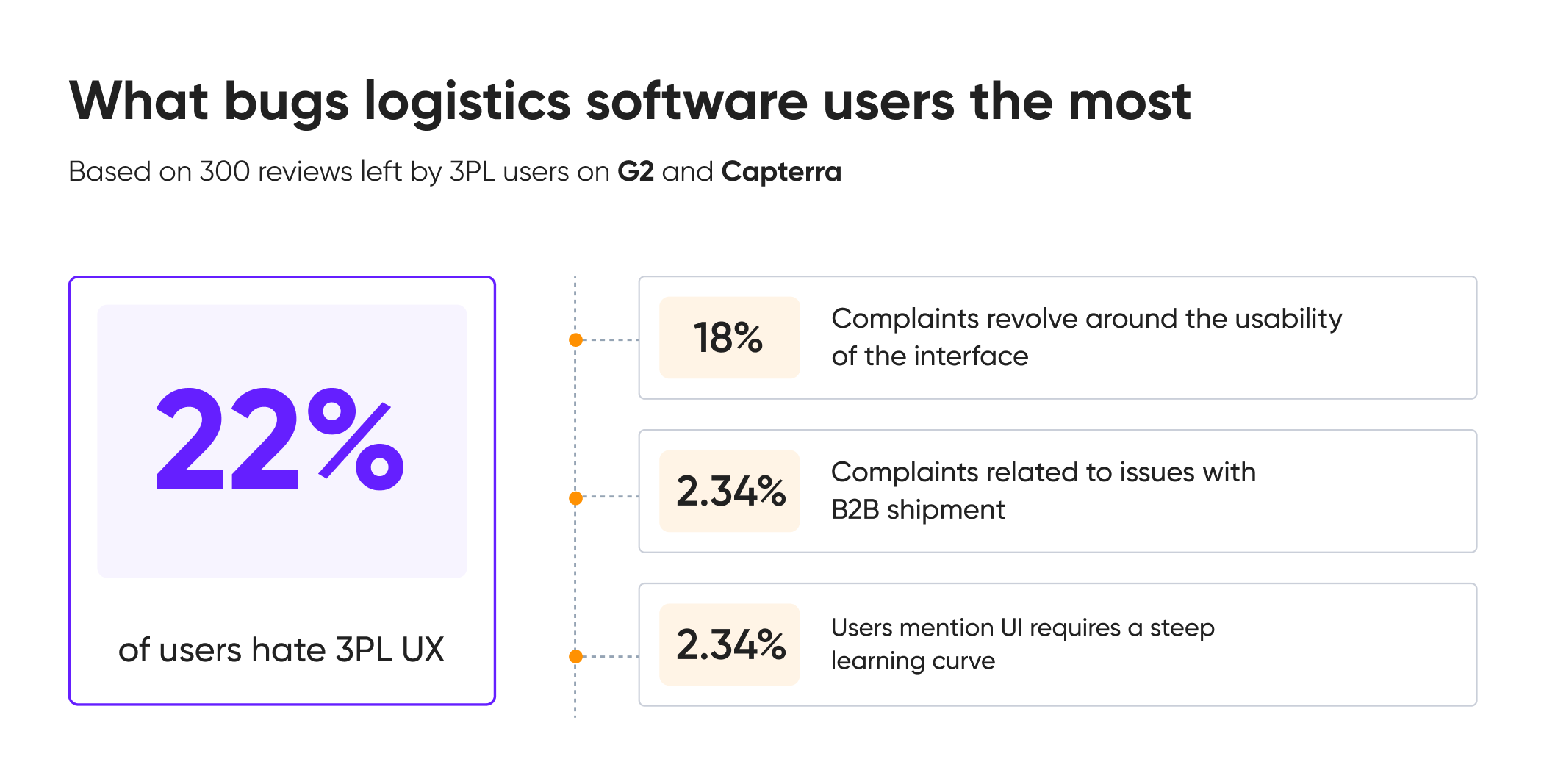
22% of 3PL software users are pissed by poor design. In our June 2024 research, we analyzed 300 reviews of the four most popular order fulfillment platforms on G2 and Capterra. 

We found that users are frustrated with the interface, desiring more customization options and flexibility in the UI to better fit their workflows. We also noticed an emerging trend of complaints specifically related to issues with B2B shipments.
3pl user experience mistakes

Drawing from our experience in logistics software design, this post will share key lessons learned from a real project. We’ll include screenshots of our documents and Figma boards to provide practical insights.

Key UX challenges

A founder of various eCommerce and logistics companies reached out to us to design their 3PL software platform from scratch. They had a crystal-clear vision of how this platform should add user value. Picture this: automated fulfillment process, ability to pay for what you really use, and less time spent on navigation. 

Less time spent in the logistics app means that the core challenge here is to achieve simplicity. As much as we love to simplify, simplify, and simplify again, you can't fully achieve it in fulfillment management. 

For us, simplicity means streamlined workflows, reasonable customization, and clear data presentation.

logistics design meme

Research is the foundation for everything

Starting with research can be broken down into three key areas: service blueprint, competitor research, and user interviews.

Service blueprint

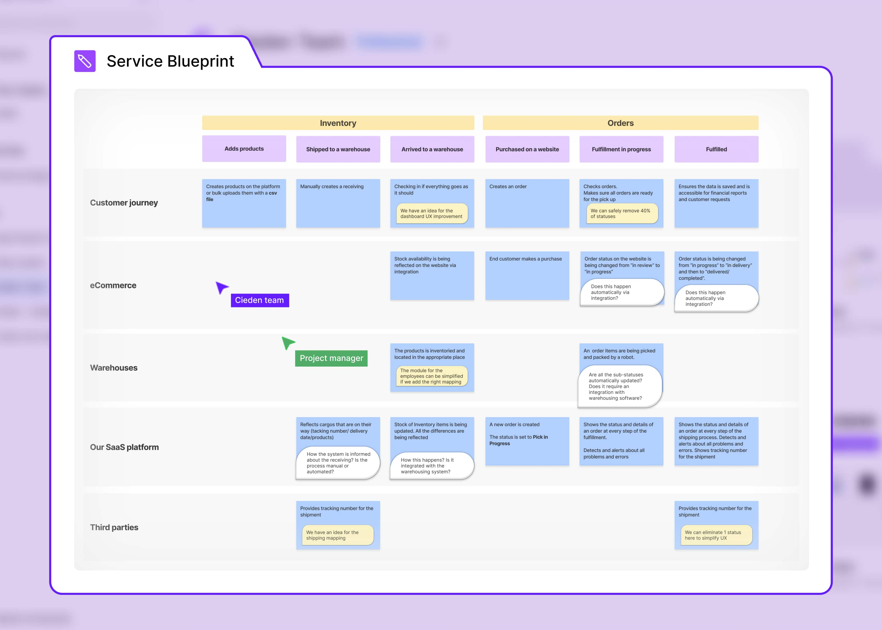
Before jumping on a call with users, it’s valuable to understand workflow intricacies tied to the platform. There are always many things to be discovered during this process.

It’s more difficult to start with a big picture, though more rewarding, too. You can create a blueprint first, then interview users, edit the blueprint, make new observations, interview it, and be agile when it comes to a holistic overview of the system.

By mapping out the entire service, a service blueprint can highlight inefficiencies, pain points, and areas for improvement across the entire logistics process, not just the user interface. This can lead to more strategic and impactful design decisions.

It also helps visualize complex interactions between multiple systems, processes, and stakeholders, making it easier to identify dependencies, potential bottlenecks, and areas that require special attention.

3PL product blueprint

Competitor UX evaluation

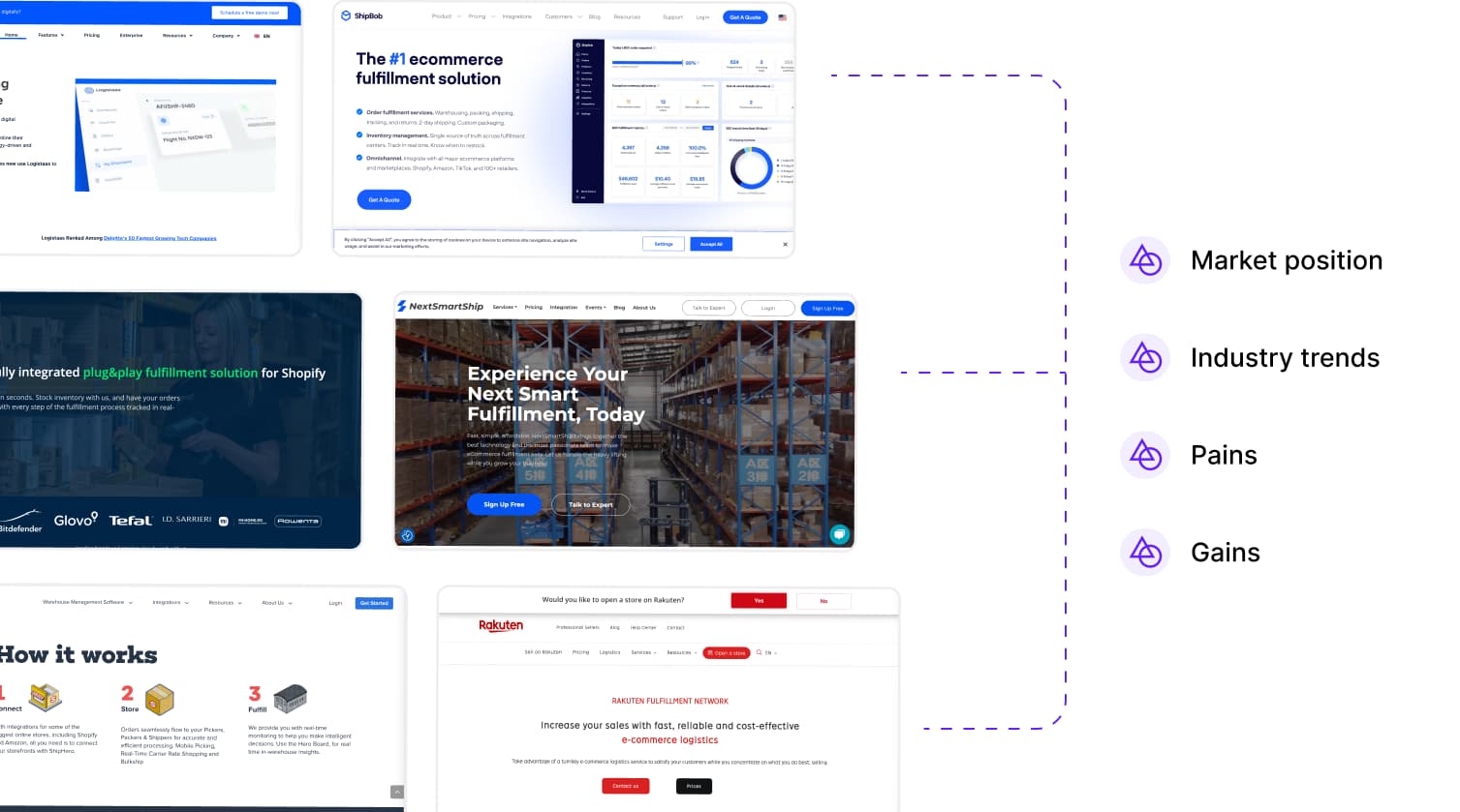
The goal of competitor UX evaluation is to identify their strengths and weaknesses from a usability and accessibility perspective. This has allowed us to set industry standards, establish reference points, and avoid mistakes while designing our solution.

3PL software UX evaluation

For instance, although ShipMonk is generally good software, it still faces significant issues that impact the usability and accessibility of the product. Key problems include small font sizes, poor contrast, and ineffective usability for filters and form-filling patterns.

Through this process, we aimed to surpass our competitors in functionality and usability. The competitor analysis revealed 22 UX issues that we wanted to solve and highlighted two standout practices that we were going to implement.

User research

Once you identify primary users and stakeholders, it’s time for user research. What worked best for us was inviting small business owners who have been using multiple software tools for local and international orders.

Here's the text to invite people on interview:


​​Subject line: We’d love your feedback on [Platform]

Hi [Name],

Your feedback on [Product] can help us improve it for you and others. It takes just 30 minutes, and I promise to keep it brief. As a small token of gratitude, I'll send you an Amazon eGift voucher :)

Interview details:

  • Date and Time: Please, schedule the interview at a convenient time for you via [Calendly / Google appoinment schedule, etc]
  • Platform: [Google Meet / Zoom]
  • Duration: 30-40 minutes

Thanks a ton for consideration.

Warmly,

[Your Name]
[Position]
[Contact Information]


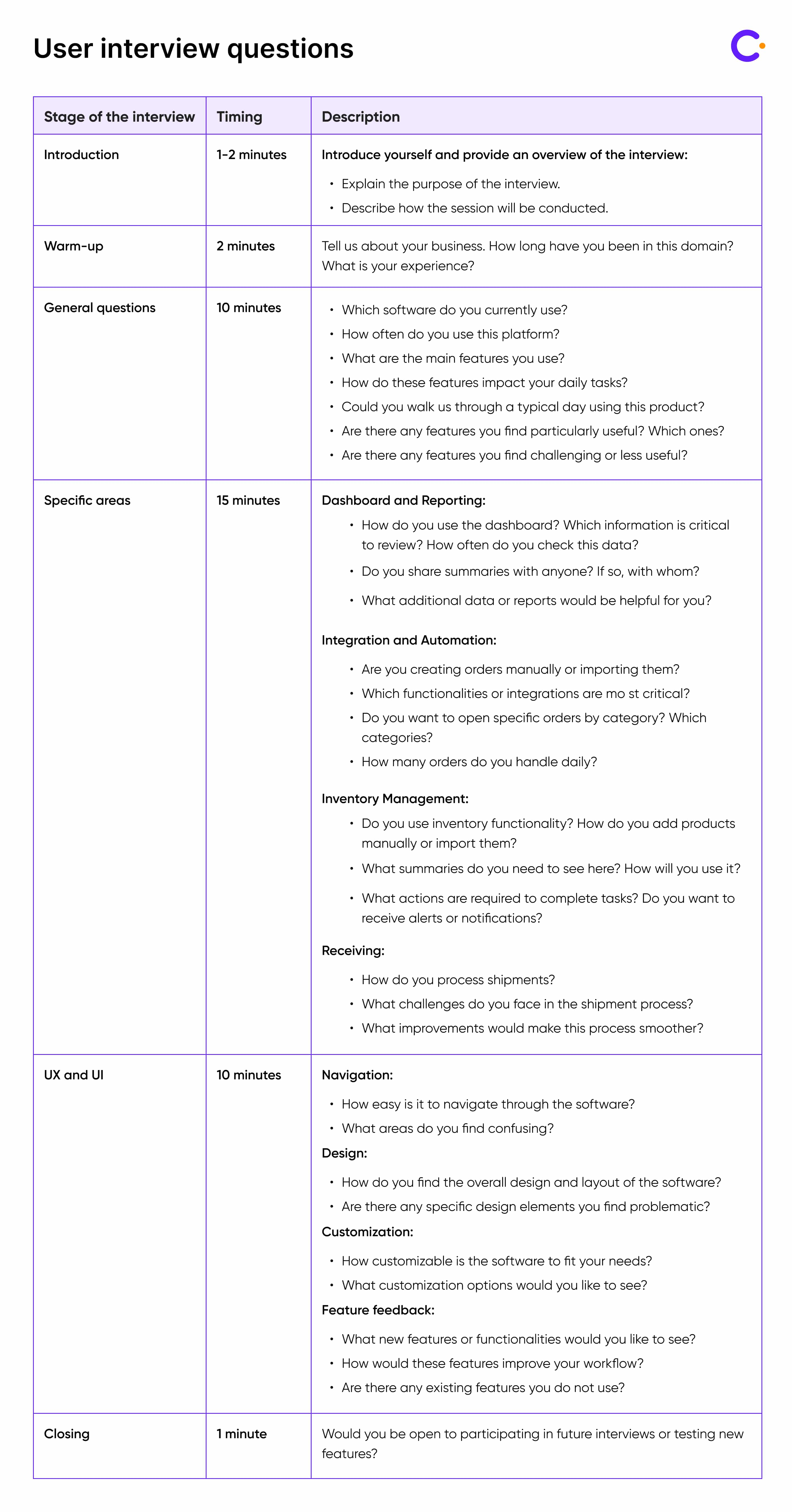
And below are the question to ask during the interview.

How to Design Effortless Shipping Management Software Cieden

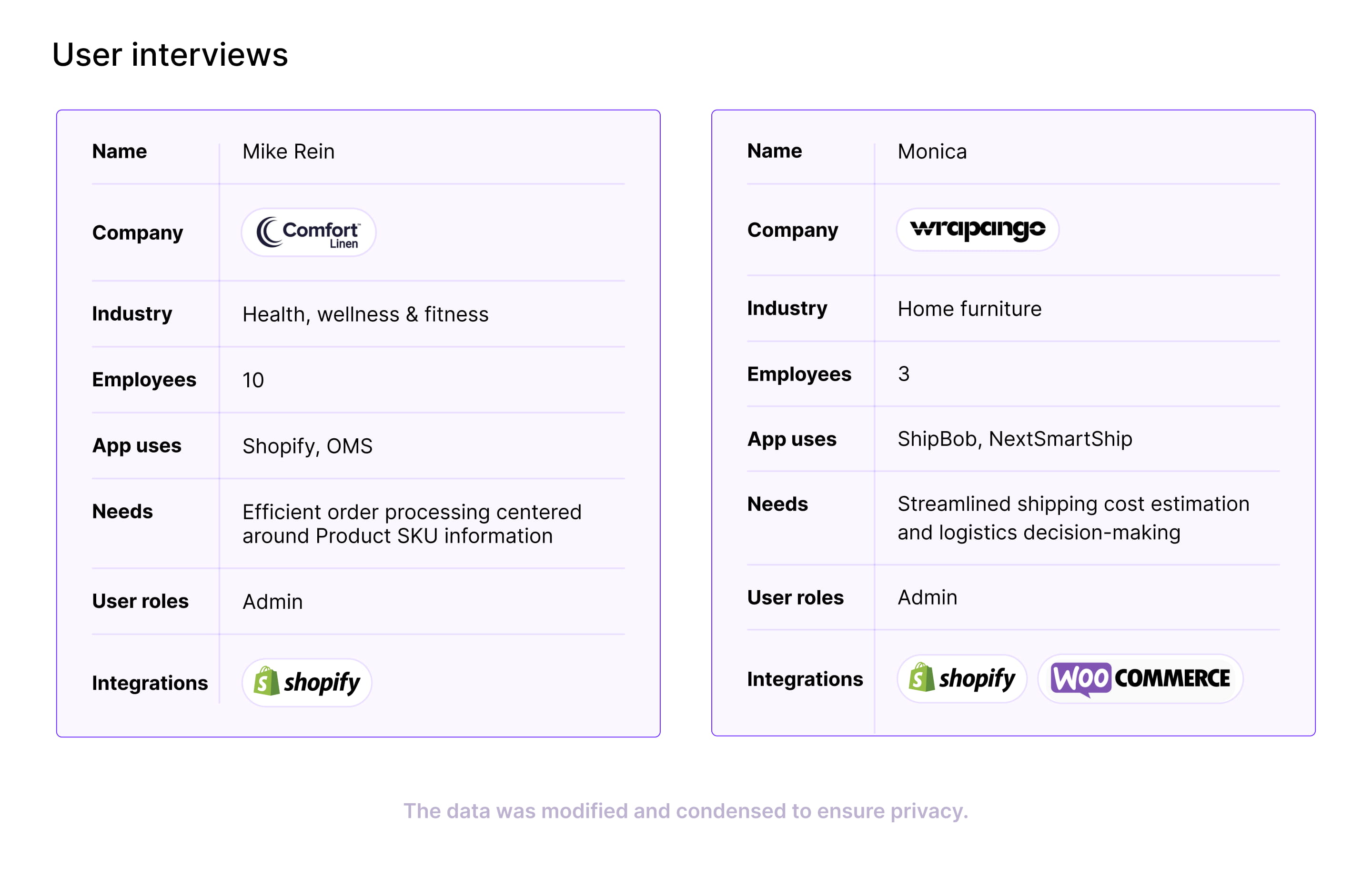
Analyzing user interview

Once we gathered user insights, we were able to analyze key pain points. 

logistics software user interview

Two major issues could be easily solved by our client’s product. We’re talking about ship mapping for local and international orders and a dashboard that provides a comprehensive overview of hundreds or thousands of orders.

This feedback led us to create a clear filter structure to make handling international orders as straightforward as local ones. This way, customers who use multiple tools could access what our product offers in one package.

Core features of shipping management software

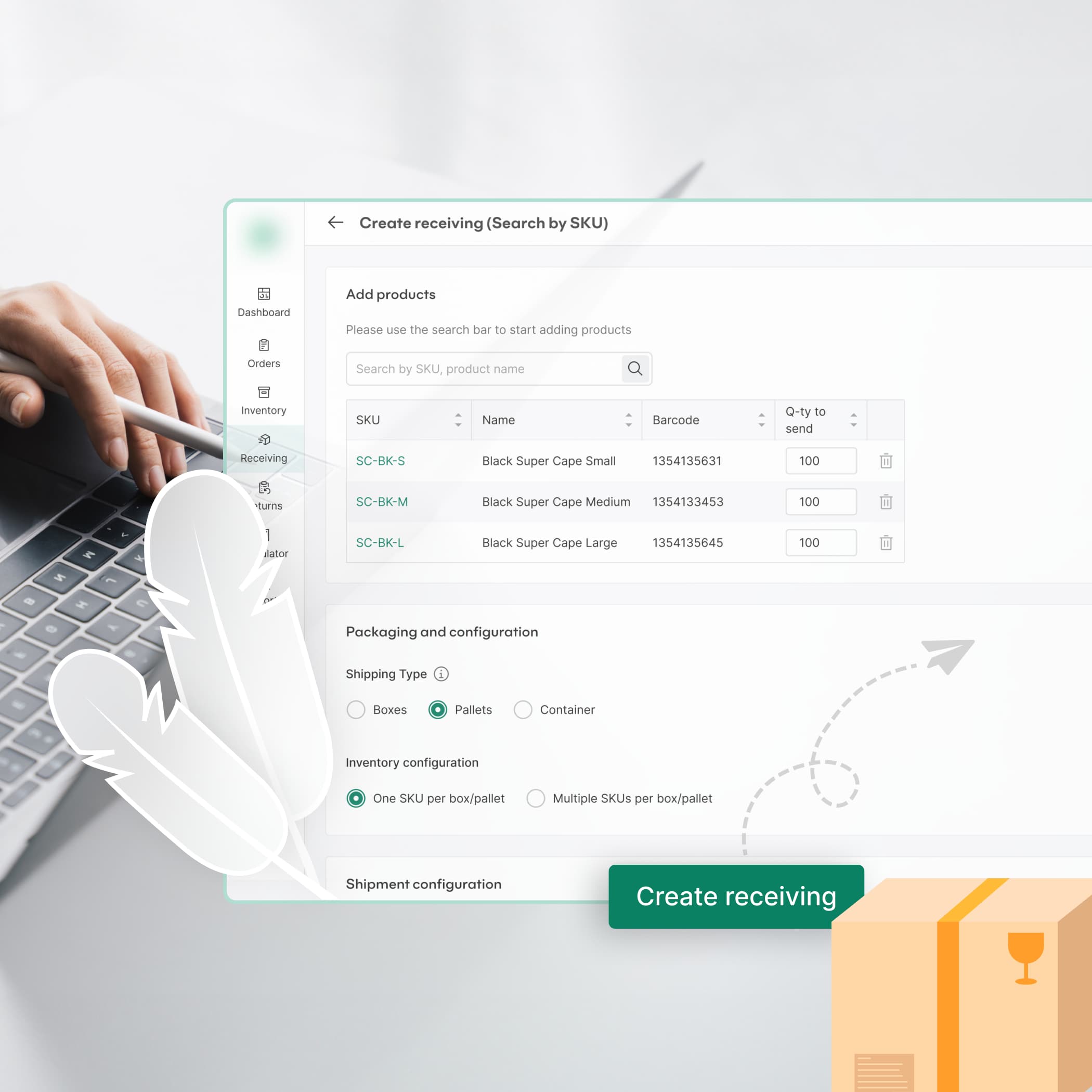
An effective shipping management software must include essential features that streamline operations and improve efficiency. Here are the key features, along with some good and bad practices. 

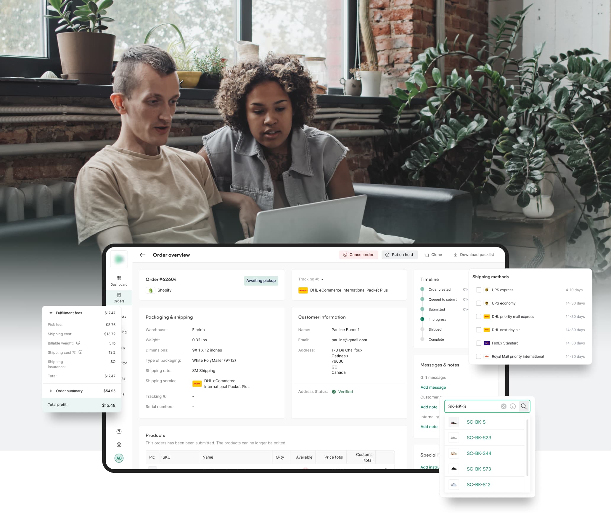
Order processing and tracking

Efficient order processing and real-time tracking are crucial for managing shipments. The software should allow users to easily process orders, generate shipping labels, and track shipments from origin to destination.


Order processing and tracking

Good practices:

  • streamlined order entry: Implement intuitive forms and automated data entry to minimize manual input and reduce errors.
  • real-time tracking: Provide customers and internal stakeholders with real-time visibility into the status of shipments through a user-friendly dashboard and mobile app notifications.
  • integration with inventory systems: Ensure seamless integration with inventory management systems to update stock levels automatically when orders are processed.

Bad practices:

  • manual data entry: Relying on manual processes for order entry and tracking can lead to errors and delays.
  • poor user interface: A cluttered or non-intuitive interface can frustrate users, leading to inefficiencies and mistakes.
  • lack of transparency: Failure to provide real-time tracking updates can lead to customer dissatisfaction and increased support inquiries.

Inventory management

Accurate inventory management is vital for preventing stockouts and overstocking. The software should provide real-time updates on inventory levels, enabling users to make informed decisions about stock replenishment and order fulfillment.

inventory management design

Good Practices:

  • automated stock updates: Use real-time tracking to update inventory levels as orders are processed and shipped.
  • forecasting tools: Implement tools for demand forecasting to help plan inventory levels based on historical data and trends.
  • low stock alerts: Set up automated alerts for low stock levels to ensure timely replenishment and avoid stockouts.

Bad Practices:

  • delayed updates: Delays in updating inventory levels can lead to inaccuracies and stockouts.
  • inadequate reporting: Poorly designed reporting tools can make it difficult to monitor inventory levels and trends.
  • over-complex systems: Overly complicated inventory management systems can be difficult to use and maintain, leading to errors.

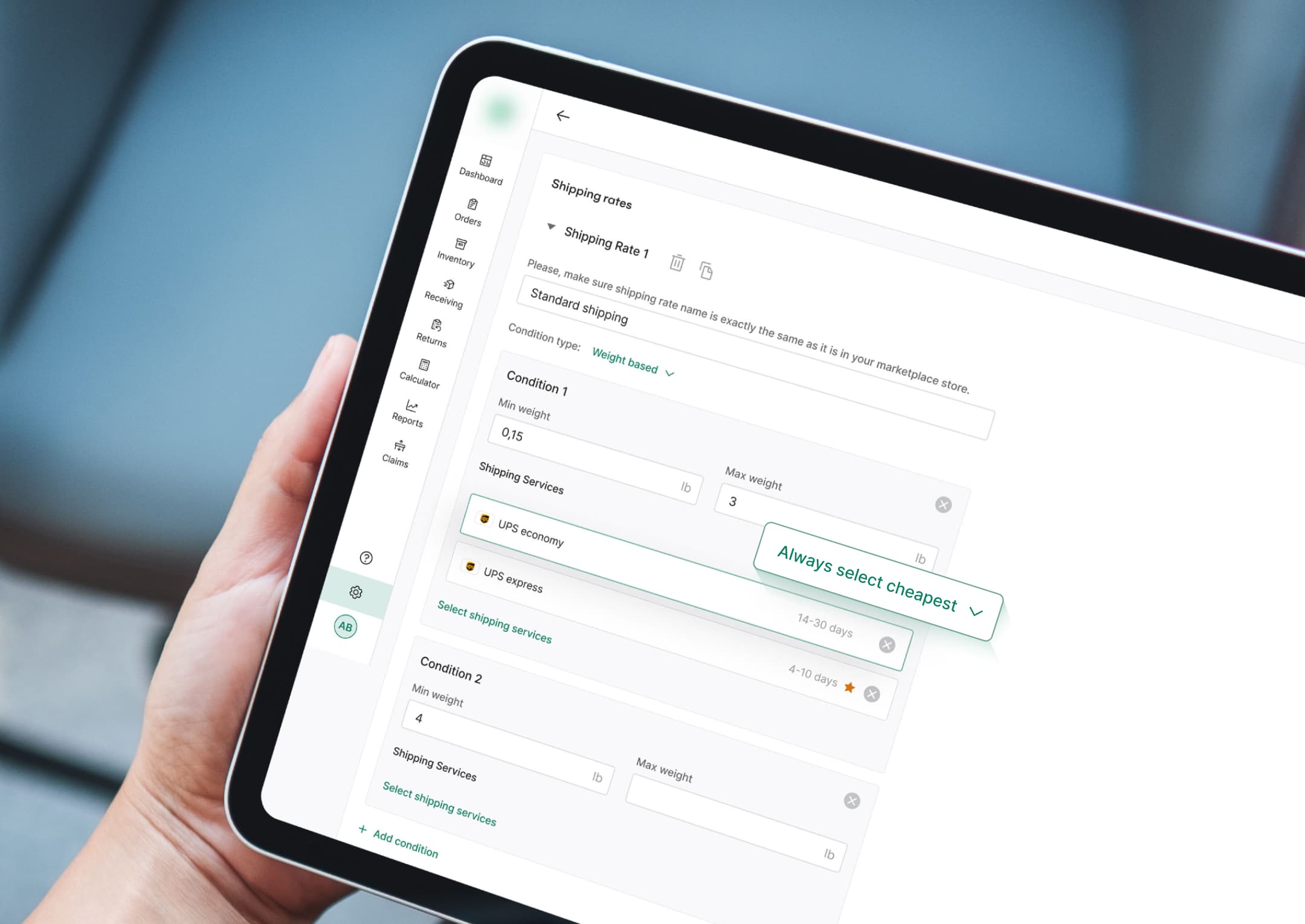
Multi-carrier support

Supporting multiple carriers allows users to select the best shipping options based on cost, speed, and reliability. The software should seamlessly integrate with various carriers, providing flexibility and optimizing shipping processes.
multi-carrier support

Good practices:

  • carrier integration: Ensure seamless integration with a wide range of carriers to provide users with multiple shipping options.
  • automated carrier selection: Implement algorithms to automatically select the most appropriate carrier based on predefined criteria such as cost, delivery time, and service level.
  • customizable shipping rules: Allow users to set custom shipping rules based on their specific needs and preferences.

Bad practices:

  • limited carrier integration: Restricting users to only a few carriers can reduce flexibility and increase costs.
  • manual carrier selection: Requiring users to manually select carriers for each shipment can be time-consuming and prone to errors.
  • inconsistent updates: Inconsistent updates from carrier integrations can lead to confusion and inefficiencies in the shipping process.

Designing the user interface

A well-defined visual hierarchy is essential for guiding users' attention to important elements and actions. This involves maintaining a clean and organized layout with a logical flow that ensures intuitive and efficient navigation.

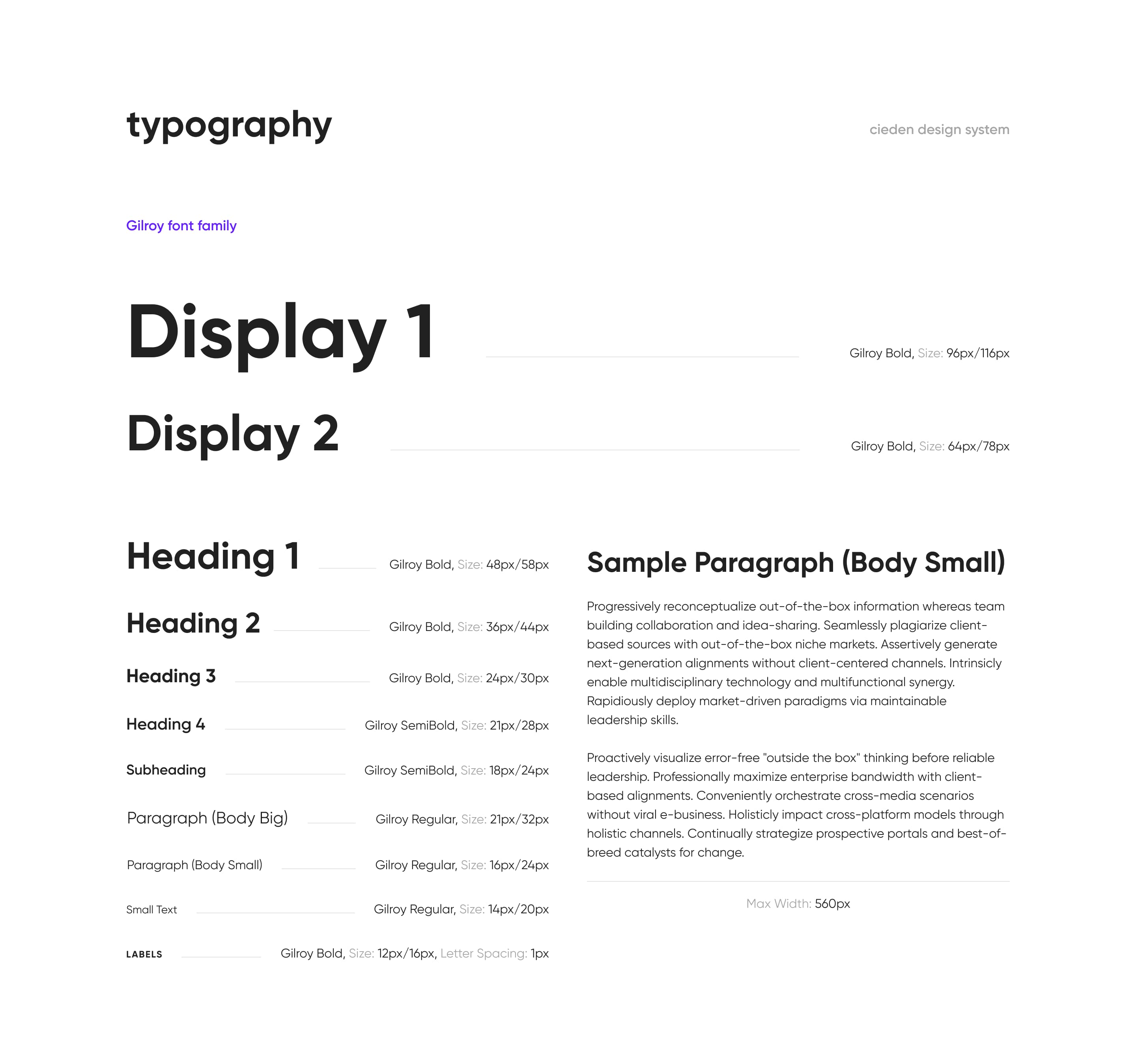
In addition to visual hierarchy, choosing the right typography is crucial for enhancing readability and user engagement. Fonts should be legible and appropriately sized, with a clear distinction between headings, subheadings, and body text. This ensures a cohesive and enjoyable user experience.

typography

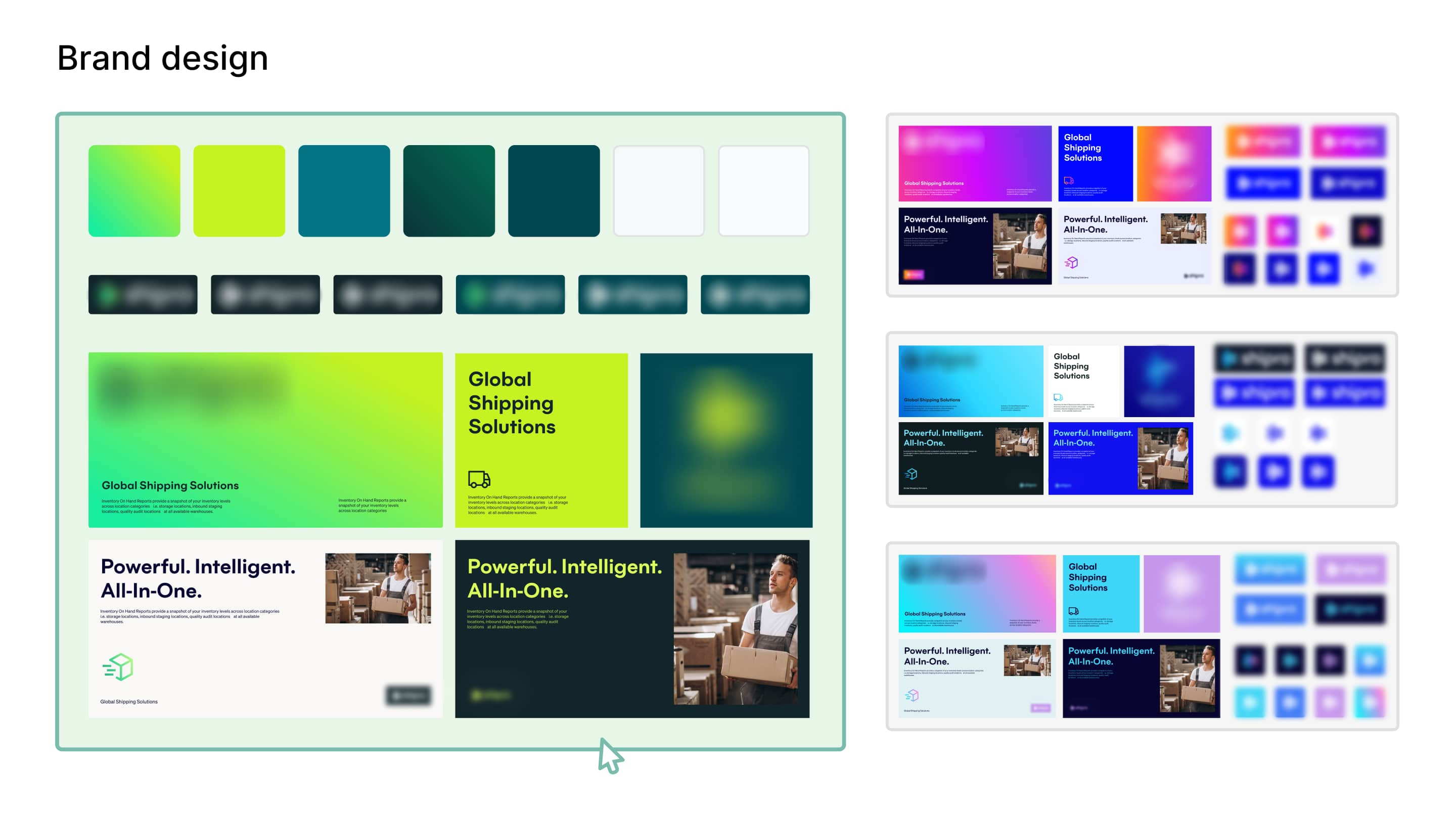
Color schemes and branding

Consistent color schemes and branding create a cohesive look and feel. Colors should align with the brand identity and be used strategically to highlight important information and guide user actions. Avoid using too much blue, as it's overused in this industry.

shipment platform design

Icons and graphics

Icons and graphics enhance visual communication and make the interface more engaging. They should be intuitive and complement the overall design, providing visual cues that help users understand and navigate the software.

Wrap up

Everything we’ve mentioned in this post is achievable within three months. This platform was designed from the ground up and was ready for development without any additional edits. This was possible thanks to the quality service blueprint, which was fundamental in understanding how the product works and how it can deliver value to users.

When designing shipping management software, it’s better to invest in the research phase at the beginning. It will pay off. 

Discover the full case study.

Within, you'll find a brief story of the project and description of the productfeatures with their designs.

Open

FAQ

What is the most important feature for UX in shipping management software?

The most important feature for UX in shipping management software is intuitive navigation. For example, ShipBob, a leading logistics platform, focuses heavily on providing a streamlined and user-friendly interface. Their dashboard is designed to present critical information such as order status, inventory levels, and shipment tracking in a clear and accessible manner. This reduces the learning curve and allows users to find information and complete tasks efficiently without confusion. According to a Forrester report, 70% of users expect websites to have easy navigation, underscoring the importance of this feature.

What are the common UX mistakes to avoid in shipping management software?

Common UX mistakes include overly complex workflows, lack of customization options, poor mobile optimization, and inadequate user support and training resources. For example, early versions of some logistics software like Freightos had overly complex interfaces that confused users. By simplifying their workflows and adding more customization options, they significantly improved user satisfaction. A survey by PwC highlighted that 32% of users would leave a brand they love after just one bad experience.

How do you ensure cross-platform compatibility?

Ensuring cross-platform compatibility involves designing a responsive interface that adapts to different devices and screen sizes and conducting thorough testing across various platforms and browsers. ShipStation is an excellent example, providing seamless functionality across desktops, tablets, and mobile devices. Their development team employs a mobile-first design strategy and uses tools like BrowserStack for extensive cross-browser testing. According to Statista, mobile devices accounted for 53.42% of global website traffic in the 4th quarter of 2023.

What are the best practices for performance optimization?

Best practices for performance optimization include minimizing load times, efficient database management, and continuous monitoring and updates to maintain optimal performance. For example, NetSuite employs caching strategies, database indexing, and asynchronous loading techniques to enhance performance. Their continuous performance monitoring setup alerts the development team to any degradation, ensuring swift resolutions. Google research indicates that a one-second delay in mobile load times can impact conversion rates by up to 20%, making optimization critical.

How can emerging technologies enhance UX in shipping management software?

Emerging technologies, such as AI and predictive analytics, can enhance UX by automating tasks, providing data-driven insights, and offering personalized experiences. For instance, UPS uses AI to optimize delivery routes, predict shipment delays, and personalize user interactions based on past behavior. This not only improves operational efficiency but also enhances user satisfaction by providing more accurate and timely information. Gartner predicts that by 2026, 75% of businesses will use generative AI to create synthetic customer data, highlighting its growing importance in enhancing UX.

start your project with us.

Getting in touch
is easy .
Thank you for your message. It has been sent