ux/ui essentials

Your Short Web Accessibility Checklist for All Users

15 min read
Your Short Web Accessibility Checklist for All Users Cieden

A beautiful website is great, if you can actually use it. But the reality is, the web isn’t always a friendly place for everyone. 

At Cieden, our focus has always been on designing a user experience that works for all users. Sure, a site might meet industry standards, but that doesn’t always mean it’s accessible. 

So, after conducting thorough research, we created this short web accessibility checklist for anyone curious about making your website or app genuinely inclusive.

Your Short Web Accessibility Checklist for All Users Cieden
Play

When a product is useful but not accessible

Why is web accessibility important?

Over 15% of the global population has some form of disability. That’s more than a billion people who might find themselves locked out of websites due to design choices. 

Disabilities are diverse, and each type can impact how people see, hear, click, or make sense of a website or an app. And while there is a wide variety, the major types can grouped into the following categories:

  • visual: Blindness, low vision, or color blindness make visual elements harder to see;

  • hearing: Deaf or hard-of-hearing users miss out on sound cues and need transcripts or captions;

  • motor: Limited movement can make using a mouse tricky—keyboard navigation helps;

  • cognitive: Memory or attention challenges can make cluttered sites and long blocks of text hard to manage. 

But it’s not just permanent disabilities. Think about temporary accessibility challenges (a broken arm or concussion), situational factors (bright sunlight or a noisy cafe), or simply aging eyes and hearing. And as the global population ages, more people than ever will need accessible design, which makes accessibility both a responsibility and an opportunity: you’re inviting a broader audience to engage with your brand and showing you truly care about inclusivity.

As you learn more along the way, you’ll find that addressing accessibility in this broader, more general sense almost always brings benefits that overlap with general web best practices:

  • improved usability and user experience; 

  • mobile-friendliness; 

  • device independence;

  • internationalization;

  • website responsiveness;

  • SEO boosts;

  • and even lower maintenance costs. 

Plus, accessible design keeps your site compliant with global legal standards like the US Section 508 or the EU Directive on Accessibility for Public Sector Websites. It’s a smart investment that pays off in user satisfaction and legal peace of mind.

Where to start?

There are many blogs on the best practices and tools that can help audit your website. But if you don’t want to get lost in a flood of information, here is a good starting point based on the WCAG (Web Content Accessibility Guidelines) from the W3C (World Wide Web Consortium). 

Together with the WAI that governs the technical aspects of an issue, the W3C standards are the top resource for all things accessibility, covering what it means for content to be accessible. 

But it can get pretty overwhelming, to be honest. So if you’re just starting, we’ve broken down the accessibility requirements into actionable, approachable a11y checklist steps, without getting into too much technical detail.

Web accessibility checklist

Checkpoint Done
Use high-contrast colors (3:1 big text, 4.5:1 small)
Don't rely on color alone, add labels/icons
Test for color blindness, avoid red/green confusion
Keep color scheme simple and consistent
Ensure text is clear on background images
Use readable font size (16px+ for body)
Space out text (1.5x line height, 0.12x letter spacing, 0.16x word spacing)
Left-align text paragraphs
Use simple, readable fonts (sans-serif), limit to 2-3
Ensure site works with keyboard only, highlight focus
Add "Skip to Content" link
Avoid automatic actions on focus
Add alt text for images
Include captions for videos, transcripts for audio
Organize headings in order (h1, h2, etc.)

Let’s get started!

Choose colors wisely

Did you know over 90% of online content relies on color to communicate? 

Color is powerful. It sets the mood, directs attention, and makes your site memorable. But for accessible web design, it needs to do more than just look good. 

Make sure your content doesn’t depend solely on sensory characteristics like color, shape, or size. Especially, the color should not be used as the only visible means of conveying information, indicating an action, prompting a response, or distinguishing a visual element. 

Of course, no colors are banned! But thoughtful color choices can make or break accessibility. Here’s what to keep in mind when choosing colors for your website or app:

1. Use contrast to stand out

To help everyone distinguish between elements on the page, prioritize color contrast. WCAG recommends a 3:1 contrast ratio for interactive elements and larger text (like buttons) and 4.5:1 for smaller text (Level AA conformity). When colors contrast well, users can quickly spot elements on your page.

Choose colors wisely

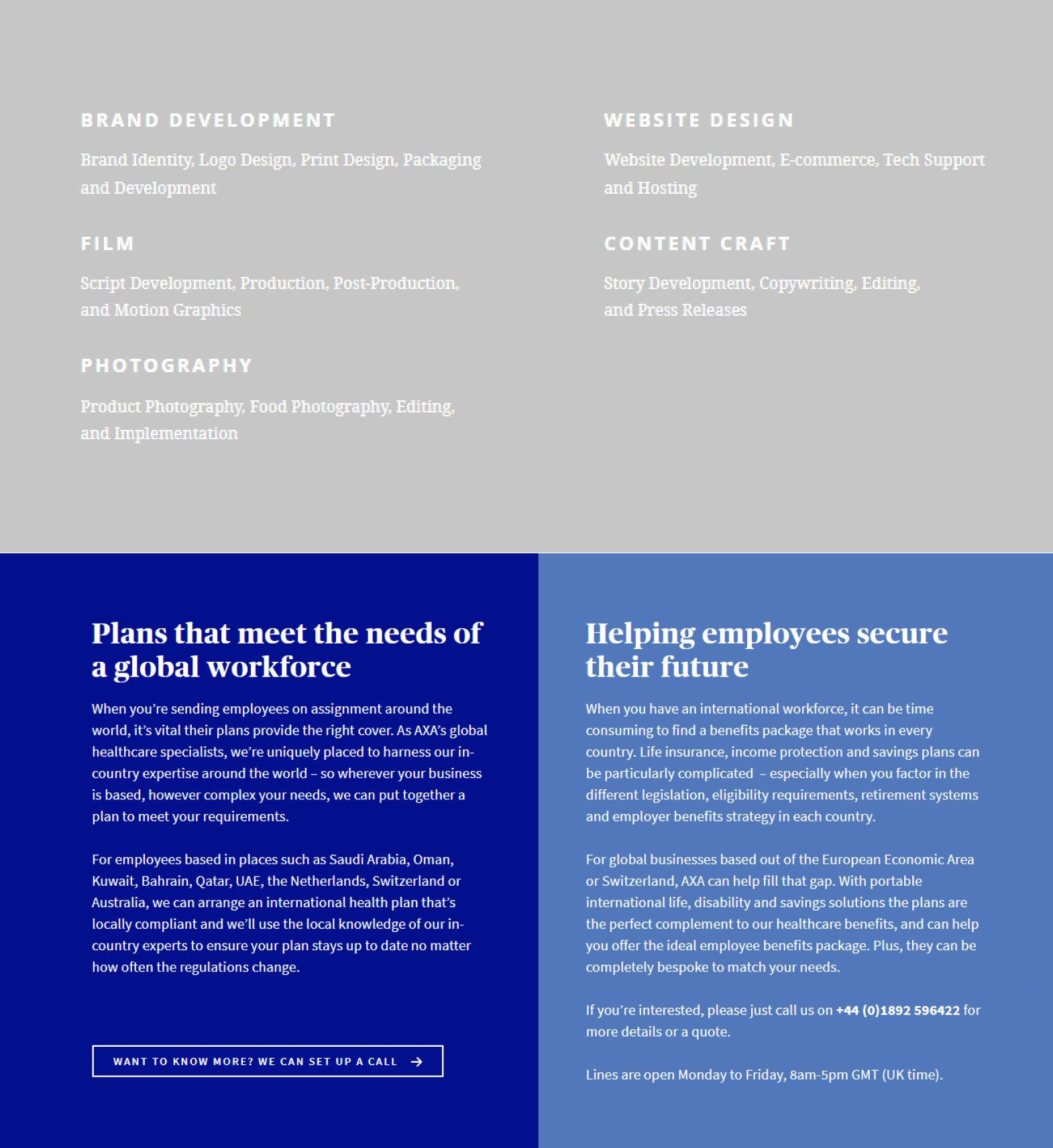
Top: TypesetDesign’s “About Us” page (Contrast Ratio: 1.7:1 - fails WCAG standards)

Bottom: AXA Global Healthcare’s interface (Contrast Ratio: 14.97:1 for the dark blue section and 4.58:1 for the light blue section - meets WCAG standards)

See how these contrast levels make the right side easier to read? 

When you choose high-contrast colors, you’re creating a smoother experience for everyone, especially users with low vision. And if you want to go the extra mile, aim for Level AAA by opting for even higher contrast ratios

Here are a few go-to tools to check and improve contrast across your site:

  • Contrast Checker and WebAIM: These tools analyze your color combos to see if they hit WCAG standards. Just plug in your background and text colors to see if they’re playing nice together. 

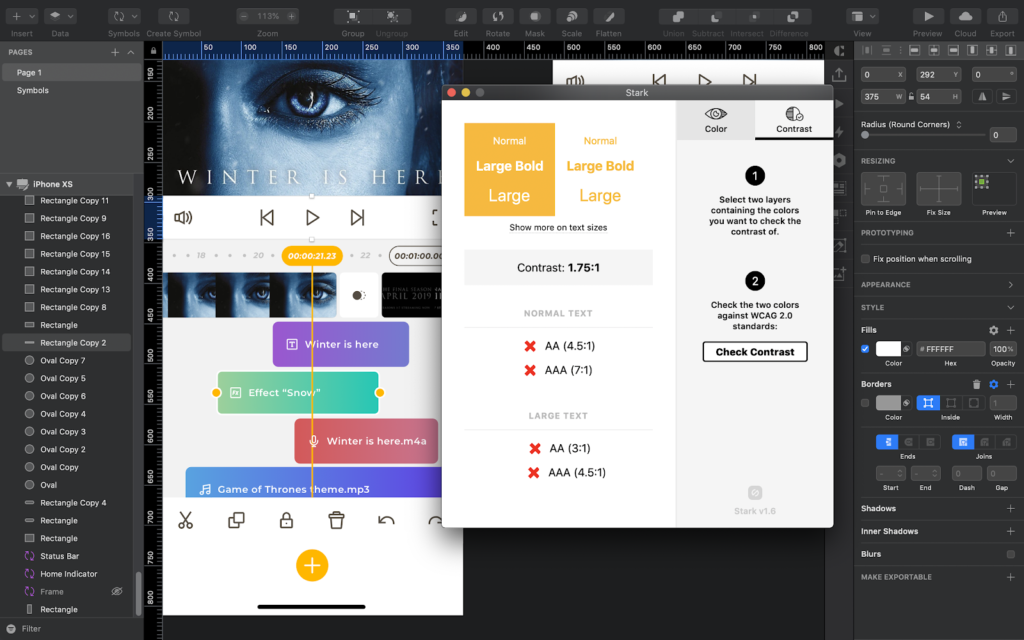
  • Stark Plugin for Sketch: This one’s a designer’s best friend. Stark not only lets you simulate color blindness and check contrast ratios but also suggests friendlier color combinations without sacrificing style. If your colors aren’t quite right, it can help you find options that look great and meet readability standards.
Contrast in accessible design

Stark plugin for Sketch

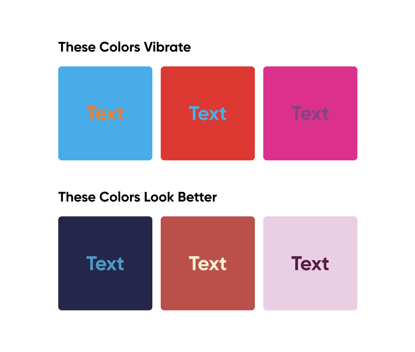
2. Say no to color clashes

Those neon color combos might catch attention, but they can also make people’s eyes hurt (or worse). Although vibrating color combinations pass WCAG contrast tests, they can be a nightmare for some users, even causing discomfort or triggering seizures. 

If you have any flashing effects, keep them below three blinks per second — nobody wants a light show when they’re just trying to read.

Choose colors wisely

3. Remember, not everyone sees colors the same way

Color blindness affects around 5% of men, with red-green blindness being the most common. So if your “Approve” button is green and the “Reject” button is red, that important visual cue might be lost on some users. 

To illustrate, they might see your website like this:

Choose colors wisely

Test how your design looks to people with different types of color blindness using this tool. And don’t rely on color alone. Back it up with icons, labels, or textures so that everyone gets the same message.

4. Keep it simple

More color isn’t always better. Too many hues can make a site chaotic and confusing, especially for users with cognitive disabilities. 

Choose a consistent, limited palette to guide users through the page. Think about it: you’re less likely to get lost on a clean site like TimeOut than on a Round Table pizza delivery page. Less visual noise = a more pleasant, less overwhelming experience.

Choose colors wisely

You can get lost on the site of Round Table pizza delivery compared to minimalistic and conservative TimeOut.

5. Mind the Backgrounds

Using images as backgrounds is trendy, but they can backfire if text gets lost in the colors. Your text should always be easy to read, even over a busy image. 

Here’s a tip: if you use images as backgrounds, try a color overlay to make the text stand out. Compare these two:

Choose colors wisely

Top: Opodo's hidden menu blended into the background image, making it tough to see (they fixed it, though!).
Bottom: Deuter used a background color for Menu to make it visible on the bright background.

Design text and fonts everyone can read

How text looks and feels can make the difference between someone effortlessly reading or struggling through every line. Let’s talk about the four essentials: font size, spacing, alignment, and style.

6. Set a readable font size

When it comes to font size, bigger is often better. 

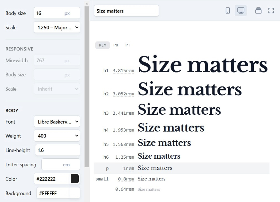
While most browsers let users adjust text size, not everyone knows how to do it or wants to mess with their settings. 16px for body text is a good starting point — large enough to be readable without overwhelming the page. As per WCAG guidelines, users should be able to resize all texts on the page to up to 200% without horizontal scrolling.

Importance of size in accessibility

Pro tip: use relative units like percentages or ems instead of fixed pixels. This approach lets your text scale smoothly across devices, making it easy for users to adjust sizes without disrupting the layout.

7. Add space for better readability

Believe it or not, line spacing (lead) can be just as important as font size and really affects the feel of a design, the typographical rhythm, and accessibility. Crowded text feels cluttered and becomes harder to read, while overly spaced-out text can feel disconnected. Users with cognitive disabilities or visual impairment may also have difficulties tracking lines of text when they are spaced too closely together.

Spacing and its impact on readability

Here are the accessibility guidelines for letter, word and line spacing:

  • line height (line spacing): at least 1.5 times the font size;

  • letter spacing (tracking): 0.12 times the font size;

  • word spacing: 0.16 times the font size.

Keep line length manageable, too. Ideally, each line shouldn’t exceed 80 characters or glyphs (40 for languages like Chinese, Japanese, and Korean). For extra comfort, aim for 40-60 characters or even 20-40 for short English body text to reduce eye strain and make text easier to follow.

8. Align text to the left

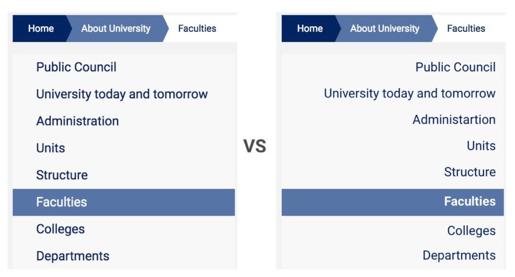
Eye tracking studies show that left-aligned text is the easiest to read. Many people with cognitive disabilities have a great deal of trouble with blocks of text that are center-justified, while right-aligned texts reduce reading speed and comfort levels, disrupt the flow, and force readers to search for each new line’s starting point.

Alignment comparison example

9. Choose simple, readable fonts

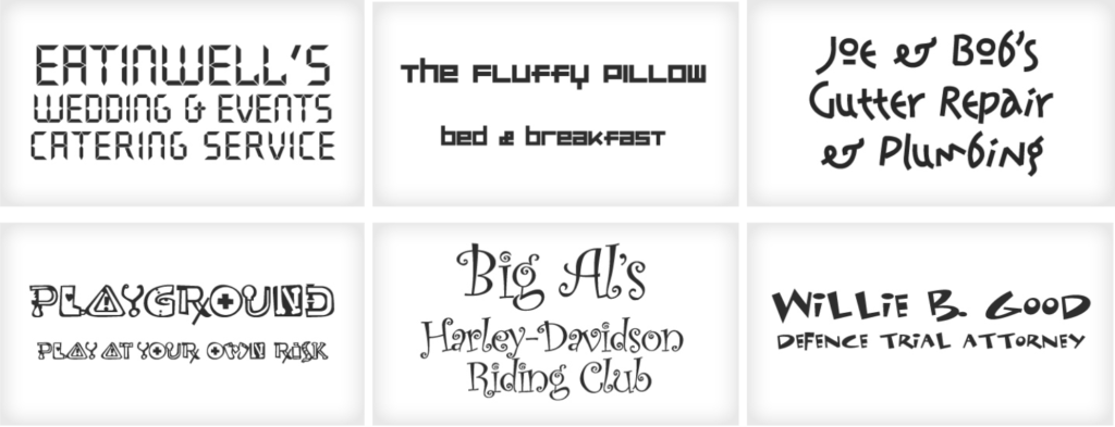
While there are no hard-and-fast rules about fonts, they should, of course, be clear, readable, and readily available on users’ computers. Fancy cursive and fantasy fonts might be great on a wedding invite but aren’t ideal for web content. Stick with sans-serif fonts for body text — they’re clean, professional, and easy on the eyes. 

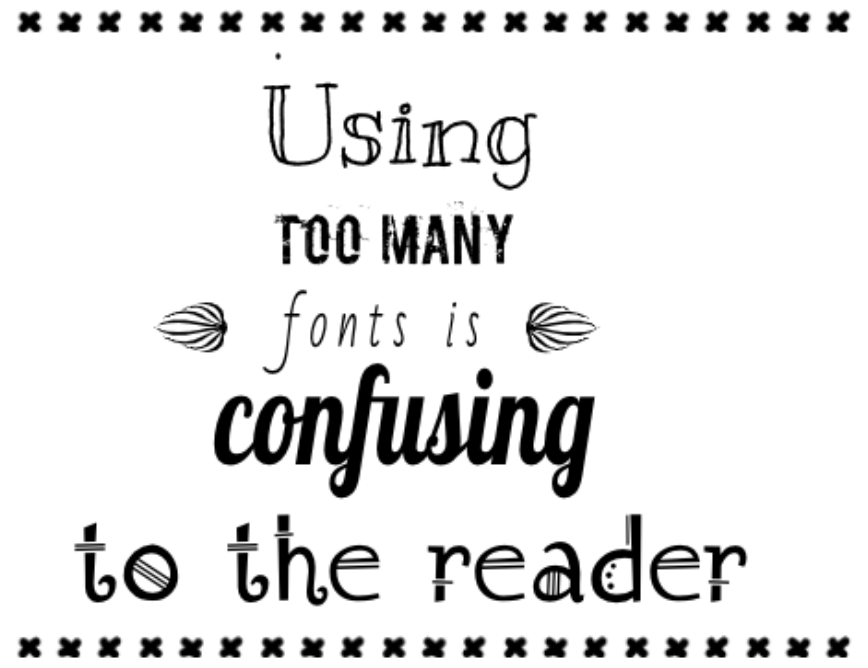
And let’s keep it consistent: two or three fonts per design max. Mixing different fonts can create a confusing visual layout, especially for those with learning disabilities or attention deficit disorders.

Here are some examples of poor typography:

Example of poor typography

and lastly …

Example of poor typography

Simplify navigation for inclusive access

Good navigation should work for everyone, whether they’re using a mouse, keyboard, or screen reader. Here’s how to keep things simple and frustration-free, so every user can find their way around your site easily.

10. Make navigation and layout keyboard-friendly

A truly accessible website doesn’t require a mouse. That means every page, link, button, form, and interactive element should work smoothly with a keyboard only.

Most people using keyboard-only navigation rely on the Tab and arrow keys to move between elements, and the Enter/Return key to make selections or submit answers. Here’s what that means for you:

  • show keyboard focus: Make sure there’s a visible indicator, like an outline, that jumps between areas on a page in a meaningful sequence as users tab through. This “keyboard focus” makes it crystal clear which element they’re interacting with.
Your Short Web Accessibility Checklist for All Users Cieden

Source: Ahrefs

  • avoid keyboard traps: Don’t let users get stuck! Keyboard traps happen when someone tabs to an element (like a modal or popup) and can’t move away. Always make sure users can freely tab in and out of any element.

11. Add a “Skip to Content” link

Sometimes, people just want to get to the main event without tabbing through menus, headers, and sidebars. A “Skip to Content” link at the top of your page gives users a shortcut straight to what they want to see, letting them bypass blocks of repetitive elements.

Your Short Web Accessibility Checklist for All Users Cieden

Source: Mailchimp

12. Prevent unexpected jumps

When someone tabs to a new element, this shouldn't initiate a change of context. Focusing on a menu item, for instance, shouldn’t automatically open a dropdown — it can be jarring and throw people off track. Instead, let users control when they expand or interact with elements.

When a page contains dynamic content, use ARIA landmarks to tag areas of the page, so screen readers know what each section is without guessing. This keeps things organized and user-friendly.

13. Add Alt text and captions for non-text content 

To work around accessibility issues, many people use assistive technologies to browse the Internet, like screen readers that vocalize the text on each page, Braille terminals, and alternative keyboards

But these assistive devices need a little help, too. 

Every image, video, and graphic on your site should come with alternative text (Alt text) in the markup/code so that assistive technologies can reproduce this content and help users “see” the image’s purpose, even if they can’t see it. 

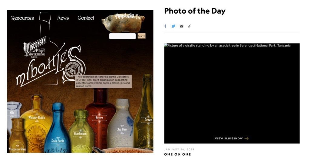
Good alt text provides the message you wish to convey, so users get the full picture (literally!). This text appears inside the image container in cases where the image cannot be displayed. The image title is another feature that can be added to the image tag, which is displayed in a popup.

Non-text content should have alternative representation

Title tag on Mr. Bottles website / Alt tag on National Geographic website

The exception to this rule is when an image is used purely for decoration, like background flourishes or tiny icons with no direct meaning. In cases like this, the alt text can be left empty. This tells screen readers to skip it, keeping the user focused on the main content.

14. Use captions and transcripts for videos and audio

Adding captions is helpful not just for people with hearing impairments but also for users who may be using your website somewhere where they can't play audio, like in a quiet office or other noisy locations. 

For video clips, in-sync captions work best, so they move along with the video. For podcasts and audio content, provide text transcripts. They’re a bonus for SEO too! Just consider including your keywords whenever it makes sense to do so.

Captioned image and subtitles for video examples

BBC (left: captioned image; right: subtitles for video)

15. Structure content with headings that work

Assistive technologies, like screen readers, rely on a heading structure to navigate through content, and accessibility guidelines dictate the logical focus order, where headers, paragraphs, and sub-headers should be organized based on content direction.

Here’s how to do it right:

  • use <h1> for the main title: Start with an <h1> tag for the primary page title, and reserve this tag for the top title only.

  • follow the order: Keep headings in logical sequence (<h2> for subheadings under <h1>, <h3> under <h2>, etc.). Skipping levels (like jumping from <h1> to <h3>) can make content feel out of order and confuse screen readers.

We hope that this quick website accessibility checklist provides enough information for you to get an idea of how to build a more accessible website or app. 

The best part? You don’t need to do it alone! You can conduct your accessibility audit by using such tools as WAVE, AChecker, PowerMapper, Tenon.io, or browser extensions.

Making your site work for everyone, no matter their abilities, is definitely worth the effort. And if you need a hand, we would be more than happy to assist you on your quest!

FAQ

What is website accessibility?

Website accessibility means designing a site so that everyone, including people with disabilities, can use it comfortably. This includes things like readable text, easy navigation, and adding descriptions to images. It’s all about making sure no one is left out and everyone has a smooth experience.

How to test a website for accessibility?

You can test a website’s accessibility with tools like WAVE, Axe, or Lighthouse, which help find common issues. It’s also good to try navigating with just a keyboard or using a screen reader to spot anything tricky for users. Mixing both tool-based and hands-on testing gives you the best results.

How to check accessibility of a website?

Start by running your site through free tools like WebAIM or Google’s Lighthouse, which scan for things like text contrast and missing image descriptions. Then, check that you can navigate everything with just a keyboard. This quick approach covers a lot of the basics.

How to audit a website for accessibility?

To audit for accessibility, use tools like WAVE or Tenon, and then do some manual checks. Automated tools spot many technical issues, while manual testing makes sure real users can easily navigate and interact with the site. A mix of both helps make the site easier to use for everyone.

Why is website accessibility important?

Accessibility matters because it means everyone can use and enjoy your site, including people with disabilities. It’s also legally required in many places, plus it can improve your site’s SEO and user satisfaction. An accessible site makes things easier for everyone, whether they have a disability or just need a little extra help navigating.

start your project with us.

Getting in touch
is easy .
Thank you for your message. It has been sent