
What is typographic hierarchy?
Before digging deep into the practical implications of typographic hierarchy, let’s make sure we understand what it is.
Typographic means that it has to do with typography; in turn, typography is the process of arranging letters, numbers, symbols, and other text elements.
Hierarchy implies that elements in the text are not equal in terms of their importance. This inequality is manifested through font styles, sizes, weights, colors, and other attributes.
All in all, this means that typographic hierarchy is a system of relationships among text elements that should emphasize the elements that matter most, and subsequently, deemphasize elements that are more supplementary.
You can find plenty of examples of typographic hierarchy in your day-to-day life. This article, for instance, is structured with headers, subheaders, and other formatting options to make it easier for you to read.
Why is hierarchy important
Now that we know what typographic hierarchy is, let’s break down why it is important. We, at Cieden, believe that visuals speak louder than words, so take a look at the example below. Which copy is easier and more pleasant to read?
We think the answer to the previous question is quite obvious. Typographic hierarchy makes large pieces of text legible and skimmable. This, in turn, has numerous business implications. More on that later.
Elements of typographic hierarchy
Since this article is about hierarchy, let’s imagine that you’re working on a design project and have already chosen a font to work with. Let’s now list the ways you can harmonize the text within your product or marketing campaign:
- size;
- weight;
- color;
- contrast;
- case;
- position and alignment.
Let’s break down all of these in more detail.
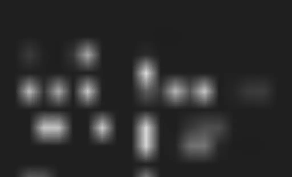
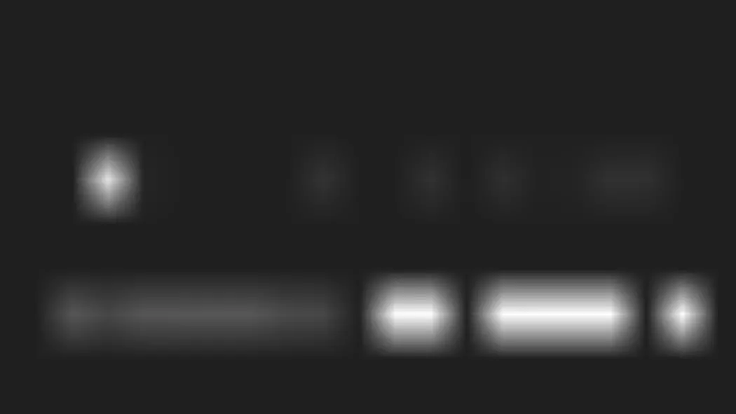
Size
Size matters. Especially when it comes to typography. It is the most obvious and intuitive way to differentiate one piece of text from another. Larger equals more important.
Typically, headers and titles are significantly larger than regular body copy.
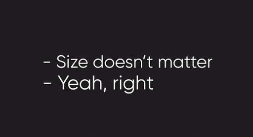
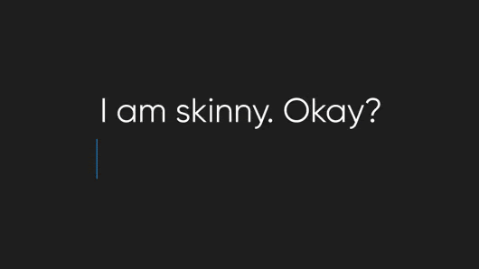
Weight
While shaming people for being too skinny or fat is bad, typography is a different ball game. The fatter the letters are, the more important and conspicuous they appear. Take a look at the example below.
Color
Typically, brands have two or three main brand colors. This means that you should exercise caution when using additional colors to differentiate elements from one another. Your website is not a rainbow, so be mindful of introducing new colors.
When using color to emphasize a text element, be sure to use colors that you already use on your website/app.

Contrast
Contrast is less about emphasizing and more about the text being readable. For instance, the grey text on the black background is barely legible. So, while choosing a background and the font color, be mindful of the contrast issues.
Case (lower / upper case)
Using all-caps might come in handy above and beyond having online arguments; it can also be helpful in product and marketing typography! Upper case words and phrases are regulars in landing page hero banners, for example.
Position and Alignment
Position and alignment are most significant when it comes to copy structure. When writing about complex topics that have a multilayered structure, be sure to make the hierarchy of elements crystal clear.

UX and business implications of typographic hierarchy
Now that we broke down all ways of establishing typographic hierarchy, let’s take a look at why it’s critical for your digital products and marketing.
1. All digital products rely on text
For the sake of an experiment, we took a screenshot from Amazon and removed all the text. Sans text, the interface immediately stopped making sense. We’re sure that the same thing would happen with any other website/app we chose. As you can see, all products, both digital and analog, heavily rely on text.
Since pretty much any product relies on text as the core means of communication, our job is to make this text readable and skimmable. This way, users are able to consume important information in a logical manner and thus efficiently use your product.
2. Guide users through your product
As soon as users land on your website or app, they begin to actively interact with it. It is your job to easily convey what you do, why people should choose you over your competitors, and what next steps they should take.
Take a look at the example of our homepage below. Even at first glance, It’s quite conspicuous that we do design. Since we are a service provider, the key call to action is “contact us”. Upon scrolling further, the information is logically structured to provide leads with everything they need to make a decision.
3. Increase conversions
On average, a user spends about 15 seconds on a website while looking for information. That means you have 15 seconds to capture someone’s attention and encourage him or her to keep investigating. You can read more on this critical timeframe in an article by quicksprout.
Let’s be pessimistic for a second. Let’s assume that a website visitor quickly scrolled through your page, didn’t find the information he/she was looking for, and left your website. Google would notice this behavior and deem the webpage irrelevant to that person’s search query. When this happens at scale, the results can be disastrous for your website’s SEO (search engine optimization). As a result, you should do your best to capture the reader’s attention and make finding information effortless for the sake of your SEO and actual conversions.
Conclusion
Through this article, we’ve established how typographic hierarchy is a system of relationships among text elements on a page. The hierarchical system implies inequality among these elements. The more important the element, the more effort should you put into emphasizing and differentiating them. You can do that by changing the size, weight, color, contrast, case, position, and alignment.
Keeping these principles in mind will help you make your copy legible and engaging, which, in turn, will help you boost conversions and retain users on your website longer.

