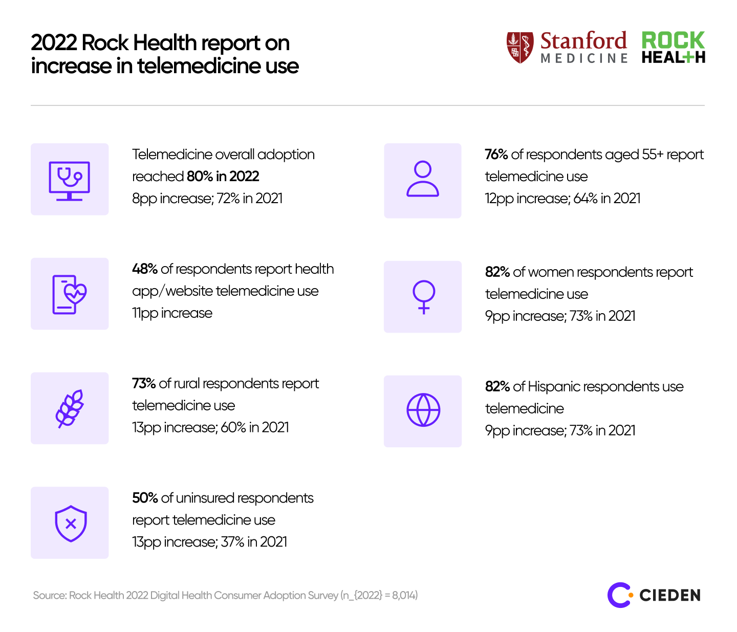
According to a 2022 Rock Health report, telemedicine reached the 80% adoption mark in 2022, up from 72% in 2021. It has become the preferred channel for prescription care and minor illnesses. Use of telehealth increased significantly among respondents aged 55+ (12% increase), rural residents (13% increase), and respondents without health insurance at the time of the survey (13% increase).
Undoubtedly, telehealth, supported by cloud and mobile services, makes healthcare more accessible, efficient, and convenient.
As demand for telehealth services rises, startups and enterprises will face increasing challenges. These include data privacy, regulatory compliance, system interoperability maintenance, patient data security, and high development costs.
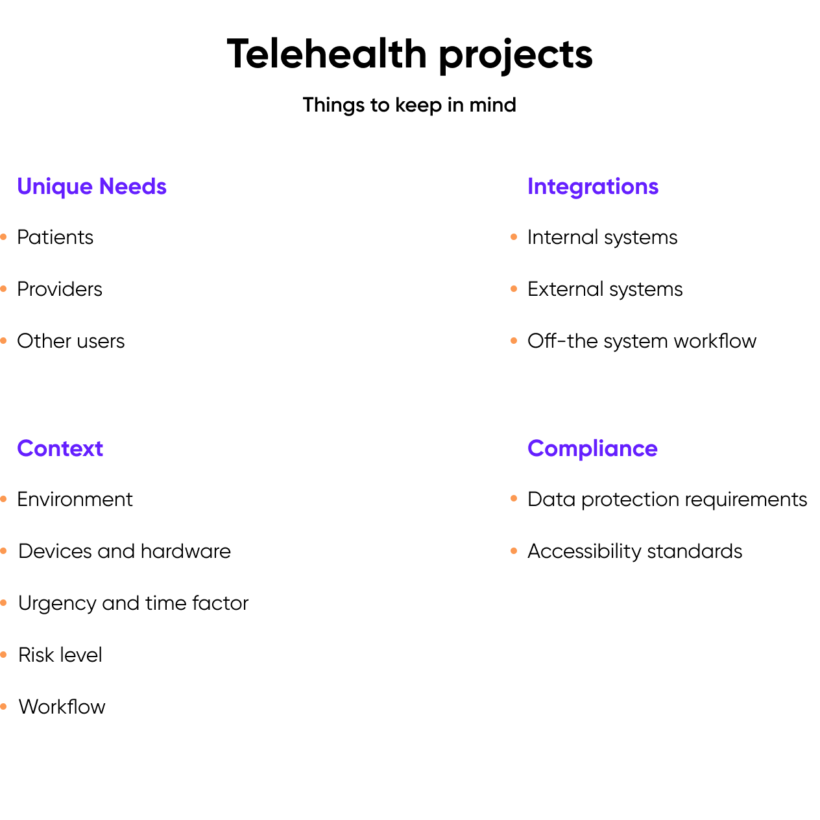
To minimize challenges, prioritize extensive research and discovery work early in the product development. In this article, you’ll get a glimpse of how we do it at Cieden when creating telehealth product design. You will learn how to uncover real user needs, understand the product's usage context, identify essential UI elements and integrations, and meet regulatory compliance requirements to create products your users need and will love.
Our approach to telehealth product design
1. Understand users and their unique needs
One of the most critical parts of product design is to understand user needs. The same logic applies to the telehealth industry: you need to recognize who is going to use this product. Creating a user persona is a good start, but it’s not enough for uncovering deeper knowledge and empathy.
There are almost always multiple user types on telehealth platforms, and each has its own unique goals, needs, frustrations, motivations, workflows, and tasks. The complexity of each user often leads us to use several different user research methods and process analysis techniques. For example, we use customer journey mapping and service blueprints to document all user interactions with a solution or service.
Returning to the creation of user personas, here are some common characteristics we typically define when working on telehealth app design:
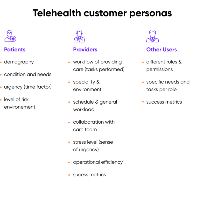
Patients
Telehealth patients, by definition, need assistance with their health. However, the degree and nature of their needs can vary quite drastically. Proper research helps us understand the potential health problems we seek to address via any given company or app, what the environment of those patients may be, and how we can best meet their needs. No matter the type of patient we are principally designing for, we like to create quick and easy onboarding flows that concurrently educate users on how to use the system and achieve their goals.
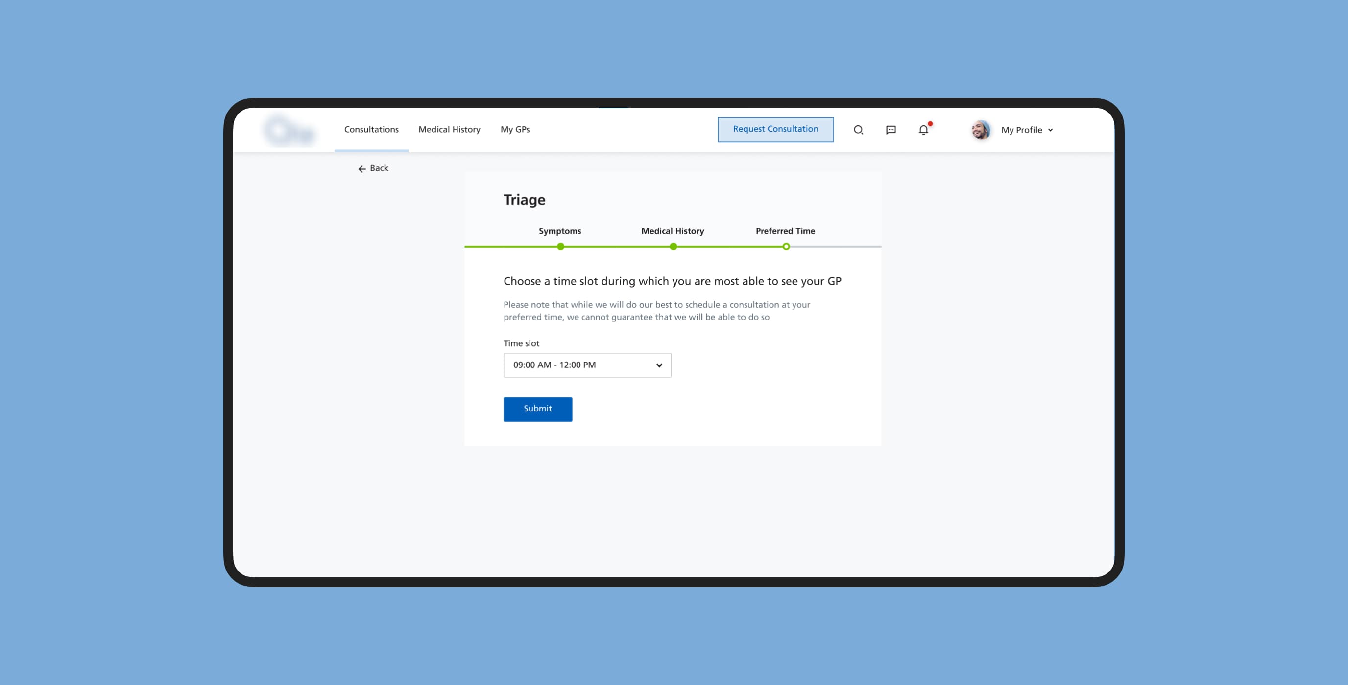
Emergent patients: While most emergent patients call 911 or get themselves to an emergency room, there are still digital solutions that are designed to assist hospital staff in providing the fastest, most quality care possible to patients.
Non-emergent patients: These patients do not need emergency assistance but still suffer from issues that should be addressed within 24 hours. Fatigue, irritability, pain, and other factors must be considered when designing a software interface for these types of patients. Their tolerance for confusing telehealth web design is typically much lower than it may normally be under other circumstances.
Chronic or specialist care patients: Chronic care or specialist needs, while serious, are not always emergent. In situations like this, the patient is probably looking for a very specific service provider to help them and is willing to spend time and effort researching the best options available. Family members and friends may also partake in the research process. Situations like these call for collaborative efforts, note-taking, aggregating data from multiple sources, and facilitating easy and friendly communication between the patients and service providers.
Elderly patients: Elderly users often get lost when using new technologies. They may also have vision, hearing, and memory impairments that can interfere with their ability to use an app effectively. In healthcare product design intended for older users, we focus on reducing clutter, ensuring ease of explanation for family members, and providing straightforward access to operator assistance.
Patients with disabilities: Patients can also grapple with different types of disabilities, which affect nearly 1.3 billion people globally. This makes it so important to design software that meets accessibility standards.
Providers
Different medical specialties have their unique workflows that affect how providers operate. Although these workflows can vary widely, we often see that providers work under tight schedules with many responsibilities and little room for error. This pressure needs to be considered when designing solutions to support them.
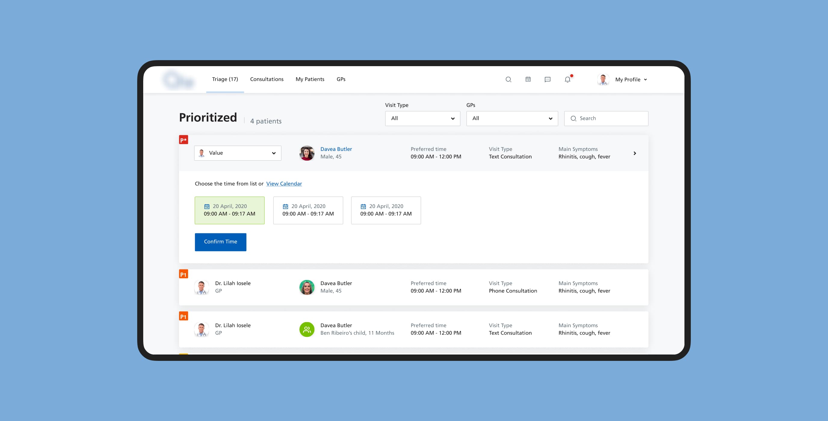
A product designer’s goal isn’t to disrupt these established operations, which are usually based on regulations or years of practice. Instead, it’s about enhancing their daily routines to make their workdays smoother, less stressful, and less prone to mistakes.
To achieve this, product designers should study operational workflows closely, map existing digital solutions within those workflows, and then come up with the right solution that harmoniously fits into the overall environment.
Administrators
Other healthtech users include:
- medical system managers interested in operational reporting;
- platform administrators who manage permissions and custom settings;
- insurance company representatives;
- ongoing post-care support staff.
Once we identify and map out each user persona for the software, we can make our UI/UX design for healthcare more valuable and usable.
2. Know the context
The users’ environment — that is, the actual physical and digital surroundings of any given customer — is an extremely important aspect of healthcare design.
The first question to ask yourself when fleshing out the user environment is what device will be used to access the software. Will it be a desktop, mobile phone, tablet, TV, or custom hardware? There are many possibilities to consider.
For example, a patient may often just use their phone, but providers can use several devices with different software programs running simultaneously. These multiple devices can be a part of one single workflow, and different features within the hardware and software can complement each other throughout. On the contrary, other features can be inaccessible on mobile phones due to security issues.
Devices aren’t the only factors to consider. Physical location is often just as important: healthtech can be deployed in urgent care facilities, private rooms, laboratories, hospital intake and admin areas, exam rooms, or even within emergency vehicles. Familiarizing ourselves with physical locations sheds additional light on the mental and emotional states of the individuals using our software and how each user persona will interact with it.
3. System-wide integrations
Another deeply embedded aspect of UI/UX design in healthcare is related to system integrations. It is almost unheard of for a telehealth system to be designed as a separate software unit. After all, medical software is often a net of data connections that feed from one system and transfer to others.
To design proper medical forms, you need to know what information should be fed to the EHRs or what can be obtained from a third-party system. This is why it is vital to know what data is used, stored, and processed by the platform.
Just imagine what could happen if we forget to design the “Allergies” field within a patient intake form, and this info isn’t stored in the patient’s medical record! Furthermore, all data processing needs to be clearly understood to maintain legal compliance with different standards.
4. Compliance
The medical industry is one of the most regulated industries in the world. Consequently, the cost of any error is astronomical, so it’s important to follow numerous rules and policies when running a healthcare business.
Thankfully for us, there are only a few key rules we need to comply with in healthcare app design. Here are the specific legislative acts we consider when creating a healthcare product:
- Health Insurance Portability and Accountability Act (HIPAA), which stipulates requirements related to data protection and security provisions for safeguarding medical information. If you’ve heard about GDPR, it is similar but much stricter.
- while the California Consumer Privacy Act (CCPA) does not apply to medical practitioners who already abide by HIPAA, it will certainly apply to all other types of healthcare companies, such as medical device manufacturers.
- Health Information Technology for Economic and Clinical Health Act (HITECH) that enforces penalties for not using EHRs properly.
- most healthcare organizations are required by ACA Section 1557 to address the accessibility of their digital communications.
When designing a product, we adhere to WCAG 2.1 accessibility standards and select the appropriate level of conformity.
UI elements you will probably have in your telehealth product
Now, we'll focus on the essential UI elements of telehealth design that you’ll probably need in your app.
Forms
The medical domain is full of documentation; a huge amount of data is collected and stored as medical records. This means that much time is spent creating and properly maintaining this documentation.
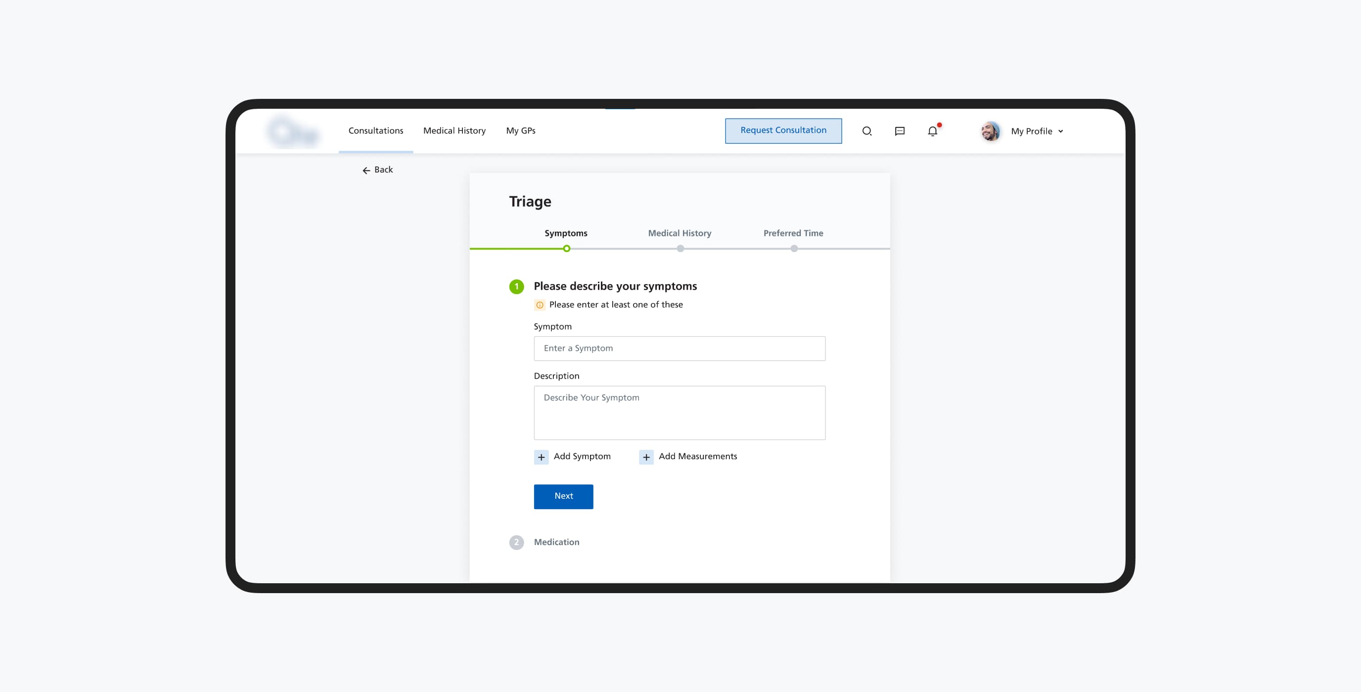
When designing forms for healthcare product design, we use techniques to ensure they are simple and easy to complete. For example, we often use single-column layouts for a clear path within the form, group related fields, use a wizard or progress bar for long forms, use proper labeling, and add visual cues. The list goes on.
Video console
Telehealth solutions revolve around connecting patients and providers remotely. 76% of US hospitals interact with their patients at a distance. This means the video console should be crystal-clear for patients and seamless for providers, who can also take notes during calls and use other systems simultaneously.
Collaboration tools
Cases usually require collaborative work, so our healthcare UI design strives to make the teamwork aspect transparent. We often consider integrating activity history and messaging tools.
Read more about our hands-on experience in specific healthtech projects in our case studies. You’ll learn about our expertise in solving real-world problems, such as improving engagement for a clinical portal with the use of hook models; integrating a machine learning API into a clinical portal to increase operational efficiency and reduce triage time, and improving the form fill process for sight exams.
If you’re looking to create a telehealth platform, strengthen your UX/UI design for startups, add new features, or explore new markets, schedule a free consultation with our team. We’ll discuss your ideas and challenges and find out how we can add value to your product.
