ux/ui essentials

How to Optimize Your SaaS Pricing Page – Complete Guide

15 min read
Stanislav Boiko
Stanislav Boiko
28 Mar 2024
How to Optimize Your SaaS Pricing Page – Complete Guide Cieden

Do you fully utilize the potential of your SaaS pricing page? You’d be surprised to know how significant — and how often underestimated — its influence on the conversion rate and, ultimately, your business’s ROI is. You’d be even more surprised to discover the capacity of UX design to optimize your pricing strategy and improve the pricing page in a way that unmistakably leads a potential customer to the purchasing decision.

This article highlights the fundamentals of a SaaS pricing page design. But more importantly, it provides you with a big set of concrete and practical UX/UI design techniques tailored exactly for a pricing page and based on the best practices of SaaS trendsetters. Every method is supported with examples and step-by-step guidance on the application. If you apply even part of them, you will boost the sales of your SaaS product. Try it, and you will see for yourself!

Intro

The UX value of a pricing page is often underestimated due to its apparently clear-cut functional role. Customers are believed to appear at this place when they have already made up their minds about using a product.

So, if they can afford to make a purchase at a set price, the deal goes through. If not, nothing can be done here. As to the product’s necessity, quality, and specific value for a user’s needs and goals, we think this persuasive job is done earlier — and by other aspects of the onboarding process.

This is the normal way we can think about the destination of a pricing page. However, the difference between the customer’s journey in UX design and a sales funnel in classical marketing is its non-linear, multisession nature. This means no one can know for sure when a particular customer shows up on a pricing page.

Entry points

Some users concerned with the cost more than with the quality of a product may go there immediately after getting on the landing page. They would like to make sure it complies with their financial comfort zone.

Others may get to the pricing page after weeks, months, or even years of using free trial periods or a freemium plan (one of the top SaaS gamification techniques), being curious about what else they can get with premium plan offers.

And only a part of the users can discover the pricing page as intended by the flow of the onboarding process, establishing some kind of an empathic connection with your platform in advance.

So, what’s the conclusion from the above ambiguity?

If no rule can account for all contingencies, we can give up and make a pricing page purely informative and functional. No particular hopes are pinned on its conversion potential.

Or, we can go ahead and design it in a way that integrates the entire customer’s journey in a condensed form.

Such a pricing page layout would include general background information, value reminders, all-around support, and subtle retention strategies in a single package. Then, wherever and whenever a user gets to this page, it will work as it should — leading to a purchasing decision, with a financial receipt as evidence.

This article will explain how to do this, exactly.

Part I. Top 3 SaaS Pricing Page Optimization Tricks

When it comes to discussing the optimization of a pricing page, a reader is usually instructed on specific design solutions and UI/UX practices applicable to this purpose.

However, some fundamental concerns must be addressed well in advance before starting the design/redesign process. If you neglect these issues or do not find relevant answers to them, all the hands-on techniques can come in vain and just waste the resources.

So, put aside your easels and a paint box for a while, and pay attention to the following pillars.

Defining the effective pricing strategy

You have to get a clear idea about your SaaS pricing models before making a single touch on your pricing page design. This is important because different monetization approaches require completely different UX solutions to create the most appealing and conversion-effective layout.

For example, if you have both monthly billing and annual options, you can spotlight how much a client would save with a one-year purchase. Or, with a pay-as-you-go paradigm, you need to preface your plans with some sort of a demo or a FAQ section briefly introducing each feature. And so on.
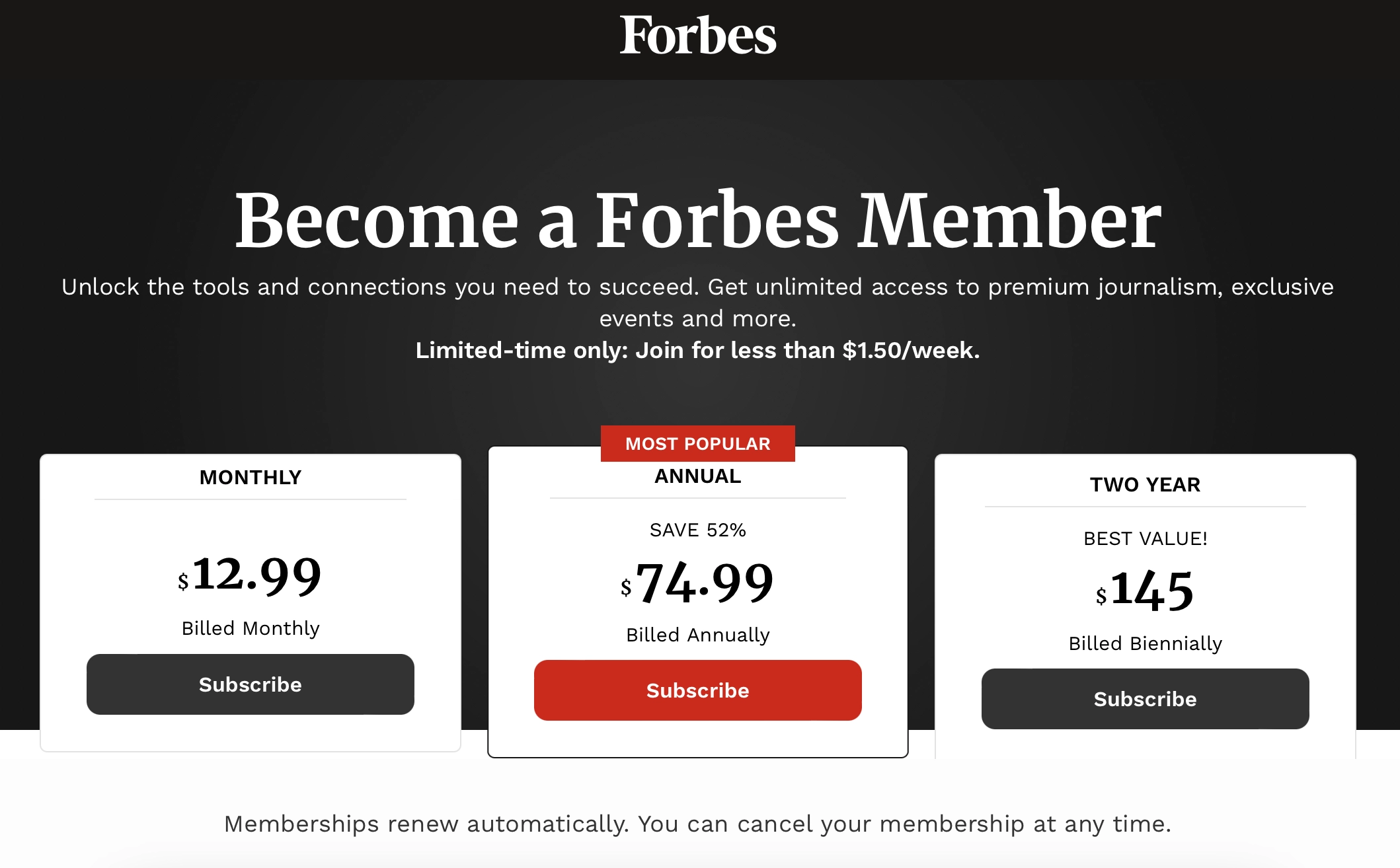
Forbes example of defining the effective pricing strategy

Source: https://account.forbes.com/subscribe 

In other words, your pricing strategy establishes a pattern of the most cogent user experience.

Comprehensive market and user research

Designing a pricing page in a really compelling way means including only those features/services/options that your target users need and want to see the most.

Moreover, it means articulating these issues exactly in the form a user can clearly understand and emotionally endorse.

In addition, you can decide how to build a hierarchy of features, which of them should come first, and what would be most appreciated by different groups varying in their purchasing power.

But you can do nothing of that if you do not investigate sociodemographic profiles and the needs of your users inside and out.

Iterative usability studies

With all due respect to the guiding principles of UX design, when it comes to a particular SaaS software project, small details matter.

How long should this page be? Is it necessary to include a FAQ section if a live support option is available? What about the size and colors of a CTA button? What number of features in a preview form is acceptable before it becomes excessive? The number of such context- and context-specific questions is infinite.

Therefore, you need to test. Of course, you may learn the theory of SaaS billing best practices or google the best pricing pages on the Web, but such research will be incomplete and inaccurate. Only your own clients are the best indicators to say what is efficient and what does not work so well in their particular case.

This is what the Groove sales team did. They progressively increased the conversion rate from 1.11% at the beginning to 1.17% after the first testing and redesign and to 4.15% when the next test was applied and all the lessons learned. As to the amazing results of the testing-driven pricing page upgrade by HubSpot, we already discussed it in our prime guide on the UX design for SaaS.

Part II. What Makes the Best SaaS Pricing Page Design?

Now that we have discussed the seminal issues underlying the entire process of a pricing page design, it is time to talk about specific surgical methods and techniques of its production.

The number of price offers/plans

Option 1: Don’t overload it with too many plans if you can

In the vast majority of credible resources on this topic on the Web, you will find a recommendation to use no more than 3-4 pricing tiers for the sake of marketing effectiveness.

In the already mentioned case study of Groove, reducing the number of pricing options was one of the key changes that increased the conversion rate by 4.5 times. The simpler and minimalistic the page, the easier the sales process is, and the fewer friction points a potential client will have at this crucial point of buying decision-making.

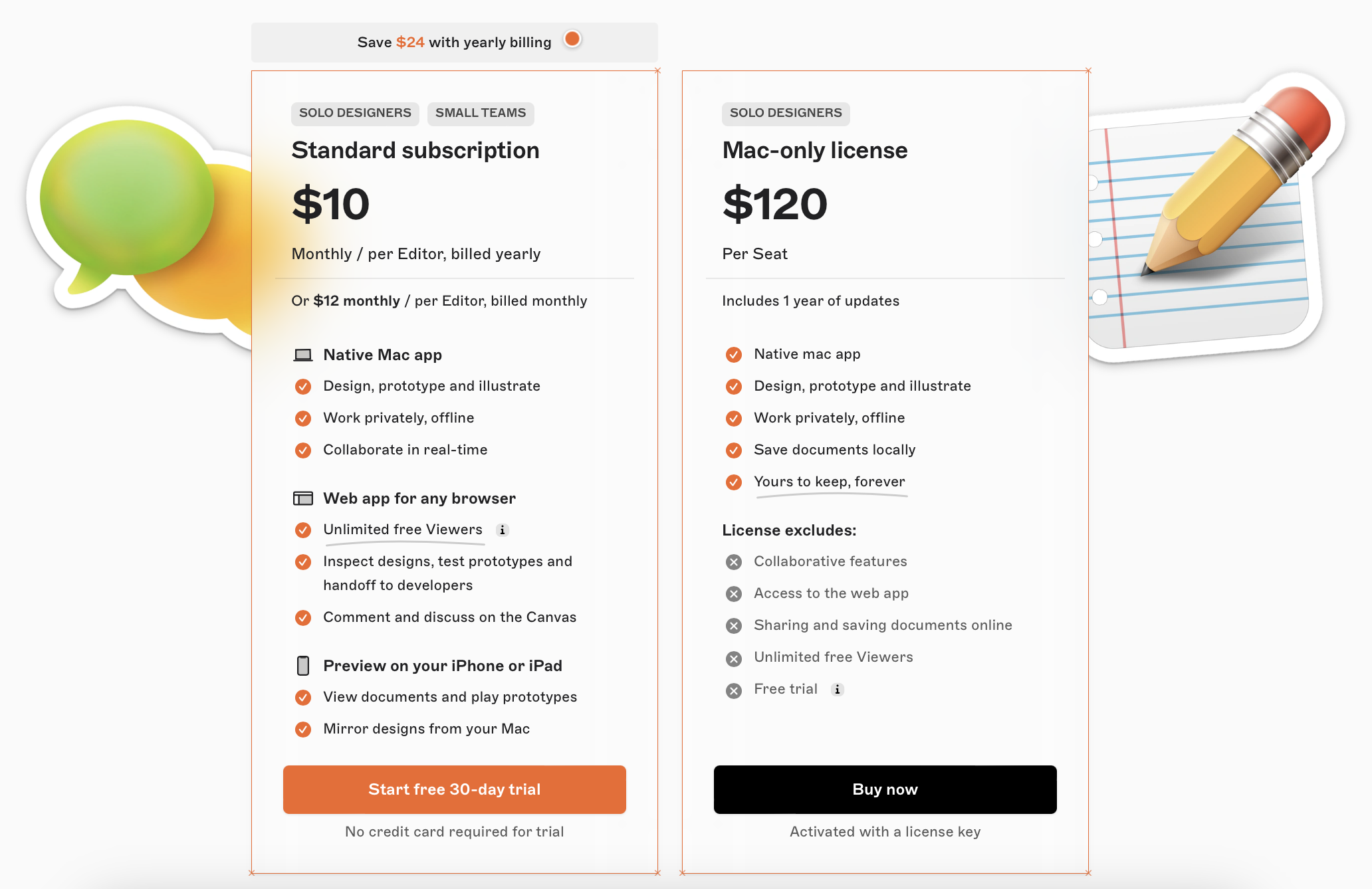
Unsurprisingly, some successful SaaS platforms use even less than three delivery plans.

The number of price offers/plans example by Sketch

Source: https://www.sketch.com/


Option 2:
If you cannot cut down, then frame and structure your multiple offerings within smart interactive frameworks

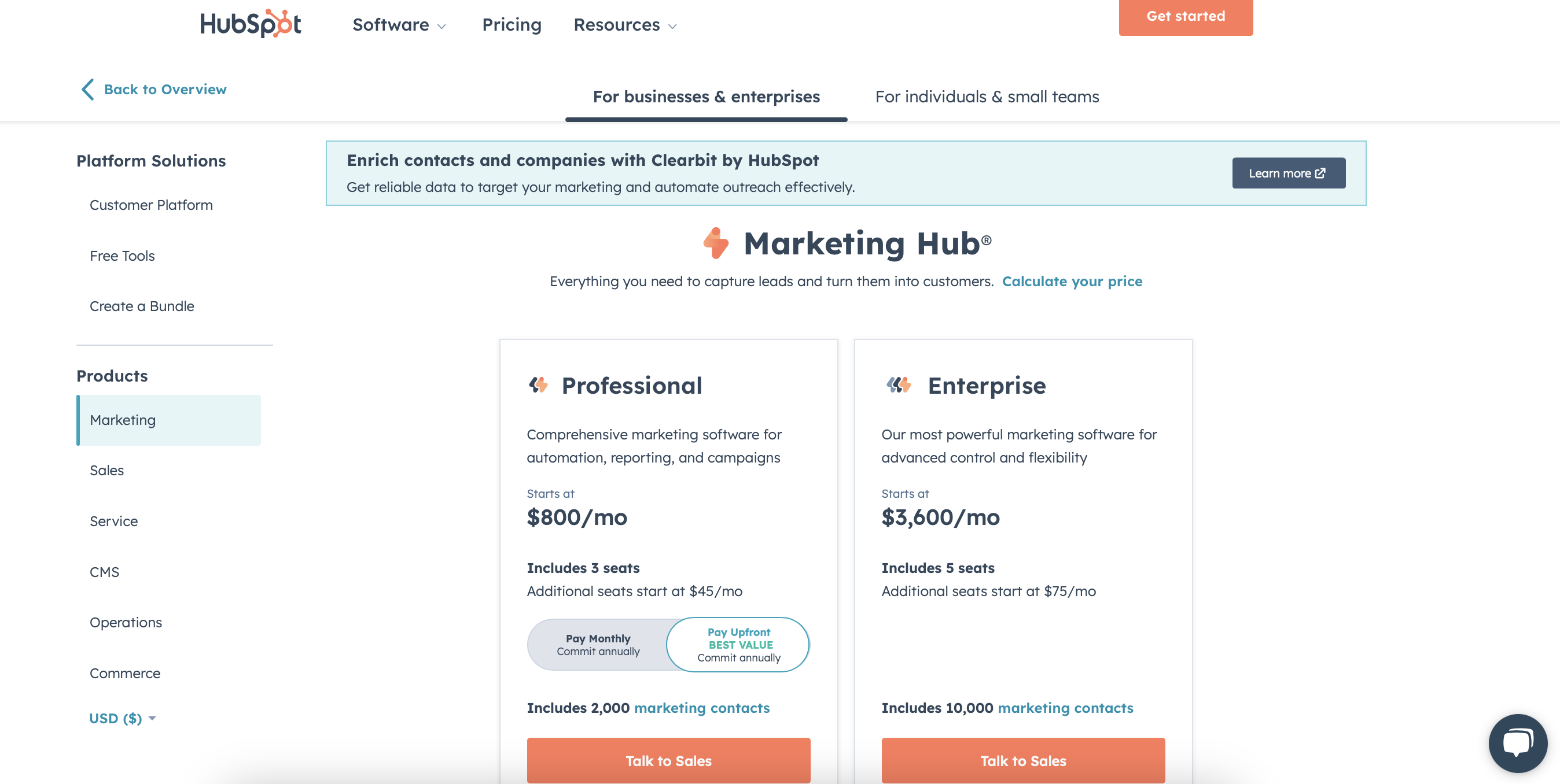
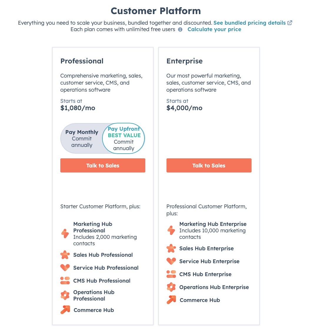
Hubspot is a very insightful example of how this can be done properly. 

The number of price offers/plans example by Hubspot

Source: https://www.hubspot.com/

The company provides a huge spectrum of products and services in sales, marketing, CRM, customer services, and other areas for different customer segments, from individual entrepreneurs to international corporations. Therefore, having few plans is not an option for such a case.

The team hence created a sophisticated yet intuitively clear tree of frames and tab pages based on the service/product segment criteria. With such a system, a customer can choose an area of interest and only then start exploring pricing options or plans.

The length of feature lists

This can often be a painful and frustrating issue in the SaaS design process.

On the one hand, you want to inform a potential client about all the features, services, and benefits they will get for their money. Common sense also suggests that the more a basket is filled, the more pleased and satisfied a person is paying its price.

Yet, on the other hand, if that list goes beyond some magic length determined by a particular client’s cognitive capacity and emotional predisposition, most users will skip reading for sure. 

Neglect on this issue jeopardizes your conversion and potentially increases the churn rate.

Option 1: Split lists

This is the most common approach to tackling this problem, practiced by many holistic SaaS platforms.

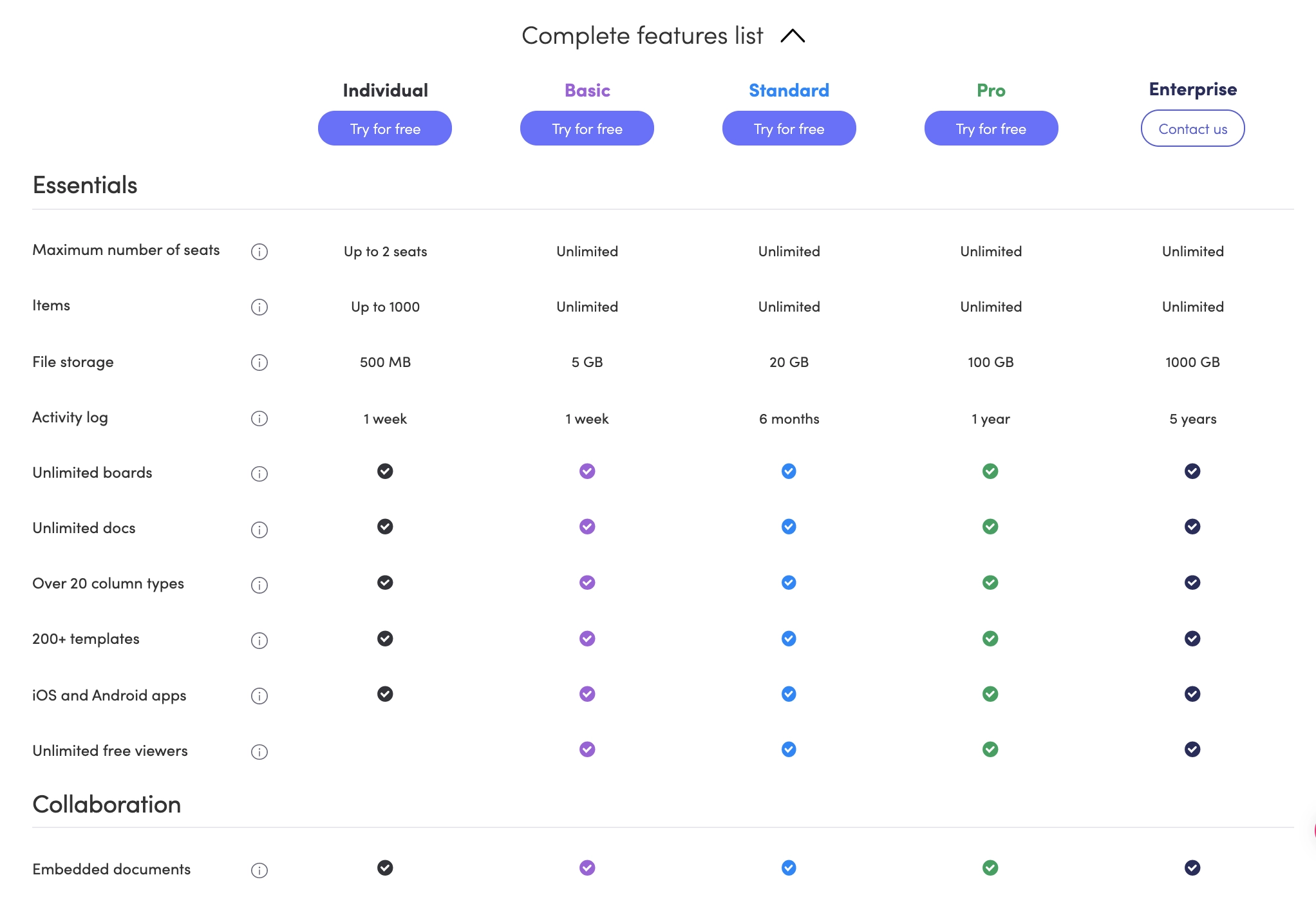
In such a case, the most essential and commercially impactful services and features are briefly enumerated underneath the price for each plan. At the same time, the rest of the items are hidden within a special tab. It can be titled “See all features,” “Complete feature list,” etc.

Good feature list example

Source: https://monday.com/

These lists can reach a truly unbelievable length. But the good thing about them is that the client decides whether to read it and how far. Such unconstrained pricing page UX makes no negative impact on the conversion rate.

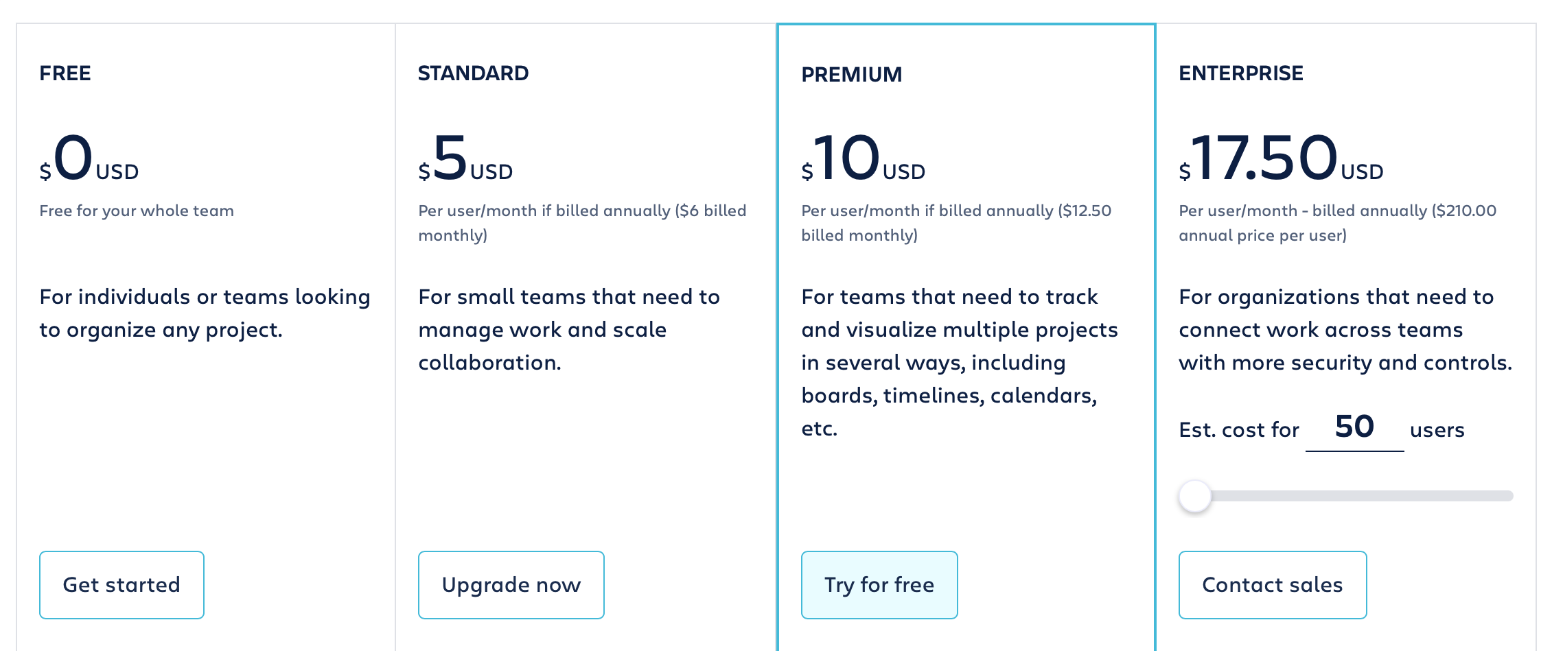
Option 2: “Everything +

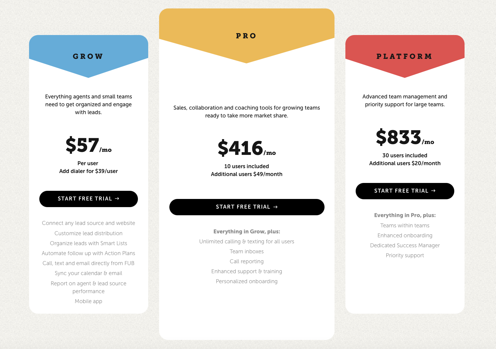
Another smart solution is to write only new features for each next offer. This way, you avoid any repetition and simply mention that a more advanced plan includes all the opportunities of lower plans by default.

However, such an apparently smart solution has its caveats. For example, in this CRM platform, implementation efficiency is dubious. It visually made the lists of more advanced offers look shorter than the basic plan. In such a way, a user can subconsciously perceive that the value of more expensive plans is below the asking price.

The length of feature lists example

Source: https://www.followupboss.com/ 

Option 3: The most essential everything

If you want to do without a split list and at the same time prevent misperception of the plans’ value by users, the way is just to select the most important features and repeat them all for each case.

In this pricing page example, the team acted exactly that way by restating the same items for each plan.

Example of restating the same items for each next plan

Source: https://www.hubspot.com/

UX/UI designers often resort to such an apparently wasteful replication because they know how human psychology works. To avoid the perception of scarcity that can forestall further conscious reading, they introduce full lists, showing that a higher price is paid for a bigger value.

Option 4: “Everything +” in a proper hierarchy

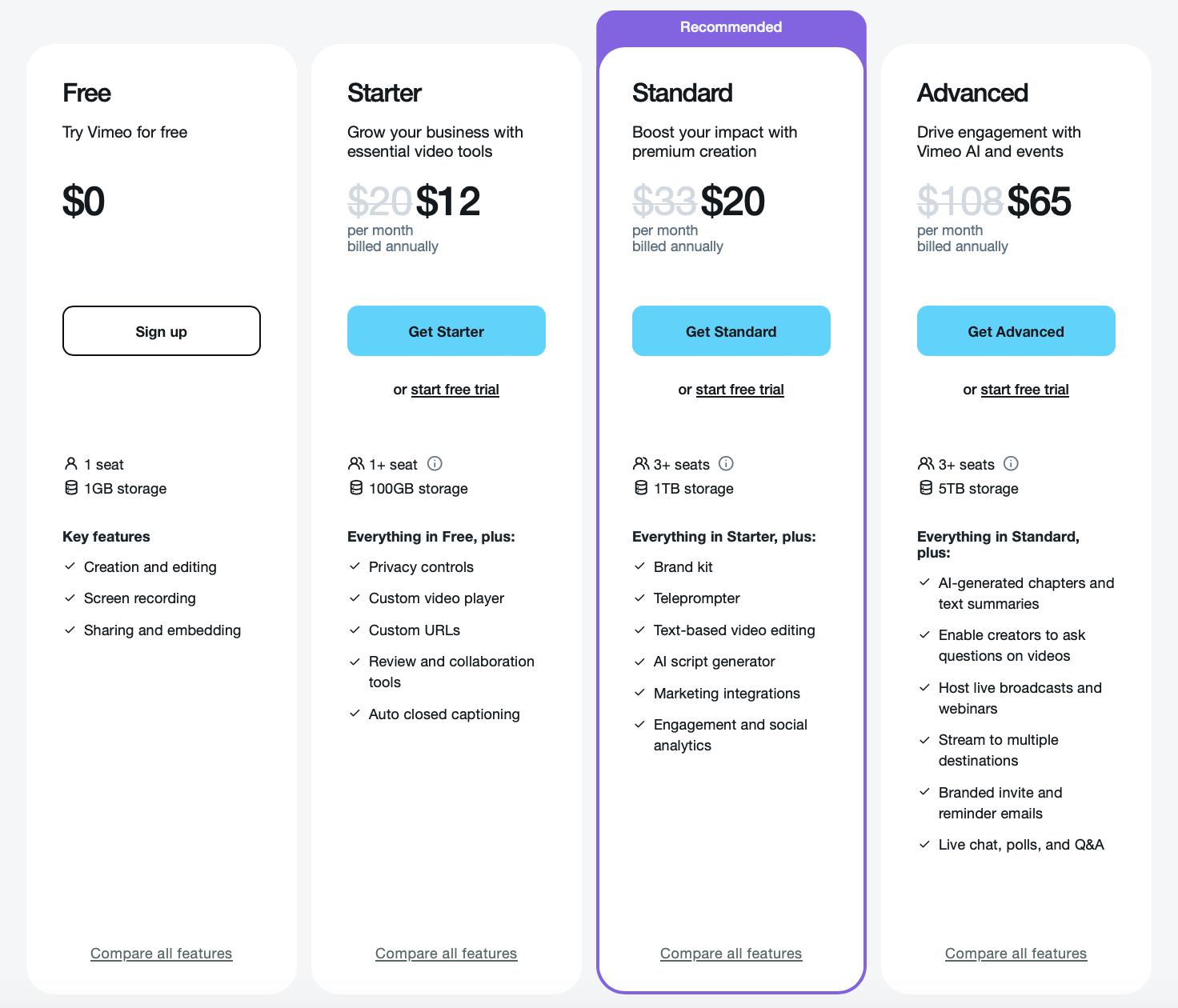
Some platforms demonstrate an even smarter solution when features are selected and organized in a way that avoids duplication and still makes each next list look longer.

Proper hierarchy example by Vimeo

Source: https://vimeo.com/ 


Option 5:
A spreadsheet

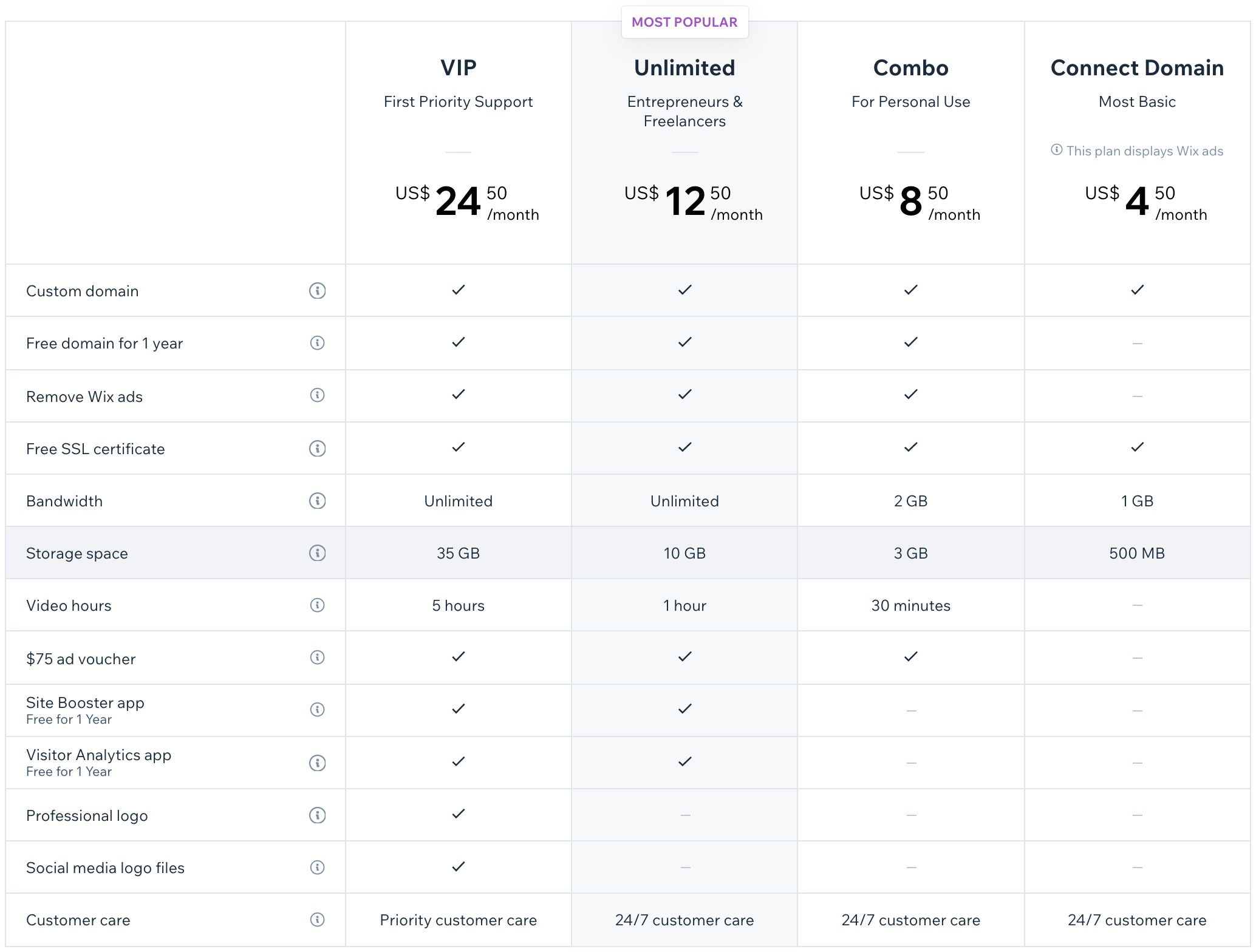
Finally, as an alternative to all the solutions above, you can create a grid with all possible features and services as qualifiers, and then mark their availability in the fields underneath each price offers with ticks and/or crosses. This can be a good choice if you have a complex product that needs all its aspects to be highlighted in detail. 

Spreadsheet example of pricing by Wix

Source: https://www.wix.com/ 

This solution would definitely make the life of your developer team easier by infinitely simplifying the procedure of plan modification and adding new features thereafter.

However, it also conceals an essential flaw in terms of user experience. A customer has to make an additional effort to shift the focus of attention between sections of a grid while keeping in mind the value of each feature. As a result, it takes longer to get right into the details of every price offer and becomes a friction point in the buying process.

Therefore, such a representation is not mainstream among the world-famous SaaS platforms.

Presentation of prices

Tip 1: Charm prices

Everybody in sales is out to talk about the magic power of ending prices with 9 or 99 as allegedly making an offer look cheaper than it is.

However, studies showed that charm prices are effective only for low-income clients seeking to save every penny or when customers of enterprise-level services have limited information and no experience with a particular service/product. With a more qualified and conscious active user, that trick won’t work. Moreover, high-end buyers prefer round-pound prices, which are subconsciously associated with prestige and high quality.

So, it is no wonder that many projects that are savvy at pricing optimization and know how to deal with UX, e.g., Slack, HubSpot, or Cloudflare, to mention a few, don’t bother with those charming figures — and thrive nonetheless.

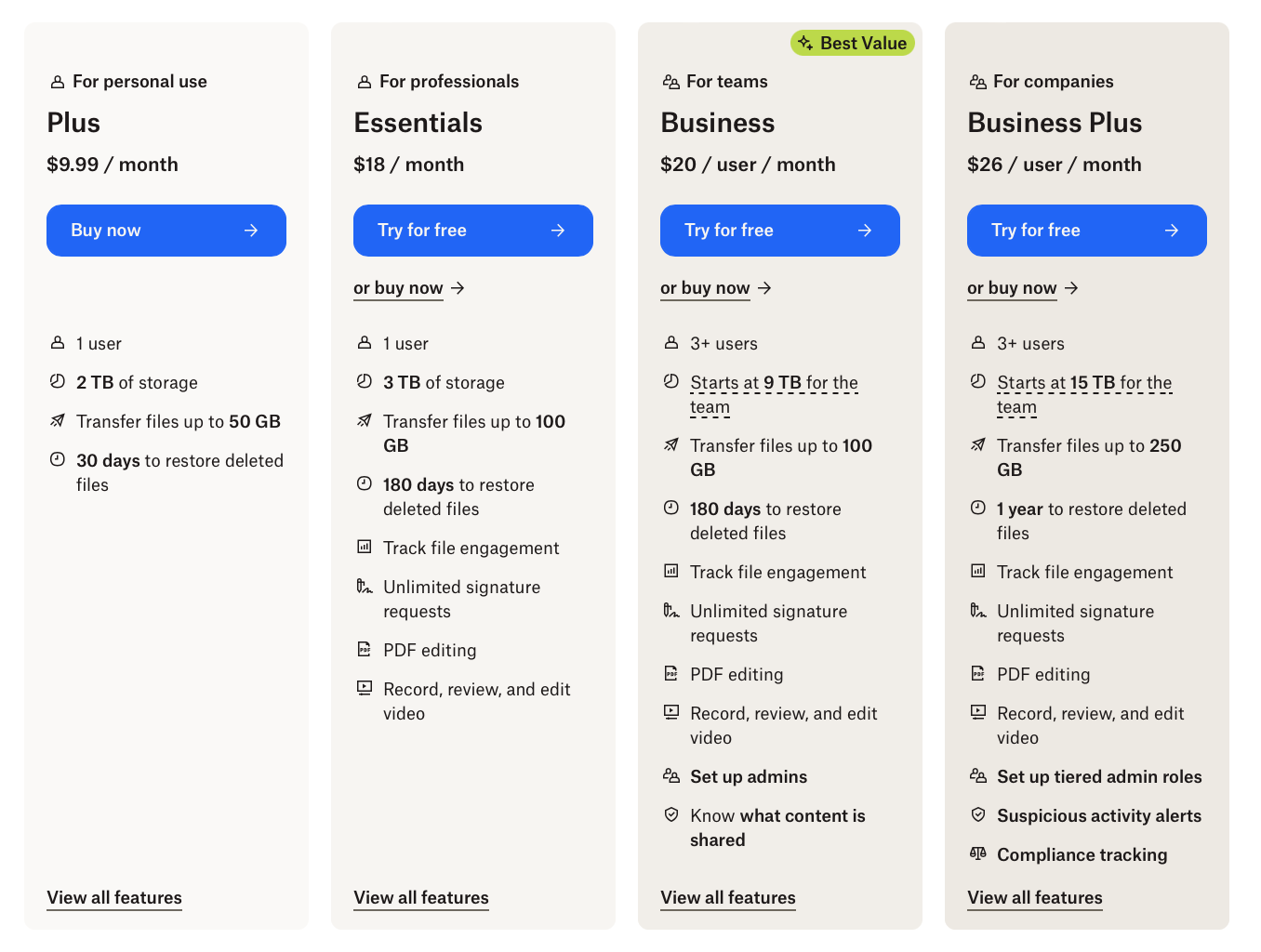
However, others, like Square or Dropbox, apply a more cunning mixed approach. They use 9-ended values only for low-cost subscription plans targeting clients with small purchasing power.

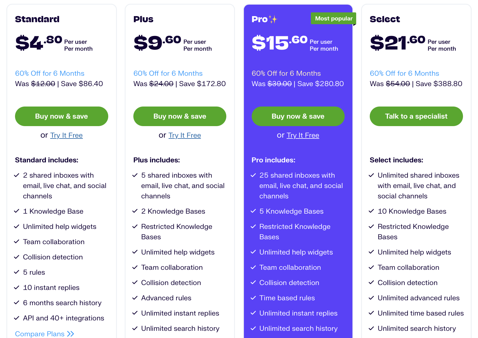
Presentation of prices used by Dropbox

Source: https://www.dropbox.com/ 

So, you can play with this technique if you like. But before you do, you should define the market niche better and research your user to achieve the intended outcome.

Anyway, no need to care too much about this lifehack because it does not make the weather a lot. There are more important things to consider, such as basic heuristics and the psychological needs of users.

Tip 2: Eloquent demonstration of gains

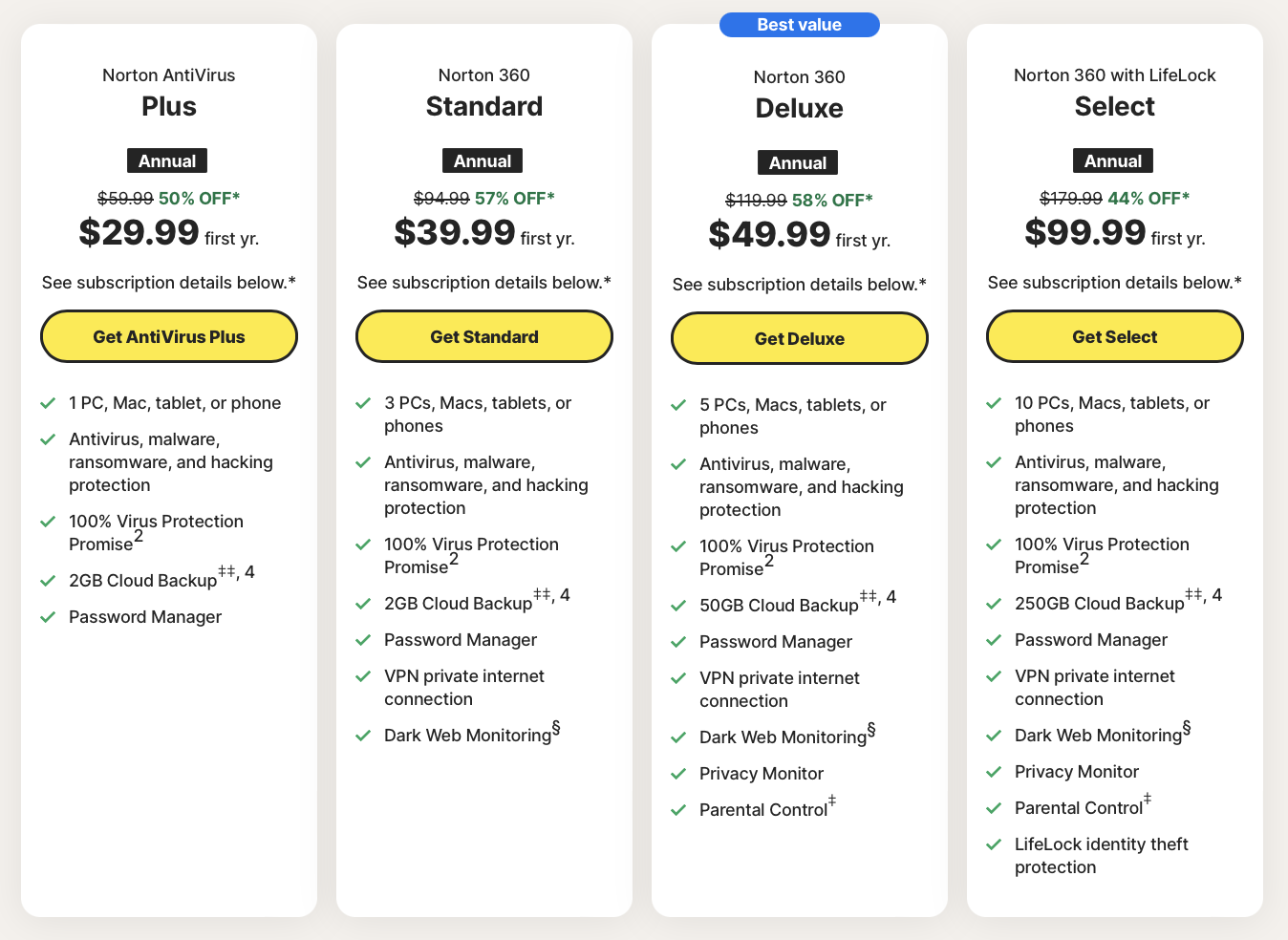
If the pricing strategy allows for any savings depending on loyalty issues, such as the time and duration of the subscription, referral programs, etc., then clearly indicate and visually emphasize them. This will make a potential customer realize the advantage from the first second.

Eloquent demonstration of gains

Source: https://us.norton.com/ 


Tip 3:
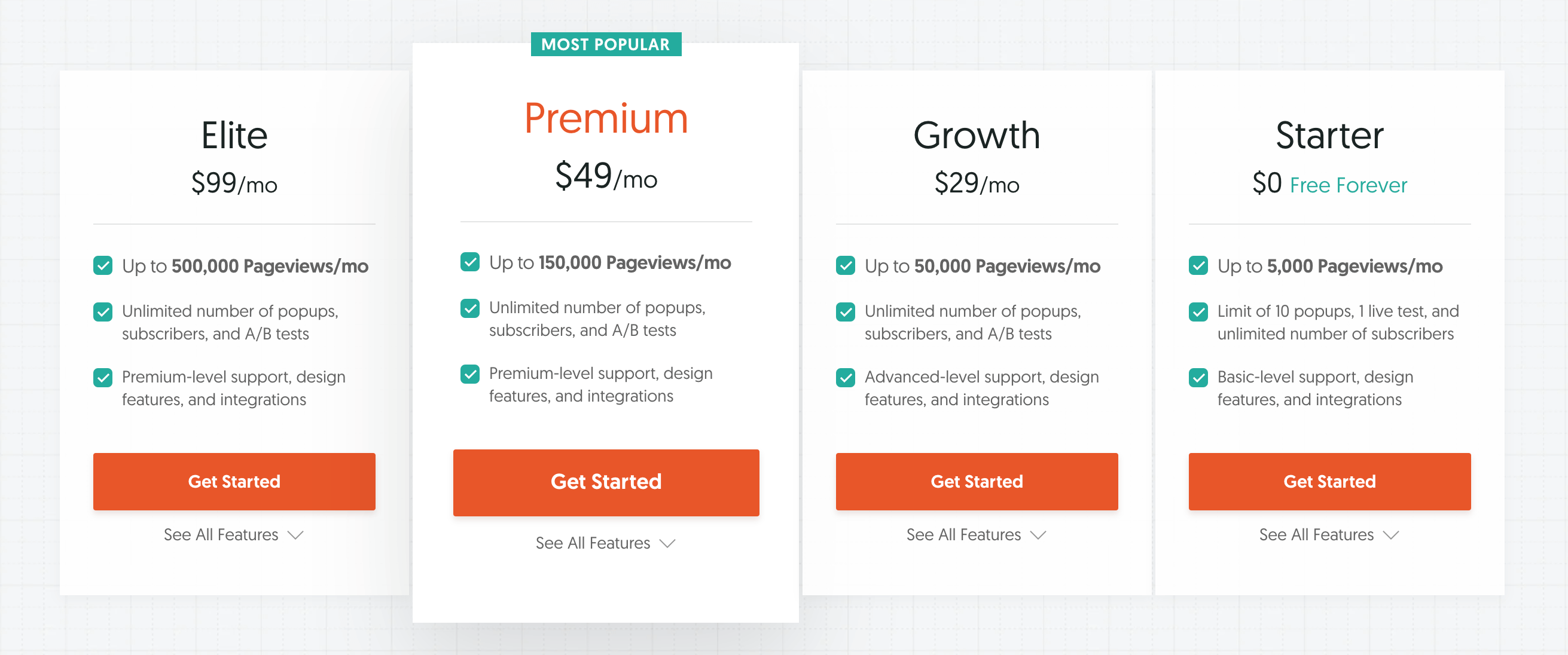
Range your subscription packages in the reverse order (from higher to lower)

This technique is based on the so-called anchoring effect. It is a psychological tendency to use the first piece of information as a reference point for perception, comparison, analysis, and eventually decision-making within the entire process. 

This means that if the first price is the highest, every new figure in a row will be subconsciously considered as cheap regardless of its objective value on the market. And on the contrary, if you start with freemium or a basic $10 offer, all other plans can be perceived as unjustifiably expensive. 

Example of ranging your subscription packages in the reverse order

Source: https://www.hellobar.com

Interestingly enough, if you take the trouble to investigate the best SaaS pricing pages of the market trendsetters (as we did), you will discover that most of them use a standard hierarchy from lowest to highest price.

However, we cannot but mention this technique as its efficiency was evidenced by experiments and scholarly research. That is why feel free to use it, but keep in mind that this mental game will never be of crucial importance for serious users making the backbone of your future loyal client base.

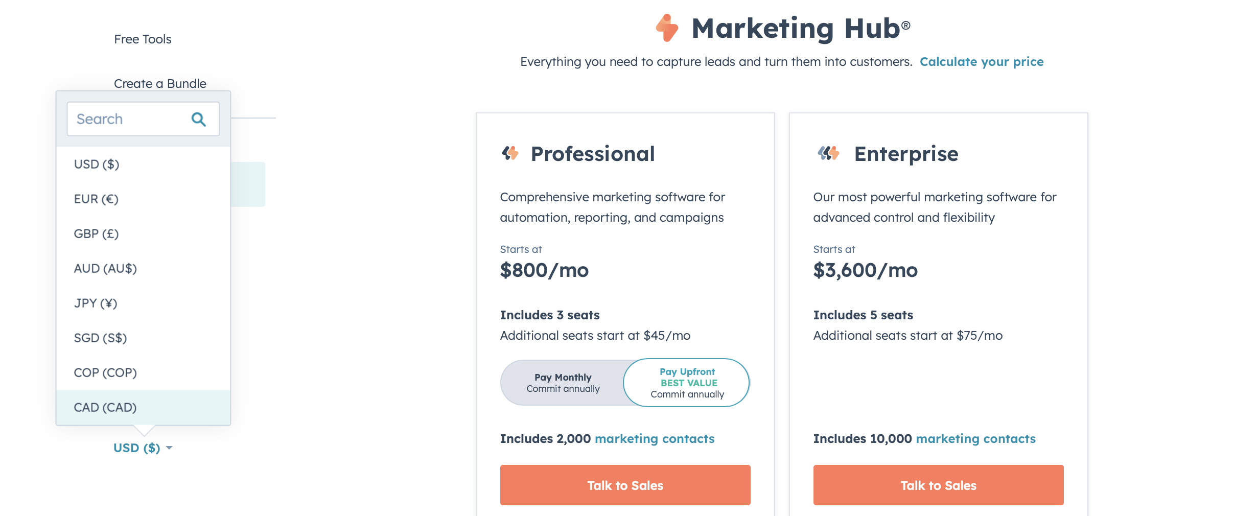
Tip 4: Add multiple currencies and/or currency conversion tools to make the process more comfortable for your non-U.S. customers

Although the billing mechanism will convert currencies anyway, users would feel safer and more confident when paying with the currency their card is initialized for. Awareness that no extra conversion fees are charged is encouraging as well.

Example of adding multiple currencies

Source: https://www.hubspot.com/ 

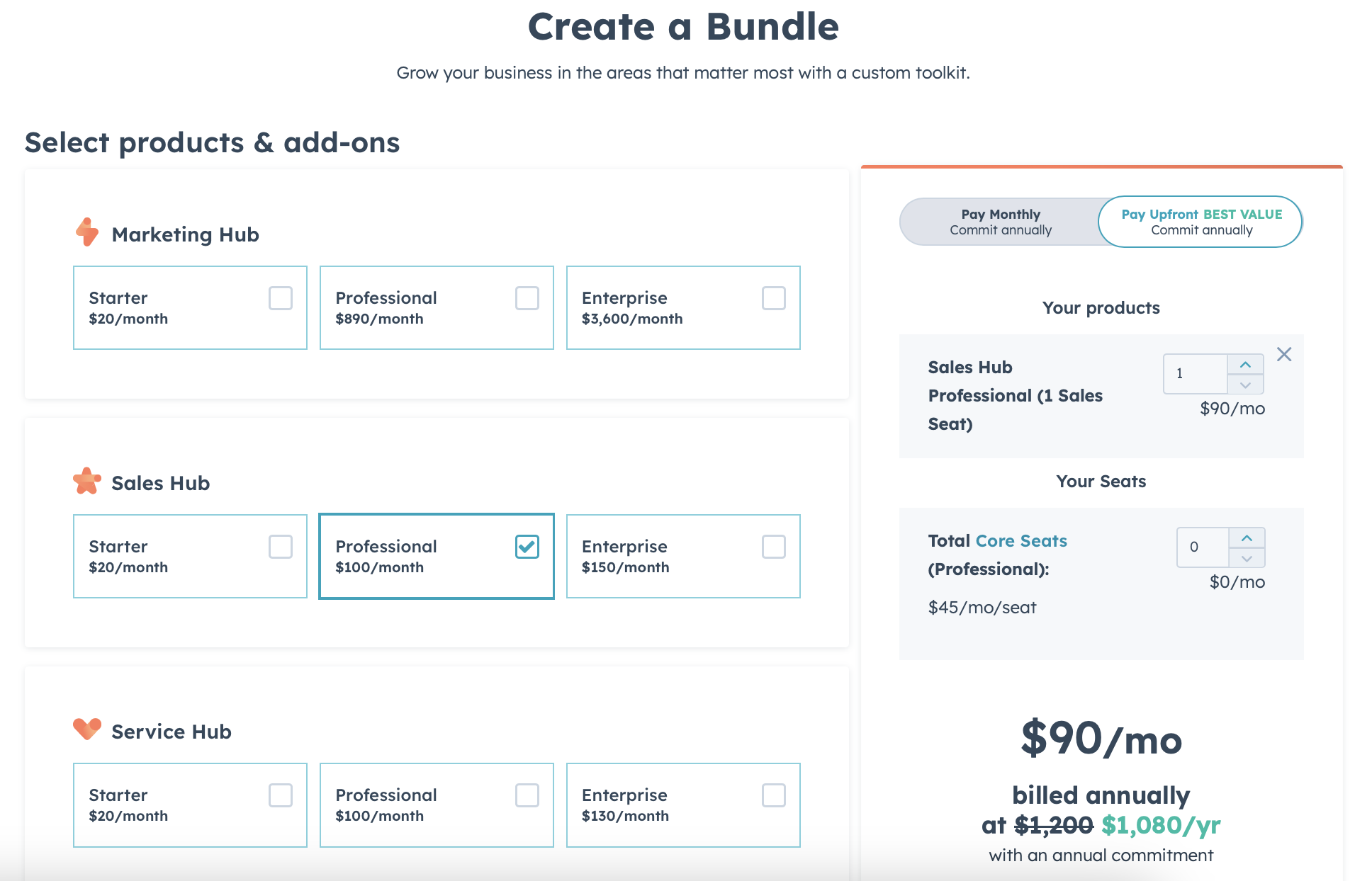
Tip 5: Provide potential customers with an opportunity to calculate and/or customize the plan based on their specific needs and preferences

This can inspire a customer to explore the product and discover its key features and opportunities unwittingly, even without consciously intending to be enlightened about the issue. By trying to make a customized quote in the most saving and gainful manner, a user can learn more than from all the introductory materials and tips you have placed on the landing page.

An opportunity to be a master of choice in the purchase process also gives a client a sense of freedom and enhances trust in the company. Moreover, for some products with plentiful product information, such a practice is the only way to meet every customer’s needs fully.

Calculate your price feature by Hubspot

Source: https://www.hubspot.com/ 

Presentation of plans

Tip: Spotlight the preferred option

This practice is beneficial by all accounts.

First, it reduces the friction points and time for decision-making for potential buyers who tend to rely on the majority view and/or are too busy to spend time making a deliberate choice.

Second, if the design process was preceded by good research, you can highlight a plan that is most relevant to both your business objectives and your target user’s needs.

Last but not least, the efficiency of visually allocating the recommended plan is evidenced by several credible studies. For example, the research by CXL Institute proved that this technique reduces the time for purchasing decisions and increases the overall conversion ratio.
A SaaS pricing page presents their pricing plans spotlighting the most popular option.

Source: https://www.groovehq.com/

However, this method won’t work if you highlight the most expensive and/or poorly conceived plan. That is why it should go along with proper user research.

Elaborating plan titles

Tip 1: Be creative but not too much

Most often, you may come across pretty standardized names for SaaS price offers, such as “starter,” “standard,” “pro,” “premium,” “business,” “enterprise,” and so on in that spirit.

On the one hand, it is a good practice in line with the principles of simplicity and intuitive design. There’s no need to invent anything when working cliches are in place and a customer is used to them.

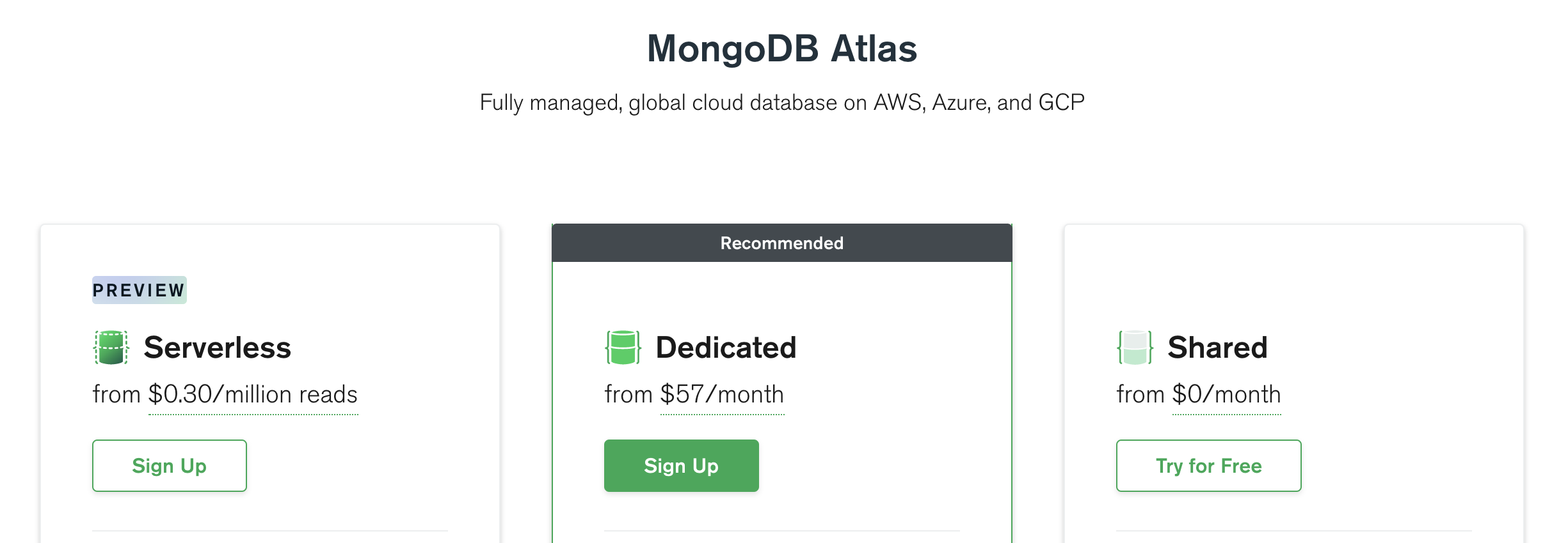
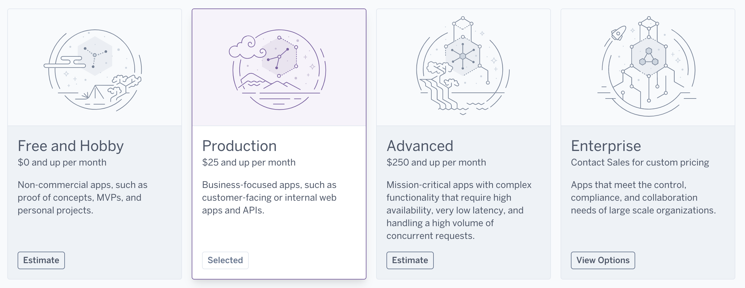
However, if your product allows for it, you can add some life and persuasive power to an interface to make titles a bit more interesting and closely convey the essence of your services.

Elaborating on plan titles example

Source: https://www.mongodb.com 


Tip 2:
Add action

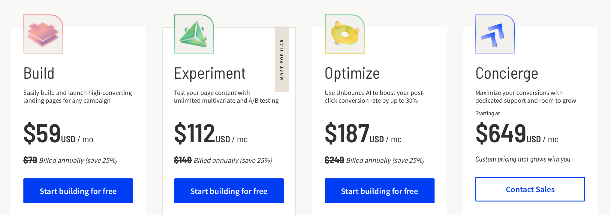
Any relevant appeals to action are always a good practice throughout the customer’s journey, as they subconsciously instill the resolution of a client to make a purchasing decision. Making titles of your plans in the imperative mood is a smart way to do this subtly and unobtrusively.

Good example of adding action to titles

Source: https://unbounce.com/ 

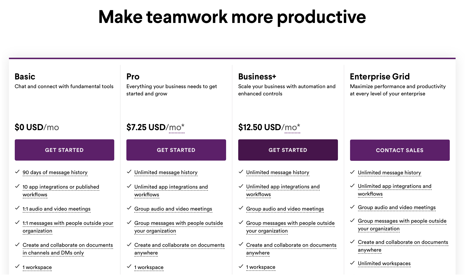
Tip 3: Microcopy

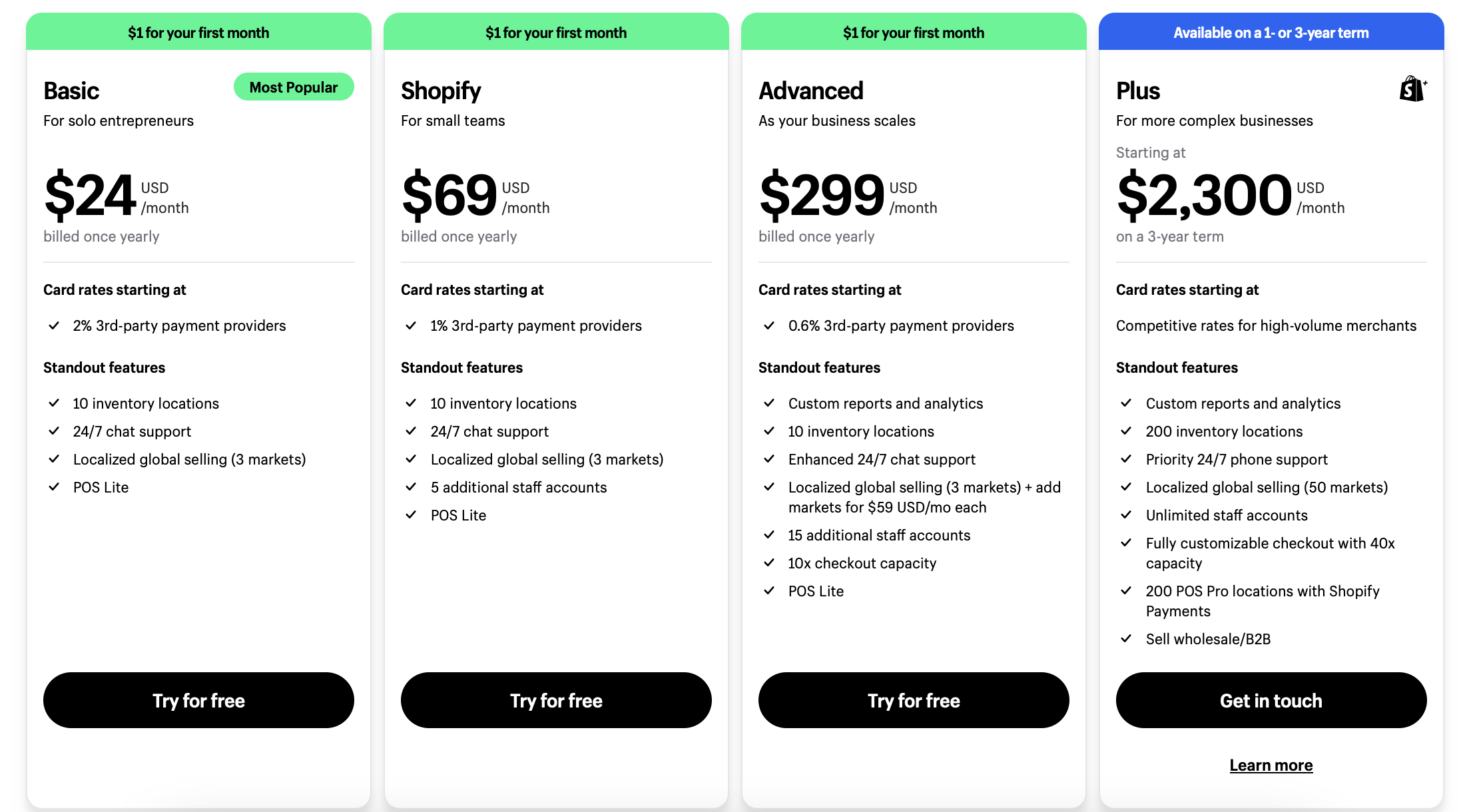
If you include a brief one-sentence description underneath each title, potential customers can get a clearer idea of which plan best suits their needs.

In contrast to specific features/services listed beneath the price, such a description is more general and usually refers to a potential user’s professional and sociodemographic group. In other words, it creates an overall image of a customer that is best suited for a plan.

Obviously, this method is effective only if it is based on developing buyer personas and not just on creating them out of thin air.

A SaaS pricing page that uses microcopy to describe buyer personas.

Source: https://www.shopify.com/

CTA design

A call-to-action button deserves particular attention because of its symbolic make-or-break role both for the pricing pages and the entire customer journey.

By clicking on this element, a customer actually makes a commercially meaningful gesture in recognition of your product.

Tip 1: Make it bright and eye-catching

CTA on the pricing page has to be so attractive that a user would unwittingly desire to use it. Just take a look at the two following screenshots and answer honestly which one makes you more inclined to press the button:

This bleak and almost invisible pattern,

Bad example of CTA

Source: https://www.heroku.com/home


or these tasty, saturated section-long buttons looking like packs of fresh-squeezed beet juice?

Example of a bright and eye-catching CTA

Source: https://slack.com/ 

Of course, you may find the unobtrusive and very modest design of CTA buttons. The reasons for this may be different, from compliance with a brand identity to corporate culture issues.

However, bright and eye-catching will never be redundant on your pricing page. That’s for sure.

Tip 2: Make it engaging

Just as with titles of plans, you can either use standard forms, “get started” or “sign up,” or devote a bit more of your creative energy to find more captivating formulas.

At the very least, you can add the words “now” and “free” as time- and cost-saving allusions. This is what the best SaaS pricing pages often display.

Or, you may even experiment with the magic of some non-standard statements to express your brand’s uniqueness and/or make each of the buttons distinct.

Experiment with the magic of some non-standard statements

Source: https://trello.com/

User interface

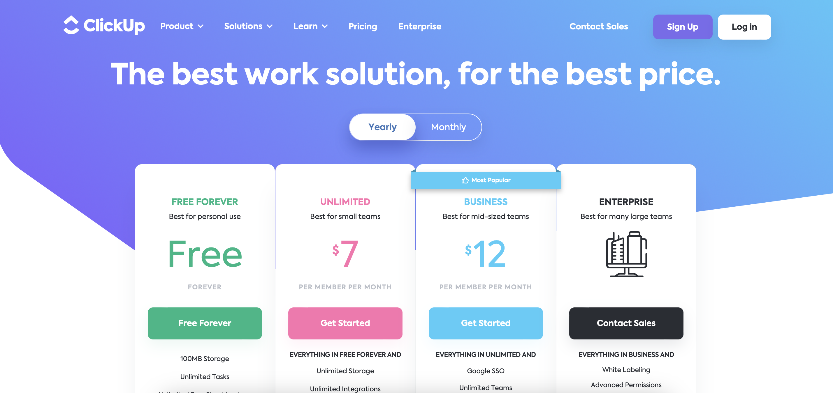
Tip 1: Apply a color scheme that is pleasant to look at

Aesthetic appeal is always highly desirable for every stage and any piece of UI design. Do you think a pricing page is an exception? On the contrary, this space’s visual pleasantness is as important as the homepage.

This is not surprising: a customer makes an important decision here. The more emotionally comfortable the environment is, the more likely is a needed outcome.

A SaaS pricing page leverages a friendly and aesthetically pleasing color palette.

Source: https://clickup.com/ 

Therefore, choose a friendly and approachable color palette in line with your brand’s visual guidelines, — and create beautiful pricing for your product, not just precise and efficient. Depending on your SaaS pricing page best practices and specifics, it can convey calmness, confidence, fun, energy, and other moods of success.

Tip 2: Include emotionally charged elements

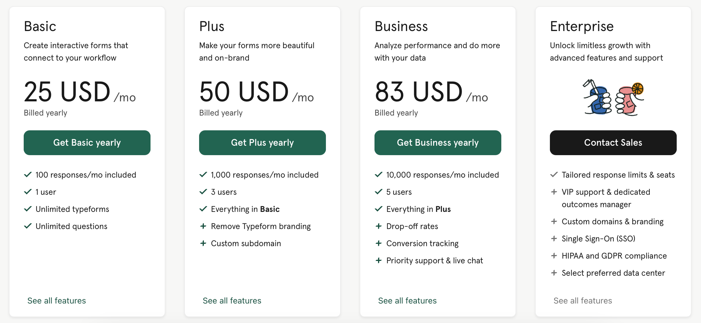
Lovely animated illustrations and enjoyable colors also work well to set even the most frustrated and bored client in a good mood. A pricing page deals with numbers and formal statements in the first place, so a bit of fun is a very good solution to make it warmer and more humane.

Along with enjoyable colors, lovely animated illustrations also work well to set even the most frustrated and bored client in a good mood. The best pricing page deals with numbers and formal statements in the first place, but a bit of fun is still a very good solution to make it warmer and more humane
Emotionally charged elements

Source: https://www.typeform.com/

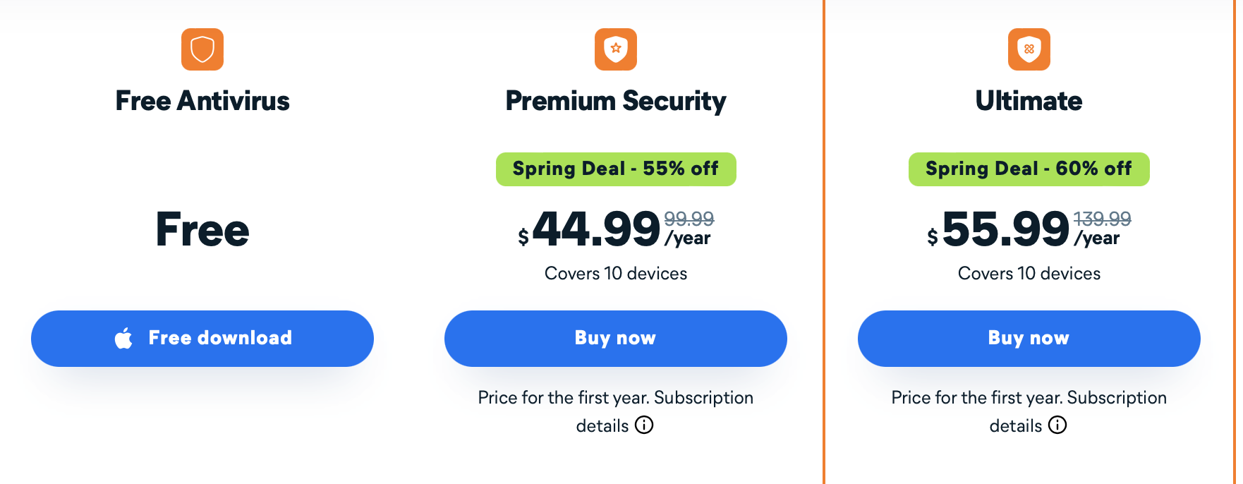
Tip 3: Give it enough space to breathe

This is a fundamental part of modern UI design. Still, it makes sense to remind about it with respect to the successful pricing, for reasons that were already mentioned throughout the article:


  • amidst the process of important and financially charging decision-making, additional space makes a user feel less constrained and more comfortable;
  • with grids, tables, and a large amount of numerical and formal data, sufficient spacing balances the cognitive load and smoothes the frictions in visual navigation between elements.
An example of a SaaS pricing page that uses blank space to separate the available pricing options.

Source: https://www.avast.com

Customer support

One word: must-have.

The importance of this issue is so critical that it is no exaggeration to say you can divide your expected sales rate by ten times if a user has no instruction and support at the purchase stage.

Along with purely technical issues (when something is just unclear in price offers), this is where doubts, fears, and hesitations reach their apogee. Without a helping hand lent immediately, they will do their destructive job.

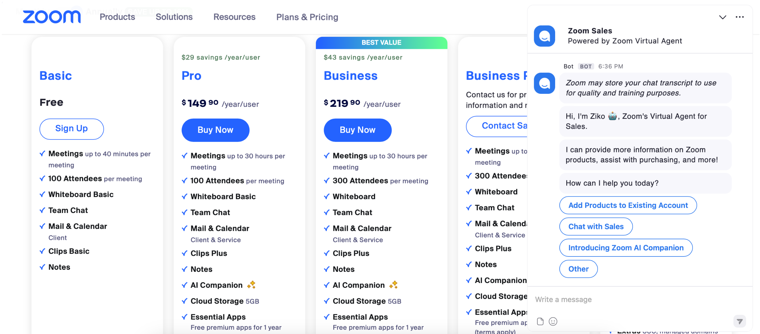
Tip 1: A live chat

With such an option at hand, a customer can address any questions to a specialist within a few minutes. This includes very specific personal challenges and problems that cannot be found in educational materials. A well-trained and friendly client manager can also have a profound persuasive influence on those users who would never make up their minds without external authority.
Live chat example

Source: https://zoom.us/

Tip 2:  FAQ section

Will you delve into the FAQ if you can chat with a specialist or request a phone call within a minute?

Still, you need a well-designed FAQ section with high-quality content.

First, it is a source of more in-depth knowledge to which a user can go after getting brief instructions from a support team. A client manager can also use this data to give more comprehensive advice.

Second, it is a matter of politeness. Well-thought-out questions and answers demonstrate that you respect your target customers and spend time and energy understanding their possible requests.
FAQ section example

Source: https://www.elastic.co/ 


Tip 3:
Microcopy… again

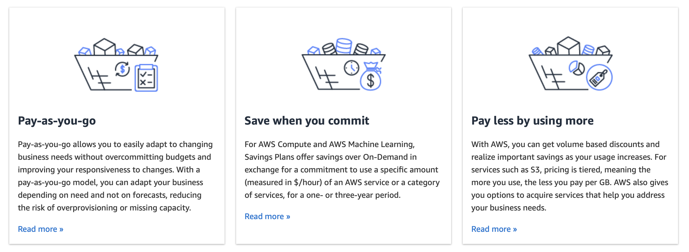
It is also nice to use a piece of microcopy and popup tips right in the main section of a pricing page. This especially matters in the case of customizable plans based on feature differentiation that need special instruction on how to use them.

For example, if you try to visit the pricing page of Amazon Cloud Services, you will not get immediate access to the price offers. Any visitor will first have to read through short instructive pieces of information, and only then proceed to the plans.

A SaaS pricing page that uses microcopy to elaborate on the pricing options available.

Source: https://aws.amazon.com/ 

Value reminders

Tip 1: Value proposition and supplementary taglines

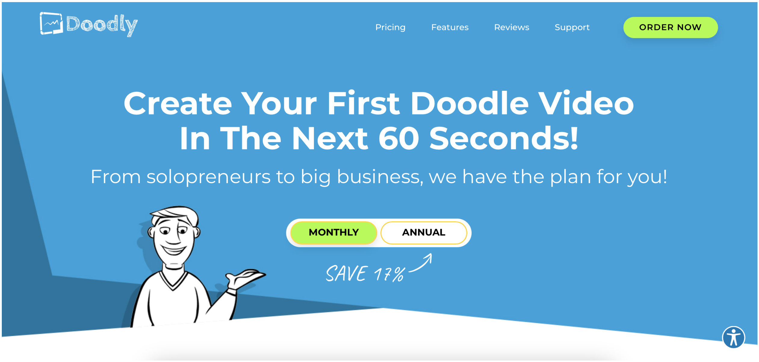
In modern SaaS, a value-based pricing strategy is a must. It is unnecessary to restate your key message of value at every turn. Still, highlight some of its aspects and emphasize the key benefits a user will get after purchasing a product.
Value proposition example by Doodly

Source: https://doodly.com/ 

As in this example, the method can be especially efficient if combined with other strategies, such as a demonstration of savings and funny illustrations.

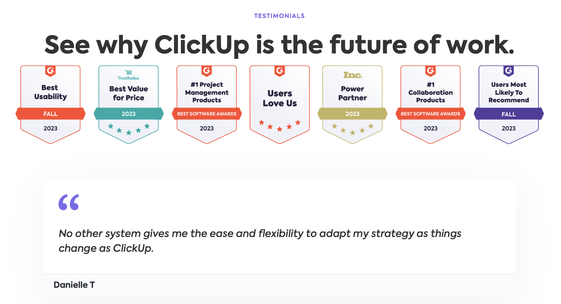
Tip 2: Testimonials

Surprised?

Yes, including a social proof section is one of the pricing page best practices. Although it looks like the last place that needs such sort of things, designers often replicate this element here to be on the safe side.

It may have an encouraging and soothing effect at the moment of final hesitations or sudden doubt, often coming at the last minute of the decision-making process.

Confident SaaS giants like Adobe, Salesforce, or Atlassian Corporation usually don’t use this technique. But it can be helpful for young, ambitious projects on the rise to their fame.

A SaaS pricing page that leverages testimonials to instill trust.

Source: https://clickup.com/

Conclusion

These are the main lessons learned from our little adventure among the best SaaS pricing page examples and practices:


  • do market/user research and polish your pricing strategy before starting the pricing page design;
  • apply the science of human psychology to make your prices and services perceived in line with your business strategy;
  • use UX design techniques to ensure that your page visitor feels like a guest at a billionaire’s house — i.e., receiving incomparably more than giving;
  • use UI design tools to set a user in a purchasing mood by evoking the thrill of discovery, the inspiration of new opportunities, and the satisfaction of a good bargain;
  • most importantly, pull all the parts of the design process together to remove friction points and make a purchasing experience smooth, quick, and non-exhaustive.

We hope now you are fully convinced that a pricing page has boundless potential for conversion optimization and sales growth. But you have to consider the science of UX/UI design in its entirety, leaving nothing out. 

 This is the only way, indeed.

Stay in touch. In the next article, we will talk about another key driver of your SaaS commercial success — SaaS video marketing.

Did you like the article?

Help us share it:

How to Optimize Your SaaS Pricing Page – Complete Guide Cieden

FAQ

How to understand if my pricing page is effective?

To assess the effectiveness of your pricing page, conduct a SaaS pricing page audit focusing on conversion rates, bounce rates, and user engagement metrics. Analyze how visitors interact with the page—what they click on, how long they stay, and at what point they drop off or proceed to purchase. 


Collect feedback directly from users through surveys or feedback forms to understand their experience and barriers they faced. Comparing these insights with industry benchmarks can also offer a clear picture of where your pricing page stands. 


For expert guidance and innovative solutions, turning to an experienced UX/UI design agency can significantly enhance the effectiveness of your pricing page.

How to optimize SaaS pricing page?

To make an optimized SaaS pricing page, start by understanding your pricing options, market, and users. 


Optimizing a SaaS pricing page also involves making it straightforward and engaging for potential customers. The key is to present pricing options clearly, using language that demystifies your product offerings. Highlighting value through comparative charts, testimonials, and a prominent call to action can guide visitors toward making a decision. Incorporating interactive elements like sliders for customizable plans enhances user engagement. Accessibility is crucial, so ensure the page is mobile-friendly and loads quickly. 


By focusing on a clean design that emphasizes clarity, simplicity, and value, you can significantly improve the likelihood of visitors transitioning into paying customers.

What are the key elements of SaaS pricing pages?

SaaS pricing pages include the following core elements:


-pricing plans;

-prices;

-free trial or demo options;

-feature description and/or comparison;

-CTA buttons.


But there can be more. Some SaaS products place FAQs, testimonials, live chat, and other elements to make their pages more informative and user-friendly.

How does improving the UX of a SaaS pricing page affect conversion rates?

Improving the UX of a SaaS pricing page can significantly boost conversion rates by making the pricing structure easy to understand and navigate. A well-designed UX ensures that potential customers can quickly find the information they need without feeling overwhelmed or confused. This involves using clear language, intuitive design, and highlighting key information such as features, benefits, and pricing options. 


Additionally, incorporating elements like FAQs, testimonials, and a comparison chart helps in building trust and addressing any concerns upfront. An optimized UX also means the page is responsive and loads quickly, catering to users on various devices. 


By simplifying the decision-making process and making the value proposition clear, businesses can encourage more visitors to take the next step, whether that's signing up for a free trial or choosing a paid plan.

start your project with us.

Getting in touch
is easy .
Thank you for your message. It has been sent