ux/ui essentials

Fixing 9 Common UX Mistakes in Food Delivery App | UX Upgrade

5 min read
Dara Bilousova
Dara Bilousova
19 May 2022
Fixing 9 Common UX Mistakes in Food Delivery App | UX Upgrade Cieden

Intro

This is already the third article in the “UX Upgrade” series by Cieden. This project aims to enhance the keenness of your eye and perfect your professional skills as a designer. Each time we pick up a real-world piece of design and improve its UX/UI drawing on the best practices in this area.  

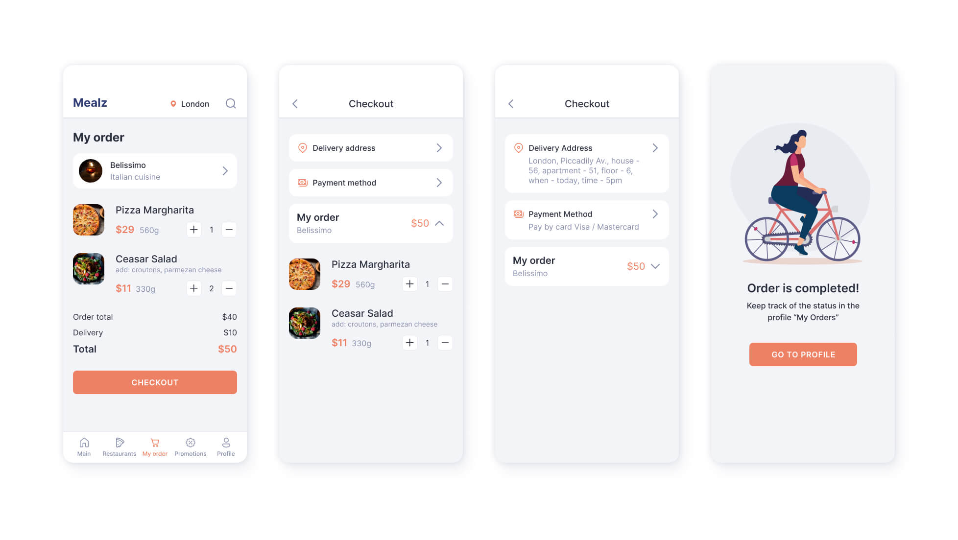
Last time, I promised to tackle the design of a shopping cart and a checkout. So said – so done: today we will review the screens of a food delivery app. 

Fixing 9 Common UX Mistakes in Food Delivery App | UX Upgrade Cieden

Tell me if I’m wrong, but food delivery services are among the most frequently used in everyday life by any urban dweller. And while our primary concern is for food to be fresh and tasty, the quality of the in-app user experience also matters. The convenience and the amount of time spent to make a purchase define if we would ever get back to this service again.  

At the same time, the usability of a delivery app cannot be grasped by merely assessing the visual aesthetics of its layouts. UX design is not static; it should work for the whole flow of user-system interaction. 

That is why our analysis will build on the deeper usability research. 


Mistake â„–1. Co-existence of two headers

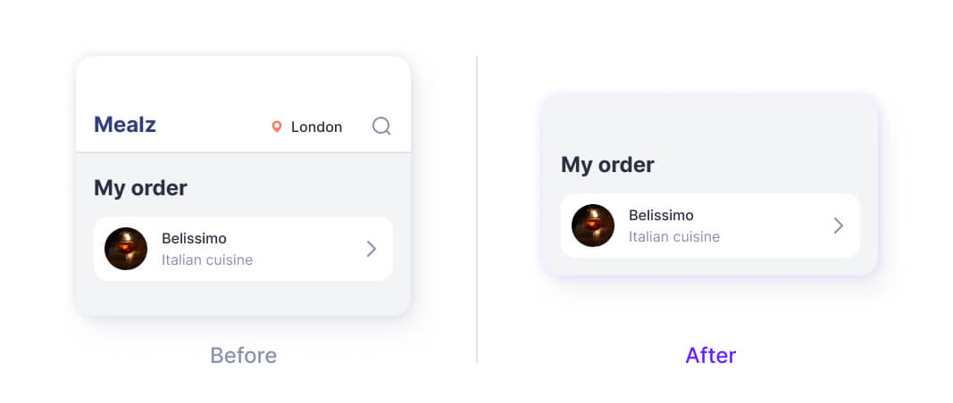
The first eye-catching mistake is the two-header type layout.

The first header is a navigation bar with search and location settings. The second one is a simple text header indicating the current location of a user. 

To obviate this evidently excessive duality, let’s decide which of the two headers is more deserving of the privilege to remain on this page. As I see it, this is a header “My order” because it describes the current state of the system and thus complies with the overall functionality of this page as a shopping cart. So renaming it accordingly is logical and, I would say, natural (if you take a different view, I cannot wait to see them in the comments!). 

Situations like this one reaffirm the importance of fine-tuning skills in UX copywriting which is also an important part of a designer's job.

Fixing 9 Common UX Mistakes in Food Delivery App | UX Upgrade Cieden

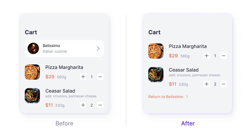
Mistake â„–2. The high contrast of the link

What seems to be the most prominent item on the page? A link to the store, isn't it? 

Don't you think this is a little counterintuitive? Returning to the shop is the last thing a user may dream of at this moment: they just want to get their food delivered and enjoy it in a calm atmosphere. Moreover, we have just been there a couple of minutes ago. 

Therefore, it would be more appropriate to designate this action as secondary and display it accordingly. Let’s hence make its button less contrasting and garish. We can still find and press it if needed, but now the focus of the page is shifted towards the main mission of this screen, - completing your order.

Fixing 9 Common UX Mistakes in Food Delivery App | UX Upgrade Cieden

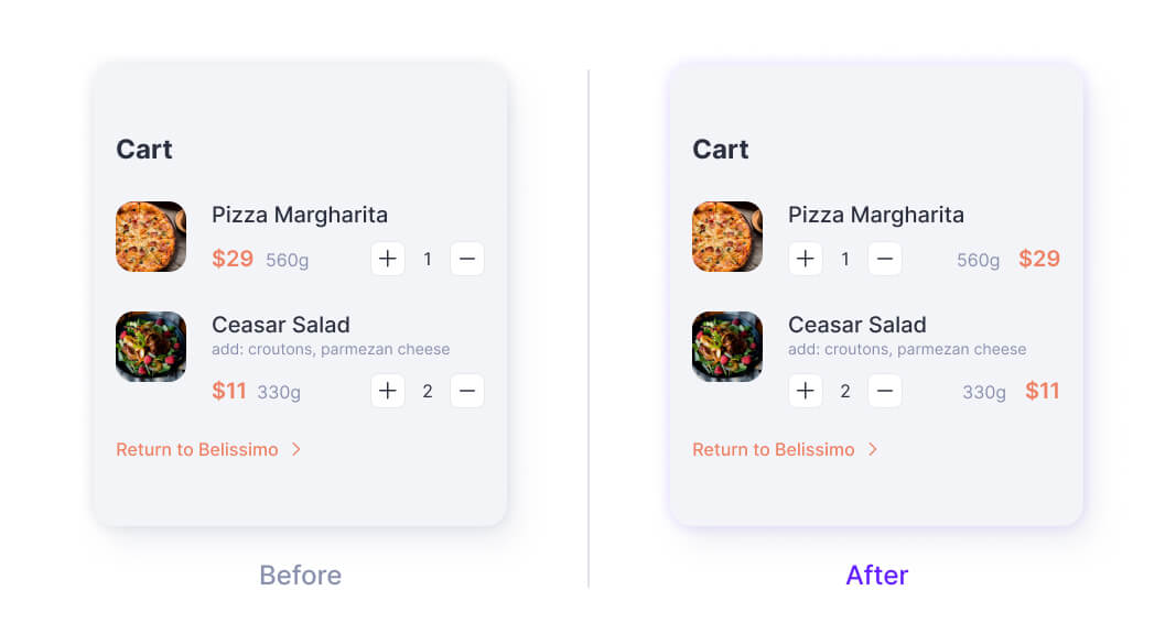
Mistake â„–3. Prices alignment

Forgive me in advance, now I am going to bore you just a tiny bit. Try to recall and visualize a typical supermarket receipt. The fundamentals of designing paper receipts are similarly applicable to digital ones. In a typical receipt, prices are aligned to the right by the decimal point. This way the human eye can easily scan the list of all the prices. But on this one, prices are replaced with counters. This makes human visual attention confused and unable to perceive the sequence of the quantitative data consistently. Let’s switch the elements – and voila! – we have a clean and tidy price list.  

Fixing 9 Common UX Mistakes in Food Delivery App | UX Upgrade Cieden

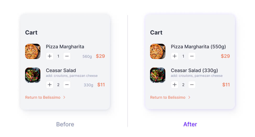
Mistake â„–4. Short-sighted planning

One of the most critical mistakes that I usually find in some design concepts or non-commercial design projects is an underestimation of the real size of space that some elements may occupy when they get filled with meaning and content. 

In such cases, real-life interfaces may turn cluttered and distorted compared to how they looked in natty initial designs. For example, the length of a price or a weight indicator can be much longer than it is on this screen. Moreover, this particular layout is intended for a widescreen. 

Just imagine (better not!) what will happen if we transpose this design onto smaller devices. To find a safe solution, I will relocate weight measurements to the title of the product. Even if it takes a little bit more space than expected, it won’t be as critical as it is with a current placement fraught with chaos and waste of horizontal space.

Fixing 9 Common UX Mistakes in Food Delivery App | UX Upgrade Cieden

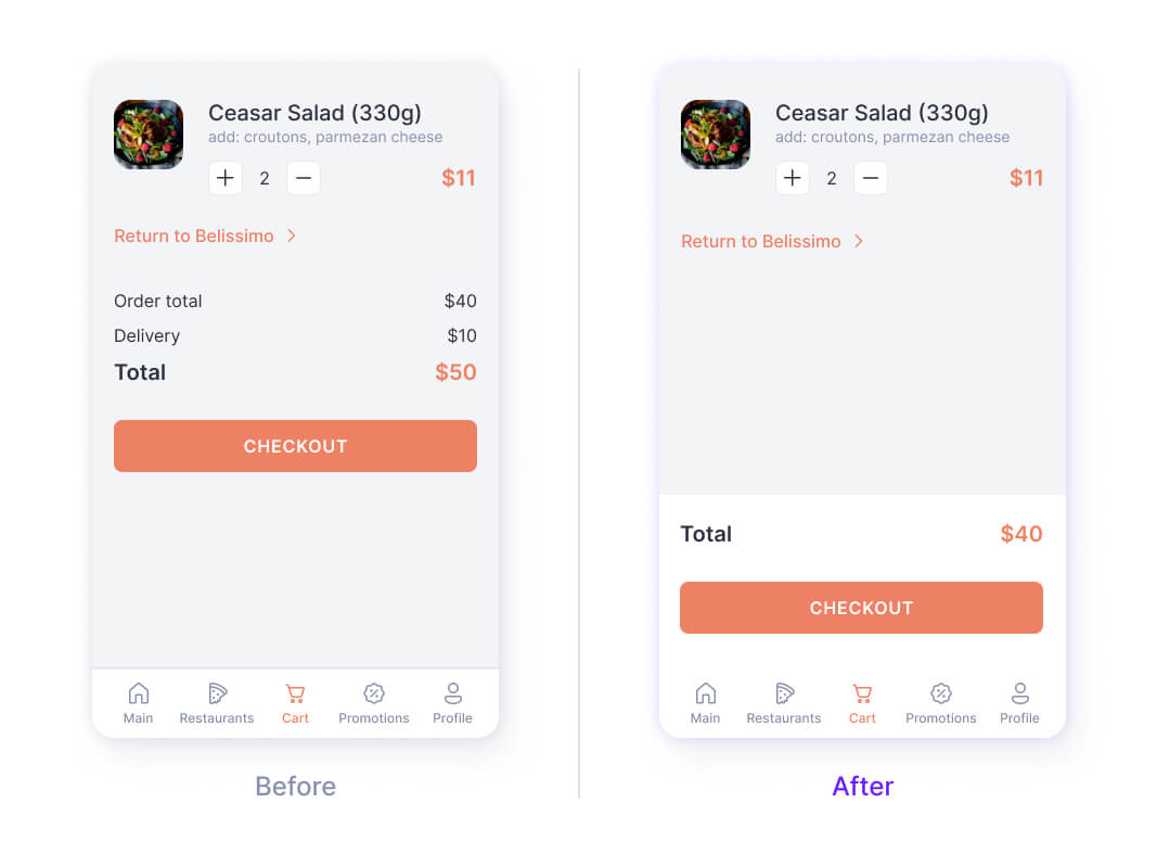
Mistake â„–5. Non-fixed total price

Let’s specify the goal of the cart once again. A user should be able to take one last look at what's inside, check the correctness of the pricing, and find out the total price. There is no definitive solution or a rule of thumb about the placement of total, but in my projects, I prefer to keep it fixed at the bottom of the page. This way, no matter how many products are in the cart, I can always see how exactly the next delivery would hit me in the pocket, without extra scrolling. 

Now let’s press the Checkout button and... What is that?

Fixing 9 Common UX Mistakes in Food Delivery App | UX Upgrade Cieden

Mistake â„–6. Different header styles

I spotlighted the importance of visual consistency in the first episode of UX Upgrade. If you haven’t seen it yet, I recommend you to check it out. I would apply the header style of the second screen to the first one because its “back” button naturally makes it more relevant for a user. However, the choice of the header style is simply a matter of taste so that you can pick and apply anyone from a variety of available ones. You just make sure you realize and can substantiate your preference.

Have you noticed that we have already changed this header twice? This is the iterative nature of the design process in action. 

Fixing 9 Common UX Mistakes in Food Delivery App | UX Upgrade Cieden

Mistake â„–7. Overcomplication

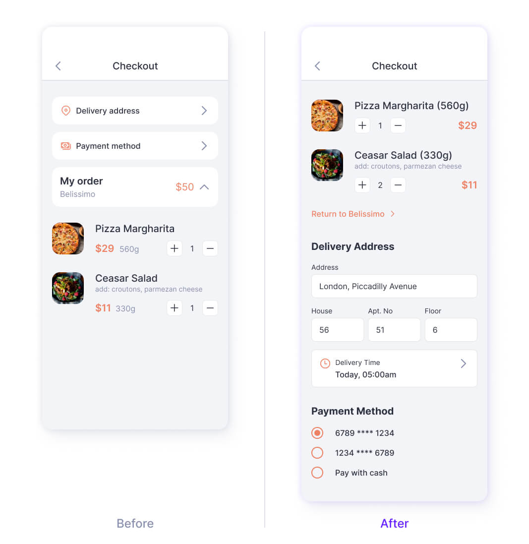
Right now adding an address and selecting a payment method are processed on two separate pages. This is not convenient. We'll come back to that one.

But before that, a more serious blunder is the practice of asking users the same questions over and over again. Delivery apps usually ask for the location at the start of the entire flow in order to show only relevant restaurants where delivery to your area is available. Just save all the data already provided by a user and then pre-fill respective fields automatically to streamline the ordering process and not keep a user hungry longer than needed. 

Now, let's get back to the problem of two stand-alone pages. Using additional pages without utmost necessity noticeably overcomplicates the process of filling out the data because it requires extra effort and more time to access the checkout page. In particular, we need to: 

  • tap every section,
  • then save changes,
  • return to the previous step,
  • and do this for both operations!

That's time-consuming, - and exhausting. 

Yet a primary goal of good user experience is, on the contrary, to make it as quick and frictionless as possible, and let a customer enjoy their favorite burgers, pizza, or salad in a blink of an eye. The faster a user completes their goal, the more positive their emotions and higher the chances to get back for reorder are.

So, let’s simplify the form and reduce it to just a few fields. If you are attentive enough, you could notice that I didn’t change the time field. This decision is based on the assumption that an option of scheduling the delivery may be not available for some restaurants. Thus, this feature belongs to secondary, not primary functionality. Such an understanding in turn comes from hands-on experience of using catering services. This is how design and real life work together!

Fixing 9 Common UX Mistakes in Food Delivery App | UX Upgrade Cieden

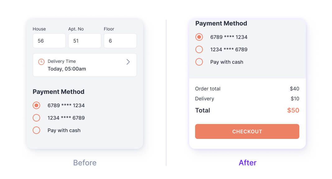
Mistakes â„–8. No price total

Most likely designer carelessness led to this mistake. If we could ignore the total price on the previous screen (I totally don’t recommend doing that), the total price is the key element of the checkout page. 

Fixing 9 Common UX Mistakes in Food Delivery App | UX Upgrade Cieden

Mistake â„–9. Incorrect wording

Here we are… the last screen. 

“It’s so simple, isn’t it? How could there be any mistakes?” This is what Dr.Watson would say. 

“Elementary, my dear Watson! Pay attention to the words!” This is what Sherlock Holmes would reply.

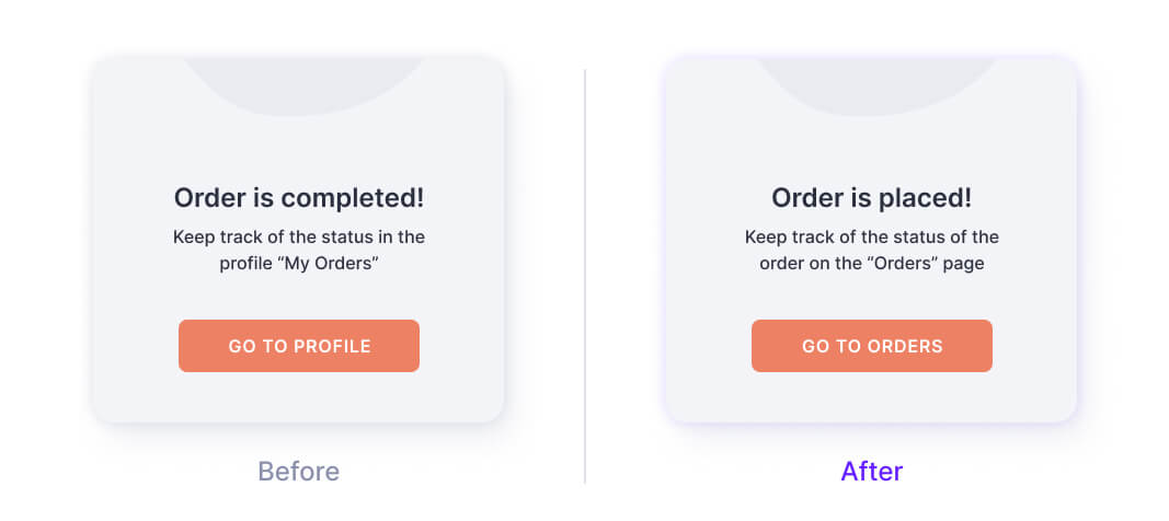
First, the heading reads: “Order is completed”. But a hungry user feels this is not true: the order will be completed indeed when the food arrives on that table in that kitchen (or at least at the front door!). Then let’s change the heading to “Order is placed”. It displays the current order status more precisely.

Second, the button suggests proceeding back to our profile. But why do we need a profile if we are waiting for our order? Let’s better redirect a customer to the Orders tab where they could track a courier's location. 

Fixing 9 Common UX Mistakes in Food Delivery App | UX Upgrade Cieden

Conclusion

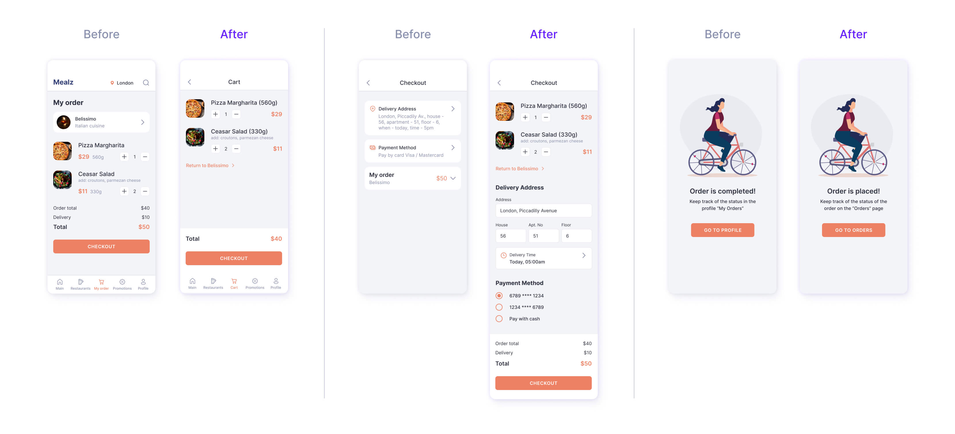
Now let’s check the results and compare “before” and “after”, as we always do. “Amazing..!” These are supposed to be your words, my dear readers, because I never like to toot my own horn. 

Fixing 9 Common UX Mistakes in Food Delivery App | UX Upgrade Cieden

I really hope this article was interesting and useful for you. The key insights that you could get from this workshop about designing a shopping cart and a checkout for a food delivery app include: 

  • the composition and hierarchy of elements should be clear and consistent, without confusing duplication or displacement;
  • the visual language of a user interface needs to be intuitive and easy to follow. This is provided by proper contrasting, alignment, and placement of elements;
  • some types of quantitative data require more space when they get filled out with real data. This enhances the importance of advance planning;
  • implementation of a unified style and avoiding overcomplication makes the user experience more time- and energy-saving;
  • apparently close concepts may convey completely different meanings, so pay attention to the exact meaning of words and phrases in your UX copywriting not to mislead a user.

I am already working on the next class that will be more systematic and theoretical than all the previous ones put together. But this theory will not be boring! 

Stay safe and watch for updates!

Did you like the article?

Help us share it:

Fixing 9 Common UX Mistakes in Food Delivery App | UX Upgrade Cieden

start your project with us.

Getting in touch
is easy .
Thank you for your message. It has been sent