ux/ui essentials

Fixing Bad UX | Cinema Tickets Purchase Service, UX Upgrade

10 min read
Dara Bilousova
Dara Bilousova
18 Feb 2022
Fixing Bad UX | Cinema Tickets Purchase Service, UX Upgrade Cieden

This article continues our Fixing Bad UX series, where I take real-world design examples and demonstrate how a few simple but competent and precise changes can elevate the quality of user experience to a whole new level.

Previously, I chose a sample of a mobile banking platform from Dribble. This time, we'll be working with a cinema tickets purchase page. While its design appears to be typical and broadly accepted among users, a discerning eye will notice how much room for further improvement it conceals.

Fixing Bad UX | Cinema Tickets Purchase Service, UX Upgrade Cieden
Play

Mistake №1. Information cards inconsistency

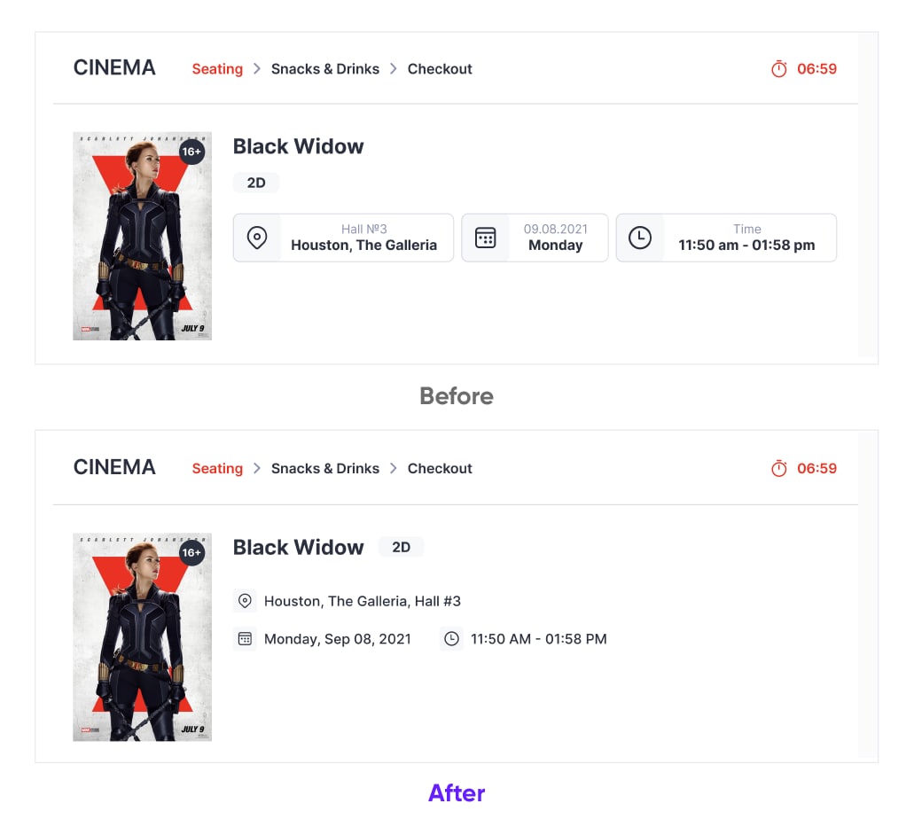
The first thing you notice are cards with additional information about a particular movie. They are intended to inform users of a film’s location, date, and time. In the current format, they poorly fit this purpose. 

Due to the inconsistency between labels and text inside the card fields, it requires additional effort from the user to figure out what it is all about quickly. Specifically:

  • the first card comprises textual formats of data in both sections;
  • the second one has the date in the numerical format in the upper line and the day title as text below;
  • the third card is the exact opposite, with a number-based label topped with the word "time.

The most straightforward solution is to make the text and labels consistent by swapping them in sections 2-3. 

However, I can show you an even smarter solution. If we simplify the overall style of the cards, we will both simplify UX and free up more space on the page. 

It can be done in three simple steps:

  • there is no need for the words “address”, “time”, and “date”. Icons referring to this data are already informative, so textual labels are redundant;
  • for the sake of convenience, it makes sense to place the longer address in the first row and the date and time on equal intervals underneath it;
  • and the icing on the cake, let’s put the “2D” label right next to the movie title. This would save vertical space for the main content.

Check out how these changes affected the perception of UI and the quality of UX.

Fixing Bad UX | Cinema Tickets Purchase Service, UX Upgrade Cieden

Mistake №2. Unbalanced composition

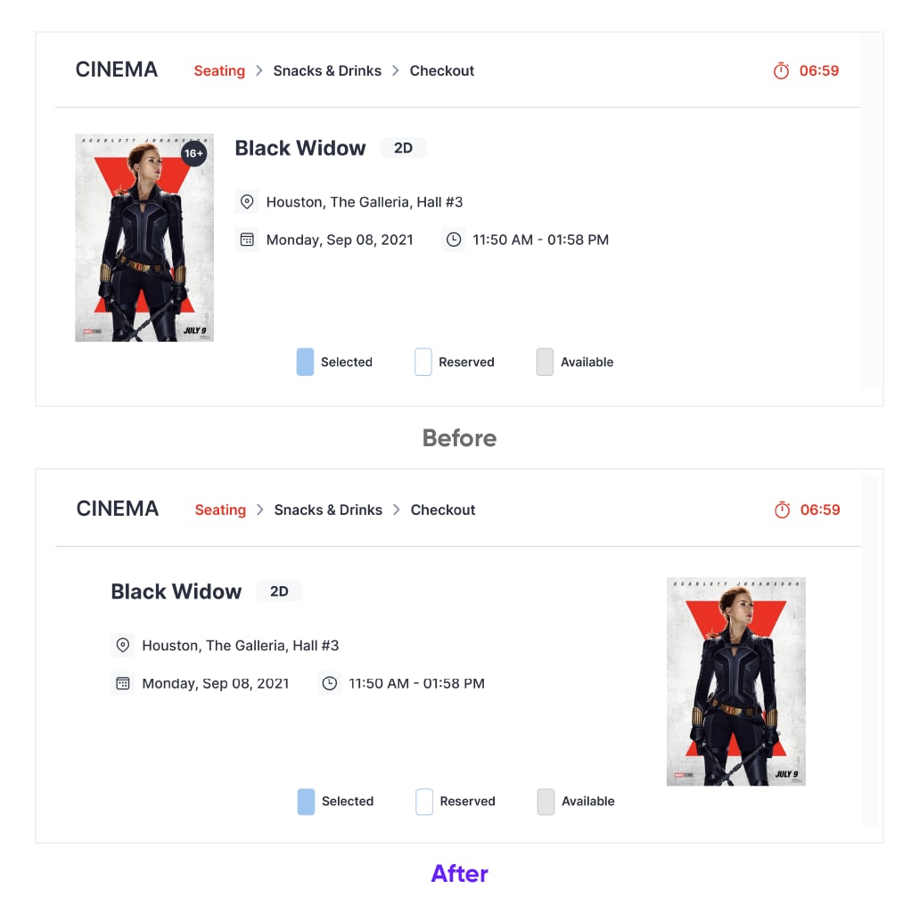
As the proverb says, “What’s good for the back is bad for the head”. You have definitely noticed that while fixing the first mistake I have involuntarily made the composition unbalanced

Now the visual perception of the page has become heavily left-weighted, while the right side stays empty. Such a situation does not suit us, because unbalanced composition creates discomfort for human eyes and makes the design look less appealing. 

Yet this problem is so easily fixed. We just need to move the poster to the right.

Fixing Bad UX | Cinema Tickets Purchase Service, UX Upgrade Cieden

Mistake №3. Unclear legend

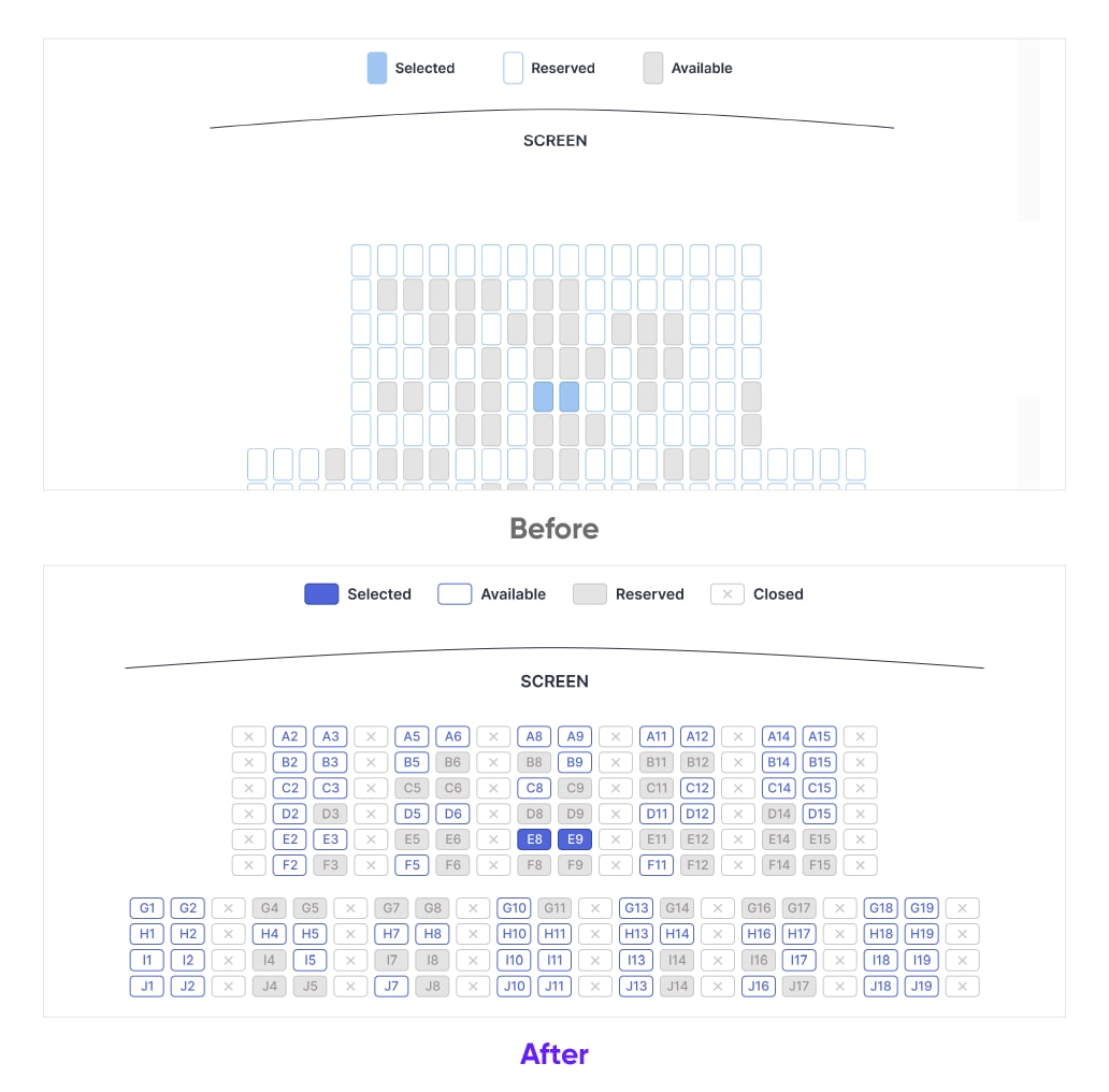
Now let’s take a look at the map of a cinema hall. What do you think, is its legend convenient enough to choose a seat? 

Without row/seat numbers, it is very difficult to sort out the position of your seats (for example, if you would like to sit next to your friends who already bought their tickets). These labels appear in the checkout section only when those seats are selected. 

Also, the current color scheme is misleading about the status of seats as empty or taken: 

  • the blank space usually signifies vacant positions, while in this legend it is, on the contrary, attributed to reserved places;
  • the same is true for the greyed sections. Grey color is intuitively associated with inactive (i.e. unavailable for booking) elements, while here it refers to vacant seats.

We can improve this over-complicated and unclear legend with several simple steps.

  • let’s start with adding row/seat numbers to the seat fields to simplify a user’s navigation;
  • this in turn necessitates modifying their shape from vertical to horizontal for saving space on the page;
  • to fix the color concept of the legend, we will make reserved seats grey and vacant ones white/blank with a colored outline. They would fill with color when selected. 
Fixing Bad UX | Cinema Tickets Purchase Service, UX Upgrade Cieden

In this way, the design becomes more clear and predictable, while a user regains control over the purchasing process. 

In addition, a good design should be adaptable to changes in a user's needs. The most recent event that has made its alteration to all the realms of human life is the COVID-19 pandemic. So it would be nice to allow for showing the seats closed off in compliance with the lockdown restrictions. For example, we can mark the “safety distance” seats in our legend with a cross. Note, that the design remains understandable and uncomplicated.

The following mistakes are not so grave. Still, they similarly produce a noticeable impact on user experience. 

Mistake №4. Misleading elements

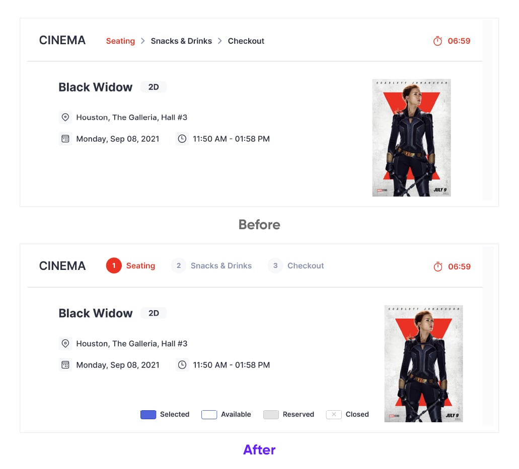
Such a design pattern as breadcrumbs is typically used to navigate between nested pages, and get to a particular page or option instantly. However, if we look attentively at this element on our page, its purpose is completely different. It works as a form stepper to show stages and progress in the purchase process. But this is not the format adopted for this element in the digital product design.

Let's make it look the way it should so you can appreciate the difference. 

Fixing Bad UX | Cinema Tickets Purchase Service, UX Upgrade Cieden

Mistake №5. Purposeless countdown

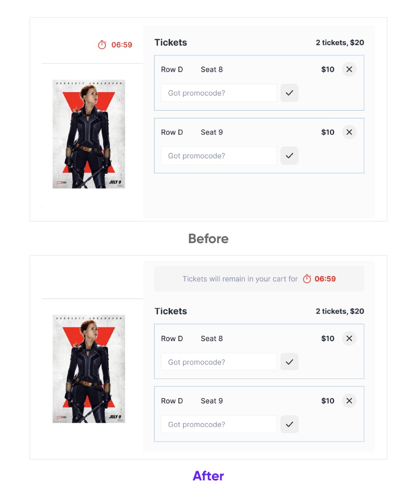
If you noticed the countdown timer, you might have wondered why this element is above the movie poster when it is supposed to be in the checkout section.

A countdown timer is undoubtedly an important element for such a type of service. It creates a sense of urgency and thus speeds up the ticket booking process by showing the user how much time is left to complete the purchasing procedure.

While the business's intentions are clear, they may not work if a user finds this element in the wrong place and has no idea what it is about. It may go unnoticed or even cause anxiety, distorting a user's overall emotional experience. 

To solve this problem, we need to:

  • relocate the element to the checkout section; 
  • add microcopy with an explanation of its meaning.
Fixing Bad UX | Cinema Tickets Purchase Service, UX Upgrade Cieden

Mistake №6. Several promo code fields

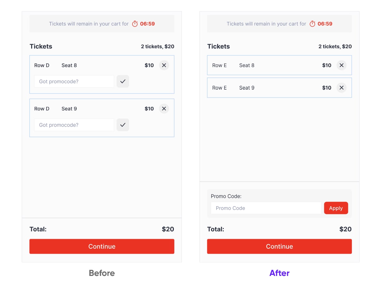
Under the current version, every ticket has a separate promo code field. As there are only two tickets in the processing, this does not seem to be a big problem. But imagine you are going to buy thirty tickets for a student group. Then entering a promo code for each one would turn into a nightmare and eat an awful lot of your precious time. If you are in a hurry then this obstacle would definitely make your drop the case halfway.

A sound solution is to use only one promo code per order while leaving it to the developers to denote the difference between discounted and full-price tickets. 

Fixing Bad UX | Cinema Tickets Purchase Service, UX Upgrade Cieden

Mistake №7. Poor readability of the total

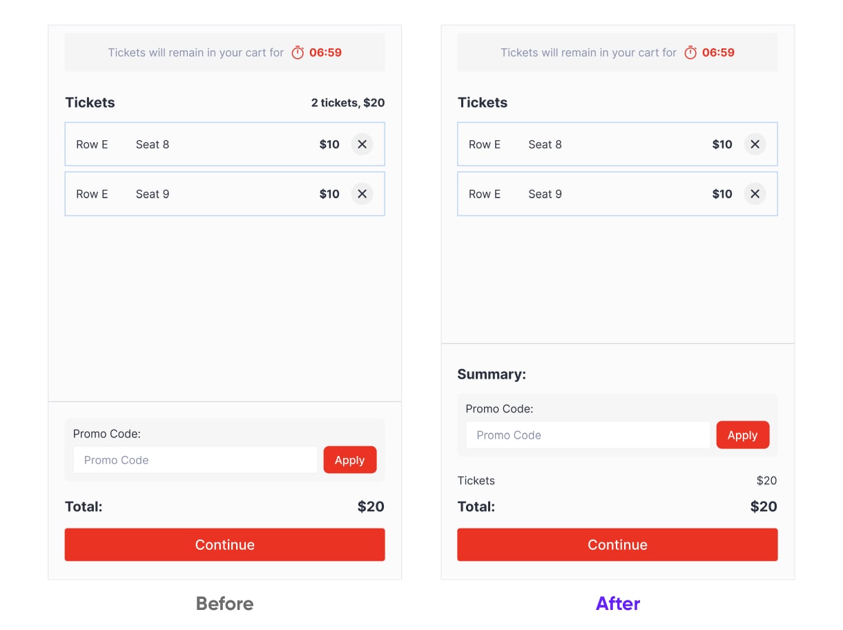
"The subtotal is near the title "Tickets," and the total is at the opposite end of the page. It's a little disconcerting for a user because these categories are interrelated and should logically follow one another.

Therefore let’s put both elements within the same section in the lower right corner of the page. We can also add a title to clarify their hierarchy.

Fixing Bad UX | Cinema Tickets Purchase Service, UX Upgrade Cieden

Conclusion

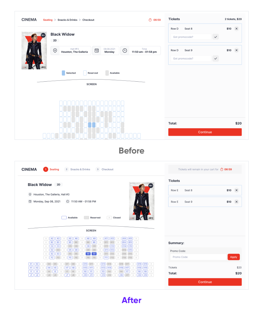
You can now compare the design before and after our improvements and estimate the difference in UX quality. I hope you agree that the latter is far more suitable for user needs. This, in turn, would enhance their overall satisfaction with the cinema.

Fixing Bad UX | Cinema Tickets Purchase Service, UX Upgrade Cieden

So the key lessons learned from this workshop are as follows:

  • consistency both within and between the design elements is critical for good readability of a page and smooth running of UX;
  • to serve its purpose, the legend should be clear, precise, intuitive, and adaptable to changes;
  • misuse of design patterns and inappropriate placement of elements on the page may mislead a user and create unneeded friction points in their experience;
  • a good design should always be ergonomic and space-saving. The principle of Occam’s razor, “entities are not to be multiplied without necessity”, is fully applicable in this realm.

As this series progresses, I'll show you how to improve your designs in countless different ways. Stay tuned!

start your project with us.

Getting in touch
is easy .
Thank you for your message. It has been sent