The art of toggle UI: where and when to use it?

-
Use a toggle switch in UI for simple, binary choices like turning features on or off, managing security settings, or switching system modes.
-
Ideal when a quick, immediate change is required without any additional steps.
-
Avoid it for actions that require user confirmation, involve selecting multiple options, or have intricate dependencies.
-
Prefer toggle design over buttons for on/off settings, but use buttons for cycling through different modes or options.
-
Choose checkboxes when users need to select several options simultaneously.
Terminology and legacy
To avoid confusion, let's distinguish between a toggle switch (a single slider for binary on/off states, like a light switch) and a toggle button or segmented control (a group of buttons for selecting mutually exclusive options, e.g., List View vs. Map View, not simple on/off).
Toggle switches, based on skeuomorphism, mirror physical light switches. Their familiarity is their key strength. It allows users to instinctively understand their immediate activation.
Even though the toggle switch reminds us of a real light switch, that's also its downfall in digital apps. Unlike a real switch, its digital twin often doesn't give instant, clear feedback, which can totally confuse users and mess with how they think things should work. This disconnect is why people keep debating whether it's still useful. The component only really works if that light switch idea holds up. If the "light" doesn't come on right away, things get unclear.
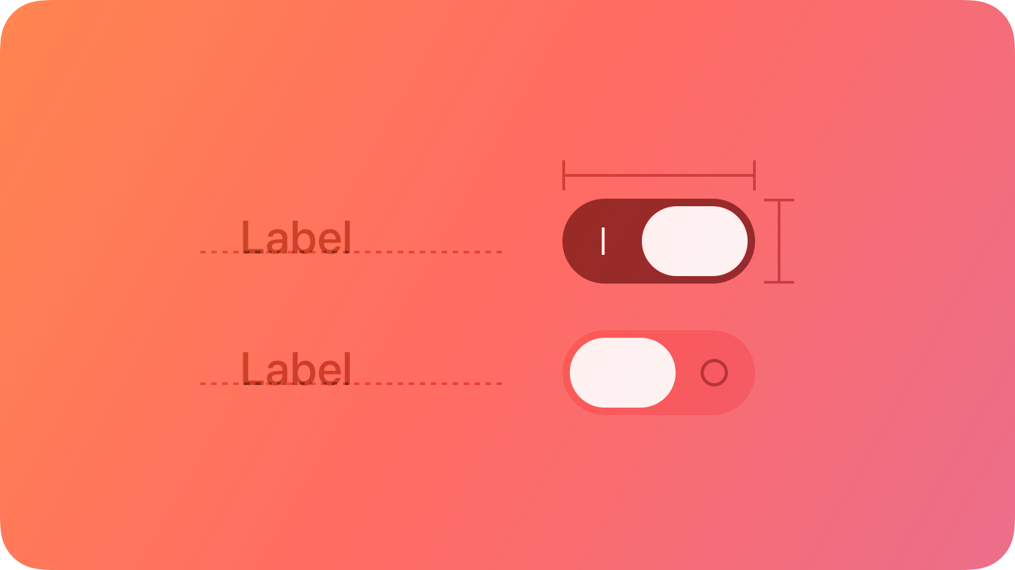
A toggle switch in UI provides users with a mechanism to change between two states. In enterprise applications, where quick and accurate adjustments are needed, toggle switches offer an efficient solution.
What is a toggle switch used for?
- Feature activation: Enable or disable functions like reports, real-time data updates, or notifications.

- In-app preferences: Configure dashboard layouts, workflow processes, and other settings to suit individual roles and needs.

- Security settings: Control security features such as encryption or user access.

When using a toggle switch in UI is the right choice?
-
Instant сhange is needed: The setting should update immediately without further actions.
-
For simple on/off choices: The decision is straightforward, like "enable/disable."
-
It affects the whole system: The toggle component changes settings that impact the entire application.
When not to use a toggle switch in UI design?
-
For actions requiring confirmation: Use checkboxes or toggle button UI for actions that require user approval.
-
For multiple choices: Opt for checkboxes when users need to select multiple options.
-
For complicated settings: Choose other controls for settings with multiple dependencies that need careful review.
Toggle switch vs. checkbox
Toggle switches and checkboxes both offer binary "yes/no" input, but their proper use depends on context. The key difference is the immediacy of the action they trigger, a fundamental principle for correct application.
-
Toggle switches are like Super Sonic! They change things right away, so you don't need to hit "Save" or "Submit."
-
Checkboxes are a way to make choices within a bigger group of changes. What you select doesn't happen right away. You get to review everything you've picked before you hit "Submit" or whatever the final confirmation button is. So, they're basically for showing what you intend to do or what you choose to do, but without immediately making it happen.
Toggle Switch
Character
Checkboxes
Forms vs. settings
Flowing directly from the Immediacy Principle is the rule of context. The environment in which the control appears dictates the user's expectations and, therefore, the appropriate component.
- Forms: Checkboxes are the undisputed standard for use within forms. A form is a context where users expect to make multiple selections and then submit them all at once. Placing a toggle switch within a form introduces a critical ambiguity: does this one setting take effect now, while the others wait for me to click "Submit"? This violation of the user's mental model is a significant source of confusion and usability problems.
- Settings: Toggle switches are the ideal control for standalone settings pages or panels. In this context, users are typically adjusting independent system functionalities one at a time, such as enabling notifications, activating dark mode, or turning Wi-Fi on or off. Here, the expectation of an immediate result aligns perfectly with the toggle's function.
States and selections
The functional differences extend beyond immediacy and context, particularly when dealing with lists and hierarchies.
-
Multiple selections: If a user needs to select one or more related options from a list (e.g., choosing pizza toppings), checkboxes are the only correct component. A list of toggle switches would imply that each selection is an independent, immediate action, which is functionally incorrect and inefficient.
-
Hierarchical state: Checkboxes possess a crucial third state that toggles lack: the "indeterminate" state. This is visually represented by a dash or a filled square and is used to signify that a parent checkbox has a mix of selected and unselected children. This functionality is essential for tree-like structures or "Select All" features. A toggle switch is strictly binary and cannot represent this partial state.
Multiple selections
Checkboxes allow users to select multiple related options from a list.
Select accounts for consolidated report:
Complex hierarchical state
Parent checkboxes reflect the mixed state of their children and grandchildren.
Switch vs. checkbox: a contextual decision matrix
| Scenario / question | Use toggle switch | Use checkbox | Rationale and supporting evidence |
|---|---|---|---|
| Does the change take effect immediately? | Yes | No | Toggles are for instant actions; checkboxes are for deferred actions confirmed by a button like "Submit" or "Save". |
| Is the control inside a form with a 'Submit' button? | No (avoid) | Yes | Using a toggle inside a form creates ambiguity about when the setting is applied, violating user expectations. |
| Is the user selecting one or more items from a list? | No | Yes | Checkboxes are designed for multi-selection from a list of related items. |
| Does the control need to represent a parent/child hierarchy (e.g., "Select All")? | No | Yes | Checkboxes support an "indeterminate" state, which is necessary for hierarchical selections. Toggles are strictly binary. |
| Is the control for a single, independent system setting (e.g., Dark Mode)? | Yes | (Can be used, but toggle is often preferred) | This is the primary use case for a toggle switch, especially on mobile, as it clearly communicates an active state change. |
| Is the user making a single 'yes/no' choice? | (Can be used) | Yes | While a toggle works, some guidelines suggest a single checkbox is more usable for a simple yes/no question, as it doesn't imply a default value. |
Toggle switch vs. toggle button
Toggle switch design works best for settings that can be turned on or off, while toggle button design is used to let users switch between different options.

Here’s a quick comparison:
| Aspect | Toggle Switch | Toggle Button |
|---|---|---|
| Interaction | Easy on/off control | Switches between options or modes |
| Visual indication | Instantly shows on/off status | Highlights the selected mode or option |
| Use case | Turning a feature like notifications on or off | Switching between editing and viewing modes |
Apple and Google's toggle guidelines
Apple and Google, the big players in mobile and desktop, have their own official rules for how to use components. Even though they both agree on the basic idea of a toggle switch, their guidelines for where and how to label them are pretty different, which really affects design.
Apple's Human Interface Guidelines (HIG)
Apple's guidelines for toggles are characterized by their precision and strict contextual rules. The HIG treats the visual "switch" component as a specific tool for a specific job.
-
Core purpose and context: According to HIG, a toggle is used to help people choose between two opposing values that affect the state of content or a view. The most prescriptive rule is that the classic "switch" style should be used only within a list row, such as in a settings menu. For a similar binary state change outside of a list (e.g., in a toolbar), Apple directs designers to use a button that behaves like a toggle—such as an icon that changes its appearance when selected—rather than the switch component itself.
-
Labeling philosophy: Apple's stance on labeling is famously minimalist. The HIG explicitly advises designers to avoid adding labels that describe the values of a switch, such as "On" or "Off". The rationale is that these labels are redundant; the visual state of the switch (its color and thumb position) combined with the descriptive label of the list row (e.g., "Airplane Mode") provides sufficient context and clarity, and adding extra text only clutters the interface.
-
Visual design and comparison to checkboxes: Visual distinction between on/off states is crucial for toggle switches, not just color. While green is default, app accent colors are acceptable with sufficient contrast. Switches are preferred over checkboxes for emphasized settings due to their visual weight, but checkboxes are mandated for hierarchical settings.
Google's Material Design (M2 & M3)
Google's Material Design guidelines, while sharing the same core principles as Apple, are generally more flexible in their application and more explicit in their instructions.

-
Core purpose and context: Material Design defines the switch's purpose as toggling a single item on or off, particularly on mobile devices, and to immediately activate or deactivate something. It is positioned as the preferred method for adjusting settings on mobile, without the strict "list-only" constraint found in Apple's HIG.
-
Labeling philosophy: In direct contrast to Apple, Material Design recommends that the option the switch controls, as well as its current state, should be made clear from a corresponding inline label. This reflects a philosophy that prioritizes explicit communication over minimalism. However, Material Design concurs with Apple that placing text
inside the switch graphic itself (e.g., "ON" and "OFF" on the track or thumb) is deprecated and should be avoided. -
Visual design and comparison to other controls: Material Design prioritizes scannability, making selected states more prominent. Material 3 improved touchability, accessibility, and allows optional icons. It recommends switches over radio buttons for independent controls and over checkboxes for simple mobile on/off actions.
Long live the (correctly used) toggle switch

The humble toggle switch is still important in today's UIs. Designers really need to nail its use, making sure it fits its purpose, sticks to common practices, and is crystal clear and easy for everyone to use. It's not about whether we have toggle switches, but how wisely we use them that makes them work so well and feel intuitive. Here are five criterias for effective toggle switch implementation:
-
Immediacy dictates when the action occurs, establishing the toggle's core behavioral contract.
-
Binarity defines what the toggle controls, constraining its use to single, independent, two-state settings.
-
Contextual Fitness determines if the toggle is the right component for the job by comparing it against alternatives like checkboxes and radio buttons.
-
Perceptual Clarity governs how the toggle is visually designed and labeled to ensure its function and state are unambiguously understood at a glance.
-
Universal Operability ensures the toggle works for everyone by making its function and state programmatically available and operable via multiple input methods.
Questions designers should ask themselves
By asking the right questions, designers can question their decisions, find areas to improve, make sure nothing is overlooked, and reduce mistakes, leading to better, more thoughtful designs.
-
Is the feature a clear on/off decision?
-
Should the change be immediate and without a confirmation process?
-
Is the toggle meant for adjusting a setting rather than performing an action?
Credits
Our content combines the knowledge of Cieden’s designers with insights from industry influencers. Here are these kind people and teams who push the industry forward:
-
Peter Demcak on UXtweak
-
Toggle-Switch Guidelines by Alita Joyce
-
What is the difference between toggle switch and toggle button? by Yin Fu Wu
Keep exploring
If you’d like to take toggle switches to the next level, study Core77 for industrial design inspiration.
What it is: Core77 is an industrial design magazine and resource that has been serving the design community for decades. It showcases innovative physical products, materials, manufacturing processes, and discussions on the practice of industrial design.
Why it's useful for toggles: It pushes you to think beyond the screen. A toggle is a fundamentally physical concept, and its digital representation often borrows from our real-world experience. By looking at innovative physical switches in products like high-end audio equipment, automotive dashboards, or smart home devices, you can find inspiration for texture, haptics, materiality, and satisfying tactile feedback.
How to explore it: Browse galleries and projects. Look through their product galleries, student showcases, and design awards sections. Pay close attention to control panels and user interfaces on physical products.
What to look for:
-
Materiality: How do materials like brushed aluminum, soft-touch plastic, or wood change the perception of a switch?
-
Haptics & feedback: Consider the "click" or resistance in a physical switch. How can you translate that satisfying feeling into a digital interaction (perhaps with haptic feedback on a phone)?
-
Form factor: Look at unique switch shapes beyond the standard pill or rectangle. Some of the most iconic products are defined by their unique controls.
Here are some more materials for learning:
-
Toggle Switch: 5 Simple Design Tips For Better Design by Nick Babich
-
UX Design: Checkbox and Toggle in Forms by Nick Babich
- What Makes A Great Toggle Button? (Case Study, Part 1) by Eduard Kuric