ux/ui essentials

SaaS Onboarding UX: Best Practices, Common Mistakes, Examples for Inspo

10 min read
Dara Bilousova
Dara Bilousova
22 May 2024
SaaS Onboarding UX: Best Practices, Common Mistakes, Examples for Inspo Cieden

We’ve already touched upon the significance of easy and convenient SaaS onboarding UX for the commercial success of any product in our article. A brief reminder: nearly 9 of 10 users quit a sign-up process if they find it difficult to complete.

Certainly, the customer onboarding experience is never limited to passing the registration procedure. In a broad sense, it embraces the whole array of activities and resources, ensuring that a new customer gets fully engaged with the product, has got into its value, and has begun using it on a permanent basis.

Yet, in this post, we will focus mainly on the sign-up process. It deserves particular attention as a rather challenging milestone in the onboarding adventure. The more simple and flawless this aspect of the user onboarding flow is, the higher conversion rates you will observe in your customer success metrics, let alone better chances of a successful sale with every particular user.

We’ll deepen our analysis by exploring the guide “Designing the User Onboarding Experience” by John Ozuysal. Expanding on his ideas and examples will give you a broader vision of the subject. By the time the guide was released, John had been the Head of Growth at UserGuiding focused on streamlining the customer onboarding experience of various digital products, so he knew what he was talking about.

By the end of this article, you’ll have an understanding of SaaS product onboarding best practices, steps to making your sign-up process smooth, and mistakes to avoid.

What is SaaS user onboarding?

In SaaS, onboarding indicates a set of online interactions at the starting period of a user’s engagement with a platform, from the initial registration procedure to the first experience of its operational use. However, the mission of the onboarding phase goes far beyond signing up and learning how to work with a product and its core features. 

Along with this, SaaS customer onboarding process aims at:

  • creating the most motivational and engaging experience for a new client at the first stages of a user journey;
  • convincing a customer of a product’s authenticity and unique value;
  • product adoption, i.e., ensuring it is a match with a user’s specific needs, preferences, and basic tasks.

At the same time, in the designers’ community, SaaS onboarding is most often treated as a continuous process that is not limited to the starting period and, actually, lasts throughout the entire user account lifecycle. This is because a good digital product gets improved and streamlined permanently, thus requiring the respective updating of a user all the time.

SaaS Onboarding UX: Best Practices, Common Mistakes, Examples for Inspo Cieden
Play

Effective onboarding principles

In his article, John Ozuysal introduces the “triple A’s” rule to create an efficient and successful user onboarding process. 

The first one — accommodating, means giving a user all the tools needed for using a product. The second one — assimilating, provides a user with a knowledge base enabling their understanding of how exactly (in what way!) a product should be used. Finally, accelerating implies conveying your product value proposition as soon as possible — but also as best you can. Imagine you are a James Bond chasing a beautiful girl to give her a bouquet of beautiful flowers: you are to be quick and still careful not to damage your delicate cargo in a rush.

John also distinguishes three basic components of effective onboarding.

First, highlight the valuable core functions that make your product unique. Explain to a user why they are to prefer your product to those of your competitors, showcase the primary drivers of customer success, and exemplify the positive outcomes for resolving their tasks. Demonstrate social proof wherever appropriate. Be clear and concise.

Second, provide a user with an opportunity to adjust the product to their needs and interests. Envisage powerful tools of customization and opt-in forms, empowering a user to start using the software at its fullest potential and achieve their personal outcomes. This is also a brilliant first step in building good and lasting relationships between a customer and the brand that ensures long-term retention, as well as more meaningful and valuable feedback.

Third, guide users, i.e., provide clear instructions on how to use your application. This applies to both using the product as a whole and configuring individual modules, such as profile photos or administering user interests. This component may take different forms of educational content and training, including product tutorials, actionable guides, video instructions, interactive walkthroughs, product tours, etc.

SaaS onboarding best practices

Now, let’s proceed to the practical part of this article. Read on to explore some onboarding UX best practices used in top-level SaaS products.

Initial setup

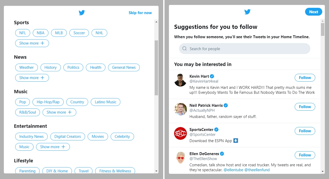
Good practice for the first launch of a product is filling in personal data such as user name, interests, profile photo, etc. This is how X (formerly Twitter) does it, by offering customized topics and selected accounts that may be of greatest interest or relevance to you, based on the preferences indicated in the profile section.

As an outcome, each session on X becomes growingly enticing since a user knows that a myriad of events and subjects (and people!) they are most excited about await in their user journey — specifically in the news feed.

Twitter recommends topics and people to follow as part of the SaaS customer onboarding process.

Source: X

At the same time, applying this practice in the wrong way may, on the contrary, lead to devastating effects on the product experience and long-term retention, even among your most advanced users. Of course, if you are X and creatively explore every way to personalize your customers’ digital experience without great fiscal risks, then do everything you like. Otherwise, be extra careful. In particular, never ask a user for personal details that have nothing to do with their content customization.

The hook of engagement

The initial setup is not enough to make the SaaS onboarding journey a piece of candy, even despite the efforts a user invested in filling in a sign-up form and a profile. So, let’s brainstorm other potential sources of their motivation to get back to the platform.

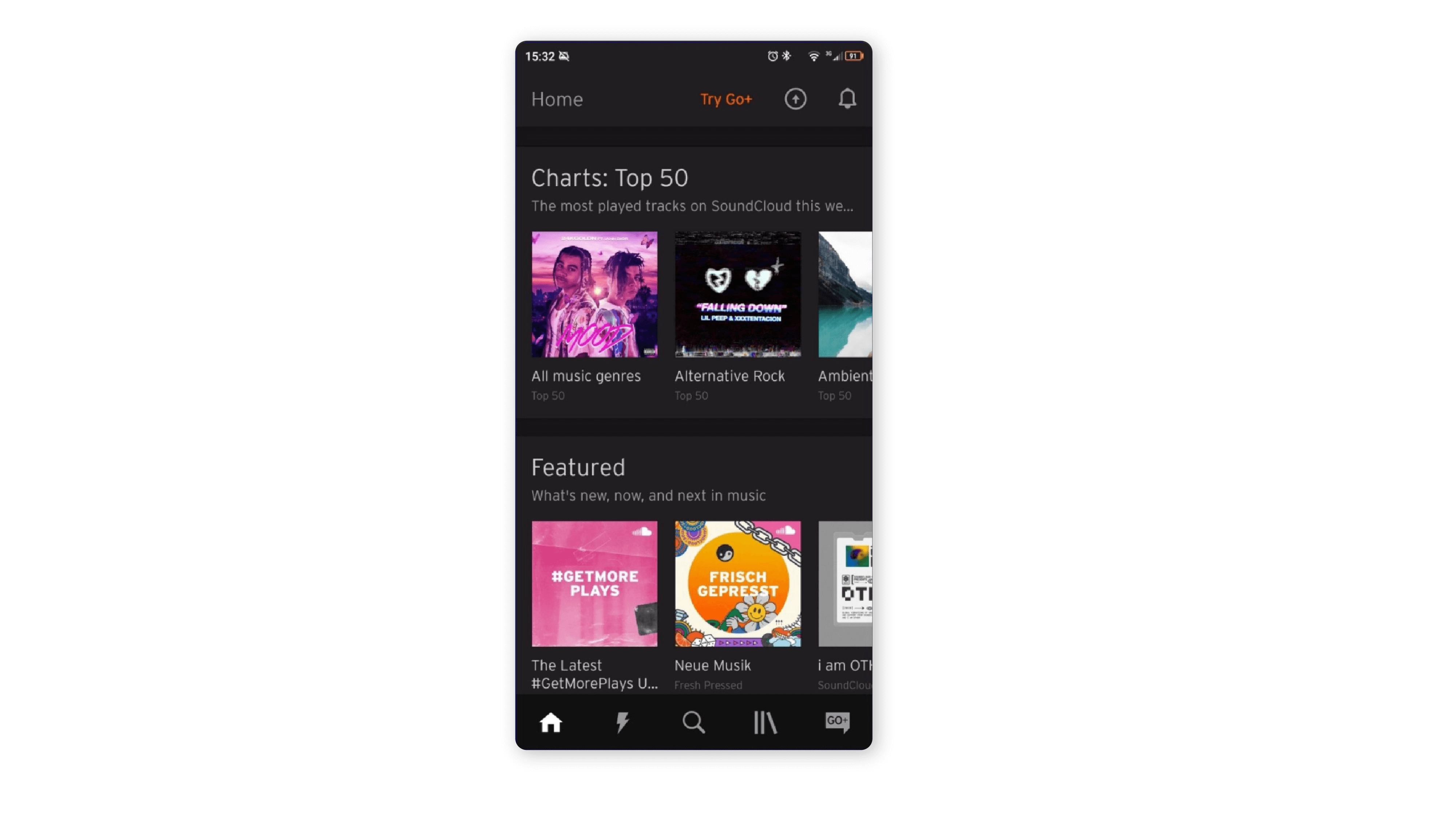
For example, SoundCloud can pitch a good idea. At this cloud-based streaming platform, immediately after completing a sign-up process, a user sees playlists with trendy songs and thoughtful mixtapes, again tailored to the user’s particular tastes.

SoundCloud app suggests tailored playlists as part of their SaaS onboarding strategy.

Source: SoundCloud

Interactive learning

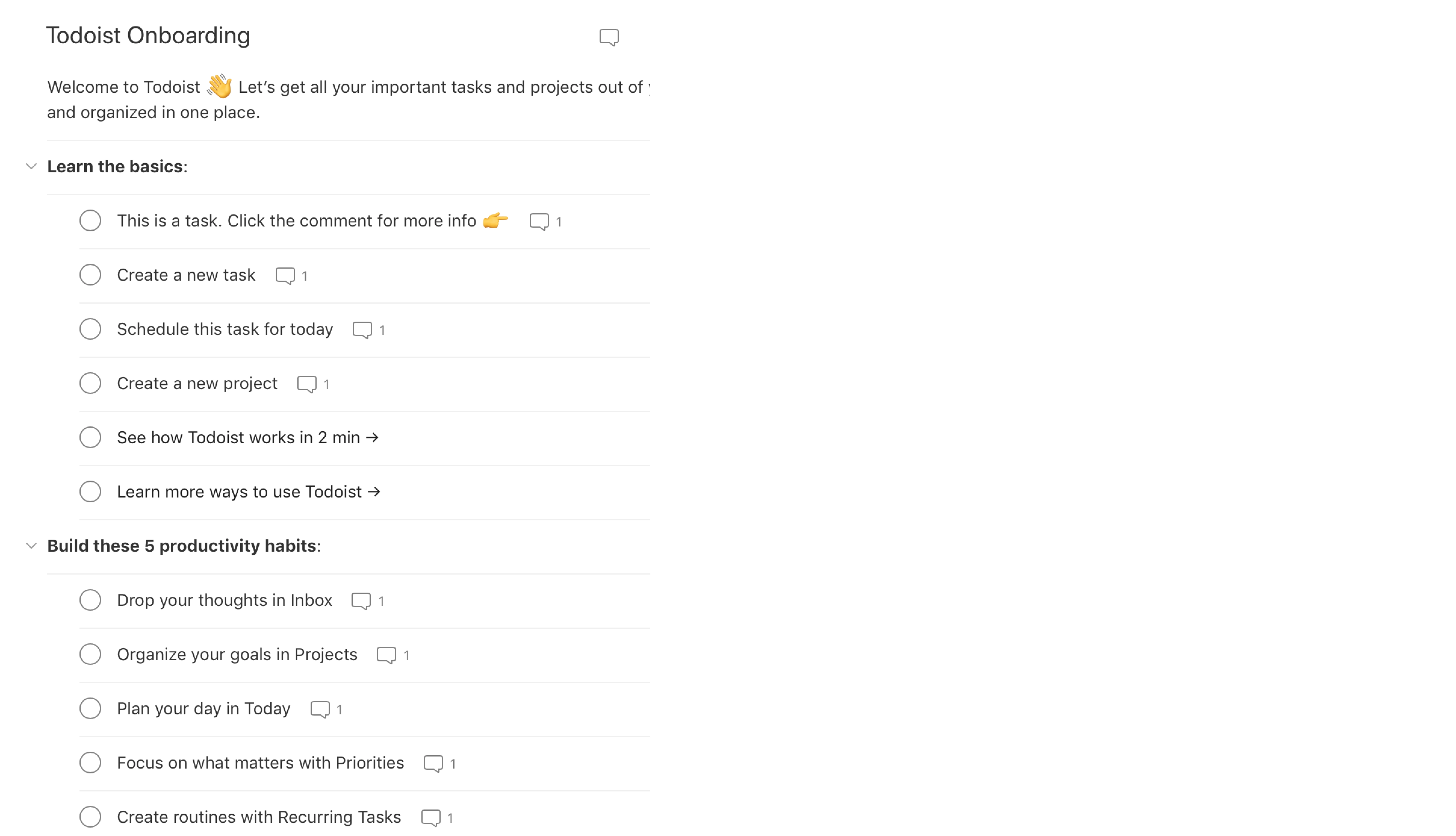
This type of onboarding is perfectly demonstrated by the task management tool Todoist. After signing up, you are offered to create several key tasks, set their deadlines, add them to active sections or projects, etc.

Todoist offers interactive learning to onboard users.

Source: Todoist

Actionable guides and a product walkthrough have no fixed form. So you can use all your imagination and creativity to design onboarding that both amuses and entertains prospective users while giving them all the necessary information about the product activation.

In this way, a user doesn’t merely observe a product’s functional capacities but can immediately “touch and feel” it from all sides and make a well-founded decision if it fits them.

Steps to successful SaaS customer onboarding

Most of the following methods apply to any SaaS platform. You can choose the needed ingredients depending on the specifics and needs of the project.

Make it easy to start

Ensure that the first stage of your onboarding procedure is simple, intuitive, and clearly maps out the entire process.

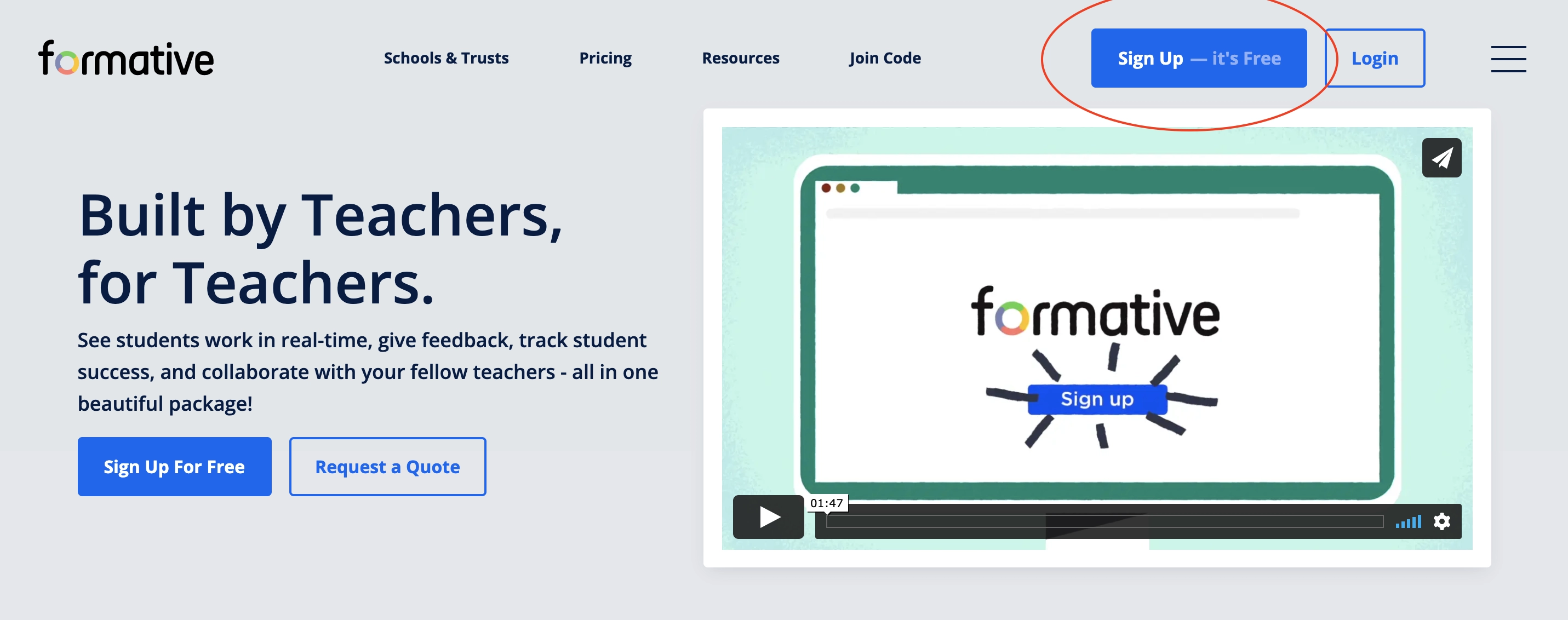
The further away, the more inventive SaaS designers become in leading a newcomer into the customer onboarding process from the first seconds of landing on the home page. For example, a CTA button may be replicated several times within each homepage section, in place of its conventional use at the beginning and the bottom only. 

Also, instead of classical “join,” “get started,” or “sign up” for this element, you may now oftener encounter its extended and/or more creative versions, e.g., “join now, it’s free,” “start your free trial,” or “try it right now.”  Sometimes, such catchy appeals are implemented even for a navigation menu, as in this example.

An example of a catchy sign-up CTA button implemented within the Formative's SaaS onboarding UX.

Source: Formative

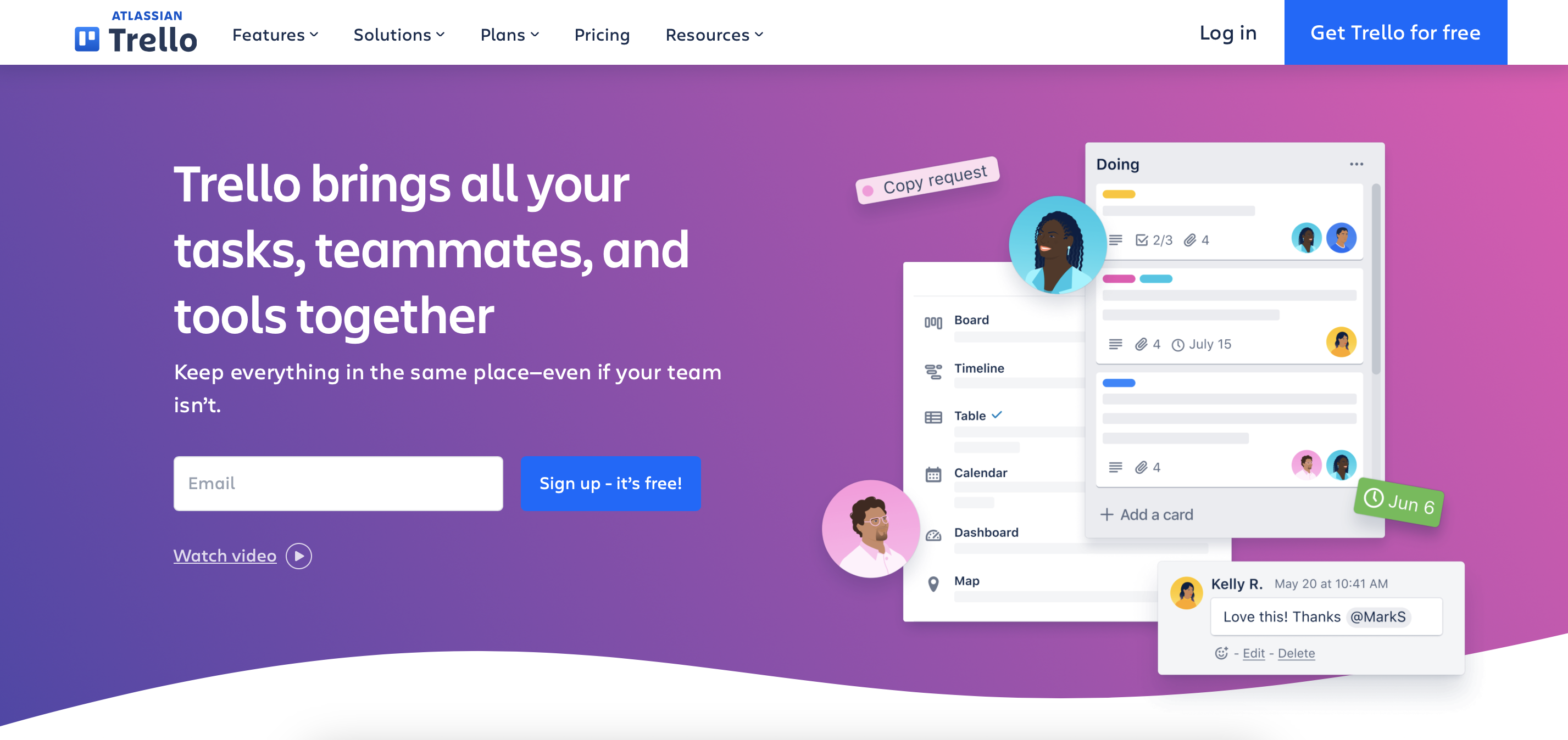
A popular project management app went even further and initiated the sign-up process within the user response to CTA.

The sign-up process within the user response to CTA, implemented by Trello.

Source: Trello

By placing an email field near a CTA button and adding information about no financial obligations, designers created conditions in which a potential customer gets onboarded simultaneously with pressing a button.

This and similar UX onboarding best practices demonstrate one basic intent: to reduce the attention span and energy needed for the customer to start onboarding to the minimum threshold.

Make it fast

Include only the most essential items, such as email address, password, and phone verification, if needed. Leave an opportunity to add all other personal data and customization in the member area later.

What makes such an approach the most effective and viable? Simply because the rule of 8 seconds of the customer’s attention remains relevant for the registration process, as it was for the landing page. If a user stumbles in the complex variety of fields and categories before they are determined to work with your product, there is a big chance they will not finish.

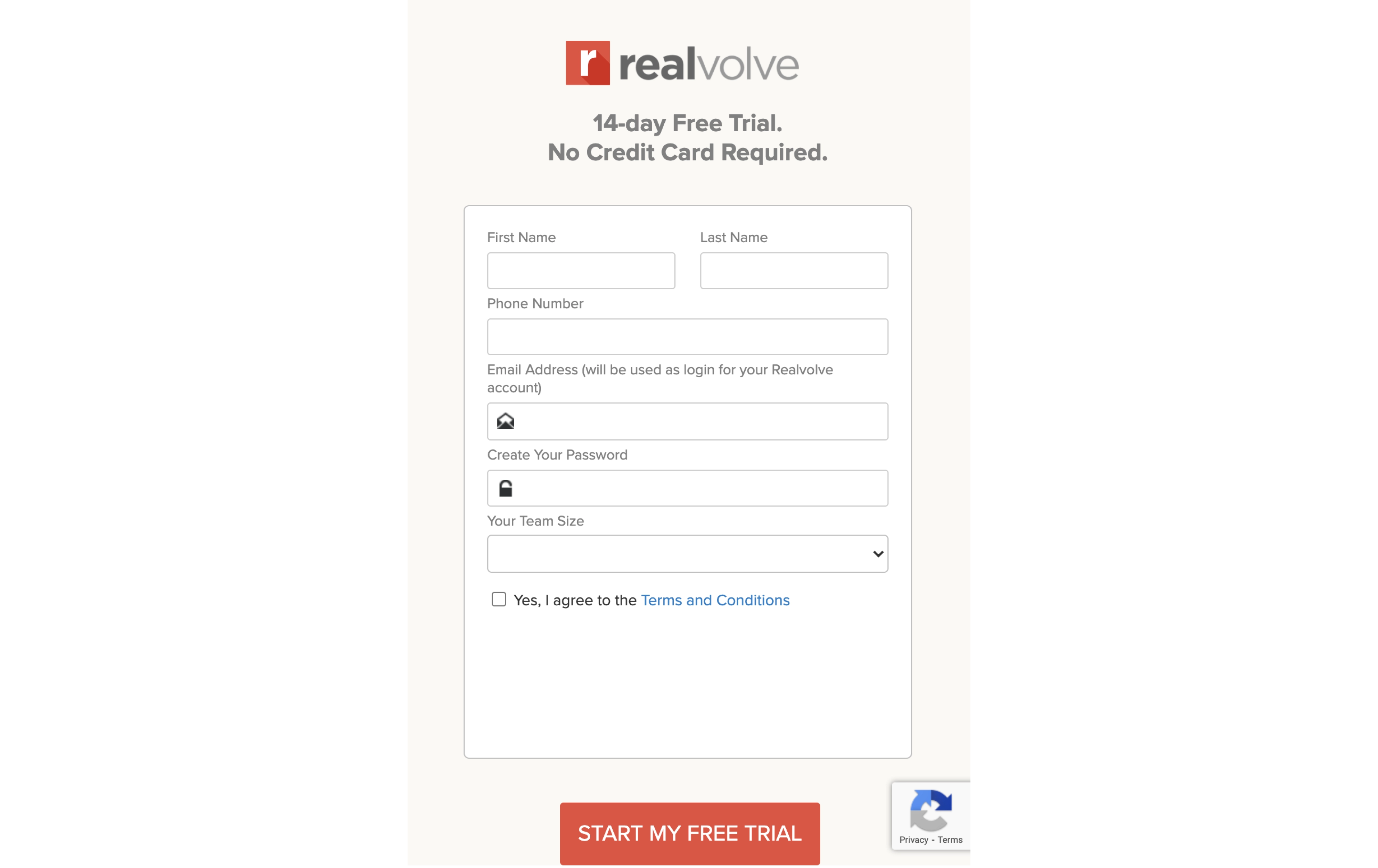
This example of a real estate CRM platform perfectly exemplifies how good UX design may include all the needed elements within a concise and non-exhaustive form.

A sign-up form with minimum elements, including name, phone number, email, password, and team size by Realvolve.

Source: Realvolve

Nothing redundant is eliminated, and everything that could be was optimized.

Based on this case study, we have a set of useful patterns and tips for providing swift registration. In particular:

  • an email address may also serve as a user login;
  • password need not require double entry (it can be restored with email anyway);
  • a field with a team size gives the platform the needed basic information to customize its service for a customer (depending on your product specifics, this field differs, of course). This removes the need for a separate customization step;
  • introducing a free trial period that does not require a credit card. This smart UX move lets you start using a platform and all its features right after pressing a button!

Make it clear

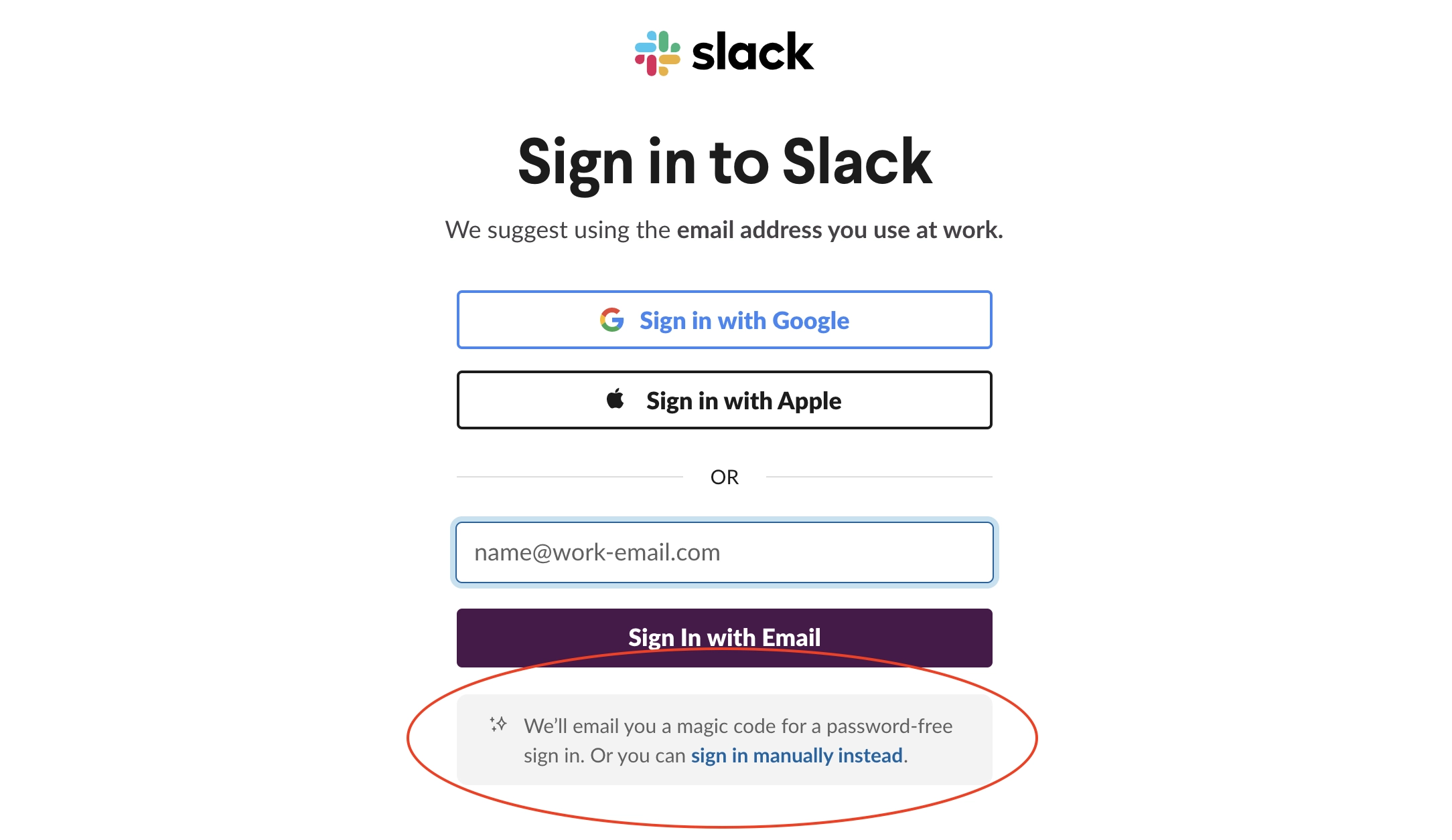
Follow the customer on each step of the onboarding process, guiding them with built-in tooltips, simple microcopy instructions, eye-catching visuals, and encouraging notifications to minimize the time and energy spent figuring out the process.

A sign-up form with encouraging tips as part of SaaS onboarding UX in Slack.

Source: Slack

Following their human nature, a product designer may be tempted to think that some steps and required actions are fully intuitive and tangible, so nothing needs to be explained. However, in reality, the clarity of something to you does not imply it for everyone. That is why tooltips, visual directions, and small descriptive aids that do not burden the interface can be a great SaaS onboarding solution in most cases.

Make it personal

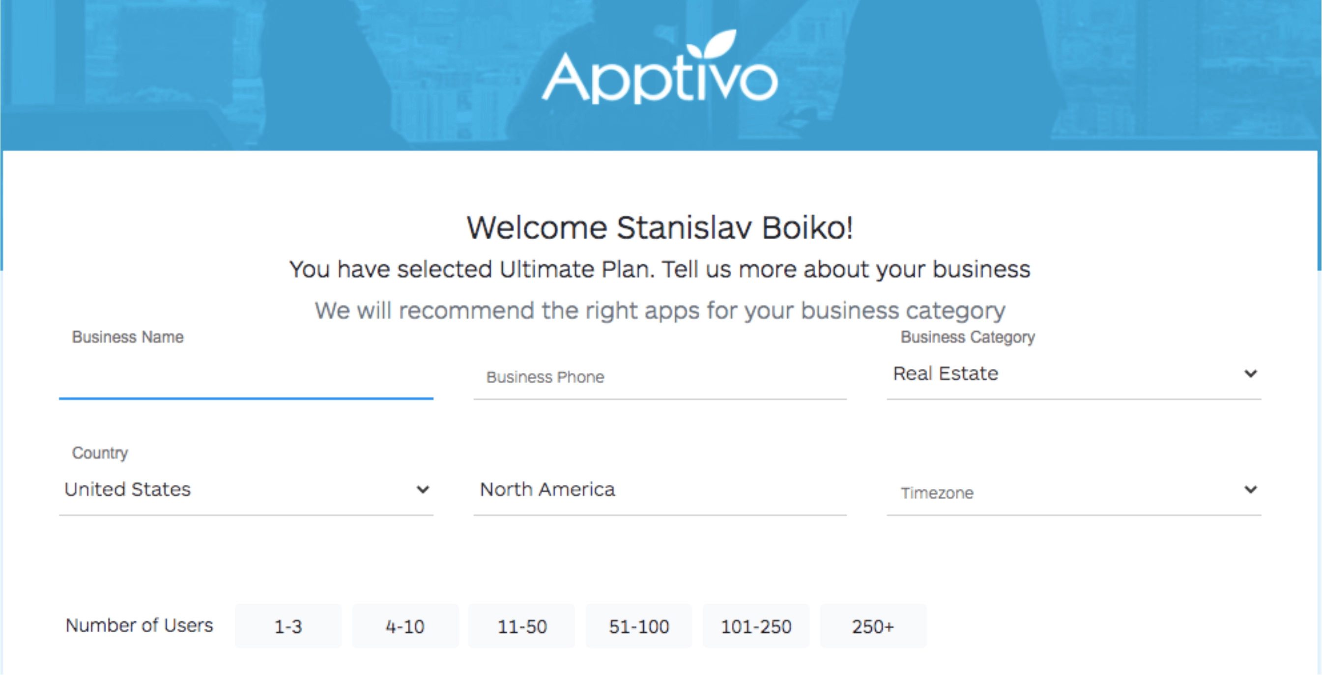
It would be nice to ask a newcomer’s name in advance and then address them personally. Preceding each instruction or recommendation with “Dear John” or “Welcome, Marie” will definitely make the entire process more warm and pleasant.

A personal address to a new customer, implemented by Apptivo.

Source: Apptivo

As in this example, a personal address to a new customer is combined with clarifying his business goals and needs. Taken together, this creates an impression of a human-centric approach, as if the platform distinguishes and takes care of you personally. Showing that your individuality matters to the company makes a “being there” effect underneath the machine algorithm.

Do you want to know how to enhance this effect and make it absolutely irrefutable in your marketing strategy? Assign a personal consultant to each new client, with an introductory email, sent right with the customer onboarding process started.

However, this step requires a large customer management team in your company and goes beyond the UX design competency.

Customize

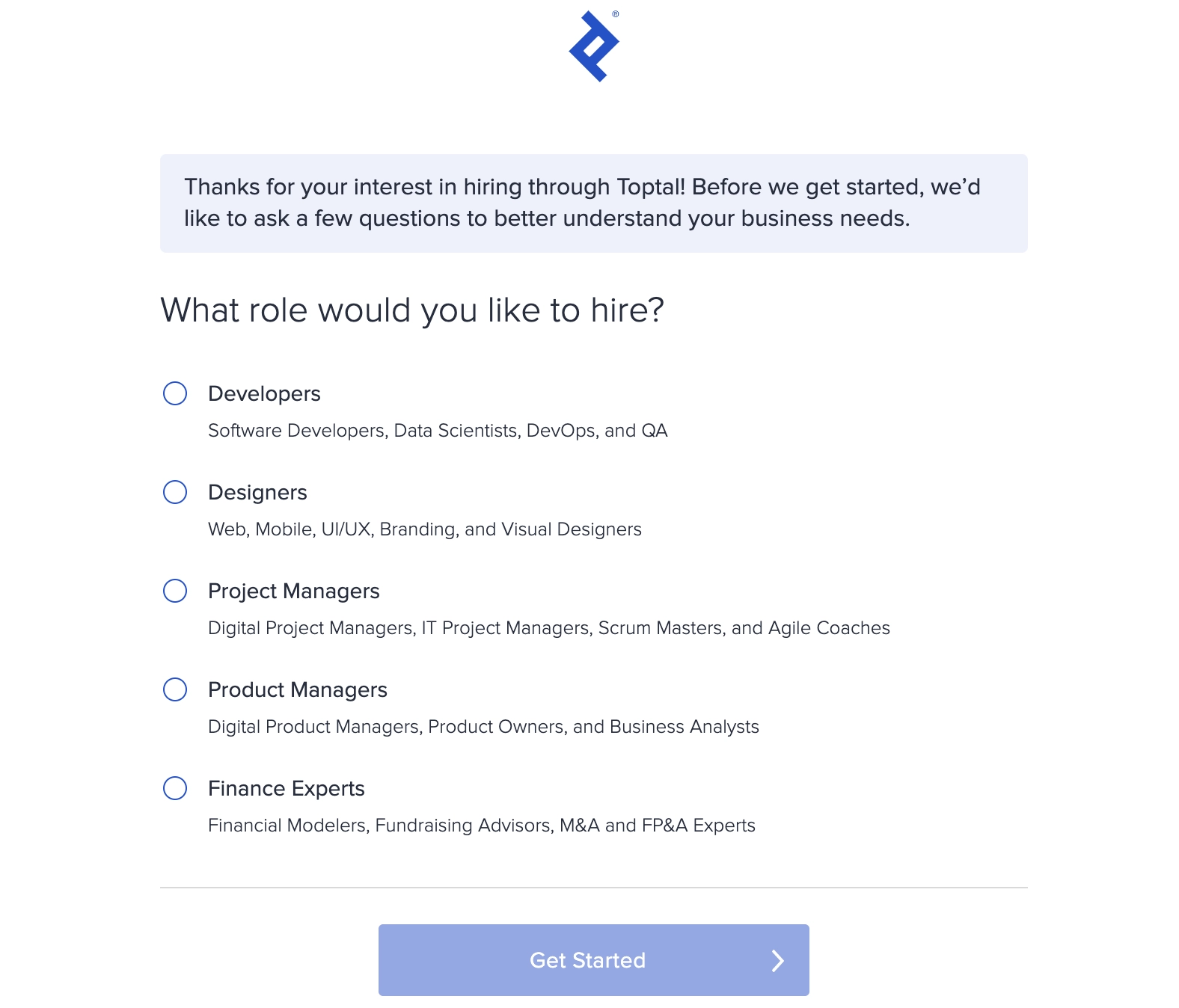
A personal touch is indispensable for long-term SaaS growth, especially for B2B formats like CRM, ERP, or CMS. They have a complex range of services and features, deal with diverse datasets, and, at the same time, need to remain clear and convenient for a user. That is why you often cannot do without a customization stage in the onboarding process.

A brief questionnaire on Toptal used to customize SaaS customer onboarding.

Source: Toptal

By including this stage, you may collect the most important information about the customer with respect to their possibilities of using your platform. This, in turn, narrows down the system’s complexity and leaves only relevant features and resources at the client’s disposal after their effective onboarding.

In this way, you largely relieve the customer of the burden of adjustment, adaptation, and familiarization with the platform.

Include emotional appeals

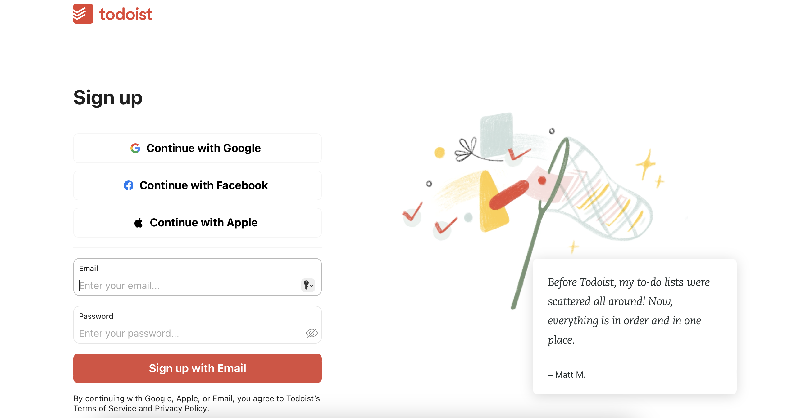
Registration is often the most boring part of the user experience. Why not fix it and improve onboarding by using a few friendly remarks, funny illustrations, and anecdotes?

Engaging visuals as part of the sign-up procedure on Todoist.

Source: Todoist

You may think that if your product is a B2B RegTech for serious top-management clients, there is no room for fun and relaxation. Certainly, emotive elements should not be overkill or out of line. This is a UX designer’s task to make sure they are not. But any user is a human being (at least as of 2024), and the laws of the human psyche are universal. The studies have unequivocally proven that emotional triggers may either boost or impede decision-making toward the needed choice outcomes.

Diversify sign-up options

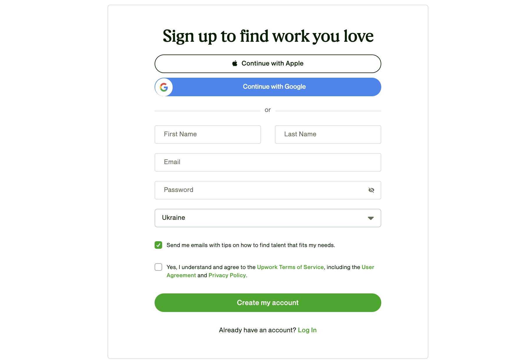
The more expansive and interconnected the universe of SaaS becomes, the wider range of options it suggests to simplify its sign-up procedure for a new startup. Technically, any reliable platform with a credible data security system can be used as an entry point to your product. Today, one may sign up with Google, Apple, Facebook, PayPal, MS Office Suite, and many other networks where they already have a personal account.

Multiple sign-up options offered by Upword to streamline customer onboarding process.

Source: Upwork

In this respect, it makes sense to enrich the customer experience with several registration options. For quite a few SaaS services, signing up with one of the third-party platforms would actually mean instant onboarding, especially if your platform envisages a free trial period.

Show progress

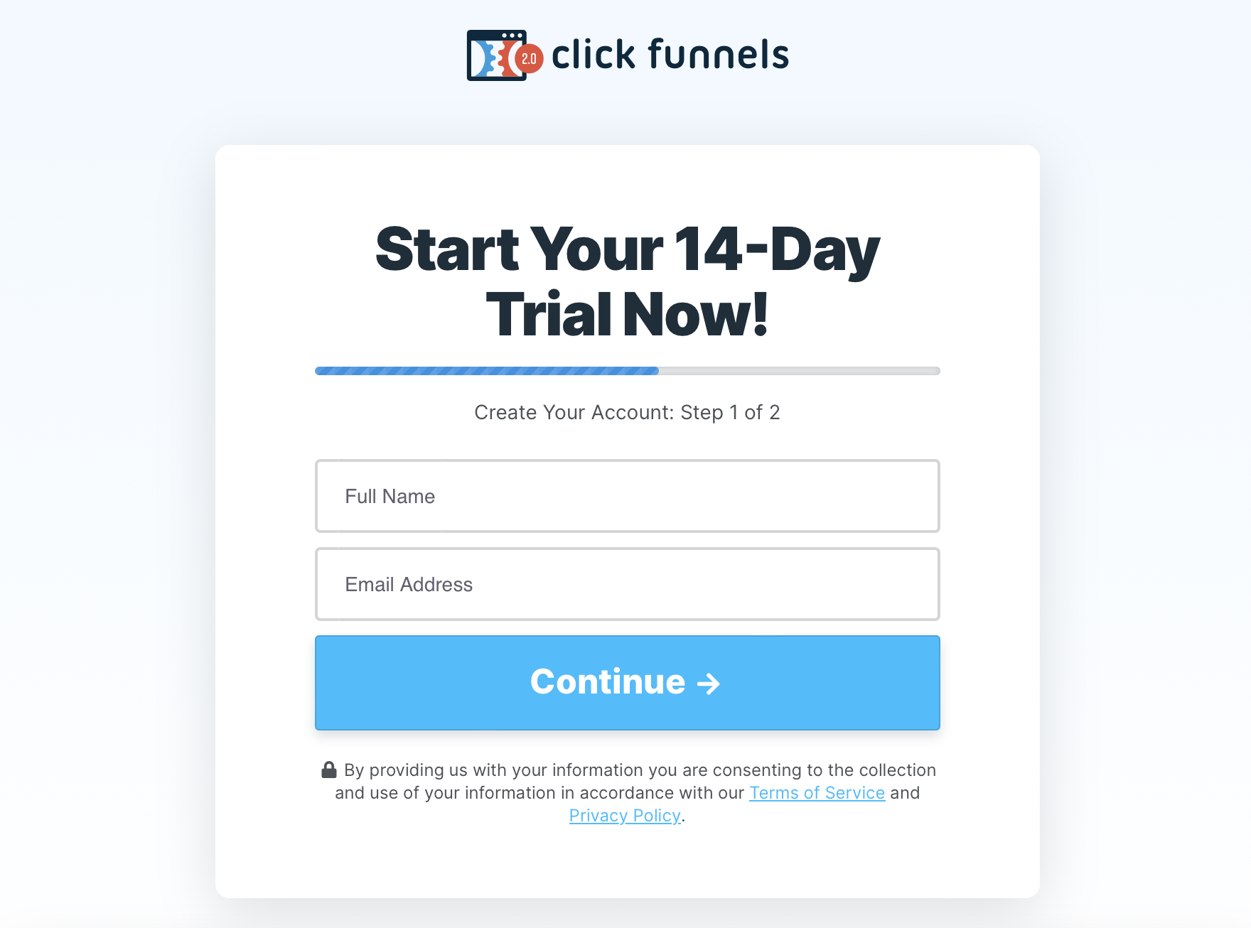
Implement SaaS onboarding UI elements showing how many steps the registration process takes and at what stage the user is at the moment.

A progress bar implemented by Click Funnels to make their SaaS onboarding flow clearer.

Source: Click Funnels

Showing progress is important and radically contributes to SaaS onboarding for two reasons, both rooted in human psychology.

First, when a user sees where they are and how many stages remain, this moves them from the realm of the unknown to the known area (i.e., to the comfort zone). A customer, hence, becomes more confident and comfortable. Otherwise, with new and new windows appearing in their sight, imagination may play a trick, giving them a feeling of an endless process.

Second, people naturally like to finish what they started. When users see how many steps passed and how many are left, they get under the so-called Zeigarnik effect. It implies that humans feel uncomfortable with interrupted or uncompleted tasks.

In application to your SaaS, this means that a progress bar, one of the SaaS gamification techniques, will definitely increase the chances for sign-up completion.

Reward

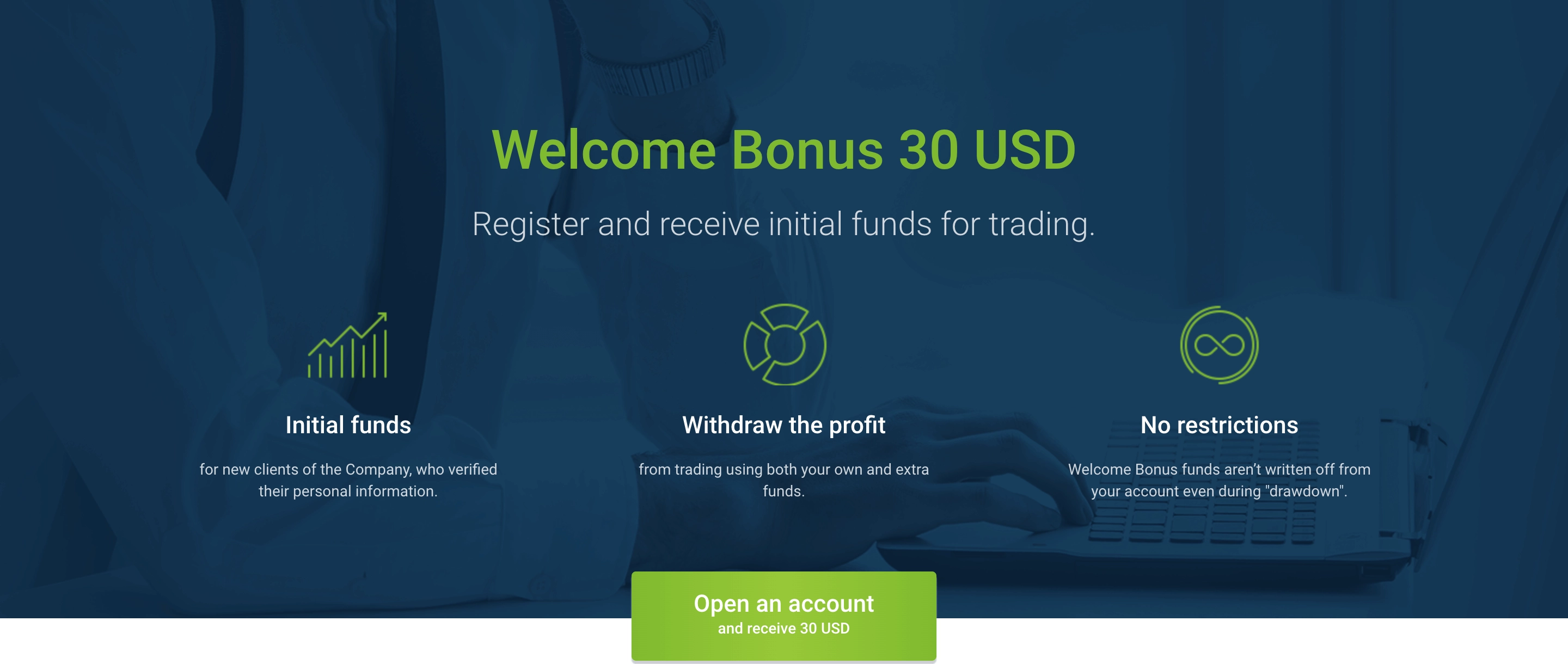
Even if you already granted a customer a free trial period or a demo at the conversion stage, don’t think that a bit of reward would be redundant with further user onboarding. Motivating with something valuable and/or pleasant is one of the things that is never enough for most living beings.

Roboforex welcomes a user with a 30 USD bonus during onboarding.

Source: RoboForex

Therefore you may incentivize a new customer on each step of SaaS customer onboarding. This can be a mere emotionally pleasing appreciation (“Great job!”), a symbolic gift (“Get a premium emoji set!”), or even quite a real bonus (“Sign up today and get a bonus of $20 at your account!”). Among other things, a tangible reward at any stage of the customer journey is one of the most reliable ways to ensure a high user activation rate of your SaaS.

Use value reminders

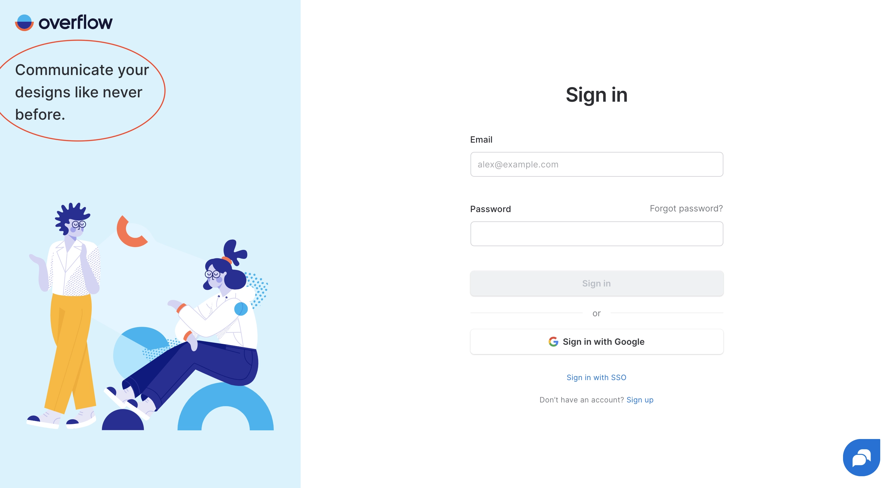
Use different strategies to subtly feature the value of your product through the onboarding process. In this way, you remind a customer why they started the entire process and what outcome expects for them at the end of all efforts. Better if the messages of value are accompanied by appealing visuals.

In the example with Overflow, product designers implemented a different interpretation of their main proposition of value, in other words — but with the same meaning.

A powerful value reminder used by Overflow to boost customer trust at the onboarding stage.

Source: Overflow

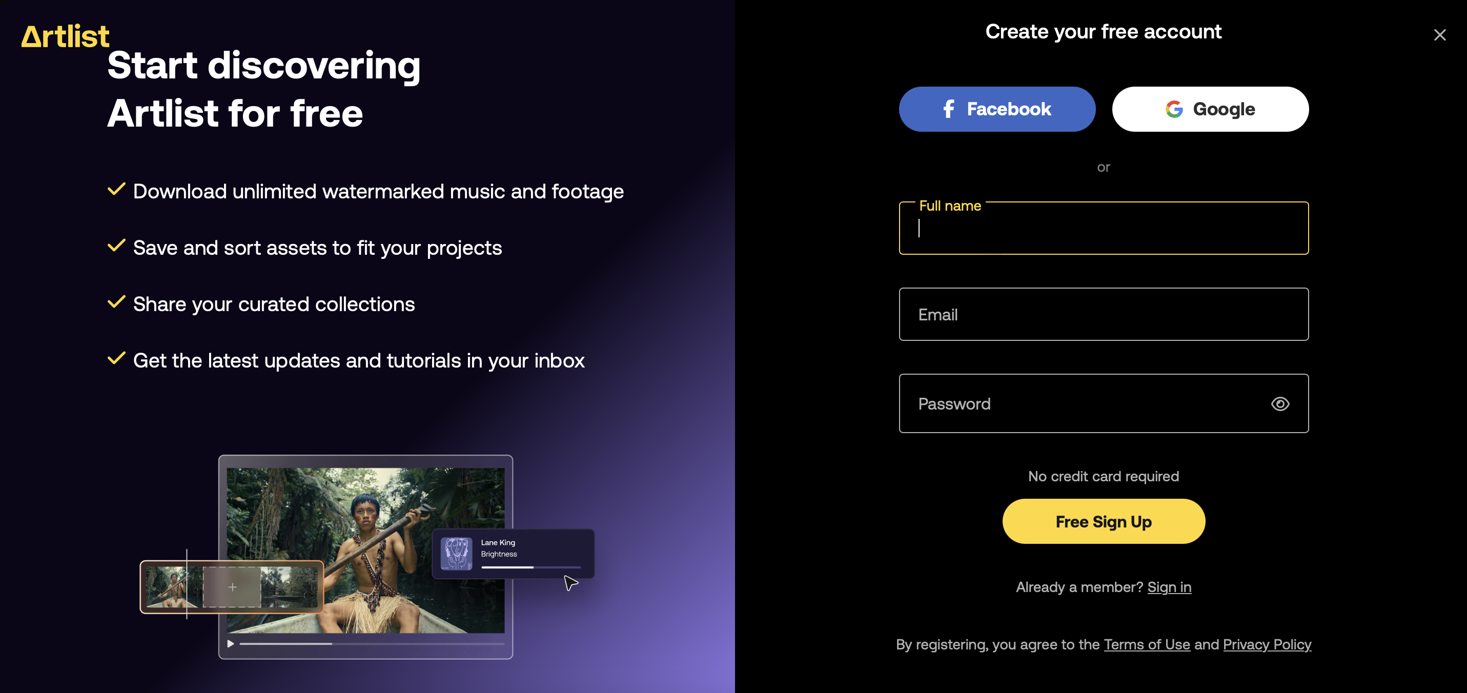
This music licensing platform went even further in its SaaS onboarding improvement. They expanded the statement of value by giving specific clues to how a customer may use their product for everyday practical needs.

Value reminders used by Artlist to show the ways customers can use the platform.

Source: Artlist

Value reminders really work. They shift a user’s attention from the periphery of technical procedures (filling formal registration data, etc.) back to the heart of the basic purpose and meaning — to get their hands on the product.

Respect rights and privacy

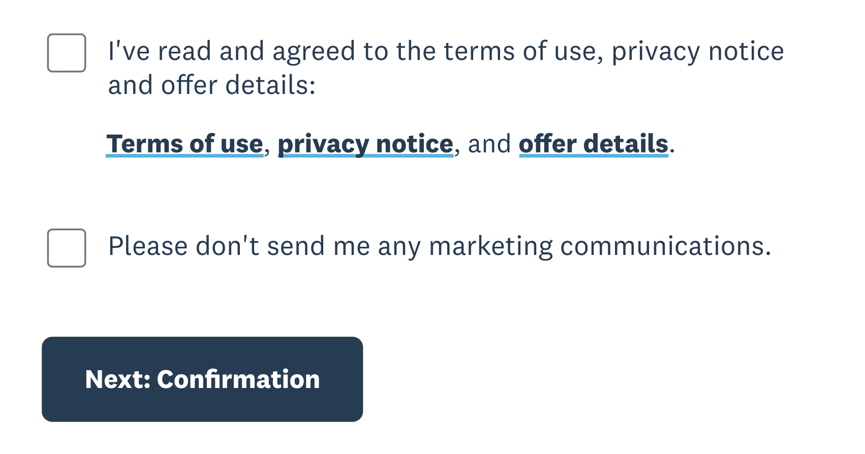
Some users are very reluctant to share their personal data, especially at the first encounter with something new. That is why we recommend requesting only the most essential information. Include a privacy statement with a reference to more detailed information in your product tutorial. Make an additional statement to reassure the customer that their profile will be totally secured

Terms of use, privacy notice, and offer details included within the Xero sign-up process.

Source: Xero

We all realize that most people do not open privacy statements and even the terms of use, let alone read these texts through. But the very presence of references to such formal and legally binding documents gives them an air of trust and confidence that their rights are officially protected and privacy respected.

Provide handy support

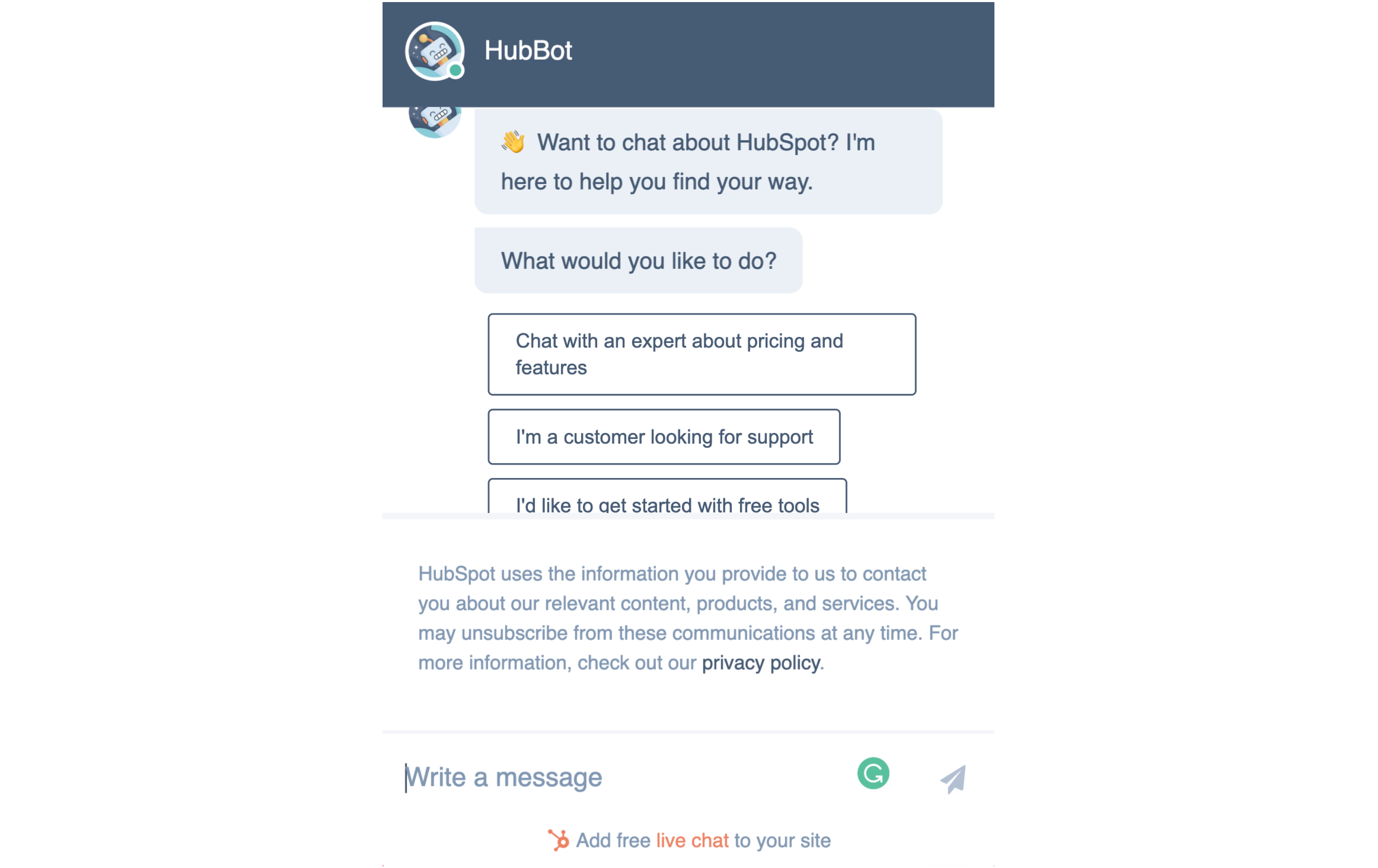
It is best if you’ve managed to anticipate all the questions and inconveniences that may arrive on the way. Yet, this rarely happens. If a customer stumbles at some stage and does not receive help immediately, they would most likely quit the process. Develop a live support system to avoid such a problem.

A live chat feature of HubSpot acts as an instant assistant during SaaS customer onboarding.

Source: HubSpot

In the best SaaS onboarding process, such support is provided within minutes, whereas a customer can find an access point to it within a second (usually a chat icon in the lower right corner).

At the same time, it is not that good to redirect a user to the FAQ and general information section, where they painstakingly need to look for an option to contact a support team.

Besides, the customer feedback your users would leave to the support will allow your team to identify soft spots in user experience and further improve the onboarding process in the most time-saving manner.

Onboarding mistakes

Well, we’ve just covered the SaaS onboarding best practices and steps. Tired? Wait a while, you’ll catch your second wind! You know that avoiding mistakes is sometimes (often!) more important and financially crucial than following conventional wisdom. The onboarding process is no exception. So, reviewing the key onboarding errors capable of distracting prospective users during the product activation — i.e., producing customer churn — is necessary to streamline the customer onboarding process.

For your information

Customer churn is the percentage of users who stop using your product over a period of time. The churn rate is calculated as follows: we divide the number of users who quit using your product by the overall number of users who started using the product during the period for which the rate is calculated.

For example, if at the beginning of the quarter, we had 500 users, and at the end, only 250 of them remained on the platform, the churn rate is 50%. You can find more detailed information on SaaS churn and the best customer reactivation strategies in our feature article.

Underestimation

This is when you implement onboarding as a residual, simply because “that’s what they tell us to do” and not because you personally think that’s the right thing to do.

Such a SaaS onboarding strategy usually leads to designing the onboarding process carelessly, often without considering all the functionality your user needs to get acquainted with. But it is evident we can achieve nothing good without proper effort and thoughtful actions.

The best way to avoid this mistake is to plan onboarding for each individual feature at the time you develop this feature. Create a centralized content hub; write all the necessary text at once and add the essential tips to the layout. The customer onboarding journey’s success builds on such tiny details and small steps.

Non-standard onboarding elements

Overall, this mistake is typical not just for the SaaS onboarding strategy but for any aspect of the customer journey.

Standard elements, such as green buttons to confirm or arrow icons to navigate between onboarding elements, are familiar to every user of websites and software. Using non-standard elements increases the likelihood of a user making a mistake or getting stuck during onboarding, significantly reducing engagement, creating additional friction points, and ruining the product’s overall impression.

Focusing on features rather than basic value

As a product designer, you may be anxious to introduce every cool feature of your creation to the end-user from the very beginning of SaaS onboarding. This is a very understandable desire: all the features are so cool and unique on the market, and you have invested so much time and soul into each of them.

But don’t hurry, however much you would love to. An excessive amount of information in sign-up flows can confuse the user. Instead, for meeting your onboarding goals apply a more artful approach: tempt a customer with the value for which they reached out to your product. The sooner a user turns even a small goal into reality, the more likely it is they will stop at your product as the most valuable and useful.

Lack of guidance

In SaaS onboarding, no matter how skillful and experienced your customer is or how clear and intuitive your interface is. On the first visit to a site or application, you must provide a user with a short guide, lesson, or a set of tooltips.

Ozuysal’s guide has become a new revelation for us regarding the universality of onboarding. From the perspective of marketing, this set-up process of customer onboarding takes place both inside and outside a platform. For example, there is a separate algorithm for email onboarding.

So get ready not only for the design of in-app/onsite onboarding but also for the design of email templates... and who knows what else! Remember the red and blue pills for Neo from The Matrix? This was also an example of a user onboarding experience — user activation for reality.

Your homework is to be creative and pick up other best SaaS onboarding examples. Who knows, maybe this will give you new, unexpected horizons and better prospects for in-app onboarding design.

Leaving the user’s success without a compliment

Of course, with an ideal approach to onboarding, a message with congratulations should appear immediately upon filling in sign-up forms and hereafter in the case of successful outcomes at performing every task. But in the context of an effective onboarding process, positive reinforcement is even more helpful, as it allows you to easily create a starting point and a benchmark for building a product and nurturing a positive customer experience.

Onboarding problem-solving

So, how to identify and eliminate problems in your SaaS onboarding flow?

John Ozuysal recommends using the so-called Immersion Research. It envisages taking on the role of your end-user as deeply as possible instead of researching a group of real-life users. If, for some reason, you have no opportunity to provide centralized monitoring of onboarding metrics and collect feedback from your potential customers, this method is exactly what you need.

This type of research will be especially useful for those products that do not yet have a client base or if you, as a designer, cannot reach them out. In general, this research method is good for developing empathy, an indispensable qualification for UX/UI designers, product managers, and overall onboarding teams in any company. It is also a relatively quick and low-cost way to test the effectiveness of the onboarding you’ve created.

To quickly analyze the effectiveness of onboarding, ask yourself the following questions (either free-form or as a formalized onboarding survey):

  • how long does it take a user to interact with your product for the first time?
  • what exactly takes extra time during performing the key tasks during onboarding?
  • how long does it take to complete each onboarding task?
  • how long does it take to complete the onboarding completely and start using the product?

Additional ways to enhance the efficiency of the immersive research method:

  1. Make a checklist of the onboarding goals you would like to accomplish as a product user on your first visit. Try to accomplish these objectives under different circumstances.

  1. Write down every idea that comes to your mind and every detail that relates to your onboarding experience. Do this again and again. This also includes first impressions, emotional states and thoughts that arise along the way, and the time you spend on the completion of every task. Repeat this exercise in different situations.

  1. Try to look at the product with a fresh eye. It won’t be easy given that you are the design’s author and it is actually your beloved child. But just try to use it the same way as you would work with any other product for personal purposes. Note whether the SaaS onboarding UX reveals the required value and functionality of the product.

Conclusion

In terms of a truly robust user onboarding process, hurrying to make a potential customer proceed with subscribing as soon as possible without a thorough engagement and communication plan isn’t the winning option. That is why both UI and UX must be top-notch to retain the user’s attention at a time when it is still fragile and superficial.

However, the registration process itself, which was in the spotlight of our article, should never be neglected on its own. With proper elaboration, it can become the most powerful onboarding tool. Hopefully, our tips, examples, and software onboarding best practices managed to convince you.

Specifically, you can draw the following conclusions:

  • user onboarding goes beyond a first-time emotional impression; it includes a wide range of tactics aimed to both enlighten and engage prospective users;
  • to consider every aspect of efficient onboarding, a designer should follow the three “A” principles of accommodating (tools), assimilating (knowledge), and accelerating (value);
  • the SaaS onboarding best practices like interactive learning, the hook of engagement, and initial setup are at your disposal;
  • the simple, fast, clear, personalized, and customizable sign-up is a must for the best SaaS onboarding experiences, along with such elements as value reminders, progress bars, and emotional appeals;
  • avoiding the key onboarding mistakes (such as underestimation, excessive focus on features, lack of guidance, etc.) is even more critical than following best practices because they are primary factors of your SaaS customer churn;
  • even if you have already designed your product’s onboarding and now get worried about its quality and efficiency, it is never too late to identify and eliminate its problems. One of the good and time-proven methods is Immersion Research based on placing yourself in your user’s shoes.


To discover more options for boosting your SaaS sales through thoughtful UX/UI, stand by for new articles in this series.

FAQ

What is SaaS user onboarding?

In SaaS, user onboarding is the process within a customer journey that guides new users from initial registration to the first use of the product’s features. It helps customers understand your SaaS product, see its value, and proceed to further adoption.

What’s the importance of user onboarding in SaaS?

The SaaS onboarding process directly affects user retention, churn, and, ultimately, your sales. By delivering the best app onboarding experiences, you get your users started on the right foot — then, they’re more likely to see the benefits and keep using your product.

How long is the average onboarding for SaaS?

Of course, the average onboarding duration depends on the very product and its complexity, as well as how quickly users can achieve the desired value. Yet, the golden rule is to make a strong first impression within the first seven minutes. Upon that, a normal onboarding process may last from a few days to a week.

What is a user onboarding checklist?

A user onboarding checklist is a short guide that outlines the key steps new users should take to get started with your SaaS product. It typically covers profile setup and core features.

What is the difference between onboarding and implementation of SaaS?

SaaS customer onboarding introduces users to the product and teaches them how to use it. SaaS implementation, on the other hand, focuses on getting the product up and running within a company — the process that usually involves data migration and customization.

What is the difference between user onboarding and product onboarding?

User onboarding targets the individual end-users who will directly interact with the SaaS product, while product onboarding takes a more global approach. It aims to make the product easier and more accessible for everyone, not just separate users.

start your project with us.

Getting in touch
is easy .
Thank you for your message. It has been sent